
Search results for "Inclusion" in Home Design Ideas
 User
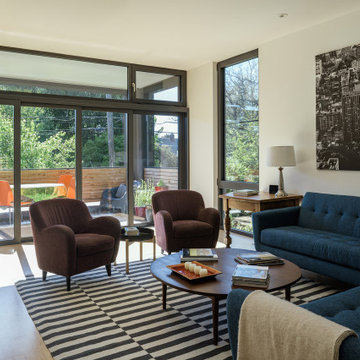
The original small 2 bedroom dwelling was deconstructed piece by piece, with every element recycled/re-used. The larger, newly built home + studio uses much less energy than the original. In fact, the home and office combined are net zero (the home’s blower door test came in at Passive House levels, though certification was not procured). The transformed home boasts a better functioning layout, increased square footage, and bold accent colors to boot. The multiple level patios book-end the home’s front and rear facades. The added outdoor living with the nearly 13’ sliding doors allows ample natural light into the home. The transom windows create an increased openness with the floor to ceiling glazing. The larger tilt-turn windows throughout the home provide ventilation and open views for the 3-level contemporary home. In addition, the larger overhangs provide increased passive thermal protection from the scattered sunny days. The conglomeration of exterior materials is diverse and playful with dark stained wood, concrete, natural wood finish, and teal horizontal siding. A fearless selection of a bright orange window brings a bold accent to the street-side composition. These elements combined create a dynamic modern design to the inclusive Portland backdrop.
 RLH Studio
Spacecrafting Photography
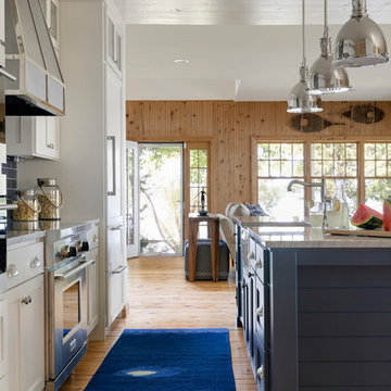
Inspiration for a small coastal single-wall shiplap ceiling open concept kitchen remodel in Minneapolis with a farmhouse sink, shaker cabinets, white cabinets, granite countertops, blue backsplash, subway tile backsplash, paneled appliances, an island and white countertops
Inspiration for a small coastal single-wall shiplap ceiling open concept kitchen remodel in Minneapolis with a farmhouse sink, shaker cabinets, white cabinets, granite countertops, blue backsplash, subway tile backsplash, paneled appliances, an island and white countertops


Find the right local pro for your project

 European Cabinets & Design Studios
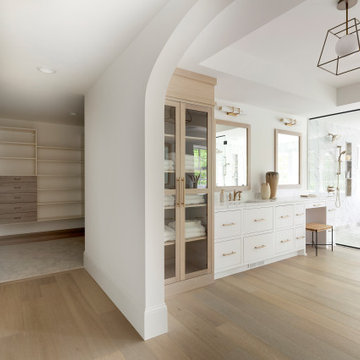
The master bathroom features vanities from BMT Bagni's Fly collection and flooring by Skema.
Inspiration for a large modern master corner bathtub remodel in San Francisco with an integrated sink, flat-panel cabinets, gray cabinets, a wall-mount toilet and gray walls
Inspiration for a large modern master corner bathtub remodel in San Francisco with an integrated sink, flat-panel cabinets, gray cabinets, a wall-mount toilet and gray walls


 House of L
A 1927 colonial home in Shaker Heights, Ohio, received a breathtaking renovation that required extensive work, transforming it from a tucked away, utilitarian space, to an all-purpose gathering room, a role that most kitchens embrace in a home today. The scope of work changed over the course of the project, starting more minimalistically and then quickly becoming the main focus of the house's remodeling, resulting in a staircase being relocated and walls being torn down to create an inviting focal point to the home where family and friends could connect. The focus of the functionality was to allow for multiple prep areas with the inclusion of two islands and sinks, two eating areas (one for impromptu snacking and small meals of younger family members and friends on island no. two and a built-in bench seat for everyday meals in the immediate family). The kitchen was equipped with all Subzero and Wolf appliances, including a 48" range top with a 12" griddle, two double ovens, a 42" built-in side by side refrigerator and freezer, a microwave drawer on island no. one and a beverage center and icemaker in island no. two. The aesthetic feeling embraces the architectural feel of the home while adding a modern sensibility with the revamped layout and graphic elements that tie the color palette of whites, chocolate and charcoal. The cabinets were custom made and outfitted with beaded inset doors with a Shaker panel frame and finished in Benjamin Moore's OC-17 White Dove, a soft white that allowed for the kitchen to feel warm while still maintaining its brightness. Accents of walnut were added to create a sense of warmth, including a custom premium grade walnut countertop on island no. one from Brooks Custom and a TV cabinet with a doggie feeding station beneath. Bringing the cabinet line to the 8'6" ceiling height helps the room feel taller and bold light fixtures at the islands and eating area add detail to an otherwise simpler ceiling detail. The 1 1/4" countertops feature Calacatta Gold Marble with an ogee edge detail. Special touches on the interiors include secret storage panels, an appliance garage, breadbox, pull-out drawers behind the cabinet doors and all soft-close hinges and drawer glides. A kneading area was made as a part of island no. one for the homeowners' love of baking, complete with a stone top allowing for dough to stay cool. Baskets beneath store kitchen essentials that need air circulation. The room adjacent to the kitchen was converted to a hearth room (from a formal dining room) to extend the kitchen's living space and allow for a natural spillover for family and guests to spill into.
Jason Miller, Pixelate
 HELT
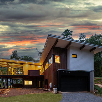
This lakefront diamond in the rough lot was waiting to be discovered by someone with a modern naturalistic vision and passion. Maintaining an eco-friendly, and sustainable build was at the top of the client priority list. Designed and situated to benefit from passive and active solar as well as through breezes from the lake, this indoor/outdoor living space truly establishes a symbiotic relationship with its natural surroundings. The pie-shaped lot provided significant challenges with a street width of 50ft, a steep shoreline buffer of 50ft, as well as a powerline easement reducing the buildable area. The client desired a smaller home of approximately 2500sf that juxtaposed modern lines with the free form of the natural setting. The 250ft of lakefront afforded 180-degree views which guided the design to maximize this vantage point while supporting the adjacent environment through preservation of heritage trees. Prior to construction the shoreline buffer had been rewilded with wildflowers, perennials, utilization of clover and meadow grasses to support healthy animal and insect re-population. The inclusion of solar panels as well as hydroponic heated floors and wood stove supported the owner’s desire to be self-sufficient. Core ten steel was selected as the predominant material to allow it to “rust” as it weathers thus blending into the natural environment.

 chadbourne + doss architects
 has created a modern detached garage and guesthouse in Seattle, Washington.
photo by Benjamin Benschneider
Garage - small modern detached two-car garage idea in Seattle
Garage - small modern detached two-car garage idea in Seattle

 Cascade West Development
The Ascension - Super Ranch on Acreage in Ridgefield Washington by Cascade West Development Inc. for the Clark County Parade of Homes 2016.
As soon as you pass under the timber framed entry and through the custom 8ft tall double-doors you’re immersed in a landscape of high ceilings, sharp clean lines, soft light and sophisticated trim. The expansive foyer you’re standing in offers a coffered ceiling of 12ft and immediate access to the central stairwell. Procession to the Great Room reveals a wall of light accompanied by every angle of lush forest scenery. Overhead a series of exposed beams invite you to cross the room toward the enchanting, tree-filled windows. In the distance a coffered-box-beam ceiling rests above a dining area glowing with light, flanked by double islands and a wrap-around kitchen, they make every meal at home inclusive. The kitchen is composed to entertain and promote all types of social activity; large work areas, ubiquitous storage and very few walls allow any number of people, large or small, to create or consume comfortably. An integrated outdoor living space, with it’s large fireplace, formidable cooking area and built-in BBQ, acts as an extension of the Great Room further blurring the line between fabricated and organic settings.
Cascade West Facebook: https://goo.gl/MCD2U1
Cascade West Website: https://goo.gl/XHm7Un
These photos, like many of ours, were taken by the good people of ExposioHDR - Portland, Or
Exposio Facebook: https://goo.gl/SpSvyo
Exposio Website: https://goo.gl/Cbm8Ya

 Adaptiv DC
THEME The main theme for this room is an active, physical and personalized experience for a growing boy. This was achieved with the use of bold colors, creative inclusion of personal favorites and the use of industrial materials. FOCUS The main focus of the room is the 12 foot long x 4 foot high elevated bed. The bed is the focal point of the room and leaves ample space for activity within the room beneath. A secondary focus of the room is the desk, positioned in a private corner of the room outfitted with custom lighting and suspended desktop designed to support growing technical needs and school assignments. STORAGE A large floor armoire was built at the far die of the room between the bed and wall.. The armoire was built with 8 separate storage units that are approximately 12”x24” by 8” deep. These enclosed storage spaces are convenient for anything a growing boy may need to put away and convenient enough to make cleaning up easy for him. The floor is built to support the chair and desk built into the far corner of the room. GROWTH The room was designed for active ages 8 to 18. There are three ways to enter the bed, climb the knotted rope, custom rock wall, or pipe monkey bars up the wall and along the ceiling. The ladder was included only for parents. While these are the intended ways to enter the bed, they are also a convenient safety system to prevent younger siblings from getting into his private things. SAFETY This room was designed for an older child but safety is still a critical element and every detail in the room was reviewed for safety. The raised bed includes extra long and higher side boards ensuring that any rolling in bed is kept safe. The decking was sanded and edges cleaned to prevent any potential splintering. Power outlets are covered using exterior industrial outlets for the switches and plugs, which also looks really cool.
 Jordan Design Build Group
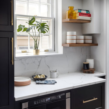
Expanding and updating the kitchen was our top priority – the new layout was designed to straddle the original house and the addition, creating work zones rather than the traditional work triangle. The modified galley layout more than doubled their countertop area and storage space. Extending the kitchen into the addition took full advantage of the vaulted ceilings and light-filled space. To improve flow and connectivity, we opened up a wall between the old kitchen and the front entry hall providing a straight path from front door to the new mudroom/drop zone and kitchen beyond. A door from the dining room into the kitchen was shifted to allow for a more generous kitchen.
The beautifully veined Calacatta Eiffel quartz counters and backsplash provide visual contrast with the black cabinetry and keep the space from feeling too heavy. A continuous ledge and floating shelves replace traditional uppers for a more open and modern feel. Stained wood is used throughout, from the bench top, to shelving, trim and custom millwork; it brings in a natural element and helps unite all of the spaces. A hood with a custom Venetian plaster finish is flanked by vintage inspired sconces and provides a stunning focal point in the room. A deep nook is home to a ‘bubble box’ that dispenses cold sparkling or still water on demand – the marble tile backsplash further differentiates this beverage zone. The brushed brass hardware stands out against the dark cabinets and adds a touch of warmth. With seating for three at the counter and the inclusion of a breakfast area banquette (with drawers), the home is ideal for family time and relaxed gatherings with friends.

 Ralph Saviano
Beyond Virtual Tours | Chris Ricketts
www.BeyondVT.com
Large transitional open concept medium tone wood floor living room photo in San Francisco with gray walls
Large transitional open concept medium tone wood floor living room photo in San Francisco with gray walls
 Bobby Berk
Millennials—the 77 million-strong generation born between 1981 and 1997--this past year surpassed the Baby Boom as the United States’ largest population cohort. This burgeoning generation currently represents one of every three homebuyers and we expect that this new and emerging demographic will reshape economic, business, and geographic marketplaces for decades to come.
Bobby-Berk
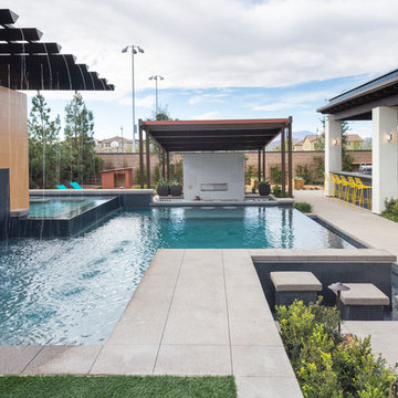
The Responsive Home project, a collaboration between TRI Pointe Group’s Pardee Homes and Hanley Wood’s BUILDER magazine, is a discovery lab for research, design and building practices to understand and activate the Millennial home buyer, now and over the next several years as they become of home-buying age.
As a result of this collaboration, two concept homes, located within the Inspirada master-planned community in Henderson, Nevada were unveiled at the IBS show in Las Vegas in January 2016. These innovative homes are fun, quirky, and positively ooze personality, thanks in no small part to architects Bassenian Lagoni, landscape architects Anderson Baron and celebrity creative director Bobby Berk, who infused the designs with youthful energy.
By design, the Responsive Home answers present and longer-term ownership living needs, providing a new home that young buyers can attain, personalize, adapt to their needs, and live in a connected, accessible way. Available in two floor plans, the Contemporary Farmhouse and the Contemporary Transitional blend livability with modern function catering to the most important request according to younger buyers – more space, specifically outdoors.
Both home choices offer evolution-over-time floor plans with powerful indoor-outdoor workflow, technology-enabled automation, energy performance and bold design finishes. Homeowners can personalize their space in multiple ways including options for additional bedrooms, office or fitness room, casita and studio living spaces inclusive of separate home entrances, among others.
Photo Credits: Brett Beyer

 Carpediem Design
La vie de vacancier
Quand est venu le temps de rénover sa chambre à coucher, les propriétaires souhaitaient se
sentir comme à l’hôtel, avec tout le confort, le calme, la douceur et les commodités qu’on
retrouve lorsqu’on prend des vacances bien méritées.
La pièce n’étant pas très grande, nous avons décidé d’ouvrir la penderie (walk-in) existante afin
d’accroître la superficie visible.
Pour réaliser cet exploit, nous avons misé sur une combinaison de bois laqué de couleur crème
et de noyer naturel pour le mobilier intégré, le tout sur un plancher de noyer africain. L’aire bien
éclairée, en plus du contraste des tons clairs et du bois naturel, contribue à agrandir la pièce.
Même si une esthétique agréable était primordiale, nous n’avons pas négligé le côté pratique
lors de la conception du design. C’est pourquoi nous avons inclus un important espace de
rangement avec de nombreux tiroirs et armoires. Ont également été ajoutées une aire de
maquillage, ainsi qu’une banquette rembourrée douillette au bord des fenêtres en baie, afin de
profiter de bons moments de lecture dans la chaleur du soleil.
Il ne reste que le service aux chambres, la femme de ménage et le chocolat sur l’oreiller pour
que l’illusion soit complète…

 MTR Contractors | My Thatch Roof
Many of our followers might be (wrongfully) thinking, "What if I don't think thatch is right for my backyard?" Or "I love thatch but my annoying spouse doesn't." If that happens to be the case, you no longer have to fret. MTR believes in inclusion. We have something for everyone. We also build structures with no thatch, but if we do, then we want to make sure it's still an impressive, beautiful, and unique addition to your patio. For instance, look at this majestic pergola of 1,100 sqft... We customized it with the 8" diameter yellow pine round posts to give it a truly unique look.
Even if your backyard doesn't look like a nature park, we can find something perfect for your patio. We love adding the round posts which is not the typical look. It gives it a modern and sleek look. And with the addition of the Manila rope at the bottom it gives it a completely different look!
t really is an art and a craft to build a structure like this one. The way each piece of wood is perfectly and geometrically placed is an art form. The craziest part is that the builders don't build based off formulas or engineered drawings; they build off experience and pure brain and on the spot thinking. We're lucky to have the people we work with love this learned and lived trade.

 Natural Stone Institute
This private residence boasts of old-world masonry with Classic Italian Palladian Architecture. The architect designed this 6-14 acre creekside property around the 29,000 square-foot home. The estate incorporates a four-car garage inclusive of servants quarters, and a pool cabana/pavilion. Expansive areas of hardscape connect buildings on the property.
The main exterior cladding is Texas Lueders Limestone. It was used for wall panels as well as plinths, window surrounds, balustrade assemblies, solid columns, and cornices. In a method of old-world construction, the limestone was fabricated to plus zero in tolerance to accomodate 1/8" lime-mortar joints. "Border Stones" were utilized with the lime-mortar joints system to interlock the stone facade to the CMU wall behind.
Large stone column and window assemblies make up th east and west facades. These load-bearing elements support the pediment assemblies and structure above. The arches at the Pavilion were also designed as load-bearing, where pediment kneelers were cut from two separate carved pieces and epoxied together. Weighing 7,200 lbs each, the kneelers had to be set with a 180 ton crane in order to reach over two very large existing oak trees. The garage and pool cabana were constructed with the same stone cladding system, and with similar load-bearing elements.
 Jordan Design Build Group
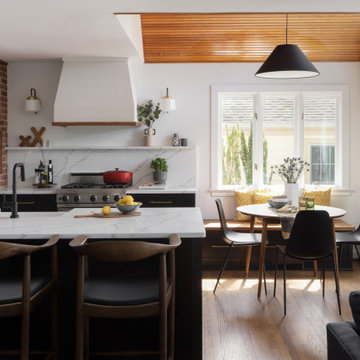
Expanding and updating the kitchen was our top priority – the new layout was designed to straddle the original house and the addition, creating work zones rather than the traditional work triangle. The modified galley layout more than doubled their countertop area and storage space. Extending the kitchen into the addition took full advantage of the vaulted ceilings and light-filled space. To improve flow and connectivity, we opened up a wall between the old kitchen and the front entry hall providing a straight path from front door to the new mudroom/drop zone and kitchen beyond. A door from the dining room into the kitchen was shifted to allow for a more generous kitchen.
The beautifully veined Calacatta Eiffel quartz counters and backsplash provide visual contrast with the black cabinetry and keep the space from feeling too heavy. A continuous ledge and floating shelves replace traditional uppers for a more open and modern feel. Stained wood is used throughout, from the bench top, to shelving, trim and custom millwork; it brings in a natural element and helps unite all of the spaces. A hood with a custom Venetian plaster finish is flanked by vintage inspired sconces and provides a stunning focal point in the room. A deep nook is home to a ‘bubble box’ that dispenses cold sparkling or still water on demand – the marble tile backsplash further differentiates this beverage zone. The brushed brass hardware stands out against the dark cabinets and adds a touch of warmth. With seating for three at the counter and the inclusion of a breakfast area banquette (with drawers), the home is ideal for family time and relaxed gatherings with friends.
 Schloegel Design Remodel
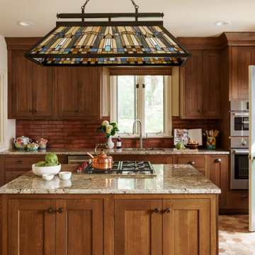
This perspective highlights the seamless integration of a high-end culinary workspace within a classic Craftsman aesthetic. The expansive kitchen island, featuring a granite countertop with a built-in range, serves as the centerpiece of the room, perfectly positioned under a custom-framed art glass chandelier. This architectural light fixture acts as a jewelry piece for the kitchen, echoing the geometric precision found in traditional Mission-style design while casting a warm, ambient glow across the entire space.
The view showcases the impressive depth of the custom-stained cabinetry, which extends to the ceiling with elegant crown molding. To the right, professional-grade stainless steel appliances, including double wall ovens, are sleekly integrated into the woodwork, offering a modern contrast to the rustic textures of the red brick backsplash and hexagonal tiled flooring. The inclusion of a light sage green pantry door adds a subtle pop of color, softening the rich wood tones and bringing a fresh, nature-inspired element to the palette.
Every architectural choice, from the recessed lighting to the thoughtfully placed casement window over the sink, emphasizes a balance of practicality and style. The layout is designed for effortless flow, providing ample prep space on the island while keeping essential tools and high-performance appliances within easy reach. This kitchen successfully creates a sophisticated yet homey environment that is ideal for both quiet family meals and large-scale entertaining.
 Natural Stone Institute
This private residence boasts of old-world masonry with Classic Italian Palladian Architecture. The architect designed this 6-14 acre creekside property around the 29,000 square-foot home. The estate incorporates a four-car garage inclusive of servants quarters, and a pool cabana/pavilion. Expansive areas of hardscape connect buildings on the property.
The main exterior cladding is Texas Lueders Limestone. It was used for wall panels as well as plinths, window surrounds, balustrade assemblies, solid columns, and cornices. In a method of old-world construction, the limestone was fabricated to plus zero in tolerance to accomodate 1/8" lime-mortar joints. "Border Stones" were utilized with the lime-mortar joints system to interlock the stone facade to the CMU wall behind.
Large stone column and window assemblies make up th east and west facades. These load-bearing elements support the pediment assemblies and structure above. The arches at the Pavilion were also designed as load-bearing, where pediment kneelers were cut from two separate carved pieces and epoxied together. Weighing 7,200 lbs each, the kneelers had to be set with a 180 ton crane in order to reach over two very large existing oak trees. The garage and pool cabana were constructed with the same stone cladding system, and with similar load-bearing elements.

 Cantoni Irvine
From the street, it’s an impeccably designed English manor. Once inside, the best of that same storied architecture seamlessly meshes with modernism. This blend of styles was exactly the vibe three-decades-running Houston homebuilder Chris Sims, founder and CEO of Sims Luxury Builders, wanted to convey with the $5.2 million show-home in Houston’s coveted Tanglewood neighborhood. “Our goal was to uniquely combine classic and Old World with clean and modern in both the architectural design as well as the interior finishes,” Chris says.
Their aesthetic inspiration is clearly evident in the 8,000-square-foot showcase home’s luxurious gourmet kitchen. It is an exercise in grey and white—and texture. To achieve their vision, the Sims turned to Cantoni. “We had a wonderful experience working with Cantoni several years ago on a client’s home, and were pleased to repeat that success on this project,” Chris says.
Cantoni designer Amy McFall, who was tasked with designing the kitchen, promptly took to the home’s beauty. Situated on a half-acre corner lot with majestic oak trees, it boasts simplistic and elegant interiors that allow the detailed architecture to shine. The kitchen opens directly to the family room, which holds a brick wall, beamed ceilings, and a light-and-bright stone fireplace. The generous space overlooks the outdoor pool. With such a large area to work with, “we needed to give the kitchen its own, intimate feel,” Amy says.
To that end, Amy integrated dark grey, high-gloss lacquer cabinetry from our Atelier Collection. by Aster Cucine with dark grey oak cabinetry, mixing finishes throughout to add depth and texture. Edginess came by way of custom, heavily veined Calacatta Viola marble on both the countertops and backsplash.
The Sims team, meanwhile, insured the layout lent itself to minimalism. “With the inclusion of the scullery and butler’s pantry in the design, we were able to minimize the storage needed in the kitchen itself,” Chris says. “This allowed for the clean, minimalist cabinetry, giving us the creative freedom to go darker with the cabinet color and really make a bold statement in the home.”
It was exactly the look they wanted—textural and interesting. “The juxtaposition of ultra-modern kitchen cabinetry and steel windows set against the textures of the wood floors, interior brick, and trim detailing throughout the downstairs provided a fresh take on blending classic and modern,” Chris says. “We’re thrilled with the result—it is showstopping.”
They were equally thrilled with the design process. “Amy was incredibly responsive, helpful and knowledgeable,” Chris says. “It was a pleasure working with her and the entire Cantoni team.”
Check out the kitchen featured in Modern Luxury Interiors Texas’ annual “Ode to Texas Real Estate” here.
144