
Search results for "Increase heart" in Home Design Ideas
 KURV Architecture DPC (Alex Hughes Architects)
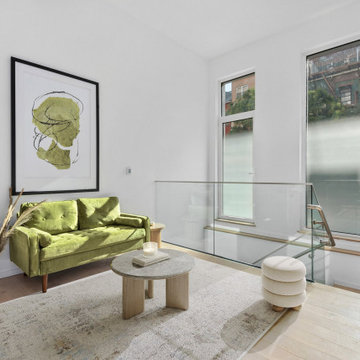
Located in the heart of Manhattan’s Lower East Side, the building was erected on a shallow commercial lot between two 120 year old masonry buildings and a new residential rental building. 330 Grand Street is a mix of 725 SF 1BRs and 1050 SF 2BR apartments. It also contains a 1100 SF two story duplex as well as private and public rooftop space, large private balconies for most units and two large private terraces for the ground floor units.
330 Grand Street was originally designed and approved at the NYC DOB as a prefabricated modular building. During the pandemic, as shipping costs skyrocketed putting the project at risk, we suggested redesigning the building as a reinforced cast-in-place concrete structure. Concrete was readily available and prices had not been affected by the demand increase that many other materials suffered in the pandemic. We took this opportunity to raise floor to ceiling heights, enlarge high performance windows and redistribute the buildings MEPFS and Structural Systems to create very open floor plans.
The challenge was to create a luxurious sensorial living experience with very limited means. In a city with very high construction costs, low cost residential buildings in the area are usually devoid of good quality, design and character. Our approach was to aim high for the end user, prioritizing natural light, open space with long visual perspectives, high ceilings and as always, rejecting the use of predefined building templates.
Our biggest challenge was to ensure that the small spaces feel as clean cut, large and bright as possible. Several unique design decisions were made to ensure low cost and high quality;
Floor plans were laid out so that spaces were wide open and free of clutter from mechanical or structural interruptions. Therefore all infrastructure was placed in lateral demising walls, which in turn act as the unit’s storage and kitchen. The apartments feel wide open, are super quiet and have more storage space than any other comparable apartment in the city.
To solve the problem of the site’s shallow commercial lot which is typically prone to dark interior spaces we focused our attention on the building’s envelope. Instead of the usual small punched window openings, oversized high performance windows were designed to ensure that light penetrated as far as possible into the units. In the smaller 1BR units, the full 50’ depth of the lot is perceived by partitioning spaces with sliding pocket doors that can be retracted to allow deep visual perspectives, making the sight lines in the space feel longer, larger, more ample than normal. In addition to the full height glazing, each unit above the 2nd floor receives a 7 foot covered balcony, adding 120 to 240 sf to each apartment, something unusual in New York City buildings. The space is large enough for a full size dining table, when the weather permits being outside.
We also worked hard to ensure modularity. For example, all kitchen units are all identical throughout the building. The idea of modularity and the economy of the repetitive unit is exercised to the maximum through the building.
Hardware, appliances, flooring, wall coverings and material finishes are all carefully selected to feel bespoke, high quality and unique.
It was important to KURV that the result of this work manifest into something that would deeply connect with the end user and sustain relationships with the consumers of this space.
All images by KURV Architecture ©
 Schumacher Homes
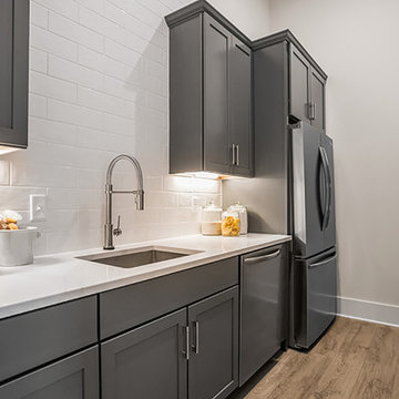
Built by Schumacher Homes, America's Largest Custom Home Builder, this stunning Charleston II Modern Hill Country in Ravenna, Ohio, effortlessly balances classic architectural details with rustic elements. Based on one of our most popular floor plans, the Charleston II offers increased square footage and abundant storage solutions tailored for modern living. The heart of the home is a chef-ready kitchen equipped with generous counter space, a large central island to gather around, and premium double-stacked cabinets flanking both perimeter walls to maximize storage. The kitchen cabinetry showcases an elegant mix of design textures, featuring sophisticated glass-front doors above the cooktop for a sleek, stylish display and traditional solid-door double-stacked cabinetry above the refrigerator. Directly off the main kitchen, the walk-in pantry has been upgraded into a dual-purpose space featuring a secondary messy kitchen, allowing all meal prep and cooking clutter to remain hidden behind closed doors while entertaining guests.
Distinct custom woodwork details elevate the interior architecture throughout the home. Both the great room and the dining room are anchored by matching 3D accent walls featuring a geometric design that adds subtle contrast and high-end visual focal points to the open layout. For those who work from home, a versatile front flex room has been outfitted with custom-built-in shelves and cabinets to create an organized executive study. Additionally, a perfectly placed pocket office provides a dedicated zone for daily tasks before flowing seamlessly into the private owner's retreat, which serves as a main-level sanctuary with its spacious primary bath and two independent walk-in closets. A smart split-bedroom layout places the secondary bedrooms on the completely opposite side of the residence, ensuring ultimate privacy so everyone in the family can enjoy their own space.
 Smart Remodeling LLC
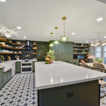
Kitchen remodeling! A thrilling project that can breathe new life into your home's heart. Here's a comprehensive guide to help you about how we remodeling this kitchen:
- Update outdated design and layout
- Increase functionality and efficiency
- Improve safety and accessibility
- Enhance overall livability
Find the right local pro for your project
 Wow Construction LLC
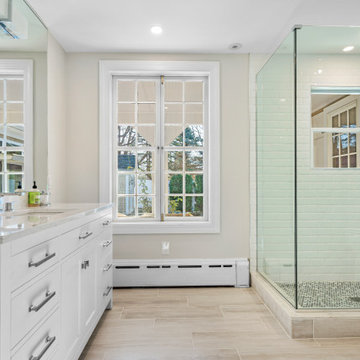
Our Contemporary Oasis remodel project in Hingham, MA began with a small, outdated full bathroom. Our team saw the potential for a much larger and more functional space. We started by removing the old walls to expand the room size and then built up new walls to create a spacious, modern bathroom. The renovation not only increased the square footage but also allowed for more natural light and better flow. With the additional space, we were able to incorporate a variety of luxurious features such as a walk-in shower, double vanity, and heated floors. The end result is a beautiful, functional bathroom that is a true oasis in the heart of the home
 Amy Pearson Design
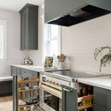
A classic Portland foursquare, lovingly owned by an active and lively family of four, had undergone some unfortunate previous renovations that were in desperate need of updating. A cramped kitchen layout, lacking countertop work space, non-functional appliance locations (the range was floating on it’s own!), cramped kitchen nook not large enough for eat-in space and therefor left underutilized, and a general lack of storage all needed to be addressed.
To increase functional space, we enclosed a small back porch and re-built the adjacent nook, folding in the square footage to create an expansive kitchen footprint. We relocated the back door and added a back deck while creating space for a mud bench for littles to tuck away their gear! The enlarged kitchen now boasts a extensive natural light thanks to the addition of several windows.
An easy work flow was created within the new kitchen layout featuring an in-island sink with range and hood flanked by matching windows. Custom cabinet accessories make storage a breeze and provide a space for all the necessities to be right at the homeowner’s fingertips. The eat-in kitchen space allows not only for lingering family chats, but homework and craft projects to be done while dinner simmers on the stove. This kitchen truly is the heart of this home!
All of the updates were completed with the home’s original foursquare architecture in mind. with a focus on classic architectural molding styles, traditional window details, and clean-lined classic fixtures. Youthfulness and modernity are infused into the space with the contemporary handmade tile backsplash, rich and timeless green cabinets, and artistic wallpaper with a whimsical floral print and subtle European nod. The custom range in cream and brass is a stunning showstopper and a testament that even the most functional of elements in a kitchen can still be beautiful! Which one is the star of the show? How do we pick just one?!
 Schumacher Homes
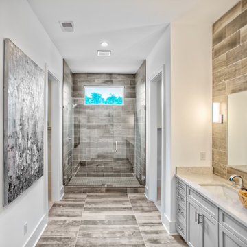
Built by Schumacher Homes, America's Largest Custom Home Builder, this stunning Charleston II American Tradition in Greenville, South Carolina, effortlessly balances traditional architectural details with modern elements. Based on one of our most popular floor plans, the Charleston II offers increased square footage and abundant storage solutions tailored for modern living. The heart of the home is an expansive, open-concept great room defined by classic wall paneling details and a custom iron railing that perfectly completes the home’s refined traditional style. This grand living space flows seamlessly into a chef-ready kitchen equipped with generous counter space, a large central island to gather around, and a giant walk-in pantry. To manage busy family schedules, an oversized laundry and mudroom zone has been upgraded with dramatic floor-to-ceiling tile, a custom bench locker, and integrated coat hooks to keep the home perfectly organized.
The thoughtful layout continues with a perfectly placed pocket office, offering a quiet, dedicated space to organize daily tasks or work from home. This pocket office leads gracefully into the luxurious owner’s retreat, a private main-level sanctuary showcasing an expansive primary bath and two large walk-in closets. To elevate the primary suite's design aesthetic, the bedroom features a show-stopping beamed cathedral ceiling that adds striking verticality and architectural detail. A smart split-bedroom layout ensures ultimate privacy for the entire family, keeping the additional secondary bedrooms situated on the completely opposite side of the residence so everyone can enjoy their own independent space.
 KURV Architecture DPC (Alex Hughes Architects)
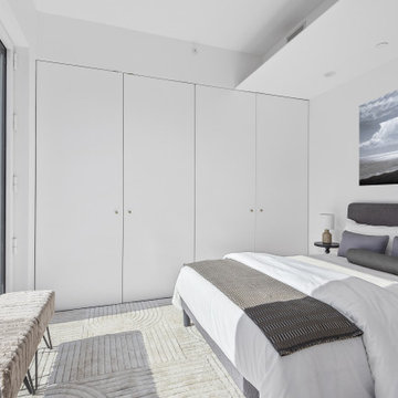
Located in the heart of Manhattan’s Lower East Side, the building was erected on a shallow commercial lot between two 120 year old masonry buildings and a new residential rental building. 330 Grand Street is a mix of 725 SF 1BRs and 1050 SF 2BR apartments. It also contains a 1100 SF two story duplex as well as private and public rooftop space, large private balconies for most units and two large private terraces for the ground floor units.
330 Grand Street was originally designed and approved at the NYC DOB as a prefabricated modular building. During the pandemic, as shipping costs skyrocketed putting the project at risk, we suggested redesigning the building as a reinforced cast-in-place concrete structure. Concrete was readily available and prices had not been affected by the demand increase that many other materials suffered in the pandemic. We took this opportunity to raise floor to ceiling heights, enlarge high performance windows and redistribute the buildings MEPFS and Structural Systems to create very open floor plans.
The challenge was to create a luxurious sensorial living experience with very limited means. In a city with very high construction costs, low cost residential buildings in the area are usually devoid of good quality, design and character. Our approach was to aim high for the end user, prioritizing natural light, open space with long visual perspectives, high ceilings and as always, rejecting the use of predefined building templates.
Our biggest challenge was to ensure that the small spaces feel as clean cut, large and bright as possible. Several unique design decisions were made to ensure low cost and high quality;
Floor plans were laid out so that spaces were wide open and free of clutter from mechanical or structural interruptions. Therefore all infrastructure was placed in lateral demising walls, which in turn act as the unit’s storage and kitchen. The apartments feel wide open, are super quiet and have more storage space than any other comparable apartment in the city.
To solve the problem of the site’s shallow commercial lot which is typically prone to dark interior spaces we focused our attention on the building’s envelope. Instead of the usual small punched window openings, oversized high performance windows were designed to ensure that light penetrated as far as possible into the units. In the smaller 1BR units, the full 50’ depth of the lot is perceived by partitioning spaces with sliding pocket doors that can be retracted to allow deep visual perspectives, making the sight lines in the space feel longer, larger, more ample than normal. In addition to the full height glazing, each unit above the 2nd floor receives a 7 foot covered balcony, adding 120 to 240 sf to each apartment, something unusual in New York City buildings. The space is large enough for a full size dining table, when the weather permits being outside.
We also worked hard to ensure modularity. For example, all kitchen units are all identical throughout the building. The idea of modularity and the economy of the repetitive unit is exercised to the maximum through the building.
Hardware, appliances, flooring, wall coverings and material finishes are all carefully selected to feel bespoke, high quality and unique.
It was important to KURV that the result of this work manifest into something that would deeply connect with the end user and sustain relationships with the consumers of this space.
All images by KURV Architecture ©
 Woodmark Homes, LLC
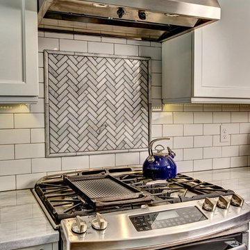
This bright and classic kitchen remodel transforms a formerly cramped and dark room, common in many of Seattle’s older houses, into an inviting heart of a home. Working with a timeless material palette, the Architect and their design team created a gracious space perfect for entertaining, cooking, and interacting with the adjacent rooms.
To maximize the square footage of this small kitchen, the team pulled back the walls around the existing basement stairs and added windows, giving the space a stylish and polished new look. This remodel shows how simple moves can increase the livability of a small kitchen while adding value to the home and enjoyment for the owners.
John G Wilbanks Photography
 Panda Windows & Doors
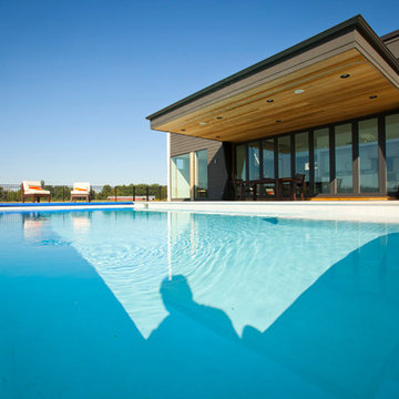
The Belfast Residence in Ohio is a new construction, custom modern house situated on a 150 acre farm. Panda solved the challenge of extending the intimate space of the kitchen into the expansiveness of the backyard by installing fully retractable TS.60 All Aluminum Thermally Broken Folding Door Systems. Custom designed for this space, this elegant and durable folding door system spans the entire wall of the kitchen. This door system uses cutting-edge aluminum extrusions with a polyamide bar to connect the frame together while reducing heat or cold transfer. When closed, this Bi-Fold door system provides a protective barrier that lowers u-factors, limits condensation, increases energy performance, and most of all reduces thermal conductivity.
The architectural firm, Drawing Dept. designed a cantilevered roof reaching out over the pool on axis with a sunken fire pit, drawing the geometry of the house further out into the landscape. As a result, the heart of the home unrestrictedly extends toward the fire pit for optimal physical and visual connection.
Impressive architectural design intertwined with Panda’s custom Bi-Fold doors can create unimaginable opportunities. No wonder this home was awarded the 2013 Merit Award from the American Institute of Architects (AIA) Cincinnati and the 2013 Honor Award from the CDA + Cincinnati Magazine for its exterior space!
Panda’s custom designed Bi-Fold Doors ensure that a homeowner can equally and cohesively enjoy their interior and exterior spaces. Views from the house and views of the house should hold equal merit.
To view more of Panda’s Bi-Fold Doors, please check out our gallery http://www.panda-windows.com/products/by-type/folding-doors.
Architect: Drawing Dept.
Contractor: Camery Hensley Construction
Photography: Ross Van Pelt
 Amy Pearson Design
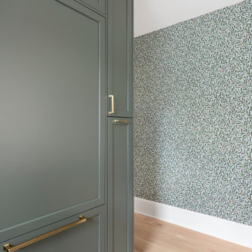
A classic Portland foursquare, lovingly owned by an active and lively family of four, had undergone some unfortunate previous renovations that were in desperate need of updating. A cramped kitchen layout, lacking countertop work space, non-functional appliance locations (the range was floating on it’s own!), cramped kitchen nook not large enough for eat-in space and therefor left underutilized, and a general lack of storage all needed to be addressed.
To increase functional space, we enclosed a small back porch and re-built the adjacent nook, folding in the square footage to create an expansive kitchen footprint. We relocated the back door and added a back deck while creating space for a mud bench for littles to tuck away their gear! The enlarged kitchen now boasts a extensive natural light thanks to the addition of several windows.
An easy work flow was created within the new kitchen layout featuring an in-island sink with range and hood flanked by matching windows. Custom cabinet accessories make storage a breeze and provide a space for all the necessities to be right at the homeowner’s fingertips. The eat-in kitchen space allows not only for lingering family chats, but homework and craft projects to be done while dinner simmers on the stove. This kitchen truly is the heart of this home!
All of the updates were completed with the home’s original foursquare architecture in mind. with a focus on classic architectural molding styles, traditional window details, and clean-lined classic fixtures. Youthfulness and modernity are infused into the space with the contemporary handmade tile backsplash, rich and timeless green cabinets, and artistic wallpaper with a whimsical floral print and subtle European nod. The custom range in cream and brass is a stunning showstopper and a testament that even the most functional of elements in a kitchen can still be beautiful! Which one is the star of the show? How do we pick just one?!
 Drury Design
THE SETUP
Client Background: Our clients, a couple who have transitioned into the empty nest phase, have cherished their home for over three decades without undergoing any significant renovations. With a newfound desire to adapt their living space to better suit their current lifestyle, they’ve embarked on a journey to reimagine their kitchen — the heart of their home. Their aspiration is to cultivate a serene, neutral-toned sanctuary on the first floor that seamlessly merges with their family room, ensuring a harmonious and inviting environment.
Design Inspiration: The renovation is inspired by the couple’s penchant for soft, calming neutrals, using their cherished family room and the kitchen’s existing tile flooring as the cornerstone for the color scheme. This approach aims to foster a sense of warmth and tranquility throughout.
Design Objectives:
Harmonize the kitchen with the family room by adopting a soothing, neutral color scheme, ensuring a seamless flow across the first floor.
Enhance kitchen functionality with thoughtfully designed cabinetry, providing a designated place for every item and maximizing storage efficiency.
Cultivate an inviting and comfortable atmosphere that reflects the homeowners’ desire for a calm and relaxing space.
Design Challenges:
The homeowners wish to retain the existing kitchen tile flooring and integrate it into a refreshed, modern design.
Accommodating a dining area spacious enough for family visits without compromising the kitchen’s open feel or functional layout.
Despite liking the current placement of plumbing and appliances, the homeowners aspire for a more open floor plan to facilitate better movement and interaction.
The need to amplify natural light in the kitchen, especially around the sink area, where existing lighting is insufficient.
Preserving the half-wall between the kitchen and family room, a feature the homeowners want to keep, while ensuring it complements the new design.
THE RENEWED SPACE
Design Solutions:
By choosing a neutral color palette that complements the existing tile, the design unifies the kitchen with the adjacent spaces. The tile’s grout was cleaned and restored, enhancing the floor’s appearance and integrating it seamlessly with the new kitchen aesthetic.
The inclusion of a larger island with seating for two, alongside maintaining a substantial dining table, was achieved by optimizing the spatial layout. This allowed for a sociable yet functional kitchen, accommodating large family gatherings without feeling crowded.
Minor adjustments to the kitchen’s layout maintained the preferred locations for plumbing and appliances while introducing an ‘open’ design concept. Strategic modifications, such as angling the pantry wall, improved the flow and accessibility within the space.
Replacing the garden window with a broader, standard window significantly increased natural light, transforming the sink area into a bright, welcoming space with enhanced views of the outdoors.
The decision to keep the half-wall was ingeniously leveraged to define the dining area while maintaining an open connection to the family room. This feature not only serves as a visual separator but also ties the two spaces together through the shared color scheme and design elements.
The homeowners are thrilled with their newly remodeled kitchen, which has become a hub of warmth and hospitality. Hosting a wedding shower and a birthday party, they have shared their renewed space with friends and family, who have been equally enamored. This remodel has not only met their functional and aesthetic desires but has also enriched their home with a fresh sense of serenity and joy.
The upstairs part of the home is shaping up nicely. Here’s their newly remodeled primary bathroom.
 Living Design Interiors
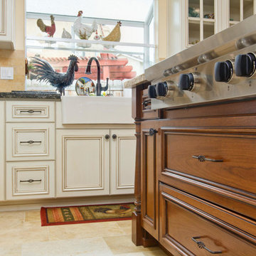
This Encinitas home was completely remodelled and included a substantial addon. The French COuntry kitchen, being the heart of the home, increased to twice the original size and featured luxurious appliances and finishes..
Wooden cabinets, with beautiful glass front wrap the kitchen, while the dramatic island was designed to stand as a piece of furniture and is home to a magnificent cooktop. The extra wide peninsula has room enough for ample seating.
Beautiful lighting, magnificent travertine flooring and ample cabinet space makes this kitchen a center hub for years to come..
 Bell+Associates Architecture Inc.
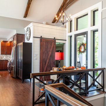
This 1,800 sq ft all-season cottage is designed to make the most of its breathtaking south-facing view of the Ottawa River. Every aspect of the cottage was carefully considered to optimize the relationship between indoor and outdoor spaces, ensuring the water views are an integral part of daily life.
At the heart of the cottage is the expansive open-concept kitchen, dining, and living area, featuring a striking stone fireplace and vaulted ceilings. An abundance of windows along the river-facing side allows natural light to flood the space while offering uninterrupted views of the water. Strategic design elements, including retractable canopies, provide shade during hot summer months while allowing for increased sunlight during the winter to enhance the warmth and comfort of the interiors.
Perfect for entertaining, the spacious sunroom serves as a flexible space for both intimate gatherings and larger groups. It includes a second stone fireplace and ample room for dining and lounging, with seamless access to the outdoor deck. For sun lovers, the deck provides the perfect spot to bask in the warmth, while the canopy offers a shady retreat to enjoy the river views during hot days. A cozy firepit patio closer to the water creates an inviting space for evening gatherings, complete with the charm of a crackling fire and views of the river.
Off the sunroom, a screened porch offers a shaded escape, providing relief from the heat and bugs during the summer afternoons. This porch is conveniently located next to the BBQ area, allowing for easy outdoor cooking and socializing.
The primary bedroom suite includes a bedroom partition wall that allows the bed to face the river while providing unimpeded access to the walk-in closet and ensuite bathroom. The main level also includes a butler’s pantry, office, full bathroom, and a second bedroom ideal for family.
The lower level expands the living space further, offering four additional guest bedrooms, a bunk room for the kids, ample storage, a laundry room, and a versatile games room. With thoughtful design and functional spaces, this cottage balances comfort, style, and connection to nature.

 Contour Functional Art
In an increasingly high-tech, cookie-cutter world, handmade objects are both rare and cherished. Contour’s unique, one-of-a-kind handmade pieces celebrate old world craft, artisanal charm and time-honored techniques. Fill your space with heart and soul.
Here is recycling at its best- from our local partner in Malawi. Glass bottles from surrounding lodges and villages are collected, broken into pieces and tumbled in a homemade glass-tumbler. This newly smooth glass is further hand-wrapped in copper or steel wire and attached to in-house welded frames, creating distinctive chandeliers, pendants, wall lights and lampshades.
Each tumbled glass product can be made with a combination of white, aqua, green and brown glass. As each light is a unique piece, please let us know color and size preference.
These lights come without electrical components or ceiling hooks. Chandeliers are delivered with either linked chain attachment or baobab string (let us know your preference).
MATERIALS:
Recycled tumbled glass, copper, steel wire
DIMENSIONS:
Small: 20" wide x 20" long
Medium: 29.5" wide x 69" long
Large: 39" wide x 90" long
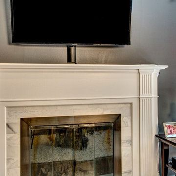 Woodmark Homes, LLC
This bright and classic kitchen remodel transforms a formerly cramped and dark room, common in many of Seattle’s older houses, into an inviting heart of a home. Working with a timeless material palette, the Architect and their design team created a gracious space perfect for entertaining, cooking, and interacting with the adjacent rooms.
To maximize the square footage of this small kitchen, the team pulled back the walls around the existing basement stairs and added windows, giving the space a stylish and polished new look. This remodel shows how simple moves can increase the livability of a small kitchen while adding value to the home and enjoyment for the owners.
John G Wilbanks Photography
 Santech Construction Corp.
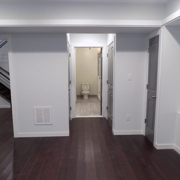
This modern apartment renovation project, completed by Santech Construction, focused on upgrading existing units to meet contemporary living standards. The work included updated layouts, high-quality finishes, and improved functionality throughout each unit. Modern materials and fixtures were selected to enhance the aesthetic appeal, energy efficiency, and overall comfort of the living spaces. The renovation was designed to increase long-term property value while offering residents a fresh, modern environment in the heart of Philadelphia.
You can read more about our previous renovation projects on our website - https://santechconstruction.com/residential/
 KURV Architecture DPC (Alex Hughes Architects)
Located in the heart of Manhattan’s Lower East Side, the building was erected on a shallow commercial lot between two 120 year old masonry buildings and a new residential rental building. 330 Grand Street is a mix of 725 SF 1BRs and 1050 SF 2BR apartments. It also contains a 1100 SF two story duplex as well as private and public rooftop space, large private balconies for most units and two large private terraces for the ground floor units.
330 Grand Street was originally designed and approved at the NYC DOB as a prefabricated modular building. During the pandemic, as shipping costs skyrocketed putting the project at risk, we suggested redesigning the building as a reinforced cast-in-place concrete structure. Concrete was readily available and prices had not been affected by the demand increase that many other materials suffered in the pandemic. We took this opportunity to raise floor to ceiling heights, enlarge high performance windows and redistribute the buildings MEPFS and Structural Systems to create very open floor plans.
The challenge was to create a luxurious sensorial living experience with very limited means. In a city with very high construction costs, low cost residential buildings in the area are usually devoid of good quality, design and character. Our approach was to aim high for the end user, prioritizing natural light, open space with long visual perspectives, high ceilings and as always, rejecting the use of predefined building templates.
Our biggest challenge was to ensure that the small spaces feel as clean cut, large and bright as possible. Several unique design decisions were made to ensure low cost and high quality;
Floor plans were laid out so that spaces were wide open and free of clutter from mechanical or structural interruptions. Therefore all infrastructure was placed in lateral demising walls, which in turn act as the unit’s storage and kitchen. The apartments feel wide open, are super quiet and have more storage space than any other comparable apartment in the city.
To solve the problem of the site’s shallow commercial lot which is typically prone to dark interior spaces we focused our attention on the building’s envelope. Instead of the usual small punched window openings, oversized high performance windows were designed to ensure that light penetrated as far as possible into the units. In the smaller 1BR units, the full 50’ depth of the lot is perceived by partitioning spaces with sliding pocket doors that can be retracted to allow deep visual perspectives, making the sight lines in the space feel longer, larger, more ample than normal. In addition to the full height glazing, each unit above the 2nd floor receives a 7 foot covered balcony, adding 120 to 240 sf to each apartment, something unusual in New York City buildings. The space is large enough for a full size dining table, when the weather permits being outside.
We also worked hard to ensure modularity. For example, all kitchen units are all identical throughout the building. The idea of modularity and the economy of the repetitive unit is exercised to the maximum through the building.
Hardware, appliances, flooring, wall coverings and material finishes are all carefully selected to feel bespoke, high quality and unique.
It was important to KURV that the result of this work manifest into something that would deeply connect with the end user and sustain relationships with the consumers of this space.
All images by KURV Architecture ©
 Flourish Interiors by Vanessa C Smith
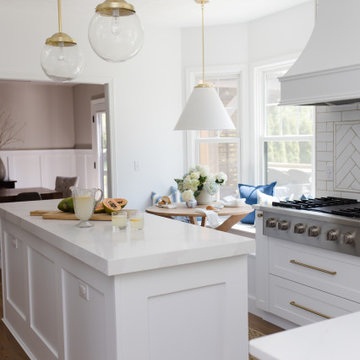
Kitchens are the heart of the home, and so it makes sense that kitchen design is one of the most important things we do here at Flourish Interiors. This sunny, bright kitchen at our Parkridge Residence is a personal favorite. The classic elements are made extra luxurious with the beautiful curved range hood. Investing in a range hood is a really beneficial choice: it not only elevates the look of the kitchen overall but drastically increases resale value perception down the road as well. It is the hallmark of more upscale, gourmet kitchens.
 Integrated Home Improvement
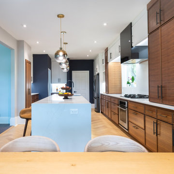
Both the design and construction teams put their heart into making sure we worked with the client to achieve this gorgeous vision. The client was sensitive to both aesthetic and functionality goals, so we set out to improve their old, dated cramped kitchen, with an open concept that facilitates cooking workflow, and dazzles the eye with its mid century modern design. One of their biggest items was their need for increased storage space. We certainly achieved that with ample cabinet space and doubling their pantry space.
The 13 foot waterfall island is the centerpiece, which is heavily utilized for cooking, eating, playing board games and hanging out. The pantry behind the walnut doors used to be the fridge space, and there's an extra pantry now to the left of the current fridge. We moved the sink from the counter to the island, which really helped workflow (we created triangle between cooktop, sink and fridge/pantry 2). To make the cabinets flow linearly at the top we moved and replaced the window. The beige paint is called alpaca from Sherwin Williams and the blue is charcoal blue from sw.
Everything was carefully selected, from the horizontal grain on the walnut cabinets, to the subtly veined white quartz from Arizona tile, to the black glass paneled luxury hood from Futuro Futuro. The pendants and chandelier are from West Elm. The flooring is from karastan; a gorgeous engineered, white oak in herringbone pattern. The recessed lights are decorative from Lumens. The pulls are antique brass from plank hardware (in London). We sourced the door handles and cooktop (Empava) from Houzz. The faucet is Rohl and the sink is Bianco.
 Drury Design
THE SETUP
Client Background: Our clients, a couple who have transitioned into the empty nest phase, have cherished their home for over three decades without undergoing any significant renovations. With a newfound desire to adapt their living space to better suit their current lifestyle, they’ve embarked on a journey to reimagine their kitchen — the heart of their home. Their aspiration is to cultivate a serene, neutral-toned sanctuary on the first floor that seamlessly merges with their family room, ensuring a harmonious and inviting environment.
Design Inspiration: The renovation is inspired by the couple’s penchant for soft, calming neutrals, using their cherished family room and the kitchen’s existing tile flooring as the cornerstone for the color scheme. This approach aims to foster a sense of warmth and tranquility throughout.
Design Objectives:
Harmonize the kitchen with the family room by adopting a soothing, neutral color scheme, ensuring a seamless flow across the first floor.
Enhance kitchen functionality with thoughtfully designed cabinetry, providing a designated place for every item and maximizing storage efficiency.
Cultivate an inviting and comfortable atmosphere that reflects the homeowners’ desire for a calm and relaxing space.
Design Challenges:
The homeowners wish to retain the existing kitchen tile flooring and integrate it into a refreshed, modern design.
Accommodating a dining area spacious enough for family visits without compromising the kitchen’s open feel or functional layout.
Despite liking the current placement of plumbing and appliances, the homeowners aspire for a more open floor plan to facilitate better movement and interaction.
The need to amplify natural light in the kitchen, especially around the sink area, where existing lighting is insufficient.
Preserving the half-wall between the kitchen and family room, a feature the homeowners want to keep, while ensuring it complements the new design.
THE RENEWED SPACE
Design Solutions:
By choosing a neutral color palette that complements the existing tile, the design unifies the kitchen with the adjacent spaces. The tile’s grout was cleaned and restored, enhancing the floor’s appearance and integrating it seamlessly with the new kitchen aesthetic.
The inclusion of a larger island with seating for two, alongside maintaining a substantial dining table, was achieved by optimizing the spatial layout. This allowed for a sociable yet functional kitchen, accommodating large family gatherings without feeling crowded.
Minor adjustments to the kitchen’s layout maintained the preferred locations for plumbing and appliances while introducing an ‘open’ design concept. Strategic modifications, such as angling the pantry wall, improved the flow and accessibility within the space.
Replacing the garden window with a broader, standard window significantly increased natural light, transforming the sink area into a bright, welcoming space with enhanced views of the outdoors.
The decision to keep the half-wall was ingeniously leveraged to define the dining area while maintaining an open connection to the family room. This feature not only serves as a visual separator but also ties the two spaces together through the shared color scheme and design elements.
The homeowners are thrilled with their newly remodeled kitchen, which has become a hub of warmth and hospitality. Hosting a wedding shower and a birthday party, they have shared their renewed space with friends and family, who have been equally enamored. This remodel has not only met their functional and aesthetic desires but has also enriched their home with a fresh sense of serenity and joy.
The upstairs part of the home is shaping up nicely. Here’s their newly remodeled primary bathroom.
10