
Search results for "Increase" in Home Design Ideas
 Quality Custom Cabinetry, Inc
Eric Roth Photography
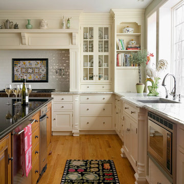
Elegant l-shaped light wood floor eat-in kitchen photo in Boston with an undermount sink, flat-panel cabinets, white cabinets, stainless steel appliances and white backsplash
Elegant l-shaped light wood floor eat-in kitchen photo in Boston with an undermount sink, flat-panel cabinets, white cabinets, stainless steel appliances and white backsplash
 AZL interiors
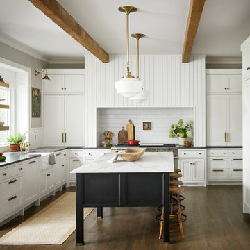
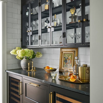
With tall ceilings, an impressive stone fireplace, and original wooden beams, this home in Glen Ellyn, a suburb of Chicago, had plenty of character and a style that felt coastal. Six months into the purchase of their home, this family of six contacted Alessia Loffredo and Sarah Coscarelli of ReDesign Home to complete their home’s renovation by tackling the kitchen.
“Surprisingly, the kitchen was the one room in the home that lacked interest due to a challenging layout between kitchen, butler pantry, and pantry,” the designer shared, “the cabinetry was not proportionate to the space’s large footprint and height. None of the house’s architectural features were introduced into kitchen aside from the wooden beams crossing the room throughout the main floor including the family room.” She moved the pantry door closer to the prepping and cooking area while converting the former butler pantry a bar. Alessia designed an oversized hood around the stove to counterbalance the impressive stone fireplace located at the opposite side of the living space.
She then wanted to include functionality, using Trim Tech‘s cabinets, featuring a pair with retractable doors, for easy access, flanking both sides of the range. The client had asked for an island that would be larger than the original in their space – Alessia made the smart decision that if it was to increase in size it shouldn’t increase in visual weight and designed it with legs, raised above the floor. Made out of steel, by Wayward Machine Co., along with a marble-replicating porcelain countertop, it was designed with durability in mind to withstand anything that her client’s four children would throw at it. Finally, she added finishing touches to the space in the form of brass hardware from Katonah Chicago, with similar toned wall lighting and faucet.

Find the right local pro for your project
 Boss Design Center
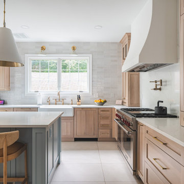
This thoughtfully designed kitchen blends the clean simplicity of Scandinavian style with the warmth of natural materials. Light oak shaker cabinetry pairs seamlessly with a soft blue quartzite island, creating a balanced palette that feels fresh yet timeless. Brass hardware, a farmhouse sink, and oversized pendant lights add refined character without overpowering the space.
A custom range hood and full-height ceramic tile backsplash provide subtle texture and visual interest, while panel-ready appliances and smart storage solutions keep the look streamlined. The spacious island offers ample prep space and casual seating, making it both functional and welcoming for everyday life.
From the light porcelain tile flooring to the gold-toned fixtures and tailored detailing, every element works in harmony to create a bright, inviting kitchen that celebrates craftsmanship and modern living.

 The Artisans Group, Inc.
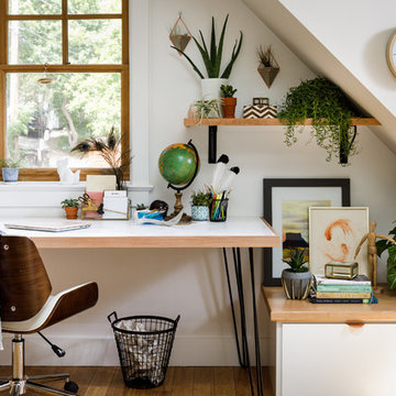
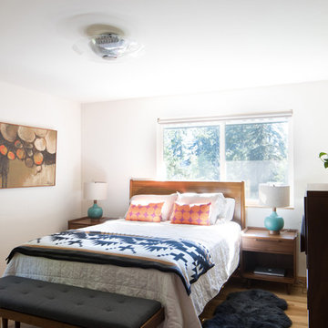
Winner of the 2018 Tour of Homes Best Remodel, this whole house re-design of a 1963 Bennet & Johnson mid-century raised ranch home is a beautiful example of the magic we can weave through the application of more sustainable modern design principles to existing spaces.
We worked closely with our client on extensive updates to create a modernized MCM gem.
Extensive alterations include:
- a completely redesigned floor plan to promote a more intuitive flow throughout
- vaulted the ceilings over the great room to create an amazing entrance and feeling of inspired openness
- redesigned entry and driveway to be more inviting and welcoming as well as to experientially set the mid-century modern stage
- the removal of a visually disruptive load bearing central wall and chimney system that formerly partitioned the homes’ entry, dining, kitchen and living rooms from each other
- added clerestory windows above the new kitchen to accentuate the new vaulted ceiling line and create a greater visual continuation of indoor to outdoor space
- drastically increased the access to natural light by increasing window sizes and opening up the floor plan
- placed natural wood elements throughout to provide a calming palette and cohesive Pacific Northwest feel
- incorporated Universal Design principles to make the home Aging In Place ready with wide hallways and accessible spaces, including single-floor living if needed
- moved and completely redesigned the stairway to work for the home’s occupants and be a part of the cohesive design aesthetic
- mixed custom tile layouts with more traditional tiling to create fun and playful visual experiences
- custom designed and sourced MCM specific elements such as the entry screen, cabinetry and lighting
- development of the downstairs for potential future use by an assisted living caretaker
- energy efficiency upgrades seamlessly woven in with much improved insulation, ductless mini splits and solar gain
 The Artisans Group, Inc.
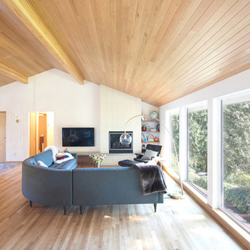
Winner of the 2018 Tour of Homes Best Remodel, this whole house re-design of a 1963 Bennet & Johnson mid-century raised ranch home is a beautiful example of the magic we can weave through the application of more sustainable modern design principles to existing spaces.
We worked closely with our client on extensive updates to create a modernized MCM gem.
Extensive alterations include:
- a completely redesigned floor plan to promote a more intuitive flow throughout
- vaulted the ceilings over the great room to create an amazing entrance and feeling of inspired openness
- redesigned entry and driveway to be more inviting and welcoming as well as to experientially set the mid-century modern stage
- the removal of a visually disruptive load bearing central wall and chimney system that formerly partitioned the homes’ entry, dining, kitchen and living rooms from each other
- added clerestory windows above the new kitchen to accentuate the new vaulted ceiling line and create a greater visual continuation of indoor to outdoor space
- drastically increased the access to natural light by increasing window sizes and opening up the floor plan
- placed natural wood elements throughout to provide a calming palette and cohesive Pacific Northwest feel
- incorporated Universal Design principles to make the home Aging In Place ready with wide hallways and accessible spaces, including single-floor living if needed
- moved and completely redesigned the stairway to work for the home’s occupants and be a part of the cohesive design aesthetic
- mixed custom tile layouts with more traditional tiling to create fun and playful visual experiences
- custom designed and sourced MCM specific elements such as the entry screen, cabinetry and lighting
- development of the downstairs for potential future use by an assisted living caretaker
- energy efficiency upgrades seamlessly woven in with much improved insulation, ductless mini splits and solar gain
 User
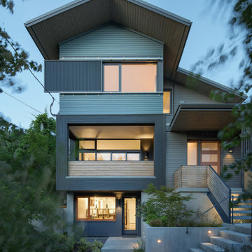
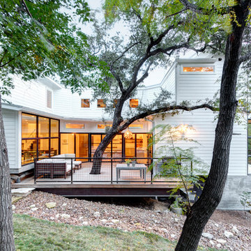
UserThe original small 2 bedroom dwelling was deconstructed piece by piece, with every element recycled/re-used. The larger, newly built home + studio uses much less energy than the original. In fact, the home and office combined are net zero (the home’s blower door test came in at Passive House levels, though certification was not procured). The transformed home boasts a better functioning layout, increased square footage, and bold accent colors to boot. The multiple level patios book-end the home’s front and rear facades. The added outdoor living with the nearly 13’ sliding doors allows ample natural light into the home. The transom windows create an increased openness with the floor to ceiling glazing. The larger tilt-turn windows throughout the home provide ventilation and open views for the 3-level contemporary home. In addition, the larger overhangs provide increased passive thermal protection from the scattered sunny days. The conglomeration of exterior materials is diverse and playful with dark stained wood, concrete, natural wood finish, and teal horizontal siding. A fearless selection of a bright orange window brings a bold accent to the street-side composition. These elements combined create a dynamic modern design to the inclusive Portland backdrop.
 Fowlkes Studio
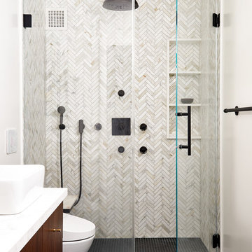
Small trendy 3/4 marble tile mosaic tile floor and black floor alcove shower photo in New York with flat-panel cabinets, medium tone wood cabinets, white walls, a vessel sink, a hinged shower door and white countertops
 MA Peterson Design Build, Inc.
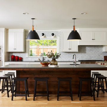
Inspiration for a transitional l-shaped medium tone wood floor kitchen remodel in Minneapolis with shaker cabinets, white cabinets, gray backsplash, subway tile backsplash, stainless steel appliances, an island and gray countertops
 Henrietta Heisler Interiors Inc
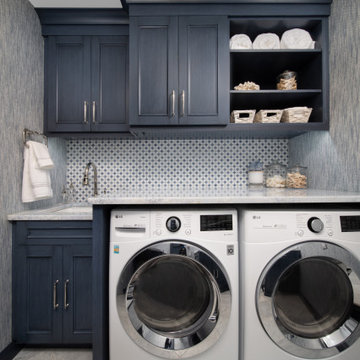
This little laundry room uses hidden tricks to modernize and maximize limited space. The main wall features bumped out upper cabinets above the washing machine for increased storage and easy access. Next to the cabinets are open shelves that allow space for the air vent on the back wall. This fan was faux painted to match the cabinets - blending in so well you wouldn’t even know it’s there!
Between the cabinetry and blue fantasy marble countertop sits a luxuriously tiled backsplash. This beautiful backsplash hides the door to necessary valves, its outline barely visible while allowing easy access.
Making the room brighter are light, textured walls, under cabinet, and updated lighting. Though you can’t see it in the photos, one more trick was used: the door was changed to smaller french doors, so when open, they are not in the middle of the room. Door backs are covered in the same wallpaper as the rest of the room - making the doors look like part of the room, and increasing available space.

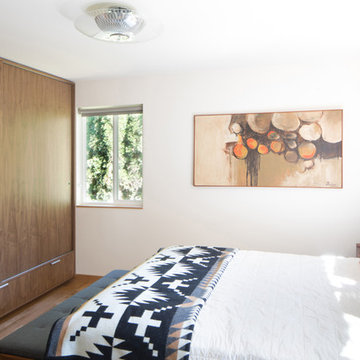 The Artisans Group, Inc.
Winner of the 2018 Tour of Homes Best Remodel, this whole house re-design of a 1963 Bennet & Johnson mid-century raised ranch home is a beautiful example of the magic we can weave through the application of more sustainable modern design principles to existing spaces.
We worked closely with our client on extensive updates to create a modernized MCM gem.
Extensive alterations include:
- a completely redesigned floor plan to promote a more intuitive flow throughout
- vaulted the ceilings over the great room to create an amazing entrance and feeling of inspired openness
- redesigned entry and driveway to be more inviting and welcoming as well as to experientially set the mid-century modern stage
- the removal of a visually disruptive load bearing central wall and chimney system that formerly partitioned the homes’ entry, dining, kitchen and living rooms from each other
- added clerestory windows above the new kitchen to accentuate the new vaulted ceiling line and create a greater visual continuation of indoor to outdoor space
- drastically increased the access to natural light by increasing window sizes and opening up the floor plan
- placed natural wood elements throughout to provide a calming palette and cohesive Pacific Northwest feel
- incorporated Universal Design principles to make the home Aging In Place ready with wide hallways and accessible spaces, including single-floor living if needed
- moved and completely redesigned the stairway to work for the home’s occupants and be a part of the cohesive design aesthetic
- mixed custom tile layouts with more traditional tiling to create fun and playful visual experiences
- custom designed and sourced MCM specific elements such as the entry screen, cabinetry and lighting
- development of the downstairs for potential future use by an assisted living caretaker
- energy efficiency upgrades seamlessly woven in with much improved insulation, ductless mini splits and solar gain
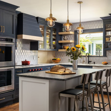
 Thyme & Place Design LLC
The client requested a kitchen that would not only provide a great space to cook and enjoy family meals but one that would fit in with her unique design sense. An avid collector of contemporary art, she wanted something unexpected in her 100-year-old home in both color and finishes but still providing a great layout with improved lighting, storage, and superior cooking abilities. The existing kitchen was in a closed off space trapped between the family room and the living. If you were in the kitchen, you were isolated from the rest of the house. Making the kitchen an integrated part of the home was a paramount request.
Step one, remove the wall separating the kitchen from the other rooms in the home which allowed the new kitchen to become an integrated space instead of an isolation room for the cook. Next, we relocated the pantry access which was in the family room to the kitchen integrating a poorly used recess which had become a catch all area which did not provide any usable space for storage or working area. To add valuable function in the kitchen we began by capturing unused "cubbies", adding a walk-in pantry from the kitchen, increasing the storage lost to un-needed drop ceilings and bring light and design to the space with a new large awning window, improved lighting, and combining interesting finishes and colors to reflect the artistic attitude of the client.
A bathroom located above the kitchen had been leaking into the plaster ceiling for several years. That along with knob and tube wiring, rotted beams and a brick wall from the back of the fireplace in the adjacent living room all needed to be brought to code. The walls, ceiling and floors in this 100+ year old home were completely out of level and the room’s foot print could not be increased.
The choice of a Sub-Zero wolf product is a standard in my kitchen designs. The quality of the product, its manufacturing and commitment to food preservation is the reason I specify Sub Zero Wolf. For the cook top, the integrated line of the contemporary cooktop and the signature red knobs against the navy blue of the cabinets added to the design vibe of the kitchen. The cooking performance and the large continuous grate on the cooktop makes it an obvious choice for a cook looking for a great cook top with professional results in a more streamlined profile. We selected a Sharp microwave drawer for the island, an XO wine refrigerator, Bosch dishwasher and Kitchen Aid double convection wall ovens to round out the appliance package.
A recess created by the fireplace was outfitted with a cabinet which now holds small appliances within easy reach of my very petite client. Natural maple accents were used inside all the wall cabinets and repeated on the front of the hood and for the sliding door appliance cabinet and the floating shelves. This allows a brighter interior for the painted cabinets instead of the traditional same interior as exterior finish choice. The was an amazing transformation from the old to the new.
The final touches are the honey bronze hardware from Top Knobs, Mitzi pendants from Hudson Valley Lighting group,
a fabulous faucet from Brizo. To eliminate the old freestanding bottled water cooler, we specified a matching water filter faucet.
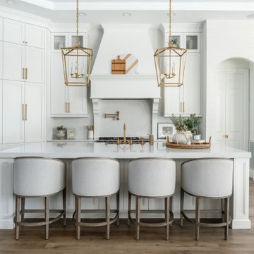

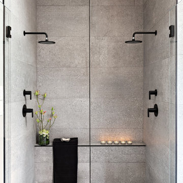
 Lauren Levant
Double shower - large contemporary master gray tile and cement tile gray floor and concrete floor double shower idea in Other with gray walls, a hinged shower door, medium tone wood cabinets, a vessel sink, concrete countertops and black countertops
 AZL interiors
With tall ceilings, an impressive stone fireplace, and original wooden beams, this home in Glen Ellyn, a suburb of Chicago, had plenty of character and a style that felt coastal. Six months into the purchase of their home, this family of six contacted Alessia Loffredo and Sarah Coscarelli of ReDesign Home to complete their home’s renovation by tackling the kitchen.
“Surprisingly, the kitchen was the one room in the home that lacked interest due to a challenging layout between kitchen, butler pantry, and pantry,” the designer shared, “the cabinetry was not proportionate to the space’s large footprint and height. None of the house’s architectural features were introduced into kitchen aside from the wooden beams crossing the room throughout the main floor including the family room.” She moved the pantry door closer to the prepping and cooking area while converting the former butler pantry a bar. Alessia designed an oversized hood around the stove to counterbalance the impressive stone fireplace located at the opposite side of the living space.
She then wanted to include functionality, using Trim Tech‘s cabinets, featuring a pair with retractable doors, for easy access, flanking both sides of the range. The client had asked for an island that would be larger than the original in their space – Alessia made the smart decision that if it was to increase in size it shouldn’t increase in visual weight and designed it with legs, raised above the floor. Made out of steel, by Wayward Machine Co., along with a marble-replicating porcelain countertop, it was designed with durability in mind to withstand anything that her client’s four children would throw at it. Finally, she added finishing touches to the space in the form of brass hardware from Katonah Chicago, with similar toned wall lighting and faucet.
 Edgewater Design Group
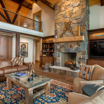
We love it when a home becomes a family compound with wonderful history. That is exactly what this home on Mullet Lake is. The original cottage was built by our client’s father and enjoyed by the family for years. It finally came to the point that there was simply not enough room and it lacked some of the efficiencies and luxuries enjoyed in permanent residences. The cottage is utilized by several families and space was needed to allow for summer and holiday enjoyment. The focus was on creating additional space on the second level, increasing views of the lake, moving interior spaces and the need to increase the ceiling heights on the main level. All these changes led for the need to start over or at least keep what we could and add to it. The home had an excellent foundation, in more ways than one, so we started from there.
It was important to our client to create a northern Michigan cottage using low maintenance exterior finishes. The interior look and feel moved to more timber beam with pine paneling to keep the warmth and appeal of our area. The home features 2 master suites, one on the main level and one on the 2nd level with a balcony. There are 4 additional bedrooms with one also serving as an office. The bunkroom provides plenty of sleeping space for the grandchildren. The great room has vaulted ceilings, plenty of seating and a stone fireplace with vast windows toward the lake. The kitchen and dining are open to each other and enjoy the view.
The beach entry provides access to storage, the 3/4 bath, and laundry. The sunroom off the dining area is a great extension of the home with 180 degrees of view. This allows a wonderful morning escape to enjoy your coffee. The covered timber entry porch provides a direct view of the lake upon entering the home. The garage also features a timber bracketed shed roof system which adds wonderful detail to garage doors.
The home’s footprint was extended in a few areas to allow for the interior spaces to work with the needs of the family. Plenty of living spaces for all to enjoy as well as bedrooms to rest their heads after a busy day on the lake. This will be enjoyed by generations to come.

 Cathie Hong Interiors
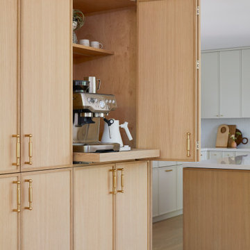
Mid-sized danish u-shaped light wood floor and brown floor open concept kitchen photo in San Francisco with an undermount sink, shaker cabinets, light wood cabinets, quartz countertops, white backsplash, ceramic backsplash, stainless steel appliances, an island and white countertops
1