
Search results for "Increased connectivity" in Home Design Ideas

 Charlie Allen Renovations, Inc.
For a small family in the Boston suburbs, their modest sized home was just the right size. But with some smart changes, they wondered if it could be more enjoyable. Working with architect Joseph S. Artley, we came up with a number of solutions:
• To make the kitchen a more comfortable work and gathering space, a bay window was removed and the kitchen itself bumped out slightly to allow for the introduction of an expansive island, as well as additional countertop and cabinetry.
• The first floor half-bathroom was relocated to the end of the entry hall. This allowed us to connect the kitchen with what had been a three-season porch.
• That three-season porch was properly heated and remodeled as a sunny breakfast nook: the perfect spot for the family to gather in the mornings.
• Near the entry to the breakfast nook, an existing electrical box could not be moved. To conceal it, we suggested an oversized family bulletin board, which we provided as a gift to the homeowners. Now, it offers a great spot to catch up on the day’s activities and enjoy some family artwork while heading in for breakfast.
• This family loves to read and they asked for custom built in bookshelves in the living room that would look original to the home and match existing shelving on the other side of the room.
• The den is a favorite spot for the family to watch movies and play games, but the room, which had also been a three season porch prior to an earlier renovation, was drafty in the winter and hot in the summer. We introduced new, energy efficient windows and insulation throughout, resulting in a much more inviting and cozy room.
Today, after barely increasing the footprint of the home, the family has a new breakfast room, a usable den, a larger and more inviting kitchen, and a better-situated first-floor bath. Lots of simple fixes = a much happier space for the whole family.
Photos by Shelly Harrison

 avandearth
Startup industry is growing increasingly from year to year, and the trend to create their own projects has gripped the world. We have compiled a list of the most fun projects that are developed in Europe. We present you the most interesting start-up projects of Italy and France.
Italy: music, food and business processes
Italy has the status of a new high-tech center. This is not surprising, because in recent years, start-ups of Italian specialists are increasingly succeeding and attract the attention of the public.
1. Musixmatch is an application that displays lyrics on the smartphone screen. Founder is Max Chochola. The audience of the project is 30 million. The base has 7 million songs. Text is in 40 languages. The startup has already received investments from two venture capital funds.
2. Thefork is a start-up from Tripadvisor that contains information about food and the best restaurants in Italy.
3. Decisyon is a symbiosis of social networks and systems. It allows companies to coordinate the work of the team. The goal is an optimization of business processes. According to media reports, last year the company received an investment of $ 22 million from the American investment company.
France: transportation and the Internet of things
Earlier this year, France launched an initiative by which start-ups can apply for the selection and to get a visa to travel to the country. It helps in developing their business. This step is indicated in the country's interest in new companies and highly qualified specialists. Among the most interesting of the French start-up are projects that have been successful:
1. BlaBlaCar is a famous company that has almost become synonymous with the search for travel companions for the trip. A few weeks ago, the startup closed a new round of investment and attracted $ 200 million that will be spent on expansion in new markets. In general, for the 9 years of its existence BlaBlaCar bought eight companies and received funding of $ 335 million.
2. Actility is a company specializing in the Internet of things. Its main product is a platform ThingPark, designed to connect all kinds of organizations. The project was founded in Paris in 2010, and in June 2015 received an investment of $ 25 million from the fund Ginko Ventures.
About the Author: Avan Dearthis a writer, whose articles are published in his own blog. He likes to make student’s life easier with the help of his academic articles atCourseworkServiceUK. He can write on completely various topics, especially on the newest technologies.

 sonnemanlighting
"Suspenders™ LED system is a delicately scaled, modular system of interconnected elements and suspended LED components. It can be configured as individual lighting sculptures or as a tiered web of infinite scope and variety. Using today’s leading edge technology, Robert Sonneman has reimagined and greatly expanded his original Suspenders concept from the late 1980s with a lighter scale, increased capability, and wider range of precisely scaled luminaires.
Because of the extensive range of possibilities offered by Suspenders, we have preconfigured a collection of arrangements that you can select as shown. You can also modify these arrangements using our configuration tables, or use them as inspiration to create your own completely custom configurations.
We will continue to build upon and expand Suspenders as an openframed illumination system of innovative possibilities as we move forward.
A 24” Power Bar, connected to a ceiling-mounted Power Feed with outlet box mounted transformer by two 18” field-cuttable rod Power Feed Hangers, supports a 48” Power Bar from two 12” Power Bar Hangers. Evenly spaced Luminaires hang from 12” Luminaire Hangers on the lower Power Bar."
Find the right local pro for your project
 G. Christianson Construction, Inc.
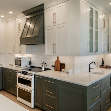
A North Albany family contacted us wanting to expand, update, and open up their Kitchen to the Family Room. The floor plan of this home actually had plenty of space but it wasn’t being well-utilized, with angled walls in the pantry and a corner kitchen and island layout. By removing the double-sided fireplace and built-in bookcases closing off the Family Room, removing the closed-off bar area, and re-imagining the awkward walk-in pantry and kitchen layout, our Designer, Sarah envisioned an expansive Kitchen footprint that connected all the key areas and significantly increased the amount of available storage and countertop space, making this Kitchen the perfect entertaining environment! Replacing the cherry cabinetry, black granite countertops, and dark hardwood floors with white shaker upper cabinets, dark green lower cabinets, light-colored hardwood flooing, and a new lighting design completely transformed the space from dark and compartmentalized, to bright and open. This Kitchen is full of brilliant custom pieces and organization cabinets, including a HIDDEN walk-in pantry (which is the family’s favorite)!

 The Jack + Mare | Portland Design & Build
The Jack + Mare worked with the homeowners of this cool mid-century inspired kitchen from schematic design all the way through construction.
The existing kitchen was demolished all the way to studs, subfloor and ceiling joists and completely rebuilt with custom cabinets, solid oak flooring, task and ambient lighting, new electrical/plumbing, counter-to-ceiling wall tile, new beam (took down wall between living/kitchen), new window and colorful barn door.
The final design maximized storage, increased counter space, improved traffic flow, connected kitchen to adjacent living room (by removing existing wall), and improved the social aspect of the kitchen.
The kitchen is now efficient, beautiful, full of light and a happy place to call home!
Features: custom walnut cabinets (designed by The J+M), tile backsplash, new lighting plan (LED can lights, under-cabinet LED lights, Cedar+Moss pendants with LED bulbs), quartz countertops, new Marvin window with new trim, pantry with pull out shelves, glass upper cabinet (with puck LED) to feature antique glass-ware, island with microwave under counter, island seating.
photo credit: Jason Quigley
 G. Christianson Construction, Inc.
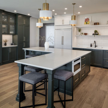
A North Albany family contacted us wanting to expand, update, and open up their Kitchen to the Family Room. The floor plan of this home actually had plenty of space but it wasn’t being well-utilized, with angled walls in the pantry and a corner kitchen and island layout. By removing the double-sided fireplace and built-in bookcases closing off the Family Room, removing the closed-off bar area, and re-imagining the awkward walk-in pantry and kitchen layout, our Designer, Sarah envisioned an expansive Kitchen footprint that connected all the key areas and significantly increased the amount of available storage and countertop space, making this Kitchen the perfect entertaining environment! Replacing the cherry cabinetry, black granite countertops, and dark hardwood floors with white shaker upper cabinets, dark green lower cabinets, light-colored hardwood flooing, and a new lighting design completely transformed the space from dark and compartmentalized, to bright and open. This Kitchen is full of brilliant custom pieces and organization cabinets, including a HIDDEN walk-in pantry (which is the family’s favorite)!

 Agate Architecture, LLC
Terri and Jim loved many things about their home, but the outdated, poorly designed kitchen, laundry room that was shoved into the corner of the kitchen, and loft that was annexed from other living spaces needed a complete makeover. The house is nestled on a large lot filled with mature trees that offer filtered morning and afternoon light. Establishing a strong visual link from the front yard through the house and into the back yard was a high design priority, as well as connecting the living spaces with an open floor plan, all without increasing the overall footprint of the home. Agate Architecture's completed remodel includes a full kitchen and dining room renovation, a new mud/laundry room, renovation of the second-floor loft, a new staircase, and exterior improvements. The use of Douglas Fir as a main unifying material and simple clean lines lends a bright Pacific Northwest style, with natural light in abundance. Terri and Jim’s home is now a truly exceptional space for everyday use and family entertaining.

 The Brooklyn Studio
This residence was a complete gut renovation of a 4-story row house in Park Slope, and included a new rear extension and penthouse addition. The owners wished to create a warm, family home using a modern language that would act as a clean canvas to feature rich textiles and items from their world travels. As with most Brooklyn row houses, the existing house suffered from a lack of natural light and connection to exterior spaces, an issue that Principal Brendan Coburn is acutely aware of from his experience re-imagining historic structures in the New York area. The resulting architecture is designed around moments featuring natural light and views to the exterior, of both the private garden and the sky, throughout the house, and a stripped-down language of detailing and finishes allows for the concept of the modern-natural to shine.
Upon entering the home, the kitchen and dining space draw you in with views beyond through the large glazed opening at the rear of the house. An extension was built to allow for a large sunken living room that provides a family gathering space connected to the kitchen and dining room, but remains distinctly separate, with a strong visual connection to the rear garden. The open sculptural stair tower was designed to function like that of a traditional row house stair, but with a smaller footprint. By extending it up past the original roof level into the new penthouse, the stair becomes an atmospheric shaft for the spaces surrounding the core. All types of weather – sunshine, rain, lightning, can be sensed throughout the home through this unifying vertical environment. The stair space also strives to foster family communication, making open living spaces visible between floors. At the upper-most level, a free-form bench sits suspended over the stair, just by the new roof deck, which provides at-ease entertaining. Oak was used throughout the home as a unifying material element. As one travels upwards within the house, the oak finishes are bleached to further degrees as a nod to how light enters the home.
The owners worked with CWB to add their own personality to the project. The meter of a white oak and blackened steel stair screen was designed by the family to read “I love you” in Morse Code, and tile was selected throughout to reference places that hold special significance to the family. To support the owners’ comfort, the architectural design engages passive house technologies to reduce energy use, while increasing air quality within the home – a strategy which aims to respect the environment while providing a refuge from the harsh elements of urban living.
This project was published by Wendy Goodman as her Space of the Week, part of New York Magazine’s Design Hunting on The Cut.
Photography by Kevin Kunstadt
 The Brooklyn Studio
This residence was a complete gut renovation of a 4-story row house in Park Slope, and included a new rear extension and penthouse addition. The owners wished to create a warm, family home using a modern language that would act as a clean canvas to feature rich textiles and items from their world travels. As with most Brooklyn row houses, the existing house suffered from a lack of natural light and connection to exterior spaces, an issue that Principal Brendan Coburn is acutely aware of from his experience re-imagining historic structures in the New York area. The resulting architecture is designed around moments featuring natural light and views to the exterior, of both the private garden and the sky, throughout the house, and a stripped-down language of detailing and finishes allows for the concept of the modern-natural to shine.
Upon entering the home, the kitchen and dining space draw you in with views beyond through the large glazed opening at the rear of the house. An extension was built to allow for a large sunken living room that provides a family gathering space connected to the kitchen and dining room, but remains distinctly separate, with a strong visual connection to the rear garden. The open sculptural stair tower was designed to function like that of a traditional row house stair, but with a smaller footprint. By extending it up past the original roof level into the new penthouse, the stair becomes an atmospheric shaft for the spaces surrounding the core. All types of weather – sunshine, rain, lightning, can be sensed throughout the home through this unifying vertical environment. The stair space also strives to foster family communication, making open living spaces visible between floors. At the upper-most level, a free-form bench sits suspended over the stair, just by the new roof deck, which provides at-ease entertaining. Oak was used throughout the home as a unifying material element. As one travels upwards within the house, the oak finishes are bleached to further degrees as a nod to how light enters the home.
The owners worked with CWB to add their own personality to the project. The meter of a white oak and blackened steel stair screen was designed by the family to read “I love you” in Morse Code, and tile was selected throughout to reference places that hold special significance to the family. To support the owners’ comfort, the architectural design engages passive house technologies to reduce energy use, while increasing air quality within the home – a strategy which aims to respect the environment while providing a refuge from the harsh elements of urban living.
This project was published by Wendy Goodman as her Space of the Week, part of New York Magazine’s Design Hunting on The Cut.
Photography by Kevin Kunstadt
 The Brooklyn Studio
This residence was a complete gut renovation of a 4-story row house in Park Slope, and included a new rear extension and penthouse addition. The owners wished to create a warm, family home using a modern language that would act as a clean canvas to feature rich textiles and items from their world travels. As with most Brooklyn row houses, the existing house suffered from a lack of natural light and connection to exterior spaces, an issue that Principal Brendan Coburn is acutely aware of from his experience re-imagining historic structures in the New York area. The resulting architecture is designed around moments featuring natural light and views to the exterior, of both the private garden and the sky, throughout the house, and a stripped-down language of detailing and finishes allows for the concept of the modern-natural to shine.
Upon entering the home, the kitchen and dining space draw you in with views beyond through the large glazed opening at the rear of the house. An extension was built to allow for a large sunken living room that provides a family gathering space connected to the kitchen and dining room, but remains distinctly separate, with a strong visual connection to the rear garden. The open sculptural stair tower was designed to function like that of a traditional row house stair, but with a smaller footprint. By extending it up past the original roof level into the new penthouse, the stair becomes an atmospheric shaft for the spaces surrounding the core. All types of weather – sunshine, rain, lightning, can be sensed throughout the home through this unifying vertical environment. The stair space also strives to foster family communication, making open living spaces visible between floors. At the upper-most level, a free-form bench sits suspended over the stair, just by the new roof deck, which provides at-ease entertaining. Oak was used throughout the home as a unifying material element. As one travels upwards within the house, the oak finishes are bleached to further degrees as a nod to how light enters the home.
The owners worked with CWB to add their own personality to the project. The meter of a white oak and blackened steel stair screen was designed by the family to read “I love you” in Morse Code, and tile was selected throughout to reference places that hold special significance to the family. To support the owners’ comfort, the architectural design engages passive house technologies to reduce energy use, while increasing air quality within the home – a strategy which aims to respect the environment while providing a refuge from the harsh elements of urban living.
This project was published by Wendy Goodman as her Space of the Week, part of New York Magazine’s Design Hunting on The Cut.
Photography by Kevin Kunstadt
 sonnemanlighting
"Suspenders™ LED system is a delicately scaled, modular system of interconnected elements and suspended LED components. It can be configured as individual lighting sculptures or as a tiered web of infinite scope and variety. Using today’s leading edge technology, Robert Sonneman has reimagined and greatly expanded his original Suspenders concept from the late 1980s with a lighter scale, increased capability, and wider range of precisely scaled luminaires.
Because of the extensive range of possibilities offered by Suspenders, we have preconfigured a collection of arrangements that you can select as shown. You can also modify these arrangements using our configuration tables, or use them as inspiration to create your own completely custom configurations.
We will continue to build upon and expand Suspenders as an openframed illumination system of innovative possibilities as we move forward.
A 24” diameter Tri-Bar, connected to a ceiling-mounted Power Feed with outlet box mounted transformer by three 18” field-cuttable rod Power Feed Hangers, supports three 36” linear Power Bars from Power Bar hangers of 6”, 12” and 18”. Luminaires hang from each Power Bar on 12” Luminaire Hangers."
 Agate Architecture, LLC
Terri and Jim loved many things about their home, but the outdated, poorly designed kitchen, laundry room that was shoved into the corner of the kitchen, and loft that was annexed from other living spaces needed a complete makeover. The house is nestled on a large lot filled with mature trees that offer filtered morning and afternoon light. Establishing a strong visual link from the front yard through the house and into the back yard was a high design priority, as well as connecting the living spaces with an open floor plan, all without increasing the overall footprint of the home. Agate Architecture's completed remodel includes a full kitchen and dining room renovation, a new mud/laundry room, renovation of the second-floor loft, a new staircase, and exterior improvements. The use of Douglas Fir as a main unifying material and simple clean lines lends a bright Pacific Northwest style, with natural light in abundance. Terri and Jim’s home is now a truly exceptional space for everyday use and family entertaining.
 The Brooklyn Studio
This residence was a complete gut renovation of a 4-story row house in Park Slope, and included a new rear extension and penthouse addition. The owners wished to create a warm, family home using a modern language that would act as a clean canvas to feature rich textiles and items from their world travels. As with most Brooklyn row houses, the existing house suffered from a lack of natural light and connection to exterior spaces, an issue that Principal Brendan Coburn is acutely aware of from his experience re-imagining historic structures in the New York area. The resulting architecture is designed around moments featuring natural light and views to the exterior, of both the private garden and the sky, throughout the house, and a stripped-down language of detailing and finishes allows for the concept of the modern-natural to shine.
Upon entering the home, the kitchen and dining space draw you in with views beyond through the large glazed opening at the rear of the house. An extension was built to allow for a large sunken living room that provides a family gathering space connected to the kitchen and dining room, but remains distinctly separate, with a strong visual connection to the rear garden. The open sculptural stair tower was designed to function like that of a traditional row house stair, but with a smaller footprint. By extending it up past the original roof level into the new penthouse, the stair becomes an atmospheric shaft for the spaces surrounding the core. All types of weather – sunshine, rain, lightning, can be sensed throughout the home through this unifying vertical environment. The stair space also strives to foster family communication, making open living spaces visible between floors. At the upper-most level, a free-form bench sits suspended over the stair, just by the new roof deck, which provides at-ease entertaining. Oak was used throughout the home as a unifying material element. As one travels upwards within the house, the oak finishes are bleached to further degrees as a nod to how light enters the home.
The owners worked with CWB to add their own personality to the project. The meter of a white oak and blackened steel stair screen was designed by the family to read “I love you” in Morse Code, and tile was selected throughout to reference places that hold special significance to the family. To support the owners’ comfort, the architectural design engages passive house technologies to reduce energy use, while increasing air quality within the home – a strategy which aims to respect the environment while providing a refuge from the harsh elements of urban living.
This project was published by Wendy Goodman as her Space of the Week, part of New York Magazine’s Design Hunting on The Cut.
Photography by Kevin Kunstadt
 G. Christianson Construction, Inc.
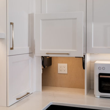
A North Albany family contacted us wanting to expand, update, and open up their Kitchen to the Family Room. The floor plan of this home actually had plenty of space but it wasn’t being well-utilized, with angled walls in the pantry and a corner kitchen and island layout. By removing the double-sided fireplace and built-in bookcases closing off the Family Room, removing the closed-off bar area, and re-imagining the awkward walk-in pantry and kitchen layout, our Designer, Sarah envisioned an expansive Kitchen footprint that connected all the key areas and significantly increased the amount of available storage and countertop space, making this Kitchen the perfect entertaining environment! Replacing the cherry cabinetry, black granite countertops, and dark hardwood floors with white shaker upper cabinets, dark green lower cabinets, light-colored hardwood flooing, and a new lighting design completely transformed the space from dark and compartmentalized, to bright and open. This Kitchen is full of brilliant custom pieces and organization cabinets, including a HIDDEN walk-in pantry (which is the family’s favorite)!

 Michael Nash Design, Build & Homes
2013 NARI CAPITAL COTY, FINALIST AWARD WINNER, RESIDENTIAL BATH UNDER $30,000
A colonial home recently built in the suburb of Leesburg had a run of the mill 10’x11’ bathroom connected to the seating room of the master suite.
The clients disliked both the builder grade soaking tub and small shower, in fact, preferring to sacrifice the tub for a much bigger spa-like shower stall. In general, they wanted more space and more storage. To increase the footprint for the remodel, a decision was made to “steal” some space from the seating room.
The new layout features a large, walk-in shower with a frameless glass enclosure. A rain shower, body sprays and bench seating meet all of the homeowners’ desires.
Large linen cabinets surround a large new vanity, touting a granite top, vessel sinks and wall-mounted faucets. Mirrored, embedded medicine cabinets are wrapped in glass tile and illuminated by hanging lights. The opposite wall features floating dressing cabinets which serve as a new make-up area.
Smart use of lighting, such as pendants, sconces, and recess lights has made the space brighter than ever. Designers at Michael Nash Design, Build & Homes used large, light color porcelain tiles and enhanced the look with complementary glass tiles on accents walls, niches and other areas.

 ZeroEnergy Design
This renovated brick rowhome in Boston’s South End offers a modern aesthetic within a historic structure, creative use of space, exceptional thermal comfort, a reduced carbon footprint, and a passive stream of income.
DESIGN PRIORITIES. The goals for the project were clear - design the primary unit to accommodate the family’s modern lifestyle, rework the layout to create a desirable rental unit, improve thermal comfort and introduce a modern aesthetic. We designed the street-level entry as a shared entrance for both the primary and rental unit. The family uses it as their everyday entrance - we planned for bike storage and an open mudroom with bench and shoe storage to facilitate the change from shoes to slippers or bare feet as they enter their home. On the main level, we expanded the kitchen into the dining room to create an eat-in space with generous counter space and storage, as well as a comfortable connection to the living space. The second floor serves as master suite for the couple - a bedroom with a walk-in-closet and ensuite bathroom, and an adjacent study, with refinished original pumpkin pine floors. The upper floor, aside from a guest bedroom, is the child's domain with interconnected spaces for sleeping, work and play. In the play space, which can be separated from the work space with new translucent sliding doors, we incorporated recreational features inspired by adventurous and competitive television shows, at their son’s request.
MODERN MEETS TRADITIONAL. We left the historic front facade of the building largely unchanged - the security bars were removed from the windows and the single pane windows were replaced with higher performing historic replicas. We designed the interior and rear facade with a vision of warm modernism, weaving in the notable period features. Each element was either restored or reinterpreted to blend with the modern aesthetic. The detailed ceiling in the living space, for example, has a new matte monochromatic finish, and the wood stairs are covered in a dark grey floor paint, whereas the mahogany doors were simply refinished. New wide plank wood flooring with a neutral finish, floor-to-ceiling casework, and bold splashes of color in wall paint and tile, and oversized high-performance windows (on the rear facade) round out the modern aesthetic.
RENTAL INCOME. The existing rowhome was zoned for a 2-family dwelling but included an undesirable, single-floor studio apartment at the garden level with low ceiling heights and questionable emergency egress. In order to increase the quality and quantity of space in the rental unit, we reimagined it as a two-floor, 1 or 2 bedroom, 2 bathroom apartment with a modern aesthetic, increased ceiling height on the lowest level and provided an in-unit washer/dryer. The apartment was listed with Jackie O'Connor Real Estate and rented immediately, providing the owners with a source of passive income.
ENCLOSURE WITH BENEFITS. The homeowners sought a minimal carbon footprint, enabled by their urban location and lifestyle decisions, paired with the benefits of a high-performance home. The extent of the renovation allowed us to implement a deep energy retrofit (DER) to address air tightness, insulation, and high-performance windows. The historic front facade is insulated from the interior, while the rear facade is insulated on the exterior. Together with these building enclosure improvements, we designed an HVAC system comprised of continuous fresh air ventilation, and an efficient, all-electric heating and cooling system to decouple the house from natural gas. This strategy provides optimal thermal comfort and indoor air quality, improved acoustic isolation from street noise and neighbors, as well as a further reduced carbon footprint. We also took measures to prepare the roof for future solar panels, for when the South End neighborhood’s aging electrical infrastructure is upgraded to allow them.
URBAN LIVING. The desirable neighborhood location allows the both the homeowners and tenant to walk, bike, and use public transportation to access the city, while each charging their respective plug-in electric cars behind the building to travel greater distances.
OVERALL. The understated rowhouse is now ready for another century of urban living, offering the owners comfort and convenience as they live life as an expression of their values.
Eric Roth Photo
 G. Christianson Construction, Inc.
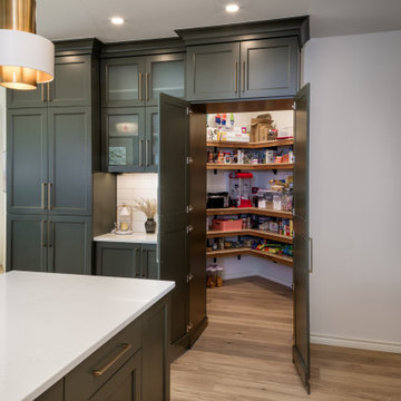
A North Albany family contacted us wanting to expand, update, and open up their Kitchen to the Family Room. The floor plan of this home actually had plenty of space but it wasn’t being well-utilized, with angled walls in the pantry and a corner kitchen and island layout. By removing the double-sided fireplace and built-in bookcases closing off the Family Room, removing the closed-off bar area, and re-imagining the awkward walk-in pantry and kitchen layout, our Designer, Sarah envisioned an expansive Kitchen footprint that connected all the key areas and significantly increased the amount of available storage and countertop space, making this Kitchen the perfect entertaining environment! Replacing the cherry cabinetry, black granite countertops, and dark hardwood floors with white shaker upper cabinets, dark green lower cabinets, light-colored hardwood flooing, and a new lighting design completely transformed the space from dark and compartmentalized, to bright and open. This Kitchen is full of brilliant custom pieces and organization cabinets, including a HIDDEN walk-in pantry (which is the family’s favorite)!
 The Brooklyn Studio
This residence was a complete gut renovation of a 4-story row house in Park Slope, and included a new rear extension and penthouse addition. The owners wished to create a warm, family home using a modern language that would act as a clean canvas to feature rich textiles and items from their world travels. As with most Brooklyn row houses, the existing house suffered from a lack of natural light and connection to exterior spaces, an issue that Principal Brendan Coburn is acutely aware of from his experience re-imagining historic structures in the New York area. The resulting architecture is designed around moments featuring natural light and views to the exterior, of both the private garden and the sky, throughout the house, and a stripped-down language of detailing and finishes allows for the concept of the modern-natural to shine.
Upon entering the home, the kitchen and dining space draw you in with views beyond through the large glazed opening at the rear of the house. An extension was built to allow for a large sunken living room that provides a family gathering space connected to the kitchen and dining room, but remains distinctly separate, with a strong visual connection to the rear garden. The open sculptural stair tower was designed to function like that of a traditional row house stair, but with a smaller footprint. By extending it up past the original roof level into the new penthouse, the stair becomes an atmospheric shaft for the spaces surrounding the core. All types of weather – sunshine, rain, lightning, can be sensed throughout the home through this unifying vertical environment. The stair space also strives to foster family communication, making open living spaces visible between floors. At the upper-most level, a free-form bench sits suspended over the stair, just by the new roof deck, which provides at-ease entertaining. Oak was used throughout the home as a unifying material element. As one travels upwards within the house, the oak finishes are bleached to further degrees as a nod to how light enters the home.
The owners worked with CWB to add their own personality to the project. The meter of a white oak and blackened steel stair screen was designed by the family to read “I love you” in Morse Code, and tile was selected throughout to reference places that hold special significance to the family. To support the owners’ comfort, the architectural design engages passive house technologies to reduce energy use, while increasing air quality within the home – a strategy which aims to respect the environment while providing a refuge from the harsh elements of urban living.
This project was published by Wendy Goodman as her Space of the Week, part of New York Magazine’s Design Hunting on The Cut.
Photography by Kevin Kunstadt

 User
Every design decision for this Caribbean beach residence was guided by the desire to maximize the views of the property’s breathtaking natural surroundings.
To connect the spaces and reveal the views from every vantage point, the team reconfigured the layout to create vistas, and installed window film to reduce solar heat gain. These modifications increased efficiencies, reused 90% of the interior envelope and did not impact the exterior structure of the building. In addition to providing incredible views, opening up the plan allows cross ventilation, maximizing the use of ocean breezes to cool the interior. The result is an effortless flow and maximization of space.
Throughout the interior, dark materials express the concept of respite in the shade, and emphasize the sweeping views of the Caribbean Sea. Millwork crafted by local artisans from local materials establishes hierarchy – providing a clear understanding of the layout – and filters light to create privacy and drama. Screens help define the spaces and create suspense.
Varying screen opacities serve specific functions: nearly opaque screens build suspense, translucent screens provide privacy, and reflective screens – as seen in the kitchen ceiling – create mystery in the core where light and views
are challenged. Referencing the seaside location, the baseboards create a sense of being in a deep shallow. The 16” tall baseboards create a pool effect, engaging the walls with Cradle to Cradle certified Mosa tile flooring. The irregular height also conceals power and data cabling. The resulting space is a contemporary oasis that offers a high-level of comfort and functionality.
Anne Rausch Photography
 Agate Architecture, LLC
Terri and Jim loved many things about their home, but the outdated, poorly designed kitchen, laundry room that was shoved into the corner of the kitchen, and loft that was annexed from other living spaces needed a complete makeover. The house is nestled on a large lot filled with mature trees that offer filtered morning and afternoon light. Establishing a strong visual link from the front yard through the house and into the back yard was a high design priority, as well as connecting the living spaces with an open floor plan, all without increasing the overall footprint of the home. Agate Architecture's completed remodel includes a full kitchen and dining room renovation, a new mud/laundry room, renovation of the second-floor loft, a new staircase, and exterior improvements. The use of Douglas Fir as a main unifying material and simple clean lines lends a bright Pacific Northwest style, with natural light in abundance. Terri and Jim’s home is now a truly exceptional space for everyday use and family entertaining.
39