
Search results for "Increased connectivity" in Home Design Ideas
 Quax
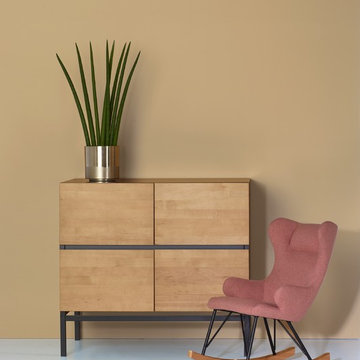
Quax loves contemporary design and with the Havana room the sleek line and solid wood get a place in the range, confirming its place on the international design scene. Tested by internationally recognized bodies on EN-716 for the beds and EN-12221 for the changing tables and with long-term use in mind.
The metal base is finished with a black powder coating. The upper structures are a mix of lacquered and solid wood panels. The charm of solid wood is reflected in its pristine patina and is the guarantee of a natural product that over time becomes increasingly unique and valuable. A contribution that should not be underestimated to the natural and the cozy interior, a caress for the senses. Depending on the tree’s habitat, color differences are possible and proof of its essence.
At Quax we use sustainable materials. All the furniture boards meet the strict E1 standard on formaldehyde emissions. We support durable forestry and ask our suppliers to submit the PEFC and FSC certificates. Special care also goes to the furniture fittings. Only reputable suppliers provide us with, among others, quality sliders for the drawers and reliable connecting techniques. The paint finish is another point of attention, we only work with international quality supplierssuch as Akzo Nobel and no local producers. All producers are responsible for the certificates of their products, for example EN 71-3 with attention for the migration of harmful elements.
Design also plays an important role in the business philosophy of Quax. In the Havana room the bars are milled out in the Mdf board, which does not only contribute to the fancy nature of this range but also to the sturdiness of the sideframes, not comparable to traditional bars.
The range includes beds 120x60 cm, 140x70 cm with optional bedrail, a chest of four drawers with optional changing extension and a two or three-door wardrobe.
Kris Van Damme for Quax
 Wellstudio Architecture
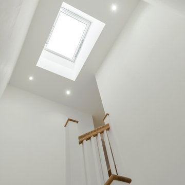
Renovation of an existing mews house, transforming it from a poorly planned out and finished property to a highly desirable residence that creates wellbeing for its occupants.
Wellstudio demolished the existing bedrooms on the first floor of the property to create a spacious new open plan kitchen living dining area which enables residents to relax together and connect.
Wellstudio inserted two new windows between the garage and the corridor on the ground floor and increased the glazed area of the garage door, opening up the space to bring in more natural light and thus allowing the garage to be used for a multitude of functions.
Wellstudio replanned the rest of the house to optimise the space, adding two new compact bathrooms and a utility room into the layout.
 Holiday Maldives
Combine ancient temples with overwater villas for the trip of a lifetime
There's a reason savvy travellers are increasingly looking beyond single-destination holidays. The Sri Lanka Maldives multi-centre trip has emerged as one of the most sought-after combinations in tropical travel—and it's easy to understand why. These two Indian Ocean neighbours couldn't be more different, yet together they create a holiday experience that satisfies every type of wanderlust.
Why Combine Sri Lanka and the Maldives?
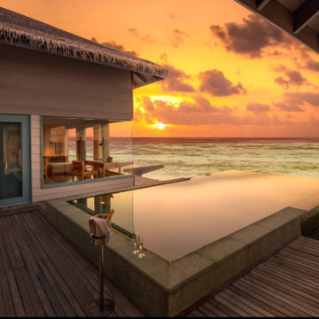
Sri Lanka offers what the Maldives doesn't: lush highlands carpeted in tea plantations, ancient cities steeped in 2,500 years of history, wildlife safaris where leopards roam free, and a culinary scene that'll have you dreaming of hoppers and kottu for years to come. The Maldives, meanwhile, delivers what Sri Lanka can't: those iconic overwater bungalows, some of the planet's most pristine coral reefs, and the kind of barefoot luxury where your biggest decision is whether to have your massage on the beach or in your private villa.
A Sri Lanka and Maldives twin centre holiday lets you experience the thrill of exploration followed by pure, unadulterated relaxation. It's the best of both worlds—literally.
The Perfect Itinerary Balance
Most travellers find that spending 7-10 days in Sri Lanka followed by 4-7 days in the Maldives creates the ideal rhythm. Sri Lanka demands more time because there's simply so much ground to cover. You might start in Colombo, travel through the Cultural Triangle to explore Sigiriya's ancient rock fortress and Dambulla's cave temples, wind through the tea country around Ella, and perhaps end with a safari in Yala National Park before catching your flight to Malé.
Then comes the reward: touching down in the Maldives, boarding a speedboat or seaplane, and watching the stress of everyday life disappear as those famous turquoise lagoons come into view. After days of early morning temple visits and winding mountain roads, there's nothing quite like sinking into a lounger with nothing on the agenda but deciding which shade of blue you're looking at.
Logistics Made Simple
One of the best aspects of this combination is how geographically convenient it is. Colombo and Malé are just over an hour apart by air, with multiple daily flights connecting the two capitals. This proximity means minimal travel fatigue and maximum time enjoying your destinations.Find More here https://holiday.com.mv/sri-lanka-and-maldives-twin-centre-holidays/
For those considering expanding their Indian Ocean adventure even further, Maldives multi-centre holidays open up possibilities beyond Sri Lanka. Dubai, Singapore, and various Indian cities all serve as excellent add-on destinations, turning an already incredible trip into a true odyssey.
Planning Considerations for 2026
Timing matters with this combination. The Maldives enjoys fairly consistent weather year-round, but Sri Lanka has two distinct monsoon seasons affecting different coasts at different times. Generally speaking, December through April works beautifully for both destinations, making it the peak season for this twin-centre route.
Budget-wise, expect Sri Lanka to be significantly more affordable than the Maldives. Many travellers use this to their advantage, opting for boutique hotels and authentic local experiences in Sri Lanka, then splurging on a premium resort for their Maldives finale. It's a strategy that delivers exceptional value without sacrificing that once-in-a-lifetime overwater villa experience.
The Verdict
A Sri Lanka Maldives multi-centre holiday isn't just about ticking two countries off a list. It's about crafting a journey with genuine contrast and emotional arc—adventure followed by serenity, cultural immersion followed by indulgent escape. For couples, honeymooners, families, and solo travellers alike, this combination consistently ranks among the most satisfying itineraries the Indian Ocean has to offer.
If you've been dreaming of ancient ruins at sunrise and sunset cocktails on a private deck over crystalline waters, this might just be your year to make it happen.
Ready to start planning your twin-centre adventure? Work with specialists who know both destinations intimately to create an itinerary that matches your travel style and budget.Find More here https://holiday.com.mv/maldives-multi-centre-holidays/
Find the right local pro for your project
 Spaces Renewed
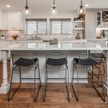
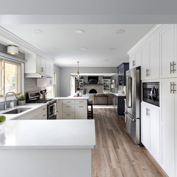
More than just a cosmetic remodel, this kitchen and dining room received a dynamic floor plan update. Without having to add square footage, we were able to double the size of the kitchen, add a wine bar, and increase the size of the previously disconnected dining room. Interior walls were removed to accomplish this open concept entertaining area. Harwood flooring throughout the areas connect the kitchen and dining areas, as well as warm up the space and add character. The warm gray accent cabinets coordinate and compliment the white kitchen. The large glass door system brings the outdoors in and allows for seamless entertaining and dining. The landscaping in the backyard was completely redone, including hardscape, walk ways, fire features, and pergola and trellis structures. The upstairs bath is an unexpected surprise with navy blue cabinetry, polished nickel plumbing fixtures, and glass accent tile. The cement look floor tile is both sophisticated and unique.
 Forward Design Build Remodel
We planned on a full kitchen remodel for this project. Our goal was to increase countertop space, widen the working triangle, improve the lighting plan, and expand the circulation between rooms.
To achieve a wider visual and functional connection from the kitchen to the dining room, we opened up the wall between the dining room and kitchen.
 Klopf Architecture
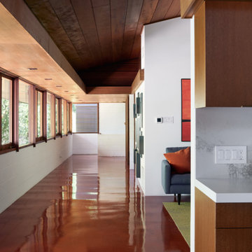
Nestled in the hills of Orinda, California, this 1951 residence is one of only seven extant homes, now known as “The Magnificent Seven”, designed by architect Olof Dahlstrand, a protégé of Frank Lloyd Wright. With its low-slung rooflines, natural materials, and deep integration with the sloping landscape, the home is a pristine example of mid-century modern design inspired by Wright’s organic principles. Over the years, prior homeowners have emphasized preservation, ensuring that the house remained relatively untouched. Each owner has respected the original architecture and stayed true to Dahlstrand’s intent. When a family of five—two college-aged sons and a middle school-aged daughter—acquired the property, they were captivated by its history, legacy of care, and architectural significance. While they appreciated Dahlstrand’s original vision, they also recognized the need to adapt the home for contemporary living while preserving its design integrity.
The remodel was conceived as a thoughtful response to the past—an effort to bring the house into the 21st century without compromising its soul. The primary mandate was to maintain architectural continuity while improving the functionality, comfort, and livability for a modern family. The design team—architects and contractor alike—worked with a shared reverence for the original architecture, allowing that mindset to guide even the most technical or pragmatic decisions.
A key objective was to increase natural light in the kitchen—a departure from Wrightian principles of enclosed, intimate cooking spaces—while maintaining the home’s architectural language. The kitchen was reconfigured to foster a stronger connection to adjacent living spaces while retaining the underlying concept of spatial separation. One of the most transformative architectural changes was the removal of a ridge beam that was originally planned to remain visible through the kitchen. During construction, the team collaborated on a better solution: a wide-flanged steel beam concealed within the roof envelope. This subtle move preserved the clean lines and ceiling continuity, a modern update carried out with utmost respect for the existing framework.
The home’s original powder room, previously accessible only through the kitchen, was relocated for better flow and privacy. A new powder room was carved out of former kitchen cabinetry—a narrow, interior space that could have felt dark and enclosed. To avoid this, the design extended the line of original transom windows into the new powder room and added a skylight above the vanity. The result is a bright and airy space that feels consistent with the rest of the home. Other updates included the installation of new solid-core interior doors with veneers carefully matched to the original mahogany, enhancing the continuity of the interiors. Even smaller decisions, such as placing the door knobs at 42 inches high, mirrored the original proportions. Every choice reflected a shared belief between the architect, contractor, and client: that new work should serve the integrity of the old.
The home’s extensive interior redwood millwork and paneling was meticulously restored. Where new materials were introduced—such as the replacement redwood soffit paneling—the contractor took pains to find finish nails that matched the original, rather than using modern equivalents. This level of craftsmanship and collaboration defined the project. It extended even to the detailing of a blind door to the new powder room, which had to disappear into the existing redwood board-and-batten wall. It was a team effort: the owner found a suitable handle, the architects devised the custom in-swing mechanism, and the contractor executed it so the door aligned precisely with the battens. Throughout, the homeowners were deeply engaged in the design process. One, a meticulous design enthusiast, focused on aesthetic integrity and historic detail. The other brought a practical and function-driven perspective, ensuring that new fixtures and materials would be durable and require minimal maintenance.
While the home’s location posed no major site challenges, sustainability was a key concern. The team upgraded the roof insulation, installed solar panels with battery storage, and added ductless mini-split cooling systems. Lighting was another area where modern technology was woven into a historic framework: new square LED fixtures echo the original custom perimeter soffit lights, maintaining the design language while offering advanced performance.
A planned expansion of a bedroom into suite with a bathroom had to be shelved due to budget constraints and the high cost of below-grade foundation work. Still, the team focused their efforts on making the most of the existing footprint, resolving constraints through design ingenuity rather than adding square footage. This renovation represents a collaborative achievement in preserving and evolving a historically significant home. Every decision was shaped by a shared ethos among clients, architects, and contractor: to maintain the home’s architectural soul while updating it for contemporary life. The result is a timeless modernist residence that continues Olof Dahlstrand’s legacy, remaining grounded in nature, craftsmanship, and human-scale design.
Klopf Architecture Team: John Klopf, AIA, Klara Kevane, Fernanda Bernardes
Interior Architectural Design: Klopf Architecture
Structural Engineer: Daniel Bastiao
Contractor: Don Larwood, Larwood Construction
Photography: Mariko Reed
Year Completed: 2022
 Spaces Renewed
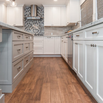
More than just a cosmetic remodel, this kitchen and dining room received a dynamic floor plan update. Without having to add square footage, we were able to double the size of the kitchen, add a wine bar, and increase the size of the previously disconnected dining room. Interior walls were removed to accomplish this open concept entertaining area. Harwood flooring throughout the areas connect the kitchen and dining areas, as well as warm up the space and add character. The warm gray accent cabinets coordinate and compliment the white kitchen. The large glass door system brings the outdoors in and allows for seamless entertaining and dining. The landscaping in the backyard was completely redone, including hardscape, walk ways, fire features, and pergola and trellis structures. The upstairs bath is an unexpected surprise with navy blue cabinetry, polished nickel plumbing fixtures, and glass accent tile. The cement look floor tile is both sophisticated and unique.
 Gayle Lee & Company
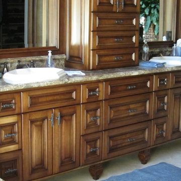
Martin King Photography --The Project: To take a dated and dysfunctional bathroom and transform it into a grand and stylish Master Bathroom complete with Tudor elements of design.
The Challenge: The original ceiling height was not consistent with the rest of the Master Suite and made the space feel extremely closed in. The layout did not allow for a sense of luxury and spaciousness.
The Solution: Raising the ceiling and continuing the exposed beam element from the bedroom area visually expanded the space and connected the room to the rest of the Master Suite. Custom designed and crafted cabinetry increased the beauty of the space along with much needed storage. A new layout created the space needed to give the room both volume and function.
The Result: A beautiful Master Bathroom that provides every opportunity to relax and enjoy the pleasures of a sophisticated well thought out bathroom.
 TreHus Architects+Interior Designers+Builders
The owners of this historic 1931 property purchased the home, intending to transform it from an outdated duplex to a functional single-family home.
Beginning with the kitchen, the remodel aimed to combine the existing and separate spaces, including a tiny kitchen and cramped eating area, to creating a
comfortable, practical space for their large family to cook, eat and do homework. The main scope of the remodel was to increase light, create flow throughout the
main floor by connecting the kitchen to the dining and living room, and bring in elements of the client's heritage and showcase their travels through the finishes of
the design. The clients hoped to achieve all these while restoring and enhancing the home's original architecture, which was covered up by prior remodels.
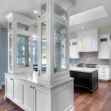
 Design Matters
Incredible Los Altos transformation. This home was brought to Design Matters of Los Gatos in the middle of construction as many elements were not working well. I was able to provide new kitchen layout and material designs along with ceiling designs, color palettes, designs for the bathrooms and provide a harmonious space for this lovely family~
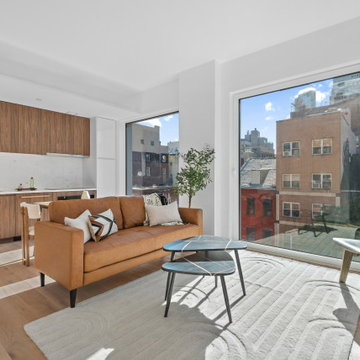
 KURV Architecture DPC (Alex Hughes Architects)
Located in the heart of Manhattan’s Lower East Side, the building was erected on a shallow commercial lot between two 120 year old masonry buildings and a new residential rental building. 330 Grand Street is a mix of 725 SF 1BRs and 1050 SF 2BR apartments. It also contains a 1100 SF two story duplex as well as private and public rooftop space, large private balconies for most units and two large private terraces for the ground floor units.
330 Grand Street was originally designed and approved at the NYC DOB as a prefabricated modular building. During the pandemic, as shipping costs skyrocketed putting the project at risk, we suggested redesigning the building as a reinforced cast-in-place concrete structure. Concrete was readily available and prices had not been affected by the demand increase that many other materials suffered in the pandemic. We took this opportunity to raise floor to ceiling heights, enlarge high performance windows and redistribute the buildings MEPFS and Structural Systems to create very open floor plans.
The challenge was to create a luxurious sensorial living experience with very limited means. In a city with very high construction costs, low cost residential buildings in the area are usually devoid of good quality, design and character. Our approach was to aim high for the end user, prioritizing natural light, open space with long visual perspectives, high ceilings and as always, rejecting the use of predefined building templates.
Our biggest challenge was to ensure that the small spaces feel as clean cut, large and bright as possible. Several unique design decisions were made to ensure low cost and high quality;
Floor plans were laid out so that spaces were wide open and free of clutter from mechanical or structural interruptions. Therefore all infrastructure was placed in lateral demising walls, which in turn act as the unit’s storage and kitchen. The apartments feel wide open, are super quiet and have more storage space than any other comparable apartment in the city.
To solve the problem of the site’s shallow commercial lot which is typically prone to dark interior spaces we focused our attention on the building’s envelope. Instead of the usual small punched window openings, oversized high performance windows were designed to ensure that light penetrated as far as possible into the units. In the smaller 1BR units, the full 50’ depth of the lot is perceived by partitioning spaces with sliding pocket doors that can be retracted to allow deep visual perspectives, making the sight lines in the space feel longer, larger, more ample than normal. In addition to the full height glazing, each unit above the 2nd floor receives a 7 foot covered balcony, adding 120 to 240 sf to each apartment, something unusual in New York City buildings. The space is large enough for a full size dining table, when the weather permits being outside.
We also worked hard to ensure modularity. For example, all kitchen units are all identical throughout the building. The idea of modularity and the economy of the repetitive unit is exercised to the maximum through the building.
Hardware, appliances, flooring, wall coverings and material finishes are all carefully selected to feel bespoke, high quality and unique.
It was important to KURV that the result of this work manifest into something that would deeply connect with the end user and sustain relationships with the consumers of this space.
All images by KURV Architecture ©
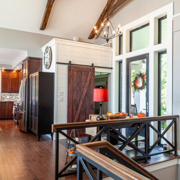
 Bell+Associates Architecture Inc.
This 1,800 sq ft all-season cottage is designed to make the most of its breathtaking south-facing view of the Ottawa River. Every aspect of the cottage was carefully considered to optimize the relationship between indoor and outdoor spaces, ensuring the water views are an integral part of daily life.
At the heart of the cottage is the expansive open-concept kitchen, dining, and living area, featuring a striking stone fireplace and vaulted ceilings. An abundance of windows along the river-facing side allows natural light to flood the space while offering uninterrupted views of the water. Strategic design elements, including retractable canopies, provide shade during hot summer months while allowing for increased sunlight during the winter to enhance the warmth and comfort of the interiors.
Perfect for entertaining, the spacious sunroom serves as a flexible space for both intimate gatherings and larger groups. It includes a second stone fireplace and ample room for dining and lounging, with seamless access to the outdoor deck. For sun lovers, the deck provides the perfect spot to bask in the warmth, while the canopy offers a shady retreat to enjoy the river views during hot days. A cozy firepit patio closer to the water creates an inviting space for evening gatherings, complete with the charm of a crackling fire and views of the river.
Off the sunroom, a screened porch offers a shaded escape, providing relief from the heat and bugs during the summer afternoons. This porch is conveniently located next to the BBQ area, allowing for easy outdoor cooking and socializing.
The primary bedroom suite includes a bedroom partition wall that allows the bed to face the river while providing unimpeded access to the walk-in closet and ensuite bathroom. The main level also includes a butler’s pantry, office, full bathroom, and a second bedroom ideal for family.
The lower level expands the living space further, offering four additional guest bedrooms, a bunk room for the kids, ample storage, a laundry room, and a versatile games room. With thoughtful design and functional spaces, this cottage balances comfort, style, and connection to nature.
 LBK Design Build
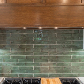
The goal of this renovation was to modernize the home while preserving its warmth and character. The design introduces a more functional layout, increased storage, and a cohesive material palette that connects the mudroom, kitchen, pantry, primary suite, and bathroom. Clean-lined millwork, warm wood tones, painted cabinetry, and layered textures create a balanced aesthetic that feels both timeless and updated.The original layout featured a compartmentalized kitchen with limited storage and circulation challenges. The mudroom lacked built-in organization, and the pantry provided minimal functionality. Within the primary suite, the bathroom and closet areas did not maximize available square footage or storage opportunities. Existing finishes throughout the home relied heavily on warm wood cabinetry and beige-toned tile.
 Charlie Allen Renovations, Inc.
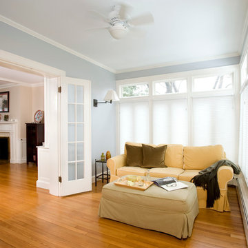
For a small family in the Boston suburbs, their modest sized home was just the right size. But with some smart changes, they wondered if it could be more enjoyable. Working with architect Joseph S. Artley, we came up with a number of solutions:
• To make the kitchen a more comfortable work and gathering space, a bay window was removed and the kitchen itself bumped out slightly to allow for the introduction of an expansive island, as well as additional countertop and cabinetry.
• The first floor half-bathroom was relocated to the end of the entry hall. This allowed us to connect the kitchen with what had been a three-season porch.
• That three-season porch was properly heated and remodeled as a sunny breakfast nook: the perfect spot for the family to gather in the mornings.
• Near the entry to the breakfast nook, an existing electrical box could not be moved. To conceal it, we suggested an oversized family bulletin board, which we provided as a gift to the homeowners. Now, it offers a great spot to catch up on the day’s activities and enjoy some family artwork while heading in for breakfast.
• This family loves to read and they asked for custom built in bookshelves in the living room that would look original to the home and match existing shelving on the other side of the room.
• The den is a favorite spot for the family to watch movies and play games, but the room, which had also been a three season porch prior to an earlier renovation, was drafty in the winter and hot in the summer. We introduced new, energy efficient windows and insulation throughout, resulting in a much more inviting and cozy room.
Today, after barely increasing the footprint of the home, the family has a new breakfast room, a usable den, a larger and more inviting kitchen, and a better-situated first-floor bath. Lots of simple fixes = a much happier space for the whole family.
Photos by Shelly Harrison
 HATZ Landscape
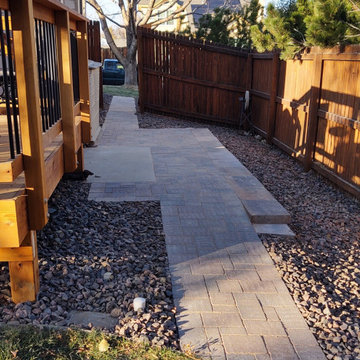
Pathway to connect front and back yards and increase utility space
Patio - mid-sized rustic side yard concrete paver patio idea in Denver
Patio - mid-sized rustic side yard concrete paver patio idea in Denver
 KURV Architecture DPC (Alex Hughes Architects)
Located in the heart of Manhattan’s Lower East Side, the building was erected on a shallow commercial lot between two 120 year old masonry buildings and a new residential rental building. 330 Grand Street is a mix of 725 SF 1BRs and 1050 SF 2BR apartments. It also contains a 1100 SF two story duplex as well as private and public rooftop space, large private balconies for most units and two large private terraces for the ground floor units.
330 Grand Street was originally designed and approved at the NYC DOB as a prefabricated modular building. During the pandemic, as shipping costs skyrocketed putting the project at risk, we suggested redesigning the building as a reinforced cast-in-place concrete structure. Concrete was readily available and prices had not been affected by the demand increase that many other materials suffered in the pandemic. We took this opportunity to raise floor to ceiling heights, enlarge high performance windows and redistribute the buildings MEPFS and Structural Systems to create very open floor plans.
The challenge was to create a luxurious sensorial living experience with very limited means. In a city with very high construction costs, low cost residential buildings in the area are usually devoid of good quality, design and character. Our approach was to aim high for the end user, prioritizing natural light, open space with long visual perspectives, high ceilings and as always, rejecting the use of predefined building templates.
Our biggest challenge was to ensure that the small spaces feel as clean cut, large and bright as possible. Several unique design decisions were made to ensure low cost and high quality;
Floor plans were laid out so that spaces were wide open and free of clutter from mechanical or structural interruptions. Therefore all infrastructure was placed in lateral demising walls, which in turn act as the unit’s storage and kitchen. The apartments feel wide open, are super quiet and have more storage space than any other comparable apartment in the city.
To solve the problem of the site’s shallow commercial lot which is typically prone to dark interior spaces we focused our attention on the building’s envelope. Instead of the usual small punched window openings, oversized high performance windows were designed to ensure that light penetrated as far as possible into the units. In the smaller 1BR units, the full 50’ depth of the lot is perceived by partitioning spaces with sliding pocket doors that can be retracted to allow deep visual perspectives, making the sight lines in the space feel longer, larger, more ample than normal. In addition to the full height glazing, each unit above the 2nd floor receives a 7 foot covered balcony, adding 120 to 240 sf to each apartment, something unusual in New York City buildings. The space is large enough for a full size dining table, when the weather permits being outside.
We also worked hard to ensure modularity. For example, all kitchen units are all identical throughout the building. The idea of modularity and the economy of the repetitive unit is exercised to the maximum through the building.
Hardware, appliances, flooring, wall coverings and material finishes are all carefully selected to feel bespoke, high quality and unique.
It was important to KURV that the result of this work manifest into something that would deeply connect with the end user and sustain relationships with the consumers of this space.
All images by KURV Architecture ©
 Klopf Architecture
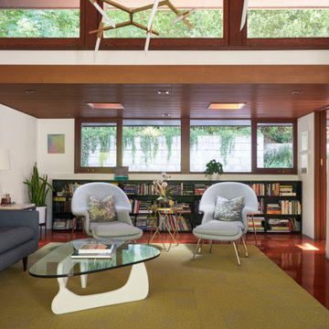
Nestled in the hills of Orinda, California, this 1951 residence is one of only seven extant homes, now known as “The Magnificent Seven”, designed by architect Olof Dahlstrand, a protégé of Frank Lloyd Wright. With its low-slung rooflines, natural materials, and deep integration with the sloping landscape, the home is a pristine example of mid-century modern design inspired by Wright’s organic principles. Over the years, prior homeowners have emphasized preservation, ensuring that the house remained relatively untouched. Each owner has respected the original architecture and stayed true to Dahlstrand’s intent. When a family of five—two college-aged sons and a middle school-aged daughter—acquired the property, they were captivated by its history, legacy of care, and architectural significance. While they appreciated Dahlstrand’s original vision, they also recognized the need to adapt the home for contemporary living while preserving its design integrity.
The remodel was conceived as a thoughtful response to the past—an effort to bring the house into the 21st century without compromising its soul. The primary mandate was to maintain architectural continuity while improving the functionality, comfort, and livability for a modern family. The design team—architects and contractor alike—worked with a shared reverence for the original architecture, allowing that mindset to guide even the most technical or pragmatic decisions.
A key objective was to increase natural light in the kitchen—a departure from Wrightian principles of enclosed, intimate cooking spaces—while maintaining the home’s architectural language. The kitchen was reconfigured to foster a stronger connection to adjacent living spaces while retaining the underlying concept of spatial separation. One of the most transformative architectural changes was the removal of a ridge beam that was originally planned to remain visible through the kitchen. During construction, the team collaborated on a better solution: a wide-flanged steel beam concealed within the roof envelope. This subtle move preserved the clean lines and ceiling continuity, a modern update carried out with utmost respect for the existing framework.
The home’s original powder room, previously accessible only through the kitchen, was relocated for better flow and privacy. A new powder room was carved out of former kitchen cabinetry—a narrow, interior space that could have felt dark and enclosed. To avoid this, the design extended the line of original transom windows into the new powder room and added a skylight above the vanity. The result is a bright and airy space that feels consistent with the rest of the home. Other updates included the installation of new solid-core interior doors with veneers carefully matched to the original mahogany, enhancing the continuity of the interiors. Even smaller decisions, such as placing the door knobs at 42 inches high, mirrored the original proportions. Every choice reflected a shared belief between the architect, contractor, and client: that new work should serve the integrity of the old.
The home’s extensive interior redwood millwork and paneling was meticulously restored. Where new materials were introduced—such as the replacement redwood soffit paneling—the contractor took pains to find finish nails that matched the original, rather than using modern equivalents. This level of craftsmanship and collaboration defined the project. It extended even to the detailing of a blind door to the new powder room, which had to disappear into the existing redwood board-and-batten wall. It was a team effort: the owner found a suitable handle, the architects devised the custom in-swing mechanism, and the contractor executed it so the door aligned precisely with the battens. Throughout, the homeowners were deeply engaged in the design process. One, a meticulous design enthusiast, focused on aesthetic integrity and historic detail. The other brought a practical and function-driven perspective, ensuring that new fixtures and materials would be durable and require minimal maintenance.
While the home’s location posed no major site challenges, sustainability was a key concern. The team upgraded the roof insulation, installed solar panels with battery storage, and added ductless mini-split cooling systems. Lighting was another area where modern technology was woven into a historic framework: new square LED fixtures echo the original custom perimeter soffit lights, maintaining the design language while offering advanced performance.
A planned expansion of a bedroom into suite with a bathroom had to be shelved due to budget constraints and the high cost of below-grade foundation work. Still, the team focused their efforts on making the most of the existing footprint, resolving constraints through design ingenuity rather than adding square footage. This renovation represents a collaborative achievement in preserving and evolving a historically significant home. Every decision was shaped by a shared ethos among clients, architects, and contractor: to maintain the home’s architectural soul while updating it for contemporary life. The result is a timeless modernist residence that continues Olof Dahlstrand’s legacy, remaining grounded in nature, craftsmanship, and human-scale design.
Klopf Architecture Team: John Klopf, AIA, Klara Kevane, Fernanda Bernardes
Interior Architectural Design: Klopf Architecture
Structural Engineer: Daniel Bastiao
Contractor: Don Larwood, Larwood Construction
Photography: Mariko Reed
Year Completed: 2022
 HTZ Construction
Client Objectives
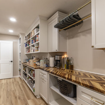
The homeowners wanted to transform their outdated kitchen into a bright, welcoming space that better supported their love of cooking, baking, and entertaining. Storage was a major priority, with a need for dedicated organization for small appliances, baking supplies, serving pieces, and party essentials. They envisioned a larger, more functional layout with ample seating, improved flow to adjacent living spaces, and a timeless design featuring warm wood tones, and traditional details with a fresh, elevated feel. Expanding the footprint of the home to create a more spacious gathering area was also a key consideration.
Our Solution
We reimagined the kitchen as a highly functional hub for everyday living and entertaining. The design focused on maximizing storage, improving workflow, and creating a more open connection to surrounding spaces. Thoughtful cabinetry solutions, expansive island seating, dedicated pantry storage, and updated finishes help support the family’s cooking and hosting needs while maintaining a warm, inviting aesthetic. Strategic window placement enhances natural light and highlights views of the property, creating a bright and welcoming environment for family and guests alike.
Special Features
A kitchen expansion to significantly increase square footage, large island with seating, dedicated walk-in pantry, appliance garage, custom storage and organization solutions, warm wood, new windows maximizing backyard views, all-new appliances, solid surface countertops, updated lighting throughout, LVP flooring, soffit removal, wall removal to improve flow to adjacent living spaces, enhanced storage around laundry area, and a timeless design blending traditional character with modern functionality.
 CRD Design Build
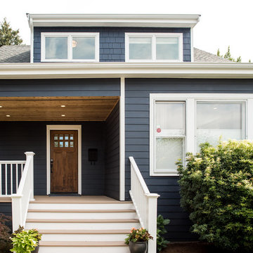
Nearly every inch of this 1908 Ravenna home was upgraded, and the interior layout was re-envisioned. On the main floor, the kitchen and dining room locations were swapped to connect the kitchen to the living room. A spa-like bathroom was added upstairs to create an inviting new master suite, with heated floors, a double vanity, and a large shower. A spacious walk-in closet with a custom-designed organization system completes the luxurious appointments. The basement was dug down for increased head height, and a new laundry room, bedroom, and bonus room were added. All new mechanical, electrical, and plumbing systems were installed, and the exterior was refreshed, with all new siding and rebuilt porches, including high-end composite decking and railings. The home is now an oasis, welcoming its owners and guests with gleaming new hardwood flooring, custom cabinetry and mill work, professional-grade appliances, layered lighting, and a gorgeous and warming soapstone fireplace surround.
 Bell+Associates Architecture Inc.
This 1,800 sq ft all-season cottage is designed to make the most of its breathtaking south-facing view of the Ottawa River. Every aspect of the cottage was carefully considered to optimize the relationship between indoor and outdoor spaces, ensuring the water views are an integral part of daily life.
At the heart of the cottage is the expansive open-concept kitchen, dining, and living area, featuring a striking stone fireplace and vaulted ceilings. An abundance of windows along the river-facing side allows natural light to flood the space while offering uninterrupted views of the water. Strategic design elements, including retractable canopies, provide shade during hot summer months while allowing for increased sunlight during the winter to enhance the warmth and comfort of the interiors.
Perfect for entertaining, the spacious sunroom serves as a flexible space for both intimate gatherings and larger groups. It includes a second stone fireplace and ample room for dining and lounging, with seamless access to the outdoor deck. For sun lovers, the deck provides the perfect spot to bask in the warmth, while the canopy offers a shady retreat to enjoy the river views during hot days. A cozy firepit patio closer to the water creates an inviting space for evening gatherings, complete with the charm of a crackling fire and views of the river.
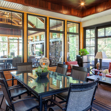
Off the sunroom, a screened porch offers a shaded escape, providing relief from the heat and bugs during the summer afternoons. This porch is conveniently located next to the BBQ area, allowing for easy outdoor cooking and socializing.
The primary bedroom suite includes a bedroom partition wall that allows the bed to face the river while providing unimpeded access to the walk-in closet and ensuite bathroom. The main level also includes a butler’s pantry, office, full bathroom, and a second bedroom ideal for family.
The lower level expands the living space further, offering four additional guest bedrooms, a bunk room for the kids, ample storage, a laundry room, and a versatile games room. With thoughtful design and functional spaces, this cottage balances comfort, style, and connection to nature.
40