
Search results for "Increasingly subtle" in Home Design Ideas
 OakWood Designers & Builders
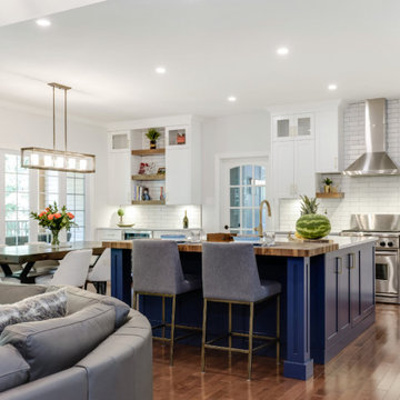
From dark and dreary to light and bright! ?
These clients loved the custom home that they built almost a decade ago but were growing tired of their interior and wanted to make a change. Their vision was to lighten, brighten and modernize the finishes and designs in the home they had originally built, so they turned to the OakWood Team for expert advice.
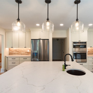
There are a lot of things we love about this updated kitchen design, but one of our favourite details has to be the island countertop which features a combination of quartz and a custom end grain black walnut butcherblock. End-grain construction is made from small rectangular blocks arranged so that the ends (with growth rings showing) are visible on the surface. The strongest and most expensive type of butcher block, it’s great for surfaces dedicated to cutting, because it camouflages knife marks and is gentle on blade edges (they slide into the grain rather than against it).
Another goal for this space was to create a more open concept plan. There are no barriers between the eating area, kitchen, and living room, allowing for better communication, ease of movement, and increased lighting. This idea of transparency is also seen in the open shelving and the glass cabinetry uppers. Although very subtle, these glass details help complement the look and feel of this space.
The end result is a completely redesigned space that any homeowner would be proud of.
 Schumacher Homes
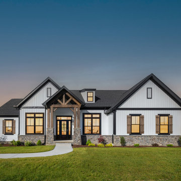
Built by Schumacher Homes, America's Largest Custom Home Builder, this stunning Charleston II Modern Hill Country in Ravenna, Ohio, effortlessly balances classic architectural details with rustic elements. Based on one of our most popular floor plans, the Charleston II offers increased square footage and abundant storage solutions tailored for modern living. The heart of the home is a chef-ready kitchen equipped with generous counter space, a large central island to gather around, and premium double-stacked cabinets flanking both perimeter walls to maximize storage. The kitchen cabinetry showcases an elegant mix of design textures, featuring sophisticated glass-front doors above the cooktop for a sleek, stylish display and traditional solid-door double-stacked cabinetry above the refrigerator. Directly off the main kitchen, the walk-in pantry has been upgraded into a dual-purpose space featuring a secondary messy kitchen, allowing all meal prep and cooking clutter to remain hidden behind closed doors while entertaining guests.
Distinct custom woodwork details elevate the interior architecture throughout the home. Both the great room and the dining room are anchored by matching 3D accent walls featuring a geometric design that adds subtle contrast and high-end visual focal points to the open layout. For those who work from home, a versatile front flex room has been outfitted with custom-built-in shelves and cabinets to create an organized executive study. Additionally, a perfectly placed pocket office provides a dedicated zone for daily tasks before flowing seamlessly into the private owner's retreat, which serves as a main-level sanctuary with its spacious primary bath and two independent walk-in closets. A smart split-bedroom layout places the secondary bedrooms on the completely opposite side of the residence, ensuring ultimate privacy so everyone in the family can enjoy their own space.

 Drury Design
The Setup
The homeowners of this Barrington Hills residence approached Drury Design with a clear vision: transform their existing kitchen into a space that would better serve their active family of four. With two young children who are homeschooled and love to bake with their mom, plus two dogs, this kitchen needed to function as the true heart of the home.
The existing kitchen was functional but didn’t maximize the potential of the beautiful natural light and scenic views available through the floor-to-ceiling windows. The space was locked between the dining room and family room, which limited structural modifications, but the homeowners wanted to create a more family-friendly environment that would complement the warm walnut built-ins and furnishings in the adjacent dining room while staying true to the home’s overall aesthetic.
Design Objectives:
Create a highly functional workspace that accommodates multiple family members cooking and gathering simultaneously
Maximize the connection to the beautiful outdoor scenery and natural light through thoughtful design choices
Establish a cohesive color palette that complements the existing walnut elements in the adjacent dining room without becoming too tone-on-tone (aka “matchy matchy”)
Improve the seating arrangement to take advantage of the stunning views (rather than facing away from the windows)
Work within the existing architectural constraints, including a curved soffit that could not be removed
Increase storage capacity while maintaining clean, uncluttered sightlines throughout the space
Design Challenges:
The curved soffit presented a design dilemma of whether to echo the curve throughout the kitchen or work with it in a more subtle way
The relatively low ceiling height required careful consideration to avoid making the space feel cramped or cave-like
The existing hardwood floor could not be refinished, which meant the new kitchen footprint had to match or exceed the original layout exactly
Finding the right balance of warm and neutral tones to complement both the existing walnut elements nearby and the natural outdoor views proved challenging
The refrigerator placement was constrained by door swing requirements, which affected the entire layout and prevented centering the sink on the back wall
Rethinking the original seating, which faced inward toward the kitchen (turning backs to the beautiful windows and outdoor views)
Pendant lighting from the previous kitchen obstructed views to the outdoors despite the abundant natural light available
The Renewed Space
Design Solutions:
The curved soffit was embraced subtly through the full slab backsplash, which echoes the curve without requiring curved cabinetry or architectural elements that might feel forced
Low ceiling challenges were addressed by using lighter painted cabinets for some tall elements, including the double oven, pantries, and refrigerator area, creating an airy feel while reserving the darker stained walnut for the center section and island
The floor constraint was managed by designing the new layout to cover all previously unfinished areas while maintaining the exact footprint, with only minor touch-ups needed in a few areas
The color palette balances warm walnut stain (harmonizing with the dining room built-ins) with soft, neutral painted cabinets – avoiding stark white that wouldn’t complement the home’s warm aesthetic
Refrigerator placement was optimized with a slim pullout pantry to the left, allowing proper door clearance while maintaining the desired layout flow and enabling the main pantry to be positioned adjacently
The seating was completely reimagined with a built-in banquette facing the windows, allowing diners to enjoy the outdoor views while providing flexible seating for two to four people
Decorative pendant lighting was eliminated in favor of recessed can lights, preserving the unobstructed views to the beautiful outdoor scenery
This kitchen transformation demonstrates how thoughtful design can dramatically improve functionality for a busy family while honoring existing architectural elements. The children immediately began cooking and baking with their mother in the new space, and the window-facing banquette has become a favorite gathering spot where the family can enjoy both meals and the beautiful outdoor views.
Find the right local pro for your project
 Thrive Outdoor, Inc.
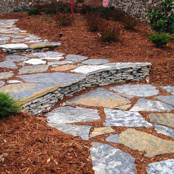
Hardscaping is the implementation of garden architecture combining plants, walls, walkways, and even water. This landscaping technique utilizes non-plant based elements as an integral part of the overall design and construction of your landscape, providing more than ornamental grasses, trees, shrubs and flowers to your outdoor space.
Retaining Walls That Tame the Landscape and Protect Your Investment
More than functional, our retaining walls are works of art. Made of modular concrete or natural stone, they are both classic and contemporary in style. We’ll work hard to complement the style of your home’s existing structures and outdoor surfaces while ensuring a design that is integral to preventing erosion, providing easy transitions to steep grades and protecting your investment in plantings.
Sustainable and Beautiful Patios, Entryways and Driveways
Turf Tamer, Inc. is known for unique, custom stonework and specialty brick paving that varies from subtle to dramatic. We use a variety of materials, including concrete permeable pavers, bricks, concrete, and flagstone, some of which carry up to a lifetime warranty. Our designers and crew can create an incredible, low-maintenance outdoor surface that increases the beauty, function and value of your home.
Sustainable Decks for Value, Beauty and Enjoyment
If it’s a deck you want, we’ll design it to be uniquely yours. And, we’ll build it from cedar, redwood or even longer lasting composition materials. Whatever it takes, we’ll make those transitions from inside to outside living beautiful, low-maintenance and perfect for your next dinner party or family get together.
 Schumacher Homes
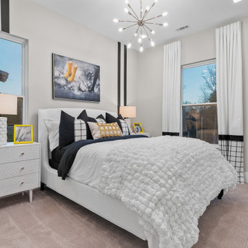
Built by Schumacher Homes, America's Largest Custom Home Builder, this stunning Charleston II Modern Hill Country in Franklin, North Carolina, effortlessly balances classic architectural details with modern elements. Based on one of our most popular floor plans, the Charleston II offers increased square footage and abundant storage solutions tailored for modern living. The heart of the home is a chef-ready kitchen equipped with generous counter space, a large central island to gather around, and premium double-stacked cabinets flanking both perimeter walls to maximize storage. The kitchen cabinetry showcases an elegant mix of design textures, featuring sophisticated glass-front doors above the cooktop for a sleek, stylish look, and traditional solid-door double-stacked cabinetry above the refrigerator. Directly off the main kitchen, the giant walk-in pantry has been converted into a dual-purpose space featuring a secondary messy kitchen, allowing all meal prep and cooking clutter to remain hidden behind closed doors while entertaining guests in the main living space.
Distinct custom woodwork details elevate the interior architecture throughout the home. Both the great room and the dining room are anchored by matching 3D accent walls featuring a geometric design that adds subtle contrast and high-end visual focal points to the open layout. For those who work from home, a versatile front flex room has been outfitted with custom-built-in shelves and cabinets to create an organized executive study. Additionally, a perfectly placed pocket office provides a dedicated zone for organizing daily tasks before flowing seamlessly into the private owner's retreat, which serves as a main-level sanctuary with its spacious primary bath and two independent walk-in closets. A smart split-bedroom layout places the secondary bedrooms on the completely opposite side of the residence, ensuring ultimate privacy so everyone in the family can enjoy their own space.
 Drury Design
The Setup
The homeowners of this Barrington Hills residence approached Drury Design with a clear vision: transform their existing kitchen into a space that would better serve their active family of four. With two young children who are homeschooled and love to bake with their mom, plus two dogs, this kitchen needed to function as the true heart of the home.
The existing kitchen was functional but didn’t maximize the potential of the beautiful natural light and scenic views available through the floor-to-ceiling windows. The space was locked between the dining room and family room, which limited structural modifications, but the homeowners wanted to create a more family-friendly environment that would complement the warm walnut built-ins and furnishings in the adjacent dining room while staying true to the home’s overall aesthetic.
Design Objectives:
Create a highly functional workspace that accommodates multiple family members cooking and gathering simultaneously
Maximize the connection to the beautiful outdoor scenery and natural light through thoughtful design choices
Establish a cohesive color palette that complements the existing walnut elements in the adjacent dining room without becoming too tone-on-tone (aka “matchy matchy”)
Improve the seating arrangement to take advantage of the stunning views (rather than facing away from the windows)
Work within the existing architectural constraints, including a curved soffit that could not be removed
Increase storage capacity while maintaining clean, uncluttered sightlines throughout the space
Design Challenges:
The curved soffit presented a design dilemma of whether to echo the curve throughout the kitchen or work with it in a more subtle way
The relatively low ceiling height required careful consideration to avoid making the space feel cramped or cave-like
The existing hardwood floor could not be refinished, which meant the new kitchen footprint had to match or exceed the original layout exactly
Finding the right balance of warm and neutral tones to complement both the existing walnut elements nearby and the natural outdoor views proved challenging
The refrigerator placement was constrained by door swing requirements, which affected the entire layout and prevented centering the sink on the back wall
Rethinking the original seating, which faced inward toward the kitchen (turning backs to the beautiful windows and outdoor views)
Pendant lighting from the previous kitchen obstructed views to the outdoors despite the abundant natural light available
The Renewed Space
Design Solutions:
The curved soffit was embraced subtly through the full slab backsplash, which echoes the curve without requiring curved cabinetry or architectural elements that might feel forced
Low ceiling challenges were addressed by using lighter painted cabinets for some tall elements, including the double oven, pantries, and refrigerator area, creating an airy feel while reserving the darker stained walnut for the center section and island
The floor constraint was managed by designing the new layout to cover all previously unfinished areas while maintaining the exact footprint, with only minor touch-ups needed in a few areas
The color palette balances warm walnut stain (harmonizing with the dining room built-ins) with soft, neutral painted cabinets – avoiding stark white that wouldn’t complement the home’s warm aesthetic
Refrigerator placement was optimized with a slim pullout pantry to the left, allowing proper door clearance while maintaining the desired layout flow and enabling the main pantry to be positioned adjacently
The seating was completely reimagined with a built-in banquette facing the windows, allowing diners to enjoy the outdoor views while providing flexible seating for two to four people
Decorative pendant lighting was eliminated in favor of recessed can lights, preserving the unobstructed views to the beautiful outdoor scenery
This kitchen transformation demonstrates how thoughtful design can dramatically improve functionality for a busy family while honoring existing architectural elements. The children immediately began cooking and baking with their mother in the new space, and the window-facing banquette has become a favorite gathering spot where the family can enjoy both meals and the beautiful outdoor views.
 Drury Design
The Setup
The homeowners of this Barrington Hills residence approached Drury Design with a clear vision: transform their existing kitchen into a space that would better serve their active family of four. With two young children who are homeschooled and love to bake with their mom, plus two dogs, this kitchen needed to function as the true heart of the home.
The existing kitchen was functional but didn’t maximize the potential of the beautiful natural light and scenic views available through the floor-to-ceiling windows. The space was locked between the dining room and family room, which limited structural modifications, but the homeowners wanted to create a more family-friendly environment that would complement the warm walnut built-ins and furnishings in the adjacent dining room while staying true to the home’s overall aesthetic.
Design Objectives:
Create a highly functional workspace that accommodates multiple family members cooking and gathering simultaneously
Maximize the connection to the beautiful outdoor scenery and natural light through thoughtful design choices
Establish a cohesive color palette that complements the existing walnut elements in the adjacent dining room without becoming too tone-on-tone (aka “matchy matchy”)
Improve the seating arrangement to take advantage of the stunning views (rather than facing away from the windows)
Work within the existing architectural constraints, including a curved soffit that could not be removed
Increase storage capacity while maintaining clean, uncluttered sightlines throughout the space
Design Challenges:
The curved soffit presented a design dilemma of whether to echo the curve throughout the kitchen or work with it in a more subtle way
The relatively low ceiling height required careful consideration to avoid making the space feel cramped or cave-like
The existing hardwood floor could not be refinished, which meant the new kitchen footprint had to match or exceed the original layout exactly
Finding the right balance of warm and neutral tones to complement both the existing walnut elements nearby and the natural outdoor views proved challenging
The refrigerator placement was constrained by door swing requirements, which affected the entire layout and prevented centering the sink on the back wall
Rethinking the original seating, which faced inward toward the kitchen (turning backs to the beautiful windows and outdoor views)
Pendant lighting from the previous kitchen obstructed views to the outdoors despite the abundant natural light available
The Renewed Space
Design Solutions:
The curved soffit was embraced subtly through the full slab backsplash, which echoes the curve without requiring curved cabinetry or architectural elements that might feel forced
Low ceiling challenges were addressed by using lighter painted cabinets for some tall elements, including the double oven, pantries, and refrigerator area, creating an airy feel while reserving the darker stained walnut for the center section and island
The floor constraint was managed by designing the new layout to cover all previously unfinished areas while maintaining the exact footprint, with only minor touch-ups needed in a few areas
The color palette balances warm walnut stain (harmonizing with the dining room built-ins) with soft, neutral painted cabinets – avoiding stark white that wouldn’t complement the home’s warm aesthetic
Refrigerator placement was optimized with a slim pullout pantry to the left, allowing proper door clearance while maintaining the desired layout flow and enabling the main pantry to be positioned adjacently
The seating was completely reimagined with a built-in banquette facing the windows, allowing diners to enjoy the outdoor views while providing flexible seating for two to four people
Decorative pendant lighting was eliminated in favor of recessed can lights, preserving the unobstructed views to the beautiful outdoor scenery
This kitchen transformation demonstrates how thoughtful design can dramatically improve functionality for a busy family while honoring existing architectural elements. The children immediately began cooking and baking with their mother in the new space, and the window-facing banquette has become a favorite gathering spot where the family can enjoy both meals and the beautiful outdoor views.

 Custom Design & Construction
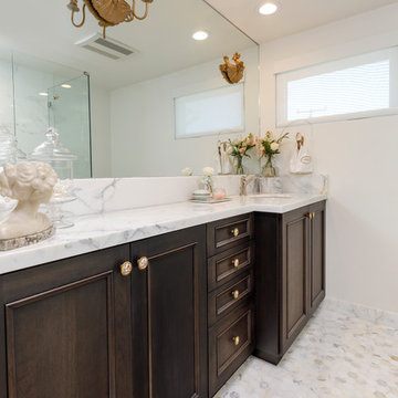
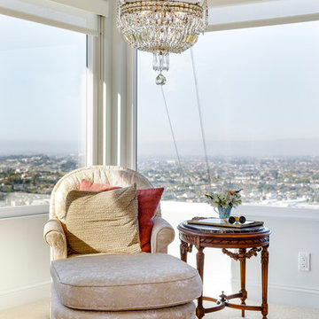
This South Bay project was completed in an elegant, traditional style with the intent to increase the functionality of the master suite while maintaining a timeless charm. Originally, this bathroom was cramped and crowded, so we designed a long, narrow counter space to maximize storage. For the large bedroom, we wanted to incorporate the client’s unique style into an open and spacious design. Our client has a beautiful collection of antiques which we repurposed in both the master bathroom and bedroom.
The countertops in the bathroom are made from antique marble. The tile pattern in the bathroom is subtle and compliments the Victorian-era gold accents. After the remodel, the bedroom is now a bright, inviting space with panoramic views of Los Angeles.
We loved working closely on this project with our client to create a space she felt was uniquely hers. This is a fabulous example of how the designers at Custom Design and Construction are dedicated to serving our clients so that they can love their home again.
 Custom Design & Construction
This South Bay project was completed in an elegant, traditional style with the intent to increase the functionality of the master suite while maintaining a timeless charm. Originally, this bathroom was cramped and crowded, so we designed a long, narrow counter space to maximize storage. For the large bedroom, we wanted to incorporate the client’s unique style into an open and spacious design. Our client has a beautiful collection of antiques which we repurposed in both the master bathroom and bedroom.
The countertops in the bathroom are made from antique marble. The tile pattern in the bathroom is subtle and compliments the Victorian-era gold accents. After the remodel, the bedroom is now a bright, inviting space with panoramic views of Los Angeles.
We loved working closely on this project with our client to create a space she felt was uniquely hers. This is a fabulous example of how the designers at Custom Design and Construction are dedicated to serving our clients so that they can love their home again.
 Amy Pearson Design
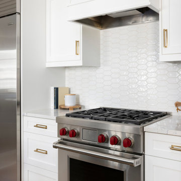
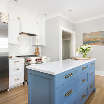
These clients loved the historic details of their classic Portland Bungalow, but wished for modern updates to improve livability. We were able to capture square footage to the kitchen by removing an unused chimney allowing us to increase additional work surface with the addition of a narrow island. Where traffic flow previously moved directly across the work triangle, the new layout keeps cooking activities within one zone of the kitchen and shifting traffic flow to another zone, allowing their daughter and four-legged family members to run through the space freely! High-end appliances create a luxury cooking experience. Crisp surfaces and colors create a light and bright space while classically sized crown and trim profiles draw the eye up and around the room offering a feeling of expanse in a modestly sized footprint. The blue and white color pallet offer a subtle reminder to coastal and tropical environments … the client’s favorite place to escape!
 Klopf Architecture
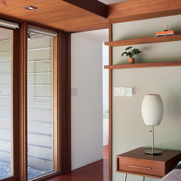
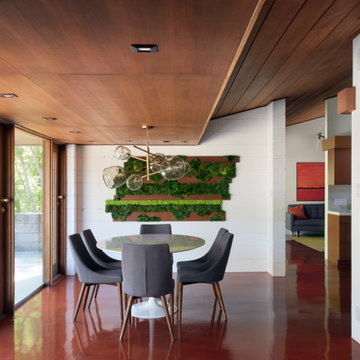
Nestled in the hills of Orinda, California, this 1951 residence is one of only seven extant homes, now known as “The Magnificent Seven”, designed by architect Olof Dahlstrand, a protégé of Frank Lloyd Wright. With its low-slung rooflines, natural materials, and deep integration with the sloping landscape, the home is a pristine example of mid-century modern design inspired by Wright’s organic principles. Over the years, prior homeowners have emphasized preservation, ensuring that the house remained relatively untouched. Each owner has respected the original architecture and stayed true to Dahlstrand’s intent. When a family of five—two college-aged sons and a middle school-aged daughter—acquired the property, they were captivated by its history, legacy of care, and architectural significance. While they appreciated Dahlstrand’s original vision, they also recognized the need to adapt the home for contemporary living while preserving its design integrity.
The remodel was conceived as a thoughtful response to the past—an effort to bring the house into the 21st century without compromising its soul. The primary mandate was to maintain architectural continuity while improving the functionality, comfort, and livability for a modern family. The design team—architects and contractor alike—worked with a shared reverence for the original architecture, allowing that mindset to guide even the most technical or pragmatic decisions.
A key objective was to increase natural light in the kitchen—a departure from Wrightian principles of enclosed, intimate cooking spaces—while maintaining the home’s architectural language. The kitchen was reconfigured to foster a stronger connection to adjacent living spaces while retaining the underlying concept of spatial separation. One of the most transformative architectural changes was the removal of a ridge beam that was originally planned to remain visible through the kitchen. During construction, the team collaborated on a better solution: a wide-flanged steel beam concealed within the roof envelope. This subtle move preserved the clean lines and ceiling continuity, a modern update carried out with utmost respect for the existing framework.
The home’s original powder room, previously accessible only through the kitchen, was relocated for better flow and privacy. A new powder room was carved out of former kitchen cabinetry—a narrow, interior space that could have felt dark and enclosed. To avoid this, the design extended the line of original transom windows into the new powder room and added a skylight above the vanity. The result is a bright and airy space that feels consistent with the rest of the home. Other updates included the installation of new solid-core interior doors with veneers carefully matched to the original mahogany, enhancing the continuity of the interiors. Even smaller decisions, such as placing the door knobs at 42 inches high, mirrored the original proportions. Every choice reflected a shared belief between the architect, contractor, and client: that new work should serve the integrity of the old.
The home’s extensive interior redwood millwork and paneling was meticulously restored. Where new materials were introduced—such as the replacement redwood soffit paneling—the contractor took pains to find finish nails that matched the original, rather than using modern equivalents. This level of craftsmanship and collaboration defined the project. It extended even to the detailing of a blind door to the new powder room, which had to disappear into the existing redwood board-and-batten wall. It was a team effort: the owner found a suitable handle, the architects devised the custom in-swing mechanism, and the contractor executed it so the door aligned precisely with the battens. Throughout, the homeowners were deeply engaged in the design process. One, a meticulous design enthusiast, focused on aesthetic integrity and historic detail. The other brought a practical and function-driven perspective, ensuring that new fixtures and materials would be durable and require minimal maintenance.
While the home’s location posed no major site challenges, sustainability was a key concern. The team upgraded the roof insulation, installed solar panels with battery storage, and added ductless mini-split cooling systems. Lighting was another area where modern technology was woven into a historic framework: new square LED fixtures echo the original custom perimeter soffit lights, maintaining the design language while offering advanced performance.
A planned expansion of a bedroom into suite with a bathroom had to be shelved due to budget constraints and the high cost of below-grade foundation work. Still, the team focused their efforts on making the most of the existing footprint, resolving constraints through design ingenuity rather than adding square footage. This renovation represents a collaborative achievement in preserving and evolving a historically significant home. Every decision was shaped by a shared ethos among clients, architects, and contractor: to maintain the home’s architectural soul while updating it for contemporary life. The result is a timeless modernist residence that continues Olof Dahlstrand’s legacy, remaining grounded in nature, craftsmanship, and human-scale design.
Klopf Architecture Team: John Klopf, AIA, Klara Kevane, Fernanda Bernardes
Interior Architectural Design: Klopf Architecture
Structural Engineer: Daniel Bastiao
Contractor: Don Larwood, Larwood Construction
Photography: Mariko Reed
Year Completed: 2022
 Amy Pearson Design
These clients loved the historic details of their classic Portland Bungalow, but wished for modern updates to improve livability. We were able to capture square footage to the kitchen by removing an unused chimney allowing us to increase additional work surface with the addition of a narrow island. Where traffic flow previously moved directly across the work triangle, the new layout keeps cooking activities within one zone of the kitchen and shifting traffic flow to another zone, allowing their daughter and four-legged family members to run through the space freely! High-end appliances create a luxury cooking experience. Crisp surfaces and colors create a light and bright space while classically sized crown and trim profiles draw the eye up and around the room offering a feeling of expanse in a modestly sized footprint. The blue and white color pallet offer a subtle reminder to coastal and tropical environments … the client’s favorite place to escape!
 Pro-Painting & Drywall, Inc.
Pro-Painting & Drywall, Inc.
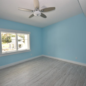
Brilliant Blue Bedroom Paint
Perhaps because it's the color of both the sky and the sea: In color therapy, blue tones are said to evoke clarity, pureness, and increased intuition. In the home, the shade is immediately calming and welcoming, whether used in a deep navy for a touch of drama, or a pale robin's egg in a more subtle space.
Call for a free in home estimate 904-731-6471

 Dwellify
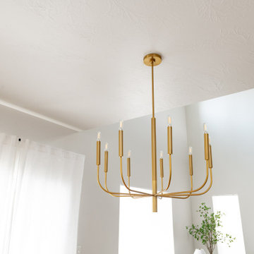
In this kitchen remodeling project, our homeowners envisioned a clean and inviting Scandinavian-style space. To achieve their desired aesthetic, we prioritized several key elements. The first step involved updating the backsplash with fresh white tiles, creating a bright and airy backdrop that epitomized the Scandinavian design philosophy. The lighting in both the kitchen and dining room was meticulously chosen to elevate the space. We installed modern fixtures that emitted warm, diffused light, adding a cozy ambiance and enhancing the overall atmosphere. To further enhance the Scandinavian charm, the white kitchen cabinets were adorned with new gold hardware, providing a subtle touch of elegance and contrast. The gold sink faucet harmonized with the hardware, ensuring a cohesive and stylish look. A kitchen island was added to increase functionality, featuring matching white cabinets and a countertop, seamlessly integrating with the rest of the kitchen. Finally, the hardwood flooring brought warmth and natural beauty, completing the Scandinavian-inspired transformation. The result was a clean, inviting, and harmonious kitchen that perfectly captured the essence of Scandinavian design
 Amy Pearson Design
A classic Portland foursquare, lovingly owned by an active and lively family of four, had undergone some unfortunate previous renovations that were in desperate need of updating. A cramped kitchen layout, lacking countertop work space, non-functional appliance locations (the range was floating on it’s own!), cramped kitchen nook not large enough for eat-in space and therefor left underutilized, and a general lack of storage all needed to be addressed.
To increase functional space, we enclosed a small back porch and re-built the adjacent nook, folding in the square footage to create an expansive kitchen footprint. We relocated the back door and added a back deck while creating space for a mud bench for littles to tuck away their gear! The enlarged kitchen now boasts a extensive natural light thanks to the addition of several windows.
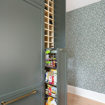
An easy work flow was created within the new kitchen layout featuring an in-island sink with range and hood flanked by matching windows. Custom cabinet accessories make storage a breeze and provide a space for all the necessities to be right at the homeowner’s fingertips. The eat-in kitchen space allows not only for lingering family chats, but homework and craft projects to be done while dinner simmers on the stove. This kitchen truly is the heart of this home!
All of the updates were completed with the home’s original foursquare architecture in mind. with a focus on classic architectural molding styles, traditional window details, and clean-lined classic fixtures. Youthfulness and modernity are infused into the space with the contemporary handmade tile backsplash, rich and timeless green cabinets, and artistic wallpaper with a whimsical floral print and subtle European nod. The custom range in cream and brass is a stunning showstopper and a testament that even the most functional of elements in a kitchen can still be beautiful! Which one is the star of the show? How do we pick just one?!
 Sierra Living Concepts Inc
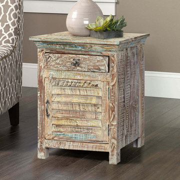
Dimension:
24" L X 18" D X 30" H
Drawer: 16" L X 13" D X 2.5" H
Cabinet Shelves: 17" L X 17" D X 7.25" H
Create a warm and wonderful atmosphere in any room of your home with our Winter White Mini Cabinet. This handmade freestanding mini cupboard features a top drawer and a 2-shelf storage section complete with shutter door. This smart nightstand has a subtle multi-color finish and stands off the floor.
Use this rustic end table cabinet to increase your storage and expand your counter or tabletop space. It is built with solid reclaimed wood.
Special Features:
• 100% Handcrafted
• Reclaimed wood craftsmanship
• Cornice shaped top molding
• 1 Drawer, 1 cabinet with 2 shelves
• Decorative wrought-Iron hardware
• Distressed finish throughout
• Smooth interior with a dark stain
• Heirloom quality
Note: Custom Options such as Size, Shape, Shade & Design are not applicable to this item. Reclaimed Wood Furniture is subjected to have Slight Variations.

 LBK Design Build
The kitchen and mudroom renovation of this 1880 New Hope, PA home balanced preservation with modern function. The project added contemporary features without losing the original charm, using warm materials and subtle contrasts for a unified look that honors its history. The design improved space flow, increased natural light, and incorporated custom touches to enhance usability within the historic structure.
 Klopf Architecture
Nestled in the hills of Orinda, California, this 1951 residence is one of only seven extant homes, now known as “The Magnificent Seven”, designed by architect Olof Dahlstrand, a protégé of Frank Lloyd Wright. With its low-slung rooflines, natural materials, and deep integration with the sloping landscape, the home is a pristine example of mid-century modern design inspired by Wright’s organic principles. Over the years, prior homeowners have emphasized preservation, ensuring that the house remained relatively untouched. Each owner has respected the original architecture and stayed true to Dahlstrand’s intent. When a family of five—two college-aged sons and a middle school-aged daughter—acquired the property, they were captivated by its history, legacy of care, and architectural significance. While they appreciated Dahlstrand’s original vision, they also recognized the need to adapt the home for contemporary living while preserving its design integrity.
The remodel was conceived as a thoughtful response to the past—an effort to bring the house into the 21st century without compromising its soul. The primary mandate was to maintain architectural continuity while improving the functionality, comfort, and livability for a modern family. The design team—architects and contractor alike—worked with a shared reverence for the original architecture, allowing that mindset to guide even the most technical or pragmatic decisions.
A key objective was to increase natural light in the kitchen—a departure from Wrightian principles of enclosed, intimate cooking spaces—while maintaining the home’s architectural language. The kitchen was reconfigured to foster a stronger connection to adjacent living spaces while retaining the underlying concept of spatial separation. One of the most transformative architectural changes was the removal of a ridge beam that was originally planned to remain visible through the kitchen. During construction, the team collaborated on a better solution: a wide-flanged steel beam concealed within the roof envelope. This subtle move preserved the clean lines and ceiling continuity, a modern update carried out with utmost respect for the existing framework.
The home’s original powder room, previously accessible only through the kitchen, was relocated for better flow and privacy. A new powder room was carved out of former kitchen cabinetry—a narrow, interior space that could have felt dark and enclosed. To avoid this, the design extended the line of original transom windows into the new powder room and added a skylight above the vanity. The result is a bright and airy space that feels consistent with the rest of the home. Other updates included the installation of new solid-core interior doors with veneers carefully matched to the original mahogany, enhancing the continuity of the interiors. Even smaller decisions, such as placing the door knobs at 42 inches high, mirrored the original proportions. Every choice reflected a shared belief between the architect, contractor, and client: that new work should serve the integrity of the old.
The home’s extensive interior redwood millwork and paneling was meticulously restored. Where new materials were introduced—such as the replacement redwood soffit paneling—the contractor took pains to find finish nails that matched the original, rather than using modern equivalents. This level of craftsmanship and collaboration defined the project. It extended even to the detailing of a blind door to the new powder room, which had to disappear into the existing redwood board-and-batten wall. It was a team effort: the owner found a suitable handle, the architects devised the custom in-swing mechanism, and the contractor executed it so the door aligned precisely with the battens. Throughout, the homeowners were deeply engaged in the design process. One, a meticulous design enthusiast, focused on aesthetic integrity and historic detail. The other brought a practical and function-driven perspective, ensuring that new fixtures and materials would be durable and require minimal maintenance.
While the home’s location posed no major site challenges, sustainability was a key concern. The team upgraded the roof insulation, installed solar panels with battery storage, and added ductless mini-split cooling systems. Lighting was another area where modern technology was woven into a historic framework: new square LED fixtures echo the original custom perimeter soffit lights, maintaining the design language while offering advanced performance.
A planned expansion of a bedroom into suite with a bathroom had to be shelved due to budget constraints and the high cost of below-grade foundation work. Still, the team focused their efforts on making the most of the existing footprint, resolving constraints through design ingenuity rather than adding square footage. This renovation represents a collaborative achievement in preserving and evolving a historically significant home. Every decision was shaped by a shared ethos among clients, architects, and contractor: to maintain the home’s architectural soul while updating it for contemporary life. The result is a timeless modernist residence that continues Olof Dahlstrand’s legacy, remaining grounded in nature, craftsmanship, and human-scale design.
Klopf Architecture Team: John Klopf, AIA, Klara Kevane, Fernanda Bernardes
Interior Architectural Design: Klopf Architecture
Structural Engineer: Daniel Bastiao
Contractor: Don Larwood, Larwood Construction
Photography: Mariko Reed
Year Completed: 2022
 Alure Home Improvements
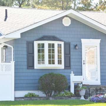
Windows and doors not on the face of the home are capped and trimmed in white giving continuity to its look. New gutters and leaders help accent the project and increase curb appeal. the subtle accent of the dark blue shutters provides a crowning touch.
11