
Search results for "Increasingly subtle" in Home Design Ideas
 Custom Design & Construction
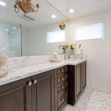
This South Bay project was completed in an elegant, traditional style with the intent to increase the functionality of the master suite while maintaining a timeless charm. Originally, this bathroom was cramped and crowded, so we designed a long, narrow counter space to maximize storage. For the large bedroom, we wanted to incorporate the client’s unique style into an open and spacious design. Our client has a beautiful collection of antiques which we repurposed in both the master bathroom and bedroom.
The countertops in the bathroom are made from antique marble. The tile pattern in the bathroom is subtle and compliments the Victorian-era gold accents. After the remodel, the bedroom is now a bright, inviting space with panoramic views of Los Angeles.
We loved working closely on this project with our client to create a space she felt was uniquely hers. This is a fabulous example of how the designers at Custom Design and Construction are dedicated to serving our clients so that they can love their home again.
 Drury Design
The Setup
The homeowners of this Barrington Hills residence approached Drury Design with a clear vision: transform their existing kitchen into a space that would better serve their active family of four. With two young children who are homeschooled and love to bake with their mom, plus two dogs, this kitchen needed to function as the true heart of the home.
The existing kitchen was functional but didn’t maximize the potential of the beautiful natural light and scenic views available through the floor-to-ceiling windows. The space was locked between the dining room and family room, which limited structural modifications, but the homeowners wanted to create a more family-friendly environment that would complement the warm walnut built-ins and furnishings in the adjacent dining room while staying true to the home’s overall aesthetic.
Design Objectives:
Create a highly functional workspace that accommodates multiple family members cooking and gathering simultaneously
Maximize the connection to the beautiful outdoor scenery and natural light through thoughtful design choices
Establish a cohesive color palette that complements the existing walnut elements in the adjacent dining room without becoming too tone-on-tone (aka “matchy matchy”)
Improve the seating arrangement to take advantage of the stunning views (rather than facing away from the windows)
Work within the existing architectural constraints, including a curved soffit that could not be removed
Increase storage capacity while maintaining clean, uncluttered sightlines throughout the space
Design Challenges:
The curved soffit presented a design dilemma of whether to echo the curve throughout the kitchen or work with it in a more subtle way
The relatively low ceiling height required careful consideration to avoid making the space feel cramped or cave-like
The existing hardwood floor could not be refinished, which meant the new kitchen footprint had to match or exceed the original layout exactly
Finding the right balance of warm and neutral tones to complement both the existing walnut elements nearby and the natural outdoor views proved challenging
The refrigerator placement was constrained by door swing requirements, which affected the entire layout and prevented centering the sink on the back wall
Rethinking the original seating, which faced inward toward the kitchen (turning backs to the beautiful windows and outdoor views)
Pendant lighting from the previous kitchen obstructed views to the outdoors despite the abundant natural light available
The Renewed Space
Design Solutions:
The curved soffit was embraced subtly through the full slab backsplash, which echoes the curve without requiring curved cabinetry or architectural elements that might feel forced
Low ceiling challenges were addressed by using lighter painted cabinets for some tall elements, including the double oven, pantries, and refrigerator area, creating an airy feel while reserving the darker stained walnut for the center section and island
The floor constraint was managed by designing the new layout to cover all previously unfinished areas while maintaining the exact footprint, with only minor touch-ups needed in a few areas
The color palette balances warm walnut stain (harmonizing with the dining room built-ins) with soft, neutral painted cabinets – avoiding stark white that wouldn’t complement the home’s warm aesthetic
Refrigerator placement was optimized with a slim pullout pantry to the left, allowing proper door clearance while maintaining the desired layout flow and enabling the main pantry to be positioned adjacently
The seating was completely reimagined with a built-in banquette facing the windows, allowing diners to enjoy the outdoor views while providing flexible seating for two to four people
Decorative pendant lighting was eliminated in favor of recessed can lights, preserving the unobstructed views to the beautiful outdoor scenery
This kitchen transformation demonstrates how thoughtful design can dramatically improve functionality for a busy family while honoring existing architectural elements. The children immediately began cooking and baking with their mother in the new space, and the window-facing banquette has become a favorite gathering spot where the family can enjoy both meals and the beautiful outdoor views.
 Jordan Design Build Group
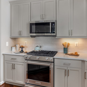
In the kitchen, new Shaker style cabinets in a soft gray finish are complemented by quartz countertops with subtle Calacatta Gold veining. We increased functionality by using full overlay cabinets with soft-close doors and full-extension drawers; we added useful accessories such as roll-outs, tray dividers and a trash/recycling center. The new undermount stainless steel sink is a stylish upgrade from the old enameled drop-in sink and the full height textured subway tile is a huge improvement over the old four inch high laminate backsplash. The kitchen pantry received new shelving and the adjacent laundry/utility room even got a facelift with luxury vinyl tile flooring and new paint.
Find the right local pro for your project
 Dwellify
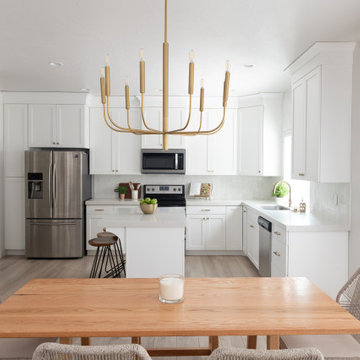
In this kitchen remodeling project, our homeowners envisioned a clean and inviting Scandinavian-style space. To achieve their desired aesthetic, we prioritized several key elements. The first step involved updating the backsplash with fresh white tiles, creating a bright and airy backdrop that epitomized the Scandinavian design philosophy. The lighting in both the kitchen and dining room was meticulously chosen to elevate the space. We installed modern fixtures that emitted warm, diffused light, adding a cozy ambiance and enhancing the overall atmosphere. To further enhance the Scandinavian charm, the white kitchen cabinets were adorned with new gold hardware, providing a subtle touch of elegance and contrast. The gold sink faucet harmonized with the hardware, ensuring a cohesive and stylish look. A kitchen island was added to increase functionality, featuring matching white cabinets and a countertop, seamlessly integrating with the rest of the kitchen. Finally, the hardwood flooring brought warmth and natural beauty, completing the Scandinavian-inspired transformation. The result was a clean, inviting, and harmonious kitchen that perfectly captured the essence of Scandinavian design
 LBK Design Build
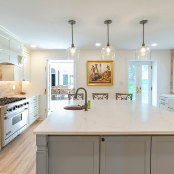
The kitchen and mudroom renovation of this 1880 New Hope, PA home balanced preservation with modern function. The project added contemporary features without losing the original charm, using warm materials and subtle contrasts for a unified look that honors its history. The design improved space flow, increased natural light, and incorporated custom touches to enhance usability within the historic structure.
 Christopher Simmonds Architect
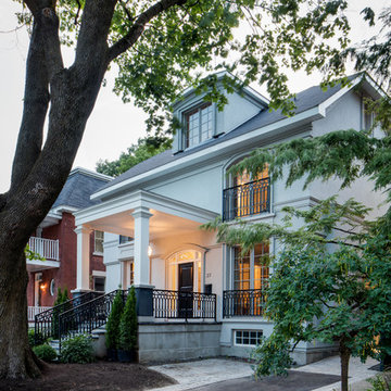
A long relationship with Paris led our clients to recreate a piece of the city they love here in Ottawa. This renovation revitalized a fire-damaged, turn-of-the-century house into a timeless and sophisticated residence for a well-travelled couple.
The gracefully composed façade, featuring round arch windows and wrought-iron balustrades, hints at the Parisian-inspired spaces inside. The clients wanted the dark interior transformed into a bright, elegant and comfortable space, suited to house their collection of art and antiques.
The home exudes a calm elegance; subtle paint colours and white oak flooring create a tranquil atmosphere, while trims and plaster mouldings are used to highlight and define openings. French doors link the traditionally defined spaces and frame carefully composed views from room to room.
A dilapidated addition at the rear of the home was removed and replaced while increasing the floor area. This made it possible to add bedrooms that overlook the quiet park and pond, adjacent to the property.
The new kitchen features a bay window and sitting area which also has views to the park. A sleek black and stainless faucet and dramatic chandelier create contrast in the all-white kitchen. Caesarstone countertops, glass cabinet doors, and crown mouldings tie into the home’s restrained palette.
The formal dining room is linked to the kitchen through two doorways allowing a symmetrical composition, and opens up to the back terrace through a wall of French doors and windows. The re-built terrace leads down to a stone patio and lush yard.
Additionally, the home was designed for aging in place, with an elevator rough-in and an accessible side entrance.
Photography: Adrien Williams
 Schumacher Homes
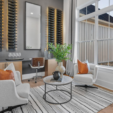
Built by Schumacher Homes, America's Largest Custom Home Builder, this stunning Charleston II Modern Hill Country in Franklin, North Carolina, effortlessly balances classic architectural details with modern elements. Based on one of our most popular floor plans, the Charleston II offers increased square footage and abundant storage solutions tailored for modern living. The heart of the home is a chef-ready kitchen equipped with generous counter space, a large central island to gather around, and premium double-stacked cabinets flanking both perimeter walls to maximize storage. The kitchen cabinetry showcases an elegant mix of design textures, featuring sophisticated glass-front doors above the cooktop for a sleek, stylish look, and traditional solid-door double-stacked cabinetry above the refrigerator. Directly off the main kitchen, the giant walk-in pantry has been converted into a dual-purpose space featuring a secondary messy kitchen, allowing all meal prep and cooking clutter to remain hidden behind closed doors while entertaining guests in the main living space.
Distinct custom woodwork details elevate the interior architecture throughout the home. Both the great room and the dining room are anchored by matching 3D accent walls featuring a geometric design that adds subtle contrast and high-end visual focal points to the open layout. For those who work from home, a versatile front flex room has been outfitted with custom-built-in shelves and cabinets to create an organized executive study. Additionally, a perfectly placed pocket office provides a dedicated zone for organizing daily tasks before flowing seamlessly into the private owner's retreat, which serves as a main-level sanctuary with its spacious primary bath and two independent walk-in closets. A smart split-bedroom layout places the secondary bedrooms on the completely opposite side of the residence, ensuring ultimate privacy so everyone in the family can enjoy their own space.

 Dwellify
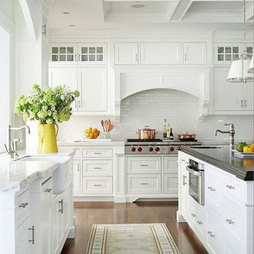
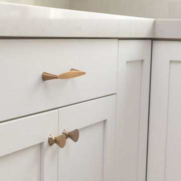
In this kitchen remodeling project, our homeowners envisioned a clean and inviting Scandinavian-style space. To achieve their desired aesthetic, we prioritized several key elements. The first step involved updating the backsplash with fresh white tiles, creating a bright and airy backdrop that epitomized the Scandinavian design philosophy. The lighting in both the kitchen and dining room was meticulously chosen to elevate the space. We installed modern fixtures that emitted warm, diffused light, adding a cozy ambiance and enhancing the overall atmosphere. To further enhance the Scandinavian charm, the white kitchen cabinets were adorned with new gold hardware, providing a subtle touch of elegance and contrast. The gold sink faucet harmonized with the hardware, ensuring a cohesive and stylish look. A kitchen island was added to increase functionality, featuring matching white cabinets and a countertop, seamlessly integrating with the rest of the kitchen. Finally, the hardwood flooring brought warmth and natural beauty, completing the Scandinavian-inspired transformation. The result was a clean, inviting, and harmonious kitchen that perfectly captured the essence of Scandinavian design
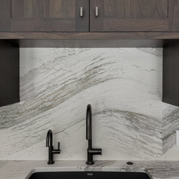 Drury Design
The Setup
The homeowners of this Barrington Hills residence approached Drury Design with a clear vision: transform their existing kitchen into a space that would better serve their active family of four. With two young children who are homeschooled and love to bake with their mom, plus two dogs, this kitchen needed to function as the true heart of the home.
The existing kitchen was functional but didn’t maximize the potential of the beautiful natural light and scenic views available through the floor-to-ceiling windows. The space was locked between the dining room and family room, which limited structural modifications, but the homeowners wanted to create a more family-friendly environment that would complement the warm walnut built-ins and furnishings in the adjacent dining room while staying true to the home’s overall aesthetic.
Design Objectives:
Create a highly functional workspace that accommodates multiple family members cooking and gathering simultaneously
Maximize the connection to the beautiful outdoor scenery and natural light through thoughtful design choices
Establish a cohesive color palette that complements the existing walnut elements in the adjacent dining room without becoming too tone-on-tone (aka “matchy matchy”)
Improve the seating arrangement to take advantage of the stunning views (rather than facing away from the windows)
Work within the existing architectural constraints, including a curved soffit that could not be removed
Increase storage capacity while maintaining clean, uncluttered sightlines throughout the space
Design Challenges:
The curved soffit presented a design dilemma of whether to echo the curve throughout the kitchen or work with it in a more subtle way
The relatively low ceiling height required careful consideration to avoid making the space feel cramped or cave-like
The existing hardwood floor could not be refinished, which meant the new kitchen footprint had to match or exceed the original layout exactly
Finding the right balance of warm and neutral tones to complement both the existing walnut elements nearby and the natural outdoor views proved challenging
The refrigerator placement was constrained by door swing requirements, which affected the entire layout and prevented centering the sink on the back wall
Rethinking the original seating, which faced inward toward the kitchen (turning backs to the beautiful windows and outdoor views)
Pendant lighting from the previous kitchen obstructed views to the outdoors despite the abundant natural light available
The Renewed Space
Design Solutions:
The curved soffit was embraced subtly through the full slab backsplash, which echoes the curve without requiring curved cabinetry or architectural elements that might feel forced
Low ceiling challenges were addressed by using lighter painted cabinets for some tall elements, including the double oven, pantries, and refrigerator area, creating an airy feel while reserving the darker stained walnut for the center section and island
The floor constraint was managed by designing the new layout to cover all previously unfinished areas while maintaining the exact footprint, with only minor touch-ups needed in a few areas
The color palette balances warm walnut stain (harmonizing with the dining room built-ins) with soft, neutral painted cabinets – avoiding stark white that wouldn’t complement the home’s warm aesthetic
Refrigerator placement was optimized with a slim pullout pantry to the left, allowing proper door clearance while maintaining the desired layout flow and enabling the main pantry to be positioned adjacently
The seating was completely reimagined with a built-in banquette facing the windows, allowing diners to enjoy the outdoor views while providing flexible seating for two to four people
Decorative pendant lighting was eliminated in favor of recessed can lights, preserving the unobstructed views to the beautiful outdoor scenery
This kitchen transformation demonstrates how thoughtful design can dramatically improve functionality for a busy family while honoring existing architectural elements. The children immediately began cooking and baking with their mother in the new space, and the window-facing banquette has become a favorite gathering spot where the family can enjoy both meals and the beautiful outdoor views.
 LBK Design Build
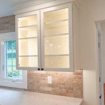
The kitchen and mudroom renovation of this 1880 New Hope, PA home balanced preservation with modern function. The project added contemporary features without losing the original charm, using warm materials and subtle contrasts for a unified look that honors its history. The design improved space flow, increased natural light, and incorporated custom touches to enhance usability within the historic structure.
 Amy Pearson Design
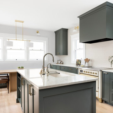
A classic Portland foursquare, lovingly owned by an active and lively family of four, had undergone some unfortunate previous renovations that were in desperate need of updating. A cramped kitchen layout, lacking countertop work space, non-functional appliance locations (the range was floating on it’s own!), cramped kitchen nook not large enough for eat-in space and therefor left underutilized, and a general lack of storage all needed to be addressed.
To increase functional space, we enclosed a small back porch and re-built the adjacent nook, folding in the square footage to create an expansive kitchen footprint. We relocated the back door and added a back deck while creating space for a mud bench for littles to tuck away their gear! The enlarged kitchen now boasts a extensive natural light thanks to the addition of several windows.
An easy work flow was created within the new kitchen layout featuring an in-island sink with range and hood flanked by matching windows. Custom cabinet accessories make storage a breeze and provide a space for all the necessities to be right at the homeowner’s fingertips. The eat-in kitchen space allows not only for lingering family chats, but homework and craft projects to be done while dinner simmers on the stove. This kitchen truly is the heart of this home!
All of the updates were completed with the home’s original foursquare architecture in mind. with a focus on classic architectural molding styles, traditional window details, and clean-lined classic fixtures. Youthfulness and modernity are infused into the space with the contemporary handmade tile backsplash, rich and timeless green cabinets, and artistic wallpaper with a whimsical floral print and subtle European nod. The custom range in cream and brass is a stunning showstopper and a testament that even the most functional of elements in a kitchen can still be beautiful! Which one is the star of the show? How do we pick just one?!
 Drury Design
The Setup
The homeowners of this Barrington Hills residence approached Drury Design with a clear vision: transform their existing kitchen into a space that would better serve their active family of four. With two young children who are homeschooled and love to bake with their mom, plus two dogs, this kitchen needed to function as the true heart of the home.
The existing kitchen was functional but didn’t maximize the potential of the beautiful natural light and scenic views available through the floor-to-ceiling windows. The space was locked between the dining room and family room, which limited structural modifications, but the homeowners wanted to create a more family-friendly environment that would complement the warm walnut built-ins and furnishings in the adjacent dining room while staying true to the home’s overall aesthetic.
Design Objectives:
Create a highly functional workspace that accommodates multiple family members cooking and gathering simultaneously
Maximize the connection to the beautiful outdoor scenery and natural light through thoughtful design choices
Establish a cohesive color palette that complements the existing walnut elements in the adjacent dining room without becoming too tone-on-tone (aka “matchy matchy”)
Improve the seating arrangement to take advantage of the stunning views (rather than facing away from the windows)
Work within the existing architectural constraints, including a curved soffit that could not be removed
Increase storage capacity while maintaining clean, uncluttered sightlines throughout the space
Design Challenges:
The curved soffit presented a design dilemma of whether to echo the curve throughout the kitchen or work with it in a more subtle way
The relatively low ceiling height required careful consideration to avoid making the space feel cramped or cave-like
The existing hardwood floor could not be refinished, which meant the new kitchen footprint had to match or exceed the original layout exactly
Finding the right balance of warm and neutral tones to complement both the existing walnut elements nearby and the natural outdoor views proved challenging
The refrigerator placement was constrained by door swing requirements, which affected the entire layout and prevented centering the sink on the back wall
Rethinking the original seating, which faced inward toward the kitchen (turning backs to the beautiful windows and outdoor views)
Pendant lighting from the previous kitchen obstructed views to the outdoors despite the abundant natural light available
The Renewed Space
Design Solutions:
The curved soffit was embraced subtly through the full slab backsplash, which echoes the curve without requiring curved cabinetry or architectural elements that might feel forced
Low ceiling challenges were addressed by using lighter painted cabinets for some tall elements, including the double oven, pantries, and refrigerator area, creating an airy feel while reserving the darker stained walnut for the center section and island
The floor constraint was managed by designing the new layout to cover all previously unfinished areas while maintaining the exact footprint, with only minor touch-ups needed in a few areas
The color palette balances warm walnut stain (harmonizing with the dining room built-ins) with soft, neutral painted cabinets – avoiding stark white that wouldn’t complement the home’s warm aesthetic
Refrigerator placement was optimized with a slim pullout pantry to the left, allowing proper door clearance while maintaining the desired layout flow and enabling the main pantry to be positioned adjacently
The seating was completely reimagined with a built-in banquette facing the windows, allowing diners to enjoy the outdoor views while providing flexible seating for two to four people
Decorative pendant lighting was eliminated in favor of recessed can lights, preserving the unobstructed views to the beautiful outdoor scenery
This kitchen transformation demonstrates how thoughtful design can dramatically improve functionality for a busy family while honoring existing architectural elements. The children immediately began cooking and baking with their mother in the new space, and the window-facing banquette has become a favorite gathering spot where the family can enjoy both meals and the beautiful outdoor views.
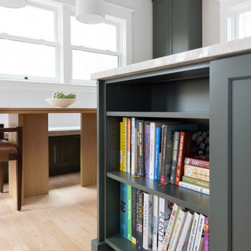 Amy Pearson Design
A classic Portland foursquare, lovingly owned by an active and lively family of four, had undergone some unfortunate previous renovations that were in desperate need of updating. A cramped kitchen layout, lacking countertop work space, non-functional appliance locations (the range was floating on it’s own!), cramped kitchen nook not large enough for eat-in space and therefor left underutilized, and a general lack of storage all needed to be addressed.
To increase functional space, we enclosed a small back porch and re-built the adjacent nook, folding in the square footage to create an expansive kitchen footprint. We relocated the back door and added a back deck while creating space for a mud bench for littles to tuck away their gear! The enlarged kitchen now boasts a extensive natural light thanks to the addition of several windows.
An easy work flow was created within the new kitchen layout featuring an in-island sink with range and hood flanked by matching windows. Custom cabinet accessories make storage a breeze and provide a space for all the necessities to be right at the homeowner’s fingertips. The eat-in kitchen space allows not only for lingering family chats, but homework and craft projects to be done while dinner simmers on the stove. This kitchen truly is the heart of this home!
All of the updates were completed with the home’s original foursquare architecture in mind. with a focus on classic architectural molding styles, traditional window details, and clean-lined classic fixtures. Youthfulness and modernity are infused into the space with the contemporary handmade tile backsplash, rich and timeless green cabinets, and artistic wallpaper with a whimsical floral print and subtle European nod. The custom range in cream and brass is a stunning showstopper and a testament that even the most functional of elements in a kitchen can still be beautiful! Which one is the star of the show? How do we pick just one?!

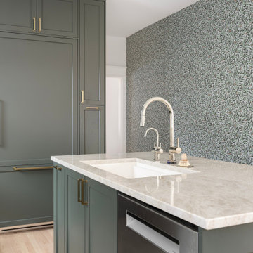 Amy Pearson Design
A classic Portland foursquare, lovingly owned by an active and lively family of four, had undergone some unfortunate previous renovations that were in desperate need of updating. A cramped kitchen layout, lacking countertop work space, non-functional appliance locations (the range was floating on it’s own!), cramped kitchen nook not large enough for eat-in space and therefor left underutilized, and a general lack of storage all needed to be addressed.
To increase functional space, we enclosed a small back porch and re-built the adjacent nook, folding in the square footage to create an expansive kitchen footprint. We relocated the back door and added a back deck while creating space for a mud bench for littles to tuck away their gear! The enlarged kitchen now boasts a extensive natural light thanks to the addition of several windows.
An easy work flow was created within the new kitchen layout featuring an in-island sink with range and hood flanked by matching windows. Custom cabinet accessories make storage a breeze and provide a space for all the necessities to be right at the homeowner’s fingertips. The eat-in kitchen space allows not only for lingering family chats, but homework and craft projects to be done while dinner simmers on the stove. This kitchen truly is the heart of this home!
All of the updates were completed with the home’s original foursquare architecture in mind. with a focus on classic architectural molding styles, traditional window details, and clean-lined classic fixtures. Youthfulness and modernity are infused into the space with the contemporary handmade tile backsplash, rich and timeless green cabinets, and artistic wallpaper with a whimsical floral print and subtle European nod. The custom range in cream and brass is a stunning showstopper and a testament that even the most functional of elements in a kitchen can still be beautiful! Which one is the star of the show? How do we pick just one?!
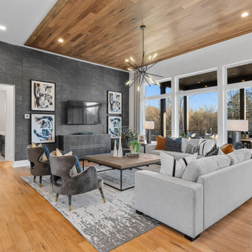 Schumacher Homes
Built by Schumacher Homes, America's Largest Custom Home Builder, this stunning Charleston II Modern Hill Country in Franklin, North Carolina, effortlessly balances classic architectural details with modern elements. Based on one of our most popular floor plans, the Charleston II offers increased square footage and abundant storage solutions tailored for modern living. The heart of the home is a chef-ready kitchen equipped with generous counter space, a large central island to gather around, and premium double-stacked cabinets flanking both perimeter walls to maximize storage. The kitchen cabinetry showcases an elegant mix of design textures, featuring sophisticated glass-front doors above the cooktop for a sleek, stylish look, and traditional solid-door double-stacked cabinetry above the refrigerator. Directly off the main kitchen, the giant walk-in pantry has been converted into a dual-purpose space featuring a secondary messy kitchen, allowing all meal prep and cooking clutter to remain hidden behind closed doors while entertaining guests in the main living space.
Distinct custom woodwork details elevate the interior architecture throughout the home. Both the great room and the dining room are anchored by matching 3D accent walls featuring a geometric design that adds subtle contrast and high-end visual focal points to the open layout. For those who work from home, a versatile front flex room has been outfitted with custom-built-in shelves and cabinets to create an organized executive study. Additionally, a perfectly placed pocket office provides a dedicated zone for organizing daily tasks before flowing seamlessly into the private owner's retreat, which serves as a main-level sanctuary with its spacious primary bath and two independent walk-in closets. A smart split-bedroom layout places the secondary bedrooms on the completely opposite side of the residence, ensuring ultimate privacy so everyone in the family can enjoy their own space.
 Unique Ambiance LLC
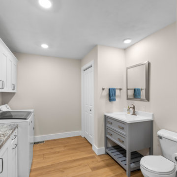
This transformative interior design project evolved from a previously dark and segmented space into a well-lit and open environment with fresh, modern finishes. Although the overall floorplan was preserved, significant structural changes were implemented to enhance the flow and brightness of the space.
Key modifications included the removal of ceiling-mounted kitchen cabinets and the peninsula beneath them, along with a freestanding China hutch. Most of the walls between the dining room and foyer were taken down, and French doors into the living room were opened up. These changes allowed us to maintain distinct room definitions while dramatically increasing natural light and creating a more open feel.
Throughout the project, optional floor plans were discussed, narrowed down, and finalized in collaboration with the client. Cabinetry details were chosen not only for their aesthetic appeal but also for their functional storage capabilities. A lighting layout was meticulously developed based on the new floor plan and cabinetry arrangement, tailored to achieve the desired levels of illumination specified by the client.
The color palette was carefully selected to enhance the newly brightened space. A light, warm wide LVT wood plank was used throughout, paired with soft and light neutral tones on the walls. Crisp, clean whites were chosen for the trim and cabinetry, providing a fresh contrast. Additionally, pops of blue and grays in the countertops, backsplash, interior and exterior doors, and accent quilts added subtle yet impactful color accents, completing the serene and inviting atmosphere of the home.
 Amy Pearson Design
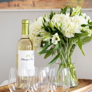
These clients loved the historic details of their classic Portland Bungalow, but wished for modern updates to improve livability. We were able to capture square footage to the kitchen by removing an unused chimney allowing us to increase additional work surface with the addition of a narrow island. Where traffic flow previously moved directly across the work triangle, the new layout keeps cooking activities within one zone of the kitchen and shifting traffic flow to another zone, allowing their daughter and four-legged family members to run through the space freely! High-end appliances create a luxury cooking experience. Crisp surfaces and colors create a light and bright space while classically sized crown and trim profiles draw the eye up and around the room offering a feeling of expanse in a modestly sized footprint. The blue and white color pallet offer a subtle reminder to coastal and tropical environments … the client’s favorite place to escape!
 Amy Pearson Design
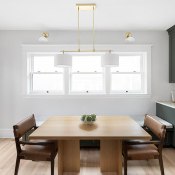
A classic Portland foursquare, lovingly owned by an active and lively family of four, had undergone some unfortunate previous renovations that were in desperate need of updating. A cramped kitchen layout, lacking countertop work space, non-functional appliance locations (the range was floating on it’s own!), cramped kitchen nook not large enough for eat-in space and therefor left underutilized, and a general lack of storage all needed to be addressed.
To increase functional space, we enclosed a small back porch and re-built the adjacent nook, folding in the square footage to create an expansive kitchen footprint. We relocated the back door and added a back deck while creating space for a mud bench for littles to tuck away their gear! The enlarged kitchen now boasts a extensive natural light thanks to the addition of several windows.
An easy work flow was created within the new kitchen layout featuring an in-island sink with range and hood flanked by matching windows. Custom cabinet accessories make storage a breeze and provide a space for all the necessities to be right at the homeowner’s fingertips. The eat-in kitchen space allows not only for lingering family chats, but homework and craft projects to be done while dinner simmers on the stove. This kitchen truly is the heart of this home!
All of the updates were completed with the home’s original foursquare architecture in mind. with a focus on classic architectural molding styles, traditional window details, and clean-lined classic fixtures. Youthfulness and modernity are infused into the space with the contemporary handmade tile backsplash, rich and timeless green cabinets, and artistic wallpaper with a whimsical floral print and subtle European nod. The custom range in cream and brass is a stunning showstopper and a testament that even the most functional of elements in a kitchen can still be beautiful! Which one is the star of the show? How do we pick just one?!
 Custom Design & Construction
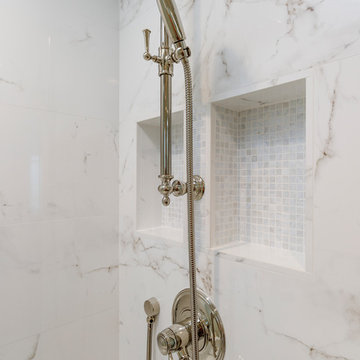
This South Bay project was completed in an elegant, traditional style with the intent to increase the functionality of the master suite while maintaining a timeless charm. Originally, this bathroom was cramped and crowded, so we designed a long, narrow counter space to maximize storage. For the large bedroom, we wanted to incorporate the client’s unique style into an open and spacious design. Our client has a beautiful collection of antiques which we repurposed in both the master bathroom and bedroom.
The countertops in the bathroom are made from antique marble. The tile pattern in the bathroom is subtle and compliments the Victorian-era gold accents. After the remodel, the bedroom is now a bright, inviting space with panoramic views of Los Angeles.
We loved working closely on this project with our client to create a space she felt was uniquely hers. This is a fabulous example of how the designers at Custom Design and Construction are dedicated to serving our clients so that they can love their home again.
 Custom Design & Construction
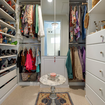
This South Bay project was completed in an elegant, traditional style with the intent to increase the functionality of the master suite while maintaining a timeless charm. Originally, this bathroom was cramped and crowded, so we designed a long, narrow counter space to maximize storage. For the large bedroom, we wanted to incorporate the client’s unique style into an open and spacious design. Our client has a beautiful collection of antiques which we repurposed in both the master bathroom and bedroom.
The countertops in the bathroom are made from antique marble. The tile pattern in the bathroom is subtle and compliments the Victorian-era gold accents. After the remodel, the bedroom is now a bright, inviting space with panoramic views of Los Angeles.
We loved working closely on this project with our client to create a space she felt was uniquely hers. This is a fabulous example of how the designers at Custom Design and Construction are dedicated to serving our clients so that they can love their home again.
12