
Search results for "Inefficient" in Home Design Ideas
 Kay Cosby Interiors
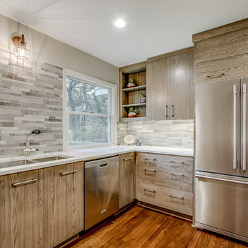
Historic homes are a hidden gem, and when this client approached me about remodeling her family home in one of the oldest neighborhoods in Dallas I
knew we had a diamond in the rough. Under many layers of vinyl tile and plywood, the kitchen floors revealed pristine hardwoods waiting to be brought to life. An inefficient vintage kitchen had begun to break down and cramp the client's style and productivity. Mullioned windows obstructed the client's view
and hindered her from connecting with nature. The detail elements such as soft arches transitioning from room to room were lost in a sea of white. This beloved home had become something it wasn't meant to be. Our goal was to help it welcome friends and family with open arms and provide a casual atmosphere in which to love, laugh and relax. We needed to transform it all; floors, walls, kitchen and bedrooms. We left no stone unturned until we had the perfect collaboration of traditional family heirlooms mixed in with a modern palette. New brown stained floors, grey European style cabinets, white quartz counters, textured backsplash tile, mullion free vinyl windows and an open floorplan modernized this kitchen while staying true to its natural roots. Neutral gray walls collaborate with dark accents in the arches to define their detail. Reupholstering the furniture in patterned fabrics updated each room to span the spectrum of traditional to modern. The curated collection of family antiques finished in new hues and newly acquired pieces create a space unique to and adored by this client. Photos by Zack Lewis of Showcase Photographers
 SHOWCASE -- Hastings, Nebraska
Talk about a dramatic transformation!!
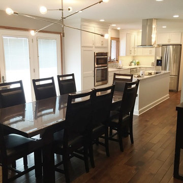
This Customer had a very large, but dark Kitchen & Dining Room. The original design of the Kitchen was very inefficient. Several cabinet doors couldn't open all the way for access into the cabinet. Counter space was broken up. The flow of both cooking and traffic through the Kitchen wasn't efficient. Lighting was dim. It wasn't a bright and cheery space where family gatherings could happen easily.
Now? This is the space where everyone congregates! You can definitely see why. Beautiful!! SHOWCASE is so thrilled for this customer's family to enjoy their lovely new spaces!!
__________________________________________
CABINETRY --
All Cabinetry is Homecrest Cabinetry by Masterbrand Cabinets. Maple wood with "Alpine" paint. The Cabinet door style is Lautner with slab drawer fronts. Hinges are 1/2" overlay. Drawer guides are Full-Extension with Soft-Close.
CABINET HARDWARE --
Hardware Resources / Jeffery Alexander Hardware in the "Sutton" series in a Brushed Nickel finish (Styles - 635-96SN, 635-128SN, 635-160SN)
KITCHEN COUNTERTOPS --
Cambria "Brittanica" quartz tops with an eased edge
Kitchen Sink is a Swanstone QURC3322 in "Metallico"
Kitchen Faucet is Moen "Align" 7565 in "Chrome"
Kitchen Soap is Moen S3947C in "Chrome"
 Robert Kutner Architect
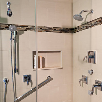
The clients are original owners of their contemporary home built in the early 80's'. Their master bath was inefficient with an oversized under-utilized tub with steps taking up 1/3 of the space and tall walls separating the vanity area from the enclosed shower, blocking potential views of the wooded lot. The new design maintained the original 8'x15' space with 10' ceilings. Interior walls were removed, a 54" corner whirlpool tub was installed adjacent to a 36" vanity and new windows with transoms replaced old drafty ones. New floating vanities with tall cabinets create the new ladies vanity area. The 3 sided, 2 person frameless shower enclosure is a highlight of the new space.
Photography by Curtis Martin
Find the right local pro for your project
 Kitchen & Bath Masters
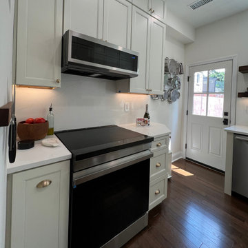
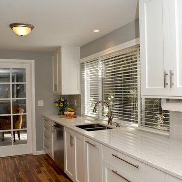
We rolled up our sleeves to transform the kitchen of our client’s charming but aging home in Washington, DC. The original kitchen featured worn-out, dated cabinetry and a layout that was both inefficient and impractical for modern living.
To breathe new life into the space, we replaced the old cabinets with brighter, contemporary cabinetry, instantly opening up the kitchen and making it feel more welcoming. We also reimagined the entire layout to create a design that is not only visually appealing but also highly functional for everyday use.
One of the most impactful changes was removing an old half-closed window and replacing it with a larger, modern window. This single upgrade dramatically increased the amount of natural light in the kitchen, creating a brighter, airier atmosphere and offering beautiful views outside.
To tie the kitchen into the rest of the home, we replaced the outdated vinyl flooring with engineered wood, blending seamlessly with the existing flooring throughout the house and adding warmth and character.
As part of the renovation, we also updated the powder room located within the kitchen space, giving it a fresh, modern look to match the newly remodeled kitchen.
Seeing our client so pleased with the final result made the entire project even more rewarding. We’re proud to have turned an old, dark kitchen into a functional, light-filled, and stylish heart of the home.
 Designer's Edge Kitchen & Bath
The homeowner's had been living with inefficient and worn-out cabinetry in their 1970's ranch. They had remodeled other spaces in their home and were now ready to take on their kitchen remodel themselves. We found cabinetry that was well made and within their budget and developed a plan for the stages of their remodel. Appliances, lighting and fixtures remained in their original location. The cabinetry was fitted with robust storage solutions to organize everything in a functional layout. The vinyl flooring was replaced with beautiful hardwood. The dynamic pattern gives this kitchen a lovely focal point.
PHOTOS: Sharon Olsen, Designer's Edge Kitchen & Bath
 Mom's Design Build
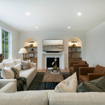
Built in 1992, this lakeside home was ready for a full renovation to match its scenic setting and the demands of modern living. The original layout felt dated and inefficient, so the remodel opened the space by replacing a pantry closet with a sleek pantry cabinet and adding a large window above the sink to flood the kitchen with light and views. An oversized closet became a stylish wet bar and butler’s pantry in rich alder, now a walk-through between the dining and living areas. Warm white oak floors, contrasting cabinetry, honed Borghini marble, and soapstone counters complete the sophisticated yet inviting kitchen design. The bathroom, laundry room, sitting room, front entry, and dining area were also updated in the home remodel. Welcome to Heart of Home.
 Lindus Construction/Midwest LeafGuard
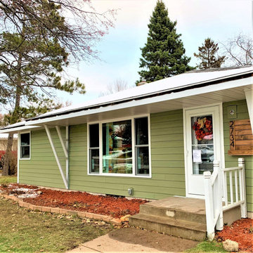
Rachel opted to replace her home’s worn-out energy inefficient siding with olive LP® SmartSide® prefinished in Diamond Kote®. This combination offers both attractiveness and reassurance, as the siding is backed by a 30-Year No Fade Warranty.
the narrow profiles of Infinity® from Marvin windows allow for expanded views. In all, our craftsmen replaced ten windows in Rachel’s home.
 LBK Design Build
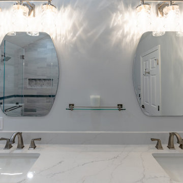
This Primary Suite renovation was designed to enhance both functionality and aesthetics, creating a luxurious yet practical retreat. The original floor plan presented several challenges, including inefficient space utilization, lack of storage, and outdated design elements that no longer met the homeowner’s needs. To address these concerns, the new layout was carefully planned to improve flow, maximize storage, and incorporate modern conveniences while maintaining a timeless appeal.
 GMI Design Group
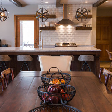
This kitchen was once closed off with two small doors and an odd-shaped peninsula. The cabinetry and tile floor was dated and the arrangement was inefficient.
We moved the wall between the adjoining living room and enlarged the opening, framing it in faux wood beams. Beams were also added to the kitchen. The living area became a large dining room with a custom chandelier and red metal cross back chairs. An 11 foot walnut island can seat 8 and has quartz countertops and a stainless undermount farmhouse apron sink.
Beveled subway tile with grey grout lines the walls and floating rustic shelves flank the modern stainless range hood. Undercabinet lighting and USB outlets give functionality to the desk area. Grey wood and metal swivel bar stools add slim, clean seating.
Rustic wood flooring was added throughout the main level.
 Legacy Builders Group
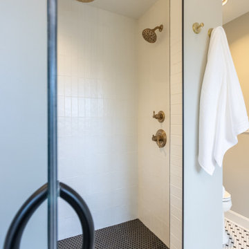
This Wyoming master bath felt confined with an
inefficient layout. Although the existing bathroom
was a good size, an awkwardly placed dividing
wall made it impossible for two people to be in
it at the same time.
Taking down the dividing wall made the room
feel much more open and allowed warm,
natural light to come in. To take advantage of
all that sunshine, an elegant soaking tub was
placed right by the window, along with a unique,
black subway tile and quartz tub ledge. Adding
contrast to the dark tile is a beautiful wood vanity
with ultra-convenient drawer storage. Gold
fi xtures bring warmth and luxury, and add a
perfect fi nishing touch to this spa-like retreat.

 Horwitz A+D
[?????? ??????????] At the intersection of art and architecture lives our Mobile Greenhouse. This seeming love-child of tom fruin & olson kundig was assembled with salvaged pieces including Sunkist-steel-factory windows, a motorcycle trailer, an old factory hand wheel, a rooftop solar water tank, a kid’s single speed bicycle front/rear sprockets, a chain from a retractable entry gate along with new metal stock from @ims_metals and beautiful art glass from @pacificartglass. p.c. Gary Moss Photography
Function is elevated through beauty and now our herb garden is protected from the adorable bunnies of this Conejo Valley while the structure throws pools of liquid blue and green on the DG. All while re-using leftover parts, some of a bygone era. (Sigh. Oh, single-paned steel windows, we love you - even though you are completely energy inefficient) The parabolic angle-iron arch was critical to the design so we sallied forth through the tantrums it caused. As lovers of #stainedglass in general, we loved seeing this larger scale project come together.
 Jordan Design Build Group
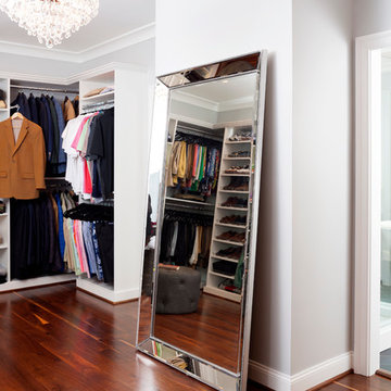
JDBG created an expansive and tailored new master bathroom/closet/dressing area by reclaiming wasted space from an inefficient and dated bathroom layout.
Stacy Zarin Goldberg Photography
 Irene Designs
Mudroom — Project Description (Bolton, CT)
(Reconfiguration • Custom Storage • Functional Entry Design)
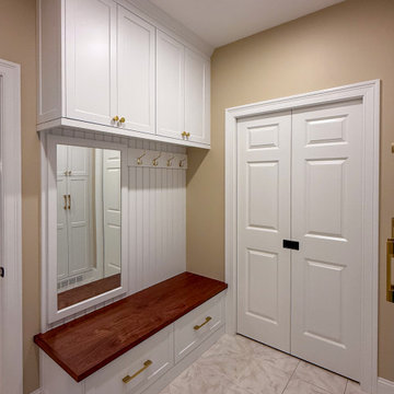
The original mudroom layout was cramped and inefficient, offering minimal storage and poor traffic flow. The garage door opened directly into a wall, the single corner closet provided limited accessibility to its sides, and there was no place for shoes, coats, or everyday landing items. The space lacked both organization and visual appeal.
Key Issues in the Old Layout
Garage door swung into a side wall, restricting movement
Small corner closet with poor left/right access and inadequate capacity
No dedicated shoe storage
No seating or landing surface
No mirror, making the space feel smaller and less functional
Overall layout did not support daily use or family workflow
New Layout & Built-In Storage Solutions
The mudroom was completely reconfigured to create a balanced, efficient, and visually cohesive entry zone that supports everyday routines and maximizes available space.
Wall-to-Wall Back Closet
Full-width custom closet spans the entire back wall
Equipped with double pocket doors for effortless access without blocking circulation
Interior fitted with coat hanging space and top shelving for seasonal items
Full-Height Shoe & Accessory Storage
A dedicated tall cabinet provides:
Bottom half: organized shoe storage
Top half: adjustable shelves for accessories, baskets, or household essentials
Built-In Combo Opposite the Closet
A custom multifunctional unit includes:
Walnut bench top for warmth, texture, and a natural design element
Two deep drawers beneath the bench for gloves, hats, pet items, etc.
Full-height mirror strategically placed to visually expand the room
Open hanging storage for quick-access items
Upper enclosed cabinet with adjustable shelving for concealed storage
Additional Enhancements
The garage door swing was reversed for proper ergonomics and easier entry
Added crown molding throughout the space for a cohesive, finished look consistent with the rest of the renovation
Upgraded lighting brightens the room and enhances the sense of cleanliness and order
 Corinthian Fine Homes
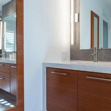
Our homeowner had worked with us in the past and asked us to design and renovate their 1980’s style master bathroom and closet into a modern oasis with a more functional layout. The original layout was chopped up and an inefficient use of space. Keeping the windows where they were, we simply swapped the vanity and the tub, and created an enclosed stool room. The shower was redesigned utilizing a gorgeous tile accent wall which was also utilized on the tub wall of the bathroom. A beautiful free-standing tub with modern tub filler were used to modernize the space and added a stunning focal point in the room. Two custom tall medicine cabinets were built to match the vanity and the closet cabinets for additional storage in the space with glass doors. The closet space was designed to match the bathroom cabinetry and provide closed storage without feeling narrow or enclosed. The outcome is a striking modern master suite that is not only functional but captures our homeowners’ great style
 AMS Fireplace, Inc.
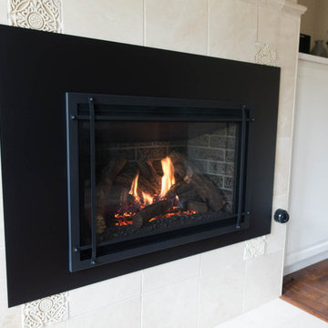
The Chaska 34 is a perfect fit for both your space and your lifestyle. With the traditional look and ease of a gas fireplace, it's the best of both worlds.
The Chaska 34 gas insert is completely airtight and is the perfect solution to your inefficient wood fireplace.
Why not have the reliability that you depend on and the look you love, all in one?
 SHOWCASE -- Hastings, Nebraska
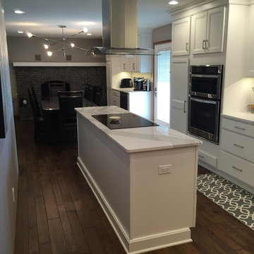
Talk about a dramatic transformation!!
This Customer had a very large, but dark Kitchen & Dining Room. The original design of the Kitchen was very inefficient. Several cabinet doors couldn't open all the way for access into the cabinet. Counter space was broken up. The flow of both cooking and traffic through the Kitchen wasn't efficient. Lighting was dim. It wasn't a bright and cheery space where family gatherings could happen easily.
Now? This is the space where everyone congregates! You can definitely see why. Beautiful!! SHOWCASE is so thrilled for this customer's family to enjoy their lovely new spaces!!
__________________________________________
CABINETRY --
All Cabinetry is Homecrest Cabinetry by Masterbrand Cabinets. Maple wood with "Alpine" paint. The Cabinet door style is Lautner with slab drawer fronts. Hinges are 1/2" overlay. Drawer guides are Full-Extension with Soft-Close.
CABINET HARDWARE --
Hardware Resources / Jeffery Alexander Hardware in the "Sutton" series in a Brushed Nickel finish (Styles - 635-96SN, 635-128SN, 635-160SN)
KITCHEN COUNTERTOPS --
Cambria "Brittanica" quartz tops with an eased edge
Kitchen Sink is a Swanstone QURC3322 in "Metallico"
Kitchen Faucet is Moen "Align" 7565 in "Chrome"
Kitchen Soap is Moen S3947C in "Chrome"
 Re-Mix Home Designs
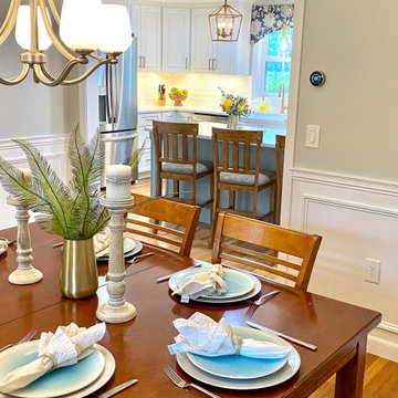
This kitchen was transformed from a dark, inefficient space into a bright welcoming area full of countertop space and storage. Accented with brass fixtures, lighting and hardware this transitional meets modern farmhouse kitchen space now offers this family lots of new amenities such as a 4-seat island, coffee/entertaining bar area as well as tons of storage. Two lantern style lights are the perfect touch to this 7' island space. Before opening up the doorway, the kitchen felt cut off from the dining room. The small enhancement creates a cohesive space.
 Robert Kutner Architect
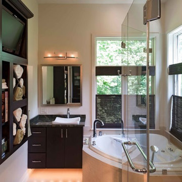
The clients are original owners of their contemporary home built in the early 80's'. Their master bath was inefficient with an oversized under-utilized tub with steps taking up 1/3 of the space and tall walls separating the vanity area from the enclosed shower, blocking potential views of the wooded lot. The new design maintained the original 8'x15' space with 10' ceilings. Interior walls were removed, a 54" corner whirlpool tub was installed adjacent to a 36" vanity and new windows with transoms replaced old drafty ones. New floating vanities with tall cabinets create the new ladies vanity area. The 3 sided, 2 person frameless shower enclosure is a highlight of the new space.
Photography by Curtis Martin
 Saikley Architects
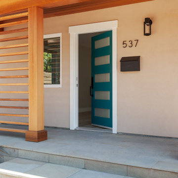
The clients wanted to update their ranch house and make good use of their unusually large site next to downtown Mountain View. We sketched several options for design and scope of work to assess feasibility and value to the clients.
The chosen design retains an existing bedroom wing, while the layout of the living spaces is re-worked to an open plan flooded with light, with vaulted ceilings and strong indoor-outdoor connection to a yard optimized for outdoor living. Awkward angles and inefficient spaces of the former house have been replaced with a clear, simple floor plan designed for ease of everyday living.
One end of the site is used for a two-bedroom ADU (Accessory Dwelling Unit) with its own face to the street and its own back yard. Income from the ADU will go a long way toward financing the rebuild of the main house.
Photography: Kurt Manley
https://saikleyarchitects.com/portfolio/open-ranch-adu/
 Mom's Design Build
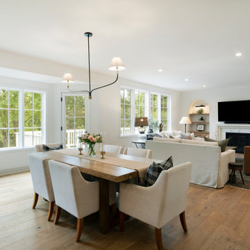
Built in 1992, this lakeside home was ready for a full renovation to match its scenic setting and the demands of modern living. The original layout felt dated and inefficient, so the remodel opened the space by replacing a pantry closet with a sleek pantry cabinet and adding a large window above the sink to flood the kitchen with light and views. An oversized closet became a stylish wet bar and butler’s pantry in rich alder, now a walk-through between the dining and living areas. Warm white oak floors, contrasting cabinetry, honed Borghini marble, and soapstone counters complete the sophisticated yet inviting kitchen design. The bathroom, laundry room, sitting room, front entry, and dining area were also updated in the home remodel. Welcome to Heart of Home.
42