
Search results for "Inefficient" in Home Design Ideas
 TVL Creative Ltd.
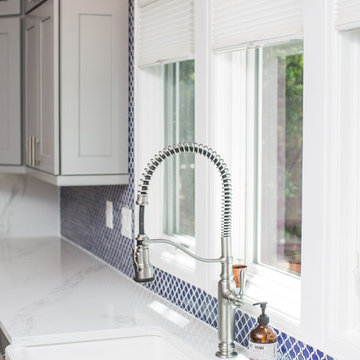
This project is an incredible transformation and the perfect example of successful style mixing! This client, and now a good friend of TVL (as they all become), is a wonderfully eclectic and adventurous one with immense interest in texture play, pops of color, and unique applications. Our scope in this home included a full kitchen renovation, main level powder room renovation, and a master bathroom overhaul. Taking just over a year to complete from the first design phases to final photos, this project was so insanely fun and packs an amazing amount of fun details and lively surprises. The original kitchen was large and fairly functional. However, the cabinetry was dated, the lighting was inefficient and frankly ugly, and the space was lacking personality in general. Our client desired maximized storage and a more personalized aesthetic. The existing cabinets were short and left the nice height of the space under-utilized. We integrated new gray shaker cabinets from Waypoint Living Spaces and ran them to the ceiling to really exaggerate the height of the space and to maximize usable storage as much as possible. The upper cabinets are glass and lit from within, offering display space or functional storage as the client needs. The central feature of this space is the large cobalt blue range from Viking as well as the custom made reclaimed wood range hood floating above. The backsplash along this entire wall is vertical slab of marble look quartz from Pental Surfaces. This matches the expanse of the same countertop that wraps the room. Flanking the range, we installed cobalt blue lantern penny tile from Merola Tile for a playful texture that adds visual interest and class to the entire room. We upgraded the lighting in the ceiling, under the cabinets, and within cabinets--we also installed accent sconces over each window on the sink wall to create cozy and functional illumination. The deep, textured front Whitehaven apron sink is a dramatic nod to the farmhouse aesthetic from KOHLER, and it's paired with the bold and industrial inspired Tournant faucet, also from Kohler. We finalized this space with other gorgeous appliances, a super sexy dining table and chair set from Room & Board, the Paxton dining light from Pottery Barn and a small bar area and pantry on the far end of the space. In the small powder room on the main level, we converted a drab builder-grade space into a super cute, rustic-inspired washroom. We utilized the Bonner vanity from Signature Hardware and paired this with the cute Ashfield faucet from Pfister. The most unique statements in this room include the water-drop light over the vanity from Shades Of Light, the copper-look porcelain floor tile from Pental Surfaces and the gorgeous Cashmere colored Tresham toilet from Kohler. Up in the master bathroom, elegance abounds. Using the same footprint, we upgraded everything in this space to reflect the client's desire for a more bright, patterned and pretty space. Starting at the entry, we installed a custom reclaimed plank barn door with bold large format hardware from Rustica Hardware. In the bathroom, the custom slate blue vanity from Tharp Cabinet Company is an eye catching statement piece. This is paired with gorgeous hardware from Amerock, vessel sinks from Kohler, and Purist faucets also from Kohler. We replaced the old built-in bathtub with a new freestanding soaker from Signature Hardware. The floor tile is a bold, graphic porcelain tile with a classic color scheme. The shower was upgraded with new tile and fixtures throughout: new clear glass, gorgeous distressed subway tile from the Castle line from TileBar, and a sophisticated shower panel from Vigo. We finalized the space with a small crystal chandelier and soft gray paint. This project is a stunning conversion and we are so thrilled that our client can enjoy these personalized spaces for years to come.
 Robert Kutner Architect
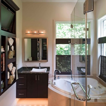
The clients are original owners of their contemporary home built in the early 80's'. Their master bath was inefficient with an oversized under-utilized tub with steps taking up 1/3 of the space and tall walls separating the vanity area from the enclosed shower, blocking potential views of the wooded lot. The new design maintained the original 8'x15' space with 10' ceilings. Interior walls were removed, a 54" corner whirlpool tub was installed adjacent to a 36" vanity and new windows with transoms replaced old drafty ones. New floating vanities with tall cabinets create the new ladies vanity area. The 3 sided, 2 person frameless shower enclosure is a highlight of the new space.
Photography by Curtis Martin
 Saikley Architects
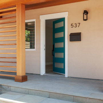
The clients wanted to update their ranch house and make good use of their unusually large site next to downtown Mountain View. We sketched several options for design and scope of work to assess feasibility and value to the clients.
The chosen design retains an existing bedroom wing, while the layout of the living spaces is re-worked to an open plan flooded with light, with vaulted ceilings and strong indoor-outdoor connection to a yard optimized for outdoor living. Awkward angles and inefficient spaces of the former house have been replaced with a clear, simple floor plan designed for ease of everyday living.
One end of the site is used for a two-bedroom ADU (Accessory Dwelling Unit) with its own face to the street and its own back yard. Income from the ADU will go a long way toward financing the rebuild of the main house.
Photography: Kurt Manley
https://saikleyarchitects.com/portfolio/open-ranch-adu/
Find the right local pro for your project
 Advance Design Studio, Ltd.
This primary bathroom was transformed from an underused, inefficient space into a luxurious retreat designed for everyday wellness. The homeowners wanted the feeling of a dark, relaxing, moody resort with the function of a private spa. Their favorite features of the new space include the steam shower, dual shower heads, sauna, cold plunge, benches, warm wood details, dramatic tile, and thoughtful lighting. Our design-build team guided the project from design through completed construction, creating a cohesive space that flows beautifully with the bedroom. The result is a high-performing wellness suite that the homeowners now use and enjoy daily.
 Turnstyle Design
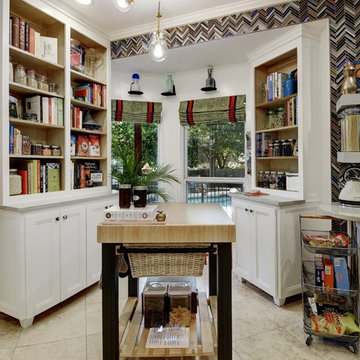
A long overdue renovation was needed for this kitchen. Belonging to a chef, it was cramped, inefficient and difficult to work in. Turnstyle came in and opened up walls, bringing in much more natural light, improving flow and removing previous space constraints. With floor to ceiling glass tile in a gorgeous palette and herringbone pattern, we emphasized the extra-large pass-through we created, with now full view to the pool and what we turned into the now dining room. Custom cabinetry and countertops, feel easy for kids to find their place and wallpaper adds whimsy surrounding a wonderful open pantry area – perfect for any chef to feel fully inspired. | Twist Tours Photography
 Corinthian Fine Homes
This homeowner loved her home, loved the location, but it needed updating and a more efficient use of the condensed space she had for her master bedroom/bath.
She was desirous of a spa-like master suite that not only used all spaces efficiently but was a tranquil escape to enjoy.
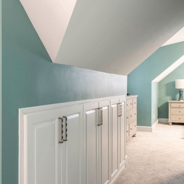
Her master bathroom was small, dated and inefficient with a corner shower and she used a couple small areas for storage but needed a more formal master closet and designated space for her shoes. Additionally, we were working with severely sloped ceilings in this space, which required us to be creative in utilizing the space for a hallway as well as prized shoe storage while stealing space from the bedroom. She also asked for a laundry room on this floor, which we were able to create using stackable units. Custom closet cabinetry allowed for closed storage and a fun light fixture complete the space. Her new master bathroom allowed for a large shower with fun tile and bench, custom cabinetry with transitional plumbing fixtures, and a sliding barn door for privacy.
 Castle Building & Remodeling
This South Minneapolis family bathroom was pretty groovy before Castle arrived! Old shiny wallpaper, outdated and crumbling tile and an inefficient floor plan were not serving this growing family any longer.
A new floor plan opened up the natural light to the entire bathroom and allowed a much-desired double vanity to be installed. The homeowners wanted direct access from their master bedroom as well, so a new door opening was created for easier access without disturbing the rest of the household.
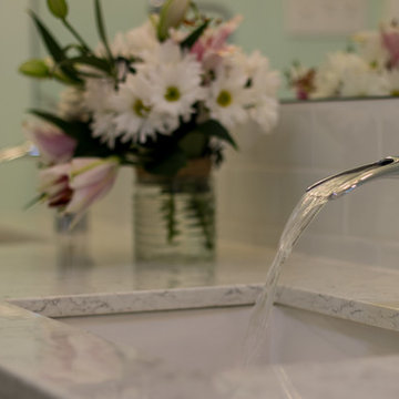
A bright space was important to the homeowners, so a solar tube was installed with an integral bath fan. The old window was converted to more private glass block, and a wall of mirror was added to reflect natural light throughout the space and to make the space feel bigger. A fresh, transitional color scheme was chosen with timeless materials like marble and white.
 Lundin Architects LLC
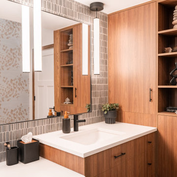
An under used whirlpool tub and inefficient layout were rectified by removing the tub and outdated glass block shower to create a generous walk-in shower area and dual vanity with built ins for storage. Woods and textured materials add warmth and sophistication to the space.
 Re-Mix Home Designs
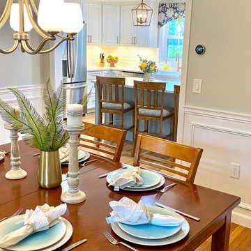
This kitchen was transformed from a dark, inefficient space into a bright welcoming area full of countertop space and storage. Accented with brass fixtures, lighting and hardware this transitional meets modern farmhouse kitchen space now offers this family lots of new amenities such as a 4-seat island, coffee/entertaining bar area as well as tons of storage. Two lantern style lights are the perfect touch to this 7' island space. Before opening up the doorway, the kitchen felt cut off from the dining room. The small enhancement creates a cohesive space.
 ALL Renovation & Design LLC
Mrs. Deighan loved to cook, but hated her kitchen.
It was nonfunctional, inefficient, and an eyesore.
The sink was in the corner under low cabinets. The awkwardly placed fridge made it impractical for the entire family to be working together.
And that was a big deal.
She wanted a beautiful place to cook and entertain.
Besides the cramped space, the old, brown plywood cabinets were falling apart.
Because the cabinets were low, under-cabinet lighting was useless.
The kitchen was dark.
The previous owners had updated the flooring, but only by putting uglier tiles over the old vinyl.
And the ceiling had a leak stain.
It was time for a big change.
The Deighan's called Amos from ALL Renovation & Design.
Amos’s many successful remodeling projects done for them over the years had forged a friendship that made him the obvious contractor of choice.
Amos sat down with them and asked them to make a dream kitchen list.
If budget were of no concern, what would the space look like?
Once the Deighan's had their list, Amos helped them to evaluate each investment, taking into consideration the age and value of the home.
Then Amos presented a plan that fit perfectly in the Deighan's budget.
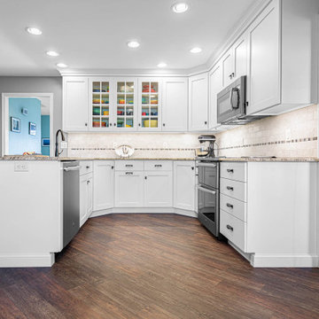
The basic U-shaped kitchen layout stayed the same.
Modern, creamy white custom cabinets replaced the dark plywood cabinets.
The fridge moved to make space for more cabinets.
The biggest challenge was moving the laundry room wall a few feet.
Moving it was necessary to add more space, but, since the wall was load-bearing, moving it required extra attention.
It was worth it.
Extra space allowed the counter to extend and the sink to move.
After the hard work ended, the reason for the transformation became reality.
Now “we can have the whole family in there comfortably and working together,” Mrs. Deighan said.
She loves her kitchen.
Especially the windowed cabinets that show off her fiestaware.
And when you see the beautiful St. Cecilia granite countertops, with Milstone Sari porcelain mosaic tile backsplash, maple flat-panel cabinets with under-cabinet lighting, and all new appliances including a double oven, you will see why she does.
 TVL Creative Ltd.
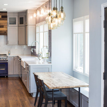
This project is an incredible transformation and the perfect example of successful style mixing! This client, and now a good friend of TVL (as they all become), is a wonderfully eclectic and adventurous one with immense interest in texture play, pops of color, and unique applications. Our scope in this home included a full kitchen renovation, main level powder room renovation, and a master bathroom overhaul. Taking just over a year to complete from the first design phases to final photos, this project was so insanely fun and packs an amazing amount of fun details and lively surprises. The original kitchen was large and fairly functional. However, the cabinetry was dated, the lighting was inefficient and frankly ugly, and the space was lacking personality in general. Our client desired maximized storage and a more personalized aesthetic. The existing cabinets were short and left the nice height of the space under-utilized. We integrated new gray shaker cabinets from Waypoint Living Spaces and ran them to the ceiling to really exaggerate the height of the space and to maximize usable storage as much as possible. The upper cabinets are glass and lit from within, offering display space or functional storage as the client needs. The central feature of this space is the large cobalt blue range from Viking as well as the custom made reclaimed wood range hood floating above. The backsplash along this entire wall is vertical slab of marble look quartz from Pental Surfaces. This matches the expanse of the same countertop that wraps the room. Flanking the range, we installed cobalt blue lantern penny tile from Merola Tile for a playful texture that adds visual interest and class to the entire room. We upgraded the lighting in the ceiling, under the cabinets, and within cabinets--we also installed accent sconces over each window on the sink wall to create cozy and functional illumination. The deep, textured front Whitehaven apron sink is a dramatic nod to the farmhouse aesthetic from KOHLER, and it's paired with the bold and industrial inspired Tournant faucet, also from Kohler. We finalized this space with other gorgeous appliances, a super sexy dining table and chair set from Room & Board, the Paxton dining light from Pottery Barn and a small bar area and pantry on the far end of the space. In the small powder room on the main level, we converted a drab builder-grade space into a super cute, rustic-inspired washroom. We utilized the Bonner vanity from Signature Hardware and paired this with the cute Ashfield faucet from Pfister. The most unique statements in this room include the water-drop light over the vanity from Shades Of Light, the copper-look porcelain floor tile from Pental Surfaces and the gorgeous Cashmere colored Tresham toilet from Kohler. Up in the master bathroom, elegance abounds. Using the same footprint, we upgraded everything in this space to reflect the client's desire for a more bright, patterned and pretty space. Starting at the entry, we installed a custom reclaimed plank barn door with bold large format hardware from Rustica Hardware. In the bathroom, the custom slate blue vanity from Tharp Cabinet Company is an eye catching statement piece. This is paired with gorgeous hardware from Amerock, vessel sinks from Kohler, and Purist faucets also from Kohler. We replaced the old built-in bathtub with a new freestanding soaker from Signature Hardware. The floor tile is a bold, graphic porcelain tile with a classic color scheme. The shower was upgraded with new tile and fixtures throughout: new clear glass, gorgeous distressed subway tile from the Castle line from TileBar, and a sophisticated shower panel from Vigo. We finalized the space with a small crystal chandelier and soft gray paint. This project is a stunning conversion and we are so thrilled that our client can enjoy these personalized spaces for years to come.
 AMS Fireplace, Inc.
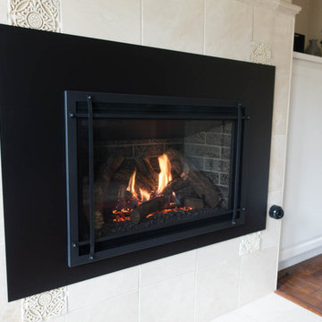
The Chaska 34 is a perfect fit for both your space and your lifestyle. With the traditional look and ease of a gas fireplace, it's the best of both worlds.
The Chaska 34 gas insert is completely airtight and is the perfect solution to your inefficient wood fireplace.
Why not have the reliability that you depend on and the look you love, all in one?
 SHOWCASE -- Hastings, Nebraska
Talk about a dramatic transformation!!
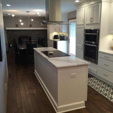
This Customer had a very large, but dark Kitchen & Dining Room. The original design of the Kitchen was very inefficient. Several cabinet doors couldn't open all the way for access into the cabinet. Counter space was broken up. The flow of both cooking and traffic through the Kitchen wasn't efficient. Lighting was dim. It wasn't a bright and cheery space where family gatherings could happen easily.
Now? This is the space where everyone congregates! You can definitely see why. Beautiful!! SHOWCASE is so thrilled for this customer's family to enjoy their lovely new spaces!!
__________________________________________
CABINETRY --
All Cabinetry is Homecrest Cabinetry by Masterbrand Cabinets. Maple wood with "Alpine" paint. The Cabinet door style is Lautner with slab drawer fronts. Hinges are 1/2" overlay. Drawer guides are Full-Extension with Soft-Close.
CABINET HARDWARE --
Hardware Resources / Jeffery Alexander Hardware in the "Sutton" series in a Brushed Nickel finish (Styles - 635-96SN, 635-128SN, 635-160SN)
KITCHEN COUNTERTOPS --
Cambria "Brittanica" quartz tops with an eased edge
Kitchen Sink is a Swanstone QURC3322 in "Metallico"
Kitchen Faucet is Moen "Align" 7565 in "Chrome"
Kitchen Soap is Moen S3947C in "Chrome"
 Dwellify
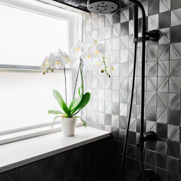
In this home remodeling project, the homeowners sought to transform their bathroom into an Industrial-style space. The original bathroom was dark, dated, and inefficient in its layout, prompting a complete overhaul to achieve a modern and functional feel. To optimize the space, unnecessary walls were knocked down, opening the area and allowing for a more logical flow. To preserve some of the home's historical elements, carefully selected materials were used, seamlessly blending the old with the new. A distinctive feature of the design was the incorporation of exposed pipes, not only as an industrial aesthetic element but also to create more space in the shower. The result is a bathroom that pays homage to the history of the home while introducing eye-catching tiles and a stylish vanity area, successfully combining industrial design elements with the practicality and aesthetics desired by the homeowners.
 KCBR Design | Remodel
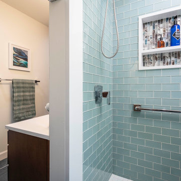
What was once an awkward and inefficient primary bathroom is now a space designed to truly function. The original doorway cut directly into the vanity, and a built in tub consumed valuable square footage, limiting both storage and circulation.
By relocating the entry and reworking the layout, we were able to create a more natural flow. An upgraded shower and a large double oak vanity with thoughtful storage solutions now anchor the space, making daily routines seamless. Heated terrazzo floors add comfort underfoot, while streamlined plumbing fixtures bring a clean, intentional finish to the design.
In the guest bathroom, we moved beyond purely functional and introduced color, pattern, and layered texture to create a space that feels personal and inviting.
Hearing our client share that this remodel has genuinely improved her quality of life is exactly why we do what we do. The result is a cohesive primary and guest bathroom renovation that balances beauty, comfort, and everyday function.
 Corinthian Fine Homes
This couple approached us to design and renovate their existing master suite on their adorable Broad Ripple area home. Their goals were to update, open up and improve the function of their space. The ceilings were very low and the space was tight with an inefficient master bath and separate closet. We began by removing the ceiling and providing a high cathedral space for an expanded feel in the bedroom. We removed a side door and picture window and installed a sliding glass door to improve the natural lighting of the space and allow access to their landscaped patio on the back of the home. We stole space from the large master bedroom and eliminated the door that led into the closet, to allow for a larger bathroom and walk-in master closet with dressing area. This permitted a larger shower with a bench and the addition of a make-up vanity area. We also enlarged the window in the bathroom to allow more natural light into the space. The final design element was a floating step outside the sliding door onto their patio which is clean, modern and enhances the entrance to their serene master suite from the exterior.
 Jordan Design Build Group
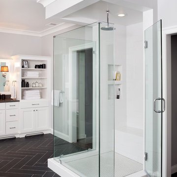
JDBG created an expansive and tailored new master bathroom/closet/dressing area by reclaiming wasted space from an inefficient and dated bathroom layout.
Stacy Zarin Goldberg Photography
 INSPIRED KITCHEN DESIGN
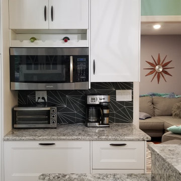
The U-shape of the kitchen — once a source of inefficiency — now functions smoothly with plenty of storage options with IKEA AXSTAD base cabinetry and MAXIMERA drawers. This base cabinetry runs from the oven to the dishwasher, with plenty of options for eating and cooking utensils, extra plates and linens, for example. There is also an additional bank of cabinetry next to the coffee station (and above it) which serves as a pantry and additional storage as well.
 Horwitz A+D
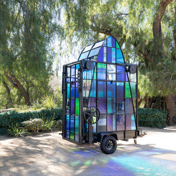
[?????? ??????????] At the intersection of art and architecture lives our Mobile Greenhouse. This seeming love-child of tom fruin & olson kundig was assembled with salvaged pieces including Sunkist-steel-factory windows, a motorcycle trailer, an old factory hand wheel, a rooftop solar water tank, a kid’s single speed bicycle front/rear sprockets, a chain from a retractable entry gate along with new metal stock from @ims_metals and beautiful art glass from @pacificartglass. p.c. Gary Moss Photography
Function is elevated through beauty and now our herb garden is protected from the adorable bunnies of this Conejo Valley while the structure throws pools of liquid blue and green on the DG. All while re-using leftover parts, some of a bygone era. (Sigh. Oh, single-paned steel windows, we love you - even though you are completely energy inefficient) The parabolic angle-iron arch was critical to the design so we sallied forth through the tantrums it caused. As lovers of #stainedglass in general, we loved seeing this larger scale project come together.
 Mom's Design Build
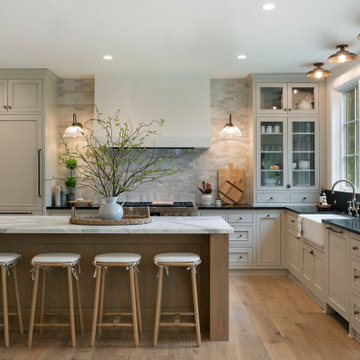
Built in 1992, this lakeside home was ready for a full renovation to match its scenic setting and the demands of modern living. The original layout felt dated and inefficient, so the remodel opened the space by replacing a pantry closet with a sleek pantry cabinet and adding a large window above the sink to flood the kitchen with light and views. An oversized closet became a stylish wet bar and butler’s pantry in rich alder, now a walk-through between the dining and living areas. Warm white oak floors, contrasting cabinetry, honed Borghini marble, and soapstone counters complete the sophisticated yet inviting kitchen design. The bathroom, laundry room, sitting room, front entry, and dining area were also updated in the home remodel. Welcome to Heart of Home.
44