
Search results for "Initially" in Home Design Ideas
 LABLstudio
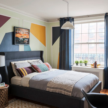
A West Village Bachelor pad bedroom, featuring a hand-painted geometric design that highlights the pre-war features of the space, like the picture moldings. Additionally, because the client wanted both a work space and a place to put his TV (the pre-war wall could not hold a wall mounted tv!), we designed a custom desk/console piece out of reclaimed wood and metal hairpin legs that served both purposes, and fit the space perfectly.
Photos by Matthew Williams
 ASR DESIGN STUDIO
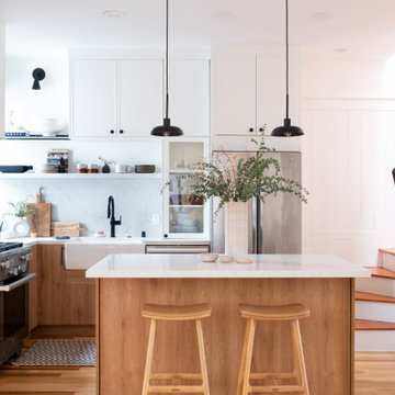
Built in 1907 and nestled into the beating heart of San Fran’s Bernal Heights neighbourhood, this adorable abode was an unpolished gem ready to be turned into our clients’ dream home.
Our mission was to gift Bonview with classic, natural and timeless style while setting it up with impressive functionality so that it was ready to be the pet-friendly, kid-friendly and entertaining-friendly home they needed it to be. Mission accepted!
Our clients’ vision was clear: They wanted whites, blacks and wood tones with texture and personality. Oh, and that spunky wine fridge? Yep, that was a non-negotiable. ?
“It’s not unusual for our friends and family to drop past unannounced any day of the week. And we love it!” They told us during our initial Design Therapy Sesh.
We knew immediately what she meant - we have an open-door policy with our families, too! Which was why we consciously created living spaces that were open, inviting and welcoming.
Now, the only problem our clients would have would be convincing their guests to leave!
Our clients also enjoyed cooking and baking casually, so we created an organized, intuitive and functional kitchen and pantry that made whipping up homemade dips and snacks for their game nights a breeze.
 Wentworth
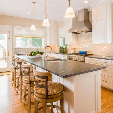
Elegant medium tone wood floor kitchen photo in DC Metro with an undermount sink, recessed-panel cabinets, white cabinets, white backsplash, subway tile backsplash and an island
Find the right local pro for your project
 WERK | Building Modern
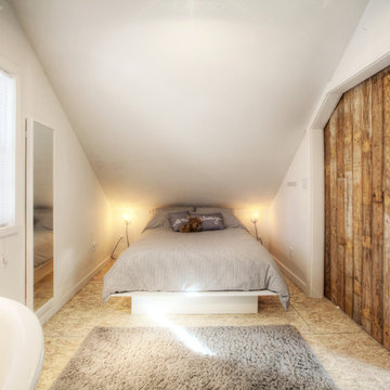
Carriage House loft bedroom shares space directly with open bathroom with barn door separation from loft kitchen/living space - Interior Architecture: HAUS | Architecture + BRUSFO - Construction Management: WERK | Build - Photo: HAUS | Architecture
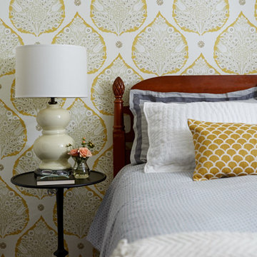
 Jill Cordner Interior Design
Photos by Liz Daly http://www.lizdaly.com/
Elegant dark wood floor bedroom photo in San Francisco with multicolored walls
Elegant dark wood floor bedroom photo in San Francisco with multicolored walls


 building Lab, inc.
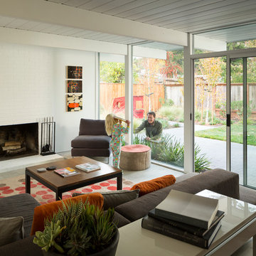
Eichler in Marinwood - In conjunction to the porous programmatic kitchen block as a connective element, the walls along the main corridor add to the sense of bringing outside in. The fin wall adjacent to the entry has been detailed to have the siding slip past the glass, while the living, kitchen and dining room are all connected by a walnut veneer feature wall running the length of the house. This wall also echoes the lush surroundings of lucas valley as well as the original mahogany plywood panels used within eichlers.
photo: scott hargis
 indi interiors
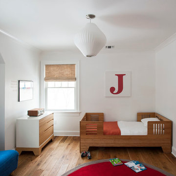
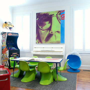
This kids room features a Wonk furniture set and a George Nelson ceiling light.
Matthew Willams Photography
Victoria Kirk Interiors Co-Designer
Kids' room - mid-sized transitional boy medium tone wood floor kids' room idea in Auckland with white walls
Kids' room - mid-sized transitional boy medium tone wood floor kids' room idea in Auckland with white walls
 Drewett Works
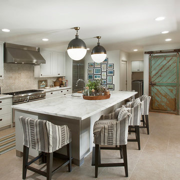
This Paradise Valley stunner was a down-to-the-studs renovation. The owner, a successful business woman and owner of Bungalow Scottsdale -- a fabulous furnishings store, had a very clear vision. DW's mission was to re-imagine the 1970's solid block home into a modern and open place for a family of three. The house initially was very compartmentalized including lots of small rooms and too many doors to count. With a mantra of simplify, simplify, simplify, Architect CP Drewett began to look for the hidden order to craft a space that lived well.
This residence is a Moroccan world of white topped with classic Morrish patterning and finished with the owner's fabulous taste. The kitchen was established as the home's center to facilitate the owner's heart and swagger for entertaining. The public spaces were reimagined with a focus on hospitality. Practicing great restraint with the architecture set the stage for the owner to showcase objects in space. Her fantastic collection includes a glass-top faux elephant tusk table from the set of the infamous 80's television series, Dallas.
It was a joy to create, collaborate, and now celebrate this amazing home.
Project Details:
Architecture: C.P. Drewett, AIA, NCARB; Drewett Works, Scottsdale, AZ
Interior Selections: Linda Criswell, Bungalow Scottsdale, Scottsdale, AZ
Photography: Dino Tonn, Scottsdale, AZ
Featured in: Phoenix Home and Garden, June 2015, "Eclectic Remodel", page 87.
 Dona Rosene Interiors
Michael Hunter
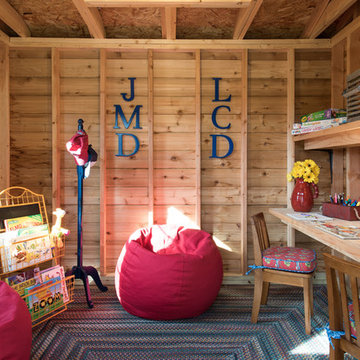
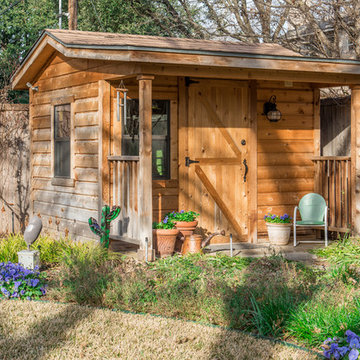
Inspiration for a small rustic gender-neutral concrete floor kids' room remodel in Dallas
Inspiration for a small rustic gender-neutral concrete floor kids' room remodel in Dallas
 Crisp Architects
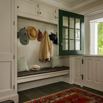
Entryway - country gray floor entryway idea in New York with beige walls and a white front door

 TKS Design Group
Download our free ebook, Creating the Ideal Kitchen. DOWNLOAD NOW
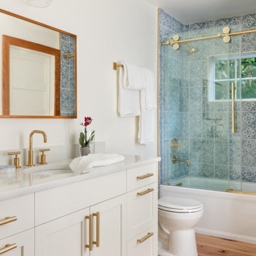
For many, extra time at home during COVID left them wanting more from their homes. Whether you realized the shortcomings of your space or simply wanted to combat boredom, a well-designed and functional home was no longer a want, it became a need. Tina found herself wanting more from her Old Irving Park home and reached out to The Kitchen Studio about adding function to her kitchen to make the most of the available real estate.
At the end of the day, there is nothing better than returning home to a bright and happy space you love. And this kitchen wasn’t that for Tina. Dark and dated, with a palette from the past and features that didn’t make the most of the available square footage, this remodel required vision and a fresh approach to the space. Lead designer, Stephanie Cole’s main design goal was better flow, while adding greater functionality with organized storage, accessible open shelving, and an overall sense of cohesion with the adjoining family room.
The original kitchen featured a large pizza oven, which was rarely used, yet its footprint limited storage space. The nearby pantry had become a catch-all, lacking the organization needed in the home. The initial plan was to keep the pizza oven, but eventually Tina realized she preferred the design possibilities that came from removing this cumbersome feature, with the goal of adding function throughout the upgraded and elevated space. Eliminating the pantry added square footage and length to the kitchen for greater function and more storage. This redesigned space reflects how she lives and uses her home, as well as her love for entertaining.
The kitchen features a classic, clean, and timeless palette. White cabinetry, with brass and bronze finishes, contrasts with rich wood flooring, and lets the large, deep blue island in Woodland’s custom color Harbor – a neutral, yet statement color – draw your eye.
The kitchen was the main priority. In addition to updating and elevating this space, Tina wanted to maximize what her home had to offer. From moving the location of the patio door and eliminating a window to removing an existing closet in the mudroom and the cluttered pantry, the kitchen footprint grew. Once the floorplan was set, it was time to bring cohesion to her home, creating connection between the kitchen and surrounding spaces.
The color palette carries into the mudroom, where we added beautiful new cabinetry, practical bench seating, and accessible hooks, perfect for guests and everyday living. The nearby bar continues the aesthetic, with stunning Carrara marble subway tile, hints of brass and bronze, and a design that further captures the vibe of the kitchen.
Every home has its unique design challenges. But with a fresh perspective and a bit of creativity, there is always a way to give the client exactly what they want [and need]. In this particular kitchen, the existing soffits and high slanted ceilings added a layer of complexity to the lighting layout and upper perimeter cabinets.
While a space needs to look good, it also needs to function well. This meant making the most of the height of the room and accounting for the varied ceiling features, while also giving Tina everything she wanted and more. Pendants and task lighting paired with an abundance of natural light amplify the bright aesthetic. The cabinetry layout and design compliments the soffits with subtle profile details that bring everything together. The tile selections add visual interest, drawing the eye to the focal area above the range. Glass-doored cabinets further customize the space and give the illusion of even more height within the room.
While her family may be grown and out of the house, Tina was focused on adding function without sacrificing a stunning aesthetic and dreamy finishes that make the kitchen the gathering place of any home. It was time to love her kitchen again, and if you’re wondering what she loves most, it’s the niche with glass door cabinetry and open shelving for display paired with the marble mosaic backsplash over the range and complimenting hood. Each of these features is a stunning point of interest within the kitchen – both brag-worthy additions to a perimeter layout that previously felt limited and lacking.
Whether your remodel is the result of special needs in your home or simply the excitement of focusing your energy on creating a fun new aesthetic, we are here for it. We love a good challenge because there is always a way to make a space better – adding function and beauty simultaneously.

 LeichtUSA
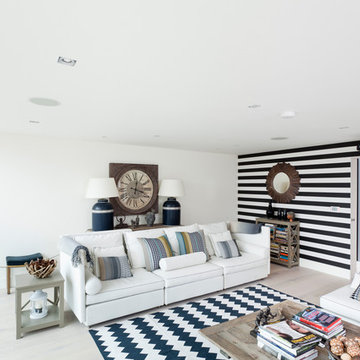
Attractive living as an architectural experiment: a 136-year-old water tower, a listed building with a spectacular 360-degree panorama view over the City of London. The task, to transform it into a superior residence, initially seemed an absolute impossibility. But when the owners came across architect Mike Collier, they had found a partner who was to make the impossible possible. The tower, which had been empty for decades, underwent radical renovation work and was extended by a four-storey cube containing kitchen, dining and living room - connected by glazed tunnels and a lift shaft. The kitchen, realised by Enclosure Interiors in Tunbridge Wells, Kent, with furniture from LEICHT is the very heart of living in this new building.
Shiny white matt-lacquered kitchen fronts (AVANCE-LR), tone-on-tone with the worktops, reflect the light in the room and thus create expanse and openness. The surface of the handle-less kitchen fronts has a horizontal relief embossing; depending on the light incidence, this results in a vitally structured surface. The free-standing preparation isle with its vertical side panels with a seamlessly integrated sink represents the transition between kitchen and living room. The fronts of the floor units facing the dining table were extended to the floor to do away with the plinth typical of most kitchens. Ceiling-high tall units on the wall provide plenty of storage space; the electrical appliances are integrated here invisible to the eye. Floor units on a high plinth which thus appear to be floating form the actual cooking centre within the kitchen, attached to the wall. A range of handle-less wall units concludes the glazed niche at the top.
LEICHT international: “Architecture and kitchen” in the centre of London. www.LeichtUSA.com
 TKS Design Group
Download our free ebook, Creating the Ideal Kitchen. DOWNLOAD NOW
For many, extra time at home during COVID left them wanting more from their homes. Whether you realized the shortcomings of your space or simply wanted to combat boredom, a well-designed and functional home was no longer a want, it became a need. Tina found herself wanting more from her Old Irving Park home and reached out to The Kitchen Studio about adding function to her kitchen to make the most of the available real estate.
At the end of the day, there is nothing better than returning home to a bright and happy space you love. And this kitchen wasn’t that for Tina. Dark and dated, with a palette from the past and features that didn’t make the most of the available square footage, this remodel required vision and a fresh approach to the space. Lead designer, Stephanie Cole’s main design goal was better flow, while adding greater functionality with organized storage, accessible open shelving, and an overall sense of cohesion with the adjoining family room.
The original kitchen featured a large pizza oven, which was rarely used, yet its footprint limited storage space. The nearby pantry had become a catch-all, lacking the organization needed in the home. The initial plan was to keep the pizza oven, but eventually Tina realized she preferred the design possibilities that came from removing this cumbersome feature, with the goal of adding function throughout the upgraded and elevated space. Eliminating the pantry added square footage and length to the kitchen for greater function and more storage. This redesigned space reflects how she lives and uses her home, as well as her love for entertaining.
The kitchen features a classic, clean, and timeless palette. White cabinetry, with brass and bronze finishes, contrasts with rich wood flooring, and lets the large, deep blue island in Woodland’s custom color Harbor – a neutral, yet statement color – draw your eye.
The kitchen was the main priority. In addition to updating and elevating this space, Tina wanted to maximize what her home had to offer. From moving the location of the patio door and eliminating a window to removing an existing closet in the mudroom and the cluttered pantry, the kitchen footprint grew. Once the floorplan was set, it was time to bring cohesion to her home, creating connection between the kitchen and surrounding spaces.
The color palette carries into the mudroom, where we added beautiful new cabinetry, practical bench seating, and accessible hooks, perfect for guests and everyday living. The nearby bar continues the aesthetic, with stunning Carrara marble subway tile, hints of brass and bronze, and a design that further captures the vibe of the kitchen.
Every home has its unique design challenges. But with a fresh perspective and a bit of creativity, there is always a way to give the client exactly what they want [and need]. In this particular kitchen, the existing soffits and high slanted ceilings added a layer of complexity to the lighting layout and upper perimeter cabinets.
While a space needs to look good, it also needs to function well. This meant making the most of the height of the room and accounting for the varied ceiling features, while also giving Tina everything she wanted and more. Pendants and task lighting paired with an abundance of natural light amplify the bright aesthetic. The cabinetry layout and design compliments the soffits with subtle profile details that bring everything together. The tile selections add visual interest, drawing the eye to the focal area above the range. Glass-doored cabinets further customize the space and give the illusion of even more height within the room.
While her family may be grown and out of the house, Tina was focused on adding function without sacrificing a stunning aesthetic and dreamy finishes that make the kitchen the gathering place of any home. It was time to love her kitchen again, and if you’re wondering what she loves most, it’s the niche with glass door cabinetry and open shelving for display paired with the marble mosaic backsplash over the range and complimenting hood. Each of these features is a stunning point of interest within the kitchen – both brag-worthy additions to a perimeter layout that previously felt limited and lacking.
Whether your remodel is the result of special needs in your home or simply the excitement of focusing your energy on creating a fun new aesthetic, we are here for it. We love a good challenge because there is always a way to make a space better – adding function and beauty simultaneously.
 Dayloom
This Kohlmark home leant itself perfectly to lighting.
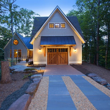
Inspiration for a large craftsman attached one-car garage remodel in DC Metro
Inspiration for a large craftsman attached one-car garage remodel in DC Metro

27