
Search results for "Initially" in Home Design Ideas
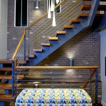
 Blue Heron Signature Homes
The initial and sole objective of setting the tone of this home began and was entirely limited to the foyer and stairwell to which it opens--setting the stage for the expectations, mood and style of this home upon first arrival. Designed and built by Terramor Homes in Raleigh, NC.
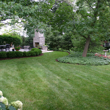
 Western DuPage Landscaping, Inc.
After years of enjoying their backyard, the clients of this property enlisted our firm to improve the original landscape we had completed over ten years ago. Our goal was to update the patio and further develop their backyard by creating a garden with a variety of color and texture.
Over time the existing patio had settled, plantings grew, and an existing Oak thrived. During the initial home and landscape construction our clients were particularly concerned about the health of the mature Oak located just off the home. Special care was given when the patio was first built. Precautions were again taken in working around the Oak as the existing patio was removed and replaced. Surrounding trees and shrubs had grown and enclosed the backyard limiting access. This required almost all work and transport of material to be done by hand.
The old concrete paver patio was replaced with bluestone. Existing mortared limestone around the edges of the patio levels were cleaned and tuck-pointed. A new stoop was constructed with mortared limestone risers and bluestone treads. A built-in grill and fireplace further updated the backyard space. The fireplace was designed to follow the organic curve of the patio. Mortared limestone and bluestone material were repeated on all elements, tying them together.
Along with the updated patio, many additions were made in transforming the modest backyard into a lush garden. Masses of annuals, ornamental grasses, and perennials along with mixed shrubs created sweeps of color and texture in front of a new arborvitae hedge and other existing trees and shrubs.
After careful planning and execution the completed landscape gave our clients the updated landscape they desired. The completion of the project was a rewarding and fulfilling experience as we transformed a good past project into a fantastic new project.
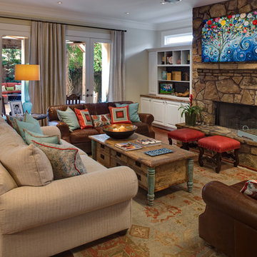
 Live Beautifully, LLC
Brightly colored coral and aqua accessories and life to this rustic family room.
photography by Michael Hart
Large mountain style open concept dark wood floor family room photo in Houston with a stone fireplace, a wall-mounted tv, beige walls and a standard fireplace
Large mountain style open concept dark wood floor family room photo in Houston with a stone fireplace, a wall-mounted tv, beige walls and a standard fireplace
Find the right local pro for your project
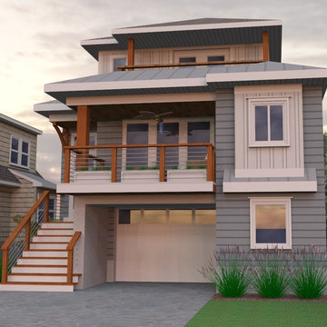
 Chaser Gaffney Architecture + Construction
Inspiration for a mid-sized transitional gray three-story mixed siding exterior home remodel in Other
 Kathleen Jennison
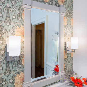
An Arts & Crafts Bungalow is one of my favorite styles of homes. We have quite a few of them in our Stockton Mid-Town area. And when C&L called us to help them remodel their 1923 American Bungalow, I was beyond thrilled.
As per usual, when we get a new inquiry, we quickly Google the project location while we are talking to you on the phone. My excitement escalated when I saw the Google Earth Image of the sweet Sage Green bungalow in Mid-Town Stockton. "Yes, we would be interested in working with you," I said trying to keep my cool.
But what made it even better was meeting C&L and touring their home, because they are the nicest young couple, eager to make their home period perfect. Unfortunately, it had been slightly molested by some bad house-flippers, and we needed to bring the bathroom back to it "roots."
We knew we had to banish the hideous brown tile and cheap vanity quickly. But C&L complained about the condensation problems and the constant fight with mold. This immediately told me that improper remodeling had occurred and we needed to remedy that right away.
The Before: Frustrations with a Botched Remodel
The bathroom needed to be brought back to period appropriate design with all the functionality of a modern bathroom. We thought of things like marble countertop, white mosaic floor tiles, white subway tile, board and batten molding, and of course a fabulous wallpaper.
This small (and only) bathroom on a tight budget required a little bit of design sleuthing to figure out how we could get the proper look and feel. Our goal was to determine where to splurge and where to economize and how to complete the remodel as quickly as possible because C&L would have to move out while construction was going on.
The Process: Hard Work to Remedy Design and Function
During our initial design study, (which included 2 hours in the owners’ home), we noticed framed images of William Morris Arts and Crafts textile patterns and knew this would be our design inspiration. We presented C&L with three options and they quickly selected the Pimpernel Design Concept.
We had originally selected the Black and Olive colors with a black vanity, mirror, and black and white floor tile. C&L liked it but weren’t quite sure about the black, We went back to the drawing board and decided the William & Co Pimpernel Wallpaper in Bayleaf and Manilla color with a softer gray painted vanity and mirror and white floor tile was more to their liking.
After the Design Concept was approved, we went to work securing the building permit, procuring all the elements, and scheduling our trusted tradesmen to perform the work.
We did uncover some shoddy work by the flippers such as live electrical wires hidden behind the wall, plumbing venting cut-off and buried in the walls (hence the constant dampness), the tub barely balancing on two fence boards across the floor joist, and no insulation on the exterior wall.
All of the previous blunders were fixed and the bathroom put back to its previous glory. We could feel the house thanking us for making it pretty again.
The After Reveal: Cohesive Design Decisions
We selected a simple white subway tile for the tub/shower. This is always classic and in keeping with the style of the house.
We selected a pre-fab vanity and mirror, but they look rich with the quartz countertop. There is much more storage in this small vanity than you would think.
The Transformation: A Period Perfect Refresh
We began the remodel just as the pandemic reared and stay-in-place orders went into effect. As C&L were already moved out and living with relatives, we got the go-ahead from city officials to get the work done (after all, how can you shelter in place without a bathroom?).
All our tradesmen were scheduled to work so that only one crew was on the job site at a time. We stayed on the original schedule with only a one week delay.
The end result is the sweetest little bathroom I've ever seen (and I can't wait to start work on C&L's kitchen next).
Thank you for joining me in this project transformation. I hope this inspired you to think about being creative with your design projects, determining what works best in keeping with the architecture of your space, and carefully assessing how you can have the best life in your home.
 Owen Landscape Architect
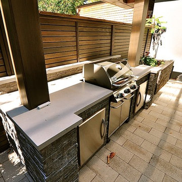
The client had initially asked for just a spot within the yard for his existing barbecue. During the conceptual design phase, Peter devised an outdoor kitchen that acted as a docking station for the grill part of the barbecue.
Tracy Granger
 CLOSET ENVY INC.
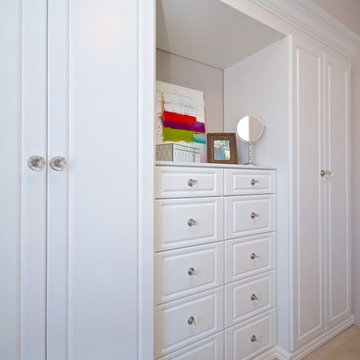
This was a reach in closet initially with sliding doors. Client wanted to rip out the existing closet and doors to build a wall unit. No furniture was going in the bedroom, so the closet had to hold everything. We did hanging areas behind the doors, and drawers under the countertop
 Hearthstone Inc
Richard Herman is in the hospitality business and owns several upscale hotels in Florida and in other states as well as cattle ranches in both Florida and Missouri. Their farm in Ocala is by farm their most unique. The property serves as a 4-H demonstration project for the purpose of children’s education. They have been working with the Academy Prep of St. Pete which is dedicated to inner-city youths that are selected on the basis of need and achievement. Wife Diane spends her time on the farm raising Gypsy Vanners, a diminutive draft horse named after the job they did in Eastern Europe, pulling the wagons (vans) for gypsies that wandered across the continent. On the Ocala farm, there are several mules with a unique profession.
Richard had visited the Hearthstone display at a Log & Timber Home Shows at the Orlando Convention Center many years ago. He was impressed that Hearthstone had stayed in touch with him over the years by mailings, invitations to shows, and periodic phone calls. When the time came to start serious consideration of the design of barn, Hearthstone responded promptly and professionally to Richard and Diane’s requests for information and a review of their ideas for their barn, which would serve as the centerpiece for their new farm.
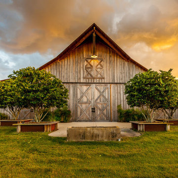
They wanted a multipurpose facility that could accommodate an educational environment and a large hall suitable for the fundraising events for his charities. Richard wanted a barn that reflected the look and feel of barns built at the dawn of the 20th century. Besides the rustic chicken houses and vegetable gardens, they have completely renovated a 1020’s era farmhouse to be as historically correct as possible and serves as the entry to the farm.
“They very careful to feel us out, get comfortable with our capabilities, and be convinced that we could perform as promised,” said Project Manager John Ricketson of Hearthstone.
Design Process
There were some initial drawings that gave us a start on the basic shape and size of the barn. From there, it was a process of narrowing down the uses of each area and the spans that could be achieved. The barn was going to have the traditional “board & batten” exterior siding and a metal roof. There is a cantilevered ‘hay hood” on the north gable end above the large sliding barn doors that open into the foyer and horse stalls. The wings house a combination of areas, beginning with the large restrooms to accommodate crowds for events. Other parts of the wings have garage areas for the farm vehicles, feed room, tack room, wash rack, storage, offices, and smaller restrooms.
Keeping with the look and feel of the turn of the century, Hearthstone developed a process for giving the timbers a surface texture that mimicked the circular cuts of timbers that had just come out of an old sawmill. This was easier said than done. Randy Giles guided his millwright (Wolfgang) in designing a machine that would do this effectively.
The barn was delivered in October of 2014 and was erected over the course of two weeks, thanks to a hardworking crew (Eric Foster) and near-perfect weather. After the Hearthstone crew completed the erection and roof dry-in, it was time for the local carpenters to step up and install some light conventional framing on the gable ends before applying the roof fascia and exterior board & batten siding. Next came the big sliding barn doors, plumbing, electrical, heating, and cooling. Large rustic fixtures were hung from the great hall roof timbers.
Exterior
The board & batten siding was cypress and allowed to turn color naturally as rain hit it and the sun started working on it with UV rays. This method causes a much grayer look closer to the ground and less so where the roof overhang provides protection. The North end has some large limestone boulders and planters arranged around the pad with tall pampas grass. The planters provide casual seating before events and during outside receptions. The entire area was sodded with lush St. Augustine grass and split rail fences were added to enclose the barn area. The corrugated metal roof was a special order material that immediately rusted after being exposed to moisture. The layer of rust protects the metal from the elements.
Interior
The board & batten theme was carried throughout most of the interior with the timbers left natural to show off the circular saw texture. All of the tongue & groove decking was shipped in advance to allow the local painter to pre-stain it with a dark brown transparent stain that is a beautiful background to the light color Eastern White Pine timbers.
“Everything was unique in this project” said Project Manager John Ricketson. “The setting on a small demonstration farm close to Ocala, the multipurpose design, the circular saw texture on the timbers.”
The Hermans are very proud of their farm’s outcome. Richard sent a note to Randy Giles, owner of Hearthstone: “The Barn is fantastic, not a single problem, period. Next month, we have Jo Dee Messina coming in to help with a fundraiser for a local center for abused kids. Folks love the farm, ...... but that barn gets all of the attention. I would encourage you to use me as a reference for your sales team, feel free to extend my cell phone to any prospective purchasers.”
 TKS Design Group
Download our free ebook, Creating the Ideal Kitchen. DOWNLOAD NOW
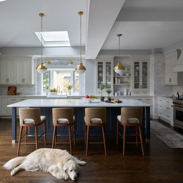
For many, extra time at home during COVID left them wanting more from their homes. Whether you realized the shortcomings of your space or simply wanted to combat boredom, a well-designed and functional home was no longer a want, it became a need. Tina found herself wanting more from her Old Irving Park home and reached out to The Kitchen Studio about adding function to her kitchen to make the most of the available real estate.
At the end of the day, there is nothing better than returning home to a bright and happy space you love. And this kitchen wasn’t that for Tina. Dark and dated, with a palette from the past and features that didn’t make the most of the available square footage, this remodel required vision and a fresh approach to the space. Lead designer, Stephanie Cole’s main design goal was better flow, while adding greater functionality with organized storage, accessible open shelving, and an overall sense of cohesion with the adjoining family room.
The original kitchen featured a large pizza oven, which was rarely used, yet its footprint limited storage space. The nearby pantry had become a catch-all, lacking the organization needed in the home. The initial plan was to keep the pizza oven, but eventually Tina realized she preferred the design possibilities that came from removing this cumbersome feature, with the goal of adding function throughout the upgraded and elevated space. Eliminating the pantry added square footage and length to the kitchen for greater function and more storage. This redesigned space reflects how she lives and uses her home, as well as her love for entertaining.
The kitchen features a classic, clean, and timeless palette. White cabinetry, with brass and bronze finishes, contrasts with rich wood flooring, and lets the large, deep blue island in Woodland’s custom color Harbor – a neutral, yet statement color – draw your eye.
The kitchen was the main priority. In addition to updating and elevating this space, Tina wanted to maximize what her home had to offer. From moving the location of the patio door and eliminating a window to removing an existing closet in the mudroom and the cluttered pantry, the kitchen footprint grew. Once the floorplan was set, it was time to bring cohesion to her home, creating connection between the kitchen and surrounding spaces.
The color palette carries into the mudroom, where we added beautiful new cabinetry, practical bench seating, and accessible hooks, perfect for guests and everyday living. The nearby bar continues the aesthetic, with stunning Carrara marble subway tile, hints of brass and bronze, and a design that further captures the vibe of the kitchen.
Every home has its unique design challenges. But with a fresh perspective and a bit of creativity, there is always a way to give the client exactly what they want [and need]. In this particular kitchen, the existing soffits and high slanted ceilings added a layer of complexity to the lighting layout and upper perimeter cabinets.
While a space needs to look good, it also needs to function well. This meant making the most of the height of the room and accounting for the varied ceiling features, while also giving Tina everything she wanted and more. Pendants and task lighting paired with an abundance of natural light amplify the bright aesthetic. The cabinetry layout and design compliments the soffits with subtle profile details that bring everything together. The tile selections add visual interest, drawing the eye to the focal area above the range. Glass-doored cabinets further customize the space and give the illusion of even more height within the room.
While her family may be grown and out of the house, Tina was focused on adding function without sacrificing a stunning aesthetic and dreamy finishes that make the kitchen the gathering place of any home. It was time to love her kitchen again, and if you’re wondering what she loves most, it’s the niche with glass door cabinetry and open shelving for display paired with the marble mosaic backsplash over the range and complimenting hood. Each of these features is a stunning point of interest within the kitchen – both brag-worthy additions to a perimeter layout that previously felt limited and lacking.
Whether your remodel is the result of special needs in your home or simply the excitement of focusing your energy on creating a fun new aesthetic, we are here for it. We love a good challenge because there is always a way to make a space better – adding function and beauty simultaneously.
 Atlanta Porch & Patio
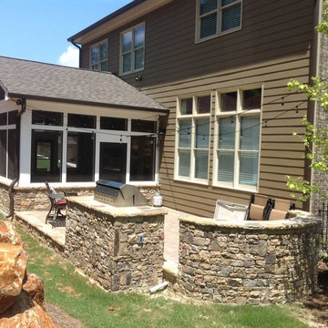
At Atlanta Porch & Patio we are dedicated to building beautiful custom porches, decks, and outdoor living spaces throughout the metro Atlanta area. Our mission is to turn our clients’ ideas, dreams, and visions into personalized, tangible outcomes. Clients of Atlanta Porch & Patio rest easy knowing each step of their project is performed to the highest standards of honesty, integrity, and dependability. Our team of builders and craftsmen are licensed, insured, and always up to date on trends, products, designs, and building codes. We are constantly educating ourselves in order to provide our clients the best services at the best prices.
We deliver the ultimate professional experience with every step of our projects. After setting up a consultation through our website or by calling the office, we will meet with you in your home to discuss all of your ideas and concerns. After our initial meeting and site consultation, we will compile a detailed design plan and quote complete with renderings and a full listing of the materials to be used. Upon your approval, we will then draw up the necessary paperwork and decide on a project start date. From demo to cleanup, we strive to deliver your ultimate relaxation destination on time and on budget.
 ASR DESIGN STUDIO
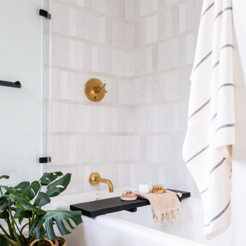
Built in 1907 and nestled into the beating heart of San Fran’s Bernal Heights neighbourhood, this adorable abode was an unpolished gem ready to be turned into our clients’ dream home.
Our mission was to gift Bonview with classic, natural and timeless style while setting it up with impressive functionality so that it was ready to be the pet-friendly, kid-friendly and entertaining-friendly home they needed it to be. Mission accepted!
Our clients’ vision was clear: They wanted whites, blacks and wood tones with texture and personality. Oh, and that spunky wine fridge? Yep, that was a non-negotiable. ?
“It’s not unusual for our friends and family to drop past unannounced any day of the week. And we love it!” They told us during our initial Design Therapy Sesh.
We knew immediately what she meant - we have an open-door policy with our families, too! Which was why we consciously created living spaces that were open, inviting and welcoming.
Now, the only problem our clients would have would be convincing their guests to leave!
Our clients also enjoyed cooking and baking casually, so we created an organized, intuitive and functional kitchen and pantry that made whipping up homemade dips and snacks for their game nights a breeze.
 Advance Design Studio, Ltd.
After six years of living in their Huntley IL home, Chris and Meghan were tired of their dark, dingy, outdated kitchen and it was finally time for a long-anticipated change. “The kitchen is the place where we live, it’s where we do everything,” Meghan said. “It was important that it be a space where we wanted to be.” Meghan loves cooking and enjoys including their girls in healthy meal prepping, this led them to want a brighter, more enjoyable kitchen with increased functionality and improved storage.
For Chris especially, the laundry room was an entirely dysfunctional eyesore. “We had a washer and a dryer, but it was all kind-of cobbled together!” Chris said. “There were always laundry piles everywhere, we weren’t really sure what we wanted to do in there, but it was time for us to make a change.” The mess of the space was stressful every time they walked in the door from the garage each day. Kids’ backpacks and shoes piled up haphazardly in the makeshift boot-bench closet left the family feeling disorganized and stressed. They needed space for folding clothes and locker cubbies to help keep the family organized.
Having known Christine and Todd in the Huntley community for years, Chris and Meghan were familiar with their work. “We already trusted them personally and having seen their projects for years we knew they did top notch work. After we reviewed the initial round of designs, we knew that hiring them was definitely the right choice,” Meghan and Chris said. Although Chris had done a lot of work in their home himself, the kitchen and laundry room renovation was such a large undertaking that he didn’t want to steal time away from his family to spend what would surely be many long weekends doing the job himself. “That would not have been a wise choice for us,” Chris laughed.
“Our designer, Michelle was very, very, easy to work with; anything we wanted to see or weren’t sure about, she went above and beyond to make this easy for us. She was easy to get hold of and always quick to respond,” the couple said. Michelle pulled ideas that mirrored the couple’s taste and style and was adept at directing the couple to limited choices that didn’t overwhelm them and kept the process moving. “I have a hard time making decisions. Michelle made the decision-making process so easy. I loved how she listened to what I liked and then presented three great options for me to choose from,” Meghan said.
The main objectives for the kitchen were better storage solutions, they wanted the space to reflect their lifestyle and taste, and they wanted it to last for years with low maintenance. One of the first steps in creating a more functional kitchen was relocating the refrigerator, creating an improved workflow for the busy family.
“We didn’t know that we could even move the refrigerator to a new location where it is now, that was something that we never would have thought of,” Chris said. “The new refrigerator location makes the kitchen feel so much bigger. We didn’t add any space, but our whole kitchen with the new design just seems like it’s so much larger than before!” Meghan said.
The perimeter mist colored cabinets helped warm and brighten the entire room, while the graphite colored cabinets on the island added contrast. Using this fresh, clean color palette satisfied the couple’s desire for a bright space that was the exact opposite of what they had before. Organization accessories were also added to the cabinets such as a spice drawer tray and roll outs to create hidden convenience.
“I absolutely love the hidden spices – it makes cooking so much more enjoyable!” Chris said. “And all the pull outs, and the double trash bin, who would think you could get so excited about organization!” the couple said in unison.
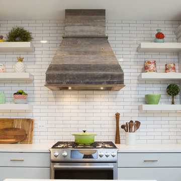
One thing they hated in their original kitchen was how dark the space felt. Added lighting on the ceiling with the new light fixtures combined with the lighter cabinetry colors throughout solved this problem. “Our new kitchen has this warm, almost cozy feeling that our old kitchen never had, it’s just a space that I love spending my time in now,” Meghan said. The light airy feeling was accentuated with the use of floating white shelves on either side of the decorative range hood. “We have so much cabinetry space, the new design is amazing we actually have more storage space than we will ever need,” Meghan said.
The island was extended to create more work surface and added space for stool seating. “The new island changes how we live. Now the kids can be in the kitchen with us, doing homework, eating breakfast, and the three of us have special dinners there when Chris is working late,” Meghan said.
The Carrara Marmi Quartz countertops were chosen because they are, not only beautiful, but are made from hard-working material that doesn’t require maintenance. The white subway tile backsplash that wraps to the ceiling behind the focal point cooktop range/hood compliments the crisp white countertops perfectly, while brushed brass hardware and light fixtures keep the design fresh and new.
The couple had a few fears at the beginning of the project, as most homeowners do. Their biggest fear was being out of their kitchen and laundry room for an extended time. The crew made it very easy for the family to work in a limited space keeping the washer and dryer hooked up the majority of the time, and also getting appliances working with minimal downtime.
“They above and beyond accommodated us to get us through the process,” Meghan said. “They did a great job making sure we were as comfortable as possible throughout the process,” Chris added.
“Our project manager DJ did a great job. He was very good at updating us on schedule changes, getting guys in as quickly as possible. Everyone that stepped in the house was nice and did great work,” said Chris. They thought Advance’s carpenter was phenomenal and were impressed when he took a conceptual idea from a photograph and worked with designer Michelle to create a one of a kind range/hood that has become the topic of conversation with friends and family who visit the new kitchen. “He was in our house literally every day for several weeks. He was easy to work with and good at what he did,” Meghan and Chris said.
The focal point of the kitchen; a hand-crafted, custom-built ventilation hood was clad with handpicked reclaimed barnwood. Advance Design’s carpenter built the framework and the cladding to create a one-of-a-kind design element that the couple loves.
“I think it was especially fun for him to create something unique from scratch, showcasing his talent in this area,” Meghan said. “I love that my kitchen is not like everyone else’s. I got to pick out the wood on my hood and watch it being built and was able to choose what pieces of wood went where on it. It’s totally unique.”
Red Oak flooring was toothed-in throughout the kitchen and the rest of the first floor anywhere changes were made. Then the whole floor was refinished to tone down the orange undertones in the existing floor stain, ultimately changing the color complexion of the entire first floor. The result is a completely new feeling to the entire home.
Renovating the laundry room was extremely important to Meghan and Chris, but they had trouble visualizing what the possibilities were for the seemingly small space. Michelle produced beautiful 3D illustrations that helped them envision the space in a whole new way.
“I must have told Michelle 100 times that I am a visual person, seeing the designs in 3D made it so easy to make decisions and see what we could really do with our space,” Meghan said.
A dividing wall and doorway were removed between the existing laundry room and hallway formerly containing a coat closet, providing space to design specialized graphite colored cabinetry matching the kitchen island to house custom storage cubbies for each family member. Adding the tall utility cabinetry in the new laundry area helped solve the storage issue, tucking away cleaning supplies, household items, and even the cat got its own cubby.
“I love how everything is now hidden in its own space. I can’t tell you how much I hated coming home and seeing everything sitting around on counters,” Chris said.
Electrical outlets were planned for the inside of utility cabinets, so devices could charge in hidden locations. Stacking the washer and dryer allowed for wider countertop space to provide a folding area and a special space for clothes to hang. “The way I do laundry has been completely transformed! I can actually fold clothes and hang them now right out of the washer and dryer,” Meghan said.
“The end result in the kitchen and the laundry/mud room was an updated light and bright space, with a smarter work flow that better meets the needs of this family,” Michelle said.
“I would totally recommend Advance Design,” Meghan said. “Sometimes I sit and just look at my kitchen and laundry room and think ‘Wow, I can’t believe I get to live here!’ It’s an understatement to say we love our new space.”
 Jennifer Butler Design
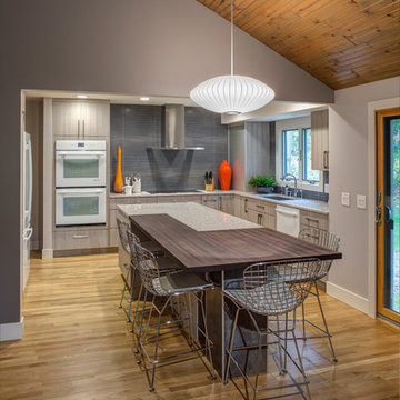
The initial layout of the kitchen worked well for Todd and Jennifer, with the exception of the existing adjacent dinette area (not shown). Because they have a separate dining room, the dinette was redundant and instead of being used for eating, it was an underutilized area just waiting to be loved. By stretching their existing island into the dinette, they created casual seating on the dry end of the island that activates the formerly underused space and creates an inviting place for family and friends to be in the kitchen without jamming zones dedicated for food prep. For Jennifer and Todd, minor spatial tweaking gave them exactly the added and more functional space they needed without making major layout changes.
Bill Lindhout Photography
 OKLAHOMA SHUTTERS
Benefits of Plantation Shutters
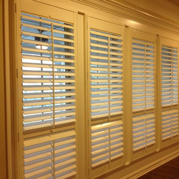
Plantation shutters offer advantages and benefits to homeowners over other window coverings including:
• A permanent addition to a house: While they don't add much to the sale price and don't guarantee a return on investment, the curb appeal helps the house sell faster. The permanency of plantation shutters allows them to be included in appraisals.
• Versatility: Many have the ability to open only halfway if desired. If you want to let in all the light, plantation shutters swing away from the window to grant an unobstructed view.
• Insulation: When all louvers are closed, a good insulating barrier is created, trapping unwanted temperatures and saving you money on your energy bill.
• Easy maintenance: With wide louvers, a simple wipe-down is often all that's needed. Vinyl shutters can be taken off their hinges and sprayed off for a major cleaning.
• Elegance: The classic, yet modern look conveys a permanency like no other window dressing can. Whether painted or natural wood, they all have a look that says; welcome home.
Wood vs. Faux Wood
It's not hard to argue that natural wood is more appealing than vinyl or PVC. However, "faux wood," as it's sometimes called, has some advantages:
• Price -- Faux wood shutters are often lower in price than real wood.
• Weight -- Because some shutters are made "hollow core" (as opposed to vinyl-wrapped medium density fiberboard, MDF), they can be significantly lighter.
• Moisture Resistance -- If you live in an area with high humidity, hollow faux wood or aluminum core will resist expanding and sagging. (MDF core louvers will tend to expand and crack as the material swells with moisture.)
Natural wood is the choice for those who have a very healthy budget or for whom a specific appearance is a must. Among the advantages are:
• Size -- Because wood plantation shutters are made of hardwood, they can be quite a bit larger than plastic or vinyl. Vinyl shutters larger than 29 inches may be prone to sag, so they need divider rails or other supports which can destroy the traditional look of a plantation shutter.
• Natural -- While vinyl or plastic shutters can be painted to match any color scheme, the natural shades and finishes of the various species of wood have something for every look.
• Classic -- While many plastic shutters can be made to look like real wood, the faux wood finishes can vary significantly depending on manufacturer and model. Up close, it can be easy to tell they're plastic. The warmth of natural wood is a classic feel that's impossible to beat.
Popular Plantation Shutter Brands
When you go to purchase your plantation shutters, brands names may offer a good representation of high-, mid-, and low-cost range of what's available. Which one you choose depends on your budget and your tastes. Hunter-Douglas and Norman Shutters produce three lines of plantation shutters in both real wood and faux wood styles. A higher-end product, Hunter-Douglas may be worth the cost for beauty and quality of workmanship. The Window Outfitters and Sunland produce a mid-cost line of shutters. The mid-range pricing may be for those who are balancing aesthetics with a budget. National franchise and or box stores may not offer an in-house expert or designer. Look to local companies that specialize in plantation shutters looking online may offer a low-cost brand for budget-minded DIYers. Available in both faux and real wood, the affordability combines with the visual appeal to make this a very popular choice for plantation shutters. Regardless of which line you go with, be sure to ask about frames. Generally all manufactures offer frame choices and may add to the cost, but they add an unsurpassed beauty and warmth to a room with plantation shutters.
Plantation shutters look like similar to wooden blinds, but there are significant differences. Blinds are often narrow, made of aluminum or vinyl, and the slats tilt based on a gear and pulley mechanism and they hang in the window with cords. By contrast, plantation shutters have wide compound louvers that fit into a frame and are controlled by way of a wooden rod running up the middle. When not needed, they can be manufactured to swing back onto the wall. Options to are available to build a more contemporary look with a larger view with a “hidden tilt” feature.
Cost of Plantation Shutters
Nationally, the cost of plantation shutters, depending on their size and the material, whether or not they are custom arches and colors or stains, may vary. Most manufacturers want their shutters to be professionally installed to keep the warranty intact which is a benefit to the customer in the long run. They will usually have a limited lifetime warranty.
Cost of Installation
Costs for having plantation shutters installed by a contractor are a bit more predictable. Contractors who have installed plantation shutters before can quickly get accurate measurements and suggest which materials would work best in different rooms. For example, while natural wood may look beautiful in your living room, it might not be so practical in a bathroom where moisture will cause the wood to warp. The size, material, and quality of the shutter will have a significant effect on the cost. Contractors usually go through a shutter supplier and can get various sizes that are not normally available at home improvement stores. Hiring a professional team of knowledgeable suppliers and installers is a good choice.
Here are some sample prices of the shutters most contractors use for standard-sized windows: In general, plantation shutters should cost approximately $20 to $26 per square foot. Labor costs depend on factors such as the contractor's workload, remoteness of the location, environment, and the contractor's overhead. Labor generally runs about $100 per hour and will be added to the shutter cost.
• 16x20 -- Faux wood $120. Real wood $156
• 24x50 -- Faux wood $160. Real wood $208
• 36x54 -- Faux wood $270. Real wood $351
• 36x60 -- Faux wood $300 Real wood $390
• 42x72 -- Faux wood $420. Real wood $546
• 48x82 -- Faux wood $550. Real wood $715
DIY
Plantation shutters can be purchased and installed by the homeowners. How much they cost will depend on size and material. Faux wood shutter’s cost depends on size and wooden shutter’s cost will depend on size and whether or not they are painted or stained.
• Natural wood is $90-$600 depending on size. Many companies offer standard stained selection but custom color matching may be available from $175 -$250.
• Faux wood will be from $120-$500.
• Additional tools include: Hang Strips $4-$15 and about $4 for mounting hardware. Locks or closures can cost up to $15 for each shutter.
Finally, if you order them online, you can expect to pay $30-$70 shipping per shutter or per set of shutters per window depending on the supplier. Keep in mind that even if you're handy with tools, installing shutters can be time-consuming if you've never done it before there is defiantly a learning curve.
 Western DuPage Landscaping, Inc.
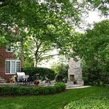
After years of enjoying their backyard, the clients of this property enlisted our firm to improve the original landscape we had completed over ten years ago. Our goal was to update the patio and further develop their backyard by creating a garden with a variety of color and texture.
Over time the existing patio had settled, plantings grew, and an existing Oak thrived. During the initial home and landscape construction our clients were particularly concerned about the health of the mature Oak located just off the home. Special care was given when the patio was first built. Precautions were again taken in working around the Oak as the existing patio was removed and replaced. Surrounding trees and shrubs had grown and enclosed the backyard limiting access. This required almost all work and transport of material to be done by hand.
The old concrete paver patio was replaced with bluestone. Existing mortared limestone around the edges of the patio levels were cleaned and tuck-pointed. A new stoop was constructed with mortared limestone risers and bluestone treads. A built-in grill and fireplace further updated the backyard space. The fireplace was designed to follow the organic curve of the patio. Mortared limestone and bluestone material were repeated on all elements, tying them together.
Along with the updated patio, many additions were made in transforming the modest backyard into a lush garden. Masses of annuals, ornamental grasses, and perennials along with mixed shrubs created sweeps of color and texture in front of a new arborvitae hedge and other existing trees and shrubs.
After careful planning and execution the completed landscape gave our clients the updated landscape they desired. The completion of the project was a rewarding and fulfilling experience as we transformed a good past project into a fantastic new project.
 Allied Kitchen, Bath, Home and Outdoor Living
Bill Feinberg, Allied Kitchen & Bath
Bathroom - transitional bathroom idea in Miami
Bathroom - transitional bathroom idea in Miami
 Schwartz and Architecture
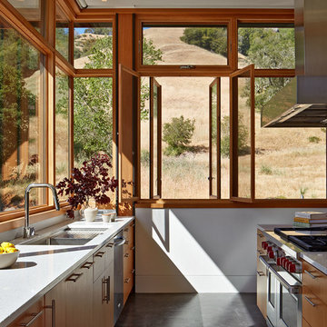
The proposal analyzes the site as a series of existing flows or “routes” across the landscape. The negotiation of both constructed and natural systems establishes the logic of the site plan and the orientation and organization of the new home. Conceptually, the project becomes a highly choreographed knot at the center of these routes, drawing strands in, engaging them with others, and propelling them back out again. The project’s intent is to capture and harness the physical and ephemeral sense of these latent natural movements as a way to promote in the architecture the wanderlust the surrounding landscape inspires. At heart, the client’s initial family agenda--a home as antidote to the city and basecamp for exploration--establishes the ethos and design objectives of the work.
Photography - Bruce Damonte

 Matt Fajkus Architecture
The Control/Shift House is perched on the high side of the site which takes advantage of the view to the southeast. A gradual descending path navigates the change in terrain from the street to the entry of the house. A series of low retaining walls/planter beds gather and release the earth upon the descent resulting in a fairly flat level for the house to sit on the top one third of the site. The entry axis is aligned with the celebrated stair volume and then re-centers on the actual entry axis once you approach the forecourt of the house.
The initial desire was for an “H” scheme house with common entertaining spaces bridging the gap between the more private spaces. After an investigation considering the site, program, and view, a key move was made: unfold the east wing of the “H” scheme to open all rooms to the southeast view resulting in a “T” scheme. The new derivation allows for both a swim pool which is on axis with the entry and main gathering space and a lap pool which occurs on the cross axis extending along the lengthy edge of the master suite, providing direct access for morning exercise and a view of the water throughout the day.
The Control/Shift House was derived from a clever way of following the “rules.” Strict HOA guidelines required very specific exterior massing restrictions which limits the lengths of unbroken elevations and promotes varying sizes of masses. The solution most often used in this neighborhood is one of addition - an aggregation of masses and program randomly attached to the inner core of the house which often results in a parasitic plan. The approach taken with the Control/Shift House was to push and pull program/massing to delineate and define the layout of the house. Massing is intentional and reiterated by the careful selection of materiality that tracks through the house. Voids and relief in the plan are a natural result of this method and allow for light and air to circulate throughout every space of the house, even into the most inner core.
Photography: Charles Davis Smith
 Murakami Design Inc.
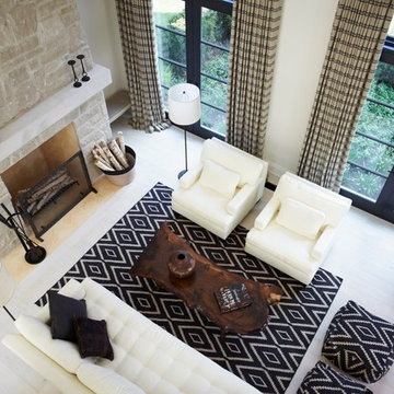
At Murakami Design Inc., we are in the business of creating and building residences that bring comfort and delight to the lives of their owners.
Murakami provides the full range of services involved in designing and building new homes, or in thoroughly reconstructing and updating existing dwellings.
From historical research and initial sketches to construction drawings and on-site supervision, we work with clients every step of the way to achieve their vision and ensure their satisfaction.
We collaborate closely with such professionals as landscape architects and interior designers, as well as structural, mechanical and electrical engineers, respecting their expertise in helping us develop fully integrated design solutions.
Finally, our team stays abreast of all the latest developments in construction materials and techniques.
 ASR DESIGN STUDIO
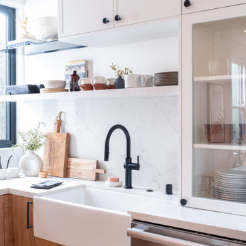
Built in 1907 and nestled into the beating heart of San Fran’s Bernal Heights neighbourhood, this adorable abode was an unpolished gem ready to be turned into our clients’ dream home.
Our mission was to gift Bonview with classic, natural and timeless style while setting it up with impressive functionality so that it was ready to be the pet-friendly, kid-friendly and entertaining-friendly home they needed it to be. Mission accepted!
Our clients’ vision was clear: They wanted whites, blacks and wood tones with texture and personality. Oh, and that spunky wine fridge? Yep, that was a non-negotiable. ?
“It’s not unusual for our friends and family to drop past unannounced any day of the week. And we love it!” They told us during our initial Design Therapy Sesh.
We knew immediately what she meant - we have an open-door policy with our families, too! Which was why we consciously created living spaces that were open, inviting and welcoming.
Now, the only problem our clients would have would be convincing their guests to leave!
Our clients also enjoyed cooking and baking casually, so we created an organized, intuitive and functional kitchen and pantry that made whipping up homemade dips and snacks for their game nights a breeze.
96