
Search results for "Innovative approach" in Home Design Ideas

 StoneUnlimited Kitchen and Bath Remodeling
In recent years, shiplap installments have been popular on HGTV, other design networks, and in magazines. Shiplap has become a desired focal feature in homes to achieve a shabby chic, cottage-like aesthetic. When we were approached by the owners of this bathroom we couldn’t have been more excited to help them achieve the effect that they were dreaming of.
Our favorite features of this bathroom are:
1. The floor to ceiling shiplap walls are beautiful and have completely converted the space
2. The innovative design of the tub deck showcases Stoneunlimited’s ability to utilize Waypoint cabinets in various ways to achieve sophisticated detail.
3. The design of the tile in the shower in differing sizes, textures and chair rail detail make the white on white tile appealing to the eye and emphasizes the farmhouse shabby-chic feel.
If you can imagine a warm and cozy bathroom or kitchen with the beauty of shiplap, Stoneunlimited Kitchen and Bath can help you achieve your dream of having a farmhouse inspired space too!
This bathroom remodel in Alpharetta, Georgia features:
Shiplap: Floor to ceiling 4” tongue & groove
Cabinets: Waypoint Shaker Style Cabinets with Soft Close feature in Harbor finish
Knobs & Pulls: Ascendra in Polish Chrome
Tile:
Main Floor Tile: 6x40 Longwood Nut Porcelain
Shower Tile:
1x3 Mini brick mosaic tile in gloss white for the top 58” of the shower walls and niche
3x6 Highland Whisper White subway tiles for the lower 36” of the shower walls
2x6 Highland Whisper White Chair Rail tile used as a divider between the Mini Brick and Subway tile
2x2 Arabescato Herringbone marble tile for the shower floor
Tub:
Kohler 36” x 66” soaking tub with Artifacts Faucet in Chrome finish
Tub Deck was built up to enclose the rectangular under mount tub
Waypoint cabinet panels were used to create the apron for the tub deck
Hardware: Shower Trim, Faucets, Robe Hook, Towel Rack are all Kohler Artifacts Series in Chrome
 StoneUnlimited Kitchen and Bath Remodeling
In recent years, shiplap installments have been popular on HGTV, other design networks, and in magazines. Shiplap has become a desired focal feature in homes to achieve a shabby chic, cottage-like aesthetic. When we were approached by the owners of this bathroom we couldn’t have been more excited to help them achieve the effect that they were dreaming of.
Our favorite features of this bathroom are:
1. The floor to ceiling shiplap walls are beautiful and have completely converted the space
2. The innovative design of the tub deck showcases Stoneunlimited’s ability to utilize Waypoint cabinets in various ways to achieve sophisticated detail.
3. The design of the tile in the shower in differing sizes, textures and chair rail detail make the white on white tile appealing to the eye and emphasizes the farmhouse shabby-chic feel.
If you can imagine a warm and cozy bathroom or kitchen with the beauty of shiplap, Stoneunlimited Kitchen and Bath can help you achieve your dream of having a farmhouse inspired space too!
This bathroom remodel in Alpharetta, Georgia features:
Shiplap: Floor to ceiling 4” tongue & groove
Cabinets: Waypoint Shaker Style Cabinets with Soft Close feature in Harbor finish
Knobs & Pulls: Ascendra in Polish Chrome
Tile:
Main Floor Tile: 6x40 Longwood Nut Porcelain
Shower Tile:
1x3 Mini brick mosaic tile in gloss white for the top 58” of the shower walls and niche
3x6 Highland Whisper White subway tiles for the lower 36” of the shower walls
2x6 Highland Whisper White Chair Rail tile used as a divider between the Mini Brick and Subway tile
2x2 Arabescato Herringbone marble tile for the shower floor
Tub:
Kohler 36” x 66” soaking tub with Artifacts Faucet in Chrome finish
Tub Deck was built up to enclose the rectangular under mount tub
Waypoint cabinet panels were used to create the apron for the tub deck
Hardware: Shower Trim, Faucets, Robe Hook, Towel Rack are all Kohler Artifacts Series in Chrome
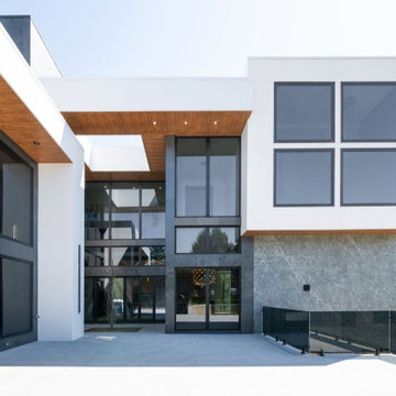
 KC Architects, Inc
KC Architects, led by licensed architect Katarzyna Cimoch, provides exceptional residential architectural services throughout Chicago and surrounding communities. As a Polish architect Chicago residents trust, we specialize in custom home design, additions, renovations, and new construction projects. Our comprehensive approach includes initial consultation, design development, permitting assistance, and construction supervision. We understand Chicago's unique architectural landscape and building requirements, ensuring every project meets both aesthetic and regulatory standards. Our team combines European design sensibilities with local expertise to create spaces that reflect your lifestyle and preferences. From modern additions to historic renovations, we handle projects of all scales with meticulous attention to detail. As an experienced Polish architect Chicago homeowners recommend, Katarzyna brings bilingual communication and cultural understanding to every project. We pride ourselves on transparent communication, realistic timelines, and innovative solutions that maximize your property's potential while respecting your budget.
FAQs:
1. What architectural services do you provide? We offer residential design, additions, renovations, and new construction.
2. Are you licensed in Illinois? Yes, Katarzyna Cimoch is licensed in both Illinois and Florida.
3. Do you handle permits? Yes, we assist with all permitting and approval processes.
4. What's your design process? We follow a five-step process from consultation to final walkthrough.
5. Do you supervise construction? Yes, we provide construction supervision services.
6. What areas do you serve? We serve Chicago and surrounding communities.
7. Do you work on historic homes? Yes, we have experience with historic renovations.
8. What's included in consultation? Initial consultation covers project scope, timeline, and budget discussion.
9. Do you provide 3D renderings? Yes, we create detailed visualizations during design development.
10. How long does design take? Timeline varies by project complexity and scope.
Find the right local pro for your project
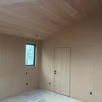
 United Porte Inc
One of their most attractive traits is the seamless integration they offer. With a virtually invisible frame, these doors become an integral part of your wall, creating a sleek and uninterrupted visual line. This aesthetic makes them ideal for an array of settings – whether you’re aiming for a minimalist, modern, or classic interior design.
Moreover, these portals provide an element of surprise and a dash of intrigue – a bookcase that swings open to reveal a room or a mirrored wall that is actually an entrance to a walk-in closet. By choosing to order and buy hidden doors, you gift your space with the charm of the unexpected and impress your guests with your innovative approach to design.
Embracing versatility
An extraordinary feature of hidden doors is their flexibility. Suiting various purposes, they can serve as both a subtle addition to your house or an imposing style statement. But don't take our word for it! Order and buy interior doors and witness the aesthetic transformation they'll unleash.
Tailored to your space
Customisability is another aspect where hidden doors shine. The one we’re spotlighting here, for instance, comes in a classy white palette – primed and ready for installation. The door size is an ample 18" x 96", and the hidden frame is offered in silver to keep things elegant and understated.
Furthermore, its right-hand outswing feature ensures that your room layout is taken into consideration. So, whether it’s a small apartment or a sprawling villa, this door will fit like a dream.
A seamless shopping experience
We believe in delivering more than just a product. It’s our priority to make sure your shopping experience with us is as seamless and enjoyable as possible. So, when you order and buy doors from us, we will provide all the guidance you need. From browsing from our wide range of door styles to selecting the right one for your space, and from placing the order to getting it installed – we're with you every step of the way.
Your space deserves the best
Consider this: a door is more than just a barrier. Rather, it's a tactile interface between us and our environment, a transit point between rooms, and a visual anchor within a space. So why not ditch generic doors for something that echoes your style and transforms your walls into fascinating design landscapes?
All you need to do is order and buy doors. Your space deserves nothing less than the best.
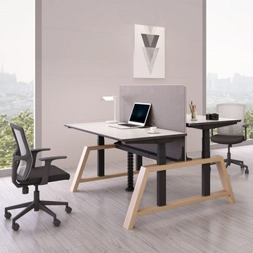
 katherine
Office Workstations and Cubicles: The Unsung Heroes of Efficient Team Environments
In today's fast-paced business world, the hum of productivity is the sweetest sound an office can produce. But what fuels this symphony of efficiency?
While leadership and strategy are crucial, the physical environment in which a team operates plays a role that is just as vital. The debate between open-plan offices and traditional cubicles has raged for years, yet the truth is that a well-designed space incorporating both office workstations cubicles can be the key to unlocking a team's full potential. This isn't just about furniture; it's about creating a habitat for success.
The Evolution of the Workspace: Beyond the Beige Box
Gone are the days of monotonous rows of identical, soul-crushing cubicles. Modern office design has embraced a more nuanced understanding of worker needs. The contemporary workstation is a far cry from its predecessors, offering flexibility, ergonomic support, and a nod to aesthetic appeal. This evolution recognizes that a one-size-fits-all approach stifles creativity and productivity.
Fostering Focus in a Sea of Collaboration
While collaboration is a cornerstone of modern business, the need for individual, focused work remains paramount. This is where the modern cubicle shines. It provides a sanctuary from the constant distractions of a completely open office, allowing employees to delve deep into tasks that require concentration. This dedicated space minimizes interruptions, leading to higher quality work and reduced stress levels.
The Power of Personalization and Ownership
Giving employees a degree of control over their immediate environment can have a profound impact on morale and engagement. Modern workstations and cubicles that allow for personalization be it through adjustable shelving, pinboards for personal items, or even the choice of chair foster a sense of ownership. This small act of empowerment can translate into a greater sense of belonging and commitment to the organization.
Ergonomics: The Foundation of Employee Well-being and Productivity
A comfortable employee is a productive employee. Ergonomics is not a luxury; it's a fundamental necessity in any office environment. Poorly designed workstations can lead to a host of musculoskeletal issues, from back pain to carpal tunnel syndrome, resulting in increased absenteeism and decreased efficiency. Investing in ergonomic chairs, adjustable-height desks, and properly positioned monitors is an investment in the long-term health and performance of your team.
Designing for Synergy: The Strategic office layout design
The arrangement of workstations and cubicles is as important as the furniture itself. A strategic office layout design can facilitate seamless communication and collaboration while still providing pockets of privacy for focused work. This involves creating "neighborhoods" for different teams, placing collaborative zones in central, easily accessible areas, and ensuring that high-traffic pathways don't cut through quiet work zones.
Breaking Down Barriers with Hybrid Designs
The most effective office environments often feature a hybrid approach. This might involve clusters of cubicles for focused work, interspersed with open, collaborative "huddle spaces" equipped with whiteboards and comfortable seating. This variety allows employees to choose the environment that best suits the task at hand, offering the best of both worlds.
The Role of Acoustics in a Thriving Workplace
Noise is one of the biggest complaints in open-plan offices. Well-designed cubicles with sound-dampening panels can significantly mitigate this issue. Furthermore, incorporating acoustic solutions throughout the office, such as sound-absorbing materials on walls and ceilings, can create a more pleasant and productive auditory environment for everyone.
Integrating Technology for a Seamless Workflow
In the digital age, technology is the lifeblood of any business. Modern office workstations are designed with this in mind, featuring integrated power and data ports, cable management systems, and ample space for multiple monitors. This seamless integration of technology ensures that employees have the tools they need to work efficiently and without frustration.
Choosing the Right Partner for Your Office Environment
The task of outfitting an office can be daunting. Partnering with a knowledgeable and reputable Meet&Co commercial furniture supplier is crucial to creating an environment that is both functional and inspiring. A good supplier will not only offer a wide range of high-quality products but will also provide expert advice on space planning and ergonomic best practices, ensuring that your investment yields the best possible return.
The Future of the Office: Flexibility and Adaptability
The world of work is constantly evolving, and office design must evolve with it. The future lies in creating flexible and adaptable spaces that can be easily reconfigured to meet the changing needs of a business. Modular furniture and movable partitions are key components of this future-proof approach, allowing organizations to scale and adapt without the need for costly and disruptive renovations.
Conclusion: A Strategic Investment in Your Greatest Asset
Ultimately, the design of your office is a direct reflection of your company's culture and values. By investing in high-quality, ergonomic, and well-designed office workstations and cubicles, you are sending a clear message to your employees: their well-being and productivity matter. This strategic investment in your physical workspace is, in fact, an investment in your most valuable asset your people. The result is a more engaged, efficient, and innovative team, ready to tackle the challenges of tomorrow.
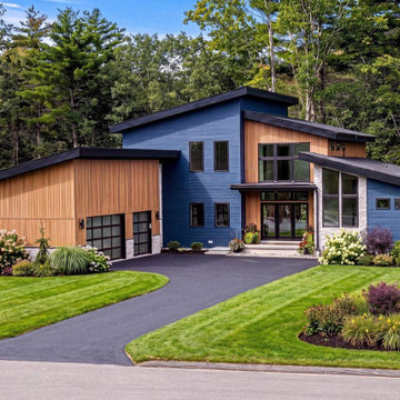
 RWH Architect PLLC
Set against a picturesque wooded landscape in Salem, New Hampshire, 6 Whistle Hill represents a bold approach to contemporary residential architecture. Designed by RWH Architect in collaboration with DHB Homes, this 4,000-square-foot custom residence introduces a distinctly modern architectural language to a community traditionally defined by more conventional home styles. Through striking geometry, carefully curated materials, and thoughtful spatial planning, the design balances architectural expression with warmth, functionality, and a strong connection to its natural surroundings.
The home's exterior is defined by its sculptural composition of intersecting shed rooflines, expansive glazing, and clean architectural forms. Rich vertical wood cladding contrasts with a deep blue façade, while natural stone elements ground the composition within the wooded setting. The interplay of materials, textures, and roof geometries creates a dynamic yet cohesive architectural identity. Particular attention was given to the home's proportions and massing, including the integration of an oversized three-car garage, ensuring that each element contributes to the overall design rather than competing with it.
A central design priority was creating a seamless relationship between the home's architecture, interior spaces, and surrounding landscape. Expansive windows were strategically positioned to maximize natural light, frame wooded views, and strengthen the connection between indoors and outdoors. Carefully considered sightlines, roof overhangs, and spatial orientation provide privacy without sacrificing openness, allowing the residence to feel both expansive and intimate.
Inside, the architectural approach emphasizes spatial continuity, understated sophistication, and the integration of everyday functionality. An open-concept kitchen, dining, and living area forms the heart of the home, anchored by a dramatic double-sided fireplace that serves as both a visual focal point and an architectural element connecting the primary gathering spaces. An open-riser staircase introduces another sculptural feature, reinforcing the home's contemporary character while maintaining visual openness between levels.
The kitchen combines refined material selections with thoughtful space planning, featuring Cabico cabinetry, integrated appliances, a full-height quartz backsplash, and a striking matte black waterfall island. A generously sized walk-in pantry, designed to blend seamlessly with the surrounding cabinetry, complements a dedicated coffee bar and thoughtfully organized mudroom. These integrated features reflect an approach to residential design in which practicality and aesthetics are equally considered.
The first-floor primary suite offers a private retreat, distinguished by Venetian plaster walls and ceilings that introduce subtle texture and warmth. Its adjoining bathroom features a microcement walk-in shower, matte black soaking tub, oversized double vanity, and separate water closet, creating a sophisticated, spa-like environment. A dedicated home office positioned near the suite provides additional flexibility while maintaining separation from the home's primary gathering areas.
Upstairs, three additional bedrooms, each with a walk-in closet, provide comfortable accommodations for family and guests. A private balcony, rear deck, and full walkout basement further extend the home's living possibilities, offering opportunities to engage with the surrounding landscape and accommodate evolving lifestyle needs.
Throughout the design process, RWH Architect focused on balancing bold contemporary forms with the practical demands of modern residential living. From carefully considered circulation and interior zoning to the relationship between exterior materials, glazing, and architectural massing, each design decision contributes to a unified architectural vision.
6 Whistle Hill demonstrates how contemporary architecture can introduce a fresh design perspective while remaining connected to its regional context. Through the collaboration of RWH Architect and DHB Homes, the residence brings together architectural innovation, sophisticated materiality, and exceptional craftsmanship to create a home that is visually distinctive, highly functional, and designed for the way people live today.
Architecture & Design: RWH Architect
Builder: DHB Homes
Location: Salem, New Hampshire
Project Type: Contemporary Custom Residence
Size: Approximately 4,000 SF

 GS Construction
Example of a small classic 3/4 white tile and stone tile mosaic tile floor alcove shower design in Chicago with an undermount sink, recessed-panel cabinets, black cabinets, quartzite countertops, a two-piece toilet and gray walls

 TOLO Architecture
Located above the coast of Malibu, this two-story concrete and glass home is organized into a series of bands that hug the hillside and a central circulation spine. Living spaces are compressed between the retaining walls that hold back the earth and a series of glass facades facing the ocean and Santa Monica Bay. The name of the project stems from the physical and psychological protection provided by wearing reflective sunglasses. On the house the “glasses” allow for panoramic views of the ocean while also reflecting the landscape back onto the exterior face of the building.
PROJECT TEAM: Peter Tolkin, Jeremy Schacht, Maria Iwanicki, Brian Proffitt, Tinka Rogic, Leilani Trujillo
ENGINEERS: Gilsanz Murray Steficek (Structural), Innovative Engineering Group (MEP), RJR Engineering (Geotechnical), Project Engineering Group (Civil)
LANDSCAPE: Mark Tessier Landscape Architecture
INTERIOR DESIGN: Deborah Goldstein Design Inc.
CONSULTANTS: Lighting DesignAlliance (Lighting), Audio Visual Systems Los Angeles (Audio/ Visual), Rothermel & Associates (Rothermel & Associates (Acoustic), GoldbrechtUSA (Curtain Wall)
CONTRACTOR: Winters-Schram Associates
PHOTOGRAPHER: Benny Chan
AWARDS: 2007 American Institute of Architects Merit Award, 2010 Excellence Award, Residential Concrete Building Category Southern California Concrete Producers
 Advance Design Studio, Ltd.
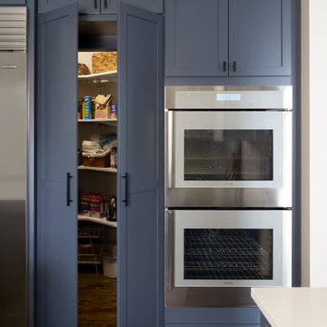
Richard and Monica of Huntley, IL, needed to make better use of their kitchen as well as more storage for pots, pans, and countertop appliances. Their space was laid out unconventionally, making cooking a challenge. A triangular nook held their refrigerator, hard-to-reach cabinets, and a cramped pantry. They needed to find a solution, so they searched Facebook for home remodeling companies in their area. Soon they found Advance Design Studio’s profile and were immediately impressed.
“Advance Design was the first and last studio I contacted,” Richard said.
Richard called Advance Design and felt an immediate connection with Project Designer Nicole. She was knowledgeable and thorough and offered many unique solutions to their kitchen layout problem.
A week later, Nicole came out to their home to meet the couple. They talked about their kitchen remodeling project and told Nicole what they wanted in their dream kitchen. Nicole saw that the kitchen had weird angles that hindered the cabinets you could use. She knew that designing a space that met both the client’s needs and dreams would be challenging.
Nicole worked with Richard and Monica to create an innovative design. When the couple came out to Advance Design Studio in Gilberts, they were blown away by the 3D illustrations Nicole showed them.
“I incorporated a hidden pantry cabinet to not only be a cool feature but also allowed me to square off the walls to gain more cabinet space,” Nicole said.
The hidden pantry added storage and squared off the strange triangular nook, creating a more traditional and functional kitchen layout. With the layout problems solved, they worked together to select materials. Richard and Monica wanted something brighter than their previous dark brown kitchen. They chose a combination of blue and white cabinetry with a white subway tile backsplash and white quartz countertops. The design was finalized, the materials were selected. It was time to begin construction.
One fear most homeowners have when beginning a home remodel is dust. Advance Design uses BuildClean HEPA filters to eliminate dust throughout the house while construction is going on. Project Manager Jason and his crew created temporary walls and cleaned up after every day of work.
“We were very impressed with how clean and organized the crew kept things while the remodeling process was underway,” Richard said.
The result is just what Richard and Monica envisioned when they began the process. Richard’s love for cooking can be explored through all-new Thermador appliances, featuring an easy-to-use induction cooktop, built-in double oven, and spacious refrigerator. Matte black hardware contrasts the bright white backsplash, countertops, and cabinets, while the stunning blue cabinets complement the dark hardwood floor and stainless-steel appliances. The dual pendant light fixtures over the reconfigured island are eye-catching and add necessary lighting.
This Huntley kitchen renovation turned out better than Richard and Monica hoped. Their experience with Advance Design’s Common Sense Remodeling process has them thinking about other projects they could do in the future.
Our award-winning design team would love to create a beautiful, functional, and spacious place for you and your family. With our “Common Sense Remodeling” approach, the process of renovating your home has never been easier. Contact us today at 847-665-1711 or schedule an appointment.
 StoneUnlimited Kitchen and Bath Remodeling
In recent years, shiplap installments have been popular on HGTV, other design networks, and in magazines. Shiplap has become a desired focal feature in homes to achieve a shabby chic, cottage-like aesthetic. When we were approached by the owners of this bathroom we couldn’t have been more excited to help them achieve the effect that they were dreaming of.
Our favorite features of this bathroom are:
1. The floor to ceiling shiplap walls are beautiful and have completely converted the space
2. The innovative design of the tub deck showcases Stoneunlimited’s ability to utilize Waypoint cabinets in various ways to achieve sophisticated detail.
3. The design of the tile in the shower in differing sizes, textures and chair rail detail make the white on white tile appealing to the eye and emphasizes the farmhouse shabby-chic feel.
If you can imagine a warm and cozy bathroom or kitchen with the beauty of shiplap, Stoneunlimited Kitchen and Bath can help you achieve your dream of having a farmhouse inspired space too!
This bathroom remodel in Alpharetta, Georgia features:
Shiplap: Floor to ceiling 4” tongue & groove
Cabinets: Waypoint Shaker Style Cabinets with Soft Close feature in Harbor finish
Knobs & Pulls: Ascendra in Polish Chrome
Tile:
Main Floor Tile: 6x40 Longwood Nut Porcelain
Shower Tile:
1x3 Mini brick mosaic tile in gloss white for the top 58” of the shower walls and niche
3x6 Highland Whisper White subway tiles for the lower 36” of the shower walls
2x6 Highland Whisper White Chair Rail tile used as a divider between the Mini Brick and Subway tile
2x2 Arabescato Herringbone marble tile for the shower floor
Tub:
Kohler 36” x 66” soaking tub with Artifacts Faucet in Chrome finish
Tub Deck was built up to enclose the rectangular under mount tub
Waypoint cabinet panels were used to create the apron for the tub deck
Hardware: Shower Trim, Faucets, Robe Hook, Towel Rack are all Kohler Artifacts Series in Chrome
 StoneUnlimited Kitchen and Bath Remodeling
In recent years, shiplap installments have been popular on HGTV, other design networks, and in magazines. Shiplap has become a desired focal feature in homes to achieve a shabby chic, cottage-like aesthetic. When we were approached by the owners of this bathroom we couldn’t have been more excited to help them achieve the effect that they were dreaming of.
Our favorite features of this bathroom are:
1. The floor to ceiling shiplap walls are beautiful and have completely converted the space
2. The innovative design of the tub deck showcases Stoneunlimited’s ability to utilize Waypoint cabinets in various ways to achieve sophisticated detail.
3. The design of the tile in the shower in differing sizes, textures and chair rail detail make the white on white tile appealing to the eye and emphasizes the farmhouse shabby-chic feel.
If you can imagine a warm and cozy bathroom or kitchen with the beauty of shiplap, Stoneunlimited Kitchen and Bath can help you achieve your dream of having a farmhouse inspired space too!
This bathroom remodel in Alpharetta, Georgia features:
Shiplap: Floor to ceiling 4” tongue & groove
Cabinets: Waypoint Shaker Style Cabinets with Soft Close feature in Harbor finish
Knobs & Pulls: Ascendra in Polish Chrome
Tile:
Main Floor Tile: 6x40 Longwood Nut Porcelain
Shower Tile:
1x3 Mini brick mosaic tile in gloss white for the top 58” of the shower walls and niche
3x6 Highland Whisper White subway tiles for the lower 36” of the shower walls
2x6 Highland Whisper White Chair Rail tile used as a divider between the Mini Brick and Subway tile
2x2 Arabescato Herringbone marble tile for the shower floor
Tub:
Kohler 36” x 66” soaking tub with Artifacts Faucet in Chrome finish
Tub Deck was built up to enclose the rectangular under mount tub
Waypoint cabinet panels were used to create the apron for the tub deck
Hardware: Shower Trim, Faucets, Robe Hook, Towel Rack are all Kohler Artifacts Series in Chrome
 Fabco Sanctuary
The architect and designer Guy Derwent was approached by his client with a clear and compelling brief: to completely transform a grand Victorian terrace house they were planning to renovate. The client envisioned something far beyond a standard renovation – this was to be a bold and dramatic reimagining of a family home that could grow with them over time.
With the property having remained largely untouched for more than fifty years, the architects saw an opportunity to unlock its potential and deliver a contemporary design that would contrast beautifully with its Victorian heritage.
The existing layout consisted of a series of small, disconnected rooms to the rear of the house. To respond to the client’s need for openness and flexibility, the architect proposed a radical restructuring of the ground floor:
The rear rooms were completely removed
Suspended timber floors were lowered by up to two metres to align with the garden
Two bold extensions were added
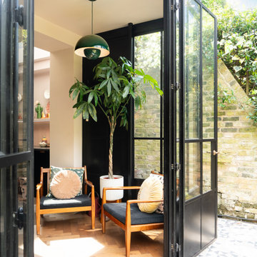
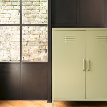
The first extension filled in the side return with a London stock brick facade and a glazed roof, while the second – a striking black steel and glass pavilion was glazed on three sides and placed along the garden elevation.
This new pavilion redefined the building’s relationship with the garden. Its steel-framed glazing created a seamless dialogue between interior and exterior, offering a sense of immersion in the surrounding landscape.
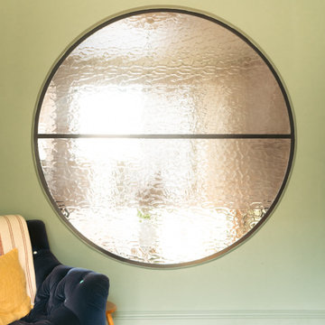
At the heart of the plan sits a dramatic, five-metre-tall dining space that acts as a transition from the original entrance hall into the new addition. A large, circular cast-glass window, framed in steel, provides a visual and spatial link between old and new, allowing light and movement to travel through the depth of the home.
Throughout the project, a series of black metal elements were introduced as sculptural interventions – each marking moments of transformation within the house. These included the bespoke steel framed circular window, a custom metal staircase, a cylindrical support column, and the striking steel and glass garden pavilion. Together, they formed a coherent architectural language that underscored the project’s bold intent.
Our steel windows and doors played a vital role in delivering the project’s vision. The architects chose steel for its refined sight lines and distinctive material character, which helped bridge the gap between the historical context of the building and the bold new additions.
The black steel frames provided a crisp contrast to the pale London stock brick and added definition to the glazed pavilion, reinforcing the sense of architectural precision. In particular, the fine steel profiles of the garden room allowed the extension to feel both lightweight and immersive, blurring the boundary between the house and its garden.
The architect drew inspiration from the Bauhaus Movement, particularly the work of Walter Gropius, whose approach to functional beauty and industrial materials informed the design of the garden pavilion.
Here, our glazing system was used not just for transparency, but as an expressive architectural element. The carefully proportioned panels help to conceal the roof thickness and reinforce the pavilion’s industrial yet abstract character – a deliberate nod to product design and modernist detailing.
Sustainability was an important factor in the selection of materials. Our steel systems, made from 99% recycled content and 100% recyclable, aligned with the project’s broader environmental goals.
The architects noted that this commitment to material longevity and circularity was central to their decision to use steel. The durability and recyclability of the windows and doors ensured the project met both aesthetic and ethical criteria.
This London terrace house now stands as a celebration of contrast – between heritage and innovation, solidity and transparency, tradition and transformation. Our steel windows and doors were not simply components; they were essential tools in crafting a home that is as bold and expressive as it is functional.
The result is a home designed for modern family life, where light, space, and materiality come together in perfect harmony.
 StoneUnlimited Kitchen and Bath Remodeling
In recent years, shiplap installments have been popular on HGTV, other design networks, and in magazines. Shiplap has become a desired focal feature in homes to achieve a shabby chic, cottage-like aesthetic. When we were approached by the owners of this bathroom we couldn’t have been more excited to help them achieve the effect that they were dreaming of.
Our favorite features of this bathroom are:
1. The floor to ceiling shiplap walls are beautiful and have completely converted the space
2. The innovative design of the tub deck showcases Stoneunlimited’s ability to utilize Waypoint cabinets in various ways to achieve sophisticated detail.
3. The design of the tile in the shower in differing sizes, textures and chair rail detail make the white on white tile appealing to the eye and emphasizes the farmhouse shabby-chic feel.
If you can imagine a warm and cozy bathroom or kitchen with the beauty of shiplap, Stoneunlimited Kitchen and Bath can help you achieve your dream of having a farmhouse inspired space too!
This bathroom remodel in Alpharetta, Georgia features:
Shiplap: Floor to ceiling 4” tongue & groove
Cabinets: Waypoint Shaker Style Cabinets with Soft Close feature in Harbor finish
Knobs & Pulls: Ascendra in Polish Chrome
Tile:
Main Floor Tile: 6x40 Longwood Nut Porcelain
Shower Tile:
1x3 Mini brick mosaic tile in gloss white for the top 58” of the shower walls and niche
3x6 Highland Whisper White subway tiles for the lower 36” of the shower walls
2x6 Highland Whisper White Chair Rail tile used as a divider between the Mini Brick and Subway tile
2x2 Arabescato Herringbone marble tile for the shower floor
Tub:
Kohler 36” x 66” soaking tub with Artifacts Faucet in Chrome finish
Tub Deck was built up to enclose the rectangular under mount tub
Waypoint cabinet panels were used to create the apron for the tub deck
Hardware: Shower Trim, Faucets, Robe Hook, Towel Rack are all Kohler Artifacts Series in Chrome
 Fabco Sanctuary
The architect and designer Guy Derwent was approached by his client with a clear and compelling brief: to completely transform a grand Victorian terrace house they were planning to renovate. The client envisioned something far beyond a standard renovation – this was to be a bold and dramatic reimagining of a family home that could grow with them over time.
With the property having remained largely untouched for more than fifty years, the architects saw an opportunity to unlock its potential and deliver a contemporary design that would contrast beautifully with its Victorian heritage.
The existing layout consisted of a series of small, disconnected rooms to the rear of the house. To respond to the client’s need for openness and flexibility, the architect proposed a radical restructuring of the ground floor:
The rear rooms were completely removed
Suspended timber floors were lowered by up to two metres to align with the garden
Two bold extensions were added
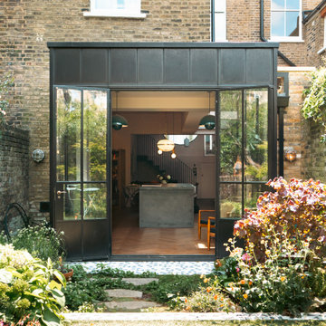
The first extension filled in the side return with a London stock brick facade and a glazed roof, while the second – a striking black steel and glass pavilion was glazed on three sides and placed along the garden elevation.
This new pavilion redefined the building’s relationship with the garden. Its steel-framed glazing created a seamless dialogue between interior and exterior, offering a sense of immersion in the surrounding landscape.
At the heart of the plan sits a dramatic, five-metre-tall dining space that acts as a transition from the original entrance hall into the new addition. A large, circular cast-glass window, framed in steel, provides a visual and spatial link between old and new, allowing light and movement to travel through the depth of the home.
Throughout the project, a series of black metal elements were introduced as sculptural interventions – each marking moments of transformation within the house. These included the bespoke steel framed circular window, a custom metal staircase, a cylindrical support column, and the striking steel and glass garden pavilion. Together, they formed a coherent architectural language that underscored the project’s bold intent.
Our steel windows and doors played a vital role in delivering the project’s vision. The architects chose steel for its refined sight lines and distinctive material character, which helped bridge the gap between the historical context of the building and the bold new additions.
The black steel frames provided a crisp contrast to the pale London stock brick and added definition to the glazed pavilion, reinforcing the sense of architectural precision. In particular, the fine steel profiles of the garden room allowed the extension to feel both lightweight and immersive, blurring the boundary between the house and its garden.
The architect drew inspiration from the Bauhaus Movement, particularly the work of Walter Gropius, whose approach to functional beauty and industrial materials informed the design of the garden pavilion.
Here, our glazing system was used not just for transparency, but as an expressive architectural element. The carefully proportioned panels help to conceal the roof thickness and reinforce the pavilion’s industrial yet abstract character – a deliberate nod to product design and modernist detailing.
Sustainability was an important factor in the selection of materials. Our steel systems, made from 99% recycled content and 100% recyclable, aligned with the project’s broader environmental goals.
The architects noted that this commitment to material longevity and circularity was central to their decision to use steel. The durability and recyclability of the windows and doors ensured the project met both aesthetic and ethical criteria.
This London terrace house now stands as a celebration of contrast – between heritage and innovation, solidity and transparency, tradition and transformation. Our steel windows and doors were not simply components; they were essential tools in crafting a home that is as bold and expressive as it is functional.
The result is a home designed for modern family life, where light, space, and materiality come together in perfect harmony.
 Fabco Sanctuary
The architect and designer Guy Derwent was approached by his client with a clear and compelling brief: to completely transform a grand Victorian terrace house they were planning to renovate. The client envisioned something far beyond a standard renovation – this was to be a bold and dramatic reimagining of a family home that could grow with them over time.
With the property having remained largely untouched for more than fifty years, the architects saw an opportunity to unlock its potential and deliver a contemporary design that would contrast beautifully with its Victorian heritage.
The existing layout consisted of a series of small, disconnected rooms to the rear of the house. To respond to the client’s need for openness and flexibility, the architect proposed a radical restructuring of the ground floor:
The rear rooms were completely removed
Suspended timber floors were lowered by up to two metres to align with the garden
Two bold extensions were added
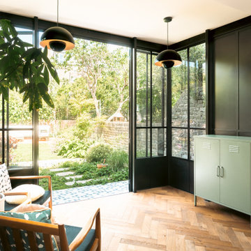
The first extension filled in the side return with a London stock brick facade and a glazed roof, while the second – a striking black steel and glass pavilion was glazed on three sides and placed along the garden elevation.
This new pavilion redefined the building’s relationship with the garden. Its steel-framed glazing created a seamless dialogue between interior and exterior, offering a sense of immersion in the surrounding landscape.
At the heart of the plan sits a dramatic, five-metre-tall dining space that acts as a transition from the original entrance hall into the new addition. A large, circular cast-glass window, framed in steel, provides a visual and spatial link between old and new, allowing light and movement to travel through the depth of the home.
Throughout the project, a series of black metal elements were introduced as sculptural interventions – each marking moments of transformation within the house. These included the bespoke steel framed circular window, a custom metal staircase, a cylindrical support column, and the striking steel and glass garden pavilion. Together, they formed a coherent architectural language that underscored the project’s bold intent.
Our steel windows and doors played a vital role in delivering the project’s vision. The architects chose steel for its refined sight lines and distinctive material character, which helped bridge the gap between the historical context of the building and the bold new additions.
The black steel frames provided a crisp contrast to the pale London stock brick and added definition to the glazed pavilion, reinforcing the sense of architectural precision. In particular, the fine steel profiles of the garden room allowed the extension to feel both lightweight and immersive, blurring the boundary between the house and its garden.
The architect drew inspiration from the Bauhaus Movement, particularly the work of Walter Gropius, whose approach to functional beauty and industrial materials informed the design of the garden pavilion.
Here, our glazing system was used not just for transparency, but as an expressive architectural element. The carefully proportioned panels help to conceal the roof thickness and reinforce the pavilion’s industrial yet abstract character – a deliberate nod to product design and modernist detailing.
Sustainability was an important factor in the selection of materials. Our steel systems, made from 99% recycled content and 100% recyclable, aligned with the project’s broader environmental goals.
The architects noted that this commitment to material longevity and circularity was central to their decision to use steel. The durability and recyclability of the windows and doors ensured the project met both aesthetic and ethical criteria.
This London terrace house now stands as a celebration of contrast – between heritage and innovation, solidity and transparency, tradition and transformation. Our steel windows and doors were not simply components; they were essential tools in crafting a home that is as bold and expressive as it is functional.
The result is a home designed for modern family life, where light, space, and materiality come together in perfect harmony.
 StoneUnlimited Kitchen and Bath Remodeling
In recent years, shiplap installments have been popular on HGTV, other design networks, and in magazines. Shiplap has become a desired focal feature in homes to achieve a shabby chic, cottage-like aesthetic. When we were approached by the owners of this bathroom we couldn’t have been more excited to help them achieve the effect that they were dreaming of.
Our favorite features of this bathroom are:
1. The floor to ceiling shiplap walls are beautiful and have completely converted the space
2. The innovative design of the tub deck showcases Stoneunlimited’s ability to utilize Waypoint cabinets in various ways to achieve sophisticated detail.
3. The design of the tile in the shower in differing sizes, textures and chair rail detail make the white on white tile appealing to the eye and emphasizes the farmhouse shabby-chic feel.
If you can imagine a warm and cozy bathroom or kitchen with the beauty of shiplap, Stoneunlimited Kitchen and Bath can help you achieve your dream of having a farmhouse inspired space too!
This bathroom remodel in Alpharetta, Georgia features:
Shiplap: Floor to ceiling 4” tongue & groove
Cabinets: Waypoint Shaker Style Cabinets with Soft Close feature in Harbor finish
Knobs & Pulls: Ascendra in Polish Chrome
Tile:
Main Floor Tile: 6x40 Longwood Nut Porcelain
Shower Tile:
1x3 Mini brick mosaic tile in gloss white for the top 58” of the shower walls and niche
3x6 Highland Whisper White subway tiles for the lower 36” of the shower walls
2x6 Highland Whisper White Chair Rail tile used as a divider between the Mini Brick and Subway tile
2x2 Arabescato Herringbone marble tile for the shower floor
Tub:
Kohler 36” x 66” soaking tub with Artifacts Faucet in Chrome finish
Tub Deck was built up to enclose the rectangular under mount tub
Waypoint cabinet panels were used to create the apron for the tub deck
Hardware: Shower Trim, Faucets, Robe Hook, Towel Rack are all Kohler Artifacts Series in Chrome

 Complete Flooring
Chris Golden
Inspiration for a transitional carpeted living room remodel in Phoenix with beige walls, a standard fireplace and a tile fireplace
Inspiration for a transitional carpeted living room remodel in Phoenix with beige walls, a standard fireplace and a tile fireplace
 Fabco Sanctuary
The architect and designer Guy Derwent was approached by his client with a clear and compelling brief: to completely transform a grand Victorian terrace house they were planning to renovate. The client envisioned something far beyond a standard renovation – this was to be a bold and dramatic reimagining of a family home that could grow with them over time.
With the property having remained largely untouched for more than fifty years, the architects saw an opportunity to unlock its potential and deliver a contemporary design that would contrast beautifully with its Victorian heritage.
The existing layout consisted of a series of small, disconnected rooms to the rear of the house. To respond to the client’s need for openness and flexibility, the architect proposed a radical restructuring of the ground floor:
The rear rooms were completely removed
Suspended timber floors were lowered by up to two metres to align with the garden
Two bold extensions were added
The first extension filled in the side return with a London stock brick facade and a glazed roof, while the second – a striking black steel and glass pavilion was glazed on three sides and placed along the garden elevation.
This new pavilion redefined the building’s relationship with the garden. Its steel-framed glazing created a seamless dialogue between interior and exterior, offering a sense of immersion in the surrounding landscape.
At the heart of the plan sits a dramatic, five-metre-tall dining space that acts as a transition from the original entrance hall into the new addition. A large, circular cast-glass window, framed in steel, provides a visual and spatial link between old and new, allowing light and movement to travel through the depth of the home.
Throughout the project, a series of black metal elements were introduced as sculptural interventions – each marking moments of transformation within the house. These included the bespoke steel framed circular window, a custom metal staircase, a cylindrical support column, and the striking steel and glass garden pavilion. Together, they formed a coherent architectural language that underscored the project’s bold intent.
Our steel windows and doors played a vital role in delivering the project’s vision. The architects chose steel for its refined sight lines and distinctive material character, which helped bridge the gap between the historical context of the building and the bold new additions.
The black steel frames provided a crisp contrast to the pale London stock brick and added definition to the glazed pavilion, reinforcing the sense of architectural precision. In particular, the fine steel profiles of the garden room allowed the extension to feel both lightweight and immersive, blurring the boundary between the house and its garden.
The architect drew inspiration from the Bauhaus Movement, particularly the work of Walter Gropius, whose approach to functional beauty and industrial materials informed the design of the garden pavilion.
Here, our glazing system was used not just for transparency, but as an expressive architectural element. The carefully proportioned panels help to conceal the roof thickness and reinforce the pavilion’s industrial yet abstract character – a deliberate nod to product design and modernist detailing.
Sustainability was an important factor in the selection of materials. Our steel systems, made from 99% recycled content and 100% recyclable, aligned with the project’s broader environmental goals.
The architects noted that this commitment to material longevity and circularity was central to their decision to use steel. The durability and recyclability of the windows and doors ensured the project met both aesthetic and ethical criteria.
This London terrace house now stands as a celebration of contrast – between heritage and innovation, solidity and transparency, tradition and transformation. Our steel windows and doors were not simply components; they were essential tools in crafting a home that is as bold and expressive as it is functional.
The result is a home designed for modern family life, where light, space, and materiality come together in perfect harmony.
 Fabco Sanctuary
The architect and designer Guy Derwent was approached by his client with a clear and compelling brief: to completely transform a grand Victorian terrace house they were planning to renovate. The client envisioned something far beyond a standard renovation – this was to be a bold and dramatic reimagining of a family home that could grow with them over time.
With the property having remained largely untouched for more than fifty years, the architects saw an opportunity to unlock its potential and deliver a contemporary design that would contrast beautifully with its Victorian heritage.
The existing layout consisted of a series of small, disconnected rooms to the rear of the house. To respond to the client’s need for openness and flexibility, the architect proposed a radical restructuring of the ground floor:
The rear rooms were completely removed
Suspended timber floors were lowered by up to two metres to align with the garden
Two bold extensions were added
The first extension filled in the side return with a London stock brick facade and a glazed roof, while the second – a striking black steel and glass pavilion was glazed on three sides and placed along the garden elevation.
This new pavilion redefined the building’s relationship with the garden. Its steel-framed glazing created a seamless dialogue between interior and exterior, offering a sense of immersion in the surrounding landscape.
At the heart of the plan sits a dramatic, five-metre-tall dining space that acts as a transition from the original entrance hall into the new addition. A large, circular cast-glass window, framed in steel, provides a visual and spatial link between old and new, allowing light and movement to travel through the depth of the home.
Throughout the project, a series of black metal elements were introduced as sculptural interventions – each marking moments of transformation within the house. These included the bespoke steel framed circular window, a custom metal staircase, a cylindrical support column, and the striking steel and glass garden pavilion. Together, they formed a coherent architectural language that underscored the project’s bold intent.
Our steel windows and doors played a vital role in delivering the project’s vision. The architects chose steel for its refined sight lines and distinctive material character, which helped bridge the gap between the historical context of the building and the bold new additions.
The black steel frames provided a crisp contrast to the pale London stock brick and added definition to the glazed pavilion, reinforcing the sense of architectural precision. In particular, the fine steel profiles of the garden room allowed the extension to feel both lightweight and immersive, blurring the boundary between the house and its garden.
The architect drew inspiration from the Bauhaus Movement, particularly the work of Walter Gropius, whose approach to functional beauty and industrial materials informed the design of the garden pavilion.
Here, our glazing system was used not just for transparency, but as an expressive architectural element. The carefully proportioned panels help to conceal the roof thickness and reinforce the pavilion’s industrial yet abstract character – a deliberate nod to product design and modernist detailing.
Sustainability was an important factor in the selection of materials. Our steel systems, made from 99% recycled content and 100% recyclable, aligned with the project’s broader environmental goals.
The architects noted that this commitment to material longevity and circularity was central to their decision to use steel. The durability and recyclability of the windows and doors ensured the project met both aesthetic and ethical criteria.
This London terrace house now stands as a celebration of contrast – between heritage and innovation, solidity and transparency, tradition and transformation. Our steel windows and doors were not simply components; they were essential tools in crafting a home that is as bold and expressive as it is functional.
The result is a home designed for modern family life, where light, space, and materiality come together in perfect harmony.
 StoneUnlimited Kitchen and Bath Remodeling
In recent years, shiplap installments have been popular on HGTV, other design networks, and in magazines. Shiplap has become a desired focal feature in homes to achieve a shabby chic, cottage-like aesthetic. When we were approached by the owners of this bathroom we couldn’t have been more excited to help them achieve the effect that they were dreaming of.
Our favorite features of this bathroom are:
1. The floor to ceiling shiplap walls are beautiful and have completely converted the space
2. The innovative design of the tub deck showcases Stoneunlimited’s ability to utilize Waypoint cabinets in various ways to achieve sophisticated detail.
3. The design of the tile in the shower in differing sizes, textures and chair rail detail make the white on white tile appealing to the eye and emphasizes the farmhouse shabby-chic feel.
If you can imagine a warm and cozy bathroom or kitchen with the beauty of shiplap, Stoneunlimited Kitchen and Bath can help you achieve your dream of having a farmhouse inspired space too!
This bathroom remodel in Alpharetta, Georgia features:
Shiplap: Floor to ceiling 4” tongue & groove
Cabinets: Waypoint Shaker Style Cabinets with Soft Close feature in Harbor finish
Knobs & Pulls: Ascendra in Polish Chrome
Tile:
Main Floor Tile: 6x40 Longwood Nut Porcelain
Shower Tile:
1x3 Mini brick mosaic tile in gloss white for the top 58” of the shower walls and niche
3x6 Highland Whisper White subway tiles for the lower 36” of the shower walls
2x6 Highland Whisper White Chair Rail tile used as a divider between the Mini Brick and Subway tile
2x2 Arabescato Herringbone marble tile for the shower floor
Tub:
Kohler 36” x 66” soaking tub with Artifacts Faucet in Chrome finish
Tub Deck was built up to enclose the rectangular under mount tub
Waypoint cabinet panels were used to create the apron for the tub deck
Hardware: Shower Trim, Faucets, Robe Hook, Towel Rack are all Kohler Artifacts Series in Chrome
43