
Search results for "Instance" in Home Design Ideas
 Donald Lococo Architects
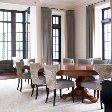
Awarded by the Classical institute of art and architecture , the linnean house has a restrained and simple elevation of doors and windows. Nestled in the Forest Hills neighborhood of Washington, D.C., the Linnean House is classical in both plan and elevation throughout its award-winning house plans. The main mass, comprising of the most formal and public spaces, is a spatial triptych along a symmetrical main axis. Inside the luxury home, the limestone façade, simple but well-proportioned with classical elements, extends itself into both the entry portico and main foyer with consistent proportions and materiality. This introduction allows the flanking living and dining rooms to be perceived as separate pavilions, each equipped with eight equal-proportioned French doors symmetrical of the main axis.
Beyond the classical spaces are two wings which lead to the master suite and a kitchen/family space, respectively. Both of which are situated to queue from the French door axis, a focal feature in the repeatedly published home design. At the entry foyer, the stark stone luxury architecture is warmed by two symmetrical wood armoire-like freestanding sculptural objects, a persistent theme throughout the luxury house. In the kitchen, for instance, stand four similar wood armoire objects at opposite corners that act as columns and help give this space a sense of boundary and enclosure. The master bath vanity, in similar fashion, is introduced as a central free-standing form anchoring itself as a notable presence in the space. Lastly, the wine room is designed as a series of free-standing heavy wood cavity walls spanned only by a hint of glass.
 miniki
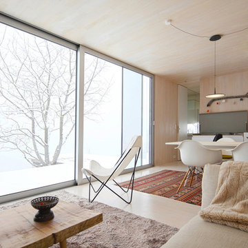
miniki is the first kitchen system that transforms into an elevated sideboard after use. There is nothing there to betray the actual function of this piece of furniture. So the surprise is even greater when a fully functional kitchen is revealed after it’s opened. When miniki was designed, priority was given not only to an elegant form but above all to functionality and absolute practicality for everyday use. All the requirements of a kitchen are organized into the smallest of spaces. And space is often at a premium.
Different modules are available to match all individual requirements. These modules can be combined to suit all tastes and so provide the perfect kitchen for all purposes. There are kitchens for all requirements – from the mini-kitchen with just one sink and some storage room for small offices to kitchenettes with, for instance, a fridge and two cooking zones, or a fully equipped eat-in kitchen with the full range of functions. This makes miniki a flexible, versatile, multi-purpose kitchen system. Simple to assemble and with its numerous combination options, the modules can be adapted swiftly and easily to any kind of setting.
miniki facts
module miniki
: 3 modules – mk 1, mk 2, mk 3
: module dimensions 120 x 60 x 60 cm / 60 x 60 x 60 cm (H x W x D)
: birch plywood with HPL laminate and sealed edges
: 15 colors
: mk 1 from 4,090 EUR (net plus devices)
: mk 3 from 1,260 EUR (net)
For further information see http://miniki.eu/en/home.html

Find the right local pro for your project
 Donald Lococo Architects
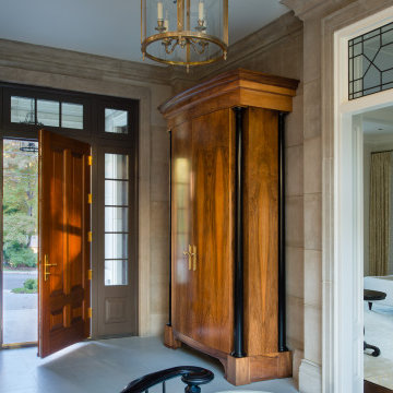
Awarded by the Classical institute of art and architecture , the linnean house has a restrained and simple elevation of doors and windows. Nestled in the Forest Hills neighborhood of Washington, D.C., the Linnean House is classical in both plan and elevation throughout its award-winning house plans. The main mass, comprising of the most formal and public spaces, is a spatial triptych along a symmetrical main axis. Inside the luxury home, the limestone façade, simple but well-proportioned with classical elements, extends itself into both the entry portico and main foyer with consistent proportions and materiality. This introduction allows the flanking living and dining rooms to be perceived as separate pavilions, each equipped with eight equal-proportioned French doors symmetrical of the main axis.
Beyond the classical spaces are two wings which lead to the master suite and a kitchen/family space, respectively. Both of which are situated to queue from the French door axis, a focal feature in the repeatedly published home design. At the entry foyer, the stark stone luxury architecture is warmed by two symmetrical wood armoire-like freestanding sculptural objects, a persistent theme throughout the luxury house. In the kitchen, for instance, stand four similar wood armoire objects at opposite corners that act as columns and help give this space a sense of boundary and enclosure. The master bath vanity, in similar fashion, is introduced as a central free-standing form anchoring itself as a notable presence in the space. Lastly, the wine room is designed as a series of free-standing heavy wood cavity walls spanned only by a hint of glass.
 ArchiCGI 3D Rendering
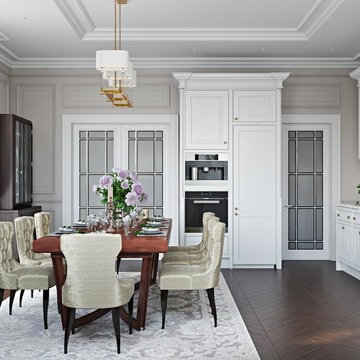
House Design rendering allows Interior Designers and Architects to bring their beautiful concepts to life. For unlike drawings and concepts, 3D visualizations give a complete picture, enabling the audience to have a glimpse into the life they could lead there.
The elegance of this Classical Interior scenes is a great sample of the highly professional 3dViz.
One could not take eyes off the clean-lined white furniture, lending the space a refined and airy look, marble backdrop and all this delightful storage space. Photoreal 3D house rendering makes colors look every bit as crisp and vivid as they’ll be in real life, so that client can have a complete picture of their effect and make suggestions if necessary.
But what really makes the 3d design stand out are details. Those small things that are never included in drawings, but are vital to the overall atmosphere.
For instance, kitchen decor allows to create a connection with the Client – by making it personal and so much “him”. Thus, cold gleam of elegant glassware, beautiful flowers on the table suggest refined taste, while photos and figurines allow to deduce that the owners are a well-traveled family with versatile interests.
 Urban Oasis Design & Construction LLC
Carrie Culp
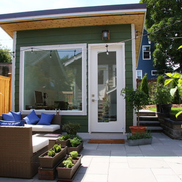
Home office - transitional home office idea in Seattle
Home office - transitional home office idea in Seattle
 Michelle Mohlere Interior Color & Design
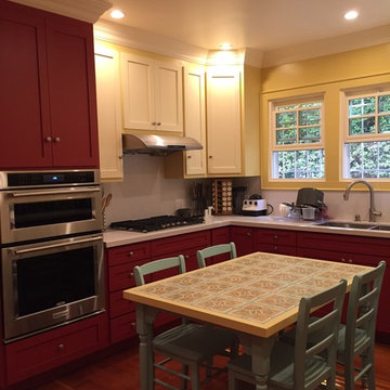
Eat-in kitchen - large southwestern u-shaped dark wood floor eat-in kitchen idea in Los Angeles with recessed-panel cabinets, red cabinets, an island, a double-bowl sink, solid surface countertops and stainless steel appliances
 Timeless Design Interiors, LLC
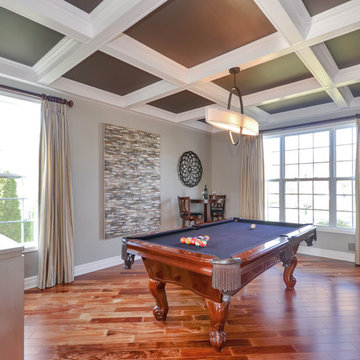
Inspiration for a large enclosed medium tone wood floor living room remodel in New York with gray walls
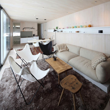 miniki
miniki is the first kitchen system that transforms into an elevated sideboard after use. There is nothing there to betray the actual function of this piece of furniture. So the surprise is even greater when a fully functional kitchen is revealed after it’s opened. When miniki was designed, priority was given not only to an elegant form but above all to functionality and absolute practicality for everyday use. All the requirements of a kitchen are organized into the smallest of spaces. And space is often at a premium.
Different modules are available to match all individual requirements. These modules can be combined to suit all tastes and so provide the perfect kitchen for all purposes. There are kitchens for all requirements – from the mini-kitchen with just one sink and some storage room for small offices to kitchenettes with, for instance, a fridge and two cooking zones, or a fully equipped eat-in kitchen with the full range of functions. This makes miniki a flexible, versatile, multi-purpose kitchen system. Simple to assemble and with its numerous combination options, the modules can be adapted swiftly and easily to any kind of setting.
miniki facts
module miniki
: 3 modules – mk 1, mk 2, mk 3
: module dimensions 120 x 60 x 60 cm / 60 x 60 x 60 cm (H x W x D)
: birch plywood with HPL laminate and sealed edges
: 15 colors
: mk 1 from 4,090 EUR (net plus devices)
: mk 3 from 1,260 EUR (net)
For further information see http://miniki.eu/en/home.html
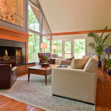
 Revealing Redesign
In June of 2015 an amazing sudden summer storm hit our area with violent winds, rain, and tornados. In the aftermath, my clients found, on top of losing 30 or so trees on their property overall, one had actually struck their home, piercing the roof in their great room.
The great room was the very last room in their house that we hadn't done a complete overhaul in. Sure, we had tweaked it, purchased a few pieces of furniture, reworked the layout, but the colors and design were much the same as they had been for decades.
Since things needed to be repaired and painted already, it was decided to jump in with both feet and totally rethink the room, change almost everything, and add architectural details that seemed to be missing in the original design from the 1980's.
So not only were the color palette, rugs, and furnishings changed, but some very important architectural interest was added. For instance, a new, more elegant post was added at the back of the space, visually connecting the downstairs with the loft above. Also, three beaded beams have been added across the vaulted ceiling, as well as a large chandelier, giving warmth, light and visual heft to the peak and upper corners of the room.
The fireplace was given a total facelift as well. New original artwork, which had inspired the palette for the space, is now highlighted inside a custom panel over a beautiful new mantel and fireplace surround.
Even though this project started with something quite unexpected and scary, my clients tell me that the results are something that they just love and enjoy whether at home just the two of them, or entertaining extended family and friends.
Photos by Laura Kicey
 Amazing Spaces
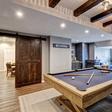
We started with a blank slate on this basement project where our only obstacles were exposed steel support columns, existing plumbing risers from the concrete slab, and dropped soffits concealing ductwork on the ceiling. It had the advantage of tall ceilings, an existing egress window, and a sliding door leading to a newly constructed patio.
This family of five loves the beach and frequents summer beach resorts in the Northeast. Bringing that aesthetic home to enjoy all year long was the inspiration for the décor, as well as creating a family-friendly space for entertaining.
Wish list items included room for a billiard table, wet bar, game table, family room, guest bedroom, full bathroom, space for a treadmill and closed storage. The existing structural elements helped to define how best to organize the basement. For instance, we knew we wanted to connect the bar area and billiards table with the patio in order to create an indoor/outdoor entertaining space. It made sense to use the egress window for the guest bedroom for both safety and natural light. The bedroom also would be adjacent to the plumbing risers for easy access to the new bathroom. Since the primary focus of the family room would be for TV viewing, natural light did not need to filter into that space. We made sure to hide the columns inside of newly constructed walls and dropped additional soffits where needed to make the ceiling mechanicals feel less random.
In addition to the beach vibe, the homeowner has valuable sports memorabilia that was to be prominently displayed including two seats from the original Yankee stadium.
For a coastal feel, shiplap is used on two walls of the family room area. In the bathroom shiplap is used again in a more creative way using wood grain white porcelain tile as the horizontal shiplap “wood”. We connected the tile horizontally with vertical white grout joints and mimicked the horizontal shadow line with dark grey grout. At first glance it looks like we wrapped the shower with real wood shiplap. Materials including a blue and white patterned floor, blue penny tiles and a natural wood vanity checked the list for that seaside feel.
A large reclaimed wood door on an exposed sliding barn track separates the family room from the game room where reclaimed beams are punctuated with cable lighting. Cabinetry and a beverage refrigerator are tucked behind the rolling bar cabinet (that doubles as a Blackjack table!). A TV and upright video arcade machine round-out the entertainment in the room. Bar stools, two rotating club chairs, and large square poufs along with the Yankee Stadium seats provide fun places to sit while having a drink, watching billiards or a game on the TV.
Signed baseballs can be found behind the bar, adjacent to the billiard table, and on specially designed display shelves next to the poker table in the family room.
Thoughtful touches like the surfboards, signage, photographs and accessories make a visitor feel like they are on vacation at a well-appointed beach resort without being cliché.
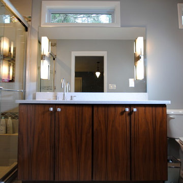
 Berry Design Build
If you are familiar with our work, at Berry Design Build, you know that to us each project is more than just sticks and mortar. Each home, each client, each family we have the privilege to work with becomes part of our team. We believe in the value of excellence, the importance of commitment, and the significance of delivery. This renovation, along with many, is very close to our hearts because it’s one of the few instances where we get to exercise more than just the Design Build division of our company. This particular client had been working with Berry for many years to find that lifetime home. Through many viewings, agent caravans, and lots of offers later she found a house worth calling home. Although not perfectly to her personality (really what home is until you make it yours) she asked our Design Build division to come in and renovate some areas: including the kitchen, hall bathroom, master bathroom, and most other areas of the house; i.e. paint, hardwoods, and lighting. Each project comes with its challenges, but we were able to combine her love of mid-century modern furnishings with the character of the already existing 1962 ranch.
Photos by Nicole Cosentino
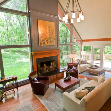 Revealing Redesign
In June of 2015 an amazing sudden summer storm hit our area with violent winds, rain, and tornados. In the aftermath, my clients found, on top of losing 30 or so trees on their property overall, one had actually struck their home, piercing the roof in their great room.
The great room was the very last room in their house that we hadn't done a complete overhaul in. Sure, we had tweaked it, purchased a few pieces of furniture, reworked the layout, but the colors and design were much the same as they had been for decades.
Since things needed to be repaired and painted already, it was decided to jump in with both feet and totally rethink the room, change almost everything, and add architectural details that seemed to be missing in the original design from the 1980's.
So not only were the color palette, rugs, and furnishings changed, but some very important architectural interest was added. For instance, a new, more elegant post was added at the back of the space, visually connecting the downstairs with the loft above. Also, three beaded beams have been added across the vaulted ceiling, as well as a large chandelier, giving warmth, light and visual heft to the peak and upper corners of the room.
The fireplace was given a total facelift as well. New original artwork, which had inspired the palette for the space, is now highlighted inside a custom panel over a beautiful new mantel and fireplace surround.
Even though this project started with something quite unexpected and scary, my clients tell me that the results are something that they just love and enjoy whether at home just the two of them, or entertaining extended family and friends.
Photos by Laura Kicey
 INSPIRED KITCHEN DESIGN
So, what is her favorite part of the kitchen? Well, everything.
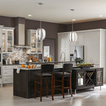
“I love the whole thing. I agonized over every detail, like the legs on the table, which we sourced from a bar company. I also love the colors like the darker gray on the island and a lighter gray for the cabinets. And, I really love the pendant lights,” she says.
Elisia offers some words of advice for other IKEA customers starting their own remodel project —especially those new to the process.
“I suggest you spend time on Pinterest and HOUZZ to get a good idea of kitchen designs. When you find a picture you like, try to figure out what it is exactly that you like. That’s how I realized I wanted that vent hood with the tile/brick facade, for instance,” she says.
“Also, I so appreciated having the help of IKD. They were experienced and knowledgeable about the IKEA software and IKEA products. Having a sounding board and someone to translate my vision into what I needed for the cabinetry was so great,” she says.
She concludes: “IKD lets you be as involved as you want to be, so I was very involved. I knew to an inch what I wanted to see. I could make sure I was buying all the right pieces, and allowing for the space necessary to make sure the doors and drawers opened enough.”
We’re so glad you love your kitchen Elisia!
 Berry Design Build
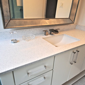
If you are familiar with our work, at Berry Design Build, you know that to us each project is more than just sticks and mortar. Each home, each client, each family we have the privilege to work with becomes part of our team. We believe in the value of excellence, the importance of commitment, and the significance of delivery. This renovation, along with many, is very close to our hearts because it’s one of the few instances where we get to exercise more than just the Design Build division of our company. This particular client had been working with Berry for many years to find that lifetime home. Through many viewings, agent caravans, and lots of offers later she found a house worth calling home. Although not perfectly to her personality (really what home is until you make it yours) she asked our Design Build division to come in and renovate some areas: including the kitchen, hall bathroom, master bathroom, and most other areas of the house; i.e. paint, hardwoods, and lighting. Each project comes with its challenges, but we were able to combine her love of mid-century modern furnishings with the character of the already existing 1962 ranch.
Photos by Nicole Cosentino

 Floriana Interiors
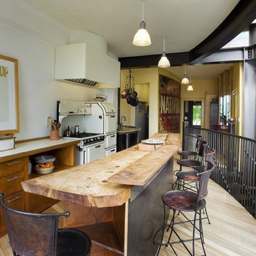
The kitchen: the old 1930’ Magic Chef stove juxtaposes the feeling of the airy space with it’s exposed I-beans, steel and glass. The pantry is tucked behind the curbed wall decorated with the nostalgic vintage metal billboard. The long curved island is single long slab of reclaimed cedar wood.

 Robin's Nest Interiors
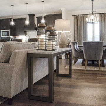
These homeowners who were downsizing to a patio home in Floyds Fork area came to us after they had made all of their selections in paint colors, fixtures and finishes and asked us to put together a comprehensive plan for their new home including space planning, furniture selections, and finishing touches in window treatments, rugs, accent lighting and accessories. Although this is a well laid out floor plan, we asked a lot of questions to make sure each area functioned for the homeowners as well as looked good. For instance, the floor plan included a Dining Area and small Breakfast Nook. The homeowners knew they would spend most of their time at the island, so we invested in quality custom bar stools, we selected fully upholstered chairs for the dining area which will be used, and turned the Breakfast Nook into a seating area for morning coffee or afternoon reading. That took care of the functional, now for the fun. Our color palette comprised of creams, grays, tans and mustard yellow is so pleasing. We kept our furnishings neutral while popping our color with window treatments and accessories. Please note we used 3 different fabrics on the 3 different windows in the Living Area. As long as the fabrics coordinate and support your color palette, you can use multiple fabrics in the same space. Since our palette was neutral, we made sure our finishing touches had a lot of texture and interest.
There is so much to look at and love in the large open space, and this is definitely one of my favorite color palettes. And as striking as this home looks, it is laid out so well. Every piece of furniture fits and functions perfectly. This is visual proof of the importance of a comprehensive plan. Enjoy!
 Research Emergent Design (Studio RED)
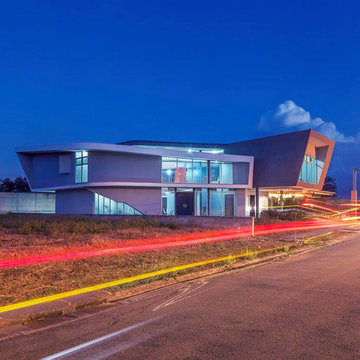
Located in the outskirts of Alajuela, Coyol is a humid weather area full of lush green land-scapes and stunning views. The clients were looking for a house able to integrate public areas, front, and backyard within one single space. Twix House is conceptualized by two main curved dynamic shapes, which create one whole. Two twin L-shaped volumes are looking to opposite sides: sunrise facade and sunset facade, resulting in an S-shaped form of the entire house. Both contain the main and secondary bedrooms of the house, giving them unique views of the Central Valley mountains.
The main access entrance opens onto a double height lobby, crossed by the bridge in the center, and a curved staircase to the left. The main public area has a double height space, which is an open plan, containing the living room, dining room, and a kitchen. These spaces are connected by slid-ing doors that lead to the terrace, becoming a key element of the house, transforming the social areas and allowing for direct communication between indoor and outdoor spaces. The private areas of the house are located on the second floor: two bedrooms and a second living room. These are connected by a third volume, which is an interior bridge, articulating the house and integrating all the downstairs and upstairs areas together.
Due to the particularities of the climate zone, a special attention had to be paid to ensuring that the house remains fresh. Therefore, as a part of the process, different passive design strategies for tropical climate areas were implemented. For instance, the roof of the bridge overlaps the rest of the roof creating a gap, which acts as a monitor letting the hot air leave. Apart from that, the orientation of the building allows for cross ventilation to take place, resulting in cool and refreshing temperatures in-doors, despite the daily tropical heat.
54