
Search results for "Insulation recreation" in Home Design Ideas
 Klopf Architecture
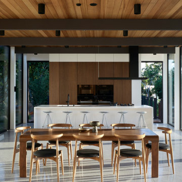
Malibu Glass Box House by Klopf Architecture
Following the devastating Woolsey Fire of 2018, the site in Malibu offered a unique opportunity to rebuild not just a home, but a new architectural composition that highlighted the property’s potential while navigating strict fire-rebuild codes in the area. Designed by Klopf Architecture, this project embraced a set of limitations and translated them into an architectural asset.
The city’s fire-rebuild process required the new structure to remain close to the original footprint, size and bulk, a constraint that ultimately clarified the architectural direction. Perched near the front of a long, narrow lot, the new home frames and overlooks a private, park-like rear expanse, an uncommon luxury especially in this part of Malibu .
Without a fixed program, the design process allowed for a different kind of creative focus allowing Klopf Architecture the opportunity to explore how a modernist home could best respond to this site. The team approached the project not with a list of requirements, but with a question: How might a modernist live here? What spatial qualities would inspire calm, connection, and a sense of wonder in this setting? The process became less about problem-solving and more about architectural storytelling—letting the site, the light, and the principles of modern design guide the form and flow of the home.
The response emerged in the form of a glass-box pavilion, an open, Mid-Century Modern inspired living, dining, and kitchen space that floats at the edge of the property’s natural descent. Connected to the more enclosed, private areas of the home by a glass-walled hallway, the living pavilion becomes a distinct centerpiece of the design. It opens on all four sides to the landscape with decks and patios on the flanks, an internal garden and water feature to the north, and a dramatic unguarded view of the expansive backyard and ocean horizon to the south.
Because of the mandated footprint, careful planning was required to ensure every space could still engage with light, landscape, or both. Strategic voids in the form of atriums and courtyards allow daylight to filter deep into the home’s core, while offering moments of surprise and retreat. These design gestures allow natural light to filter deep into the interior, creating a sense of brightness and openness throughout the day. At the same time, they expand the perceptual boundaries between inside and out, making the home feel more expansive while anchoring its connection to the surrounding landscape.
The siting of the house is what gives it its unique character. Rather than receding into the backyard like the neighboring homes, the house holds a slight prominence. From the central living pavilion, stepping down into the landscape feels more like entering a secluded park where a separate existing accessory structure, trail, and recreational areas await. The home’s modest street presence gives way to this unfolding drama of space, view, and nature.
Fire-resilient materials and assemblies are integrated seamlessly throughout including triple-pane glazing, under-slab and roof insulation, and locally sourced fire-rated cladding ensure the house not only meets Calfornia’s rigorous wildland-urban interface (WUI) standards, but feels effortlessly aligned with them. While technical decisions like fire-hardening and mechanical systems presented some construction challenges, particularly around the cantilevered glass box, the team found a functional compromise that preserved the integrity of the design.
Inside, a restrained palette and exposed post and beam design celebrate the ethos of mid-century modernism. A central circulation spine extends from the entry to the rear glass wall, offering a continuous visual link from street to ocean. Spaces such as the library and office, though more intimate in scale, are never cut off from nature as each opens to its own unique courtyard or garden view.
Though born out of a strict regulatory framework and developed without a specific client, the rebuild design unfolded with remarkable clarity. Grounded in site logic, refined by limitations and an emphasis on timeless spatial relationships – light, proportion, and a strong connection to nature, the resulting design feels both effortless and uplifting. The home lives lightly on the land, opens generously to its surroundings, and strikes a careful balance between privacy, openness, and calm. For Klopf Architecture, it stands as a compelling case study in how site, code, and circumstantial constraints can inspire enduring, modernist architecture. With years of experience reimagining mid-century modern design for how people live today, the firm took the project’s limitations as an opportunity. The result is a home shaped by open, flowing spaces, strong indoor-outdoor connections, and a calm, clear sense of structure. It’s a good reminder that even with strict constraints, there’s still room for architecture to breathe—and for modernism to keep moving forward.
Klopf Architecture project team: Geoff Campen, John Klopf, AIA, and Sherry Tan
Structural Engineer: ZFA
Contractor: Maison D’Artiste
Photography: ©2025 Mariko Reed
Year Completed: 2023
 Advance Design Studio, Ltd.
Curtis and Peggy had been thinking of a kitchen remodel for quite some time, but they knew their house would have a unique set of challenges. Their older Victorian house was built in 1891. The kitchen cabinetry was original, and they wanted to keep the authenticity of their period home while adding modern comforts that would improve their quality of life.
A friend recommended Advance Design Studio for their exceptional experience and quality of work. After meeting with designer Michelle Lecinski at Advance Design, they were confident they could partner with Advance to accomplish the unique kitchen renovation they’d been talking about for years. “We wanted to do the kitchen for a long, long time,” Curtis said. “(We asked ourselves) what are we actually going to do? How are we going to do this? And who are we going to find to do exactly what we want?”
The goal for the project was to keep the home renovation and new kitchen feeling authentic to the time in which it was built. They desperately wanted the modern comforts that come with a larger refrigerator and the dishwasher that they never had! The old home was also a bit drafty so adding a fireplace, wall insulation and new windows became a priority. They very much wanted to create a comfortable hearth room adjacent to the kitchen, complete with old world brick.
The original cabinetry had to go to make way for beautiful new kitchen cabinetry that appears as if it was a hundred years old, but with all the benefits of cutting-edge storage, self-closing drawers, and a brand-new look. “We just wanted to keep it old looking, but with some modern updates,” Peggy said.
Dura Supreme Highland Cabinets with a Heritage Old World Painted Finish replaced the original 1891 cabinets. The hand-applied careful rubbed-off detailing makes these exquisite cabinets look as if they came from a far-gone era. Despite the small size of the kitchen, Peggy, Curtis and Michelle utilized every inch with custom cabinet sizes to increase storage capacity. The custom cabinets allowed for the addition of a 24” Fisher Paykel dishwasher with a concealing Dura Supreme door panel. Michelle was also able to work into the new design a larger 30” Fisher Paykel French refrigerator. “We made every ¼ inch count in this small space,” designer Michelle said. “Having the ability to custom size the cabinetry was the only way to achieve this.”
“The kitchen essentially was designed around the Heartland Vintage range and oven,” says Michelle. A classic appliance that combines nostalgic beauty and craftsmanship for modern cooking, with nickel plated trim and elegantly shaped handles and legs; the not to miss range is a striking focal point of the entire room and an engaging conversation piece.
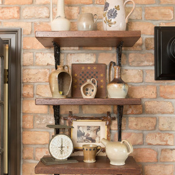
Granite countertops in Kodiak Satin with subtle veining kept with the old-world style. The delicate porcelain La Vie Crackle Sonoma tile kitchen backsplash compliments the home’s style perfectly. A handcrafted passthrough designed to show off Peggy’s fine china was custom built by project carpenters Justin Davis and Jeff Dallain to physically and visually open the space. Additional storage was created in the custom panty room with Latte Edinburg cabinets, hand-made weathered wood shelving with authentic black iron brackets, and an intricate tin copper ceiling.
Peggy and Curtis loved the idea of adding a Vermont stove to make the hearth-room not only functional, but a truly beckoning place to be. A stunning Bordeaux red Vermont Castings Stove with crisp black ventilation was chosen and combined with the authentic reclaimed Chicago brick wall. Advance’s talented carpenters custom-built elegant weathered shelves to house family memorabilia, installed carefully chosen barn sconces, and made the hearth room an inviting place to relax with a cup of coffee and a good book.
“Peggy and Curtis’ project was so much fun to work on. Creating a space that looks and feels like it always belonged in this beautiful old Victorian home is a designer’s dream. To see the delight in their faces when they saw the design details coming together truly made it worth the time and effort that went into making the very compact kitchen space work”, said Michelle. “The result is an amazing custom kitchen, packed with functionality in every inch, nook and cranny!” exclaims Michelle.
The renovation didn’t end with the kitchen. New Pella windows were added to help lessen the drafts. The removal of the original windows and trim necessitated the re-creation of hand-made corbels and trim details no longer available today. The talented carpenter team came to the rescue, crafting new pieces and masterfully finishing them as if they were always there. New custom gutters were formed and installed with a front entry rework necessary to accommodate the changes.
The whole house functions better, but it still feels like the original 1891 home. “From start to finish it’s just a much better space than we used to have,” Peggy said. “Jeff and Justin were amazing.” Curtis added; “We were lucky to find Advance Design, because they really came through for us. I loved that they had everything in house, anything you needed to have done, they could do it”.
 Hillcrest Construction
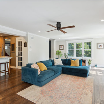
These clients reached out to Hillcrest Construction when their family began out-growing their Phoenixville-area home. Through a comprehensive design phase, opportunities to add square footage were identified along with a reorganization of the typical traffic flow throughout the house.
All household traffic into the hastily-designed, existing family room bump-out addition was funneled through a 3’ berth within the kitchen making meal prep and other kitchen activities somewhat similar to a shift at a PA turnpike toll booth. In the existing bump-out addition, the family room was relatively tight and the dining room barely fit the 6-person dining table. Access to the backyard was somewhat obstructed by the necessary furniture and the kitchen alone didn’t satisfy storage needs beyond a quick trip to the grocery store. The home’s existing front door was the only front entrance, and without a foyer or mudroom, the front formal room often doubled as a drop-zone for groceries, bookbags, and other on-the-go items.
Hillcrest Construction designed a remedy to both address the function and flow issues along with adding square footage via a 150 sq ft addition to the family room and converting the garage into a mudroom entry and walk-through pantry.
-
The project’s addition was not especially large but was able to facilitate a new pathway to the home’s rear family room. The existing brick wall at the bottom of the second-floor staircase was opened up and created a new, natural flow from the second-floor bedrooms to the front formal room, and into the rear family hang-out space- all without having to cut through the often busy kitchen. The dining room area was relocated to remove it from the pathway to the door to the backyard. Additionally, free and clear access to the rear yard was established for both two-legged and four-legged friends.
The existing chunky slider door was removed and in its place was fabricated and installed a custom centerpiece that included a new gas fireplace insert with custom brick surround, two side towers for display items and choice vinyl, and two base cabinets with metal-grated doors to house a subwoofer, wifi equipment, and other stow-away items. The black walnut countertops and mantle pop from the white cabinetry, and the wall-mounted TV with soundbar complete the central A/V hub. The custom cabs and tops were designed and built at Hillcrest’s custom shop.
The farmhouse appeal was completed with distressed engineered hardwood floors and craftsman-style window and door trim throughout.
-
Another major component of the project was the conversion of the garage into a pantry+mudroom+everyday entry.
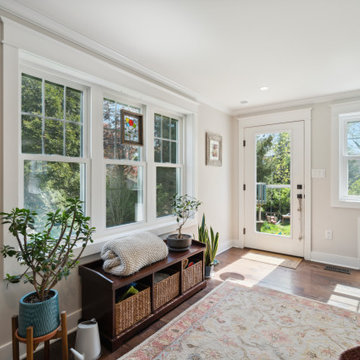
The clients had used their smallish garage for storage of outdoor yard and recreational equipment. With those storage needs being addressed at the exterior, the space was transformed into a custom pantry and mudroom. The floor level within the space was raised to meet the rest of the house and insulated appropriately. A newly installed pocket door divided the dining room area from the designed-to-spec pantry/beverage center. The pantry was designed to house dry storage, cleaning supplies, and dry bar supplies when the cleaning and shopping are complete. A window seat with doggie supply storage below was worked into the design to accommodate the existing elevation of the original garage window.
A coat closet and a small set of steps divide the pantry from the mudroom entry. The mudroom entry is marked with a striking combo of the herringbone thin-brick flooring and a custom hutch. Kids returning home from school have a designated spot to hang their coats and bookbags with two deep drawers for shoes. A custom cherry bench top adds a punctuation of warmth. The entry door and window replaced the old overhead garage doors to create the daily-used informal entry off the driveway.
With the house being such a favorable area, and the clients not looking to pull up roots, Hillcrest Construction facilitated a collaborative experience and comprehensive plan to change the house for the better and make it a home to grow within.
Find the right local pro for your project
 Home Restoration Services, Inc.
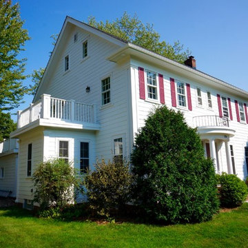
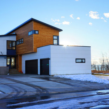
After sitting unfinished over a cold Minnesota winter, we "inherited" this project from a contractor who had not completed the exterior work. Scott Newland http://www.newlandarchitecture.com developed plans to re-create the home's original curved Portico and restore the home's classic Colonial details. The home received a complete exterior renovation, including new siding, insulation, and railings atop three flat roof areas. Photos by Greg Schmidt
 Hillcrest Construction
These clients reached out to Hillcrest Construction when their family began out-growing their Phoenixville-area home. Through a comprehensive design phase, opportunities to add square footage were identified along with a reorganization of the typical traffic flow throughout the house.
All household traffic into the hastily-designed, existing family room bump-out addition was funneled through a 3’ berth within the kitchen making meal prep and other kitchen activities somewhat similar to a shift at a PA turnpike toll booth. In the existing bump-out addition, the family room was relatively tight and the dining room barely fit the 6-person dining table. Access to the backyard was somewhat obstructed by the necessary furniture and the kitchen alone didn’t satisfy storage needs beyond a quick trip to the grocery store. The home’s existing front door was the only front entrance, and without a foyer or mudroom, the front formal room often doubled as a drop-zone for groceries, bookbags, and other on-the-go items.
Hillcrest Construction designed a remedy to both address the function and flow issues along with adding square footage via a 150 sq ft addition to the family room and converting the garage into a mudroom entry and walk-through pantry.
-
The project’s addition was not especially large but was able to facilitate a new pathway to the home’s rear family room. The existing brick wall at the bottom of the second-floor staircase was opened up and created a new, natural flow from the second-floor bedrooms to the front formal room, and into the rear family hang-out space- all without having to cut through the often busy kitchen. The dining room area was relocated to remove it from the pathway to the door to the backyard. Additionally, free and clear access to the rear yard was established for both two-legged and four-legged friends.
The existing chunky slider door was removed and in its place was fabricated and installed a custom centerpiece that included a new gas fireplace insert with custom brick surround, two side towers for display items and choice vinyl, and two base cabinets with metal-grated doors to house a subwoofer, wifi equipment, and other stow-away items. The black walnut countertops and mantle pop from the white cabinetry, and the wall-mounted TV with soundbar complete the central A/V hub. The custom cabs and tops were designed and built at Hillcrest’s custom shop.
The farmhouse appeal was completed with distressed engineered hardwood floors and craftsman-style window and door trim throughout.
-
Another major component of the project was the conversion of the garage into a pantry+mudroom+everyday entry.
The clients had used their smallish garage for storage of outdoor yard and recreational equipment. With those storage needs being addressed at the exterior, the space was transformed into a custom pantry and mudroom. The floor level within the space was raised to meet the rest of the house and insulated appropriately. A newly installed pocket door divided the dining room area from the designed-to-spec pantry/beverage center. The pantry was designed to house dry storage, cleaning supplies, and dry bar supplies when the cleaning and shopping are complete. A window seat with doggie supply storage below was worked into the design to accommodate the existing elevation of the original garage window.
A coat closet and a small set of steps divide the pantry from the mudroom entry. The mudroom entry is marked with a striking combo of the herringbone thin-brick flooring and a custom hutch. Kids returning home from school have a designated spot to hang their coats and bookbags with two deep drawers for shoes. A custom cherry bench top adds a punctuation of warmth. The entry door and window replaced the old overhead garage doors to create the daily-used informal entry off the driveway.
With the house being such a favorable area, and the clients not looking to pull up roots, Hillcrest Construction facilitated a collaborative experience and comprehensive plan to change the house for the better and make it a home to grow within.
 User
User
Modern house plan - 909-1 from Houseplans.com
Questions? Call us at 1-800-913-2350
ON SALE
Photographs may show modified designs. All images are copyrighted.
Plan 909-1
2777 sq ft
3 beds
2.50 baths
46' 2" wide
82' 5" deep
×
Plans
Main Floor Plan
Upper Floor Plan
Plan Description
A 2777SF, 3 bedroom, 2 1/2 bath modern home with a dramatic 2-story living room with giant corner windows. It includes a 3 car attached garage and is planned for a finished basement with an additional bedroom, bathroom, large recreation room and wine cellar.
This home has a very open floor plan with both the dining room and kitchen opening into the dramatic 2 story living room space. Big windows and patio doors allow great access to decks and yard. The plan includes a main level flexible room that has a separate entry and a tall ceiling, so it can be used as a studio, bedroom or office.
Specifications
Plan Styles
Modern
Bedroom Features
Walk In Closet
Upstairs Master Bdrm
Upstairs Bedrooms Bath
Additional Rooms
Great Room Living Room
Den Office Study Computer
Wine Cellar
Upstairs Laundry
Master Sitting Area
Exercise Room
Plan Feature
Energy Efficient Design
Teen Suite Jack Jill Bath
Dimension
Width
46' 2"
Depth
82' 5"
Height
28' 6"
Outdoor Spaces
Covered Front Porch
Grill Deck Sundeck
Covered Rear Porch
Loft Balcony
Entryway
Mud Room
Friend S Entry
Area
Garage Sq Ft
960 sq ft
Main Floor Sq Ft
1290 sq ft
Decks Sq Ft
276 sq ft
Basement Sq Ft
1290 sq ft
Porch Sq Ft
88 sq ft
Total Sq Ft
2777 sq ft
Upper Floor Sq Ft
1487 sq ft
Garage
Oversized Garage
Side Entry Garage
Ceiling
Lower Ceiling Ft
9'
Main Ceiling Ft
9'
Garage Ceiling Ft
10' 4"
Upper Ceiling Ft
13'
Exterior Wall Framing
Insulation
fiberglass batt
Exterior Wall Finish
wood and fiber-cement
Framing
2x6 wood
Roof
Roof Type
shed
Roof Framing
roof trusses
Roof Load
varies by location
Primary Pitch
3:12
Secondary Pitch
.25:12
Kitchen Features
Peninsula Eating Bar
Kitchen Island
Basic Features
Baths
2.50
Stories
2
Garage Stalls
3
Bedrooms
3
 Hillcrest Construction
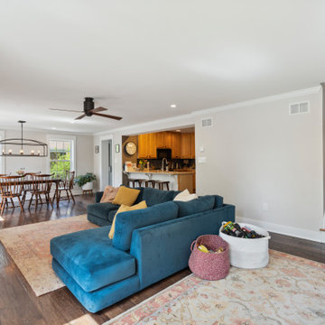
These clients reached out to Hillcrest Construction when their family began out-growing their Phoenixville-area home. Through a comprehensive design phase, opportunities to add square footage were identified along with a reorganization of the typical traffic flow throughout the house.
All household traffic into the hastily-designed, existing family room bump-out addition was funneled through a 3’ berth within the kitchen making meal prep and other kitchen activities somewhat similar to a shift at a PA turnpike toll booth. In the existing bump-out addition, the family room was relatively tight and the dining room barely fit the 6-person dining table. Access to the backyard was somewhat obstructed by the necessary furniture and the kitchen alone didn’t satisfy storage needs beyond a quick trip to the grocery store. The home’s existing front door was the only front entrance, and without a foyer or mudroom, the front formal room often doubled as a drop-zone for groceries, bookbags, and other on-the-go items.
Hillcrest Construction designed a remedy to both address the function and flow issues along with adding square footage via a 150 sq ft addition to the family room and converting the garage into a mudroom entry and walk-through pantry.
-
The project’s addition was not especially large but was able to facilitate a new pathway to the home’s rear family room. The existing brick wall at the bottom of the second-floor staircase was opened up and created a new, natural flow from the second-floor bedrooms to the front formal room, and into the rear family hang-out space- all without having to cut through the often busy kitchen. The dining room area was relocated to remove it from the pathway to the door to the backyard. Additionally, free and clear access to the rear yard was established for both two-legged and four-legged friends.
The existing chunky slider door was removed and in its place was fabricated and installed a custom centerpiece that included a new gas fireplace insert with custom brick surround, two side towers for display items and choice vinyl, and two base cabinets with metal-grated doors to house a subwoofer, wifi equipment, and other stow-away items. The black walnut countertops and mantle pop from the white cabinetry, and the wall-mounted TV with soundbar complete the central A/V hub. The custom cabs and tops were designed and built at Hillcrest’s custom shop.
The farmhouse appeal was completed with distressed engineered hardwood floors and craftsman-style window and door trim throughout.
-
Another major component of the project was the conversion of the garage into a pantry+mudroom+everyday entry.
The clients had used their smallish garage for storage of outdoor yard and recreational equipment. With those storage needs being addressed at the exterior, the space was transformed into a custom pantry and mudroom. The floor level within the space was raised to meet the rest of the house and insulated appropriately. A newly installed pocket door divided the dining room area from the designed-to-spec pantry/beverage center. The pantry was designed to house dry storage, cleaning supplies, and dry bar supplies when the cleaning and shopping are complete. A window seat with doggie supply storage below was worked into the design to accommodate the existing elevation of the original garage window.
A coat closet and a small set of steps divide the pantry from the mudroom entry. The mudroom entry is marked with a striking combo of the herringbone thin-brick flooring and a custom hutch. Kids returning home from school have a designated spot to hang their coats and bookbags with two deep drawers for shoes. A custom cherry bench top adds a punctuation of warmth. The entry door and window replaced the old overhead garage doors to create the daily-used informal entry off the driveway.
With the house being such a favorable area, and the clients not looking to pull up roots, Hillcrest Construction facilitated a collaborative experience and comprehensive plan to change the house for the better and make it a home to grow within.
 Charles Rose Architects Inc.
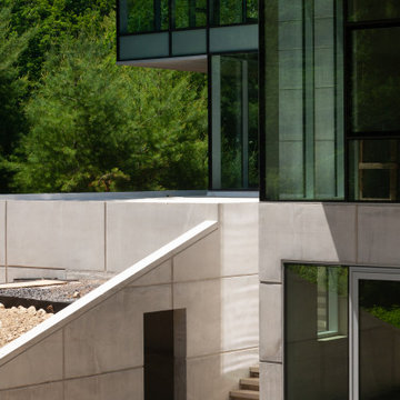
We were given the challenge of designing a house overlooking a pond on a site constrained by wetlands. Our client had an interest in permanence and solidity and a desire to work with architectural concrete. Additionally, the client desired interiors that would showcase their substantial art collection. Our design approach began with the footprint of an L-shaped courtyard house, which in part, was determined by the limited buildable area. The house is sited on a natural rise in the land, allowing the first floor elevation to rise 15 ft above the pond’s surface; this height provides dynamic views through the trees that separate the house from the pond. Ultimately, our design leverages the inherent capabilities of architectural concrete i.e. its structural capacity; the material allows for bold cantilevers and expanses of glass, creating greater transparency between interior and exterior environments.
The interior palette is comprised of rift sawn oak with 16-inch wide oak plank flooring, oak casework and millwork, a stainless steel and glass main staircase, and minimalist concrete details throughout. On the upper level, the plan accommodates a master bedroom suite, three children’s bedrooms, and a family room. The first floor includes a guest bedroom, living room, kitchen, dining room, office, and family room. The ground level has a recreational room, a mudroom, and office/studio. The site plan employs native plantings and includes a small resistance pool in the courtyard.
Concrete will be utilized for all of the house’s structural and insulation components. This method modulates the fluctuation of interior temperature, creating both an energy-efficient envelope and enough concrete mass to keep temperatures moderate and consistent throughout a 24-hour day. The employment of triple-glazed windows and a triple-glazed aluminum curtain wall further increases the project’s energy efficiency and allows the house to have abundant glass. Natural light permeates the interior and affords spectacular view in all directions of both Todd Pond and the neighboring woodlands.
 Klopf Architecture
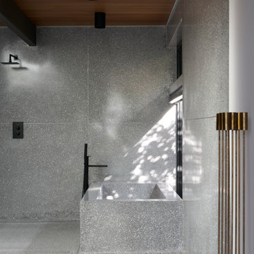
Malibu Glass Box House by Klopf Architecture
Following the devastating Woolsey Fire of 2018, the site in Malibu offered a unique opportunity to rebuild not just a home, but a new architectural composition that highlighted the property’s potential while navigating strict fire-rebuild codes in the area. Designed by Klopf Architecture, this project embraced a set of limitations and translated them into an architectural asset.
The city’s fire-rebuild process required the new structure to remain close to the original footprint, size and bulk, a constraint that ultimately clarified the architectural direction. Perched near the front of a long, narrow lot, the new home frames and overlooks a private, park-like rear expanse, an uncommon luxury especially in this part of Malibu .
Without a fixed program, the design process allowed for a different kind of creative focus allowing Klopf Architecture the opportunity to explore how a modernist home could best respond to this site. The team approached the project not with a list of requirements, but with a question: How might a modernist live here? What spatial qualities would inspire calm, connection, and a sense of wonder in this setting? The process became less about problem-solving and more about architectural storytelling—letting the site, the light, and the principles of modern design guide the form and flow of the home.
The response emerged in the form of a glass-box pavilion, an open, Mid-Century Modern inspired living, dining, and kitchen space that floats at the edge of the property’s natural descent. Connected to the more enclosed, private areas of the home by a glass-walled hallway, the living pavilion becomes a distinct centerpiece of the design. It opens on all four sides to the landscape with decks and patios on the flanks, an internal garden and water feature to the north, and a dramatic unguarded view of the expansive backyard and ocean horizon to the south.
Because of the mandated footprint, careful planning was required to ensure every space could still engage with light, landscape, or both. Strategic voids in the form of atriums and courtyards allow daylight to filter deep into the home’s core, while offering moments of surprise and retreat. These design gestures allow natural light to filter deep into the interior, creating a sense of brightness and openness throughout the day. At the same time, they expand the perceptual boundaries between inside and out, making the home feel more expansive while anchoring its connection to the surrounding landscape.
The siting of the house is what gives it its unique character. Rather than receding into the backyard like the neighboring homes, the house holds a slight prominence. From the central living pavilion, stepping down into the landscape feels more like entering a secluded park where a separate existing accessory structure, trail, and recreational areas await. The home’s modest street presence gives way to this unfolding drama of space, view, and nature.
Fire-resilient materials and assemblies are integrated seamlessly throughout including triple-pane glazing, under-slab and roof insulation, and locally sourced fire-rated cladding ensure the house not only meets Calfornia’s rigorous wildland-urban interface (WUI) standards, but feels effortlessly aligned with them. While technical decisions like fire-hardening and mechanical systems presented some construction challenges, particularly around the cantilevered glass box, the team found a functional compromise that preserved the integrity of the design.
Inside, a restrained palette and exposed post and beam design celebrate the ethos of mid-century modernism. A central circulation spine extends from the entry to the rear glass wall, offering a continuous visual link from street to ocean. Spaces such as the library and office, though more intimate in scale, are never cut off from nature as each opens to its own unique courtyard or garden view.
Though born out of a strict regulatory framework and developed without a specific client, the rebuild design unfolded with remarkable clarity. Grounded in site logic, refined by limitations and an emphasis on timeless spatial relationships – light, proportion, and a strong connection to nature, the resulting design feels both effortless and uplifting. The home lives lightly on the land, opens generously to its surroundings, and strikes a careful balance between privacy, openness, and calm. For Klopf Architecture, it stands as a compelling case study in how site, code, and circumstantial constraints can inspire enduring, modernist architecture. With years of experience reimagining mid-century modern design for how people live today, the firm took the project’s limitations as an opportunity. The result is a home shaped by open, flowing spaces, strong indoor-outdoor connections, and a calm, clear sense of structure. It’s a good reminder that even with strict constraints, there’s still room for architecture to breathe—and for modernism to keep moving forward.
Klopf Architecture project team: Geoff Campen, John Klopf, AIA, and Sherry Tan
Structural Engineer: ZFA
Contractor: Maison D’Artiste
Photography: ©2025 Mariko Reed
Year Completed: 2023
 Klopf Architecture
Malibu Glass Box House by Klopf Architecture
Following the devastating Woolsey Fire of 2018, the site in Malibu offered a unique opportunity to rebuild not just a home, but a new architectural composition that highlighted the property’s potential while navigating strict fire-rebuild codes in the area. Designed by Klopf Architecture, this project embraced a set of limitations and translated them into an architectural asset.
The city’s fire-rebuild process required the new structure to remain close to the original footprint, size and bulk, a constraint that ultimately clarified the architectural direction. Perched near the front of a long, narrow lot, the new home frames and overlooks a private, park-like rear expanse, an uncommon luxury especially in this part of Malibu .
Without a fixed program, the design process allowed for a different kind of creative focus allowing Klopf Architecture the opportunity to explore how a modernist home could best respond to this site. The team approached the project not with a list of requirements, but with a question: How might a modernist live here? What spatial qualities would inspire calm, connection, and a sense of wonder in this setting? The process became less about problem-solving and more about architectural storytelling—letting the site, the light, and the principles of modern design guide the form and flow of the home.
The response emerged in the form of a glass-box pavilion, an open, Mid-Century Modern inspired living, dining, and kitchen space that floats at the edge of the property’s natural descent. Connected to the more enclosed, private areas of the home by a glass-walled hallway, the living pavilion becomes a distinct centerpiece of the design. It opens on all four sides to the landscape with decks and patios on the flanks, an internal garden and water feature to the north, and a dramatic unguarded view of the expansive backyard and ocean horizon to the south.
Because of the mandated footprint, careful planning was required to ensure every space could still engage with light, landscape, or both. Strategic voids in the form of atriums and courtyards allow daylight to filter deep into the home’s core, while offering moments of surprise and retreat. These design gestures allow natural light to filter deep into the interior, creating a sense of brightness and openness throughout the day. At the same time, they expand the perceptual boundaries between inside and out, making the home feel more expansive while anchoring its connection to the surrounding landscape.
The siting of the house is what gives it its unique character. Rather than receding into the backyard like the neighboring homes, the house holds a slight prominence. From the central living pavilion, stepping down into the landscape feels more like entering a secluded park where a separate existing accessory structure, trail, and recreational areas await. The home’s modest street presence gives way to this unfolding drama of space, view, and nature.
Fire-resilient materials and assemblies are integrated seamlessly throughout including triple-pane glazing, under-slab and roof insulation, and locally sourced fire-rated cladding ensure the house not only meets Calfornia’s rigorous wildland-urban interface (WUI) standards, but feels effortlessly aligned with them. While technical decisions like fire-hardening and mechanical systems presented some construction challenges, particularly around the cantilevered glass box, the team found a functional compromise that preserved the integrity of the design.
Inside, a restrained palette and exposed post and beam design celebrate the ethos of mid-century modernism. A central circulation spine extends from the entry to the rear glass wall, offering a continuous visual link from street to ocean. Spaces such as the library and office, though more intimate in scale, are never cut off from nature as each opens to its own unique courtyard or garden view.
Though born out of a strict regulatory framework and developed without a specific client, the rebuild design unfolded with remarkable clarity. Grounded in site logic, refined by limitations and an emphasis on timeless spatial relationships – light, proportion, and a strong connection to nature, the resulting design feels both effortless and uplifting. The home lives lightly on the land, opens generously to its surroundings, and strikes a careful balance between privacy, openness, and calm. For Klopf Architecture, it stands as a compelling case study in how site, code, and circumstantial constraints can inspire enduring, modernist architecture. With years of experience reimagining mid-century modern design for how people live today, the firm took the project’s limitations as an opportunity. The result is a home shaped by open, flowing spaces, strong indoor-outdoor connections, and a calm, clear sense of structure. It’s a good reminder that even with strict constraints, there’s still room for architecture to breathe—and for modernism to keep moving forward.
Klopf Architecture project team: Geoff Campen, John Klopf, AIA, and Sherry Tan
Structural Engineer: ZFA
Contractor: Maison D’Artiste
Photography: ©2025 Mariko Reed
Year Completed: 2023
 Hillcrest Construction
These clients reached out to Hillcrest Construction when their family began out-growing their Phoenixville-area home. Through a comprehensive design phase, opportunities to add square footage were identified along with a reorganization of the typical traffic flow throughout the house.
All household traffic into the hastily-designed, existing family room bump-out addition was funneled through a 3’ berth within the kitchen making meal prep and other kitchen activities somewhat similar to a shift at a PA turnpike toll booth. In the existing bump-out addition, the family room was relatively tight and the dining room barely fit the 6-person dining table. Access to the backyard was somewhat obstructed by the necessary furniture and the kitchen alone didn’t satisfy storage needs beyond a quick trip to the grocery store. The home’s existing front door was the only front entrance, and without a foyer or mudroom, the front formal room often doubled as a drop-zone for groceries, bookbags, and other on-the-go items.
Hillcrest Construction designed a remedy to both address the function and flow issues along with adding square footage via a 150 sq ft addition to the family room and converting the garage into a mudroom entry and walk-through pantry.
-
The project’s addition was not especially large but was able to facilitate a new pathway to the home’s rear family room. The existing brick wall at the bottom of the second-floor staircase was opened up and created a new, natural flow from the second-floor bedrooms to the front formal room, and into the rear family hang-out space- all without having to cut through the often busy kitchen. The dining room area was relocated to remove it from the pathway to the door to the backyard. Additionally, free and clear access to the rear yard was established for both two-legged and four-legged friends.
The existing chunky slider door was removed and in its place was fabricated and installed a custom centerpiece that included a new gas fireplace insert with custom brick surround, two side towers for display items and choice vinyl, and two base cabinets with metal-grated doors to house a subwoofer, wifi equipment, and other stow-away items. The black walnut countertops and mantle pop from the white cabinetry, and the wall-mounted TV with soundbar complete the central A/V hub. The custom cabs and tops were designed and built at Hillcrest’s custom shop.
The farmhouse appeal was completed with distressed engineered hardwood floors and craftsman-style window and door trim throughout.
-
Another major component of the project was the conversion of the garage into a pantry+mudroom+everyday entry.
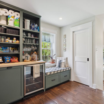
The clients had used their smallish garage for storage of outdoor yard and recreational equipment. With those storage needs being addressed at the exterior, the space was transformed into a custom pantry and mudroom. The floor level within the space was raised to meet the rest of the house and insulated appropriately. A newly installed pocket door divided the dining room area from the designed-to-spec pantry/beverage center. The pantry was designed to house dry storage, cleaning supplies, and dry bar supplies when the cleaning and shopping are complete. A window seat with doggie supply storage below was worked into the design to accommodate the existing elevation of the original garage window.
A coat closet and a small set of steps divide the pantry from the mudroom entry. The mudroom entry is marked with a striking combo of the herringbone thin-brick flooring and a custom hutch. Kids returning home from school have a designated spot to hang their coats and bookbags with two deep drawers for shoes. A custom cherry bench top adds a punctuation of warmth. The entry door and window replaced the old overhead garage doors to create the daily-used informal entry off the driveway.
With the house being such a favorable area, and the clients not looking to pull up roots, Hillcrest Construction facilitated a collaborative experience and comprehensive plan to change the house for the better and make it a home to grow within.
 Newschool Builders LLC
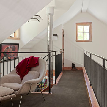
This was one of those special projects in which we were able to build not only a incredibly insulated and efficient home, but were also able to incorporate a bunch of custom woodworking, metal work, stone work and historical details into the project. We adhered to “Efficiency Vermont’s’ rigorous High Performance Home standards in the construction of this project. In addition, this was a Duplex and as a result required extra attention to special code requirements surrounding multi-family construction. We also tried to recreate the exterior details to match with the historical period of early Vermont.
 Hillcrest Construction
These clients reached out to Hillcrest Construction when their family began out-growing their Phoenixville-area home. Through a comprehensive design phase, opportunities to add square footage were identified along with a reorganization of the typical traffic flow throughout the house.
All household traffic into the hastily-designed, existing family room bump-out addition was funneled through a 3’ berth within the kitchen making meal prep and other kitchen activities somewhat similar to a shift at a PA turnpike toll booth. In the existing bump-out addition, the family room was relatively tight and the dining room barely fit the 6-person dining table. Access to the backyard was somewhat obstructed by the necessary furniture and the kitchen alone didn’t satisfy storage needs beyond a quick trip to the grocery store. The home’s existing front door was the only front entrance, and without a foyer or mudroom, the front formal room often doubled as a drop-zone for groceries, bookbags, and other on-the-go items.
Hillcrest Construction designed a remedy to both address the function and flow issues along with adding square footage via a 150 sq ft addition to the family room and converting the garage into a mudroom entry and walk-through pantry.
-
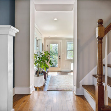
The project’s addition was not especially large but was able to facilitate a new pathway to the home’s rear family room. The existing brick wall at the bottom of the second-floor staircase was opened up and created a new, natural flow from the second-floor bedrooms to the front formal room, and into the rear family hang-out space- all without having to cut through the often busy kitchen. The dining room area was relocated to remove it from the pathway to the door to the backyard. Additionally, free and clear access to the rear yard was established for both two-legged and four-legged friends.
The existing chunky slider door was removed and in its place was fabricated and installed a custom centerpiece that included a new gas fireplace insert with custom brick surround, two side towers for display items and choice vinyl, and two base cabinets with metal-grated doors to house a subwoofer, wifi equipment, and other stow-away items. The black walnut countertops and mantle pop from the white cabinetry, and the wall-mounted TV with soundbar complete the central A/V hub. The custom cabs and tops were designed and built at Hillcrest’s custom shop.
The farmhouse appeal was completed with distressed engineered hardwood floors and craftsman-style window and door trim throughout.
-
Another major component of the project was the conversion of the garage into a pantry+mudroom+everyday entry.
The clients had used their smallish garage for storage of outdoor yard and recreational equipment. With those storage needs being addressed at the exterior, the space was transformed into a custom pantry and mudroom. The floor level within the space was raised to meet the rest of the house and insulated appropriately. A newly installed pocket door divided the dining room area from the designed-to-spec pantry/beverage center. The pantry was designed to house dry storage, cleaning supplies, and dry bar supplies when the cleaning and shopping are complete. A window seat with doggie supply storage below was worked into the design to accommodate the existing elevation of the original garage window.
A coat closet and a small set of steps divide the pantry from the mudroom entry. The mudroom entry is marked with a striking combo of the herringbone thin-brick flooring and a custom hutch. Kids returning home from school have a designated spot to hang their coats and bookbags with two deep drawers for shoes. A custom cherry bench top adds a punctuation of warmth. The entry door and window replaced the old overhead garage doors to create the daily-used informal entry off the driveway.
With the house being such a favorable area, and the clients not looking to pull up roots, Hillcrest Construction facilitated a collaborative experience and comprehensive plan to change the house for the better and make it a home to grow within.
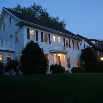 Home Restoration Services, Inc.
After sitting unfinished over a cold Minnesota winter, we "inherited" this project from a contractor who had not completed the exterior work. Scott Newland http://www.newlandarchitecture.com developed plans to re-create the home's original curved Portico and restore the home's classic Colonial details. The home received a complete exterior renovation, including new siding, insulation, and railings atop three flat roof areas. Photos by Greg Schmidt
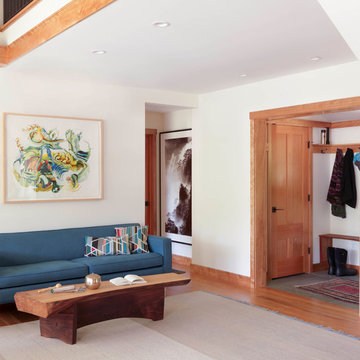 Newschool Builders LLC
This was one of those special projects in which we were able to build not only a incredibly insulated and efficient home, but were also able to incorporate a bunch of custom woodworking, metal work, stone work and historical details into the project. We adhered to “Efficiency Vermont’s’ rigorous High Performance Home standards in the construction of this project. In addition, this was a Duplex and as a result required extra attention to special code requirements surrounding multi-family construction. We also tried to recreate the exterior details to match with the historical period of early Vermont.
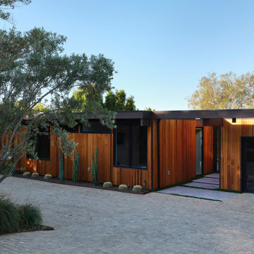 Klopf Architecture
Malibu Glass Box House by Klopf Architecture
Following the devastating Woolsey Fire of 2018, the site in Malibu offered a unique opportunity to rebuild not just a home, but a new architectural composition that highlighted the property’s potential while navigating strict fire-rebuild codes in the area. Designed by Klopf Architecture, this project embraced a set of limitations and translated them into an architectural asset.
The city’s fire-rebuild process required the new structure to remain close to the original footprint, size and bulk, a constraint that ultimately clarified the architectural direction. Perched near the front of a long, narrow lot, the new home frames and overlooks a private, park-like rear expanse, an uncommon luxury especially in this part of Malibu .
Without a fixed program, the design process allowed for a different kind of creative focus allowing Klopf Architecture the opportunity to explore how a modernist home could best respond to this site. The team approached the project not with a list of requirements, but with a question: How might a modernist live here? What spatial qualities would inspire calm, connection, and a sense of wonder in this setting? The process became less about problem-solving and more about architectural storytelling—letting the site, the light, and the principles of modern design guide the form and flow of the home.
The response emerged in the form of a glass-box pavilion, an open, Mid-Century Modern inspired living, dining, and kitchen space that floats at the edge of the property’s natural descent. Connected to the more enclosed, private areas of the home by a glass-walled hallway, the living pavilion becomes a distinct centerpiece of the design. It opens on all four sides to the landscape with decks and patios on the flanks, an internal garden and water feature to the north, and a dramatic unguarded view of the expansive backyard and ocean horizon to the south.
Because of the mandated footprint, careful planning was required to ensure every space could still engage with light, landscape, or both. Strategic voids in the form of atriums and courtyards allow daylight to filter deep into the home’s core, while offering moments of surprise and retreat. These design gestures allow natural light to filter deep into the interior, creating a sense of brightness and openness throughout the day. At the same time, they expand the perceptual boundaries between inside and out, making the home feel more expansive while anchoring its connection to the surrounding landscape.
The siting of the house is what gives it its unique character. Rather than receding into the backyard like the neighboring homes, the house holds a slight prominence. From the central living pavilion, stepping down into the landscape feels more like entering a secluded park where a separate existing accessory structure, trail, and recreational areas await. The home’s modest street presence gives way to this unfolding drama of space, view, and nature.
Fire-resilient materials and assemblies are integrated seamlessly throughout including triple-pane glazing, under-slab and roof insulation, and locally sourced fire-rated cladding ensure the house not only meets Calfornia’s rigorous wildland-urban interface (WUI) standards, but feels effortlessly aligned with them. While technical decisions like fire-hardening and mechanical systems presented some construction challenges, particularly around the cantilevered glass box, the team found a functional compromise that preserved the integrity of the design.
Inside, a restrained palette and exposed post and beam design celebrate the ethos of mid-century modernism. A central circulation spine extends from the entry to the rear glass wall, offering a continuous visual link from street to ocean. Spaces such as the library and office, though more intimate in scale, are never cut off from nature as each opens to its own unique courtyard or garden view.
Though born out of a strict regulatory framework and developed without a specific client, the rebuild design unfolded with remarkable clarity. Grounded in site logic, refined by limitations and an emphasis on timeless spatial relationships – light, proportion, and a strong connection to nature, the resulting design feels both effortless and uplifting. The home lives lightly on the land, opens generously to its surroundings, and strikes a careful balance between privacy, openness, and calm. For Klopf Architecture, it stands as a compelling case study in how site, code, and circumstantial constraints can inspire enduring, modernist architecture. With years of experience reimagining mid-century modern design for how people live today, the firm took the project’s limitations as an opportunity. The result is a home shaped by open, flowing spaces, strong indoor-outdoor connections, and a calm, clear sense of structure. It’s a good reminder that even with strict constraints, there’s still room for architecture to breathe—and for modernism to keep moving forward.
Klopf Architecture project team: Geoff Campen, John Klopf, AIA, and Sherry Tan
Structural Engineer: ZFA
Contractor: Maison D’Artiste
Photography: ©2025 Mariko Reed
Year Completed: 2023
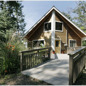
 Jaksa Builders
The site for the Mollhagen cottage on the Lake Michigan shoreline near Glenn was a washed out ravine that once supported the first Mollhagen cottage...a log home built 100 years ago. The cottage rests on elevated piers instead of a traditional foundation and is insulated with stress skin panels (SIPs) to maximize heating and cooling efficiency and reduce operating costs.
To re-create the feel of the old cottage the interior features wood floors and ceiling and trim in yellow pine, white pine and cedar. White cedar shingles, standing seam steel roofing and composite decking complete the exterior. The owners love the aesthetics, functionality, practicality and charm of their new weekend get-away.
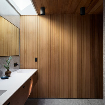 Klopf Architecture
Malibu Glass Box House by Klopf Architecture
Following the devastating Woolsey Fire of 2018, the site in Malibu offered a unique opportunity to rebuild not just a home, but a new architectural composition that highlighted the property’s potential while navigating strict fire-rebuild codes in the area. Designed by Klopf Architecture, this project embraced a set of limitations and translated them into an architectural asset.
The city’s fire-rebuild process required the new structure to remain close to the original footprint, size and bulk, a constraint that ultimately clarified the architectural direction. Perched near the front of a long, narrow lot, the new home frames and overlooks a private, park-like rear expanse, an uncommon luxury especially in this part of Malibu .
Without a fixed program, the design process allowed for a different kind of creative focus allowing Klopf Architecture the opportunity to explore how a modernist home could best respond to this site. The team approached the project not with a list of requirements, but with a question: How might a modernist live here? What spatial qualities would inspire calm, connection, and a sense of wonder in this setting? The process became less about problem-solving and more about architectural storytelling—letting the site, the light, and the principles of modern design guide the form and flow of the home.
The response emerged in the form of a glass-box pavilion, an open, Mid-Century Modern inspired living, dining, and kitchen space that floats at the edge of the property’s natural descent. Connected to the more enclosed, private areas of the home by a glass-walled hallway, the living pavilion becomes a distinct centerpiece of the design. It opens on all four sides to the landscape with decks and patios on the flanks, an internal garden and water feature to the north, and a dramatic unguarded view of the expansive backyard and ocean horizon to the south.
Because of the mandated footprint, careful planning was required to ensure every space could still engage with light, landscape, or both. Strategic voids in the form of atriums and courtyards allow daylight to filter deep into the home’s core, while offering moments of surprise and retreat. These design gestures allow natural light to filter deep into the interior, creating a sense of brightness and openness throughout the day. At the same time, they expand the perceptual boundaries between inside and out, making the home feel more expansive while anchoring its connection to the surrounding landscape.
The siting of the house is what gives it its unique character. Rather than receding into the backyard like the neighboring homes, the house holds a slight prominence. From the central living pavilion, stepping down into the landscape feels more like entering a secluded park where a separate existing accessory structure, trail, and recreational areas await. The home’s modest street presence gives way to this unfolding drama of space, view, and nature.
Fire-resilient materials and assemblies are integrated seamlessly throughout including triple-pane glazing, under-slab and roof insulation, and locally sourced fire-rated cladding ensure the house not only meets Calfornia’s rigorous wildland-urban interface (WUI) standards, but feels effortlessly aligned with them. While technical decisions like fire-hardening and mechanical systems presented some construction challenges, particularly around the cantilevered glass box, the team found a functional compromise that preserved the integrity of the design.
Inside, a restrained palette and exposed post and beam design celebrate the ethos of mid-century modernism. A central circulation spine extends from the entry to the rear glass wall, offering a continuous visual link from street to ocean. Spaces such as the library and office, though more intimate in scale, are never cut off from nature as each opens to its own unique courtyard or garden view.
Though born out of a strict regulatory framework and developed without a specific client, the rebuild design unfolded with remarkable clarity. Grounded in site logic, refined by limitations and an emphasis on timeless spatial relationships – light, proportion, and a strong connection to nature, the resulting design feels both effortless and uplifting. The home lives lightly on the land, opens generously to its surroundings, and strikes a careful balance between privacy, openness, and calm. For Klopf Architecture, it stands as a compelling case study in how site, code, and circumstantial constraints can inspire enduring, modernist architecture. With years of experience reimagining mid-century modern design for how people live today, the firm took the project’s limitations as an opportunity. The result is a home shaped by open, flowing spaces, strong indoor-outdoor connections, and a calm, clear sense of structure. It’s a good reminder that even with strict constraints, there’s still room for architecture to breathe—and for modernism to keep moving forward.
Klopf Architecture project team: Geoff Campen, John Klopf, AIA, and Sherry Tan
Structural Engineer: ZFA
Contractor: Maison D’Artiste
Photography: ©2025 Mariko Reed
Year Completed: 2023
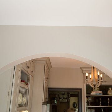 Advance Design Studio, Ltd.
Curtis and Peggy had been thinking of a kitchen remodel for quite some time, but they knew their house would have a unique set of challenges. Their older Victorian house was built in 1891. The kitchen cabinetry was original, and they wanted to keep the authenticity of their period home while adding modern comforts that would improve their quality of life.
A friend recommended Advance Design Studio for their exceptional experience and quality of work. After meeting with designer Michelle Lecinski at Advance Design, they were confident they could partner with Advance to accomplish the unique kitchen renovation they’d been talking about for years. “We wanted to do the kitchen for a long, long time,” Curtis said. “(We asked ourselves) what are we actually going to do? How are we going to do this? And who are we going to find to do exactly what we want?”
The goal for the project was to keep the home renovation and new kitchen feeling authentic to the time in which it was built. They desperately wanted the modern comforts that come with a larger refrigerator and the dishwasher that they never had! The old home was also a bit drafty so adding a fireplace, wall insulation and new windows became a priority. They very much wanted to create a comfortable hearth room adjacent to the kitchen, complete with old world brick.
The original cabinetry had to go to make way for beautiful new kitchen cabinetry that appears as if it was a hundred years old, but with all the benefits of cutting-edge storage, self-closing drawers, and a brand-new look. “We just wanted to keep it old looking, but with some modern updates,” Peggy said.
Dura Supreme Highland Cabinets with a Heritage Old World Painted Finish replaced the original 1891 cabinets. The hand-applied careful rubbed-off detailing makes these exquisite cabinets look as if they came from a far-gone era. Despite the small size of the kitchen, Peggy, Curtis and Michelle utilized every inch with custom cabinet sizes to increase storage capacity. The custom cabinets allowed for the addition of a 24” Fisher Paykel dishwasher with a concealing Dura Supreme door panel. Michelle was also able to work into the new design a larger 30” Fisher Paykel French refrigerator. “We made every ¼ inch count in this small space,” designer Michelle said. “Having the ability to custom size the cabinetry was the only way to achieve this.”
“The kitchen essentially was designed around the Heartland Vintage range and oven,” says Michelle. A classic appliance that combines nostalgic beauty and craftsmanship for modern cooking, with nickel plated trim and elegantly shaped handles and legs; the not to miss range is a striking focal point of the entire room and an engaging conversation piece.
Granite countertops in Kodiak Satin with subtle veining kept with the old-world style. The delicate porcelain La Vie Crackle Sonoma tile kitchen backsplash compliments the home’s style perfectly. A handcrafted passthrough designed to show off Peggy’s fine china was custom built by project carpenters Justin Davis and Jeff Dallain to physically and visually open the space. Additional storage was created in the custom panty room with Latte Edinburg cabinets, hand-made weathered wood shelving with authentic black iron brackets, and an intricate tin copper ceiling.
Peggy and Curtis loved the idea of adding a Vermont stove to make the hearth-room not only functional, but a truly beckoning place to be. A stunning Bordeaux red Vermont Castings Stove with crisp black ventilation was chosen and combined with the authentic reclaimed Chicago brick wall. Advance’s talented carpenters custom-built elegant weathered shelves to house family memorabilia, installed carefully chosen barn sconces, and made the hearth room an inviting place to relax with a cup of coffee and a good book.
“Peggy and Curtis’ project was so much fun to work on. Creating a space that looks and feels like it always belonged in this beautiful old Victorian home is a designer’s dream. To see the delight in their faces when they saw the design details coming together truly made it worth the time and effort that went into making the very compact kitchen space work”, said Michelle. “The result is an amazing custom kitchen, packed with functionality in every inch, nook and cranny!” exclaims Michelle.
The renovation didn’t end with the kitchen. New Pella windows were added to help lessen the drafts. The removal of the original windows and trim necessitated the re-creation of hand-made corbels and trim details no longer available today. The talented carpenter team came to the rescue, crafting new pieces and masterfully finishing them as if they were always there. New custom gutters were formed and installed with a front entry rework necessary to accommodate the changes.
The whole house functions better, but it still feels like the original 1891 home. “From start to finish it’s just a much better space than we used to have,” Peggy said. “Jeff and Justin were amazing.” Curtis added; “We were lucky to find Advance Design, because they really came through for us. I loved that they had everything in house, anything you needed to have done, they could do it”.
 Klopf Architecture
Malibu Glass Box House by Klopf Architecture
Following the devastating Woolsey Fire of 2018, the site in Malibu offered a unique opportunity to rebuild not just a home, but a new architectural composition that highlighted the property’s potential while navigating strict fire-rebuild codes in the area. Designed by Klopf Architecture, this project embraced a set of limitations and translated them into an architectural asset.
The city’s fire-rebuild process required the new structure to remain close to the original footprint, size and bulk, a constraint that ultimately clarified the architectural direction. Perched near the front of a long, narrow lot, the new home frames and overlooks a private, park-like rear expanse, an uncommon luxury especially in this part of Malibu .
Without a fixed program, the design process allowed for a different kind of creative focus allowing Klopf Architecture the opportunity to explore how a modernist home could best respond to this site. The team approached the project not with a list of requirements, but with a question: How might a modernist live here? What spatial qualities would inspire calm, connection, and a sense of wonder in this setting? The process became less about problem-solving and more about architectural storytelling—letting the site, the light, and the principles of modern design guide the form and flow of the home.
The response emerged in the form of a glass-box pavilion, an open, Mid-Century Modern inspired living, dining, and kitchen space that floats at the edge of the property’s natural descent. Connected to the more enclosed, private areas of the home by a glass-walled hallway, the living pavilion becomes a distinct centerpiece of the design. It opens on all four sides to the landscape with decks and patios on the flanks, an internal garden and water feature to the north, and a dramatic unguarded view of the expansive backyard and ocean horizon to the south.
Because of the mandated footprint, careful planning was required to ensure every space could still engage with light, landscape, or both. Strategic voids in the form of atriums and courtyards allow daylight to filter deep into the home’s core, while offering moments of surprise and retreat. These design gestures allow natural light to filter deep into the interior, creating a sense of brightness and openness throughout the day. At the same time, they expand the perceptual boundaries between inside and out, making the home feel more expansive while anchoring its connection to the surrounding landscape.
The siting of the house is what gives it its unique character. Rather than receding into the backyard like the neighboring homes, the house holds a slight prominence. From the central living pavilion, stepping down into the landscape feels more like entering a secluded park where a separate existing accessory structure, trail, and recreational areas await. The home’s modest street presence gives way to this unfolding drama of space, view, and nature.
Fire-resilient materials and assemblies are integrated seamlessly throughout including triple-pane glazing, under-slab and roof insulation, and locally sourced fire-rated cladding ensure the house not only meets Calfornia’s rigorous wildland-urban interface (WUI) standards, but feels effortlessly aligned with them. While technical decisions like fire-hardening and mechanical systems presented some construction challenges, particularly around the cantilevered glass box, the team found a functional compromise that preserved the integrity of the design.
Inside, a restrained palette and exposed post and beam design celebrate the ethos of mid-century modernism. A central circulation spine extends from the entry to the rear glass wall, offering a continuous visual link from street to ocean. Spaces such as the library and office, though more intimate in scale, are never cut off from nature as each opens to its own unique courtyard or garden view.
Though born out of a strict regulatory framework and developed without a specific client, the rebuild design unfolded with remarkable clarity. Grounded in site logic, refined by limitations and an emphasis on timeless spatial relationships – light, proportion, and a strong connection to nature, the resulting design feels both effortless and uplifting. The home lives lightly on the land, opens generously to its surroundings, and strikes a careful balance between privacy, openness, and calm. For Klopf Architecture, it stands as a compelling case study in how site, code, and circumstantial constraints can inspire enduring, modernist architecture. With years of experience reimagining mid-century modern design for how people live today, the firm took the project’s limitations as an opportunity. The result is a home shaped by open, flowing spaces, strong indoor-outdoor connections, and a calm, clear sense of structure. It’s a good reminder that even with strict constraints, there’s still room for architecture to breathe—and for modernism to keep moving forward.
Klopf Architecture project team: Geoff Campen, John Klopf, AIA, and Sherry Tan
Structural Engineer: ZFA
Contractor: Maison D’Artiste
Photography: ©2025 Mariko Reed
Year Completed: 2023
10