
Search results for "Interact" in Home Design Ideas

 Susan Glick Interiors
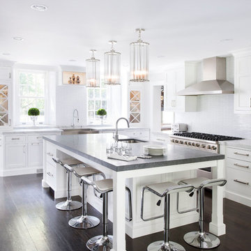
Transitional kitchen photo in New York with a farmhouse sink, shaker cabinets, white cabinets, concrete countertops, white backsplash, mosaic tile backsplash and stainless steel appliances
Find the right local pro for your project


 Metaamo Studio
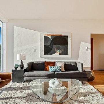
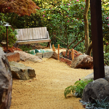
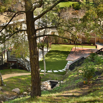
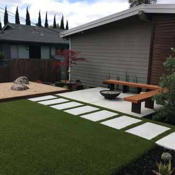
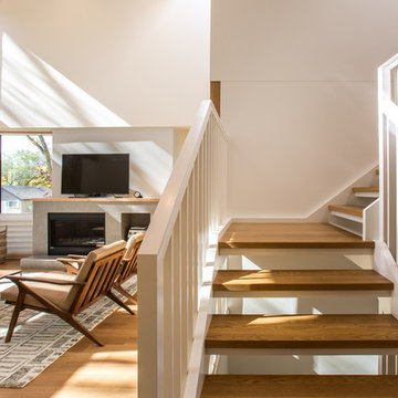
The P+M House is a new infill home for a family of four in Saskatoon’s Varsity View neighborhood.
Constructed of daylight, natural wood, and human interaction, it strives to create a rich, family-focused environment that pulls nature and ever-changing sunlight into the heart of the house.
Situated at the doorsteps of President Murray Park and the U of S campus, the home opens to the South, affronting an established street while allowing a row of towering American elms to provide natural shading and focus to the interior spaces.
The house is divided into four program zones: public, private, parents, and kids. The internal organization is a direct result of a daylight management concept, where dark-craving spaces are condensed and allocated to areas with low-light access, while providing strategic separation between zones. Left behind as a result are airy, light-filled living spaces that offer internal / external views, space for family interaction, while taking maximum advantage of limited South and West light.
The architecture begins with a main floor sectional shift that breaks the house into front & back, creating an internal topography that lets South light reach the back of the house. A trio of continuous, interlocking walls then give shape and order to the primary spaces, while openings in or between these walls extend the interior spaces into the yard and let daylight wash the heart of the house.
The highly-insulated house is the result of a thoughtful process that sought to leverage the site’s severe environmental constraints (minimal southern exposure in an extreme cold climate, where temps reach 40 below) and turn them into opportunities.
The house is composed of a 2800 sf main house, a 650 sf basement suite, and a 600 sf garage. It is constructed of reinforced concrete, 2x staggered stud walls, exposed spruce posts / glulam beams, and open-web engineered wood trusses. It is clad in stucco and western red cedar; with triple-glazed fiberglass windows and natural white oak finishes throughout.
Architectural Design: METAAMO studio w/ Oxbow Architecture
All Imagery Copyright 2017 Metaamo Studio, All Rights Reserved. No commercial use without prior written approval.

 Bilotta Kitchen & Home
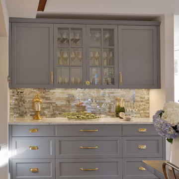
For this project, the entire kitchen was designed around the “must-have” Lacanche range in the stunning French Blue with brass trim. That was the client’s dream and everything had to be built to complement it. Bilotta senior designer, Randy O’Kane, CKD worked with Paul Benowitz and Dipti Shah of Benowitz Shah Architects to contemporize the kitchen while staying true to the original house which was designed in 1928 by regionally noted architect Franklin P. Hammond. The clients purchased the home over two years ago from the original owner. While the house has a magnificent architectural presence from the street, the basic systems, appointments, and most importantly, the layout and flow were inappropriately suited to contemporary living.
The new plan removed an outdated screened porch at the rear which was replaced with the new family room and moved the kitchen from a dark corner in the front of the house to the center. The visual connection from the kitchen through the family room is dramatic and gives direct access to the rear yard and patio. It was important that the island separating the kitchen from the family room have ample space to the left and right to facilitate traffic patterns, and interaction among family members. Hence vertical kitchen elements were placed primarily on existing interior walls. The cabinetry used was Bilotta’s private label, the Bilotta Collection – they selected beautiful, dramatic, yet subdued finishes for the meticulously handcrafted cabinetry. The double islands allow for the busy family to have a space for everything – the island closer to the range has seating and makes a perfect space for doing homework or crafts, or having breakfast or snacks. The second island has ample space for storage and books and acts as a staging area from the kitchen to the dinner table. The kitchen perimeter and both islands are painted in Benjamin Moore’s Paper White. The wall cabinets flanking the sink have wire mesh fronts in a statuary bronze – the insides of these cabinets are painted blue to match the range. The breakfast room cabinetry is Benjamin Moore’s Lampblack with the interiors of the glass cabinets painted in Paper White to match the kitchen. All countertops are Vermont White Quartzite from Eastern Stone. The backsplash is Artistic Tile’s Kyoto White and Kyoto Steel. The fireclay apron-front main sink is from Rohl while the smaller prep sink is from Linkasink. All faucets are from Waterstone in their antique pewter finish. The brass hardware is from Armac Martin and the pendants above the center island are from Circa Lighting. The appliances, aside from the range, are a mix of Sub-Zero, Thermador and Bosch with panels on everything.
8