
Search results for "Interfere" in Home Design Ideas
 Dreamwork Kitchens
From builder standard to designer upgrade.
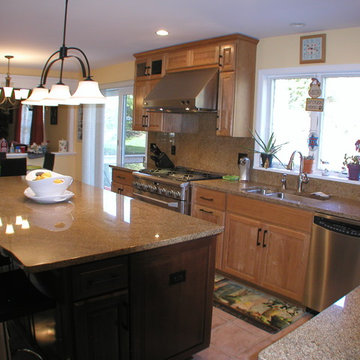
A recent project of ours in Harrison NY had us taking an adequate builder designed kitchen to something much more special. The original layout led to traffic jams while entertaining and valuable storage was lost due to the fact that the cabinets did not go to the ceiling.
The new design moves the refrigerator out of the traffic pattern that often lead to gridlock
in previous years as well as providing ample storage for trays and baking sheets in the slim pantry. Grillwork doors allow for airflow from the air-conditioning vents, while still allowing for cabinets to the ceiling.
A professional grade range replaces the old smaller model, with a heavy-duty hood to assure complete ventilation no matter what the cook creates. The microwave moves farther down the work triangle to assure that the heating of a cup of coffee or bag of popcorn need never interfere with the chef again. Equally of value is the island mini-frig not just to chill the occasional bottle of wine, but to keep the kids sodas out the main refrigerator.
And then there is the desk/ command central area. The formerly blank wall where no piece of furniture seemed to fit, because of the radiator, has become an efficient home office.
With room for two people to work, grown-ups can search Food Network for recipes while the kids do their homework – problem area solved!
 Ferriss - Architectural Renderings
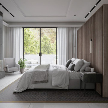
7 mistakes in bedroom design and ways to avoid them.
ERROR # 1 - Incorrect bed size.
This is a problem with any furniture in principle. When, according to the plan and ergonomic calculations, it becomes size to size, but in fact, it looks cumbersome, visually overflowing the space or, on the contrary, turns out to be too small and looks awkward.
How to avoid: Always be guided by the proportions of the size of the furniture in the room. Try to choose as big a bed as possible, but stay realistic. The main thing is that the width of the passageways in the bedroom should not be less than 70cm, and for comfortable movement, it is better to do everything 100cm.
ERROR # 2 - Poor lighting and switches.
Even in a small bedroom, you need multiple light sources. A single chandelier in the center of the ceiling is not enough, because it creates the effect of darkening the corners, and the room seems uncomfortable.
How to avoid: Hang a sconce over your headboard. Don't forget to light up the space next to the mirror and wardrobe. And be sure to place switches close to the bed so that you don't have to go to the other end of the room after an evening with a book in bed.
Do not forget about a sufficient number of outlets, this should be done even at the planning stage.
ERROR # 3 - Few storage locations
The fewer well-thought-out cabinets and shelving, the more things are visible. And the clutter spoils even the most stylish and expensive interior.
How to avoid: In addition to bedside tables, a chest of drawers (for storing small things) and a built-in wardrobe can be placed in a small bedroom: unlike a usual one, it takes up space from floor to ceiling, thereby accommodating more items. In addition, the built-in structure looks more solid and often merges with the walls, making the setting complete.
ERROR # 4 - Carpet of the wrong size.
The carpet in the bedroom is a great addition, and sometimes the final touch of the whole composition. But often people choose the wrong size or do not use it at all.
How to avoid: Choosing the right size can be guided by the unspoken rule, according to which the carpet should be 1 meter larger than the bed, both lengthwise and across. If the room is large, then it is recommended that the indentation of the carpet from the wall is 45-50 cm, if it is small, then 20-30 cm can be dispensed with.
ERROR # 5 Typical design.
If you buy a typical bed, bedside tables, and wardrobe from one manufacturer, then the interior will turn out to be formulaic and impersonal. No accessories and color schemes will help him.
How to avoid: The interior should reflect the character of its owner, and the person living in it will feel comfortable. Explore different collections of furniture and try to assemble a capsule in the same color scheme, but at the same time different in texture and shape.
ERROR # 6 Empty walls.
Even if the bedroom is a room for relaxation, it would be a mistake to make a space out of it that is intended solely for sleeping. Ascetic furnishings, unadorned walls, boring furniture, and bed linen - all this does not improve the mood at all, but, on the contrary, creates a gloomy mood.
How to avoid: The walls in the bedroom are a blank slate that you can transform into something original, beautiful, and unique to your liking. Even if you just paint one of the walls in a contrasting color, and decorate the other with several photos from the Internet, printed and inserted into frames, you can transform the atmosphere of the room as a whole.
ERROR # 7 Too dark interior.
One should not be deceived by the beauty of the thick dark tones of interior paint. It has long been known that dark blue, burgundy, blueberry, chocolate, and black for the bedroom should not be used in large quantities, since such an environment will have a tangible effect and interfere with a vigorous awakening in the morning.
How to avoid: If you like a rich range, try choosing derived shades a few tones lighter, for example, instead of black or graphite, choose gray-brown, dove-gray for the walls, and blue can be replaced with cornflower blue or azure.
Don't forget to combine dark tones with lots of whites, creams, complementing shimmery accessories, and vibrant décor.
https://www.ferriss.co/
#ferriss #We_bring_objects_to_life #3drendering #architecture #San_Francisco
 Isabelle Hope Grahm
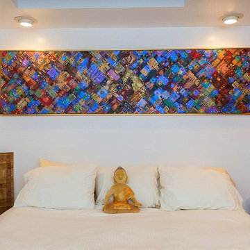
Painting by Isabelle Hope Grahm
'ROMANOV SHIMMER'
24" x 94.75"
Acrylic on Wood
2007
Photo by Natalia Knezevic
November 2016
Please inquire for price
Minimalist bedroom photo in Los Angeles
Minimalist bedroom photo in Los Angeles
Find the right local pro for your project
 Cape Associates, Inc.
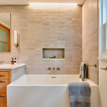
This home, set at the end of a long, private driveway, is far more than meets the eye. Built in three sections and connected by two breezeways, the home’s setting takes full advantage of the clean ocean air. Set back from the water on an open plot, its lush lawn is bordered by fieldstone walls that lead to an ocean cove.
The hideaway calms the mind and spirit, not only by its privacy from the noise of daily life, but through well-chosen elements, clean lines, and a bright, cheerful feel throughout. The interior is show-stopping, covered almost entirely in clear, vertical-grain fir—most of which was source from the same place. From the flooring to the walls, columns, staircases and ceiling beams, this special, tight-grain wood brightens every room in the home.
At just over 3,000 feet of living area, storage and smart use of space was a huge consideration in the creation of this home. For example, the mudroom and living room were both built with expansive window seating with storage beneath. Built-in drawers and cabinets can also be found throughout, yet never interfere with the distinctly uncluttered feel of the rooms.
The homeowners wanted the home to fit in as naturally as possible with the Cape Cod landscape, and also desired a feeling of virtual seamlessness between the indoors and out, resulting in an abundance of windows and doors throughout.
This home has high performance windows, which are rated to withstand hurricane-force winds and impact rated against wind-borne debris. The 24-foot skylight, which was installed by crane, consists of six independently mechanized shades operating in unison.
The open kitchen blends in with the home’s great room, and includes a Sub Zero refrigerator and a Wolf stove. Eco-friendly features in the home include low-flow faucets, dual-flush toilets in the bathrooms, and an energy recovery ventilation system, which conditions and improves indoor air quality.
Other natural materials incorporated for the home included a variety of stone, including bluestone and boulders. Hand-made ceramic tiles were used for the bathroom showers, and the kitchen counters are covered in granite – eye-catching and long-lasting.
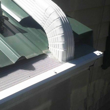
 LeafFilter Gutter Protection
LeafFilter Gutter Protection can be installed on new or existing gutters. Because Leaf Filter is not visible from the ground, it will not interfere with the look and design of your home.
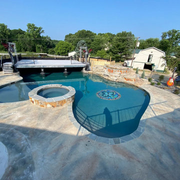
 Legendary Escapes Pools
The design strategy included working within the footprint created by the home and backyard, wanting to incorporate a swimming pool “destination” within the backyard that would be large enough to fit the “larger than life” criteria, but without taking away any of the natural beauty or obstructing the view of the horse pastures, barn and nature surrounding the home.
Once the design work began, and the pool area was able to incorporate one of every feature the customer could have wanted, Curtis had some steel grates from a former tilt-a-whirl carnival ride that gave him the idea of suspending a stage over the pool. The initial idea was a modest stage with some waterfall/sheer decent features. With the idea of using steel to form the framework, the stage idea grew into something much more that would include a full stage set up, lighting trusses, a “green room” and staging area. Once the stage was designed to be so large, the pool size and scope needed to match including the patio surround, area underneath the stage, and all the additional features.
The home architecture is a Ranch with a full finished walkout basement adjacent to the pool area. An existing deck had to be removed to allow for the pool build and new Trex deck, as well as a 3 story tall observation tower that overlooks the pool and surrounding horse pastures.
The design strategy was to work within the footprint the house and decks provided to create an extension of the home for outdoor entertaining. Since the exterior of the house was quite long (and dull, the owner equating it to a 1970’s motel), our team needed to incorporate elements to make the space feel more like a backyard resort. The goal was maintaining a cozy at home feel in a grand expanse of space.
It takes a team and a unique blend of artistry to build this project. Sandi Maki, co-owner of the company is responsible for the business side of things, and marketing to reach exceptional customers who allow us to build these backyard dreams. The construction side of our company boasts a diverse, multi-geneational family business. Allan Curtis is the designer/builder and comes up with the fantastic pool plans and ideas. His team consists of his daughter Jesse Curtis, who is high right hand and manages the project just as much as Allan does. She is instrumental in everything from dig day, to tying the steel, pouring the concrete, stonework and tile work, forming the waterfall, applying ecoFinish, pouring and stamping patio, and everything in between. Allan’s nephew Mark Curtis installed and plumbed the three pool filtration systems. Allan’s wife Annie has become very good at stonework on walls and waterfalls adding the unique accents our projects have become known for. Allan’s sister-in-law, Karen Olson also does tile and stonework on the jobs and created the rockstar mural on the patio. Frank DiPiazza assists with structural elements and built the new deck, and college student Brendan Schafer assists where needed and maintains the pool and equipment during the summer on a weekly basis.
As with many homeowners who reach out to Legendary Escapes, this owner, Dale Walter, knew he wanted a “custom” pool without knowing what that really meant. He was able to show Curtis the space, and his initial ideas, and then allowed Allan and his team the freedom to dream and build. The majority of Legendary Escapes customers make the decision to hire the company after the first meeting with Curtis. As long as the project and design are challenging and interesting, the customer meets the criteria of being easy to work with, and is special in their own unique way Curtis will consider taking on their project. From the beginning it is important to Curtis that the customer understands they need to allow the project to take on a life of it’s own, and for Curtis to create without interference or asking too many questions – working together becomes a reality.
The design is typically presented on paper, a hand-colored, hand drawn design that outlines only the large elements, and an accompanying budget which outlines the structural elements and budgets and has a “theme” budget for items to be determined but doesn’t change once it is set.
Once that contract is signed, Curtis and his team over-deliver on what the customer could only have dreamed up in their wildest imagination. Projects proceed in an organic way- not every element is planned before the project begins. As the space begins to take shape, so do the details and finishing elements. When the Rockstar project began, there was no plan for the guitars on the fences, or guitar fire features. The VIP seating area wasn’t added until mid way through the patio pours as the space began to take shape. The murals both in the grotto and on the pool floor were planned just moments before each of them was to be installed. It’s this free-flowing combination of the customers and team’s dreams, ideas, elements and the Legendary Escapes team that creates backyard pools that are as much art as they are design and engineering masterpieces.
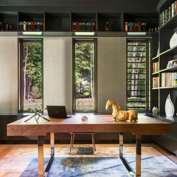
 HSL Building Company, LLC
A groundbreaking residential construction project in Connecticut, executed by HSL Builders, challenges the stereotypical notion of modern architecture as a mere "box." The innovative design, spearheaded by architect George Dumitru, revolves around a dynamic pinwheel concept. The central atrium serves as the project's focal point, with four cantilevered second-story bedrooms creating a visually centrifugal effect. Transparency is a key element, evident in the glazed atrium and open floor plan, fostering a seamless connection between indoor and outdoor spaces. Embracing Connecticut's natural landscape, the design minimizes interference to maximize picturesque vistas. This collaborative effort, led by HSL Builders, showcases inventive design elements that go beyond the traditional, redefining the essence of modern residential construction.
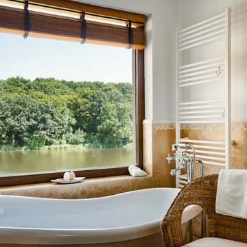
 RAZVAN BARSAN + PARTNERS
Coming up with new ideas is always challenging, but the challenge seems even more difficult to overcome when the starting point is quite limiting. In the case of this residential project, the starting point was an existing foundation, that needed to be used for the future building. Therefore, the footprint of the house needed to remain the same, however, the functions needed adjustments since the requirements and priorities of the owners changed in the previous years.
Another aspect that involved limitations but in a totally different sense was the setting - a beautiful place near a lake, surrounded by wild vegetation - and our challenge was to integrate the house while emphasizing the view.
We managed to do so by using large glass areas towards the lake, by laying the house properly on the sloped ground and by the use of materials. Because we didn't want to interfere with the all-natural vibe of the surroundings, we preferred using all-natural materials: wood as a structural material as well as an interior and exterior wall finishing, natural stone on both façades and pavements, ceramic roofing.
The result now peacefully lays near the lake, a discrete presence, while hosting the life of a family and all the peace of mind one can get.
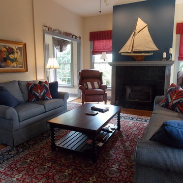
 Holly Spaulding for Ethan Allen of Fredericksburg
Working with the existing rug, I updated this federalist home to reflect a new purpose of entertaining and family use. Using the rustic console to support buffet lamps created a well lit and functional area for TV viewing. An over sized coffee table joins both sides of the wide room yet leaving an open traffic pattern. The TV is on the back wall across from the fireplace, moved back as not to interfere with the new traffic pattern.
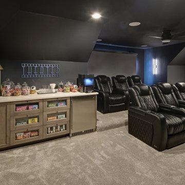
 Drury Design
THE SETUP
This remodeling project transformed a catchall room into a cinema-style theater designed for family entertainment and relaxation. The original space, which housed a small TV, older furniture, and various children’s toys, was reimagined to create a sophisticated, adult-friendly home theater with ample seating and modern amenities.
Design Objectives:
Create a Dark Theater Space: Ensure the room mimics a traditional movie theater environment.
Provide Comfortable Theater Seating: Include enough seating for the family and guests.
Integrate a Dry Bar Area: Include a space for snacks and drinks.
Optimize Space Utilization: Maintain an open area for additional activities.
Design Challenges:
Natural light: The room was too bright for a theater setting.
Seating: Accommodating six theater seats without obstructing views.
Lighting: Ensuring the lighting does not interfere with the viewing experience.
AV: Finding a clutter-free solution for AV equipment.
Dry Bar: Incorporating a dry bar area without overcrowding the space.
Viewing: Ensuring the TV placement allows for comfortable, optimized viewing.
THE RENEWED SPACE
Design Solutions:
Natural Light Control: Installed blackout remote shades on the back window and painted the walls dark charcoal to reduce natural light infiltration.
Seating Arrangement: Built a second level for the back row of seating to ensure unobstructed views for all movie watchers.
Lighting Design: Installed sconces on either side of the window that shine from the sides (to avoid interfering with the viewing experience).
AV Equipment Storage: Utilized existing recess areas with custom shelves matching the cabinetry and concealed cables using a PVC pipe system.
Dry Bar Integration: Created a dry bar area on the back wall with a refrigerator, candy storage, and a small counter space for a popcorn machine and ice maker, with locked drawers to prevent unsupervised access.
Optimal Viewing Distance: Evaluated multiple floor plans and placed the TV on the most suitable wall to ensure optimal viewing and comfortable reclined seating.
Final Thoughts:
The completed home theater has been a resounding success, providing a versatile space for the entire family. The thoughtful design and meticulous attention to detail have created a functional and enjoyable home theater that meets diverse needs, from watching movies and playing video games to relaxing and reading. The areas to the sides of the theater seats can accommodate spillover seating or activity zones. The area housing the AV equipment also includes extra shelves for storing snuggle-grade movie viewing blankets. This theater space has become a favorite hangout spot, offering comfort and entertainment for everyone.
This view shows the dual level theater seating, bean bags, open AV shelving on the right to tuck the cables which our installers ran behind the TV with PVC piping.
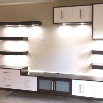
 Smart Closets
This custom media center was designed with a two-tone (White and Espresso Pine) modern style. We included downward LED lighting in all of the floating shelves for useful lighting and strip LED lighting inset in the back of the shelves and base unit for lower-level mood lighting. Two diffused laminated doors were placed at the bottom for extra visual contrast and to prevent interference with remote controls.
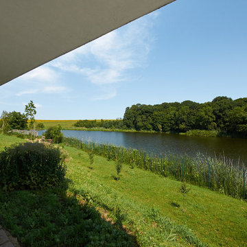 RAZVAN BARSAN + PARTNERS
Coming up with new ideas is always challenging, but the challenge seems even more difficult to overcome when the starting point is quite limiting. In the case of this residential project, the starting point was an existing foundation, that needed to be used for the future building. Therefore, the footprint of the house needed to remain the same, however, the functions needed adjustments since the requirements and priorities of the owners changed in the previous years.
Another aspect that involved limitations but in a totally different sense was the setting - a beautiful place near a lake, surrounded by wild vegetation - and our challenge was to integrate the house while emphasizing the view.
We managed to do so by using large glass areas towards the lake, by laying the house properly on the sloped ground and by the use of materials. Because we didn't want to interfere with the all-natural vibe of the surroundings, we preferred using all-natural materials: wood as a structural material as well as an interior and exterior wall finishing, natural stone on both façades and pavements, ceramic roofing.
The result now peacefully lays near the lake, a discrete presence, while hosting the life of a family and all the peace of mind one can get.
 Kitchen Solvers of Grayslake
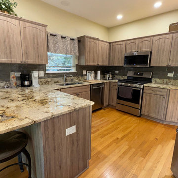
Our clients loved the look of natural wood but felt their honey oak cabinets were starting to feel a bit dated. They weren’t ready for a full remodel, but they knew it was time for an upgrade—and cabinet refacing was the perfect solution! The layout still worked well, but the wall cabinets above the refrigerator needed to be raised to fit a new, taller appliance. The cabinet doors above the fridge couldn’t open fully due to interference from the refrigerator hinge brackets—definitely not ideal. We refaced the cabinets with a Palamino wood tone in a transitional full-overlay style, bringing warmth and a clean, updated look while keeping the wood aesthetic they loved. We also elevated the functionality and style with new solid wood drawers, a rollout drawer next to the oven, elegant brushed pewter hardware with a mix of knobs and pulls and crown molding added where none existed before for a finished, polished look. The homeowners were thrilled and told us, “Everything looks perfect.”
 Andover Landscape Design & Construction
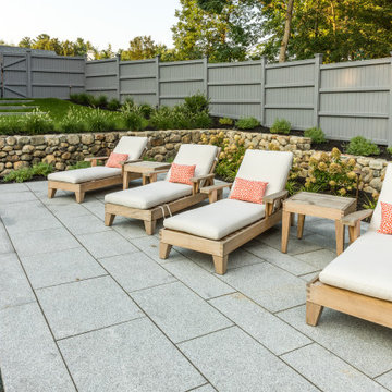
A once uninspired, blank lawn has now transformed into a backyard oasis. This retreat now provides an extension of living space for the family and their friends to enjoy for years to come. The inviting gunite pool is the focal point of this space, centrally located with plenty of sun exposure to enjoy during the summer months. For those times when relaxation is desired, a sculptural water feature provides the sound of running water without being visually overbearing.
Opposite the sun deck, is an inviting, cozy space complete with a sofa and fire pit that can be used year round. The outdoor living room space under a new deck is fully-covered and well-lit so even an occasional rain shower or too much sun won’t interfere with entertaining guests. All of these separate spaces work in harmony to provide a cohesive feel. The new pool and surrounding landscape overlooks the second fairway at Andover Country Club.
 Drury Design
The objectives were:
Make better use of the dining room – create a space ideal for informal gatherings
Create a display space that is Marvel Spectacular-worthy
Create a wow-worthy focal point that is visible as guests walk in the front door
Incorporate a sink into the bar
Plenty of storage
Incorporate the client’s custom “barrel” secret mini bar into the design
Design challenges we solved for:
Make the two areas feel as one
Provide enough support for the bar’s thick wood-top so that it would not need legs that would interfere with the seating area
Find a way to incorporate as much bar seating as possible
Make the room’s finishes flow with the rest of the house
THE RENEWED SPACE
Design solutions:
Add open cabinets on the back bar wall with lights and display sections – this ties the bar area to the open display cabinets
Back bar wall base cabinets provide lots of storage
U-shaped island allows for more seating
Custom shelving adjustable to accommodate a wide range of collectibles
Finishes that tie into the secret barrel bar integrate nicely with the rest of the house
Transforming the former dining room area into a bar with lots of display shelving gives the clients a new, functional gathering place that reflects their personal style. It feels more fun and modern, and it feels more like “them.” After all, this is their own special area in their own home and it’s a perfect place for hanging out with friends.
 Build Native Custom Homes
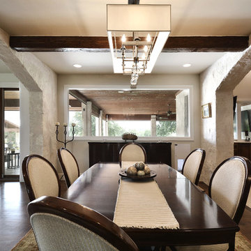
Example of a huge classic dark wood floor great room design in Austin with white walls
 Reico Kitchen & Bath
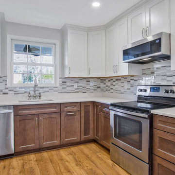
Eric Kneller from Reico Kitchen & Bath in Frederick, MD, partnered with Ravenwood to design a transitional kitchen using Merillat Autograph cabinetry.
The kitchen features the Bayard door style in an Evercore painted Warm White finish for the wall cabinets and Maple in Stained Molasses for the base cabinets.
The client shared, “We avoided a kitchen remodel for years due to stories of stressful experiences. Our project with Reico was nothing like that! From start to finish, everything was handled professionally. Eric played a key role in the process, offering helpful suggestions for the layout and design that gave us great options for customization.”
Eric added, “The homeowners wanted more storage space, especially since there was no pantry in the home. We worked together to design a solution that wouldn’t interfere with the dining area. The transitional style of the cabinets works well with the warm white and dark stained finishes. I’m pleased with the final result.”
Photos courtesy of BTW Images.

 EcoSmart
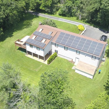
Inspiration for a mid-sized timeless white two-story stucco exterior home remodel in Bridgeport with a shingle roof
 Reico Kitchen & Bath
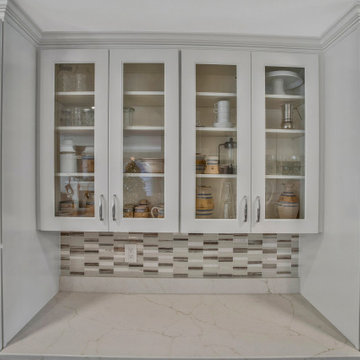
Eric Kneller from Reico Kitchen & Bath in Frederick, MD, partnered with Ravenwood to design a transitional kitchen using Merillat Autograph cabinetry.
The kitchen features the Bayard door style in an Evercore painted Warm White finish for the wall cabinets and Maple in Stained Molasses for the base cabinets.
The client shared, “We avoided a kitchen remodel for years due to stories of stressful experiences. Our project with Reico was nothing like that! From start to finish, everything was handled professionally. Eric played a key role in the process, offering helpful suggestions for the layout and design that gave us great options for customization.”
Eric added, “The homeowners wanted more storage space, especially since there was no pantry in the home. We worked together to design a solution that wouldn’t interfere with the dining area. The transitional style of the cabinets works well with the warm white and dark stained finishes. I’m pleased with the final result.”
Photos courtesy of BTW Images.
38