
Search results for "Interpretation" in Home Design Ideas
 SM Design
Bridle Path Residence — Primary Bathroom Retreat
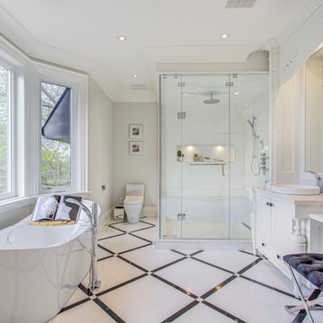
This Bridle Path Residence primary bathroom is conceived as a private spa-like retreat, combining classical architectural detailing with contemporary fixtures, expansive glazing, and a highly restrained material palette. The design prioritizes serenity and natural light while maintaining the level of craftsmanship and visual refinement established throughout the residence.
The room's strongest design feature is its relationship with the outdoors. A generous bay of windows brings the surrounding mature landscape directly into the bathroom, transforming the view into an important part of the experience. Daylight washes across the pale surfaces and enhances the sense of openness, making the space feel more like a private wellness suite than a conventional bathroom.
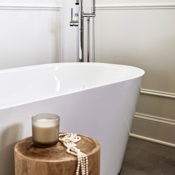
The freestanding sculptural tub is positioned directly beside the windows, creating a deliberate moment of relaxation and emphasizing the connection between bathing and the landscape. Its smooth, organic silhouette contrasts beautifully with the architectural geometry of the room, while the polished floor-mounted faucet introduces a refined contemporary detail.
The shower is treated as an architectural volume rather than simply a functional enclosure. Clear frameless glass preserves visual continuity across the room and allows the large-format wall surfaces and integrated shower niche to remain visible. The minimal hardware keeps the enclosure visually light and reinforces the clean, modern character.
A striking element is the geometric floor design, where dark linear insets intersect across the pale stone surface to create a sophisticated diamond-like pattern. This introduces a graphic layer beneath the otherwise quiet palette and provides a subtle connection to the more traditional detailing found elsewhere in the residence.
The custom vanity continues the home's tailored millwork language. White cabinetry, refined hardware, decorative supports, and integrated mirrors create a furniture-like composition rather than a generic bathroom installation. The large mirror amplifies the natural light and visually expands the room, while the sculptural upholstered stool adds softness and a touch of traditional glamour.
The material palette is intentionally restrained: luminous white surfaces, pale stone, crisp millwork, polished metal, and touches of dark detailing. This restraint allows architectural form, daylight, and the surrounding landscape to become the primary sources of visual interest.
Overall, the bathroom represents timeless luxury interpreted through a contemporary lens. Traditional millwork and geometric stone detailing provide character, while frameless glass, sculptural plumbing fixtures, and the freestanding tub introduce modern simplicity. The result is an elegant, highly personalized primary bathroom designed to feel restorative, spacious, and quietly luxurious.

 Advance Design Studio, Ltd.
Quinn and Paige, residents of this tired 1960’s tri-level home hated their kitchen. As a matter of fact, prior to making plans to renovate the first floor - they considered selling the home, but were reluctant because of its enviable location near the heart of downtown Barrington which was within walking distance to local stores and all their favorite places. So instead they contacted Advance Design Studio after hearing about them from a neighbor, to rescue their tired home and give it new life.
The very first plan was to remove the constricting walls surrounding the original kitchen, and open the expansive first floor living room and dining area to the new heart of the space; a stunning state of the art coastal designed kitchen. Exposing attractive beams in the vaulted ceiling created an interesting structural detail that suits the open plan and salutes the original architecture of the home, further emphasizing the height of the new space enjoyed now by the family as a great room.
The stage was set for the seaside feel of this kitchen by pairing crisp white painted maple cabinets with Dura Supreme’s one of kind hand weathered finish on the island in soft blue-green finish. But the authentic feeling of being on your favorite beach was supremely achieved by the matching of unique Mt. Claire marble on the island and the specialty Wareham acid washed stone on the perimeter counter tops. Pictures don’t do justice to the feel of this stone under your hand; its water-washed texture reminds instantly of summer vacations collecting rocks softly etched by hundreds of waves.
Stainless steel appliances and satin nickel hardware shine brightly against the backdrop of bright white subway tiles accentuated by subtle grey grout lines contributing to the nautical feel of this comfortable kitchen. Seeded glass door cabinetry reminiscent of beach grasses dress up the space just enough, and a proud 6” stacked crown molding extends above 36” wall cabinets into the expanse of the now taller space; balancing this kitchen nicely within its newly integrated home.
Features in this kitchen include a built in standard depth refrigerator, pull out spice racks, tall tray dividers and wood super Susan with double pull out trash and recycling. A cutlery divider holds sharp knives, and an angled cabinet was customized to hold a secret USB charging station. The bright white Kohler farm sink is graced by an elegant bridge faucet in brushed nickel. This now airy and spacious kitchen has room for guest and family to congregate around the large island, complete with stools and attractive hidden storage for seldom used entertainment pieces.
“I was sold when I saw the drawings. My designer nailed it, down to every last storage idea and coastal detail I envisioned, it was all in there. It was unbelievable how accurate her interpretation was of what was in my head; working with her made my kitchen renovation so easy, it’s as if she literally read my mind”, said Paige enthusiastically.
The woman of the house expressed upon completion not only her love for her fantastic new cooking space, but how renovating her kitchen has given new life to the entire home. Talk of moving has been relegated to the recycling bin, and instead the family is discussing plans to renovate the master bath now that they’ve decided to stay for the long term. Friends who visit the home do a double-take as they recognize the new space’s dramatic transformation from original cramped and closed spaces - to the now amazingly fresh open kitchen that has become the center of every gathering and family meal.
Designer: Nicole Ryan
Photographer: Joe Nowak
 Advance Design Studio, Ltd.
Quinn and Paige, residents of this tired 1960’s tri-level home hated their kitchen. As a matter of fact, prior to making plans to renovate the first floor - they considered selling the home, but were reluctant because of its enviable location near the heart of downtown Barrington which was within walking distance to local stores and all their favorite places. So instead they contacted Advance Design Studio after hearing about them from a neighbor, to rescue their tired home and give it new life.
The very first plan was to remove the constricting walls surrounding the original kitchen, and open the expansive first floor living room and dining area to the new heart of the space; a stunning state of the art coastal designed kitchen. Exposing attractive beams in the vaulted ceiling created an interesting structural detail that suits the open plan and salutes the original architecture of the home, further emphasizing the height of the new space enjoyed now by the family as a great room.
The stage was set for the seaside feel of this kitchen by pairing crisp white painted maple cabinets with Dura Supreme’s one of kind hand weathered finish on the island in soft blue-green finish. But the authentic feeling of being on your favorite beach was supremely achieved by the matching of unique Mt. Claire marble on the island and the specialty Wareham acid washed stone on the perimeter counter tops. Pictures don’t do justice to the feel of this stone under your hand; its water-washed texture reminds instantly of summer vacations collecting rocks softly etched by hundreds of waves.
Stainless steel appliances and satin nickel hardware shine brightly against the backdrop of bright white subway tiles accentuated by subtle grey grout lines contributing to the nautical feel of this comfortable kitchen. Seeded glass door cabinetry reminiscent of beach grasses dress up the space just enough, and a proud 6” stacked crown molding extends above 36” wall cabinets into the expanse of the now taller space; balancing this kitchen nicely within its newly integrated home.
Features in this kitchen include a built in standard depth refrigerator, pull out spice racks, tall tray dividers and wood super Susan with double pull out trash and recycling. A cutlery divider holds sharp knives, and an angled cabinet was customized to hold a secret USB charging station. The bright white Kohler farm sink is graced by an elegant bridge faucet in brushed nickel. This now airy and spacious kitchen has room for guest and family to congregate around the large island, complete with stools and attractive hidden storage for seldom used entertainment pieces.
“I was sold when I saw the drawings. My designer nailed it, down to every last storage idea and coastal detail I envisioned, it was all in there. It was unbelievable how accurate her interpretation was of what was in my head; working with her made my kitchen renovation so easy, it’s as if she literally read my mind”, said Paige enthusiastically.
The woman of the house expressed upon completion not only her love for her fantastic new cooking space, but how renovating her kitchen has given new life to the entire home. Talk of moving has been relegated to the recycling bin, and instead the family is discussing plans to renovate the master bath now that they’ve decided to stay for the long term. Friends who visit the home do a double-take as they recognize the new space’s dramatic transformation from original cramped and closed spaces - to the now amazingly fresh open kitchen that has become the center of every gathering and family meal.
Designer: Nicole Ryan
Photographer: Joe Nowak
Find the right local pro for your project
 Advance Design Studio, Ltd.
Quinn and Paige, residents of this tired 1960’s tri-level home hated their kitchen. As a matter of fact, prior to making plans to renovate the first floor - they considered selling the home, but were reluctant because of its enviable location near the heart of downtown Barrington which was within walking distance to local stores and all their favorite places. So instead they contacted Advance Design Studio after hearing about them from a neighbor, to rescue their tired home and give it new life.
The very first plan was to remove the constricting walls surrounding the original kitchen, and open the expansive first floor living room and dining area to the new heart of the space; a stunning state of the art coastal designed kitchen. Exposing attractive beams in the vaulted ceiling created an interesting structural detail that suits the open plan and salutes the original architecture of the home, further emphasizing the height of the new space enjoyed now by the family as a great room.
The stage was set for the seaside feel of this kitchen by pairing crisp white painted maple cabinets with Dura Supreme’s one of kind hand weathered finish on the island in soft blue-green finish. But the authentic feeling of being on your favorite beach was supremely achieved by the matching of unique Mt. Claire marble on the island and the specialty Wareham acid washed stone on the perimeter counter tops. Pictures don’t do justice to the feel of this stone under your hand; its water-washed texture reminds instantly of summer vacations collecting rocks softly etched by hundreds of waves.
Stainless steel appliances and satin nickel hardware shine brightly against the backdrop of bright white subway tiles accentuated by subtle grey grout lines contributing to the nautical feel of this comfortable kitchen. Seeded glass door cabinetry reminiscent of beach grasses dress up the space just enough, and a proud 6” stacked crown molding extends above 36” wall cabinets into the expanse of the now taller space; balancing this kitchen nicely within its newly integrated home.
Features in this kitchen include a built in standard depth refrigerator, pull out spice racks, tall tray dividers and wood super Susan with double pull out trash and recycling. A cutlery divider holds sharp knives, and an angled cabinet was customized to hold a secret USB charging station. The bright white Kohler farm sink is graced by an elegant bridge faucet in brushed nickel. This now airy and spacious kitchen has room for guest and family to congregate around the large island, complete with stools and attractive hidden storage for seldom used entertainment pieces.
“I was sold when I saw the drawings. My designer nailed it, down to every last storage idea and coastal detail I envisioned, it was all in there. It was unbelievable how accurate her interpretation was of what was in my head; working with her made my kitchen renovation so easy, it’s as if she literally read my mind”, said Paige enthusiastically.
The woman of the house expressed upon completion not only her love for her fantastic new cooking space, but how renovating her kitchen has given new life to the entire home. Talk of moving has been relegated to the recycling bin, and instead the family is discussing plans to renovate the master bath now that they’ve decided to stay for the long term. Friends who visit the home do a double-take as they recognize the new space’s dramatic transformation from original cramped and closed spaces - to the now amazingly fresh open kitchen that has become the center of every gathering and family meal.
Designer: Nicole Ryan
Photographer: Joe Nowak
 TKS Design Group
Download our free ebook, Creating the Ideal Kitchen. DOWNLOAD NOW
A tired primary bathroom, with varying ceiling heights and a beige-on-beige color scheme, was screaming for love. Squaring the room and adding natural materials erased the memory of the lack luster space and converted it to a bright and welcoming spa oasis. The home was a new build in 2005 and it looked like all the builder’s material choices remained. The client was clear on their design direction but were challenged by the differing ceiling heights and were looking to hire a design-build firm that could resolve that issue.
This local Glen Ellyn couple found us on Instagram (@kitchenstudioge, follow us ?). They loved our designs and felt like we fit their style. They requested a full primary bath renovation to include a large shower, soaking tub, double vanity with storage options, and heated floors. The wife also really wanted a separate make-up vanity. The biggest challenge presented to us was to architecturally marry the various ceiling heights and deliver a streamlined design.
The existing layout worked well for the couple, so we kept everything in place, except we enlarged the shower and replaced the built-in tub with a lovely free-standing model. We also added a sitting make-up vanity. We were able to eliminate the awkward ceiling lines by extending all the walls to the highest level. Then, to accommodate the sprinklers and HVAC, lowered the ceiling height over the entrance and shower area which then opens to the 2-story vanity and tub area. Very dramatic!
This high-end home deserved high-end fixtures. The homeowners also quickly realized they loved the look of natural marble and wanted to use as much of it as possible in their new bath. They chose a marble slab from the stone yard for the countertops and back splash, and we found complimentary marble tile for the shower. The homeowners also liked the idea of mixing metals in their new posh bathroom and loved the look of black, gold, and chrome.
Although our clients were very clear on their style, they were having a difficult time pulling it all together and envisioning the final product. As interior designers it is our job to translate and elevate our clients’ ideas into a deliverable design. We presented the homeowners with mood boards and 3D renderings of our modern, clean, white marble design. Since the color scheme was relatively neutral, at the homeowner’s request, we decided to add of interest with the patterns and shapes in the room.
We were first inspired by the shower floor tile with its circular/linear motif. We designed the cabinetry, floor and wall tiles, mirrors, cabinet pulls, and wainscoting to have a square or rectangular shape, and then to create interest we added perfectly placed circles to contrast with the rectangular shapes. The globe shaped chandelier against the square wall trim is a delightful yet subtle juxtaposition.
The clients were overjoyed with our interpretation of their vision and impressed with the level of detail we brought to the project. It’s one thing to know how you want a space to look, but it takes a special set of skills to create the design and see it thorough to implementation. Could hiring The Kitchen Studio be the first step to making your home dreams come to life?

 Christopher Maya Associates Inc.
By the architectural standards of Southampton, New York—where magnificent old piles built by Yankee blue bloods and extravagant contemporary mansions constructed by moguls of finance and industry are perched along one of Long Island’s toniest beaches—entrepreneur J. Christopher Burch’s house is a modest affair. Most buyers in this community would likely have torn down the ranch-style structure, which clocks in at 6,000 square feet, and replaced it with an imposing Georgian Revival or Shingle Style residence, replete with pomp and pergolas. But its unassuming character suited Burch, the founder and CEO of Burch Creative Capital and the man behind the retro-preppy lifestyle retailer C. Wonder. “I didn’t want anything too grand,” he says. “I wanted it to feel more like a cottage than an estate.”
Modifications, however, were necessary to bring the place up to snuff—namely streamlining the awkward floor plan and upgrading the surfaces. New Jersey architectural designer Marina Lanina stripped the building down to its wood frame and reconfigured the interior, more or less hewing to the original footprint save for an expanded kitchen at the rear. Lanina, who honed her skills in the office of interior designer David Kleinberg, also added guest quarters above the attached garage and, at the opposite end of the home, constructed a second-floor master suite. Bridgehampton-based landscape designer Joseph Tyree recast the 2.75-acre grounds with, among other touches, a charming parterre garden that is visible from the master bedroom’s small balcony.
The getaway exhibits the spirited, all-American styling of C. Wonder, but the brand’s candied hues are toned down. “I didn’t really want to do my stuff in the house,” Burch says, adding that he began the renovation before launching C. Wonder in 2011 with a flagship store in Manhattan. The residence is instead New York interior designer Christopher Maya’s interpretation of his client’s somewhat eccentric taste, which Burch himself describes as “a very quirky sense of classicism.” The decorator’s first meeting with the entrepreneur was inspiration enough. “Chris was sitting in the conference room with colleagues, a pink Hermès scarf wrapped around his head. I thought, This is going to be fun,” Maya recalls. The designer soon set about conjuring schemes for each room of the dwelling, aiming for an inviting, energetic atmosphere reflective of Burch’s playful personality.
Every inch of molding and trim gleams with pristine lacquerlike finishes. To offset that snappy sheen, some walls are papered in grass cloth, while others are meticulously upholstered with boldly patterned fabrics. The colors are lively—Carolina-blue in the master bedroom, buttery yellow in a guest room—and the overall ambience is light and relaxed. “A lot of houses in the Hamptons are so formal, it’s like being in a Park Avenue apartment,” Maya says. “I thought the house should be fun—when guests walk in, they should feel right away like they’re about to have a fantastic weekend.” Cerused-oak floors, sisal carpets, and the occasional rattan armchair further the casual vibe. The oak-paneled library is as sober as it gets, but an apple-green sofa and a Billy Baldwin slipper chair clad in a peridot-green leopard print leaven the mood. Accenting the room is a striking etching of an owl with its wings spread wide; it is one of several artworks by Walton Ford that Burch had purchased before the project started and which turned out to fit right in with the palette Maya conceived.
Burch also asked the designer to incorporate some furniture from a line the investor has developed for No. 9 Christopher, a lifestyle concept store he plans to open in Manhattan next year. Maya customized the pieces, including painting a Jansen-inspired desk in brilliant royal blue and an Asian-style cocktail table in a brash Dick Tracy–yellow. “The house is a little electric in spots, but I’m not scared of color,” says Burch, who sums up the place in his typically punchy style: “It’s cool. It’s small. It’s very happy.”
 Advance Design Studio, Ltd.
Quinn and Paige, residents of this tired 1960’s tri-level home hated their kitchen. As a matter of fact, prior to making plans to renovate the first floor - they considered selling the home, but were reluctant because of its enviable location near the heart of downtown Barrington which was within walking distance to local stores and all their favorite places. So instead they contacted Advance Design Studio after hearing about them from a neighbor, to rescue their tired home and give it new life.
The very first plan was to remove the constricting walls surrounding the original kitchen, and open the expansive first floor living room and dining area to the new heart of the space; a stunning state of the art coastal designed kitchen. Exposing attractive beams in the vaulted ceiling created an interesting structural detail that suits the open plan and salutes the original architecture of the home, further emphasizing the height of the new space enjoyed now by the family as a great room.
The stage was set for the seaside feel of this kitchen by pairing crisp white painted maple cabinets with Dura Supreme’s one of kind hand weathered finish on the island in soft blue-green finish. But the authentic feeling of being on your favorite beach was supremely achieved by the matching of unique Mt. Claire marble on the island and the specialty Wareham acid washed stone on the perimeter counter tops. Pictures don’t do justice to the feel of this stone under your hand; its water-washed texture reminds instantly of summer vacations collecting rocks softly etched by hundreds of waves.
Stainless steel appliances and satin nickel hardware shine brightly against the backdrop of bright white subway tiles accentuated by subtle grey grout lines contributing to the nautical feel of this comfortable kitchen. Seeded glass door cabinetry reminiscent of beach grasses dress up the space just enough, and a proud 6” stacked crown molding extends above 36” wall cabinets into the expanse of the now taller space; balancing this kitchen nicely within its newly integrated home.
Features in this kitchen include a built in standard depth refrigerator, pull out spice racks, tall tray dividers and wood super Susan with double pull out trash and recycling. A cutlery divider holds sharp knives, and an angled cabinet was customized to hold a secret USB charging station. The bright white Kohler farm sink is graced by an elegant bridge faucet in brushed nickel. This now airy and spacious kitchen has room for guest and family to congregate around the large island, complete with stools and attractive hidden storage for seldom used entertainment pieces.
“I was sold when I saw the drawings. My designer nailed it, down to every last storage idea and coastal detail I envisioned, it was all in there. It was unbelievable how accurate her interpretation was of what was in my head; working with her made my kitchen renovation so easy, it’s as if she literally read my mind”, said Paige enthusiastically.
The woman of the house expressed upon completion not only her love for her fantastic new cooking space, but how renovating her kitchen has given new life to the entire home. Talk of moving has been relegated to the recycling bin, and instead the family is discussing plans to renovate the master bath now that they’ve decided to stay for the long term. Friends who visit the home do a double-take as they recognize the new space’s dramatic transformation from original cramped and closed spaces - to the now amazingly fresh open kitchen that has become the center of every gathering and family meal.
Designer: Nicole Ryan
Photographer: Joe Nowak

 Design Group Three
Firm: Design Group Three
Designer: Alan Freysinger
Cabinetry: Greenfield Cabinetry
Photography: Jim Tschetter IC360 Images
Veteran kitchen designer Alan Freysinger worked closely with the Fox Point, WI homeowners on this kitchen. Admittedly, not afraid of color, the homeowner loved Alan's suggestion of adding the wood veneer to the mix of cabinetry, adding an additional layer of interest and the addition of texture.
Design Group Three, together with custom Greenfield Cabinetry, stepped up the living pleasure of this Fox Point family's home.
When this kitchen remodel was first underway, the homeowner envisioned a blue kitchen (orange was her 2nd choice!). She went to the paint store & found blues she liked, taped those color samples to the kitchen wall & one by one she and her husband whittled down their choices to the color blue you see now!
From Milwaukee to Chicago, clean lines are much desired in today's kitchen designs. Design Group Three hears many requests for Transitionally styled kitchens such as this one.
Want a pop of orange? blue? red? in your kitchen? Milwaukee's Design Group Three can custom match any color in paint (or stain!) for cabinetry in your home, as we did in for this blue kitchen in Fox Point, WI.
Not sure if you are up for this much color in your kitchen? Begin with remodeling a bathroom vanity with a pop of color, live with it for a while & then, if you decide it's for you too, call in Design Group Three & we'll work with you to uncover your perfect color palette.
Can you imagine this same kitchen in orange? This Fox Point, WI homeowners preliminary vision for her kitchen remodel walked the line between orange & blue!
Blue kitchens are completely on trend in today's kitchens!
According to the National Kitchen & Bath Association, Transitionally styled kitchens, such as this blue one, are the most commonly requested design genre. In fact, in 2012, for the first time ever since the NKBA started keeping track, Transitional beat out Traditional as the most requested style by homeowners.
What exactly is affordably luxury? You are witnessing it in these photos. Discover it via Milwaukee's Design Group Three & Greenfield Cabinetry.
Transitional Style (also known as "updated classic", "classic with a contemporary twist", "new takes on old classics") in interior design & furniture design refers to a blend of traditional and contemporary styles, midway between old world traditional & the world of chrome & glass contemporary; incorporating lines which are less ornate than traditional designs, but not as severely basic as contemporary lines. As a result transitional designs are classic, timeless, and clean.
Lucky, lucky kitchen. Greenfield Cabinetry's interpretation of Midwestern Modern.
Seasoned Design Group Three designer & owner, Alan Freysinger's design details take their cues from your lifestyle, as reflected in this transitionally styled kitchen.
"The general color trend is a move toward bolder, crisper colors as a reflection of the 'anything goes' culture we live in now." - Jonathan Adler, Designer
 Design Group Three
Firm: Design Group Three
Designer: Alan Freysinger
Cabinetry: Greenfield Cabinetry
Photography: Jim Tschetter IC360 Images
Veteran kitchen designer Alan Freysinger worked closely with the Fox Point, WI homeowners on this kitchen. Admittedly, not afraid of color, the homeowner loved Alan's suggestion of adding the wood veneer to the mix of cabinetry, adding an additional layer of interest and the addition of texture.
Design Group Three, together with custom Greenfield Cabinetry, stepped up the living pleasure of this Fox Point family's home.
When this kitchen remodel was first underway, the homeowner envisioned a blue kitchen (orange was her 2nd choice!). She went to the paint store & found blues she liked, taped those color samples to the kitchen wall & one by one she and her husband whittled down their choices to the color blue you see now!
From Milwaukee to Chicago, clean lines are much desired in today's kitchen designs. Design Group Three hears many requests for Transitionally styled kitchens such as this one.
Want a pop of orange? blue? red? in your kitchen? Milwaukee's Design Group Three can custom match any color in paint (or stain!) for cabinetry in your home, as we did in for this blue kitchen in Fox Point, WI.
Not sure if you are up for this much color in your kitchen? Begin with remodeling a bathroom vanity with a pop of color, live with it for a while & then, if you decide it's for you too, call in Design Group Three & we'll work with you to uncover your perfect color palette.
Can you imagine this same kitchen in orange? This Fox Point, WI homeowners preliminary vision for her kitchen remodel walked the line between orange & blue!
Blue kitchens are completely on trend in today's kitchens!
According to the National Kitchen & Bath Association, Transitionally styled kitchens, such as this blue one, are the most commonly requested design genre. In fact, in 2012, for the first time ever since the NKBA started keeping track, Transitional beat out Traditional as the most requested style by homeowners.
What exactly is affordably luxury? You are witnessing it in these photos. Discover it via Milwaukee's Design Group Three & Greenfield Cabinetry.
Transitional Style (also known as "updated classic", "classic with a contemporary twist", "new takes on old classics") in interior design & furniture design refers to a blend of traditional and contemporary styles, midway between old world traditional & the world of chrome & glass contemporary; incorporating lines which are less ornate than traditional designs, but not as severely basic as contemporary lines. As a result transitional designs are classic, timeless, and clean.
Lucky, lucky kitchen. Greenfield Cabinetry's interpretation of Midwestern Modern.
Seasoned Design Group Three designer & owner, Alan Freysinger's design details take their cues from your lifestyle, as reflected in this transitionally styled kitchen.
"The general color trend is a move toward bolder, crisper colors as a reflection of the 'anything goes' culture we live in now." - Jonathan Adler, Designer
 Jon Allen Fine Metal Art
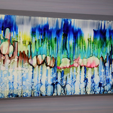
Go Your Own Way by Jon Allen is an abstract painting on metal. With beautiful blue, yellow, green, and earthtones, this one of a kind painting will command your attention and keep your interest. It looks fantastic oriented either horizontally or vertically and will complement your traditional, modern, and contemporary decor at home or in the office.
Number of Pieces: 1
Dimensions: 48" x 24" x 2" off the wall
Care & Cleaning: Clean with a soft cloth and plain soap & water
Other Features: Hardware is pre-installed for simple hanging and art will “float” 2” off the wall
 Design Group Three
Firm: Design Group Three
Designer: Alan Freysinger
Cabinetry: Greenfield Cabinetry
Photography: Jim Tschetter IC360 Images
Veteran kitchen designer Alan Freysinger worked closely with the Fox Point, WI homeowners on this kitchen. Admittedly, not afraid of color, the homeowner loved Alan's suggestion of adding the wood veneer to the mix of cabinetry, adding an additional layer of interest and the addition of texture.
Design Group Three, together with custom Greenfield Cabinetry, stepped up the living pleasure of this Fox Point family's home.
When this kitchen remodel was first underway, the homeowner envisioned a blue kitchen (orange was her 2nd choice!). She went to the paint store & found blues she liked, taped those color samples to the kitchen wall & one by one she and her husband whittled down their choices to the color blue you see now!
From Milwaukee to Chicago, clean lines are much desired in today's kitchen designs. Design Group Three hears many requests for Transitionally styled kitchens such as this one.
Want a pop of orange? blue? red? in your kitchen? Milwaukee's Design Group Three can custom match any color in paint (or stain!) for cabinetry in your home, as we did in for this blue kitchen in Fox Point, WI.
Not sure if you are up for this much color in your kitchen? Begin with remodeling a bathroom vanity with a pop of color, live with it for a while & then, if you decide it's for you too, call in Design Group Three & we'll work with you to uncover your perfect color palette.
Can you imagine this same kitchen in orange? This Fox Point, WI homeowners preliminary vision for her kitchen remodel walked the line between orange & blue!
Blue kitchens are completely on trend in today's kitchens!
According to the National Kitchen & Bath Association, Transitionally styled kitchens, such as this blue one, are the most commonly requested design genre. In fact, in 2012, for the first time ever since the NKBA started keeping track, Transitional beat out Traditional as the most requested style by homeowners.
What exactly is affordably luxury? You are witnessing it in these photos. Discover it via Milwaukee's Design Group Three & Greenfield Cabinetry.
Transitional Style (also known as "updated classic", "classic with a contemporary twist", "new takes on old classics") in interior design & furniture design refers to a blend of traditional and contemporary styles, midway between old world traditional & the world of chrome & glass contemporary; incorporating lines which are less ornate than traditional designs, but not as severely basic as contemporary lines. As a result transitional designs are classic, timeless, and clean.
Lucky, lucky kitchen. Greenfield Cabinetry's interpretation of Midwestern Modern.
Seasoned Design Group Three designer & owner, Alan Freysinger's design details take their cues from your lifestyle, as reflected in this transitionally styled kitchen.
"The general color trend is a move toward bolder, crisper colors as a reflection of the 'anything goes' culture we live in now." - Jonathan Adler, Designer
 EAG Studio
On a quiet street just steps from San Francisco’s beloved Dolores Park, a formerly modest urban structure has been transformed into a luminous vertical residence that quietly redefines contemporary city living. Through a comprehensive remodel and both vertical and horizontal expansion, the project turns a constrained urban footprint into a sequence of serene, art-forward living spaces that unfold upward toward expansive city views.
The architecture balances restraint and warmth: crisp contemporary geometry softened by natural materials, artful lighting, and carefully curated interiors. The result is a home that feels simultaneously grounded and elevated—deeply connected to its neighborhood yet remarkably private.
Reimagining the Urban Envelope
The original building has been almost entirely reconceived. The facade now reads as a disciplined composition of plaster volumes and precisely detailed window openings framed by subtle projecting bands. The geometry references San Francisco’s classic rhythm of bayed facades while stripping the language down to a refined modern expression.
Behind this quiet exterior lies a dramatically expanded interior volume. The redesign adds both additional floor area and new vertical circulation, transforming what was once a conventional city house into a multi-level architectural sequence organized around light, art, and views.
At the roofline, planted terraces soften the building’s silhouette and create a green crown visible from surrounding hillsides.
Interiors as a Sequence of Galleries
Inside, the home unfolds as a series of spatial moments connected by a sculptural stair and gallery-like corridors.
Wide plank oak floors run throughout, providing continuity and warmth against a palette of plaster walls, dark steel detailing, and natural stone. The hallways function almost as curated galleries, with layered artworks suspended in front of mesh panels that create depth and subtle shadow.
Light filters through carefully placed windows and stair openings, transforming circulation spaces into contemplative transitions rather than mere passageways.
A Living Room Anchored by Stone and Light
The primary living room occupies one of the home’s central floors, where a quiet interplay of texture and geometry defines the space.
A monumental fireplace wrapped in dark stone forms the room’s anchor, its mass contrasting with a recessed ceiling plane that seems to float above the seating area. Integrated perimeter lighting creates a soft architectural glow that washes the ceiling and walls.
Furniture is sculptural yet understated—rounded lounge chairs in warm ochre velvet, tailored sofas, and a striking marble cocktail table whose expressive veining becomes a focal artwork in itself. Deep blue carpeting grounds the seating arrangement and subtly absorbs light, enhancing the calm atmosphere.
Above the fireplace, a delicate projection artwork introduces a moment of visual poetry—an unexpected cinematic gesture that transforms the wall into a quietly animated canvas.
Kitchen as Architectural Furniture
The kitchen expresses a different register: crisp, tactile, and materially rich.
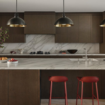
Custom walnut cabinetry spans the wall in a continuous plane, punctuated only by the sculpted hood and integrated appliances. The wood’s depth and warmth are balanced by expanses of pale marble that flow seamlessly from countertop to backsplash.
Three dome pendants hover above the island like industrial sculptures, casting pools of warm light onto the stone surface.
A row of vivid red stools introduces a controlled burst of color, a small but confident departure from the otherwise restrained palette.
Dining With a Living Backdrop
Adjacent to the kitchen, the dining room opens toward a glass wall overlooking a vertical garden of climbing ivy. The greenery becomes a constantly changing backdrop—lush and shadowy during the day, atmospheric and cinematic after sunset.
A dark wood table anchors the room, surrounded by pale oak chairs whose understated forms echo Scandinavian design traditions. The simplicity of the furniture allows the view and natural light to become the dominant experience.
Intimate Spaces and Material Contrast
Throughout the home, smaller rooms offer moments of intimacy and material experimentation.
The powder room pairs textured wall coverings with a dramatic black marble vanity whose bold veining feels almost geological. A suspended mirror and slender pendant create a sculptural composition against the tactile backdrop.
The primary bedroom, by contrast, feels serene and expansive. Floor-to-ceiling glazing frames sweeping views of the city, while soft textiles and warm wood paneling create a cocooning effect. Slender black columns subtly define a sitting area without interrupting the openness of the space.
Bathing Above the City
In the primary bathroom, a sculptural freestanding tub sits beside a panoramic window overlooking San Francisco’s hills and rooftops.
The room’s palette—light oak, grey stone, and matte metals—reinforces the spa-like atmosphere. Floating cabinetry and integrated lighting maintain a sense of visual lightness despite the richness of the materials.
Entertaining Above the Park
Higher in the house, a lounge and bar area becomes the social heart of the home. Here, dark stone slabs with dramatic veining wrap the bar wall like a piece of monumental art.
Open shelving displays glassware and spirits, while integrated wine storage hints at the home’s entertaining ambitions. A soft leather sectional and low glass table create a relaxed setting for conversation, framed by expansive views of the city skyline.
Cinema and Retreat
The lower level introduces yet another atmosphere: a dedicated media room designed for immersive viewing.
Dark walls, plush seating, and soft lighting create a cinematic environment that contrasts intentionally with the airy upper floors. It’s a retreat within the home—intimate, quiet, and removed from the brightness above.
Architecture That Balances Discipline and Warmth
What makes the project particularly compelling is its balance between architectural discipline and lived warmth.
Every element—from the carefully framed views to the restrained material palette—contributes to a cohesive spatial narrative. Yet the home never feels austere. Natural materials, curated art, and layered lighting create a sense of comfort and depth.
The result is a house that feels both architecturally rigorous and deeply human.
A Contemporary Interpretation of San Francisco Living
In a neighborhood defined by historic homes and iconic park views, this transformation offers a contemporary interpretation of San Francisco living.
It respects the city’s urban density while embracing openness, light, and vertical living. The home rises quietly above its surroundings, culminating in panoramic vistas that stretch across rooftops, hills, and sky.
What began as a conventional structure has become something far more nuanced: a modern urban sanctuary—part gallery, part retreat, and wholly connected to the vibrant city just beyond its walls.


 DANE AUSTIN INTERIOR DESIGN Boston & Cambridge
This chic couple from Manhattan requested for a fashion-forward focus for their new Boston condominium. Textiles by Christian Lacroix, Faberge eggs, and locally designed stilettos once owned by Lady Gaga are just a few of the inspirations they offered.
Project designed by Boston interior design studio Dane Austin Design. They serve Boston, Cambridge, Hingham, Cohasset, Newton, Weston, Lexington, Concord, Dover, Andover, Gloucester, as well as surrounding areas.
For more about Dane Austin Design, click here: https://daneaustindesign.com/
To learn more about this project, click here:
https://daneaustindesign.com/seaport-high-rise
 SM Design
Bridle Path Residence — Classic Luxury Kitchen
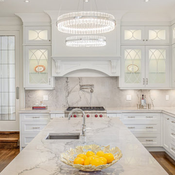
This Bridle Path Residence kitchen is designed as a sophisticated interpretation of the classic estate kitchen, combining traditional architectural detailing with the scale, functionality, and visual refinement expected of a contemporary luxury home. The design is intentionally layered, using millwork, stone, glass, metal, and lighting to create a kitchen that feels established and timeless rather than trend-driven.
The cabinetry forms the architectural backbone of the space. Custom white millwork extends across the walls in a highly considered composition, integrating refrigeration, storage, display cabinetry, and the cooking zone into one cohesive envelope. The detailing is deliberately traditional, with framed doors, decorative moulding, fluted and curved elements, and carefully proportioned cabinetry creating a sense of permanence.
One of the strongest design moments is the range wall. Rather than treating the cooking area as purely utilitarian, the design gives it the presence of a built-in architectural focal point. The sculptural hood surround, decorative corbels, arched detailing, and integrated backsplash create a furniture-like composition around the range, giving the kitchen the character of a bespoke room rather than a collection of appliances.
The marble is used extensively to establish continuity throughout the space. The expressive veining across the backsplash and island creates natural movement against the otherwise quiet white palette. Carrying the stone across multiple surfaces allows the material to become an architectural element, while the restrained cabinetry provides the necessary balance.
Glass-front display cabinets introduce another layer of craftsmanship. Their decorative glazing breaks up the extensive white cabinetry and creates illuminated moments for curated objects and serveware. This balance between concealed storage and open visual display gives the kitchen a more residential, collected character.
The oversized island is designed as both a functional work surface and the social centre of the kitchen. Its generous proportions provide ample preparation space while creating a natural gathering point. The waterfall-like continuity of the stone surface emphasizes the scale of the island and reinforces the luxurious material palette.
Lighting is treated as an architectural feature rather than simply task illumination. Two substantial contemporary crystal ring pendants float above the island, introducing sparkle and a modern counterpoint to the traditional cabinetry. Their circular geometry also softens the predominantly rectilinear architecture and creates a strong focal point when viewed from the adjoining spaces.
Warm hardwood flooring provides an important grounding element. Its natural tone prevents the extensive white and marble palette from feeling overly cool, while creating continuity with the surrounding areas of the residence. The result is a kitchen that feels bright and refined while retaining warmth and residential comfort.
The overall design is built around timeless craftsmanship with contemporary luxury. Traditional millwork establishes character, dramatic natural stone provides visual richness, decorative glass adds refinement, and modern lighting introduces a fresh layer of glamour. The result is a highly tailored kitchen designed not only for cooking, but also for entertaining, gathering, and everyday living.
 Design Group Three
Firm: Design Group Three
Designer: Alan Freysinger
Cabinetry: Greenfield Cabinetry
Photography: Jim Tschetter IC360 Images
Veteran kitchen designer Alan Freysinger worked closely with the Fox Point, WI homeowners on this kitchen. Admittedly, not afraid of color, the homeowner loved Alan's suggestion of adding the wood veneer to the mix of cabinetry, adding an additional layer of interest and the addition of texture.
Design Group Three, together with custom Greenfield Cabinetry, stepped up the living pleasure of this Fox Point family's home.
When this kitchen remodel was first underway, the homeowner envisioned a blue kitchen (orange was her 2nd choice!). She went to the paint store & found blues she liked, taped those color samples to the kitchen wall & one by one she and her husband whittled down their choices to the color blue you see now!
From Milwaukee to Chicago, clean lines are much desired in today's kitchen designs. Design Group Three hears many requests for Transitionally styled kitchens such as this one.
Want a pop of orange? blue? red? in your kitchen? Milwaukee's Design Group Three can custom match any color in paint (or stain!) for cabinetry in your home, as we did in for this blue kitchen in Fox Point, WI.
Not sure if you are up for this much color in your kitchen? Begin with remodeling a bathroom vanity with a pop of color, live with it for a while & then, if you decide it's for you too, call in Design Group Three & we'll work with you to uncover your perfect color palette.
Can you imagine this same kitchen in orange? This Fox Point, WI homeowners preliminary vision for her kitchen remodel walked the line between orange & blue!
Blue kitchens are completely on trend in today's kitchens!
According to the National Kitchen & Bath Association, Transitionally styled kitchens, such as this blue one, are the most commonly requested design genre. In fact, in 2012, for the first time ever since the NKBA started keeping track, Transitional beat out Traditional as the most requested style by homeowners.
What exactly is affordably luxury? You are witnessing it in these photos. Discover it via Milwaukee's Design Group Three & Greenfield Cabinetry.
Transitional Style (also known as "updated classic", "classic with a contemporary twist", "new takes on old classics") in interior design & furniture design refers to a blend of traditional and contemporary styles, midway between old world traditional & the world of chrome & glass contemporary; incorporating lines which are less ornate than traditional designs, but not as severely basic as contemporary lines. As a result transitional designs are classic, timeless, and clean.
Lucky, lucky kitchen. Greenfield Cabinetry's interpretation of Midwestern Modern.
Seasoned Design Group Three designer & owner, Alan Freysinger's design details take their cues from your lifestyle, as reflected in this transitionally styled kitchen.
"The general color trend is a move toward bolder, crisper colors as a reflection of the 'anything goes' culture we live in now." - Jonathan Adler, Designer
 EAG Studio
On a quiet street just steps from San Francisco’s beloved Dolores Park, a formerly modest urban structure has been transformed into a luminous vertical residence that quietly redefines contemporary city living. Through a comprehensive remodel and both vertical and horizontal expansion, the project turns a constrained urban footprint into a sequence of serene, art-forward living spaces that unfold upward toward expansive city views.
The architecture balances restraint and warmth: crisp contemporary geometry softened by natural materials, artful lighting, and carefully curated interiors. The result is a home that feels simultaneously grounded and elevated—deeply connected to its neighborhood yet remarkably private.
Reimagining the Urban Envelope
The original building has been almost entirely reconceived. The facade now reads as a disciplined composition of plaster volumes and precisely detailed window openings framed by subtle projecting bands. The geometry references San Francisco’s classic rhythm of bayed facades while stripping the language down to a refined modern expression.
Behind this quiet exterior lies a dramatically expanded interior volume. The redesign adds both additional floor area and new vertical circulation, transforming what was once a conventional city house into a multi-level architectural sequence organized around light, art, and views.
At the roofline, planted terraces soften the building’s silhouette and create a green crown visible from surrounding hillsides.
Interiors as a Sequence of Galleries
Inside, the home unfolds as a series of spatial moments connected by a sculptural stair and gallery-like corridors.
Wide plank oak floors run throughout, providing continuity and warmth against a palette of plaster walls, dark steel detailing, and natural stone. The hallways function almost as curated galleries, with layered artworks suspended in front of mesh panels that create depth and subtle shadow.
Light filters through carefully placed windows and stair openings, transforming circulation spaces into contemplative transitions rather than mere passageways.
A Living Room Anchored by Stone and Light
The primary living room occupies one of the home’s central floors, where a quiet interplay of texture and geometry defines the space.
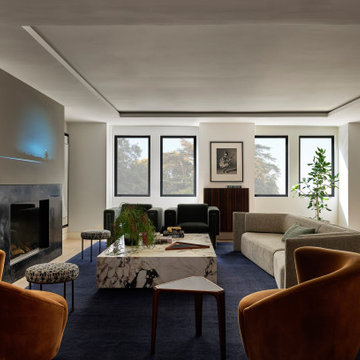
A monumental fireplace wrapped in dark stone forms the room’s anchor, its mass contrasting with a recessed ceiling plane that seems to float above the seating area. Integrated perimeter lighting creates a soft architectural glow that washes the ceiling and walls.
Furniture is sculptural yet understated—rounded lounge chairs in warm ochre velvet, tailored sofas, and a striking marble cocktail table whose expressive veining becomes a focal artwork in itself. Deep blue carpeting grounds the seating arrangement and subtly absorbs light, enhancing the calm atmosphere.
Above the fireplace, a delicate projection artwork introduces a moment of visual poetry—an unexpected cinematic gesture that transforms the wall into a quietly animated canvas.
Kitchen as Architectural Furniture
The kitchen expresses a different register: crisp, tactile, and materially rich.
Custom walnut cabinetry spans the wall in a continuous plane, punctuated only by the sculpted hood and integrated appliances. The wood’s depth and warmth are balanced by expanses of pale marble that flow seamlessly from countertop to backsplash.
Three dome pendants hover above the island like industrial sculptures, casting pools of warm light onto the stone surface.
A row of vivid red stools introduces a controlled burst of color, a small but confident departure from the otherwise restrained palette.
Dining With a Living Backdrop
Adjacent to the kitchen, the dining room opens toward a glass wall overlooking a vertical garden of climbing ivy. The greenery becomes a constantly changing backdrop—lush and shadowy during the day, atmospheric and cinematic after sunset.
A dark wood table anchors the room, surrounded by pale oak chairs whose understated forms echo Scandinavian design traditions. The simplicity of the furniture allows the view and natural light to become the dominant experience.
Intimate Spaces and Material Contrast
Throughout the home, smaller rooms offer moments of intimacy and material experimentation.
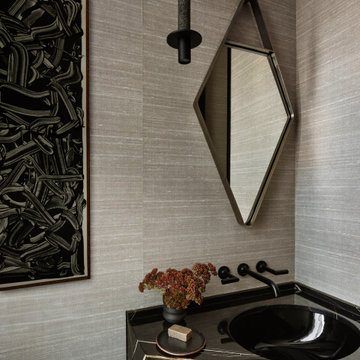
The powder room pairs textured wall coverings with a dramatic black marble vanity whose bold veining feels almost geological. A suspended mirror and slender pendant create a sculptural composition against the tactile backdrop.
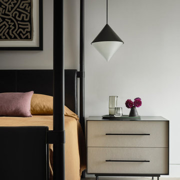
The primary bedroom, by contrast, feels serene and expansive. Floor-to-ceiling glazing frames sweeping views of the city, while soft textiles and warm wood paneling create a cocooning effect. Slender black columns subtly define a sitting area without interrupting the openness of the space.
Bathing Above the City
In the primary bathroom, a sculptural freestanding tub sits beside a panoramic window overlooking San Francisco’s hills and rooftops.
The room’s palette—light oak, grey stone, and matte metals—reinforces the spa-like atmosphere. Floating cabinetry and integrated lighting maintain a sense of visual lightness despite the richness of the materials.
Entertaining Above the Park
Higher in the house, a lounge and bar area becomes the social heart of the home. Here, dark stone slabs with dramatic veining wrap the bar wall like a piece of monumental art.
Open shelving displays glassware and spirits, while integrated wine storage hints at the home’s entertaining ambitions. A soft leather sectional and low glass table create a relaxed setting for conversation, framed by expansive views of the city skyline.
Cinema and Retreat
The lower level introduces yet another atmosphere: a dedicated media room designed for immersive viewing.
Dark walls, plush seating, and soft lighting create a cinematic environment that contrasts intentionally with the airy upper floors. It’s a retreat within the home—intimate, quiet, and removed from the brightness above.
Architecture That Balances Discipline and Warmth
What makes the project particularly compelling is its balance between architectural discipline and lived warmth.
Every element—from the carefully framed views to the restrained material palette—contributes to a cohesive spatial narrative. Yet the home never feels austere. Natural materials, curated art, and layered lighting create a sense of comfort and depth.
The result is a house that feels both architecturally rigorous and deeply human.
A Contemporary Interpretation of San Francisco Living
In a neighborhood defined by historic homes and iconic park views, this transformation offers a contemporary interpretation of San Francisco living.
It respects the city’s urban density while embracing openness, light, and vertical living. The home rises quietly above its surroundings, culminating in panoramic vistas that stretch across rooftops, hills, and sky.
What began as a conventional structure has become something far more nuanced: a modern urban sanctuary—part gallery, part retreat, and wholly connected to the vibrant city just beyond its walls.
 Design Group Three
Firm: Design Group Three
Designer: Alan Freysinger
Cabinetry: Greenfield Cabinetry
Photography: Jim Tschetter IC360 Images
Veteran kitchen designer Alan Freysinger worked closely with the Fox Point, WI homeowners on this kitchen. Admittedly, not afraid of color, the homeowner loved Alan's suggestion of adding the wood veneer to the mix of cabinetry, adding an additional layer of interest and the addition of texture.
Design Group Three, together with custom Greenfield Cabinetry, stepped up the living pleasure of this Fox Point family's home.
When this kitchen remodel was first underway, the homeowner envisioned a blue kitchen (orange was her 2nd choice!). She went to the paint store & found blues she liked, taped those color samples to the kitchen wall & one by one she and her husband whittled down their choices to the color blue you see now!
From Milwaukee to Chicago, clean lines are much desired in today's kitchen designs. Design Group Three hears many requests for Transitionally styled kitchens such as this one.
Want a pop of orange? blue? red? in your kitchen? Milwaukee's Design Group Three can custom match any color in paint (or stain!) for cabinetry in your home, as we did in for this blue kitchen in Fox Point, WI.
Not sure if you are up for this much color in your kitchen? Begin with remodeling a bathroom vanity with a pop of color, live with it for a while & then, if you decide it's for you too, call in Design Group Three & we'll work with you to uncover your perfect color palette.
Can you imagine this same kitchen in orange? This Fox Point, WI homeowners preliminary vision for her kitchen remodel walked the line between orange & blue!
Blue kitchens are completely on trend in today's kitchens!
According to the National Kitchen & Bath Association, Transitionally styled kitchens, such as this blue one, are the most commonly requested design genre. In fact, in 2012, for the first time ever since the NKBA started keeping track, Transitional beat out Traditional as the most requested style by homeowners.
What exactly is affordably luxury? You are witnessing it in these photos. Discover it via Milwaukee's Design Group Three & Greenfield Cabinetry.
Transitional Style (also known as "updated classic", "classic with a contemporary twist", "new takes on old classics") in interior design & furniture design refers to a blend of traditional and contemporary styles, midway between old world traditional & the world of chrome & glass contemporary; incorporating lines which are less ornate than traditional designs, but not as severely basic as contemporary lines. As a result transitional designs are classic, timeless, and clean.
Lucky, lucky kitchen. Greenfield Cabinetry's interpretation of Midwestern Modern.
Seasoned Design Group Three designer & owner, Alan Freysinger's design details take their cues from your lifestyle, as reflected in this transitionally styled kitchen.
"The general color trend is a move toward bolder, crisper colors as a reflection of the 'anything goes' culture we live in now." - Jonathan Adler, Designer
 EAG Studio
On a quiet street just steps from San Francisco’s beloved Dolores Park, a formerly modest urban structure has been transformed into a luminous vertical residence that quietly redefines contemporary city living. Through a comprehensive remodel and both vertical and horizontal expansion, the project turns a constrained urban footprint into a sequence of serene, art-forward living spaces that unfold upward toward expansive city views.
The architecture balances restraint and warmth: crisp contemporary geometry softened by natural materials, artful lighting, and carefully curated interiors. The result is a home that feels simultaneously grounded and elevated—deeply connected to its neighborhood yet remarkably private.
Reimagining the Urban Envelope
The original building has been almost entirely reconceived. The facade now reads as a disciplined composition of plaster volumes and precisely detailed window openings framed by subtle projecting bands. The geometry references San Francisco’s classic rhythm of bayed facades while stripping the language down to a refined modern expression.
Behind this quiet exterior lies a dramatically expanded interior volume. The redesign adds both additional floor area and new vertical circulation, transforming what was once a conventional city house into a multi-level architectural sequence organized around light, art, and views.
At the roofline, planted terraces soften the building’s silhouette and create a green crown visible from surrounding hillsides.
Interiors as a Sequence of Galleries
Inside, the home unfolds as a series of spatial moments connected by a sculptural stair and gallery-like corridors.
Wide plank oak floors run throughout, providing continuity and warmth against a palette of plaster walls, dark steel detailing, and natural stone. The hallways function almost as curated galleries, with layered artworks suspended in front of mesh panels that create depth and subtle shadow.
Light filters through carefully placed windows and stair openings, transforming circulation spaces into contemplative transitions rather than mere passageways.
A Living Room Anchored by Stone and Light
The primary living room occupies one of the home’s central floors, where a quiet interplay of texture and geometry defines the space.
A monumental fireplace wrapped in dark stone forms the room’s anchor, its mass contrasting with a recessed ceiling plane that seems to float above the seating area. Integrated perimeter lighting creates a soft architectural glow that washes the ceiling and walls.
Furniture is sculptural yet understated—rounded lounge chairs in warm ochre velvet, tailored sofas, and a striking marble cocktail table whose expressive veining becomes a focal artwork in itself. Deep blue carpeting grounds the seating arrangement and subtly absorbs light, enhancing the calm atmosphere.
Above the fireplace, a delicate projection artwork introduces a moment of visual poetry—an unexpected cinematic gesture that transforms the wall into a quietly animated canvas.
Kitchen as Architectural Furniture
The kitchen expresses a different register: crisp, tactile, and materially rich.
Custom walnut cabinetry spans the wall in a continuous plane, punctuated only by the sculpted hood and integrated appliances. The wood’s depth and warmth are balanced by expanses of pale marble that flow seamlessly from countertop to backsplash.
Three dome pendants hover above the island like industrial sculptures, casting pools of warm light onto the stone surface.
A row of vivid red stools introduces a controlled burst of color, a small but confident departure from the otherwise restrained palette.
Dining With a Living Backdrop
Adjacent to the kitchen, the dining room opens toward a glass wall overlooking a vertical garden of climbing ivy. The greenery becomes a constantly changing backdrop—lush and shadowy during the day, atmospheric and cinematic after sunset.
A dark wood table anchors the room, surrounded by pale oak chairs whose understated forms echo Scandinavian design traditions. The simplicity of the furniture allows the view and natural light to become the dominant experience.
Intimate Spaces and Material Contrast
Throughout the home, smaller rooms offer moments of intimacy and material experimentation.
The powder room pairs textured wall coverings with a dramatic black marble vanity whose bold veining feels almost geological. A suspended mirror and slender pendant create a sculptural composition against the tactile backdrop.
The primary bedroom, by contrast, feels serene and expansive. Floor-to-ceiling glazing frames sweeping views of the city, while soft textiles and warm wood paneling create a cocooning effect. Slender black columns subtly define a sitting area without interrupting the openness of the space.
Bathing Above the City
In the primary bathroom, a sculptural freestanding tub sits beside a panoramic window overlooking San Francisco’s hills and rooftops.
The room’s palette—light oak, grey stone, and matte metals—reinforces the spa-like atmosphere. Floating cabinetry and integrated lighting maintain a sense of visual lightness despite the richness of the materials.
Entertaining Above the Park
Higher in the house, a lounge and bar area becomes the social heart of the home. Here, dark stone slabs with dramatic veining wrap the bar wall like a piece of monumental art.
Open shelving displays glassware and spirits, while integrated wine storage hints at the home’s entertaining ambitions. A soft leather sectional and low glass table create a relaxed setting for conversation, framed by expansive views of the city skyline.
Cinema and Retreat
The lower level introduces yet another atmosphere: a dedicated media room designed for immersive viewing.
Dark walls, plush seating, and soft lighting create a cinematic environment that contrasts intentionally with the airy upper floors. It’s a retreat within the home—intimate, quiet, and removed from the brightness above.
Architecture That Balances Discipline and Warmth
What makes the project particularly compelling is its balance between architectural discipline and lived warmth.
Every element—from the carefully framed views to the restrained material palette—contributes to a cohesive spatial narrative. Yet the home never feels austere. Natural materials, curated art, and layered lighting create a sense of comfort and depth.
The result is a house that feels both architecturally rigorous and deeply human.
A Contemporary Interpretation of San Francisco Living
In a neighborhood defined by historic homes and iconic park views, this transformation offers a contemporary interpretation of San Francisco living.
It respects the city’s urban density while embracing openness, light, and vertical living. The home rises quietly above its surroundings, culminating in panoramic vistas that stretch across rooftops, hills, and sky.
What began as a conventional structure has become something far more nuanced: a modern urban sanctuary—part gallery, part retreat, and wholly connected to the vibrant city just beyond its walls.
 EAG Studio
On a quiet street just steps from San Francisco’s beloved Dolores Park, a formerly modest urban structure has been transformed into a luminous vertical residence that quietly redefines contemporary city living. Through a comprehensive remodel and both vertical and horizontal expansion, the project turns a constrained urban footprint into a sequence of serene, art-forward living spaces that unfold upward toward expansive city views.
The architecture balances restraint and warmth: crisp contemporary geometry softened by natural materials, artful lighting, and carefully curated interiors. The result is a home that feels simultaneously grounded and elevated—deeply connected to its neighborhood yet remarkably private.
Reimagining the Urban Envelope
The original building has been almost entirely reconceived. The facade now reads as a disciplined composition of plaster volumes and precisely detailed window openings framed by subtle projecting bands. The geometry references San Francisco’s classic rhythm of bayed facades while stripping the language down to a refined modern expression.
Behind this quiet exterior lies a dramatically expanded interior volume. The redesign adds both additional floor area and new vertical circulation, transforming what was once a conventional city house into a multi-level architectural sequence organized around light, art, and views.
At the roofline, planted terraces soften the building’s silhouette and create a green crown visible from surrounding hillsides.
Interiors as a Sequence of Galleries
Inside, the home unfolds as a series of spatial moments connected by a sculptural stair and gallery-like corridors.
Wide plank oak floors run throughout, providing continuity and warmth against a palette of plaster walls, dark steel detailing, and natural stone. The hallways function almost as curated galleries, with layered artworks suspended in front of mesh panels that create depth and subtle shadow.
Light filters through carefully placed windows and stair openings, transforming circulation spaces into contemplative transitions rather than mere passageways.
A Living Room Anchored by Stone and Light
The primary living room occupies one of the home’s central floors, where a quiet interplay of texture and geometry defines the space.
A monumental fireplace wrapped in dark stone forms the room’s anchor, its mass contrasting with a recessed ceiling plane that seems to float above the seating area. Integrated perimeter lighting creates a soft architectural glow that washes the ceiling and walls.
Furniture is sculptural yet understated—rounded lounge chairs in warm ochre velvet, tailored sofas, and a striking marble cocktail table whose expressive veining becomes a focal artwork in itself. Deep blue carpeting grounds the seating arrangement and subtly absorbs light, enhancing the calm atmosphere.
Above the fireplace, a delicate projection artwork introduces a moment of visual poetry—an unexpected cinematic gesture that transforms the wall into a quietly animated canvas.
Kitchen as Architectural Furniture
The kitchen expresses a different register: crisp, tactile, and materially rich.
Custom walnut cabinetry spans the wall in a continuous plane, punctuated only by the sculpted hood and integrated appliances. The wood’s depth and warmth are balanced by expanses of pale marble that flow seamlessly from countertop to backsplash.
Three dome pendants hover above the island like industrial sculptures, casting pools of warm light onto the stone surface.
A row of vivid red stools introduces a controlled burst of color, a small but confident departure from the otherwise restrained palette.
Dining With a Living Backdrop
Adjacent to the kitchen, the dining room opens toward a glass wall overlooking a vertical garden of climbing ivy. The greenery becomes a constantly changing backdrop—lush and shadowy during the day, atmospheric and cinematic after sunset.
A dark wood table anchors the room, surrounded by pale oak chairs whose understated forms echo Scandinavian design traditions. The simplicity of the furniture allows the view and natural light to become the dominant experience.
Intimate Spaces and Material Contrast
Throughout the home, smaller rooms offer moments of intimacy and material experimentation.
The powder room pairs textured wall coverings with a dramatic black marble vanity whose bold veining feels almost geological. A suspended mirror and slender pendant create a sculptural composition against the tactile backdrop.
The primary bedroom, by contrast, feels serene and expansive. Floor-to-ceiling glazing frames sweeping views of the city, while soft textiles and warm wood paneling create a cocooning effect. Slender black columns subtly define a sitting area without interrupting the openness of the space.
Bathing Above the City
In the primary bathroom, a sculptural freestanding tub sits beside a panoramic window overlooking San Francisco’s hills and rooftops.
The room’s palette—light oak, grey stone, and matte metals—reinforces the spa-like atmosphere. Floating cabinetry and integrated lighting maintain a sense of visual lightness despite the richness of the materials.
Entertaining Above the Park
Higher in the house, a lounge and bar area becomes the social heart of the home. Here, dark stone slabs with dramatic veining wrap the bar wall like a piece of monumental art.
Open shelving displays glassware and spirits, while integrated wine storage hints at the home’s entertaining ambitions. A soft leather sectional and low glass table create a relaxed setting for conversation, framed by expansive views of the city skyline.
Cinema and Retreat
The lower level introduces yet another atmosphere: a dedicated media room designed for immersive viewing.
Dark walls, plush seating, and soft lighting create a cinematic environment that contrasts intentionally with the airy upper floors. It’s a retreat within the home—intimate, quiet, and removed from the brightness above.
Architecture That Balances Discipline and Warmth
What makes the project particularly compelling is its balance between architectural discipline and lived warmth.
Every element—from the carefully framed views to the restrained material palette—contributes to a cohesive spatial narrative. Yet the home never feels austere. Natural materials, curated art, and layered lighting create a sense of comfort and depth.
The result is a house that feels both architecturally rigorous and deeply human.
A Contemporary Interpretation of San Francisco Living
In a neighborhood defined by historic homes and iconic park views, this transformation offers a contemporary interpretation of San Francisco living.
It respects the city’s urban density while embracing openness, light, and vertical living. The home rises quietly above its surroundings, culminating in panoramic vistas that stretch across rooftops, hills, and sky.
What began as a conventional structure has become something far more nuanced: a modern urban sanctuary—part gallery, part retreat, and wholly connected to the vibrant city just beyond its walls.
152