
Search results for "Interpreted" in Home Design Ideas
 Luxury Lighting Direct
Bari
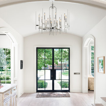
The Hudson Valley Lighting Bari chandelier is an interpretation of Italy’s mid-century design icons with its multi-tiered composition of polished glass rods, perpendicular brass arms, and lamp holders. The mixing of materials in a matrix of linear metalwork presents a sculpturesk glamorous look and feel. Adding cylindrical tungsten bulbs provide attractive accents to the sleek form of this collection. The Hudson Valley Lighting Bari 16-Light chandelier will add modern elegance to your foyer, dinning room, kitchen, bedroom etc.
*Note: Lamps included
9916-AGB
9916-PN
Dimensions:
Fixture: 32”D x 29”H (mm: 762D x 737H)
Canopy: 5½”D (mm: 140)
Finish:
Aged Brass
Polished Nickel
Shade:
Lamping:
(16) 40 Watt Incandescent Candelabra –included
Volt:
120V
 River Valley Landscapes
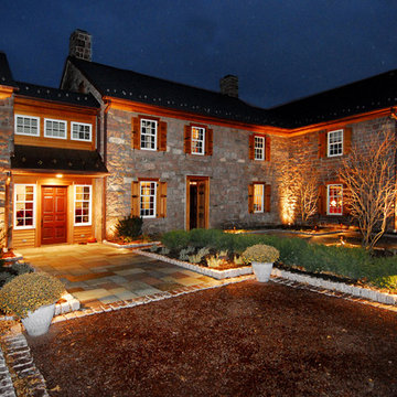
This project presented unique opportunities that are not often found in residential landscaping. The homeowners were not only restoring their 1840's era farmhouse, a piece of their family’s history, but also enlarging and updating the home for modern living. The landscape designers continued this idea by creating a space that is a modern day interpretation of an 1840s era farm rather then a strict recreation. The resulting design combines elements of farm living from that time, as well as acknowledging the property’s history as a horse farm, with staples of 21st century landscapes such as space for outdoor living, lighting, and newer plant varieties.
Guests approach from the main driveway which winds through the property and ends at the main barn. There is secondary gated driveway just for the homeowners. Connected to this main driveway is a narrower gravel lane which leads directly to the residence. The lane passes near fruit trees planted in broken rows to give the illusion that they are the remains of an orchard that once existed on the site. The lane widens at the entrance to the gardens where there is a hitching post built into the fence that surrounds the gardens and a watering trough. The widened section is intended as a place to park a golf cart or, in a nod to the home’s past, tie up horses before entering. The gravel lane passes between two stone pillars and then ends at a square gravel court edged in cobblestones. The gravel court transitions into a wide flagstone walk bordered with yew hedges and lavender leading to the front door.
Directly to the right, upon entering the gravel court, is located a gravel and cobblestone edged walk leading to a secondary entrance into the residence. The walk is gated where it connects with the gravel court to close it off so as not to confuse visitors and guests to the main residence and to emphasize the primary entrance. An area for a bench is provided along this walk to encourage stopping to view and enjoy the gardens.
On either side of the front door, gravel and cobblestone walks branch off into the garden spaces. The one on the right leads to a flagstone with cobblestone border patio space. Since the home has no designated backyard like most modern suburban homes the outdoor living space had to be placed in what would traditionally be thought of as the front of the house. The patio is separated from the entrance walk by the yew hedge and further enclosed by three Amelanchiers and a variety of plantings including modern cultivars of old fashioned plants such as Itea and Hydrangea. A third entrance, the original front door to the 1840’s era section, connects to the patio from the home’s kitchen, making the space ideal for outdoor dining.
The gravel and cobblestone walk branching off to the left of the front door leads to the vegetable and perennial gardens. The idea for the vegetable garden was to recreate the tradition of a kitchen garden which would have been planted close to the residence for easy access. The vegetable garden is surrounded by mixed perennial beds along the inside of the wood picket fence which surrounds the entire garden space. Another area designated for a bench is provided here to encourage stopping and viewing. The home’s original smokehouse, completely restored and used as a garden shed, provides a strong architectural focal point to the vegetable garden. Behind the smokehouse is planted lilacs and other plants to give mass and balance to the corner and help screen the garden from the neighboring subdivision. At the rear corner of the garden a wood arbor was constructed to provide a structure on which to grow grapes or other vines should the homeowners choose to.
The landscape and gardens for this restored farmhouse and property are a thoughtfully designed and planned recreation of a historic landscape reinterpreted for modern living. The idea was to give a sense of timelessness when walking through the gardens as if they had been there for years but had possibly been updated and rejuvenated as lifestyles changed. The attention to materials and craftsmanship blend seamlessly with the residence and insure the gardens and landscape remain an integral part of the property. The farm has been in the homeowner’s family for many years and they are thrilled at the results and happy to see respect given to the home’s history and to its meticulous restoration.
 MARIANO STONE
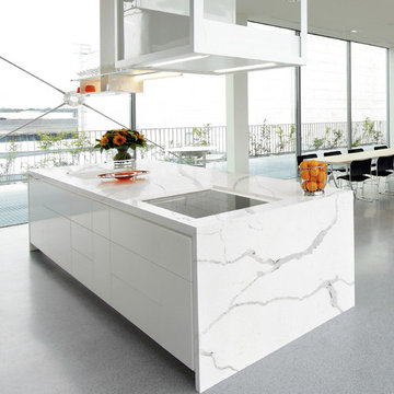
ColorQuartz's interpretation of natural Calacatta marble. Calacatta Novus CQ981 brings you natural, elegant, cascading grey veins on a white base.
Calacatta Novus makes an unforgettable impression and enhances any interior with a touch of high-end indulgence. This latest design offers the look of luxurious natural stone, with the durability and ease of maintenance that ColorQuartz is renowned for.
Find the right local pro for your project
 Richard Best Architect, Inc.
Hillside Modernism In Context.
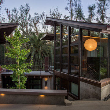
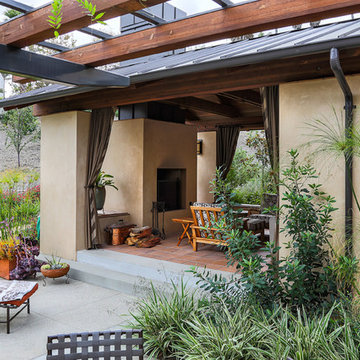
The owners of this modern hillside home sought to have a home in a nice Los Angeles neighborhood wherein they could raise their burgeoning family. The owners purchased a 1948 2000sf, single story, 2 bedroom English Cottage styled home (believed to have been originally owned by Yul Brynner) on a ½ acre hillside site in the exclusive Brentwood area of Los Angeles. The property slopes downward away from the street and overlooks a mini eucalyptus arroyo. The owners love their new location but are now faced-with having to raise their new and growing family on a hillside with extremely limited yard spaces for children to play and in a location where nature is very close – deer as well as coyotes wander the arroyo.
In 2000 the owners commissioned architect Richard Best to add 2500sf to the cottage and transform it into a home more fitting to their growing family’s needs. Subsequently, in 2014/15, the owners again commissioned Richard to create a 2-story master suite addition. Living in or visiting the completed project - the original 1948 home remodeled + the 2000 addition + the 2014/15 addition, one goes through an unexpected and delightful experience as the spaces of the home “unfold” to reveal intimacy and environmental immersion.
It was important to Richard and to the owners that their remodels and additions be appropriately designed to fit into the neighborhood and have the feel, scale, and soul of the original cottage. With this in-mind, Richard has interpreted the design intentions of the original cottage - “modernizing” the architectural vocabulary and creating open-plan, 2-story additions which promote site “engagement” at various floor levels and openness to the outdoors in a manner clearly inspired by the original cottage, yet modern.
At the front door of the original (still remains as it was) 1948 structure, one is presented with a quaint a low-slung entry which establishes a very comfortable sense of scale. Inside, the remodeled spaces of the original cottage exude comfort and a cozy sensibility evoked by the reuse of the original home’s exposed timber framing structure, open-plan circulation, and an inventive two-sided steel fireplace which acts as a room divider between the living room and a home office. Accordion wood doors connect these rooms to a newly formed outdoor rear patio. At this point one also gets ones first hint that something very interesting is happening just beyond – a glimpse of the 2000 & 2014/15 additions.
Moving from the original 1948 structure into the 2-story 2000 addition, one is greeted by a modern and open linear floor plan arrangement – a kitchen, casual dining and family room extend perpendicularly from the 1948 structure into the rear yard and down the hillside. The open framed cathedral ceiling and wood roof trusses establish a lofty feeling and a rhythm discretely separating the open rooms one from the other. Extensive use of windows and French doors connect the indoors to the outdoors and provide abundant natural lighting. This new appendage ends with a symmetrical family room which has no corners – it is a geometry composed of two overlapped squares - one rotated 45 degrees atop the other to create double opportunities for bay windows. The design not only connects the home to the desired exterior flat yards spaces, but it also takes full advantage of the sloping terrain by adding a floor below the original level so as to maintain a scale appropriate to the neighborhood. The exterior materials were chosen taking “hints” from the original 1948 structure – natural redwood siding, reused brick veneer and wood doors/windows all serving to aesthetically connect the addition back-to the spirit of the original structure.
By 2014/15 the owners’ family has fully blossomed - the children are now teenagers and there is a need for additional space. However, the owners are very content with their remodeled cottage and Richard’s 2000 addition – unsure how to add to a home which they feel is quite perfect as it is … wanting whatever changes are to be made to be sympathetic to it. They are also concerned about potential additions blocking-out their views of the eucalyptus arroyo. The owners approached Richard with trepidation – we love our perfect house but we need it to be a bit bigger and we don’t want to block-out the arroyo views or create a hemmed-in feeling – how can we add but still see the arroyo.
In response Richard created a private yet connected 2-story master suite, which by its positioning, dynamic geometries and extensive glazing create the fourth side of the former rear patio, making it into exterior courtyard with views around and through the new addition into the arroyo. A dynamic angularity in the new master addition (inspired by the 2000 addition) simultaneously reduces the apparent size/presence of the master suite addition on the edge of the eucalyptus arroyo while creating framed views into the arroyo from the newly formed courtyard. The new master suite - a master bathroom, master closet and a master sleeping loft each having exterior decks and/or patios, is connected back to the 2000 addition via a glazed hallway which provides a sense of connectedness and privacy. A modern rustic aesthetic of exposed board-formed concrete, natural finished Corten steel exterior cladding, frameless metal windows, and clear finished Douglas Fir planks serve to “extend” the soul of the original cottage into the master suite.
The project is a highly sustainable design as well. Energy use is reduced by employing a high efficiency heat pump heating and cooling system, dual paned/gasketed metal window/door systems, natural lighting through a Kalwall skylight and generous exterior glazing with extensive eaves for shading, rigid roof insulation, and earthen backing – the lower floor is up-against the hillside which tends to even-out the day/night temperature differential.
Credits:
Architecture & Interior Design: Richard Best Architect Inc.
Structural Engineering: Dan Echeto & David Choi Associates
Interior Decor: Noelle Schoop
Landscape: Connie Heitzman
Photos: Carmel McFayden and Adriano Sarmento / James Porschen
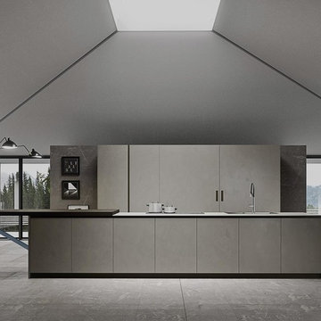
 Exclusive Home Interiors
Functional and design kitchens
With 3.1, copatlife continues its march into the creation of definite relations between function and form, derived from a culture of industrial design.
It uses elements and materials able to create an idea of kitchen space suited for its lifestyle, where design and technology give to the project security and contemporary solutions.
copatlife designs solutions and forms in order to help to live this space as unique and special.
A continuous research to find formal and aesthetic solutions capable of resolving and characterizing.
Contents and forms to interpret at best the multiple needs of our daily lives.
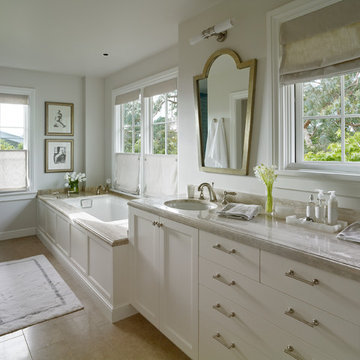
 Andrew Mann Architecture
photo by Matthew Millman
Example of an eclectic bathroom design in San Francisco
Example of an eclectic bathroom design in San Francisco
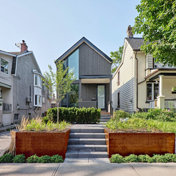
 Arbordale Landscaping Ltd
Design ideas for a small contemporary partial sun backyard concrete paver and wood fence landscaping in Toronto for summer.
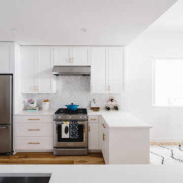
 Breathe Design Studio
Completed in 2015, this project incorporates a Scandinavian vibe to enhance the modern architecture and farmhouse details. The vision was to create a balanced and consistent design to reflect clean lines and subtle rustic details, which creates a calm sanctuary. The whole home is not based on a design aesthetic, but rather how someone wants to feel in a space, specifically the feeling of being cozy, calm, and clean. This home is an interpretation of modern design without focusing on one specific genre; it boasts a midcentury master bedroom, stark and minimal bathrooms, an office that doubles as a music den, and modern open concept on the first floor. It’s the winner of the 2017 design award from the Austin Chapter of the American Institute of Architects and has been on the Tribeza Home Tour; in addition to being published in numerous magazines such as on the cover of Austin Home as well as Dwell Magazine, the cover of Seasonal Living Magazine, Tribeza, Rue Daily, HGTV, Hunker Home, and other international publications.
Featured on Dwell!
https://www.dwell.com/article/sustainability-is-the-centerpiece-of-this-new-austin-development-071e1a55
 Mark Levy Studio
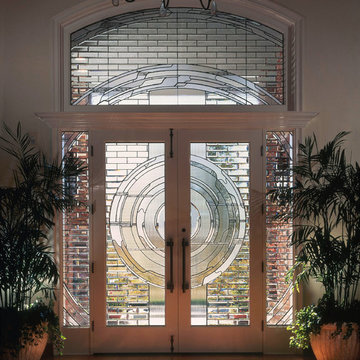
My clients home is a wonderful combination of styles. On the exterior, the architectural style is Georgian/Georgian Colonial, covered in used bricks. Their interiors however, are more contemporary and transitional. The combination of these styles was the design program I was given for this entryway.
I configured the size, shape and frequency of the hand-beveled glass background pieces so they matched those of the used bricks on the exterior. I offered this idea to bring the exterior into the interior, and vice versa. There are many textures of clear glass used for the circular elements, as well as highlights created form hand-beveled glass as well. Since this entry faced south, I selected beveled glass with the intended effect (seen above) to flood the foyer with prismatic color cast through the beveled glass. In this way, the windows bring a full range of color to the interiors, but with no colored or stained glass actually being used.
Photo: Martin Fine

 Brush Arbor Home Construction
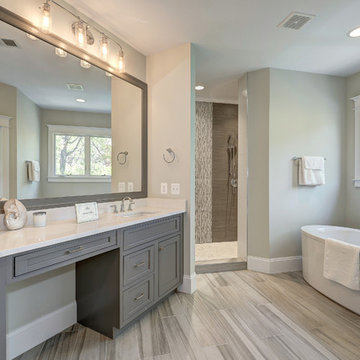
Bathroom - huge modern master light wood floor bathroom idea in DC Metro with raised-panel cabinets, dark wood cabinets, a one-piece toilet, gray walls, a drop-in sink and granite countertops
 Regan Baker Design Inc.
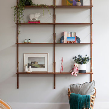
Regan Baker Design was hired in conjunction with John Lum Architects to update this beautiful edwardian in the Castro, San Francisco. The couple who work for both Pixar and Apple, enjoy color, something that Regan Baker Design really enjoys as well. The kitchen, once closed off by a peninsula island, was removed to open to the living room creating a more open floor plan. Open shelves help open up the room as well, while also creating architecture and interest to a rather tall kitchen. Once an under stair closet, the guest bathroom's custom walnut vanity provides storage for every day necessities, while the tiled walls bring interest to a rather small white bathroom. One accent glass tile wall continues the splash of blue color palette throughout the house.
Finish and fixture selections were paired with a few statement pieces including the oversized Flos pendant over the island, the Roche Bobois sofa in multi-color and the client's existing teal round slipper chair, purchased from the ever famed Judge Judy.
The nursery, designed around the client's grandmother's croched character stuffed animals and the ever so cute cloud smiley face rug, was completed just in time before the birth of their daughter.
Key Contributors:
Contractor: Ehline Construction
Architect: John Lum
Photographer: Sharon Risedorph
 Marcus Gleysteen Architects
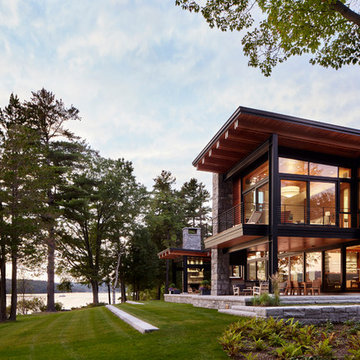
The Lake Point House is an interpretation of New Hampshire's lakeshore vernacular. While designed to maximize the lake experience, the house is carefully concealed from the shore and positioned to preserve trees and site features. The lake side of the house is a continuous wall of glass, capped by timbered eaves and anchored by monumental stone chimneys. Along the main entry sequence, the view is revealed through a series of thresholds that mark the progression of arrival and appreciation of this treasured place.
 Art & Smart Inc
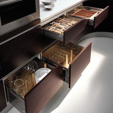
The new interpretation of Timo has evolved to incorporate wood, with multiple colour options. The design, characterized by the high level of flexibility, has been adapted to the new and versatile furnishing solution. The design, which features strong aesthetic principles, sets the TIMO kitchen apart from more ordinary compositions.
 In Site Designs
Getz Creative Photography
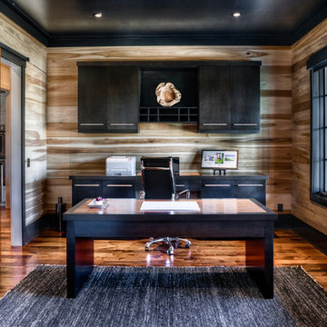
Large minimalist freestanding desk medium tone wood floor home office photo in Other
Large minimalist freestanding desk medium tone wood floor home office photo in Other

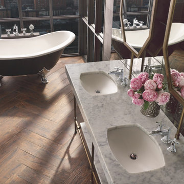
 Brizo Faucet
Combining a contemporary, masculine edge with nods to early-1900’s traditionalism, the Rook Bath Collection by Brizo® is an arresting, modern interpretation of a stately aesthetic.
Rook is about the intersection of old and new. There’s a touch of modern with a masculinity to it, along with elements of classic, traditional design—all brought together with a compelling, unified vision.
Space designed by Richard Herb, Richard Herb Interior Design
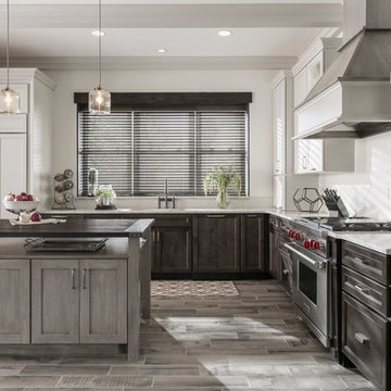
 Medallion Cabinetry
This culinary kitchen design has a transitional style and incorporates beautiful clean lines. The designer selected a beautiful combination of three different finishes from Medallion to create a well-designed and functional space to satisfy your inner chef. The custom designed kitchen island showcases our Greystone finish from the New Stoney Brooke Collection and creates defined cooking, cleaning, and prep zones within the overall space.
Medallion’s new Stoney Brooke Collection is uniquely textured in subtle shades of grays and browns. This unique finish is achieved by artfully brushing multiple glaze materials onto a stained surface. The varying shades of this glaze application create a subtle textural feel and appearance.
The component hood creates a function focal point and is finished in both Greystone and our new Irish Crème painted finish. The Irish Crème wall cabinetry coordinates beautifully with the Smoke stained base cabinets which provide a neutral backdrop for your culinary creations.
Extend the style and well-appropriated design of your kitchen into the pantry. Select coordinating cabinetry and specialized storage options to fit your culinary needs.
Find a Medallion Showroom near you today: http://www.medallioncabinetry.com/DealerLocator
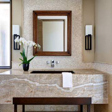
 Drewett Works
Located near the base of Scottsdale landmark Pinnacle Peak, the Desert Prairie is surrounded by distant peaks as well as boulder conservation easements. This 30,710 square foot site was unique in terrain and shape and was in close proximity to adjacent properties. These unique challenges initiated a truly unique piece of architecture.
Planning of this residence was very complex as it weaved among the boulders. The owners were agnostic regarding style, yet wanted a warm palate with clean lines. The arrival point of the design journey was a desert interpretation of a prairie-styled home. The materials meet the surrounding desert with great harmony. Copper, undulating limestone, and Madre Perla quartzite all blend into a low-slung and highly protected home.
Located in Estancia Golf Club, the 5,325 square foot (conditioned) residence has been featured in Luxe Interiors + Design’s September/October 2018 issue. Additionally, the home has received numerous design awards.
Desert Prairie // Project Details
Architecture: Drewett Works
Builder: Argue Custom Homes
Interior Design: Lindsey Schultz Design
Interior Furnishings: Ownby Design
Landscape Architect: Greey|Pickett
Photography: Werner Segarra
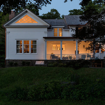
 Crisp Architects
Photographer:Rob Karosis
Example of a mid-sized cottage white two-story wood exterior home design in New York with a shingle roof
Example of a mid-sized cottage white two-story wood exterior home design in New York with a shingle roof
36