
Search results for "Introduced coffee" in Home Design Ideas
 Erica Peale Design
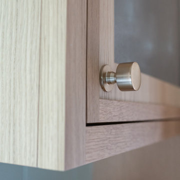
This kitchen renovation blends timeless craftsmanship with a warm, modern aesthetic. Custom natural-oak cabinetry anchors the space with organic texture, while soft green island and perimeter accents introduce a subtle wash of color. Bright natural light highlights the clean stone surfaces, brass fixtures, and tailored millwork details throughout.
Thoughtful upgrades—like paneled appliances, a plaster hood, a dedicated coffee nook, and a sculptural plaster range hood—elevate both function and flow. The result is a calm, inviting kitchen that feels fresh yet enduring, designed for everyday family living and effortless entertaining.
 TVL Creative Ltd.
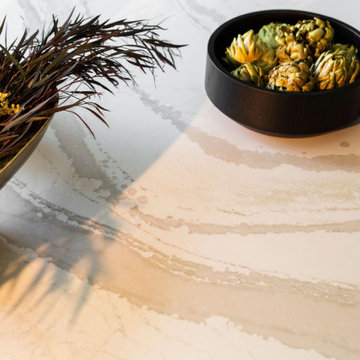
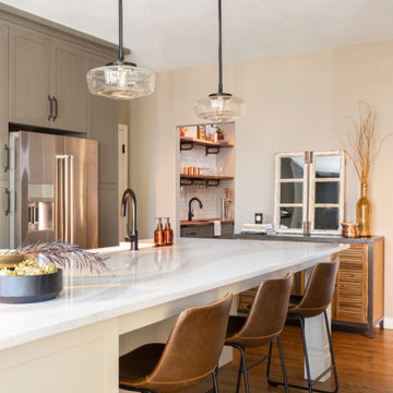
Our clients were looking to make this home their forever home and to create a warm and welcoming space that the whole family would enjoy returning to every day. One of our primary goals in this project was to change how our clients moved through their home. We tossed aside the existing walls that blocked off the kitchen and introduced a butler’s pantry to connect the kitchen directly to the dining room. Contrast is king in this home, and we utilized a variety of light and dark finishes to create distinctive layers and lean into opportunities for accents. To tie the space in this home together, we introduced warm hardwood flooring throughout the main level and selected a soft grey paint as our primary wall color.
Kitchen- The heart of this home is most definitely the kitchen! We erased every trace of the original builder kitchen and created a space that welcomes one and all. The glorious island, with its light cabinetry and dramatic quartz countertop, provides the perfect gathering place for morning coffee and baking sessions. At the perimeter of the kitchen, we selected a handsome grey finish with a brushed linen effect for an extra touch of texture that ties in with the high variation backsplash tile giving us a softened handmade feel. Black metal accents from the hardware to the light fixtures unite the kitchen with the rest of the home.
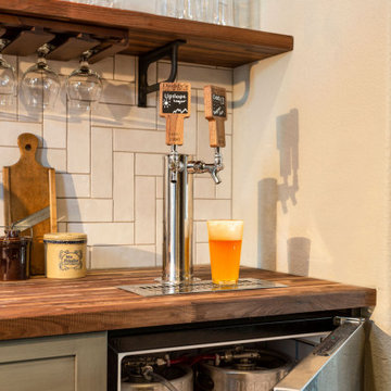
Butler’s Pantry- The Butler’s Pantry quickly became one of our favorite spaces in this home! We had fun with the backsplash tile patten (utilizing the same tile we highlighted in the kitchen but installed in a herringbone pattern). Continuing the warm tones through this space with the butcher block counter and open shelving, it works to unite the front and back of the house. Plus, this space is home to the kegerator with custom family tap handles!
Mud Room- We wanted to make sure we gave this busy family a landing place for all their belongings. With plenty of cabinetry storage, a sweet built-in bench, and hooks galore there’s no more jockeying to find a home for coats.
Fireplace- A double-sided fireplace means double the opportunity for a dramatic focal point! On the living room side (the tv-free grown-up zone) we utilized reclaimed wooden planks to add layers of texture and bring in more cozy warm vibes. On the family room side (aka the tv room) we mixed it up with a travertine ledger stone that ties in with the warm tones of the kitchen island.
Staircase- The standard builder handrail was just not going to do it anymore! So, we leveled up designed a custom steel & wood railing for this home with a dark finish that allows it to contrast beautifully against the walls and tie in with the dark accent finishes throughout the home.
 Drury Design
Our clients were ready to update their kitchen with soft and subtle colors to blend in with the home’s recently updated interior. It was also time to improve the layout. The kitchen needed to be reconfigured in order to facilitate a three-generation family and occasional entertaining.
Design Objectives
-Brighten up to blend with the home’s interior and flow into the adjacent family room area
-Incorporate specific storage for pantry items like bulk ingredients and small appliances
-Designate areas for a coffee bar, multiple prep areas and seating while highlighting a dry bar for display
-Keep clutter off of counters for a seamless design that facilitates visual flow through the entire area
Design Challenges
-Make a subtle statement with contrasting cabinets and countertops
-Incorporate a stand-alone, statement-making dry bar just outside the main kitchen space
-Design a statement hood that serves as a focal point without interrupting visual flow
-Update and add lighting to add more task, accent and overhead brightness.
-Have the space be usable for different tasks by different family members at the same time
-Create a space that looks classy and formal but is still inviting.
Design Solutions
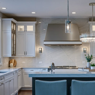
-A soft grey stain and white paint were used on all the cabinets. On only the wall cabinets flanking the window was the grey introduced on the frame to make a pop against the white paint.
-The white-painted refrigerator and freezer door panel style is a custom reeded look that adds a soft contrasting detail against the main door style. Along with the open grey-stained interior cabinet above, it looks like a piece of furniture.
-The same soft tones were used for the countertops and a full, high backsplash of Chamonix quartzite that tied everything together. It’s an elegant backdrop for the hood.
-The Dry Bar, even though showcasing a dark stained cabinet, stays open and bright with a full mirror backsplash, wood retained glass floating shelves and glass wall cabinet doors. Brushed brass trim details and a fun light fixture add a pop of character.
-The same reeded door style as the refrigerator was used on the base doors of the dry bar to tie in with the kitchen.
-About 2/3 of the existing walk-in pantry was carved out for the new dry bar footprint while still keeping a shallow-depth pantry space for storage.
-The homeowners wanted a beautiful hood but didn’t want it to dominate the design. We kept the lines of the hood simple. The soft stainless steel body has a bottom accent that incorporates both the grey stain and white-painted cabinet colors.
-Even though the Kitchen had a lot of natural light from the large window, it was important to have task and subtle feature lighting. Recessed cans provide overall lighting while clear pendants shine down on the 2nd level of the seating area on the island.
-The circular clear chandelier is the statement piece over the main island while the pendants flanking the hood emphasize the quartzite backsplash and add as accent lighting in the evening along with the interior cabinet lights.
With three generations living in the home it was important to have areas that multiple family members could use at the same time without being in each other’s way. The design incorporates different zones like the coffee bar, charging station, dry bar and refrigerator drawers.
The softness of the colors and classic feel of the wood floor keep kitchen is inviting and calming.
Find the right local pro for your project
 Drury Design
Our clients were ready to update their kitchen with soft and subtle colors to blend in with the home’s recently updated interior. It was also time to improve the layout. The kitchen needed to be reconfigured in order to facilitate a three-generation family and occasional entertaining.
Design Objectives
-Brighten up to blend with the home’s interior and flow into the adjacent family room area
-Incorporate specific storage for pantry items like bulk ingredients and small appliances
-Designate areas for a coffee bar, multiple prep areas and seating while highlighting a dry bar for display
-Keep clutter off of counters for a seamless design that facilitates visual flow through the entire area
Design Challenges
-Make a subtle statement with contrasting cabinets and countertops
-Incorporate a stand-alone, statement-making dry bar just outside the main kitchen space
-Design a statement hood that serves as a focal point without interrupting visual flow
-Update and add lighting to add more task, accent and overhead brightness.
-Have the space be usable for different tasks by different family members at the same time
-Create a space that looks classy and formal but is still inviting.
Design Solutions
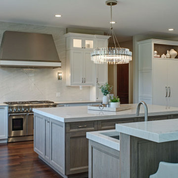
-A soft grey stain and white paint were used on all the cabinets. On only the wall cabinets flanking the window was the grey introduced on the frame to make a pop against the white paint.
-The white-painted refrigerator and freezer door panel style is a custom reeded look that adds a soft contrasting detail against the main door style. Along with the open grey-stained interior cabinet above, it looks like a piece of furniture.
-The same soft tones were used for the countertops and a full, high backsplash of Chamonix quartzite that tied everything together. It’s an elegant backdrop for the hood.
-The Dry Bar, even though showcasing a dark stained cabinet, stays open and bright with a full mirror backsplash, wood retained glass floating shelves and glass wall cabinet doors. Brushed brass trim details and a fun light fixture add a pop of character.
-The same reeded door style as the refrigerator was used on the base doors of the dry bar to tie in with the kitchen.
-About 2/3 of the existing walk-in pantry was carved out for the new dry bar footprint while still keeping a shallow-depth pantry space for storage.
-The homeowners wanted a beautiful hood but didn’t want it to dominate the design. We kept the lines of the hood simple. The soft stainless steel body has a bottom accent that incorporates both the grey stain and white-painted cabinet colors.
-Even though the Kitchen had a lot of natural light from the large window, it was important to have task and subtle feature lighting. Recessed cans provide overall lighting while clear pendants shine down on the 2nd level of the seating area on the island.
-The circular clear chandelier is the statement piece over the main island while the pendants flanking the hood emphasize the quartzite backsplash and add as accent lighting in the evening along with the interior cabinet lights.
With three generations living in the home it was important to have areas that multiple family members could use at the same time without being in each other’s way. The design incorporates different zones like the coffee bar, charging station, dry bar and refrigerator drawers.
The softness of the colors and classic feel of the wood floor keep kitchen is inviting and calming.
 H2D Architecture + Design
The Loyal Heights Addition expanded the existing home to create a more open, functional living environment centered around daily life and gathering. The design introduced a larger, more usable kitchen and dining area, improving both circulation and connection between spaces. A vaulted ceiling paired with strategically placed skylights brings in natural light deep into the space, enhancing the sense of volume and openness. Extending from the main living area, a compact deck provides an inviting outdoor space for seating and grilling, strengthening the home’s connection to the outdoors and supporting year-round indoor-outdoor living. Additionally, the primary suite was reconfigured to create a dedicated bedroom, bathroom, and closet area.
+ Architecture: H2D Architecture + Design
+ Interior Design: H2D Architecture + Design
www.h2darchitects.com
+ Builder: GT Residential Contracting
+ Photography: Anastasiya Homes
 Olamar Interiors
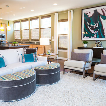
The clients are a younger couple with no pets or children. They asked me to help them with the Great Room in their brand new townhouse. The space is open concept with 9-foot ceilings. When the clients moved in they had very little furniture and the walls were white and bare. The husband had his eye on a very large original work of art that he wanted to purchase and incorporate into the design. They love to cook and entertain. They asked for a tranquil, neutral space with some color accents, comfortable and flexible seating, a wall-mounted TV with some storage for media equipment, and a bar. The room has several large windows and two sets of sliding glass doors so there is a lot of natural light, which the clients didn’t want to block, but also a lack of privacy. The couple also requested lighting over the kitchen island and some counter stools.
I was challenged by the lack of architectural detail in the room and a tight budget. I decided to choose furniture and accessories with classic modern lines so they would last for a long time. To offset all of the straight lines and neutral colors of the main furniture pieces, and to add visual interest, I introduced organic elements, texture and movement. I did this with wallpaper on the fireplace wall and on the kitchen island (in the case of the island, I railroaded the paper for some interest), a textured rug, some greenery, rough wood on the pedestals next to the fireplace, window shades in natural woven wood, and accessories (particularly two ceramic vases) in interesting shapes. I used the husband’s art piece as the starting point for the color scheme and overall design. I added balance and harmony by adding a large art piece and large pedestals across the room from the large art piece and carrying the teal color across the room in the sofa cushion and ottoman fabrics, art above the mantel and a vase in the niche next to the fireplace. I chose large green glass pendant lights for the kitchen to add color and to match the scale of the room.
One major challenge was that the clients wanted ottomans so they could put their feet up while watching TV. I couldn’t accommodate ottomans and a coffee table, so I opted just to have one large ottoman and added casters so it could be moved closer to the sofa; however, the husband is very tall and the wife is very petite so they wanted separate ottomans to accommodate their different leg lengths. My solution was to design an ottoman that provides maximum flexibility: the two pieces can be joined and a tray added to make it a coffee table, or pulled apart and used either as party seating or individual ottomans for the homeowners. They were thrilled with the solution.
Photographer: Jon W. Miller
 Erica Peale Design
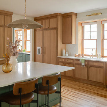
This kitchen renovation blends timeless craftsmanship with a warm, modern aesthetic. Custom natural-oak cabinetry anchors the space with organic texture, while soft green island and perimeter accents introduce a subtle wash of color. Bright natural light highlights the clean stone surfaces, brass fixtures, and tailored millwork details throughout.
Thoughtful upgrades—like paneled appliances, a plaster hood, a dedicated coffee nook, and a sculptural plaster range hood—elevate both function and flow. The result is a calm, inviting kitchen that feels fresh yet enduring, designed for everyday family living and effortless entertaining.
Sponsored
Delaware, OH

Buckeye Basements, Inc.
Central Ohio's Basement Finishing ExpertsBest Of Houzz '13-'21
 TVL Creative Ltd.
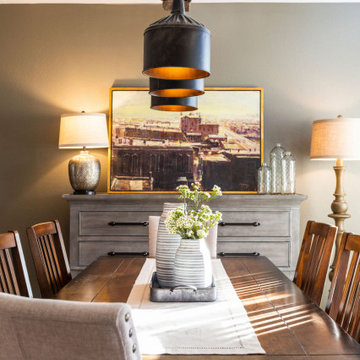
Our clients were looking to make this home their forever home and to create a warm and welcoming space that the whole family would enjoy returning to every day. One of our primary goals in this project was to change how our clients moved through their home. We tossed aside the existing walls that blocked off the kitchen and introduced a butler’s pantry to connect the kitchen directly to the dining room. Contrast is king in this home, and we utilized a variety of light and dark finishes to create distinctive layers and lean into opportunities for accents. To tie the space in this home together, we introduced warm hardwood flooring throughout the main level and selected a soft grey paint as our primary wall color.
Kitchen- The heart of this home is most definitely the kitchen! We erased every trace of the original builder kitchen and created a space that welcomes one and all. The glorious island, with its light cabinetry and dramatic quartz countertop, provides the perfect gathering place for morning coffee and baking sessions. At the perimeter of the kitchen, we selected a handsome grey finish with a brushed linen effect for an extra touch of texture that ties in with the high variation backsplash tile giving us a softened handmade feel. Black metal accents from the hardware to the light fixtures unite the kitchen with the rest of the home.
Butler’s Pantry- The Butler’s Pantry quickly became one of our favorite spaces in this home! We had fun with the backsplash tile patten (utilizing the same tile we highlighted in the kitchen but installed in a herringbone pattern). Continuing the warm tones through this space with the butcher block counter and open shelving, it works to unite the front and back of the house. Plus, this space is home to the kegerator with custom family tap handles!
Mud Room- We wanted to make sure we gave this busy family a landing place for all their belongings. With plenty of cabinetry storage, a sweet built-in bench, and hooks galore there’s no more jockeying to find a home for coats.
Fireplace- A double-sided fireplace means double the opportunity for a dramatic focal point! On the living room side (the tv-free grown-up zone) we utilized reclaimed wooden planks to add layers of texture and bring in more cozy warm vibes. On the family room side (aka the tv room) we mixed it up with a travertine ledger stone that ties in with the warm tones of the kitchen island.
Staircase- The standard builder handrail was just not going to do it anymore! So, we leveled up designed a custom steel & wood railing for this home with a dark finish that allows it to contrast beautifully against the walls and tie in with the dark accent finishes throughout the home.
 dRemodeling Design-Build
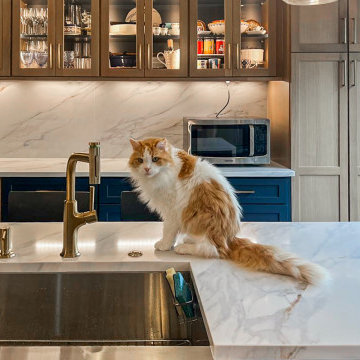
• Design Elements: To achieve a transitional look, the client selected two-toned shaker-style cabinetry that blends timeless charm with contemporary appeal. Navy blue base cabinets anchor the design with rich contrast, while light wood wall cabinets and a coordinating range hood add warmth and balance. Modern elements were introduced through sleek quartz countertops, which extend seamlessly up the wall as a full-height backsplash and waterfall gracefully down the side of the peninsula. This peninsula also provides integrated seating, creating a functional and stylish space for dining and entertaining.
• Functional Improvements: On the wall opposite of the kitchen, additional cabinetry was incorporated to maximize storage and create a dedicated coffee bar. Tall pantry cabinets were installed to provide more storage, while upper cabinets with glass doors introduced both function and style. The glass-front cabinetry features a matching wood interior and integrated lighting, offering a warm glow that highlights the displayed glassware and adds a touch of elegance to the overall design.
 K Two Designs, Inc.
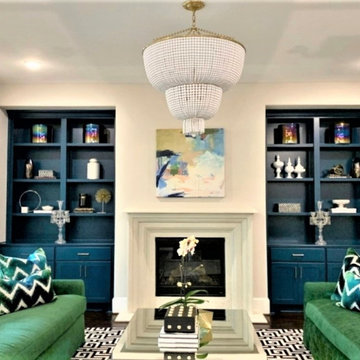
Art deco is introduced in the mirrored coffee table, low back sofa in emerald green velvet and the Greek key area rug. This room delights the eye in its use of color that is at once restrained and impactful.
 Drury Design
Our clients were ready to update their kitchen with soft and subtle colors to blend in with the home’s recently updated interior. It was also time to improve the layout. The kitchen needed to be reconfigured in order to facilitate a three-generation family and occasional entertaining.
Design Objectives
-Brighten up to blend with the home’s interior and flow into the adjacent family room area
-Incorporate specific storage for pantry items like bulk ingredients and small appliances
-Designate areas for a coffee bar, multiple prep areas and seating while highlighting a dry bar for display
-Keep clutter off of counters for a seamless design that facilitates visual flow through the entire area
Design Challenges
-Make a subtle statement with contrasting cabinets and countertops
-Incorporate a stand-alone, statement-making dry bar just outside the main kitchen space
-Design a statement hood that serves as a focal point without interrupting visual flow
-Update and add lighting to add more task, accent and overhead brightness.
-Have the space be usable for different tasks by different family members at the same time
-Create a space that looks classy and formal but is still inviting.
Design Solutions
-A soft grey stain and white paint were used on all the cabinets. On only the wall cabinets flanking the window was the grey introduced on the frame to make a pop against the white paint.
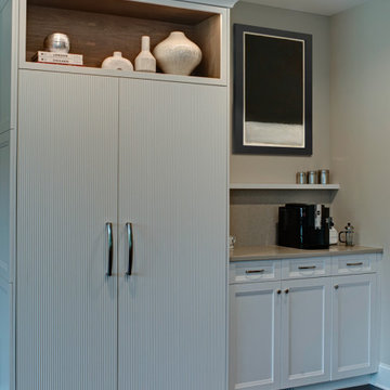
-The white-painted refrigerator and freezer door panel style is a custom reeded look that adds a soft contrasting detail against the main door style. Along with the open grey-stained interior cabinet above, it looks like a piece of furniture.
-The same soft tones were used for the countertops and a full, high backsplash of Chamonix quartzite that tied everything together. It’s an elegant backdrop for the hood.
-The Dry Bar, even though showcasing a dark stained cabinet, stays open and bright with a full mirror backsplash, wood retained glass floating shelves and glass wall cabinet doors. Brushed brass trim details and a fun light fixture add a pop of character.
-The same reeded door style as the refrigerator was used on the base doors of the dry bar to tie in with the kitchen.
-About 2/3 of the existing walk-in pantry was carved out for the new dry bar footprint while still keeping a shallow-depth pantry space for storage.
-The homeowners wanted a beautiful hood but didn’t want it to dominate the design. We kept the lines of the hood simple. The soft stainless steel body has a bottom accent that incorporates both the grey stain and white-painted cabinet colors.
-Even though the Kitchen had a lot of natural light from the large window, it was important to have task and subtle feature lighting. Recessed cans provide overall lighting while clear pendants shine down on the 2nd level of the seating area on the island.
-The circular clear chandelier is the statement piece over the main island while the pendants flanking the hood emphasize the quartzite backsplash and add as accent lighting in the evening along with the interior cabinet lights.
With three generations living in the home it was important to have areas that multiple family members could use at the same time without being in each other’s way. The design incorporates different zones like the coffee bar, charging station, dry bar and refrigerator drawers.
The softness of the colors and classic feel of the wood floor keep kitchen is inviting and calming.
 TVL Creative Ltd.
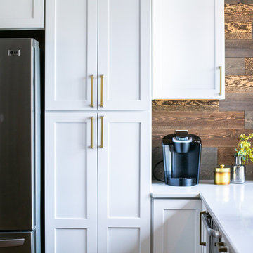
This kitchen took a tired, 80’s builder kitchen and revamped it into a personalized gathering space for our wonderful client. The existing space was split up by the dated configuration of eat-in kitchen table area to one side and cramped workspace on the other. It didn’t just under-serve our client’s needs; it flat out discouraged them from using the space. Our client desired an open kitchen with a central gathering space where family and friends could connect. To open things up, we removed the half wall separating the kitchen from the dining room and the wall that blocked sight lines to the family room and created a narrow hallway to the kitchen. The old oak cabinets weren't maximizing storage and were dated and dark. We used Waypoint Living Spaces cabinets in linen white to brighten up the room. On the east wall, we created a hutch-like stack that features an appliance garage that keeps often used countertop appliance on hand but out of sight. The hutch also acts as a transition from the cooking zone to the coffee and wine area. We eliminated the north window that looked onto the entry walkway and activated this wall as storage with refrigerator enclosure and pantry. We opted to leave the east window as-is and incorporated it into the new kitchen layout by creating a window well for growing plants and herbs. The countertops are Pental Quartz in Carrara. The sleek cabinet hardware is from our friends at Amerock in a gorgeous satin champagne bronze. One of the most striking features in the space is the pattern encaustic tile from Tile Shop. The pop of blue in the backsplash adds personality and contrast to the champagne accents. The reclaimed wood cladding surrounding the large east-facing window introduces a quintessential Colorado vibe, and the natural texture balances the crisp white cabinetry and geometric patterned tile. Minimalist modern lighting fixtures from Mitzi by Hudson Valley Lighting provide task lighting over the sink and at the wine/ coffee station. The visual lightness of the sink pendants maintains the openness and visual connection between the kitchen and dining room. Together the elements make for a sophisticated yet casual vibe-- a comfortable chic kitchen. We love the way this space turned out and are so happy that our clients now have such a bright and welcoming gathering space as the heart of their home!
 Erica Peale Design
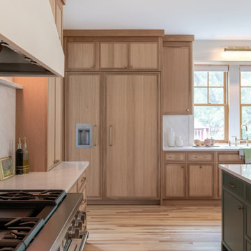
This kitchen renovation blends timeless craftsmanship with a warm, modern aesthetic. Custom natural-oak cabinetry anchors the space with organic texture, while soft green island and perimeter accents introduce a subtle wash of color. Bright natural light highlights the clean stone surfaces, brass fixtures, and tailored millwork details throughout.
Thoughtful upgrades—like paneled appliances, a plaster hood, a dedicated coffee nook, and a sculptural plaster range hood—elevate both function and flow. The result is a calm, inviting kitchen that feels fresh yet enduring, designed for everyday family living and effortless entertaining.

Sponsored
Columbus, OH

Wannemacher Interiors
Customized Award-Winning Interior Design Solutions in Franklin Cnty OH
 Drury Design
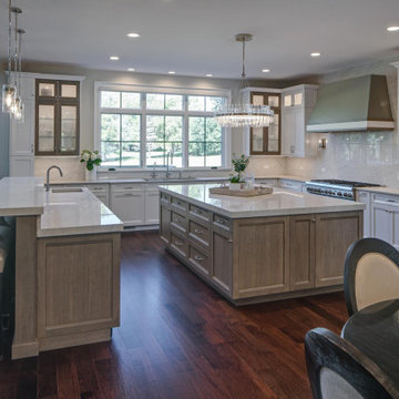
Our clients were ready to update their kitchen with soft and subtle colors to blend in with the home’s recently updated interior. It was also time to improve the layout. The kitchen needed to be reconfigured in order to facilitate a three-generation family and occasional entertaining.
Design Objectives
-Brighten up to blend with the home’s interior and flow into the adjacent family room area
-Incorporate specific storage for pantry items like bulk ingredients and small appliances
-Designate areas for a coffee bar, multiple prep areas and seating while highlighting a dry bar for display
-Keep clutter off of counters for a seamless design that facilitates visual flow through the entire area
Design Challenges
-Make a subtle statement with contrasting cabinets and countertops
-Incorporate a stand-alone, statement-making dry bar just outside the main kitchen space
-Design a statement hood that serves as a focal point without interrupting visual flow
-Update and add lighting to add more task, accent and overhead brightness.
-Have the space be usable for different tasks by different family members at the same time
-Create a space that looks classy and formal but is still inviting.
Design Solutions
-A soft grey stain and white paint were used on all the cabinets. On only the wall cabinets flanking the window was the grey introduced on the frame to make a pop against the white paint.
-The white-painted refrigerator and freezer door panel style is a custom reeded look that adds a soft contrasting detail against the main door style. Along with the open grey-stained interior cabinet above, it looks like a piece of furniture.
-The same soft tones were used for the countertops and a full, high backsplash of Chamonix quartzite that tied everything together. It’s an elegant backdrop for the hood.
-The Dry Bar, even though showcasing a dark stained cabinet, stays open and bright with a full mirror backsplash, wood retained glass floating shelves and glass wall cabinet doors. Brushed brass trim details and a fun light fixture add a pop of character.
-The same reeded door style as the refrigerator was used on the base doors of the dry bar to tie in with the kitchen.
-About 2/3 of the existing walk-in pantry was carved out for the new dry bar footprint while still keeping a shallow-depth pantry space for storage.
-The homeowners wanted a beautiful hood but didn’t want it to dominate the design. We kept the lines of the hood simple. The soft stainless steel body has a bottom accent that incorporates both the grey stain and white-painted cabinet colors.
-Even though the Kitchen had a lot of natural light from the large window, it was important to have task and subtle feature lighting. Recessed cans provide overall lighting while clear pendants shine down on the 2nd level of the seating area on the island.
-The circular clear chandelier is the statement piece over the main island while the pendants flanking the hood emphasize the quartzite backsplash and add as accent lighting in the evening along with the interior cabinet lights.
With three generations living in the home it was important to have areas that multiple family members could use at the same time without being in each other’s way. The design incorporates different zones like the coffee bar, charging station, dry bar and refrigerator drawers.
The softness of the colors and classic feel of the wood floor keep kitchen is inviting and calming.
 TVL Creative Ltd.
This kitchen took a tired, 80’s builder kitchen and revamped it into a personalized gathering space for our wonderful client. The existing space was split up by the dated configuration of eat-in kitchen table area to one side and cramped workspace on the other. It didn’t just under-serve our client’s needs; it flat out discouraged them from using the space. Our client desired an open kitchen with a central gathering space where family and friends could connect. To open things up, we removed the half wall separating the kitchen from the dining room and the wall that blocked sight lines to the family room and created a narrow hallway to the kitchen. The old oak cabinets weren't maximizing storage and were dated and dark. We used Waypoint Living Spaces cabinets in linen white to brighten up the room. On the east wall, we created a hutch-like stack that features an appliance garage that keeps often used countertop appliance on hand but out of sight. The hutch also acts as a transition from the cooking zone to the coffee and wine area. We eliminated the north window that looked onto the entry walkway and activated this wall as storage with refrigerator enclosure and pantry. We opted to leave the east window as-is and incorporated it into the new kitchen layout by creating a window well for growing plants and herbs. The countertops are Pental Quartz in Carrara. The sleek cabinet hardware is from our friends at Amerock in a gorgeous satin champagne bronze. One of the most striking features in the space is the pattern encaustic tile from Tile Shop. The pop of blue in the backsplash adds personality and contrast to the champagne accents. The reclaimed wood cladding surrounding the large east-facing window introduces a quintessential Colorado vibe, and the natural texture balances the crisp white cabinetry and geometric patterned tile. Minimalist modern lighting fixtures from Mitzi by Hudson Valley Lighting provide task lighting over the sink and at the wine/ coffee station. The visual lightness of the sink pendants maintains the openness and visual connection between the kitchen and dining room. Together the elements make for a sophisticated yet casual vibe-- a comfortable chic kitchen. We love the way this space turned out and are so happy that our clients now have such a bright and welcoming gathering space as the heart of their home!
 TVL Creative Ltd.
Our clients were looking to make this home their forever home and to create a warm and welcoming space that the whole family would enjoy returning to every day. One of our primary goals in this project was to change how our clients moved through their home. We tossed aside the existing walls that blocked off the kitchen and introduced a butler’s pantry to connect the kitchen directly to the dining room. Contrast is king in this home, and we utilized a variety of light and dark finishes to create distinctive layers and lean into opportunities for accents. To tie the space in this home together, we introduced warm hardwood flooring throughout the main level and selected a soft grey paint as our primary wall color.
Kitchen- The heart of this home is most definitely the kitchen! We erased every trace of the original builder kitchen and created a space that welcomes one and all. The glorious island, with its light cabinetry and dramatic quartz countertop, provides the perfect gathering place for morning coffee and baking sessions. At the perimeter of the kitchen, we selected a handsome grey finish with a brushed linen effect for an extra touch of texture that ties in with the high variation backsplash tile giving us a softened handmade feel. Black metal accents from the hardware to the light fixtures unite the kitchen with the rest of the home.
Butler’s Pantry- The Butler’s Pantry quickly became one of our favorite spaces in this home! We had fun with the backsplash tile patten (utilizing the same tile we highlighted in the kitchen but installed in a herringbone pattern). Continuing the warm tones through this space with the butcher block counter and open shelving, it works to unite the front and back of the house. Plus, this space is home to the kegerator with custom family tap handles!
Mud Room- We wanted to make sure we gave this busy family a landing place for all their belongings. With plenty of cabinetry storage, a sweet built-in bench, and hooks galore there’s no more jockeying to find a home for coats.
Fireplace- A double-sided fireplace means double the opportunity for a dramatic focal point! On the living room side (the tv-free grown-up zone) we utilized reclaimed wooden planks to add layers of texture and bring in more cozy warm vibes. On the family room side (aka the tv room) we mixed it up with a travertine ledger stone that ties in with the warm tones of the kitchen island.
Staircase- The standard builder handrail was just not going to do it anymore! So, we leveled up designed a custom steel & wood railing for this home with a dark finish that allows it to contrast beautifully against the walls and tie in with the dark accent finishes throughout the home.
 K Two Designs, Inc.
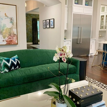
Art deco is introduced in the mirrored coffee table, low back sofa in emerald green velvet and the Greek key area rug. This room delights the eye in its use of color that is at once restrained and impactful.
Sponsored
Delaware, OH
Buckeye Basements, Inc.
Central Ohio's Basement Finishing ExpertsBest Of Houzz '13-'21
 TVL Creative Ltd.
Our clients were looking to make this home their forever home and to create a warm and welcoming space that the whole family would enjoy returning to every day. One of our primary goals in this project was to change how our clients moved through their home. We tossed aside the existing walls that blocked off the kitchen and introduced a butler’s pantry to connect the kitchen directly to the dining room. Contrast is king in this home, and we utilized a variety of light and dark finishes to create distinctive layers and lean into opportunities for accents. To tie the space in this home together, we introduced warm hardwood flooring throughout the main level and selected a soft grey paint as our primary wall color.
Kitchen- The heart of this home is most definitely the kitchen! We erased every trace of the original builder kitchen and created a space that welcomes one and all. The glorious island, with its light cabinetry and dramatic quartz countertop, provides the perfect gathering place for morning coffee and baking sessions. At the perimeter of the kitchen, we selected a handsome grey finish with a brushed linen effect for an extra touch of texture that ties in with the high variation backsplash tile giving us a softened handmade feel. Black metal accents from the hardware to the light fixtures unite the kitchen with the rest of the home.
Butler’s Pantry- The Butler’s Pantry quickly became one of our favorite spaces in this home! We had fun with the backsplash tile patten (utilizing the same tile we highlighted in the kitchen but installed in a herringbone pattern). Continuing the warm tones through this space with the butcher block counter and open shelving, it works to unite the front and back of the house. Plus, this space is home to the kegerator with custom family tap handles!
Mud Room- We wanted to make sure we gave this busy family a landing place for all their belongings. With plenty of cabinetry storage, a sweet built-in bench, and hooks galore there’s no more jockeying to find a home for coats.
Fireplace- A double-sided fireplace means double the opportunity for a dramatic focal point! On the living room side (the tv-free grown-up zone) we utilized reclaimed wooden planks to add layers of texture and bring in more cozy warm vibes. On the family room side (aka the tv room) we mixed it up with a travertine ledger stone that ties in with the warm tones of the kitchen island.
Staircase- The standard builder handrail was just not going to do it anymore! So, we leveled up designed a custom steel & wood railing for this home with a dark finish that allows it to contrast beautifully against the walls and tie in with the dark accent finishes throughout the home.
 Sandra Hambley
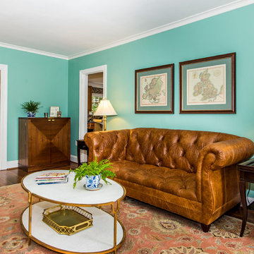
A charming Airbnb, favorite restaurant, cozy coffee house, or a piece of artwork can all serve as design inspiration for your decor. How wonderful would it be to bring the colors, patterns, shapes, fabrics, or textures of those beloved places or things into your own home? That is exactly what Janet Aurora’s client was hoping to do. Her favorite restaurant, The Ivy Chelsea Garden, is located in London and features tufted leather sofas and benches, hues of salmon and sage, botanical patterns, and artwork surrounded by lush gardens and flowers. Take a look at how Janet used this point of inspiration in the client’s living room, dining room, entryway and study.
~ Dining Room ~
To accommodate space for a dining room table that would seat eight, we eliminated the existing fireplace. Janet custom designed a table with a beautiful wrought iron base and marble top, selected botanical prints for a gallery wall, and floral valances for the windows, all set against a fresh turquoise backdrop.
~ Living Room ~
Nods to The Ivy Chelsea Garden can be seen throughout the living room and entryway. A custom leather tufted sofa anchors the living room and compliments a beloved “Grandma’s chair” with crewel fabric, which was restored to its former beauty. Walls painted with Benjamin Moore’s Dreamcatcher 640 and dark salmon hued draperies create a color palette that is strikingly similar to the al fresco setting in London. In the entryway, floral patterned wallpaper introduces the garden fresh theme seen throughout the home.
~ The Study ~
Janet transformed an existing bedroom into a study by claiming the space from two reach-in closets to create custom built-ins with lighting. Many of the homeowner’s own furnishings were used in this room, but Janet added a much-needed reading chair in turquoise to bring a nice pop of color, window treatments, and an area rug to tie the space together. Benjamin Moore’s Deep Mauve was used on the walls and Ruby Dusk was added to the back of the cabinetry to add depth and interest. We also added French doors that lead out to a small balcony for a place to take a break or have lunch.
We love the way these spaces turned out and hope our clients will enjoy their spaces inspired by their favorite restaurant.
 Erica Peale Design
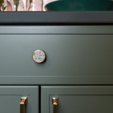
This kitchen renovation blends timeless craftsmanship with a warm, modern aesthetic. Custom natural-oak cabinetry anchors the space with organic texture, while soft green island and perimeter accents introduce a subtle wash of color. Bright natural light highlights the clean stone surfaces, brass fixtures, and tailored millwork details throughout.
Thoughtful upgrades—like paneled appliances, a plaster hood, a dedicated coffee nook, and a sculptural plaster range hood—elevate both function and flow. The result is a calm, inviting kitchen that feels fresh yet enduring, designed for everyday family living and effortless entertaining.
19