
Search results for "Involves keeping" in Home Design Ideas
 Stonepocket Unique Landscapes
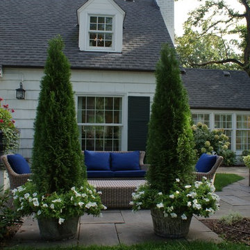
Landscape by Stonepocket located in Minnetonka, Minnesota Creating a elegant landscape to blend with a home with such character and charm was a challenge in controlled resistant. Did not want the landscape to overwhelm the home, nor did I want a typical landscape for this style that usually involves a box hedge. Utilizing light in the front to create a perennial garden give the home a sense of place. Keep the planting mostly to whites and greens in the back unifies the space.
photos by Stonepocket, Inc
 Advance Design Studio, Ltd.
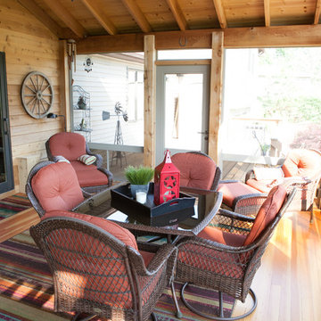
When Bill and Jackie Fox decided it was time for a 3 Season room, they worked with Todd Jurs at Advance Design Studio to make their back yard dream come true. Situated on an acre lot in Gilberts, the Fox’s wanted to enjoy their yard year round, get away from the mosquitoes, and enhance their home’s living space with an indoor/outdoor space the whole family could enjoy.
“Todd and his team at Advance Design Studio did an outstanding job meeting my needs. Todd did an excellent job helping us determine what we needed and how to design the space”, says Bill.
The 15’ x 18’ 3 Season’s Room was designed with an open end gable roof, exposing structural open beam cedar rafters and a beautiful tongue and groove Knotty Pine ceiling. The floor is a tongue and groove Douglas Fir, and amenities include a ceiling fan, a wall mounted TV and an outdoor pergola. Adjustable plexi-glass windows can be opened and closed for ease of keeping the space clean, and use in the cooler months. “With this year’s mild seasons, we have actually used our 3 season’s room year round and have really enjoyed it”, reports Bill.
“They built us a beautiful 3-season room. Everyone involved was great. Our main builder DJ, was quite a craftsman. Josh our Project Manager was excellent. The final look of the project was outstanding. We could not be happier with the overall look and finished result. I have already recommended Advance Design Studio to my friends”, says Bill Fox.
Photographer: Joe Nowak
 Kitchen Design Concepts
We introduce to you one of our newer services we are providing here at Kitchen Design Concepts: spaces that just need a little reviving! As of recent, we are taking on projects that are in need of minimal updating, as in, spaces that don’t need a full-on remodel. Yes, you heard right! If your space has good bones, you like the layout of your kitchen, and you just need a few cosmetic changes, then today’s feature is for you! Recently, we updated a space where we did just this! The kitchen was in need of a little love, some fresh paint, and new finishes. And if we’re being honest here, the result looks almost as if the kitchen had a full-on remodel! To learn more about this space and how we did our magic, continue reading below:
The Before and After
First, see what an impact new finishes can make! The “before” image shows a kitchen with outdated finishes such as the tile countertops, backsplash, and cabinetry finish. The “after” image, is a kitchen that looks almost as if its brand new, the image speaks for itself!
Cabinetry
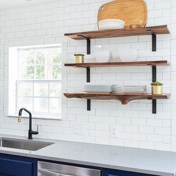
With the wooden cabinetry in this kitchen already having great bones, all we needed to do was our refinishing process that involved removing door and drawer fronts, sanding, priming, and painting. The main color of the cabinetry is white (Sherwin Williams Pure White 7005) and as an accent, we applied a deep navy blue that really pops in this space (Sherwin Willaims Naval 6244). As a special design element, we incorporated a natural wooden band across the hood which is subtle but adds an element of surprise.
Countertops
The original countertops in this space were a 12×12 tile with cracks and discolored grout from all the wear and tear. To replace the countertops, we installed a clean and crisp quartz that is not only durable but easy to maintain (no grout here!). The 3cm countertops are a Cambria quartz in a grey-tone color (Carrick).
Backsplash
Keeping things simple, yet classic, we installed a 3×6 subway tile from Interceramic. The crisp white pairs well with all the other finishes of the space and really brighten the space up! To spice things up, we paired the white tile with a contrasting grout color (Cape Grey) that matches the countertop. This is a simple method to add interest to your white backsplash!
Fixtures and Fittings
For the fixtures and fittings of the kitchen, we wanted pieces that made a statement. That’s why we selected this industrial style faucet from Brizo! The faucet is a Brizo LITZE™ PULL-DOWN FAUCET WITH ARC SPOUT AND INDUSTRIAL HANDLE (63044LF-BLGL). The matte black paired with the luxe gold elements really make a statement! To match the gold elements of the faucet, we installed cabinetry hardware from Topknobs in the same gold finish. The hardware is a Channing pull TK743HB. Lastly, the large single bowl sink (who doesn’t want a large sink?!) is a great functional touch to the kitchen. The sink is a Blanco Precision 16″ R10 super single with 16″ Drainer in stainless steel (516216).
Find the right local pro for your project

 Kimball Starr Interior Design
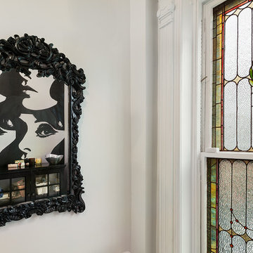
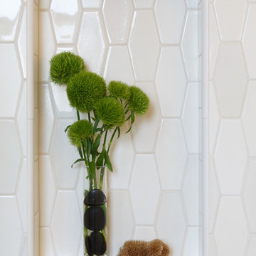
Bathroom remodel was a complete redesign to bring the original 90-year old San Francisco bathroom into modern day. Reimagining the space involved knocking down walls and employing artisans for handmade shower tiles and locally custom-made cabinetry to perfectly fit tight spaces.
Creamy tones, Mahogany wood, and ceramic crackle and subway tiles strike a balance between traditional and contemporary. The end result is a bathroom design that's a breath of fresh air and modern sophistication
- See more at: http://kimballstarr.com/projects/bathroom-remodel-st-francis-wood
 Klopf Architecture
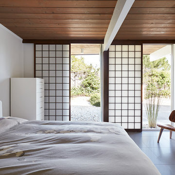
Klopf Architecture and Jesse Ososki Art remodeled an existing Eichler atrium home into a brighter, more open, and more functional version of its original self.
The goals were to preserve the Eichler look and feel without the need to strictly adhere to it. The scope of work included re-configuring the master bedroom/bath, the kitchen, and the hall bath/laundry area, as well as updating interior finishes throughout to be more sophisticated.
The owners are detail-oriented and were very involved in the design process, down to the selection of lighting controls and stainless steel faceplates.Their design aesthetic leans toward the Scandinavian — light and bright, with simple straight lines and pure geometric shapes.
The finish flooring is large porcelain tile (24” x 24”) in a neutral grey tone, providing a uniform backdrop against which other materials can stand out. The same tile continues into the shower floor (with a different finish texture for slip-resistance) and up the shower/tub walls (in a smaller size). Heath Classic Field ceramic tile in Modern Blue was used sparingly, to add color at the hall bath vanity backsplash and at the shampoo niches in both bathrooms. Back-painted soda glass in pale blue to match the Heath tile was used at the kitchen backsplash. This same accent color was also used at the front entry atrium door. Kitchen cabinetry, countertops, appliances, and light fixtures are all white, making the kitchen feel more airy and light. Countertops are Caesarstone Blizzard.
The owners chose to keep some of the original Eichler elements: the concrete masonry fireplace; the stained tongue-and-groove redwood ceiling decking; and the luan wall paneling. The luan paneling was lightly sanded, cleaned, and re-stained. The owners also kept an added element that was installed by a previous owner: sliding shoji panels at all bedroom windows and sliding glass doors, for both privacy and sun control. Grooves were cut into the new tile flooring for the shoji panels to slide in, creating a more integrated look. Walnut was used to add warmth and contrast at the kitchen bar top and niche, the bathroom vanities, and the window sill/ledge under the kitchen window.
This Burlingame Eichler Remodel is a 2,121 sf, 4 bedroom/2 bath home located in the heart of Silicon Valley.
Klopf Architecture Project Team: John Klopf, Klara Kevane and Yegvenia Torres Zavala
Contractor: Jesse Ososki Art
Structural Engineer: Emmanuel Pun
Photography ©2018 Mariko Reed
Location: Burlingame, CA
Year completed: 2017
 OLSON LEWIS + Architects
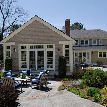
This New England home has the essence of a traditional home, yet offers a modern appeal. The home renovation and addition involved moving the kitchen to the addition, leaving the resulting space to become a formal dining and living area.
The extension over the garage created an expansive open space on the first floor. The large, cleverly designed space seamlessly integrates the kitchen, a family room, and an eating area.
A substantial center island made of soapstone slabs has ample space to accommodate prepping for dinner on one side, and the kids doing their homework on the other. The pull-out drawers at the end contain extra refrigerator and freezer space. Additionally, the glass backsplash tile offers a refreshing luminescence to the area. A custom designed informal dining table fills the space adjacent to the center island.
Paint colors in keeping with the overall color scheme were given to the children. Their resulting artwork sits above the family computers. Chalkboard paint covers the wall opposite the kitchen area creating a drawing wall for the kids. Around the corner from this, a reclaimed door from the grandmother's home hangs in the opening to the pantry. Details such as these provide a sense of family and history to the central hub of the home.
Builder: Anderson Contracting Service
Interior Designer: Kristina Crestin
Photographer: Jamie Salomon

Sponsored
Columbus, OH

Hope Restoration & General Contracting
Columbus Design-Build, Kitchen & Bath Remodeling, Historic Renovations
 Wright Jenkins Home Design
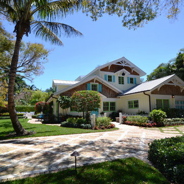
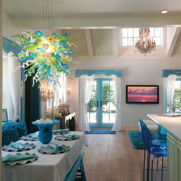
This second-story addition to an already 'picture perfect' Naples home presented many challenges. The main tension between adding the many 'must haves' the client wanted on their second floor, but at the same time not overwhelming the first floor. Working with David Benner of Safety Harbor Builders was key in the design and construction process – keeping the critical aesthetic elements in check. The owners were very 'detail oriented' and actively involved throughout the process. The result was adding 924 sq ft to the 1,600 sq ft home, with the addition of a large Bonus/Game Room, Guest Suite, 1-1/2 Baths and Laundry. But most importantly — the second floor is in complete harmony with the first, it looks as it was always meant to be that way.
©Energy Smart Home Plans, Safety Harbor Builders, Glenn Hettinger Photography
 Wright Jenkins Home Design
This second-story addition to an already 'picture perfect' Naples home presented many challenges. The main tension between adding the many 'must haves' the client wanted on their second floor, but at the same time not overwhelming the first floor. Working with David Benner of Safety Harbor Builders was key in the design and construction process – keeping the critical aesthetic elements in check. The owners were very 'detail oriented' and actively involved throughout the process. The result was adding 924 sq ft to the 1,600 sq ft home, with the addition of a large Bonus/Game Room, Guest Suite, 1-1/2 Baths and Laundry. But most importantly — the second floor is in complete harmony with the first, it looks as it was always meant to be that way.
©Energy Smart Home Plans, Safety Harbor Builders, Glenn Hettinger Photography
 Kitchen Design Concepts
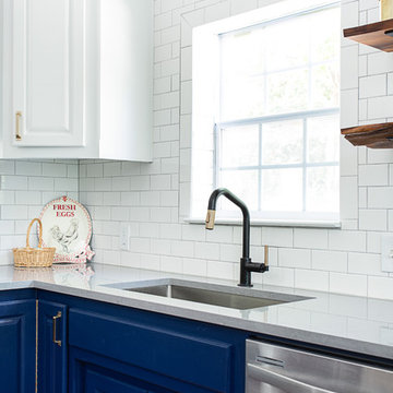
We introduce to you one of our newer services we are providing here at Kitchen Design Concepts: spaces that just need a little reviving! As of recent, we are taking on projects that are in need of minimal updating, as in, spaces that don’t need a full-on remodel. Yes, you heard right! If your space has good bones, you like the layout of your kitchen, and you just need a few cosmetic changes, then today’s feature is for you! Recently, we updated a space where we did just this! The kitchen was in need of a little love, some fresh paint, and new finishes. And if we’re being honest here, the result looks almost as if the kitchen had a full-on remodel! To learn more about this space and how we did our magic, continue reading below:
The Before and After
First, see what an impact new finishes can make! The “before” image shows a kitchen with outdated finishes such as the tile countertops, backsplash, and cabinetry finish. The “after” image, is a kitchen that looks almost as if its brand new, the image speaks for itself!
Cabinetry
With the wooden cabinetry in this kitchen already having great bones, all we needed to do was our refinishing process that involved removing door and drawer fronts, sanding, priming, and painting. The main color of the cabinetry is white (Sherwin Williams Pure White 7005) and as an accent, we applied a deep navy blue that really pops in this space (Sherwin Willaims Naval 6244). As a special design element, we incorporated a natural wooden band across the hood which is subtle but adds an element of surprise.
Countertops
The original countertops in this space were a 12×12 tile with cracks and discolored grout from all the wear and tear. To replace the countertops, we installed a clean and crisp quartz that is not only durable but easy to maintain (no grout here!). The 3cm countertops are a Cambria quartz in a grey-tone color (Carrick).
Backsplash
Keeping things simple, yet classic, we installed a 3×6 subway tile from Interceramic. The crisp white pairs well with all the other finishes of the space and really brighten the space up! To spice things up, we paired the white tile with a contrasting grout color (Cape Grey) that matches the countertop. This is a simple method to add interest to your white backsplash!
Fixtures and Fittings
For the fixtures and fittings of the kitchen, we wanted pieces that made a statement. That’s why we selected this industrial style faucet from Brizo! The faucet is a Brizo LITZE™ PULL-DOWN FAUCET WITH ARC SPOUT AND INDUSTRIAL HANDLE (63044LF-BLGL). The matte black paired with the luxe gold elements really make a statement! To match the gold elements of the faucet, we installed cabinetry hardware from Topknobs in the same gold finish. The hardware is a Channing pull TK743HB. Lastly, the large single bowl sink (who doesn’t want a large sink?!) is a great functional touch to the kitchen. The sink is a Blanco Precision 16″ R10 super single with 16″ Drainer in stainless steel (516216).
 Stonepocket Unique Landscapes
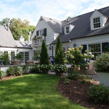
Landscape by Stonepocket located in Minnetonka, Minnesota Creating a elegant landscape to blend with a home with such character and charm was a challenge in controlled resistant. Did not want the landscape to overwhelm the home, nor did I want a typical landscape for this style that usually involves a box hedge. Utilizing light in the front to create a perennial garden give the home a sense of place. Keep the planting mostly to whites and greens in the back unifies the space.
photos by Stonepocket, Inc
 TaskRabbit
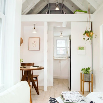
Recently, TaskRabbit challenged a group of 10 Taskers to build a Tiny House in the middle of Manhattan in just 72 hours – all for a good cause.
Building a fully outfitted tiny house in 3 days was a tall order – a build like this often takes months – but we set out to prove the power of collaboration, showing the kind of progress that can be made when people come together, bringing their best insights, skills and creativity to achieve something that seems impossible.
It was quite a week. New York was wonderful (and quite lovely, despite a bit of rain), our Taskers were incredible, and TaskRabbit’s Tiny House came together in record time, due to the planning, dedication and hard work of all involved.
A Symbol for Change
The TaskRabbit Tiny House was auctioned off with 100% of the proceeds going to our partner, Community Solutions, a national nonprofit helping communities take on complex social challenges – issues like homelessness, unemployment and health inequity – through collaboration and creative problem solving. This Tiny House was envisioned as a small symbol of the change that is possible when people have the right tools and opportunities to work together. Through our three-day build, our Taskers proved that amazing things can happen when we put our hearts into creating substantive change in our communities.
The Winning Bid
We’re proud to report that we were able to raise $26,600 to support Community Solutions’ work. Sarah, a lovely woman from New Hampshire, placed the winning bid – and it’s nice to know our tiny home is in good hands.
#ATinyTask: Behind the Scenes
The Plans
A lot of time and effort went into making sure this Tiny Home was as efficient, cozy and welcoming as possible. Our master planners, designer Lesley Morphy and TaskRabbit Creative Director Scott Smith, maximized every square inch in the little house with comfort and style in mind, utilizing a lofted bed, lofted storage, a floor-to-ceiling tiled shower, a compost toilet, and custom details throughout. There’s a surprising amount of built-in storage in the kitchen, while a conscious decision was made to keep the living space open so you could actually exist comfortably without feeling cramped.
The Build
Our Taskers worked long, hard shifts while our team made sure they were well fed, hydrated and in good spirits. The team brought amazing energy and we couldn’t be prouder of the way they worked together. Stay tuned, as we’ll be highlighting more of our Tiny House Taskers’ stories in coming days – they were so great that we want to make sure all of you get to know them better.
The Final Product
Behold, the completed Tiny House! For more photos, be sure to check out our Facebook page.
This was an incredibly inspiring project, and we really enjoyed watching the Tiny House come to life right in the middle of Manhattan. It was amazing to see what our Taskers are capable of, and we’re so glad we were able to support Community Solutions and help fight homelessness, unemployment and health inequity with #ATinyTask.
 TATCOR DESIGN BUILD
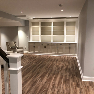
You can be fully involved in what’s playing on the TV and keep an eye on the kids at the same time thanks to the impressive surround sound and the structural column wrapped with nice wood Mill work which provides a soft separation between this area and the children’s play area. The built-in children’s area is transformational – while they are young, you can use the beautiful shelving and cabinets to store toys and games. As they get older you can turn it into a sophisticated library or office.

Sponsored
Columbus, OH

Wannemacher Interiors
Customized Award-Winning Interior Design Solutions in Franklin Cnty OH
 Advance Design Studio, Ltd.
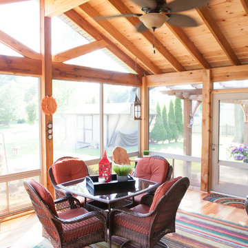
When Bill and Jackie Fox decided it was time for a 3 Season room, they worked with Todd Jurs at Advance Design Studio to make their back yard dream come true. Situated on an acre lot in Gilberts, the Fox’s wanted to enjoy their yard year round, get away from the mosquitoes, and enhance their home’s living space with an indoor/outdoor space the whole family could enjoy.
“Todd and his team at Advance Design Studio did an outstanding job meeting my needs. Todd did an excellent job helping us determine what we needed and how to design the space”, says Bill.
The 15’ x 18’ 3 Season’s Room was designed with an open end gable roof, exposing structural open beam cedar rafters and a beautiful tongue and groove Knotty Pine ceiling. The floor is a tongue and groove Douglas Fir, and amenities include a ceiling fan, a wall mounted TV and an outdoor pergola. Adjustable plexi-glass windows can be opened and closed for ease of keeping the space clean, and use in the cooler months. “With this year’s mild seasons, we have actually used our 3 season’s room year round and have really enjoyed it”, reports Bill.
“They built us a beautiful 3-season room. Everyone involved was great. Our main builder DJ, was quite a craftsman. Josh our Project Manager was excellent. The final look of the project was outstanding. We could not be happier with the overall look and finished result. I have already recommended Advance Design Studio to my friends”, says Bill Fox.
Photographer: Joe Nowak

 Chester County Kitchen & Bath
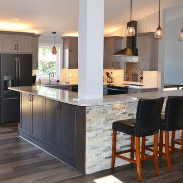
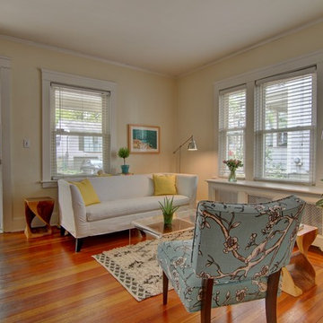
Awesome Norristown PA bi-level home remodel. We gutted the whole first level of this home down to the bare bones. We redesigned the space to an open floorplan. New structural framing, insulation, windows and doors, and all mechanicals were relocated and improved. Lighting! Lighting! Lighting! everywhere and it makes all the difference. Led lighting and smart switches were used for up lighting above cabinetry, task lighting under cabinetry, general room lighting, accent lighting under bar top, and all decorative fixtures as well. The kitchen was designed around a central island with elevated seating that is designed around the new structural columns required to open the whole area. Fabuwood cabinetry in Galaxy Horizon finish make up the perimeter cabinets accented by Galaxy Cobblestone finish used for the island cabinetry. Both cabinetry tones coordinate perfect with the new Luxury vinyl plank flooring in Uptown Chic Forever Friends. I’ve said it before and I’ll say it again, luxury vinyl is Awesome! It looks great its ultra durable and even water proof as well as less expensive than true hardwood. New stair treads, railings, and posts were installed stained to match by us; giving the steps new life. An accent wall of nickel gap boards was installed on the fireplace wall giving it some interest along with being a great clean look. The recessed niche behind the range, the dry stacked stone tile at the islands seating area, the new tile entry in a herringbone pattern just add to all the great details of this project. The New River White granite countertops are a show stopper as well; not only is it a beautiful stone the installation and seaming is excellent considering the pattern of the stone. I could go on forever we did so much. The clients were terrific and a pleasure to work with. I am glad we were able to be involved in making this dream come true.
Sponsored
Columbus, OH
Hope Restoration & General Contracting
Columbus Design-Build, Kitchen & Bath Remodeling, Historic Renovations
 Leigh Designs
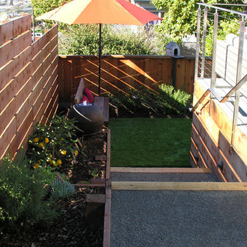
Each outdoor room of this El Cerrito Mid Century Modern backyard deck, from the outdoor kitchen, to the dining area, to lounge area, maximize the views of the bay. This couple were very excited about and involved in designing the look and feel of their outdoor living space. For instance, instead of the typical deck redwood flooring, we were able to accommodate their desire to have a flagstone floor built on a redwood frame, which was more in keeping with their Mid Century Modern style. The husband was a gourmet chef and particularly enjoyed the design of his specialty outdoor kitchen.
 Kitchen Design Concepts
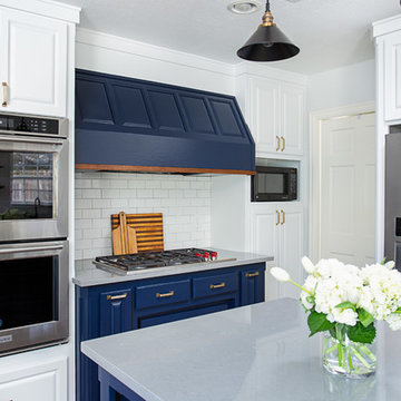
We introduce to you one of our newer services we are providing here at Kitchen Design Concepts: spaces that just need a little reviving! As of recent, we are taking on projects that are in need of minimal updating, as in, spaces that don’t need a full-on remodel. Yes, you heard right! If your space has good bones, you like the layout of your kitchen, and you just need a few cosmetic changes, then today’s feature is for you! Recently, we updated a space where we did just this! The kitchen was in need of a little love, some fresh paint, and new finishes. And if we’re being honest here, the result looks almost as if the kitchen had a full-on remodel! To learn more about this space and how we did our magic, continue reading below:
The Before and After
First, see what an impact new finishes can make! The “before” image shows a kitchen with outdated finishes such as the tile countertops, backsplash, and cabinetry finish. The “after” image, is a kitchen that looks almost as if its brand new, the image speaks for itself!
Cabinetry
With the wooden cabinetry in this kitchen already having great bones, all we needed to do was our refinishing process that involved removing door and drawer fronts, sanding, priming, and painting. The main color of the cabinetry is white (Sherwin Williams Pure White 7005) and as an accent, we applied a deep navy blue that really pops in this space (Sherwin Willaims Naval 6244). As a special design element, we incorporated a natural wooden band across the hood which is subtle but adds an element of surprise.
Countertops
The original countertops in this space were a 12×12 tile with cracks and discolored grout from all the wear and tear. To replace the countertops, we installed a clean and crisp quartz that is not only durable but easy to maintain (no grout here!). The 3cm countertops are a Cambria quartz in a grey-tone color (Carrick).
Backsplash
Keeping things simple, yet classic, we installed a 3×6 subway tile from Interceramic. The crisp white pairs well with all the other finishes of the space and really brighten the space up! To spice things up, we paired the white tile with a contrasting grout color (Cape Grey) that matches the countertop. This is a simple method to add interest to your white backsplash!
Fixtures and Fittings
For the fixtures and fittings of the kitchen, we wanted pieces that made a statement. That’s why we selected this industrial style faucet from Brizo! The faucet is a Brizo LITZE™ PULL-DOWN FAUCET WITH ARC SPOUT AND INDUSTRIAL HANDLE (63044LF-BLGL). The matte black paired with the luxe gold elements really make a statement! To match the gold elements of the faucet, we installed cabinetry hardware from Topknobs in the same gold finish. The hardware is a Channing pull TK743HB. Lastly, the large single bowl sink (who doesn’t want a large sink?!) is a great functional touch to the kitchen. The sink is a Blanco Precision 16″ R10 super single with 16″ Drainer in stainless steel (516216).
 Wright Jenkins Home Design
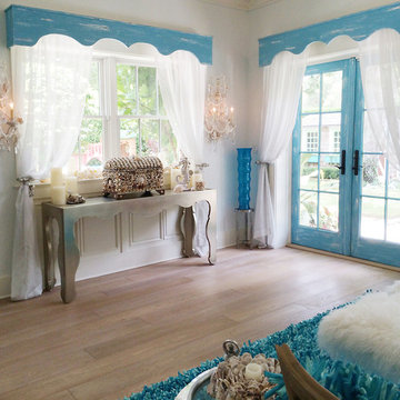
This second-story addition to an already 'picture perfect' Naples home presented many challenges. The main tension between adding the many 'must haves' the client wanted on their second floor, but at the same time not overwhelming the first floor. Working with David Benner of Safety Harbor Builders was key in the design and construction process – keeping the critical aesthetic elements in check. The owners were very 'detail oriented' and actively involved throughout the process. The result was adding 924 sq ft to the 1,600 sq ft home, with the addition of a large Bonus/Game Room, Guest Suite, 1-1/2 Baths and Laundry. But most importantly — the second floor is in complete harmony with the first, it looks as it was always meant to be that way.
©Energy Smart Home Plans, Safety Harbor Builders, Glenn Hettinger Photography
23