
Search results for "Isolate" in Home Design Ideas
 Plain & Posh
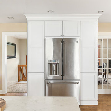
This busy young family entertains all the time and love cooking with friends in their kitchen. With 3 young boys in the house they needed room to soread out, work together and lots of addtional storage. We added 15" deep pantrys to both sides of the refrigerator. Adding the beverage area gave them room to all hang out together.
 7 Day Kitchens
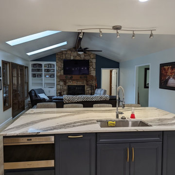
This charming family home in Belmont was in dire need of some tender loving care. The original builder-grade cabinetry and countertops were outdated and in need of an upgrade.
The kitchen was once isolated from the dining room and living room, making entertaining guests a real chore. Cooking in the kitchen meant being cut off from the rest of the household, leading to a disconnect during family time. So, we decided to make some sweeping changes.
The most transformative change was the removal of the load bearing wall separating the kitchen and living room. This created a spacious open-concept kitchen with a massive island, perfect for hosting and socializing. We upgraded the cabinets to reflect a contemporary aesthetic and added a stunning hood vent. The built-in hutch was replaced by a refrigerator and beverage center, providing ample storage space and more practical usage. The kitchen was also equipped with modern features such as roll-out trays, a trash can pull-out, spice racks, and utensil organizers. We replaced the older-style double door base cabinets with modern drawer bases for easy access, and increased the height of the cabinets from 30 inches to 36 inches, giving the kitchen a fresh, airy look and additional storage space.
The laundry room also received a makeover, with new cabinets above the washer and dryer and a tall linen/storage closet, making it more functional and storage-friendly. The small pantry closet was transformed into a sprawling 12 foot deep walk-in pantry with new shelves, cabinetry and lighting, providing ample space for all your pantry essentials. We also upgraded the flooring on the first floor with durable LVP flooring, elevating the overall aesthetic and feel of the home. All of these changes were completed in a mere 21 days, from start to finish.
 TKS Design Group
Download our free ebook, Creating the Ideal Kitchen. DOWNLOAD NOW
Lakefront property in the northwest suburbs of Chicago is hard to come by, so when we were hired by this young family with exactly that, we were immediately inspired by not just the unusually large footprint of this 1950’s colonial revival but also the lovely views of the manmade lake it was sited on. The large 5-bedroom home was solidly stuck in the 1980’s, but we saw tons of potential. We started out by updating the existing staircase with a fresh coat of paint and adding new herringbone slate to the entry hall.
The powder room off the entryway also got a refresh - new flooring, new cabinets and fixtures. We ran the new slate right through into this space for some consistency. A fun wallpaper and shiplap trim add a welcoming feel and set the tone for the home.
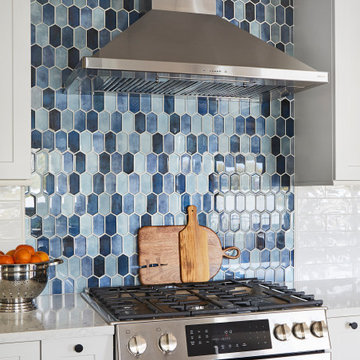
Next, we tackled the kitchen. Located away from the rest of the first floor, the kitchen felt a little isolated, so we immediately began planning for how to better connect it to the rest of the first floor. We landed on removing the wall between the kitchen and dining room and designed a modified galley style space with separate cooking and clean up zones. The cooking zone consists of the refrigerator, prep sink and cooktop, along with a nice long run of prep space at the island. The cleanup side of the kitchen consists of the main sink and dishwasher. Both areas are situated so that the user can view the lake during prep work and cleanup!
One of the home’s main puzzles was how to incorporate the mudroom and area in front of the patio doors at the back of the house. We already had a breakfast table area, so the space by the patio doors was a bit of a no man’s land. We decided to separate the kitchen proper from what became the new mudroom with a large set of barn doors. That way you can quickly hide any mudroom messes but have easy access to the light coming in through the patio doors as well as the outdoor grilling station. We also love the impact the barn doors add to the overall space.
The homeowners’ first words to us were “it’s time to ditch the brown,” so we did! We chose a lovely blue pallet that reflects the home’s location on the lake which is also vibrant yet easy on the eye. Countertops are white quartz, and the natural oak floor works well with the other honey accents. The breakfast table was given a refresh with new chairs, chandelier and window treatments that frame the gorgeous views of the lake out the back.
We coordinated the slate mudroom flooring with that used in the home’s main entrance for a consistent feel. The storage area consists of open and closed storage to allow for some clutter control as needed.
Next on our “to do” list was revamping the dated brown bar area in the neighboring dining room. We eliminated the clutter by adding some closed cabinets and did some easy updates to help the space feel more current. One snag we ran into here was the discovery of a beam above the existing open shelving that had to be modified with a smaller structural beam to allow for our new design to work. This was an unexpected surprise, but in the end we think it was well worth it!
We kept the colors here a bit more muted to blend with the homeowner’s existing furnishings. Open shelving and polished nickel hardware add some simple detail to the new entertainment zone which also looks out onto the lake!
Next we tackled the upstairs starting with the homeowner’s son’s bath. The bath originally had both a tub shower and a separate shower, so we decided to swap out the shower for a new laundry area. This freed up some space downstairs in what used to be the mudroom/laundry room and is much more convenient for daily laundry needs.
We continued the blue palette here with navy cabinetry and the navy tile in the shower. Porcelain floor tile and chrome fixtures keep maintenance to a minimum while matte black mirrors and lighting add some depth the design. A low maintenance runner adds some warmth underfoot and ties the whole space together.
We added a pocket door to the bathroom to minimize interference with the door swings. The left door of the laundry closet is on a 180 degree hinge to allow for easy full access to the machines. Next we tackled the master bath which is an en suite arrangement. The original was typical of the 1980’s with the vanity outside of the bathroom, situated near the master closet. And the brown theme continued here with multiple shades of brown.
Our first move was to segment off the bath and the closet from the master bedroom. We created a short hall from the bedroom to the bathroom with his and hers walk-in closets on the left and right as well as a separate toilet closet outside of the main bathroom for privacy and flexibility.
The original bathroom had a giant soaking tub with steps (dangerous!) as well as a small shower that did not work well for our homeowner who is 6’3”. With other bathtubs in the home, they decided to eliminate the tub and create an oversized shower which takes up the space where the old tub was located. The double vanity is on the opposite wall and a bench is located under the window for morning conversations and a place to set a couple of towels.
The pallet in here is light and airy with a mix of blond wood, creamy porcelain and marble tile, and brass accents. A simple roman shade adds some texture and it’s top-down mechanism allows for light and privacy.
This large whole house remodel gave our homeowners not only the ability to maximize the potential of their home but also created a lovely new frame from which to view their fabulous lake views.
Designed by: Susan Klimala, CKD, CBD
Photography by: Michael Kaskel
For more information on kitchen and bath design ideas go to: www.kitchenstudio-ge.com
Find the right local pro for your project
 Brooks + Scarpa Architects
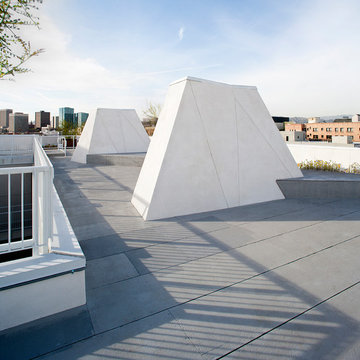
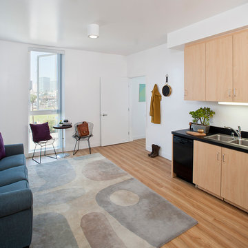
The SIX is a 52-unit affordable housing project provides a home, support services and rehabilitation for disabled veterans. It is located in the MacArthur Park area of Los Angeles. McArthur Park has one of the highest densities in the USA with over 38,000 people per square mile and a total population of 120,000 people in 2.72 square miles.
Offering shelter and comfort, the SIX breaks the prescriptive mold of the traditional shelter by creating public and private "zones" in which private space is deemphasized, in favor of large public areas. The organization of the space is intended to transform the way people live-away from a reclusive, isolating layout towards a community-oriented, interactive space.
The ground level contains offices, support spaces for the veterans, bike storage and parking while the second level has a large public courtyard. Surrounded by four levels of housing units with balconies wrapped with a wood screen made from recycle planking the courtyard has large openings with green roofs that visually connects the space to the street on the lower level beyond. This allows the tenants to enjoy a secured open space while still connecting to the larger community.
The uppermost level has a green roof, large public patio and edible garden with panoramic views of the area.
The SIX distinguishes itself from most conventionally developed projects in that it incorporates energy efficient measures that exceed standard practice, optimize building performance, and ensure reduced energy use during all phases of construction and occupancy. The planning and design emerged from close consideration and employment of passive design strategies. These strategies include: locating and orienting the building to control solar cooling loads; shaping and orienting the building for exposure to prevailing winds; shaping the building to induce buoyancy for natural ventilation; designing windows to maximize day lighting; shading south facing windows and minimizing west-facing glazing; designing windows to maximize natural ventilation; utilizing low flow fixtures and storm water management; shaping and planning the interior to enhance daylight and natural air flow distribution. These passive strategies alone make this building 50% more efficient than a conventionally designed structure.
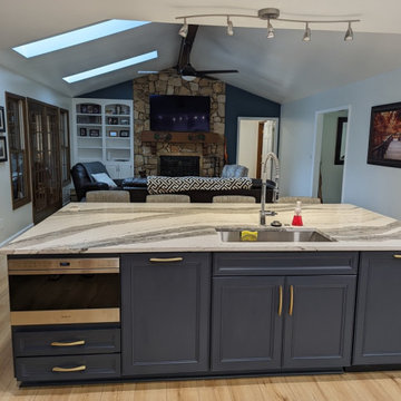 7 Day Kitchens
This charming family home in Belmont was in dire need of some tender loving care. The original builder-grade cabinetry and countertops were outdated and in need of an upgrade.
The kitchen was once isolated from the dining room and living room, making entertaining guests a real chore. Cooking in the kitchen meant being cut off from the rest of the household, leading to a disconnect during family time. So, we decided to make some sweeping changes.
The most transformative change was the removal of the load bearing wall separating the kitchen and living room. This created a spacious open-concept kitchen with a massive island, perfect for hosting and socializing. We upgraded the cabinets to reflect a contemporary aesthetic and added a stunning hood vent. The built-in hutch was replaced by a refrigerator and beverage center, providing ample storage space and more practical usage. The kitchen was also equipped with modern features such as roll-out trays, a trash can pull-out, spice racks, and utensil organizers. We replaced the older-style double door base cabinets with modern drawer bases for easy access, and increased the height of the cabinets from 30 inches to 36 inches, giving the kitchen a fresh, airy look and additional storage space.
The laundry room also received a makeover, with new cabinets above the washer and dryer and a tall linen/storage closet, making it more functional and storage-friendly. The small pantry closet was transformed into a sprawling 12 foot deep walk-in pantry with new shelves, cabinetry and lighting, providing ample space for all your pantry essentials. We also upgraded the flooring on the first floor with durable LVP flooring, elevating the overall aesthetic and feel of the home. All of these changes were completed in a mere 21 days, from start to finish.
 Brooks + Scarpa Architects
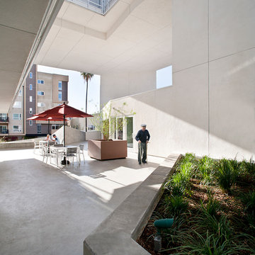
The SIX is a 52-unit affordable housing project provides a home, support services and rehabilitation for disabled veterans. It is located in the MacArthur Park area of Los Angeles. McArthur Park has one of the highest densities in the USA with over 38,000 people per square mile and a total population of 120,000 people in 2.72 square miles.
Offering shelter and comfort, the SIX breaks the prescriptive mold of the traditional shelter by creating public and private "zones" in which private space is deemphasized, in favor of large public areas. The organization of the space is intended to transform the way people live-away from a reclusive, isolating layout towards a community-oriented, interactive space.
The ground level contains offices, support spaces for the veterans, bike storage and parking while the second level has a large public courtyard. Surrounded by four levels of housing units with balconies wrapped with a wood screen made from recycle planking the courtyard has large openings with green roofs that visually connects the space to the street on the lower level beyond. This allows the tenants to enjoy a secured open space while still connecting to the larger community.
The uppermost level has a green roof, large public patio and edible garden with panoramic views of the area.
The SIX distinguishes itself from most conventionally developed projects in that it incorporates energy efficient measures that exceed standard practice, optimize building performance, and ensure reduced energy use during all phases of construction and occupancy. The planning and design emerged from close consideration and employment of passive design strategies. These strategies include: locating and orienting the building to control solar cooling loads; shaping and orienting the building for exposure to prevailing winds; shaping the building to induce buoyancy for natural ventilation; designing windows to maximize day lighting; shading south facing windows and minimizing west-facing glazing; designing windows to maximize natural ventilation; utilizing low flow fixtures and storm water management; shaping and planning the interior to enhance daylight and natural air flow distribution. These passive strategies alone make this building 50% more efficient than a conventionally designed structure.
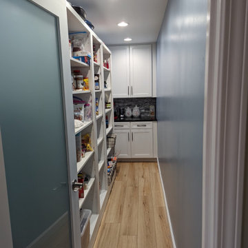 7 Day Kitchens
This charming family home in Belmont was in dire need of some tender loving care. The original builder-grade cabinetry and countertops were outdated and in need of an upgrade.
The kitchen was once isolated from the dining room and living room, making entertaining guests a real chore. Cooking in the kitchen meant being cut off from the rest of the household, leading to a disconnect during family time. So, we decided to make some sweeping changes.
The most transformative change was the removal of the load bearing wall separating the kitchen and living room. This created a spacious open-concept kitchen with a massive island, perfect for hosting and socializing. We upgraded the cabinets to reflect a contemporary aesthetic and added a stunning hood vent. The built-in hutch was replaced by a refrigerator and beverage center, providing ample storage space and more practical usage. The kitchen was also equipped with modern features such as roll-out trays, a trash can pull-out, spice racks, and utensil organizers. We replaced the older-style double door base cabinets with modern drawer bases for easy access, and increased the height of the cabinets from 30 inches to 36 inches, giving the kitchen a fresh, airy look and additional storage space.
The laundry room also received a makeover, with new cabinets above the washer and dryer and a tall linen/storage closet, making it more functional and storage-friendly. The small pantry closet was transformed into a sprawling 12 foot deep walk-in pantry with new shelves, cabinetry and lighting, providing ample space for all your pantry essentials. We also upgraded the flooring on the first floor with durable LVP flooring, elevating the overall aesthetic and feel of the home. All of these changes were completed in a mere 21 days, from start to finish.
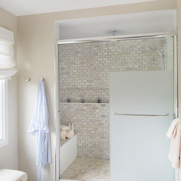 TKS Design Group
Download our free ebook, Creating the Ideal Kitchen. DOWNLOAD NOW
Lakefront property in the northwest suburbs of Chicago is hard to come by, so when we were hired by this young family with exactly that, we were immediately inspired by not just the unusually large footprint of this 1950’s colonial revival but also the lovely views of the manmade lake it was sited on. The large 5-bedroom home was solidly stuck in the 1980’s, but we saw tons of potential. We started out by updating the existing staircase with a fresh coat of paint and adding new herringbone slate to the entry hall.
The powder room off the entryway also got a refresh - new flooring, new cabinets and fixtures. We ran the new slate right through into this space for some consistency. A fun wallpaper and shiplap trim add a welcoming feel and set the tone for the home.
Next, we tackled the kitchen. Located away from the rest of the first floor, the kitchen felt a little isolated, so we immediately began planning for how to better connect it to the rest of the first floor. We landed on removing the wall between the kitchen and dining room and designed a modified galley style space with separate cooking and clean up zones. The cooking zone consists of the refrigerator, prep sink and cooktop, along with a nice long run of prep space at the island. The cleanup side of the kitchen consists of the main sink and dishwasher. Both areas are situated so that the user can view the lake during prep work and cleanup!
One of the home’s main puzzles was how to incorporate the mudroom and area in front of the patio doors at the back of the house. We already had a breakfast table area, so the space by the patio doors was a bit of a no man’s land. We decided to separate the kitchen proper from what became the new mudroom with a large set of barn doors. That way you can quickly hide any mudroom messes but have easy access to the light coming in through the patio doors as well as the outdoor grilling station. We also love the impact the barn doors add to the overall space.
The homeowners’ first words to us were “it’s time to ditch the brown,” so we did! We chose a lovely blue pallet that reflects the home’s location on the lake which is also vibrant yet easy on the eye. Countertops are white quartz, and the natural oak floor works well with the other honey accents. The breakfast table was given a refresh with new chairs, chandelier and window treatments that frame the gorgeous views of the lake out the back.
We coordinated the slate mudroom flooring with that used in the home’s main entrance for a consistent feel. The storage area consists of open and closed storage to allow for some clutter control as needed.
Next on our “to do” list was revamping the dated brown bar area in the neighboring dining room. We eliminated the clutter by adding some closed cabinets and did some easy updates to help the space feel more current. One snag we ran into here was the discovery of a beam above the existing open shelving that had to be modified with a smaller structural beam to allow for our new design to work. This was an unexpected surprise, but in the end we think it was well worth it!
We kept the colors here a bit more muted to blend with the homeowner’s existing furnishings. Open shelving and polished nickel hardware add some simple detail to the new entertainment zone which also looks out onto the lake!
Next we tackled the upstairs starting with the homeowner’s son’s bath. The bath originally had both a tub shower and a separate shower, so we decided to swap out the shower for a new laundry area. This freed up some space downstairs in what used to be the mudroom/laundry room and is much more convenient for daily laundry needs.
We continued the blue palette here with navy cabinetry and the navy tile in the shower. Porcelain floor tile and chrome fixtures keep maintenance to a minimum while matte black mirrors and lighting add some depth the design. A low maintenance runner adds some warmth underfoot and ties the whole space together.
We added a pocket door to the bathroom to minimize interference with the door swings. The left door of the laundry closet is on a 180 degree hinge to allow for easy full access to the machines. Next we tackled the master bath which is an en suite arrangement. The original was typical of the 1980’s with the vanity outside of the bathroom, situated near the master closet. And the brown theme continued here with multiple shades of brown.
Our first move was to segment off the bath and the closet from the master bedroom. We created a short hall from the bedroom to the bathroom with his and hers walk-in closets on the left and right as well as a separate toilet closet outside of the main bathroom for privacy and flexibility.
The original bathroom had a giant soaking tub with steps (dangerous!) as well as a small shower that did not work well for our homeowner who is 6’3”. With other bathtubs in the home, they decided to eliminate the tub and create an oversized shower which takes up the space where the old tub was located. The double vanity is on the opposite wall and a bench is located under the window for morning conversations and a place to set a couple of towels.
The pallet in here is light and airy with a mix of blond wood, creamy porcelain and marble tile, and brass accents. A simple roman shade adds some texture and it’s top-down mechanism allows for light and privacy.
This large whole house remodel gave our homeowners not only the ability to maximize the potential of their home but also created a lovely new frame from which to view their fabulous lake views.
Designed by: Susan Klimala, CKD, CBD
Photography by: Michael Kaskel
For more information on kitchen and bath design ideas go to: www.kitchenstudio-ge.com
 Brooks + Scarpa Architects
The SIX is a 52-unit affordable housing project provides a home, support services and rehabilitation for disabled veterans. It is located in the MacArthur Park area of Los Angeles. McArthur Park has one of the highest densities in the USA with over 38,000 people per square mile and a total population of 120,000 people in 2.72 square miles.
Offering shelter and comfort, the SIX breaks the prescriptive mold of the traditional shelter by creating public and private "zones" in which private space is deemphasized, in favor of large public areas. The organization of the space is intended to transform the way people live-away from a reclusive, isolating layout towards a community-oriented, interactive space.
The ground level contains offices, support spaces for the veterans, bike storage and parking while the second level has a large public courtyard. Surrounded by four levels of housing units with balconies wrapped with a wood screen made from recycle planking the courtyard has large openings with green roofs that visually connects the space to the street on the lower level beyond. This allows the tenants to enjoy a secured open space while still connecting to the larger community.
The uppermost level has a green roof, large public patio and edible garden with panoramic views of the area.
The SIX distinguishes itself from most conventionally developed projects in that it incorporates energy efficient measures that exceed standard practice, optimize building performance, and ensure reduced energy use during all phases of construction and occupancy. The planning and design emerged from close consideration and employment of passive design strategies. These strategies include: locating and orienting the building to control solar cooling loads; shaping and orienting the building for exposure to prevailing winds; shaping the building to induce buoyancy for natural ventilation; designing windows to maximize day lighting; shading south facing windows and minimizing west-facing glazing; designing windows to maximize natural ventilation; utilizing low flow fixtures and storm water management; shaping and planning the interior to enhance daylight and natural air flow distribution. These passive strategies alone make this building 50% more efficient than a conventionally designed structure.
 7 Day Kitchens
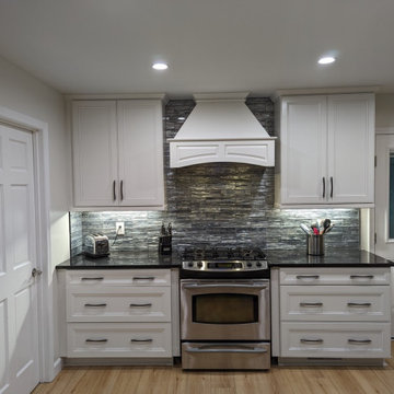
This charming family home in Belmont was in dire need of some tender loving care. The original builder-grade cabinetry and countertops were outdated and in need of an upgrade.
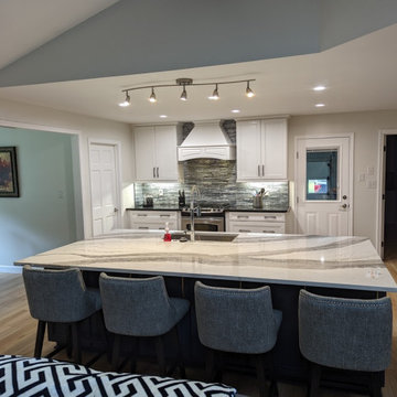
The kitchen was once isolated from the dining room and living room, making entertaining guests a real chore. Cooking in the kitchen meant being cut off from the rest of the household, leading to a disconnect during family time. So, we decided to make some sweeping changes.
The most transformative change was the removal of the load bearing wall separating the kitchen and living room. This created a spacious open-concept kitchen with a massive island, perfect for hosting and socializing. We upgraded the cabinets to reflect a contemporary aesthetic and added a stunning hood vent. The built-in hutch was replaced by a refrigerator and beverage center, providing ample storage space and more practical usage. The kitchen was also equipped with modern features such as roll-out trays, a trash can pull-out, spice racks, and utensil organizers. We replaced the older-style double door base cabinets with modern drawer bases for easy access, and increased the height of the cabinets from 30 inches to 36 inches, giving the kitchen a fresh, airy look and additional storage space.
The laundry room also received a makeover, with new cabinets above the washer and dryer and a tall linen/storage closet, making it more functional and storage-friendly. The small pantry closet was transformed into a sprawling 12 foot deep walk-in pantry with new shelves, cabinetry and lighting, providing ample space for all your pantry essentials. We also upgraded the flooring on the first floor with durable LVP flooring, elevating the overall aesthetic and feel of the home. All of these changes were completed in a mere 21 days, from start to finish.
 7 Day Kitchens
This charming family home in Belmont was in dire need of some tender loving care. The original builder-grade cabinetry and countertops were outdated and in need of an upgrade.
The kitchen was once isolated from the dining room and living room, making entertaining guests a real chore. Cooking in the kitchen meant being cut off from the rest of the household, leading to a disconnect during family time. So, we decided to make some sweeping changes.
The most transformative change was the removal of the load bearing wall separating the kitchen and living room. This created a spacious open-concept kitchen with a massive island, perfect for hosting and socializing. We upgraded the cabinets to reflect a contemporary aesthetic and added a stunning hood vent. The built-in hutch was replaced by a refrigerator and beverage center, providing ample storage space and more practical usage. The kitchen was also equipped with modern features such as roll-out trays, a trash can pull-out, spice racks, and utensil organizers. We replaced the older-style double door base cabinets with modern drawer bases for easy access, and increased the height of the cabinets from 30 inches to 36 inches, giving the kitchen a fresh, airy look and additional storage space.
The laundry room also received a makeover, with new cabinets above the washer and dryer and a tall linen/storage closet, making it more functional and storage-friendly. The small pantry closet was transformed into a sprawling 12 foot deep walk-in pantry with new shelves, cabinetry and lighting, providing ample space for all your pantry essentials. We also upgraded the flooring on the first floor with durable LVP flooring, elevating the overall aesthetic and feel of the home. All of these changes were completed in a mere 21 days, from start to finish.
 Quitterie Chailley
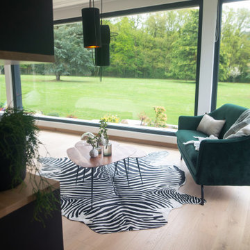
L’envie d’avoir une suite digne des grands hôtels tout en restant chez soi ! Voici la mission que nous ont confié nos clients. Leur souhait : un espace inédit, sur-mesure et fonctionnel.
L’architecte en charge de la création de l’extension et les clients nous ont donné carte blanche pour aménager son intérieur !
Nous avons donc pensé et créé ce nouvel espace comme une suite à l’hôtel, comprenant chambre, salle de bain, dressing, salon, sans oublier un coin bureau et un minibar ! Pas de cloison pour délimiter les espaces mais un meuble séparatif qui vient naturellement réunir et répartir les différentes fonctions de la suite. Placé au centre de la pièce, on circule autour de ce meuble qui comprend le dressing côté salle de bain, la tête de lit et l’espace bureau côté chambre et salon, sur les côtés le minibar et 2 portes coulissantes se dissimulent dans le meuble pour pouvoir isoler si on le souhaite l’espace dressing – salle de bain de l’espace chambre – salon. Dans la chambre un joli papier peint vient accentuer l’effet cocooning afin de bien délimiter le coin nuit du coin salon.
L’alliance du noir & du blanc, le choix des matériaux de qualité crée un style élégant, contemporain et intemporel à cette suite ; au sol le parquet réchauffe l’ambiance quant à la vue exceptionnelle sur le jardin elle fait rentrer la nature et les couleurs dans la suite et sublime l’ensemble.
 7 Day Kitchens
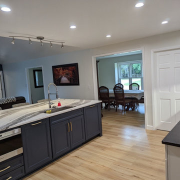
This charming family home in Belmont was in dire need of some tender loving care. The original builder-grade cabinetry and countertops were outdated and in need of an upgrade.
The kitchen was once isolated from the dining room and living room, making entertaining guests a real chore. Cooking in the kitchen meant being cut off from the rest of the household, leading to a disconnect during family time. So, we decided to make some sweeping changes.
The most transformative change was the removal of the load bearing wall separating the kitchen and living room. This created a spacious open-concept kitchen with a massive island, perfect for hosting and socializing. We upgraded the cabinets to reflect a contemporary aesthetic and added a stunning hood vent. The built-in hutch was replaced by a refrigerator and beverage center, providing ample storage space and more practical usage. The kitchen was also equipped with modern features such as roll-out trays, a trash can pull-out, spice racks, and utensil organizers. We replaced the older-style double door base cabinets with modern drawer bases for easy access, and increased the height of the cabinets from 30 inches to 36 inches, giving the kitchen a fresh, airy look and additional storage space.
The laundry room also received a makeover, with new cabinets above the washer and dryer and a tall linen/storage closet, making it more functional and storage-friendly. The small pantry closet was transformed into a sprawling 12 foot deep walk-in pantry with new shelves, cabinetry and lighting, providing ample space for all your pantry essentials. We also upgraded the flooring on the first floor with durable LVP flooring, elevating the overall aesthetic and feel of the home. All of these changes were completed in a mere 21 days, from start to finish.
 Quitterie Chailley
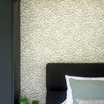
L’envie d’avoir une suite digne des grands hôtels tout en restant chez soi ! Voici la mission que nous ont confié nos clients. Leur souhait : un espace inédit, sur-mesure et fonctionnel.
L’architecte en charge de la création de l’extension et les clients nous ont donné carte blanche pour aménager son intérieur !
Nous avons donc pensé et créé ce nouvel espace comme une suite à l’hôtel, comprenant chambre, salle de bain, dressing, salon, sans oublier un coin bureau et un minibar ! Pas de cloison pour délimiter les espaces mais un meuble séparatif qui vient naturellement réunir et répartir les différentes fonctions de la suite. Placé au centre de la pièce, on circule autour de ce meuble qui comprend le dressing côté salle de bain, la tête de lit et l’espace bureau côté chambre et salon, sur les côtés le minibar et 2 portes coulissantes se dissimulent dans le meuble pour pouvoir isoler si on le souhaite l’espace dressing – salle de bain de l’espace chambre – salon. Dans la chambre un joli papier peint vient accentuer l’effet cocooning afin de bien délimiter le coin nuit du coin salon.
L’alliance du noir & du blanc, le choix des matériaux de qualité crée un style élégant, contemporain et intemporel à cette suite ; au sol le parquet réchauffe l’ambiance quant à la vue exceptionnelle sur le jardin elle fait rentrer la nature et les couleurs dans la suite et sublime l’ensemble.
 7 Day Kitchens
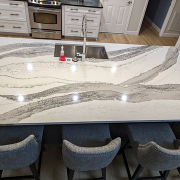
This charming family home in Belmont was in dire need of some tender loving care. The original builder-grade cabinetry and countertops were outdated and in need of an upgrade.
The kitchen was once isolated from the dining room and living room, making entertaining guests a real chore. Cooking in the kitchen meant being cut off from the rest of the household, leading to a disconnect during family time. So, we decided to make some sweeping changes.
The most transformative change was the removal of the load bearing wall separating the kitchen and living room. This created a spacious open-concept kitchen with a massive island, perfect for hosting and socializing. We upgraded the cabinets to reflect a contemporary aesthetic and added a stunning hood vent. The built-in hutch was replaced by a refrigerator and beverage center, providing ample storage space and more practical usage. The kitchen was also equipped with modern features such as roll-out trays, a trash can pull-out, spice racks, and utensil organizers. We replaced the older-style double door base cabinets with modern drawer bases for easy access, and increased the height of the cabinets from 30 inches to 36 inches, giving the kitchen a fresh, airy look and additional storage space.
The laundry room also received a makeover, with new cabinets above the washer and dryer and a tall linen/storage closet, making it more functional and storage-friendly. The small pantry closet was transformed into a sprawling 12 foot deep walk-in pantry with new shelves, cabinetry and lighting, providing ample space for all your pantry essentials. We also upgraded the flooring on the first floor with durable LVP flooring, elevating the overall aesthetic and feel of the home. All of these changes were completed in a mere 21 days, from start to finish.
 7 Day Kitchens
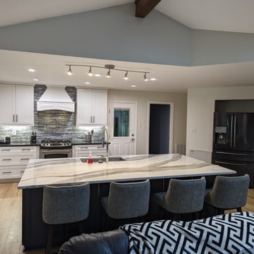
This charming family home in Belmont was in dire need of some tender loving care. The original builder-grade cabinetry and countertops were outdated and in need of an upgrade.
The kitchen was once isolated from the dining room and living room, making entertaining guests a real chore. Cooking in the kitchen meant being cut off from the rest of the household, leading to a disconnect during family time. So, we decided to make some sweeping changes.
The most transformative change was the removal of the load bearing wall separating the kitchen and living room. This created a spacious open-concept kitchen with a massive island, perfect for hosting and socializing. We upgraded the cabinets to reflect a contemporary aesthetic and added a stunning hood vent. The built-in hutch was replaced by a refrigerator and beverage center, providing ample storage space and more practical usage. The kitchen was also equipped with modern features such as roll-out trays, a trash can pull-out, spice racks, and utensil organizers. We replaced the older-style double door base cabinets with modern drawer bases for easy access, and increased the height of the cabinets from 30 inches to 36 inches, giving the kitchen a fresh, airy look and additional storage space.
The laundry room also received a makeover, with new cabinets above the washer and dryer and a tall linen/storage closet, making it more functional and storage-friendly. The small pantry closet was transformed into a sprawling 12 foot deep walk-in pantry with new shelves, cabinetry and lighting, providing ample space for all your pantry essentials. We also upgraded the flooring on the first floor with durable LVP flooring, elevating the overall aesthetic and feel of the home. All of these changes were completed in a mere 21 days, from start to finish.
 Brooks + Scarpa Architects
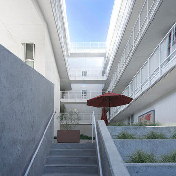
The SIX is a 52-unit affordable housing project provides a home, support services and rehabilitation for disabled veterans. It is located in the MacArthur Park area of Los Angeles. McArthur Park has one of the highest densities in the USA with over 38,000 people per square mile and a total population of 120,000 people in 2.72 square miles.
Offering shelter and comfort, the SIX breaks the prescriptive mold of the traditional shelter by creating public and private "zones" in which private space is deemphasized, in favor of large public areas. The organization of the space is intended to transform the way people live-away from a reclusive, isolating layout towards a community-oriented, interactive space.
The ground level contains offices, support spaces for the veterans, bike storage and parking while the second level has a large public courtyard. Surrounded by four levels of housing units with balconies wrapped with a wood screen made from recycle planking the courtyard has large openings with green roofs that visually connects the space to the street on the lower level beyond. This allows the tenants to enjoy a secured open space while still connecting to the larger community.
The uppermost level has a green roof, large public patio and edible garden with panoramic views of the area.
The SIX distinguishes itself from most conventionally developed projects in that it incorporates energy efficient measures that exceed standard practice, optimize building performance, and ensure reduced energy use during all phases of construction and occupancy. The planning and design emerged from close consideration and employment of passive design strategies. These strategies include: locating and orienting the building to control solar cooling loads; shaping and orienting the building for exposure to prevailing winds; shaping the building to induce buoyancy for natural ventilation; designing windows to maximize day lighting; shading south facing windows and minimizing west-facing glazing; designing windows to maximize natural ventilation; utilizing low flow fixtures and storm water management; shaping and planning the interior to enhance daylight and natural air flow distribution. These passive strategies alone make this building 50% more efficient than a conventionally designed structure.
 Brooks + Scarpa Architects
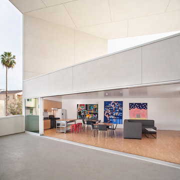
The SIX is a 52-unit affordable housing project provides a home, support services and rehabilitation for disabled veterans. It is located in the MacArthur Park area of Los Angeles. McArthur Park has one of the highest densities in the USA with over 38,000 people per square mile and a total population of 120,000 people in 2.72 square miles.
Offering shelter and comfort, the SIX breaks the prescriptive mold of the traditional shelter by creating public and private "zones" in which private space is deemphasized, in favor of large public areas. The organization of the space is intended to transform the way people live-away from a reclusive, isolating layout towards a community-oriented, interactive space.
The ground level contains offices, support spaces for the veterans, bike storage and parking while the second level has a large public courtyard. Surrounded by four levels of housing units with balconies wrapped with a wood screen made from recycle planking the courtyard has large openings with green roofs that visually connects the space to the street on the lower level beyond. This allows the tenants to enjoy a secured open space while still connecting to the larger community.
The uppermost level has a green roof, large public patio and edible garden with panoramic views of the area.
The SIX distinguishes itself from most conventionally developed projects in that it incorporates energy efficient measures that exceed standard practice, optimize building performance, and ensure reduced energy use during all phases of construction and occupancy. The planning and design emerged from close consideration and employment of passive design strategies. These strategies include: locating and orienting the building to control solar cooling loads; shaping and orienting the building for exposure to prevailing winds; shaping the building to induce buoyancy for natural ventilation; designing windows to maximize day lighting; shading south facing windows and minimizing west-facing glazing; designing windows to maximize natural ventilation; utilizing low flow fixtures and storm water management; shaping and planning the interior to enhance daylight and natural air flow distribution. These passive strategies alone make this building 50% more efficient than a conventionally designed structure.
 7 Day Kitchens
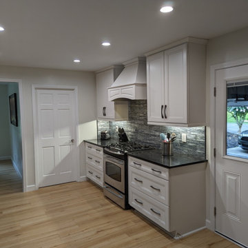
This charming family home in Belmont was in dire need of some tender loving care. The original builder-grade cabinetry and countertops were outdated and in need of an upgrade.
The kitchen was once isolated from the dining room and living room, making entertaining guests a real chore. Cooking in the kitchen meant being cut off from the rest of the household, leading to a disconnect during family time. So, we decided to make some sweeping changes.
The most transformative change was the removal of the load bearing wall separating the kitchen and living room. This created a spacious open-concept kitchen with a massive island, perfect for hosting and socializing. We upgraded the cabinets to reflect a contemporary aesthetic and added a stunning hood vent. The built-in hutch was replaced by a refrigerator and beverage center, providing ample storage space and more practical usage. The kitchen was also equipped with modern features such as roll-out trays, a trash can pull-out, spice racks, and utensil organizers. We replaced the older-style double door base cabinets with modern drawer bases for easy access, and increased the height of the cabinets from 30 inches to 36 inches, giving the kitchen a fresh, airy look and additional storage space.
The laundry room also received a makeover, with new cabinets above the washer and dryer and a tall linen/storage closet, making it more functional and storage-friendly. The small pantry closet was transformed into a sprawling 12 foot deep walk-in pantry with new shelves, cabinetry and lighting, providing ample space for all your pantry essentials. We also upgraded the flooring on the first floor with durable LVP flooring, elevating the overall aesthetic and feel of the home. All of these changes were completed in a mere 21 days, from start to finish.
 Michael Nash Design, Build & Homes
2011 CAPITAL COTY AWARD HONORABLE MENTION AWARD WINNER
Built circa 1980, a young couple with three children originally purchased this home for their growing family. After four years of karate, soccer, piano and other activities, however, the home was becoming too small to meet their needs.
Problems started upon entering the front foyer. A 25-foot long dark hallway separated the family room and the kitchen, ending in a tiny powder room stuck in the middle of the layout. The kitchen was especially isolated, a cramped L-shaped design with a box bay breakfast bump out that was literally falling apart.
The new design started with the core of the problem—the maze and separation created by the long hallways.
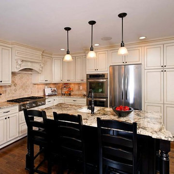
First, the 25’ load bearing wall separating the foyer from family room was totally taken out and replaced with a long supporting beam. A French door replaced a small door and window leading to a screen porch . This action allowed lots of light to get into family and foyer. Then, the powder room was removed and the partition wall between the kitchen and family room was taken down. This created a large open concept design and greatly increased the size of the kitchen.
The box bay was demolished and replaced with new walls and a large window. The plumbing for main sink and dishwasher got relocated into this box bay allowing a total transformation of the space. Now there are cabinets and counters on all sides.
The doorway to the dining room was reconfigured to allow a butler area on its left. While the right side was occupied with new 36” gas range top with a decorative wood hood above it. The refrigerator, microwave/oven and pantries—the space’s tall elements—occupy one wall..
A large Island with a prep sink and beverage center for the kids occupies the center of the layout. Capable of seating up to four, family and friends can now keep the cook company. A large built-in desk area lets the kids do their homework so the parents can supervise while they prepare meals.
Light cabinetry with a touch of caramel glazing and exotic granite countertops by our designers contributed to this kitchen’s elegant design. The contrasting distressed island’s darker finish matches the dinette set and other furnishings.
New hardwood floors were installed throughout the first floor for a seamless look, while recess, pendant and task lighting make the space even brighter. Importantly, there’s plenty of space for parents and kids to hang out together. The kitchen is truly the heart of their home.
101