
Search results for "Issue locations" in Home Design Ideas

 Truitt and White Window and Door Showroom
This hillside home in Piedmont, CA was remodeled to change the style from a 1940's rancher with eight foot ceilings and dark interiors, into a modern geometric composition with vast white interiors for casual living and generous daylighting for displaying the artist-owner's works.
In a city known for rigorous and difficult design review, an addition, two variances, and a full stylistic change were unanimously approved on the first round. All sloped roofs and attics were eliminated and replaced by a series of stacked and overlapping flat roofs. This made the house taller on the inside and shorter on the outside, which helped earn design review cooperation in the community. Windows were concentrated toward the rear yard views or moved up high on the side walls for daylight and privacy, benefitting the owners as well as the neighbors.
At the start, the owner husband was so enthusiastic and engaged in transforming his house into something modern that he presented the architect with a scaled foamcore model, rather than the usual magazine clippings and wish list. He participated in the design decisions throughout the process. The owner wife is the artist who did all the artwork in the house. She had been craving a display space with large walls and good natural light. Both of them loved the location and great views.
The project was an opportunity to transform the style of an older traditional home into a modern one, while solving numerous problems. By rebuilding the 1800 ft2 top of the 3-story home it was possible to change the style of the whole building, since the lower floors were a neutral base, and also to change the lifestyle of the owners, who wanted to move their master suite upstairs and live primarily on the top floor as empty nesters.
Going into the project, the architect knew there were multiple encroachments into the setbacks and potential privacy issues with close by neighbors. He approached this as a complex puzzle made up of architectural and political pieces which all had to fit together elegantly. It took many careful moves, small and large, to arrive at a serene and cohesive result that tied old and new together seamlessly.
The design-build contractor worked closely with the owners and handled all of the construction phase documents and design adjustments, adding ideas of their own to make the project really sing.
The project was a collaboration in three acts. The owner had a strong design concept from the start. The architect developed it into a realistic project and garnered the design approvals. Then the contractor executed brilliantly
 Truitt and White Window and Door Showroom
This hillside home in Piedmont, CA was remodeled to change the style from a 1940's rancher with eight foot ceilings and dark interiors, into a modern geometric composition with vast white interiors for casual living and generous daylighting for displaying the artist-owner's works.
In a city known for rigorous and difficult design review, an addition, two variances, and a full stylistic change were unanimously approved on the first round. All sloped roofs and attics were eliminated and replaced by a series of stacked and overlapping flat roofs. This made the house taller on the inside and shorter on the outside, which helped earn design review cooperation in the community. Windows were concentrated toward the rear yard views or moved up high on the side walls for daylight and privacy, benefitting the owners as well as the neighbors.
At the start, the owner husband was so enthusiastic and engaged in transforming his house into something modern that he presented the architect with a scaled foamcore model, rather than the usual magazine clippings and wish list. He participated in the design decisions throughout the process. The owner wife is the artist who did all the artwork in the house. She had been craving a display space with large walls and good natural light. Both of them loved the location and great views.
The project was an opportunity to transform the style of an older traditional home into a modern one, while solving numerous problems. By rebuilding the 1800 ft2 top of the 3-story home it was possible to change the style of the whole building, since the lower floors were a neutral base, and also to change the lifestyle of the owners, who wanted to move their master suite upstairs and live primarily on the top floor as empty nesters.
Going into the project, the architect knew there were multiple encroachments into the setbacks and potential privacy issues with close by neighbors. He approached this as a complex puzzle made up of architectural and political pieces which all had to fit together elegantly. It took many careful moves, small and large, to arrive at a serene and cohesive result that tied old and new together seamlessly.
The design-build contractor worked closely with the owners and handled all of the construction phase documents and design adjustments, adding ideas of their own to make the project really sing.
The project was a collaboration in three acts. The owner had a strong design concept from the start. The architect developed it into a realistic project and garnered the design approvals. Then the contractor executed brilliantly

 User
UserThis hillside home in Piedmont, CA was remodeled to change the style from a 1940's rancher with eight foot ceilings and dark interiors, into a modern geometric composition with vast white interiors for casual living and generous daylighting for displaying the artist-owner's works.
In a city known for rigorous and difficult design review, an addition, two variances, and a full stylistic change were unanimously approved on the first round. All sloped roofs and attics were eliminated and replaced by a series of stacked and overlapping flat roofs. This made the house taller on the inside and shorter on the outside, which helped earn design review cooperation in the community. Windows were concentrated toward the rear yard views or moved up high on the side walls for daylight and privacy, benefitting the owners as well as the neighbors.
At the start, the owner husband was so enthusiastic and engaged in transforming his house into something modern that he presented the architect with a scaled foamcore model, rather than the usual magazine clippings and wish list. He participated in the design decisions throughout the process. The owner wife is the artist who did all the artwork in the house. She had been craving a display space with large walls and good natural light. Both of them loved the location and great views.
The project was an opportunity to transform the style of an older traditional home into a modern one, while solving numerous problems. By rebuilding the 1800 ft2 top of the 3-story home it was possible to change the style of the whole building, since the lower floors were a neutral base, and also to change the lifestyle of the owners, who wanted to move their master suite upstairs and live primarily on the top floor as empty nesters.
Going into the project, the architect knew there were multiple encroachments into the setbacks and potential privacy issues with close by neighbors. He approached this as a complex puzzle made up of architectural and political pieces which all had to fit together elegantly. It took many careful moves, small and large, to arrive at a serene and cohesive result that tied old and new together seamlessly.
The design-build contractor worked closely with the owners and handled all of the construction phase documents and design adjustments, adding ideas of their own to make the project really sing.
The project was a collaboration in three acts. The owner had a strong design concept from the start. The architect developed it into a realistic project and garnered the design approvals. Then the contractor executed brilliantly.
Find the right local pro for your project
 User
UserThis hillside home in Piedmont, CA was remodeled to change the style from a 1940's rancher with eight foot ceilings and dark interiors, into a modern geometric composition with vast white interiors for casual living and generous daylighting for displaying the artist-owner's works.
In a city known for rigorous and difficult design review, an addition, two variances, and a full stylistic change were unanimously approved on the first round. All sloped roofs and attics were eliminated and replaced by a series of stacked and overlapping flat roofs. This made the house taller on the inside and shorter on the outside, which helped earn design review cooperation in the community. Windows were concentrated toward the rear yard views or moved up high on the side walls for daylight and privacy, benefitting the owners as well as the neighbors.
At the start, the owner husband was so enthusiastic and engaged in transforming his house into something modern that he presented the architect with a scaled foamcore model, rather than the usual magazine clippings and wish list. He participated in the design decisions throughout the process. The owner wife is the artist who did all the artwork in the house. She had been craving a display space with large walls and good natural light. Both of them loved the location and great views.
The project was an opportunity to transform the style of an older traditional home into a modern one, while solving numerous problems. By rebuilding the 1800 ft2 top of the 3-story home it was possible to change the style of the whole building, since the lower floors were a neutral base, and also to change the lifestyle of the owners, who wanted to move their master suite upstairs and live primarily on the top floor as empty nesters.
Going into the project, the architect knew there were multiple encroachments into the setbacks and potential privacy issues with close by neighbors. He approached this as a complex puzzle made up of architectural and political pieces which all had to fit together elegantly. It took many careful moves, small and large, to arrive at a serene and cohesive result that tied old and new together seamlessly.
The design-build contractor worked closely with the owners and handled all of the construction phase documents and design adjustments, adding ideas of their own to make the project really sing.
The project was a collaboration in three acts. The owner had a strong design concept from the start. The architect developed it into a realistic project and garnered the design approvals. Then the contractor executed brilliantly.

 HU-884212062
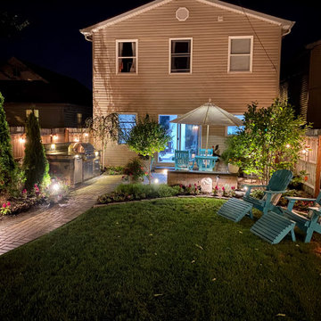
Our client recently purchased a newly-constructed home in order to downsize and have a low- maintenance home and yard. The existing side yard/back yard was undeveloped by the builder, leaving the homeowner with the huge challenge of creating a great outdoor entertaining space for family and friends, while creating privacy and overcoming the over 8-foot steep drop from the existing back porch down to the alley.
The grade was the largest challenge because the space was so narrow with such a large fall from existing porch to the property line. The second largest challenge is that this residence is located in a semi-private community where HOA approval of plans and materials is difficult, as all the residences here share a similar look and feel with a very clean and contemporary aesthetic.
We had to precisely shoot grades to know what kinds of retaining walls would need to be constructed along with how much backfill soil and dirt movement would need to be done. After that the design had to carefully consider the space with maximum functionality for outdoor entertainment with newly constructed walls to ensure it would last for many years to come. All of this was done with multiple meetings with the homeowners who are a retired engineer and active architect themselves. Once a design was settled upon, then submission to the HOA board of approval had to be completed and signed off on with all questions and concerns answered for the community by-laws.
The two biggest difficulties within the construction phase were that the neighbor next to the back yard had a large retaining wall not properly backfilled up to the property line. That neighbor wouldn’t allow us proper access and control to help alleviate the issues, so we had to skillfully work around this to ensure what we constructed would last, despite their property not being properly addressed. We also had to go through multiple shipments from the manufacturer due to large variances in the material’s appearance on the steps and another shipment that was broken during shipping. These two things delayed the project we were working to complete before the spring so the homeowner could have the maximum use of the space this year.
Topping off this challenging construction was a beautiful palette of native grasses, rosemary, groundcover, granite walkways, and synthetic grass to ensure year-round, practically effortless beauty.

 Edgewater Design Group
As written in Northern Home & Cottage by Elizabeth Edwards
Sara and Paul Matthews call their head-turning home, located in a sweet neighborhood just up the hill from downtown Petoskey, “a very human story.” Indeed it is. Sara and her husband, Paul, have a special-needs son as well as an energetic middle-school daughter. This home has an answer for everyone. Located down the street from the school, it is ideally situated for their daughter and a self-contained apartment off the great room accommodates all their son’s needs while giving his caretakers privacy—and the family theirs. The Matthews began the building process by taking their thoughts and
needs to Stephanie Baldwin and her team at Edgewater Design Group. Beyond the above considerations, they wanted their new home to be low maintenance and to stand out architecturally, “But not so much that anyone would complain that it didn’t work in our neighborhood,” says Sara. “We
were thrilled that Edgewater listened to us and were able to give us a unique-looking house that is meeting all our needs.” Lombardy LLC built this handsome home with Paul working alongside the construction crew throughout the project. The low maintenance exterior is a cutting-edge blend of stacked stone, black corrugated steel, black framed windows and Douglas fir soffits—elements that add up to an organic contemporary look. The use of black steel, including interior beams and the staircase system, lend an industrial vibe that is courtesy of the Matthews’ friend Dan Mello of Trimet Industries in Traverse City. The couple first met Dan, a metal fabricator, a number of years ago, right around the time they found out that their then two-year-old son would never be able to walk. After the couple explained to Dan that they couldn’t find a solution for a child who wasn’t big enough for a wheelchair, he designed a comfortable, rolling chair that was just perfect. They still use it. The couple’s gratitude for the chair resulted in a trusting relationship with Dan, so it was natural for them to welcome his talents into their home-building process. A maple floor finished to bring out all of its color-tones envelops the room in warmth. Alder doors and trim and a Doug fir ceiling reflect that warmth. Clearstory windows and floor-to-ceiling window banks fill the space with light—and with views of the spacious grounds that will
become a canvas for Paul, a retired landscaper. The couple’s vibrant art pieces play off against modernist furniture and lighting that is due to an inspired collaboration between Sara and interior designer Kelly Paulsen. “She was absolutely instrumental to the project,” Sara says. “I went through
two designers before I finally found Kelly.” The open clean-lined kitchen, butler’s pantry outfitted with a beverage center and Miele coffee machine (that allows guests to wait on themselves when Sara is cooking), and an outdoor room that centers around a wood-burning fireplace, all make for easy,
fabulous entertaining. A den just off the great room houses the big-screen television and Sara’s loom—
making for relaxing evenings of weaving, game watching and togetherness. Tourgoers will leave understanding that this house is everything great design should be. Form following function—and solving very human issues with soul-soothing style.

 RAJ Kitchen and Bath, LLC
This family throws some mean parties where large crowds usually sit at the poolside. There’s an entire section of this walk out second level that is dedicated to entertaining which also gives access to the pool in the backyard. This place comes alive at night with built in surround sounds and LED lights. There was just one issue. The kitchen.
The kitchen did not fit in. It was old, outdated, out-styled and nonfunctional. They knew the kitchen had to be address eventually but they just didn’t want to redo the kitchen. They wanted to revamp the kitchen, so they asked us to come in and look at the space to see how we can design this second floor kitchen in their New Rochelle home.
It was a small kitchen, strategically located where it could be the hub that the family wanted it to be. It held its own amongst everything that was in the open space like the big screen TV, fireplace and pool table. That is exactly what we did in the design and here is how we did it.
First, we got rid of the kitchen table and by doing so we created a peninsular. This eventually sets up the space for a couple of really cool pendant lights, some unique counter chairs and a wine cooler that was purchased before but never really had a home. We then turned our attention to the range and hood. This was not the main kitchen, so wall storage wasn’t the main goal here. We wanted to create a more open feel interaction while in the kitchen, hence we designed the free standing chimney hood alone to the left of the window.
We then looked at how we can make it more entertaining. We did that by adding a Wine rack on a buffet style type area. This wall was free and would have remained empty had we not find a way to add some more glitz.
Finally came the counter-top. Every detail was crucial because the view of the kitchen can be seen from when you enter the front door even if it was on the second floor walk out. The use of the space called for a waterfall edge counter-top and more importantly, the stone selection to further accentuate the effect. It was crucial that there was movement in the stone which connects to the 45 degree waterfall edge so it would be very dramatic.
Nothing was overlooked in this space. It had to be done this way if it was going to have a fighting chance to take command of its territory.
Have a look at some before and after photos on the left and see a brief video transformation of this lovely small kitchen.
See more photos and vidoe of this transformation on our website @ http://www.rajkitchenandbath.com/portfolio-items/kitchen-remodel-new-rochelle-ny-10801/

 User
UserOur client and her sister own a condo in Florida and although her sister lives there full-time, our client only comes to Florida for the winter and utilizes the guest room and a separate bathroom as her own. At the time, enthusiastic to be in Florida she went all out in decorating in the old Florida style with a green and yellow tropical feel including a plethora of palm trees (see before picture). All the furniture had to be from Tommy Bahama and even the light fixtures had a tropical theme.
Fast forward to 2015 and our client was tired and bored in these surroundings and said to me, “what was I thinking!” She didn’t have the budget to change everything and I assured her that we could update her bedroom keeping the existing furniture. One of her previous decorating problems was the tiny window over the bed which she had covered by adding a faux canopy. Unfortunately, the fabric was thin and the window showed through. I tried to persuade her that a solution for the window issue could be a large painting over the bed but she wasn’t keen so we agreed to refresh the canopy with a more modern look.
We started with fresh silvery-grey paint and glossy white trim. Using subtle greeny-blue bedding from Eastern Accents we extracted a simple palette and mixed in several patterns including a classic Greek key. There are geometrics in the pillows and a floral in the custom cornice and draperies and we found a fabric from the same color palette for the drapery behind the bed from Kravet. It has a beautiful sheen which reflects light and is heavily lined to cover the window. Our project manager added the wood trim to the cornice board.
The modern chair is upholstered in a sea green herringbone while the table has an interesting story; my client loved the shape of the table but it was originally finished completely in gold leaf. Part of our update was to change everything metal such as door knobs and drapery hardware to chrome so our project manager offered to re-finish the table in silver leaf. Along the way we had a hiccup in the communication… she asked if the top was glass and was told it was but we didn’t realize that she hadn’t unpacked it so didn’t see the gold rim. On installation day we were surprised to see the gold rim against the silver legs! Happily, it was a really good error as the painting behind the chair has both gold and silver leaf and our error looks as though it were meant to be.
We finished with turquoise blown glass lamps, several pieces of art, and a large floor mirror (not in photo). The client asked if she could choose some pretty accessories at local art fairs and one painting is by her artist brother-in-law.
This project was very enjoyable as we were able to modernize the room with an updated coastal palette while at the same time utilizing existing furniture.
Photographer: Rolando Diaz

 Advance Design Studio, Ltd.
After six years of living in their Huntley IL home, Chris and Meghan were tired of their dark, dingy, outdated kitchen and it was finally time for a long-anticipated change. “The kitchen is the place where we live, it’s where we do everything,” Meghan said. “It was important that it be a space where we wanted to be.” Meghan loves cooking and enjoys including their girls in healthy meal prepping, this led them to want a brighter, more enjoyable kitchen with increased functionality and improved storage.
For Chris especially, the laundry room was an entirely dysfunctional eyesore. “We had a washer and a dryer, but it was all kind-of cobbled together!” Chris said. “There were always laundry piles everywhere, we weren’t really sure what we wanted to do in there, but it was time for us to make a change.” The mess of the space was stressful every time they walked in the door from the garage each day. Kids’ backpacks and shoes piled up haphazardly in the makeshift boot-bench closet left the family feeling disorganized and stressed. They needed space for folding clothes and locker cubbies to help keep the family organized.
Having known Christine and Todd in the Huntley community for years, Chris and Meghan were familiar with their work. “We already trusted them personally and having seen their projects for years we knew they did top notch work. After we reviewed the initial round of designs, we knew that hiring them was definitely the right choice,” Meghan and Chris said. Although Chris had done a lot of work in their home himself, the kitchen and laundry room renovation was such a large undertaking that he didn’t want to steal time away from his family to spend what would surely be many long weekends doing the job himself. “That would not have been a wise choice for us,” Chris laughed.
“Our designer, Michelle was very, very, easy to work with; anything we wanted to see or weren’t sure about, she went above and beyond to make this easy for us. She was easy to get hold of and always quick to respond,” the couple said. Michelle pulled ideas that mirrored the couple’s taste and style and was adept at directing the couple to limited choices that didn’t overwhelm them and kept the process moving. “I have a hard time making decisions. Michelle made the decision-making process so easy. I loved how she listened to what I liked and then presented three great options for me to choose from,” Meghan said.
The main objectives for the kitchen were better storage solutions, they wanted the space to reflect their lifestyle and taste, and they wanted it to last for years with low maintenance. One of the first steps in creating a more functional kitchen was relocating the refrigerator, creating an improved workflow for the busy family.
“We didn’t know that we could even move the refrigerator to a new location where it is now, that was something that we never would have thought of,” Chris said. “The new refrigerator location makes the kitchen feel so much bigger. We didn’t add any space, but our whole kitchen with the new design just seems like it’s so much larger than before!” Meghan said.
The perimeter mist colored cabinets helped warm and brighten the entire room, while the graphite colored cabinets on the island added contrast. Using this fresh, clean color palette satisfied the couple’s desire for a bright space that was the exact opposite of what they had before. Organization accessories were also added to the cabinets such as a spice drawer tray and roll outs to create hidden convenience.
“I absolutely love the hidden spices – it makes cooking so much more enjoyable!” Chris said. “And all the pull outs, and the double trash bin, who would think you could get so excited about organization!” the couple said in unison.
One thing they hated in their original kitchen was how dark the space felt. Added lighting on the ceiling with the new light fixtures combined with the lighter cabinetry colors throughout solved this problem. “Our new kitchen has this warm, almost cozy feeling that our old kitchen never had, it’s just a space that I love spending my time in now,” Meghan said. The light airy feeling was accentuated with the use of floating white shelves on either side of the decorative range hood. “We have so much cabinetry space, the new design is amazing we actually have more storage space than we will ever need,” Meghan said.
The island was extended to create more work surface and added space for stool seating. “The new island changes how we live. Now the kids can be in the kitchen with us, doing homework, eating breakfast, and the three of us have special dinners there when Chris is working late,” Meghan said.
The Carrara Marmi Quartz countertops were chosen because they are, not only beautiful, but are made from hard-working material that doesn’t require maintenance. The white subway tile backsplash that wraps to the ceiling behind the focal point cooktop range/hood compliments the crisp white countertops perfectly, while brushed brass hardware and light fixtures keep the design fresh and new.
The couple had a few fears at the beginning of the project, as most homeowners do. Their biggest fear was being out of their kitchen and laundry room for an extended time. The crew made it very easy for the family to work in a limited space keeping the washer and dryer hooked up the majority of the time, and also getting appliances working with minimal downtime.
“They above and beyond accommodated us to get us through the process,” Meghan said. “They did a great job making sure we were as comfortable as possible throughout the process,” Chris added.
“Our project manager DJ did a great job. He was very good at updating us on schedule changes, getting guys in as quickly as possible. Everyone that stepped in the house was nice and did great work,” said Chris. They thought Advance’s carpenter was phenomenal and were impressed when he took a conceptual idea from a photograph and worked with designer Michelle to create a one of a kind range/hood that has become the topic of conversation with friends and family who visit the new kitchen. “He was in our house literally every day for several weeks. He was easy to work with and good at what he did,” Meghan and Chris said.
The focal point of the kitchen; a hand-crafted, custom-built ventilation hood was clad with handpicked reclaimed barnwood. Advance Design’s carpenter built the framework and the cladding to create a one-of-a-kind design element that the couple loves.
“I think it was especially fun for him to create something unique from scratch, showcasing his talent in this area,” Meghan said. “I love that my kitchen is not like everyone else’s. I got to pick out the wood on my hood and watch it being built and was able to choose what pieces of wood went where on it. It’s totally unique.”
Red Oak flooring was toothed-in throughout the kitchen and the rest of the first floor anywhere changes were made. Then the whole floor was refinished to tone down the orange undertones in the existing floor stain, ultimately changing the color complexion of the entire first floor. The result is a completely new feeling to the entire home.
Renovating the laundry room was extremely important to Meghan and Chris, but they had trouble visualizing what the possibilities were for the seemingly small space. Michelle produced beautiful 3D illustrations that helped them envision the space in a whole new way.
“I must have told Michelle 100 times that I am a visual person, seeing the designs in 3D made it so easy to make decisions and see what we could really do with our space,” Meghan said.
A dividing wall and doorway were removed between the existing laundry room and hallway formerly containing a coat closet, providing space to design specialized graphite colored cabinetry matching the kitchen island to house custom storage cubbies for each family member. Adding the tall utility cabinetry in the new laundry area helped solve the storage issue, tucking away cleaning supplies, household items, and even the cat got its own cubby.
“I love how everything is now hidden in its own space. I can’t tell you how much I hated coming home and seeing everything sitting around on counters,” Chris said.
Electrical outlets were planned for the inside of utility cabinets, so devices could charge in hidden locations. Stacking the washer and dryer allowed for wider countertop space to provide a folding area and a special space for clothes to hang. “The way I do laundry has been completely transformed! I can actually fold clothes and hang them now right out of the washer and dryer,” Meghan said.
“The end result in the kitchen and the laundry/mud room was an updated light and bright space, with a smarter work flow that better meets the needs of this family,” Michelle said.
“I would totally recommend Advance Design,” Meghan said. “Sometimes I sit and just look at my kitchen and laundry room and think ‘Wow, I can’t believe I get to live here!’ It’s an understatement to say we love our new space.”

 Decra-Scape, Inc.
This modern fire and ice interpretation was designed to showcase the native environment and its integration with the distinctive neo-classic architecture of this new home. This property is located in a southeast suburb of Michigan, Canton. A natural ravine sits at the back of the home creating magnificent views of the Washtenaw watershed. The fall colors are amazing with Hickory golds and vibrant Maple reds ablaze.
The client had been to numerous design centers and displays to research what they wanted to create in their backyard. They were interested in an outdoor fireplace and cook center with a bar. Our initial consultation provided them with some other options that would not be obtrusive to their magnificent vistas. The cook center and bar evolved into a smaller counter space and fire feature coffee table.
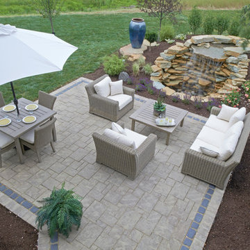
The design process started with a clean canvas. It progressed into a formal design that provided modern conveniences and an outdoor living space. The client was presented with a concept drawing on the second visit as a starting off point and they agreed to proceed with a design fee to bring that concept into fruition. The formal landscape elements close to the residence contrast the natural surroundings. The result: tremendous interest created by the tension of the formal hardscape against dramatic vistas of the ravine which appears endless. We created four defined areas within the patio space: dining, cooking, coffee table conversation area and a fire wall relaxation terrace. The relaxation terrace was elevated so that it could be viewed and enjoyed from both inside and out. The cook center was installed around the owners existing grill with the potential for a future, more permanent unit. Area rug patterns were designed within the paver field to soften and define spaces.
During installation, clay loam soils were discovered. This slowed down he base preparation, drain tile installation, and running of utilities. These non native soils are common in new construction sites. The business development associate oversaw the entire process along with the team leader. Caution was also taken to preserve a Shagbark Hickory close to the newly installed walkway.
The largest challenge of this project was the fabrication of the burners to provide a dramatic flame. These burners were custom made and installed to provide the homeowners with the climactic effects they were looking for. An intensive drainage system was installed to accommodate a water issue in the rear yard but to also be cognizant of the native surroundings and ravine.
Overall, an environment was created that was reminiscent of the homeowner’s favorite après ski, sitting next to an open fire after a long descent to the base of the Rockies. The end result not only thrilled the owner but the Canton community as well. Since the installation, the Village of Canton has asked us to present these fire features at their home show.
 Truitt and White Window and Door Showroom
This hillside home in Piedmont, CA was remodeled to change the style from a 1940's rancher with eight foot ceilings and dark interiors, into a modern geometric composition with vast white interiors for casual living and generous daylighting for displaying the artist-owner's works.
In a city known for rigorous and difficult design review, an addition, two variances, and a full stylistic change were unanimously approved on the first round. All sloped roofs and attics were eliminated and replaced by a series of stacked and overlapping flat roofs. This made the house taller on the inside and shorter on the outside, which helped earn design review cooperation in the community. Windows were concentrated toward the rear yard views or moved up high on the side walls for daylight and privacy, benefitting the owners as well as the neighbors.
At the start, the owner husband was so enthusiastic and engaged in transforming his house into something modern that he presented the architect with a scaled foamcore model, rather than the usual magazine clippings and wish list. He participated in the design decisions throughout the process. The owner wife is the artist who did all the artwork in the house. She had been craving a display space with large walls and good natural light. Both of them loved the location and great views.
The project was an opportunity to transform the style of an older traditional home into a modern one, while solving numerous problems. By rebuilding the 1800 ft2 top of the 3-story home it was possible to change the style of the whole building, since the lower floors were a neutral base, and also to change the lifestyle of the owners, who wanted to move their master suite upstairs and live primarily on the top floor as empty nesters.
Going into the project, the architect knew there were multiple encroachments into the setbacks and potential privacy issues with close by neighbors. He approached this as a complex puzzle made up of architectural and political pieces which all had to fit together elegantly. It took many careful moves, small and large, to arrive at a serene and cohesive result that tied old and new together seamlessly.
The design-build contractor worked closely with the owners and handled all of the construction phase documents and design adjustments, adding ideas of their own to make the project really sing.
The project was a collaboration in three acts. The owner had a strong design concept from the start. The architect developed it into a realistic project and garnered the design approvals. Then the contractor executed brilliantly
 RAJ Kitchen and Bath, LLC
This family throws some mean parties where large crowds usually sit at the poolside. There’s an entire section of this walk out second level that is dedicated to entertaining which also gives access to the pool in the backyard. This place comes alive at night with built in surround sounds and LED lights. There was just one issue. The kitchen.
The kitchen did not fit in. It was old, outdated, out-styled and nonfunctional. They knew the kitchen had to be address eventually but they just didn’t want to redo the kitchen. They wanted to revamp the kitchen, so they asked us to come in and look at the space to see how we can design this second floor kitchen in their New Rochelle home.
It was a small kitchen, strategically located where it could be the hub that the family wanted it to be. It held its own amongst everything that was in the open space like the big screen TV, fireplace and pool table. That is exactly what we did in the design and here is how we did it.
First, we got rid of the kitchen table and by doing so we created a peninsular. This eventually sets up the space for a couple of really cool pendant lights, some unique counter chairs and a wine cooler that was purchased before but never really had a home. We then turned our attention to the range and hood. This was not the main kitchen, so wall storage wasn’t the main goal here. We wanted to create a more open feel interaction while in the kitchen, hence we designed the free standing chimney hood alone to the left of the window.
We then looked at how we can make it more entertaining. We did that by adding a Wine rack on a buffet style type area. This wall was free and would have remained empty had we not find a way to add some more glitz.
Finally came the counter-top. Every detail was crucial because the view of the kitchen can be seen from when you enter the front door even if it was on the second floor walk out. The use of the space called for a waterfall edge counter-top and more importantly, the stone selection to further accentuate the effect. It was crucial that there was movement in the stone which connects to the 45 degree waterfall edge so it would be very dramatic.
Nothing was overlooked in this space. It had to be done this way if it was going to have a fighting chance to take command of its territory.
Have a look at some before and after photos on the left and see a brief video transformation of this lovely small kitchen.
See more photos and vidoe of this transformation on our website @ http://www.rajkitchenandbath.com/portfolio-items/kitchen-remodel-new-rochelle-ny-10801/

 River Valley Landscapes
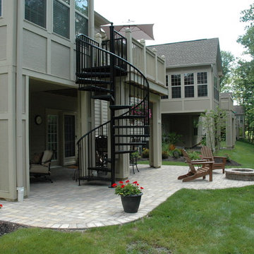
The property is one of the original farm houses located on the main street of a small town. It has been in the family for many years and our client just inherited the property. They were trying to have balance of preserving the old while realizing modern day living has its benefits too. The house had a large addition added using mostly old style materials, but designed with function and modern day luxuries. Our goal was to carry that theme to the outside.
Our first problem we had to address was how to transition between the first floor elevation changes. The lower room was the husband’s office. He stated in the future he may have clients over and it would be nice to have an area to sit outside. The wife’s main concern was to renew the four corner garden. She also felt it was very important to be able to see it from the kitchen area. Finally there was an old wishing well stuck right outside the kitchen. They both felt it would be neat to be able to incorporate this in some how. They wanted a patio area with a built in grill to accommodate there family and friends. They also wanted to keep a large play area for the kids.
We were able to pull this off successfully. We addressed the first issue by having a small lower level flagstone area. This area is large enough for 1 to 2 people to sit comfortably. It also provides a transition from his office to the larger patio area. We installed a simple small gravel sitting area opposite of the main patio. This provides our client a secluded place to relax or do business. Mrs.... told me she is amazed how much her and her husband enjoys this area. It is so peaceful looking at the small creek over a glass of wine.
We built a natural limestone retaining wall to create the patio terrace. The stone was chosen to extend the houses architectural elements into the landscape. Irregular broken flagstone was used to give it a more casual feel. We installed three Serviceberries into the patio terrace to replace some trees that were taken down during the remodeling. She was very concern that they would block the view of the four corner garden. We new they were crucial to nestle in the terrace, so we placed them for a couple days for her to decide. Fortunately she agreed they not only kept the view open, but helped frame the garden.
The four corner garden was designed to be viewed from afar and experienced up close. We wanted the space to have some formal structure while keeping with the casual farm house feel. Another natural limestone retaining wall was created. This leveled the garden terrace and helped associate it with the rest of the property. The four corner garden is nestled into the existing woods edge. This provides three distinct experiences to entering the garden; a more formal from the driveway, an open feel from the lower lawn, and a more natural / casual experience from the wooded area. The Plymouth brown gravel was used for the center of the garden. This helped highlight the stone post that was found during construction. The gravel also brings the sense of sound into the garden space. Lamb’s ear was chosen as a fun way to get kids interest in horticulture.
The balance of using the new to create the old feel is what makes this project a success. The property has already hosted a local historical society event and won an award for its preservation efforts. When Mrs.... can’t find her husband, she knows he is either reading the newspaper by the grill or resting in the hammock along the wood’s path.
Sponsored
Columbus, OH
Free consultation for landscape design!

Peabody Landscape Group
Columbus' Reliable Landscape Design & Contracting
 Edgewater Design Group
As written in Northern Home & Cottage by Elizabeth Edwards
Sara and Paul Matthews call their head-turning home, located in a sweet neighborhood just up the hill from downtown Petoskey, “a very human story.” Indeed it is. Sara and her husband, Paul, have a special-needs son as well as an energetic middle-school daughter. This home has an answer for everyone. Located down the street from the school, it is ideally situated for their daughter and a self-contained apartment off the great room accommodates all their son’s needs while giving his caretakers privacy—and the family theirs. The Matthews began the building process by taking their thoughts and
needs to Stephanie Baldwin and her team at Edgewater Design Group. Beyond the above considerations, they wanted their new home to be low maintenance and to stand out architecturally, “But not so much that anyone would complain that it didn’t work in our neighborhood,” says Sara. “We
were thrilled that Edgewater listened to us and were able to give us a unique-looking house that is meeting all our needs.” Lombardy LLC built this handsome home with Paul working alongside the construction crew throughout the project. The low maintenance exterior is a cutting-edge blend of stacked stone, black corrugated steel, black framed windows and Douglas fir soffits—elements that add up to an organic contemporary look. The use of black steel, including interior beams and the staircase system, lend an industrial vibe that is courtesy of the Matthews’ friend Dan Mello of Trimet Industries in Traverse City. The couple first met Dan, a metal fabricator, a number of years ago, right around the time they found out that their then two-year-old son would never be able to walk. After the couple explained to Dan that they couldn’t find a solution for a child who wasn’t big enough for a wheelchair, he designed a comfortable, rolling chair that was just perfect. They still use it. The couple’s gratitude for the chair resulted in a trusting relationship with Dan, so it was natural for them to welcome his talents into their home-building process. A maple floor finished to bring out all of its color-tones envelops the room in warmth. Alder doors and trim and a Doug fir ceiling reflect that warmth. Clearstory windows and floor-to-ceiling window banks fill the space with light—and with views of the spacious grounds that will
become a canvas for Paul, a retired landscaper. The couple’s vibrant art pieces play off against modernist furniture and lighting that is due to an inspired collaboration between Sara and interior designer Kelly Paulsen. “She was absolutely instrumental to the project,” Sara says. “I went through
two designers before I finally found Kelly.” The open clean-lined kitchen, butler’s pantry outfitted with a beverage center and Miele coffee machine (that allows guests to wait on themselves when Sara is cooking), and an outdoor room that centers around a wood-burning fireplace, all make for easy,
fabulous entertaining. A den just off the great room houses the big-screen television and Sara’s loom—
making for relaxing evenings of weaving, game watching and togetherness. Tourgoers will leave understanding that this house is everything great design should be. Form following function—and solving very human issues with soul-soothing style.
 Edgewater Design Group
As written in Northern Home & Cottage by Elizabeth Edwards
Sara and Paul Matthews call their head-turning home, located in a sweet neighborhood just up the hill from downtown Petoskey, “a very human story.” Indeed it is. Sara and her husband, Paul, have a special-needs son as well as an energetic middle-school daughter. This home has an answer for everyone. Located down the street from the school, it is ideally situated for their daughter and a self-contained apartment off the great room accommodates all their son’s needs while giving his caretakers privacy—and the family theirs. The Matthews began the building process by taking their thoughts and
needs to Stephanie Baldwin and her team at Edgewater Design Group. Beyond the above considerations, they wanted their new home to be low maintenance and to stand out architecturally, “But not so much that anyone would complain that it didn’t work in our neighborhood,” says Sara. “We
were thrilled that Edgewater listened to us and were able to give us a unique-looking house that is meeting all our needs.” Lombardy LLC built this handsome home with Paul working alongside the construction crew throughout the project. The low maintenance exterior is a cutting-edge blend of stacked stone, black corrugated steel, black framed windows and Douglas fir soffits—elements that add up to an organic contemporary look. The use of black steel, including interior beams and the staircase system, lend an industrial vibe that is courtesy of the Matthews’ friend Dan Mello of Trimet Industries in Traverse City. The couple first met Dan, a metal fabricator, a number of years ago, right around the time they found out that their then two-year-old son would never be able to walk. After the couple explained to Dan that they couldn’t find a solution for a child who wasn’t big enough for a wheelchair, he designed a comfortable, rolling chair that was just perfect. They still use it. The couple’s gratitude for the chair resulted in a trusting relationship with Dan, so it was natural for them to welcome his talents into their home-building process. A maple floor finished to bring out all of its color-tones envelops the room in warmth. Alder doors and trim and a Doug fir ceiling reflect that warmth. Clearstory windows and floor-to-ceiling window banks fill the space with light—and with views of the spacious grounds that will
become a canvas for Paul, a retired landscaper. The couple’s vibrant art pieces play off against modernist furniture and lighting that is due to an inspired collaboration between Sara and interior designer Kelly Paulsen. “She was absolutely instrumental to the project,” Sara says. “I went through
two designers before I finally found Kelly.” The open clean-lined kitchen, butler’s pantry outfitted with a beverage center and Miele coffee machine (that allows guests to wait on themselves when Sara is cooking), and an outdoor room that centers around a wood-burning fireplace, all make for easy,
fabulous entertaining. A den just off the great room houses the big-screen television and Sara’s loom—
making for relaxing evenings of weaving, game watching and togetherness. Tourgoers will leave understanding that this house is everything great design should be. Form following function—and solving very human issues with soul-soothing style.
 Ferriss - Architectural Renderings
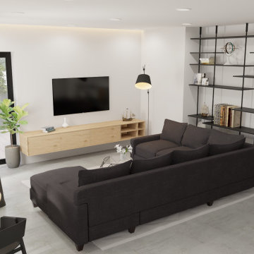
Here are some practical tips for creating a beautiful, comfortable and thoughtful living room design.
The living room in the house is the place where, as the name suggests, receives guests. However, the owners themselves relax here, spending time in front of the TV or a book, with drinks, pleasant conversation and other activities. Therefore, the living room should be the most comfortable place in your home.
The place of the sofa in the design of the living room
The sofa does not need to be placed in a draft. This means that it should not be on an imaginary line from window to door - if you drew a floor plan, it will just be easy to trace.
1. The sofa in front of the TV, diagonally from the door, is a great location. As if inviting you to sit down :)
2. Sofa near the door. A good solution if you often have overnight guests.
3. Corner sofa in the living room. Best placed in the farthest corner from the door. This will make the room look more spacious.
Correct opening of the door in the living room. Inward or outward?
Open inward or outward? There is no clear rule here, because everything depends on the layout and on the furniture placed. The main thing is that the door leaf opens freely and does not interfere with entering and exiting the room. Also, the door should not interfere with free access to the closet or dressing room.
TV in living room size and location. Location.
The TV is placed on the wall opposite to the sofa - this is the most logical and reasonable place for it in the living room. Moreover, the distance to it does not really matter: modern TV models can be placed close to the sofa.
Cabinet or bracket? To your taste. The main thing is that the television zone looks neat and presentable. Provide in advance a cable channel in which all the wires and numerous sockets for the receiver, modem, set-top box, sound bar will hide. Nothing spoils a design like sticking wires!
Height from the floor. It is optimal to place the TV 1 m from the floor to the middle of the screen - this is exactly the level of the eyes of a seated person.
Diagonal size. If there is a financial opportunity, consider options from 50 inches - smaller screens look lonely and lonely on an empty wall.
Living room furniture.
Armchair. Often the chair becomes an accent item in the interior, then its shade, and sometimes its shape, differ from the rest of the furniture. When choosing a chair, be guided also by your habits: for example, it will be more convenient to climb up with your feet and read a book in an armchair with dimensions of 90x90 cm, and you can “just sit comfortably” in a fireplace chair with a high back, comfortable armrests and with a seat 80x80 cm.
TV stand. Large TV stands are no longer as relevant as they used to be, when it was necessary to store a player, cassettes and discs there. For now, a console table or a narrow elegant pedestal is enough.
Coffee table. Nice piece of furniture that creates a cozy atmosphere. Some models, if necessary, can be transformed into a more spacious table for receiving guests - however, finding comfortable and beautiful specimens is not easy, plus they usually cost a lot.
Rack. An extremely useful type of furniture. :) Firstly, a large number of decor items can be beautifully placed on the rack. And secondly, it can also play the role of a light through partition, which divides the room into zones and does not select light at the same time. This is a very big plus for small apartments.
Fireplace. Here we are talking about electric fireplaces. Some of them come with a humidifier and heated, so 3-in-1 models can be very helpful. Fireplace portals have different styles: classic, antique, modern. Inconsistency with the general style of the living room can greatly spoil the impression of the room, so be careful with creativity. Sizing is an important issue. A large wall with a high ceiling also needs a proportionate fireplace; in horror, a small portal will look lonely and ridiculous.
What do you think about our new living room project?
https://www.ferriss.co
#ferriss #We_bring_objects_to_life #3drendering #architecture #San_Francisco

 Kerry Lewis Landscape Architecture
the rain gully, planted with native grasses and forbs; tupelo and oak lit up by the late day sun.
Inspiration for a large craftsman partial sun front yard concrete paver landscaping in Boston for fall.
Inspiration for a large craftsman partial sun front yard concrete paver landscaping in Boston for fall.

 RAJ Kitchen and Bath, LLC
This family throws some mean parties where large crowds usually sit at the poolside. There’s an entire section of this walk out second level that is dedicated to entertaining which also gives access to the pool in the backyard. This place comes alive at night with built in surround sounds and LED lights. There was just one issue. The kitchen.
The kitchen did not fit in. It was old, outdated, out-styled and nonfunctional. They knew the kitchen had to be address eventually but they just didn’t want to redo the kitchen. They wanted to revamp the kitchen, so they asked us to come in and look at the space to see how we can design this second floor kitchen in their New Rochelle home.
It was a small kitchen, strategically located where it could be the hub that the family wanted it to be. It held its own amongst everything that was in the open space like the big screen TV, fireplace and pool table. That is exactly what we did in the design and here is how we did it.
First, we got rid of the kitchen table and by doing so we created a peninsular. This eventually sets up the space for a couple of really cool pendant lights, some unique counter chairs and a wine cooler that was purchased before but never really had a home. We then turned our attention to the range and hood. This was not the main kitchen, so wall storage wasn’t the main goal here. We wanted to create a more open feel interaction while in the kitchen, hence we designed the free standing chimney hood alone to the left of the window.
We then looked at how we can make it more entertaining. We did that by adding a Wine rack on a buffet style type area. This wall was free and would have remained empty had we not find a way to add some more glitz.
Finally came the counter-top. Every detail was crucial because the view of the kitchen can be seen from when you enter the front door even if it was on the second floor walk out. The use of the space called for a waterfall edge counter-top and more importantly, the stone selection to further accentuate the effect. It was crucial that there was movement in the stone which connects to the 45 degree waterfall edge so it would be very dramatic.
Nothing was overlooked in this space. It had to be done this way if it was going to have a fighting chance to take command of its territory.
Have a look at some before and after photos on the left and see a brief video transformation of this lovely small kitchen.
See more photos and vidoe of this transformation on our website @ http://www.rajkitchenandbath.com/portfolio-items/kitchen-remodel-new-rochelle-ny-10801/
 Edgewater Design Group
As written in Northern Home & Cottage by Elizabeth Edwards
Sara and Paul Matthews call their head-turning home, located in a sweet neighborhood just up the hill from downtown Petoskey, “a very human story.” Indeed it is. Sara and her husband, Paul, have a special-needs son as well as an energetic middle-school daughter. This home has an answer for everyone. Located down the street from the school, it is ideally situated for their daughter and a self-contained apartment off the great room accommodates all their son’s needs while giving his caretakers privacy—and the family theirs. The Matthews began the building process by taking their thoughts and
needs to Stephanie Baldwin and her team at Edgewater Design Group. Beyond the above considerations, they wanted their new home to be low maintenance and to stand out architecturally, “But not so much that anyone would complain that it didn’t work in our neighborhood,” says Sara. “We
were thrilled that Edgewater listened to us and were able to give us a unique-looking house that is meeting all our needs.” Lombardy LLC built this handsome home with Paul working alongside the construction crew throughout the project. The low maintenance exterior is a cutting-edge blend of stacked stone, black corrugated steel, black framed windows and Douglas fir soffits—elements that add up to an organic contemporary look. The use of black steel, including interior beams and the staircase system, lend an industrial vibe that is courtesy of the Matthews’ friend Dan Mello of Trimet Industries in Traverse City. The couple first met Dan, a metal fabricator, a number of years ago, right around the time they found out that their then two-year-old son would never be able to walk. After the couple explained to Dan that they couldn’t find a solution for a child who wasn’t big enough for a wheelchair, he designed a comfortable, rolling chair that was just perfect. They still use it. The couple’s gratitude for the chair resulted in a trusting relationship with Dan, so it was natural for them to welcome his talents into their home-building process. A maple floor finished to bring out all of its color-tones envelops the room in warmth. Alder doors and trim and a Doug fir ceiling reflect that warmth. Clearstory windows and floor-to-ceiling window banks fill the space with light—and with views of the spacious grounds that will
become a canvas for Paul, a retired landscaper. The couple’s vibrant art pieces play off against modernist furniture and lighting that is due to an inspired collaboration between Sara and interior designer Kelly Paulsen. “She was absolutely instrumental to the project,” Sara says. “I went through
two designers before I finally found Kelly.” The open clean-lined kitchen, butler’s pantry outfitted with a beverage center and Miele coffee machine (that allows guests to wait on themselves when Sara is cooking), and an outdoor room that centers around a wood-burning fireplace, all make for easy,
fabulous entertaining. A den just off the great room houses the big-screen television and Sara’s loom—
making for relaxing evenings of weaving, game watching and togetherness. Tourgoers will leave understanding that this house is everything great design should be. Form following function—and solving very human issues with soul-soothing style.
 Edgewater Design Group
As written in Northern Home & Cottage by Elizabeth Edwards
Sara and Paul Matthews call their head-turning home, located in a sweet neighborhood just up the hill from downtown Petoskey, “a very human story.” Indeed it is. Sara and her husband, Paul, have a special-needs son as well as an energetic middle-school daughter. This home has an answer for everyone. Located down the street from the school, it is ideally situated for their daughter and a self-contained apartment off the great room accommodates all their son’s needs while giving his caretakers privacy—and the family theirs. The Matthews began the building process by taking their thoughts and
needs to Stephanie Baldwin and her team at Edgewater Design Group. Beyond the above considerations, they wanted their new home to be low maintenance and to stand out architecturally, “But not so much that anyone would complain that it didn’t work in our neighborhood,” says Sara. “We
were thrilled that Edgewater listened to us and were able to give us a unique-looking house that is meeting all our needs.” Lombardy LLC built this handsome home with Paul working alongside the construction crew throughout the project. The low maintenance exterior is a cutting-edge blend of stacked stone, black corrugated steel, black framed windows and Douglas fir soffits—elements that add up to an organic contemporary look. The use of black steel, including interior beams and the staircase system, lend an industrial vibe that is courtesy of the Matthews’ friend Dan Mello of Trimet Industries in Traverse City. The couple first met Dan, a metal fabricator, a number of years ago, right around the time they found out that their then two-year-old son would never be able to walk. After the couple explained to Dan that they couldn’t find a solution for a child who wasn’t big enough for a wheelchair, he designed a comfortable, rolling chair that was just perfect. They still use it. The couple’s gratitude for the chair resulted in a trusting relationship with Dan, so it was natural for them to welcome his talents into their home-building process. A maple floor finished to bring out all of its color-tones envelops the room in warmth. Alder doors and trim and a Doug fir ceiling reflect that warmth. Clearstory windows and floor-to-ceiling window banks fill the space with light—and with views of the spacious grounds that will
become a canvas for Paul, a retired landscaper. The couple’s vibrant art pieces play off against modernist furniture and lighting that is due to an inspired collaboration between Sara and interior designer Kelly Paulsen. “She was absolutely instrumental to the project,” Sara says. “I went through
two designers before I finally found Kelly.” The open clean-lined kitchen, butler’s pantry outfitted with a beverage center and Miele coffee machine (that allows guests to wait on themselves when Sara is cooking), and an outdoor room that centers around a wood-burning fireplace, all make for easy,
fabulous entertaining. A den just off the great room houses the big-screen television and Sara’s loom—
making for relaxing evenings of weaving, game watching and togetherness. Tourgoers will leave understanding that this house is everything great design should be. Form following function—and solving very human issues with soul-soothing style.
55