
Search results for "Issues continue" in Home Design Ideas
 Natural Stone Institute
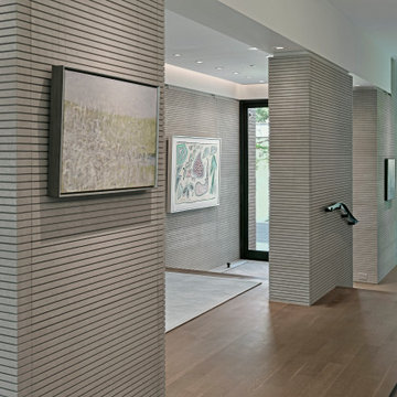
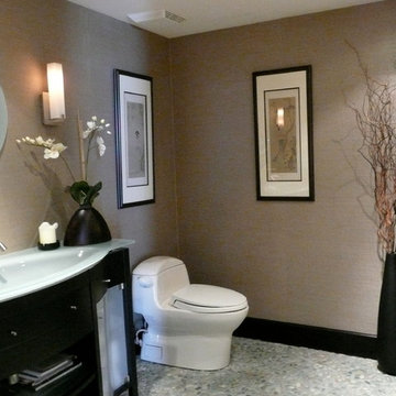
This private residence involved construction of a modern architectural style estate property in Highland Park, Texas. Dee Brown Inc’s role came into play late in the project, when corrections were needed to some specialty stonework.
The home’s center is formed around the main entry. The floorplan is largely open, but parallel core wall areas serve to define the foyer, kitchen, dining, and living areas. As key areas, the architect put special focus on materials selection for the core walls. It was decided that Indiana limestone would be the finish, and that the cladding panels would all have unique continuous horizontal grooves.
Material was received and installed by the original subcontractor. Upon seeing the completed work, it was evident to the architect and owner that grooves in the fabricated material were not consistent, and that the installation process had left numerous chips to the panels. It was at this point that the partially completed work was removed, and the second fabricator/installer was contacted.
Dee Brown Inc ordered the Indiana limestones slabs. There, special care was taken to hold tight tolerances to the horizontal grooves as well as to the typical cut-to-size aspects. Erection of these mechanically set panels was done very carefully. The result was a clean finished product with none of the tolerance and chipping issues of the original installation.
Dee Brown, Inc also created and installed special stone finishes at the adjacent half-bath. Semi-precious white onyx was transformed into a lavatory top/bowl assembly, water-closet wall cladding, and even tissue and towel holders.
 Edmond Kitchen & Bath LLC
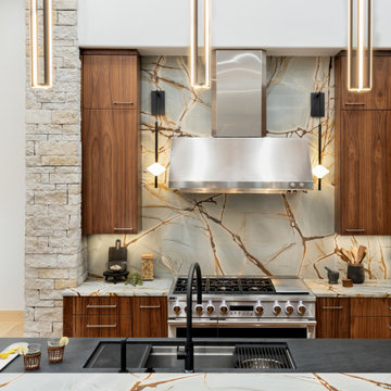
Mountain Modern Kitchen Design – New Construction Kitchen in Arcadia
While relocating to OKC from the mountains of Colorado, our homeowners found a house under construction in Arcadia that they loved, but they were not thrilled with the kitchen or bathrooms that the builder was creating, nor the quality of the cabinetry that was planned. In searching for a better kitchen layout, they came across us. Brenda and Megan redesigned every room in the home that required cabinetry, beginning with the kitchen. The architect had created a smaller space where the site line allowed you to see directly through the kitchen to the garage door. Not pretty. Since the home was still being framed when they brought us in, we redesigned the kitchen layout to extend the range wall to hide this unsightly garage door. This added the extra benefit of allowing us to create a larger pantry behind that wall as well.
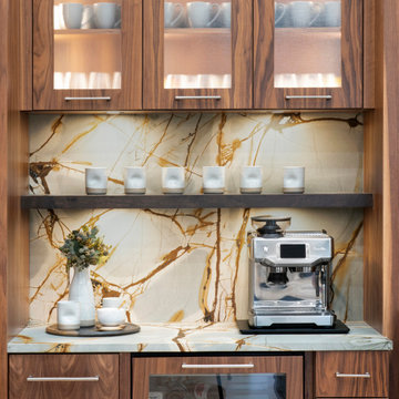
As our clients love Mountain Modern design, we selected a slab door set on frameless cabinets to provide maximum functionality with a modern feel. We highlighted the Mountain Modern design theme by using our grain-matched walnut for all cabinets. They are also huge fans of daily coffee, so we created a coffee and beverage bar to prepare drinks to their liking – again utilizing our grain matched walnut frameless cabinetry.
The counters we selected echo the Mountain Modern design, even for Oklahoma City, by providing strong veining with color throughout. Note the floating shelves left of the microwave – we continued the veining on the countertop material placed within the floating shelves to mimic the gran match cabinetry!
From a functional design perspective, we installed several pull-out accessory drawers, many base drawers, and a mixer lift station to help with the heavy lifting. In the island we placed a Galley Workstation sink with the Galley Tap to provide a space for meal prep and serve. The design was completed with careful installation of puck lighting, strip lighting, and sconces flanking the venthood, set atop more of this beautiful countertop material used as the backsplash.
The result? Our clients were, and are, thrilled in their new kitchen. As you can see, this kitchen was selected for the cover of the National Kitchen and Bath Magazine, issued and shown at the National Kitchen and Bath Show – KBIS – in Las Vegas! We are honored to have been selected for this tremendous achievement!
 ReVision Design + Build
© Ascendant Imaging
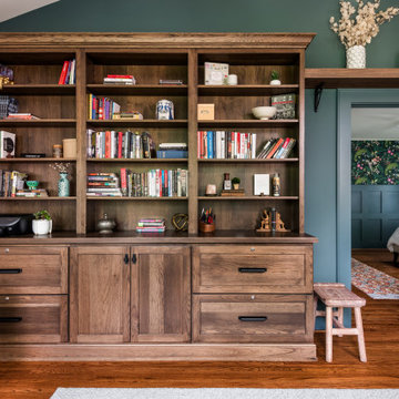
Home office library - mid-sized freestanding desk medium tone wood floor and brown floor home office library idea in Charlotte with blue walls
Home office library - mid-sized freestanding desk medium tone wood floor and brown floor home office library idea in Charlotte with blue walls
Find the right local pro for your project
 Interlocking Concrete Pavement Institute
2018 HNA Awards Honorable Mention - Concrete Paver - Permeable
Contractor: Sequoia Stonescapes
Producer: Williamette Graystone
Designer: Drake's 7 Dees Landscaping
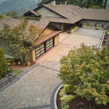
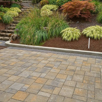
Eco-Panorama Demi pavers, in a tri-color blend, perfectly complement this home’s exterior. Contrasting color paver bands artfully define the driveway and courtyard. The use of the same pavers in the walkway and courtyard created design continuity and flow. Paver color and texture enhance and seamlessly integrate with an adjacent natural stone retaining wall.
Expert workmanship is showcased via smooth pavement elevation transitions and precise paver trim cuts. This quality Eco-Panorama Demi paver install ensured the homeowner’s stormwater drainage issues were addressed in a manner that enhanced the beauty of their home.
The existing storm drain inlets were retained and work in conjunction with installed Eco-Panorama Demi permeable pavers. The pavers also achieve visual harmonization with the adjacent natural stone wall, which was a project requirement.
This home is positioned at the lower end of a 200ft long drive that drops sixteen feet in elevation from the street entrance. Impervious concrete was replaced with PICP to manage 80,700 gallons of rainwater the pavement receives annually. The PICP improvement eliminated concerns over flooding in the home and garage. The 3500 SF pavement includes a courtyard and vehicle turnaround.
Despite thirty-seven inches of annual rainfall, these homeowners will rest assured their property is protected from rainwater runoff. Keystone Hardscapes’ Eco-Panorama permeable pavers provide improved stormwater management and elevated property value. Stormwater controls critical to the project were achieved and aesthetic beauty was significantly enhanced.
 DuetRight | Seattle
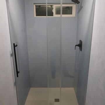
This bathroom started with all the classic problems: dated tiles, dark grout, and black mold hiding behind the surfaces. Instead of just masking the issues, we stripped everything back, treated the mold, and prepared the space for a seamless microcement finish. Follow our page or visit our website to see how we turn problem bathrooms into clean, modern space.
The final result: a fully renewed bathroom with continuous microcement on the walls and floor, no grout lines, and a clean, minimalist shower and sink area. Easy to clean, resistant to moisture, and designed to last in a humid environment. If you’re thinking about a similar makeover, visit our website or message us on Instagram to talk about your own microcement project
 Landscape Projects, Inc.
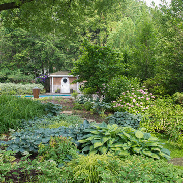
This stunning one-acre garden, within walking distance of downtown Bethesda, was designed and installed by our firm in 2004.. LPI continues to maintain it today. The owners, devoted gardeners, wanted to utilize as much of the existing plant palette as possible but also to have space for a pond, a cutting garden, and expanses of lawn. The biggest challenge proved to be coping with the prodigious amount of water on site due to an underground spring and drainage issues posed by it and the topography of the site.
In 2010 this garden won an Award of Merit from the Association of Professional Landscape Designers, , a Grand Award from the MD*DC*VA Landscape Contractors Association, and an Environmental Improvement Award of Distinction from PLANET.
©Melissa Clark Photography. All rights reserved.
 Alliance Home Remodeling
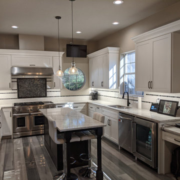
This traditional 1980's Texas kitchen was not only in need of a face lift, but was also in need of minor rearranging. The main issues were too many appliances jammed into one area and the homeowner needed to incorporate a home office into the kitchen as well. In order to keep a double oven, increase workspace, and allow for more food storage, we suggested replacing all the existing appliances with a 48" range, 42" built-in refrigerator, and built-in microwave. We also removed the peninsula and continued cabinets towards the breakfast area which opened up the kitchen to the eating area. We elongated the island adding more usable storage and working space, leaving open area on the end for seating. Lastly we integrated an office workspace by lowering the countertop, creating a seating area, and space for a pull out printer.
 AirField Systems, LLC
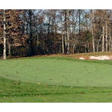
Robert Trent Jones Golf Club installs AirField Systems AirDrain.
The AirField Systems AirDrain for Golf Greens installed at Robert Trent Jones, home of The President’s Cup, continues to perform since 2004. Stronger roots, healthier turf, superior drainage and the ability to make it’s own nearly perfect perched water table without organics make AirDrain Golf Greens by AirField the choice of the most discriminating golf course architects, designers, owners and superintendents – and the savings in time, installation and maintenance make it the choice for everyone. View AirDrain Golf Greens in action after years of use at one of the most prestigious courses on the east coast.
Thru a research project conducted at Texas A&M, it was concluded that you can reduce your irrigation needs using AirField Systems AirDrain. The five year research project was jointly funded by the United States Golf Association and AirField Systems and was a collaborative effort between Texas A&M, AirField Systems and the United States Golf Association. The data from the research showed that the AirField Systems drainage profile provided between one to three more days of plant available water than a United States Golf Association recommended gravel and sand profile.
In addition, AirDrain by AirField Systems can significantly save on installation time because much less excavation is required compared to the traditional gravel drainage layers that have a much deeper profile. AirDrain arrives on site in 53” trailers, palletized and ready for install. Unlike gravel drainage, with AirDrain there is no need for heavy dump trucks that can compact your golf course.
Benefits of an AirField System Design for Golf Greens include:
1 to 3 more days of plant available water stored in the root zone (depending on climate)
Significantly reduces daily irrigation needs (as told to us by our customers)
Healthier turf / Stronger root system (as told to us by our customers)
100% Vertical Drainage under the entire playing surface
AirDrain is a 100% recycled copolymer with the impact modifier “metallocene” qualifying it as a “No Break” plastic
Helps eliminate standing water / Simplifies maintenance (as told to us by our customers)
Minimal site disturbance / Far less excavation and disposal
Several Installation days are saved over a gravel installation
Compact shipping that reduces overall storage and transportation costs
An AirDrain System sand profile creates its own perched water table without peat moss or clay
AirDrain’s sand profile and minimal organics puts it at very little risk for issues of mold or disease
http://www.rtjgc.com/Club/Scripts/Home/home.asp
 Fournier Custom Designs Inc.
 Before and after photos of projects by Astrid Newton Rush Interior Designs.
FCD: What makes you different from a designer you can find at a Home Depot or Lowes?
Astrid: I can't attest to the education, experience or qualifications required to work as a designer at those stores. However, I can tell you something about myself. I am a Florida registered interior designer with over 30 years of experience in my field. I am not simply an interior decorator. I am an interior designer with professional credentials. I am NCIDQ certified. This means I have attained the highest level of profession certification in my field through my education, work experience and a lengthy examination process. Also, my skill set is not limited to one area, such as a kitchen or window treatment design. I am well versed in all areas of interior design. In addition, in order to keep my license/registration active, I must take continuing education classes every two years that cover building codes and HSW certification which pertains to issues related to health, safety and welfare.
 Edmond Kitchen & Bath LLC
Mountain Modern Kitchen Design – New Construction Kitchen in Arcadia
While relocating to OKC from the mountains of Colorado, our homeowners found a house under construction in Arcadia that they loved, but they were not thrilled with the kitchen or bathrooms that the builder was creating, nor the quality of the cabinetry that was planned. In searching for a better kitchen layout, they came across us. Brenda and Megan redesigned every room in the home that required cabinetry, beginning with the kitchen. The architect had created a smaller space where the site line allowed you to see directly through the kitchen to the garage door. Not pretty. Since the home was still being framed when they brought us in, we redesigned the kitchen layout to extend the range wall to hide this unsightly garage door. This added the extra benefit of allowing us to create a larger pantry behind that wall as well.
As our clients love Mountain Modern design, we selected a slab door set on frameless cabinets to provide maximum functionality with a modern feel. We highlighted the Mountain Modern design theme by using our grain-matched walnut for all cabinets. They are also huge fans of daily coffee, so we created a coffee and beverage bar to prepare drinks to their liking – again utilizing our grain matched walnut frameless cabinetry.
The counters we selected echo the Mountain Modern design, even for Oklahoma City, by providing strong veining with color throughout. Note the floating shelves left of the microwave – we continued the veining on the countertop material placed within the floating shelves to mimic the gran match cabinetry!
From a functional design perspective, we installed several pull-out accessory drawers, many base drawers, and a mixer lift station to help with the heavy lifting. In the island we placed a Galley Workstation sink with the Galley Tap to provide a space for meal prep and serve. The design was completed with careful installation of puck lighting, strip lighting, and sconces flanking the venthood, set atop more of this beautiful countertop material used as the backsplash.
The result? Our clients were, and are, thrilled in their new kitchen. As you can see, this kitchen was selected for the cover of the National Kitchen and Bath Magazine, issued and shown at the National Kitchen and Bath Show – KBIS – in Las Vegas! We are honored to have been selected for this tremendous achievement!
 Gallery KBNY
The owner of this historic and landmarked town-home renovation in Hudson Square, originally built in 1826, hired Gallery Kitchen and Bath to fully gut-renovate this 3-unit row-home. The scope of work included a full-scale renovation of the owners unit, including the renovation of the kitchen, one 4-piece master ensuite bathroom, one 3-piece bathroom with a walk-in steam shower, and a beautiful powder room. Additional work in the owners unit also included flooring, electrical upgrade, major plumbing work, new HVAC system, restoration of a fireplace, installation of a fully integrated smart home system and landmarked approved windows.
CELLAR RENOVATION IN NYC LANDMARKED TOWN-HOME
Rounding out the owners unit we renovated the cellar, which was converted into an entertainment space and featured a custom glass curtain wall, along with a custom staircase with an exposed brick wall. During the demolition phase of the cellar, our team discovered 56 wine jugs filled with wine from the prohibition era, leading us to name this project the prohibition house. For the two tenant units, Gallery Kitchen and Bath undertook the renovation of 2 kitchens, 4 bathrooms, new hardwood flooring throughout, along with detailed carpentry work in the entire home.
WHY GALLERY KITCHEN AND BATH
After interviewing multiple contractors, our client decided on Gallery Kitchen and Bath primarily because of our turnkey design, selection, and build process. In a renovation of this magnitude it is crucial to have a centralized full service contractor under one roof to handle all of the aspects and simultaneous moving parts of the project. Decentralizing the entire process by having multiple unaffiliated vendors handle various parts of the process can easily become chaotic, time consuming, and costly.
Because Gallery Kitchen and Bath undertook the entire process, from the design of the entire space to the selection and procurement of all finishes and fixtures, down to the procurement of all permits and LPC filings, it made a seemingly chaotic project a’lot more manageable.
PHASE 1: DESIGN, SELECTION, PROCUREMENT
Our client wanted the renovation to incorporate a fully modern design into his Hudson Square town-house. Being that this is a landmarked property, the exterior facade had to be restored and kept with the original aesthetic, the interior of the home however was a whole different story.
In keeping up with the modern aesthetic, our designers went to work to design a custom kitchen that included fully custom flat panel base cabinets in a white high gloss finish and an absolute matte black appliance/pantry wall. The kitchen design also included a white quartz countertop and backsplash with a waterfall edge island. To bring warmth to the modern kitchen, our designers incorporated a rifted and quartered select oak wood floor in a herringbone pattern, and custom blended stain with matte polyurethane finish. For continuity, the wood floor was also extended throughout the entire owners unit.
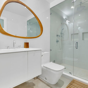
In the ensuite bathroom we created a “wet area” which houses a standalone soaking tub as well as a beautiful rainfall shower, completely leveled with the rest of the floor in the bathroom. Some highlights within this space include a tiled square drain, large niche cutouts with a carrera marble accents. Once again, to bring warmth to this modern bathroom, our designers incorporated a floating rustic oak vanity and carrera marble mosaic floor tile.
Last on the list on the owners unit floor was the cellar, which our client wanted to utilize as an entertainment space for his friends and family. During the design phase, we incorporated an open concept layout, wedding the indoor and outdoor space with a custom glass curtain wall. The design also included custom walnut built-ins that serve as a custom wet bar and storage piece.
With the design approved and selections made our office liaisons moved to procure all of the material selections and finishes.
PHASE 2: DEMO
Because this home is almost two centuries old, we had to take extra precaution during the interior demolition phase of the project. One specific area that we had to pay special attention to was the existing brick. Over time the mortar in old brick homes deteriorates and turns into dust – for this reason it was extremely important that a thorough and ongoing inspection of the exteriors and interior walls took place during the demolition of the space.
After 14 30-yard debris containers and 56 wine filled jugs from the prohibition era later , the demolition of this historic Hudson Square town-home came to an end. If you are wondering whether we tried the wine? After notifying the owner we agreed to open one of the jugs and try them together – nothing but vinegar.
PHASE 3: BUILD
One of the challenges in a renovation project of this scope is nailing down the logistics and delivery of fixtures and finish material. Adding to this challenge was a narrow entry door that required us to use a boom truck in order to deliver some of the larger materials on site. To ensure a succinct time schedule, we boomed all of the materials through the 3rd floor for the entire project and worked our renovation work from top floor to cellar. This technique also insured that any unexpected water issues during the renovation process would not damage a finished floor.
With all roughing and framing complete, the Gallery KBNY team proceeded to execute on the design plan.
THE REVEAL
From what was once a dilapidated town-home with nothing but potential, to a glamorous and luxurious modern interior space – the prohibition house was complete. Ready to speak with us about your renovation project? Contact us to schedule your free consultation and let Gallery KBNY show you why our all-inclusive approach to your renovation is the smartest way to renovating in NYC.
 Interlocking Concrete Pavement Institute
2018 HNA Awards Honorable Mention - Concrete Paver - Permeable
Contractor: Sequoia Stonescapes
Producer: Williamette Graystone
Designer: Drake's 7 Dees Landscaping
Eco-Panorama Demi pavers, in a tri-color blend, perfectly complement this home’s exterior. Contrasting color paver bands artfully define the driveway and courtyard. The use of the same pavers in the walkway and courtyard created design continuity and flow. Paver color and texture enhance and seamlessly integrate with an adjacent natural stone retaining wall.
Expert workmanship is showcased via smooth pavement elevation transitions and precise paver trim cuts. This quality Eco-Panorama Demi paver install ensured the homeowner’s stormwater drainage issues were addressed in a manner that enhanced the beauty of their home.
The existing storm drain inlets were retained and work in conjunction with installed Eco-Panorama Demi permeable pavers. The pavers also achieve visual harmonization with the adjacent natural stone wall, which was a project requirement.
This home is positioned at the lower end of a 200ft long drive that drops sixteen feet in elevation from the street entrance. Impervious concrete was replaced with PICP to manage 80,700 gallons of rainwater the pavement receives annually. The PICP improvement eliminated concerns over flooding in the home and garage. The 3500 SF pavement includes a courtyard and vehicle turnaround.
Despite thirty-seven inches of annual rainfall, these homeowners will rest assured their property is protected from rainwater runoff. Keystone Hardscapes’ Eco-Panorama permeable pavers provide improved stormwater management and elevated property value. Stormwater controls critical to the project were achieved and aesthetic beauty was significantly enhanced.
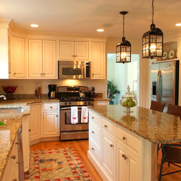
 Premier Cabinets of Virginia, LLC
Inset-style cabinetry with raised panel doors and profiled, slab drawer fronts. White lacquer on maple. Clipped corner on island accommodates angled wall with large window and breakfast table.

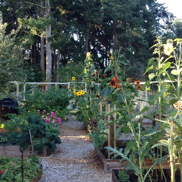
 Root Design & Landscape
This in-ground garden always battled deer and ever present maintenance issues. A garden fence was built to keep out deer, raised cedar beds for vegetables as this garden continually adapts to changes.
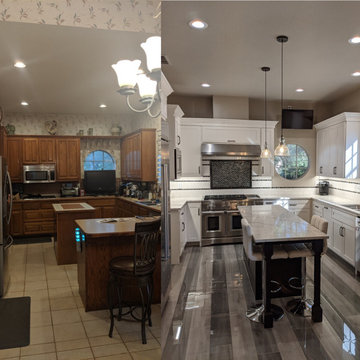 Alliance Home Remodeling
This traditional 1980's Texas kitchen was not only in need of a face lift, but was also in need of minor rearranging. The main issues were too many appliances jammed into one area and the homeowner needed to incorporate a home office into the kitchen as well. In order to keep a double oven, increase workspace, and allow for more food storage, we suggested replacing all the existing appliances with a 48" range, 42" built-in refrigerator, and built-in microwave. We also removed the peninsula and continued cabinets towards the breakfast area which opened up the kitchen to the eating area. We elongated the island adding more usable storage and working space, leaving open area on the end for seating. Lastly we integrated an office workspace by lowering the countertop, creating a seating area, and space for a pull out printer.
 Natural Stone Institute
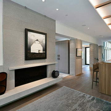
This private residence involved construction of a modern architectural style estate property in Highland Park, Texas. Dee Brown Inc’s role came into play late in the project, when corrections were needed to some specialty stonework.
The home’s center is formed around the main entry. The floorplan is largely open, but parallel core wall areas serve to define the foyer, kitchen, dining, and living areas. As key areas, the architect put special focus on materials selection for the core walls. It was decided that Indiana limestone would be the finish, and that the cladding panels would all have unique continuous horizontal grooves.
Material was received and installed by the original subcontractor. Upon seeing the completed work, it was evident to the architect and owner that grooves in the fabricated material were not consistent, and that the installation process had left numerous chips to the panels. It was at this point that the partially completed work was removed, and the second fabricator/installer was contacted.
Dee Brown Inc ordered the Indiana limestones slabs. There, special care was taken to hold tight tolerances to the horizontal grooves as well as to the typical cut-to-size aspects. Erection of these mechanically set panels was done very carefully. The result was a clean finished product with none of the tolerance and chipping issues of the original installation.
Dee Brown, Inc also created and installed special stone finishes at the adjacent half-bath. Semi-precious white onyx was transformed into a lavatory top/bowl assembly, water-closet wall cladding, and even tissue and towel holders.
 Roberth Jordan | Residential Designs
Welcome to an update on my portfolio. I continually showcase the most relevant projects from my extensive catalog to provide you with a perspective on My Residential Design capabilities.
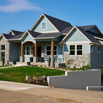
This was a challenging project. The house sits on a steep slope going down from the street. We needed to keep the house above street level to avoid water leakage issues and, more importantly, to maintain the magnificent views of Lake Texoma. The solution was to place the garage underneath the house in a walk-out basement and utilize it as a foundation to design the cozy space our client had envisioned.
The result is this lovely Farmhouse that the client and our team love so much. The functionality, flow, and the balance between value and cost were more than satisfactory. They fell utterly in love with the look of their dream house from the initial sketches. The lake views played a significant role in the whole process. Keeping that beloved image in mind and making it work with the program was the challenge we succeeded in.
Now they sit on their porch, enjoying how the sun sets over the Treasure and Wood islands.
 My Kitchen And Bath
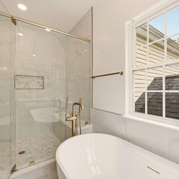
A complete primary bathroom remodel in Springfield, Virginia, designed around three priorities our clients came in with: a real walk-in shower, a freestanding tub by the windows, and a proper double vanity with storage that actually worked.
The original layout had everything in the wrong place. The tub sat against an interior wall away from the natural light. A small stall shower took up real estate across the room. The vanity was squeezed into whatever space was left over. Three windows on the back wall were doing nothing for the room because the layout was fighting them. Our solution involved knocking down the dividing wall between the old shower and vanity area, relocating plumbing for both the tub and the new vanities, and placing the freestanding tub directly under the bay of windows so morning light became part of the experience.
Design Approach
We anchored the room around contrast: deep navy cabinetry against soft white walls, warm brushed gold against cool marble tile, sharp Shaker lines against the curved silhouette of the freestanding tub. Navy was the design decision the rest of the room was built around — the clients knew they wanted color but didn't want anything that would feel dated in five years. Navy reads bold without being loud, pairs with virtually any metal finish, and has staying power that trendier choices don't.
We used Fabuwood Galaxy Indigo for the vanities — all-plywood construction with solid wood doors and drawer fronts, soft close throughout. Shaker-style flat panels keep the navy from feeling heavy. The brushed gold (Jeffrey Alexander 635-96SBZ in satin bronze) shows up across hardware, faucets, lighting, the tub filler, and the shower trim, creating a quiet continuity throughout the room.
The Shower
Removing the wall between the old shower and old vanity area created room for a proper walk-in. We tiled the entire shower floor to ceiling in Decovita Calacatta Suave 24x48" porcelain — large format installed in a 50% offset horizontal pattern, with cement board and redgard underneath. The marble-look porcelain gives the visual depth of natural marble without the maintenance.
A built-in shower bench, custom-built into the corner, is wrapped in the same wall tile on the front with a quartz top matching the vanity counter. The shower niche is detailed with MSI Arabescato Carrara 2" honed hex mosaic at the back, the same tile used on the shower floor. All tile edges are finished with Schluter in satin bronze to match the room's metal finishes. The shower door is custom frameless 3/8" tempered glass with a satin bronze pull — no metal frame interrupting the sight line.
The Vanities and Countertops
The new double vanity gives both clients their own space for morning routines. Counter tops are MSI Calacatta Miraggio Cielo quartz with pencil edging and a 4" backsplash — a soft white with subtle gray veining that reads like real Calacatta marble without the porosity issues. Two undermount square porcelain sinks finish the surface cleanly.
The Tub
A 60" freestanding soaker tub sits under the bay of three windows. The floor-mounted tub filler is satin bronze with a handheld sprayer. We relocated the drain and supply lines to make the centered placement work. The tub is the room's quietest feature and its strongest — clients tell us they use this bathroom differently than they used the old one.
Flooring
MSI Sande Ivory 12x24" matte porcelain runs throughout the bathroom floor in a 50% offset pattern parallel to the vanity wall. Cement board underneath, 4" white wood baseboard, Whisper Grey grout that handles daily use without showing wear.
Paint and Lighting
Walls are Benjamin Moore Chantilly Lace 2121-70 in satin — a true crisp white that doesn't lean cool or warm. The ceiling uses Benjamin Moore Aura Bath and Spa White, which is formulated to resist mildew in high-humidity spaces. Lighting is layered: three new 6" LED recessed lights on a dimmer, two satin bronze vanity sconces above the mirrors, and the existing three windows providing the daytime ambient light.
Project Specs
Location: Springfield, Virginia
Project type: Full primary bathroom remodel
Project duration: Approximately 5 weeks
Style: Modern, Transitional
Color palette: Navy, white, brushed gold, marble
Materials
Cabinetry: Fabuwood Galaxy Indigo, Shaker-style flat panel maple, all-plywood construction
Cabinet hardware: Jeffrey Alexander 635-96SBZ Satin Bronze pulls
Vanity counter and bench top: MSI Calacatta Miraggio Cielo Quartz, pencil edge with 4" backsplash
Sinks: Undermount white porcelain BR-202 square (x2)
Wall tile: Decovita Calacatta Suave 24x48" porcelain
Floor tile: MSI Sande Ivory 12x24" matte porcelain
Shower floor + niche back: MSI Arabescato Carrara 2" honed hex mosaic marble
Edge trim: Schluter satin bronze
Shower door: Custom frameless 3/8" tempered glass
Tub: 60" freestanding acrylic soaker (Ferguson)
Tub filler: Floor-mounted satin bronze (Ferguson)
Vanity faucets, mirrors, sconces, toilet: Satin bronze coordinated finishes (Ferguson)
Wall paint: Benjamin Moore Chantilly Lace 2121-70 Satin
Ceiling paint: Benjamin Moore Aura Bath and Spa White
Grout: Whisper Grey (floor), Standard White (walls and shower)
Designed and built by My Kitchen and Bath out of our Alexandria showroom at 5710 General Washington Drive. We've been designing and building kitchens, bathrooms, and full home renovations across Northern Virginia and the DMV since 1994.
 Robin Rigby Fisher, CMKBD/CAPS/CLIPPS
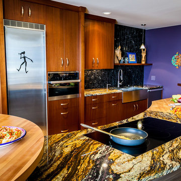
Condos are often a challenge – can’t move water, venting has to remain connected to existing ducting and recessed cans may not be an option. In this project, we had an added challenge – we could not lower the ceiling on the exterior wall due to a continual leak issue that the HOA has put off due to the multi-million-dollar expense.
DESIGN PHILOSOPHY:
Work Centers: prep, baking, clean up, message, beverage and entertaining.
Vignette Design: avoid wall to wall cabinets, enhance the work center philosophy
Geometry: create a more exciting and natural flow
ANGLES: the baking center features a Miele wall oven and Liebherr Freezer, the countertop is 36” deep (allowing for an extra deep appliance garage with stainless tambour).
CURVES: the island, desk and ceiling is curved to create a more natural flow. A raised drink counter in Sapele allows for “bellying up to the bar”
CIRCLES: the 60” table (seating for 6) is supported by a steel plate and a custom column (used also to support the end of the curved desk – not shown)
ISLAND CHALLENGE: To install recessed cans and connect to the existing ducting – we dropped the ceiling 6”. The dropped ceiling curves at the end of the island to the existing ceiling height at the pantry/desk area of the kitchen. The stainless steel column at the end of the island is an electrical chase (the ceiling is concrete, which we were not allowed to puncture) for the island
Cabinets: Sapele – Vertical Grain
Island Cabinets: Metro LM 98 – Horizontal Grain Laminate
Countertop
Granite: Purple Dunes
Wood – maple
Drink Counter: Sapele
Appliances:
Refrigerator and Freezer: Liebherr
Induction CT, DW, Wall and Steam Oven: Miele
Hood: Best Range Hoods – Cirrus
Wine Refrigerator: Perlick
Flooring: Cork
Tile Backsplash: Artistic Tile Steppes – Negro Marquina
Lighting: Tom Dixon
NW Architectural Photography
21