
Search results for "Issues continue" in Home Design Ideas
 Pathway Design & Construction
Water leaks can be frustrating and happen often unexpectedly… especially when the water is coming from your upstairs neighbor!
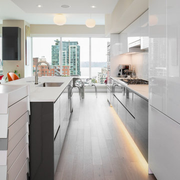
Once the leak occurred, the homeowners decided that it was the perfect opportunity to create their dream kitchen and entryway. The decision was made and the homeowners went shopping to purchase materials for their renovation. One problem; they hadn’t hired a contractor yet. They quickly discovered they would need help building their dream kitchen and entryway which is where we came in.
Scope:
Create a versatile space that reflects the homeowners’ vibrant personalities where they could cook, work, relax and entertain.
Desired features include:
Color changing LED tape lighting was essential to help create ambiance.
Smaller can lights with updated trim to modernize the lighting.
Disguising a “workspace” into the island design.
Installing a compost bin that doubles as a wine chiller for entertaining.
Separate wine bar.
Installing an intricate piece of mirror art and lighting in the entryway.
Installing custom waved back splash tile.
Challenges:
Creating a working set of construction plans from cabinet drawings was a challenge. The process entailed continuous communication with the clients including several walkthroughs before final installation of each aspect throughout the project.
Incorporating high-gloss and muted surfaces into the space without creating glare from the natural light coming in from many existing windows.
Wavy tile became difficult to install with the desired layout of backsplash outlet style and locations.
Solutions:
The core design issues were resolved with exceptional communication between our field team and the homeowners.
Satin finish countertops and matte paint offset the high gloss cabinetry and backsplash.
Because of the size of tiles in the space, the outlets needed to be cut in the center of the tile to look uniform. Time and a steady hand made this possible for the best visual result.
Result:
Thoughtful execution helped to create a versatile dream kitchen and entry way that also provides an at-home workspace. This now versatile space is useful and aesthetically pleasing, exceeding the homeowners’ vision. The small details ranging from accent lighting to the compost bin turned wine chiller make this a luxurious statement piece.
 Beyond Efficiency
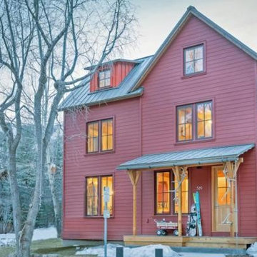
At an elevation of 8750' and winter design temperature of -16 degrees F, the historic mountain mining town of Telluride, Colorado can be cold! Beyond Efficiency was brought on board for its cold-climate expertise and provided buiding envelope advising and detailing, mechanical engineering, and guidance in surpassing Telluride's energy efficiency requirements for the new single-family home. The project was completed in the fall of 2016.
Our detailed plan review of preliminary building envelope details services identified thermal bridging issues at basement wall intersections with the slab and raised floor. Simple modifications significantly reduced heat loss and improved constructability. We also advised on the above-ground framed wall assemby, which resulted in a 2x6 wood-framed wall insulated with dense-pack cellulose, ZIP System sheathing (which doubles as the airtight weather-resistant barrier (WRB)), 2" continuous rigid mineral wool insulation, 1x4 furring, and fiber cement lap siding. The wall assembly reduces heat loss 20% compared to Telluride's minimum requirement, and the R-52 roof assembly is 35% better than code. Alpen high-solar gain fiberglass windows, which include a low-E film suspended between the two panes of glass, reduce window-related heat losses by 50% compared to code and round out the high-performance envelope package.
The final mechanical system design includes heat-recovery ventilation and in-floor radiant hydronic heating provided from a 95% AFUE high-efficiency condensing gas boiler. Utility bills from the first year of occupancy demonstrate the project's highly efficient design: the household's total site energy is about 20% less than that of the average Colorado residence, an impressive feat given that Telluride is in a significantly more extreme climate zone than a majority of Colorado's population.
Photo credit: Arkin Tilt Architects
 Counter Dimensions
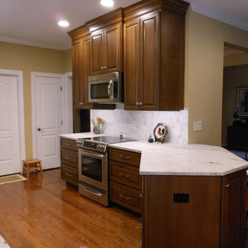
This very nice smaller home had basic builder-grade cabinets. We replaced them with a beautiful Semi-custom cabinet by Centra. Staying well with in a reasonable budget, we transformed the whole look and feel of this kitchen and added much more storage. We took the cabinets to the ceiling (adding 1 shelf all the way around) and continued the cabinets on the sink wall 30" with the large countertop cabinet. The old cabinets were re-purposed in the laundry room and garage.
Find the right local pro for your project
 Sosna Inc
After serving as a rental for some time, this home was ready to be reclaimed by its owner and her son.
Gutting “back to the studs” was an understatement for this one. This transformation involved replanning everything; including the roof, the HVAC system, the entire plumbing system, and relocating the side entrance and staircase to the back of the house. Only the subfloors, the exterior framing structure, and the brick remains from this original 1940’s-built bungalow.
When we’re renovating an old structure, we’re bound to find some surprises. This renovation did not disappoint! From basement to roof, we found more than a few, shall we say, potentially catastrophic surprises along the way.
Let’s start with the basement. The homeowner wanted to update the basement and make it a usable living space for her adult son as well as a spa with a sauna for her. This required bringing the 6 foot ceiling height up to code at 7 feet. To do this, we had to re-think the HVAC system that was in the basement ceiling. When we opened up the basement ceiling to remove the HVAC supply and return trunks, we discovered asbestos! The asbestos had to be removed before we could dismantle and remove the HVAC system.
For the main floor, when we were replanning the existing 2-bedroom layout to create two master bedrooms each with their own ensuites, we looked at the possibility of removing the main load-bearing wall. But our investigations led to the discovery that the load bearing wall was not lined up with the roof or the basement load points, so the load of the house was not continuous throughout. This was a disaster waiting to happen. And as we found out, this lack of alignment was causing major issues with the roof when we went to replace the shingles. We discovered portions of the roof truss in very poor condition, literally moments away from giving out. These were replaced and other truss components were fortified before we went on to re-shingle the roof and replace all the soffits and eavestroughs.
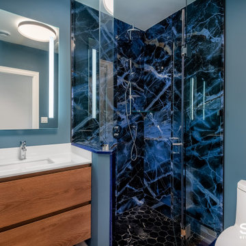
Once the structural and space planning elements were sorted out, we could turn our focus to helping this homeowner select the finishes she and her son wanted for their new spaces. She wanted white all the way, and he wanted bold colours. You will see these color choices reflected in their private bathrooms as well as in the upper kitchen and living area that she will mostly use, and the basement entertainment area that he will mostly use.
To round out the personalization of this made-new-again home, we converted the basement into an entertainment center with a bar for her son, and a sauna and third full bathroom with a jacuzzi tub for a spa-like feel for her.
Without having to build from scratch, this homeowner got the custom home of her dreams.
While you “can’t teach an old dog new tricks”, the sky’s the limit on how you can transform an old home into the home of your dreams. When your “old dog” needs some new tricks, we are the Renovator You Can Count On.
 Moss Building & Design
Formerly the home's "bonus room", its transformation to master bathroom was a design challenge for the MOSS team: an odd layout, as well as three staircases in and out of the room and the top of the former kitchen’s chimney running through it were the main issues. To solve these challenges, one staircase was completely closed off and the chimney covered up so as to essentially disappear, while all the plumbing for the room had to be run through the lower level ceiling and walls up to the bathroom. The final result? A calming oasis for the homeowners to relax in at the end of the day. The large walk-in shower is beautifully hand-tiled and located next to a standalone soaking tub, which sits next to a large window that allows in plenty of natural light. The water closet area has a unique wallpaper that draws the eye, as does the curved archway above the toilet, which matches the design in the kitchen leading from the hallway. MOSS was also able to transform a beloved piece of family furniture, which had traveled the globe with the family, into the master bathroom’s vanity, adding in a gorgeous countertop. While the room was transformed almost entirely from its original purpose, the homeowners kept the original hardwood floor, which provides continuity to the rest of the home and the original look and feel of a bygone era.
 My Kitchen And Bath
A complete primary bathroom remodel in Springfield, Virginia, designed around three priorities our clients came in with: a real walk-in shower, a freestanding tub by the windows, and a proper double vanity with storage that actually worked.
The original layout had everything in the wrong place. The tub sat against an interior wall away from the natural light. A small stall shower took up real estate across the room. The vanity was squeezed into whatever space was left over. Three windows on the back wall were doing nothing for the room because the layout was fighting them. Our solution involved knocking down the dividing wall between the old shower and vanity area, relocating plumbing for both the tub and the new vanities, and placing the freestanding tub directly under the bay of windows so morning light became part of the experience.
Design Approach
We anchored the room around contrast: deep navy cabinetry against soft white walls, warm brushed gold against cool marble tile, sharp Shaker lines against the curved silhouette of the freestanding tub. Navy was the design decision the rest of the room was built around — the clients knew they wanted color but didn't want anything that would feel dated in five years. Navy reads bold without being loud, pairs with virtually any metal finish, and has staying power that trendier choices don't.
We used Fabuwood Galaxy Indigo for the vanities — all-plywood construction with solid wood doors and drawer fronts, soft close throughout. Shaker-style flat panels keep the navy from feeling heavy. The brushed gold (Jeffrey Alexander 635-96SBZ in satin bronze) shows up across hardware, faucets, lighting, the tub filler, and the shower trim, creating a quiet continuity throughout the room.
The Shower
Removing the wall between the old shower and old vanity area created room for a proper walk-in. We tiled the entire shower floor to ceiling in Decovita Calacatta Suave 24x48" porcelain — large format installed in a 50% offset horizontal pattern, with cement board and redgard underneath. The marble-look porcelain gives the visual depth of natural marble without the maintenance.
A built-in shower bench, custom-built into the corner, is wrapped in the same wall tile on the front with a quartz top matching the vanity counter. The shower niche is detailed with MSI Arabescato Carrara 2" honed hex mosaic at the back, the same tile used on the shower floor. All tile edges are finished with Schluter in satin bronze to match the room's metal finishes. The shower door is custom frameless 3/8" tempered glass with a satin bronze pull — no metal frame interrupting the sight line.
The Vanities and Countertops
The new double vanity gives both clients their own space for morning routines. Counter tops are MSI Calacatta Miraggio Cielo quartz with pencil edging and a 4" backsplash — a soft white with subtle gray veining that reads like real Calacatta marble without the porosity issues. Two undermount square porcelain sinks finish the surface cleanly.
The Tub
A 60" freestanding soaker tub sits under the bay of three windows. The floor-mounted tub filler is satin bronze with a handheld sprayer. We relocated the drain and supply lines to make the centered placement work. The tub is the room's quietest feature and its strongest — clients tell us they use this bathroom differently than they used the old one.
Flooring
MSI Sande Ivory 12x24" matte porcelain runs throughout the bathroom floor in a 50% offset pattern parallel to the vanity wall. Cement board underneath, 4" white wood baseboard, Whisper Grey grout that handles daily use without showing wear.
Paint and Lighting
Walls are Benjamin Moore Chantilly Lace 2121-70 in satin — a true crisp white that doesn't lean cool or warm. The ceiling uses Benjamin Moore Aura Bath and Spa White, which is formulated to resist mildew in high-humidity spaces. Lighting is layered: three new 6" LED recessed lights on a dimmer, two satin bronze vanity sconces above the mirrors, and the existing three windows providing the daytime ambient light.
Project Specs
Location: Springfield, Virginia
Project type: Full primary bathroom remodel
Project duration: Approximately 5 weeks
Style: Modern, Transitional
Color palette: Navy, white, brushed gold, marble
Materials
Cabinetry: Fabuwood Galaxy Indigo, Shaker-style flat panel maple, all-plywood construction
Cabinet hardware: Jeffrey Alexander 635-96SBZ Satin Bronze pulls
Vanity counter and bench top: MSI Calacatta Miraggio Cielo Quartz, pencil edge with 4" backsplash
Sinks: Undermount white porcelain BR-202 square (x2)
Wall tile: Decovita Calacatta Suave 24x48" porcelain
Floor tile: MSI Sande Ivory 12x24" matte porcelain
Shower floor + niche back: MSI Arabescato Carrara 2" honed hex mosaic marble
Edge trim: Schluter satin bronze
Shower door: Custom frameless 3/8" tempered glass
Tub: 60" freestanding acrylic soaker (Ferguson)
Tub filler: Floor-mounted satin bronze (Ferguson)
Vanity faucets, mirrors, sconces, toilet: Satin bronze coordinated finishes (Ferguson)
Wall paint: Benjamin Moore Chantilly Lace 2121-70 Satin
Ceiling paint: Benjamin Moore Aura Bath and Spa White
Grout: Whisper Grey (floor), Standard White (walls and shower)
Designed and built by My Kitchen and Bath out of our Alexandria showroom at 5710 General Washington Drive. We've been designing and building kitchens, bathrooms, and full home renovations across Northern Virginia and the DMV since 1994.

 Star Furniture
Meet Marta Herbert
Marta comes to Star Furniture from the mountains and valleys of the West where she specialized in turning apartments into lofts, cabins into lodges and houses into estates. From cozy, to chic, to expansive, Marta's fluency with color, texture, and lighting in perfect balance is a gift first noted by professors at The American River College in Sacramento, and has evolved over the past three decades into the ability to translate the desires of her clients into classic statements of style.
As an avid student of design and proponent of continuing education, Marta has remained at the forefront of her profession gathering broad knowledge about exotic woods, fabrics, fine carpets, and the vast assortment of leathers. She understands the elements needed to create personal spaces that welcome use.
"Let me bring your vision of your room to life...it's not just a room, it's the place you want to live."
Contact Marta and let her know that you found her on Houzz.com.
Webpage: https://www.starfurniture.com/marta-herbert
Address: Star Furniture, 18107 North Freeway, Houston, TX 77090
Phone: 281-440-3330
Email: mherbert@starfurniture.com
 Smithwood Builders Inc.
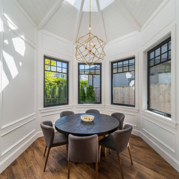
With two teen daughters, a one bathroom house isn’t going to cut it. In order to keep the peace, our clients tore down an existing house in Richmond, BC to build a dream home suitable for a growing family. The plan. To keep the business on the main floor, complete with gym and media room, and have the bedrooms on the upper floor to retreat to for moments of tranquility. Designed in an Arts and Crafts manner, the home’s facade and interior impeccably flow together. Most of the rooms have craftsman style custom millwork designed for continuity. The highlight of the main floor is the dining room with a ridge skylight where ship-lap and exposed beams are used as finishing touches. Large windows were installed throughout to maximize light and two covered outdoor patios built for extra square footage. The kitchen overlooks the great room and comes with a separate wok kitchen. You can never have too many kitchens! The upper floor was designed with a Jack and Jill bathroom for the girls and a fourth bedroom with en-suite for one of them to move to when the need presents itself. Mom and dad thought things through and kept their master bedroom and en-suite on the opposite side of the floor. With such a well thought out floor plan, this home is sure to please for years to come.
 Natural Stone Institute
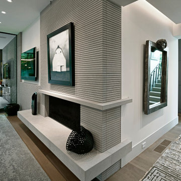
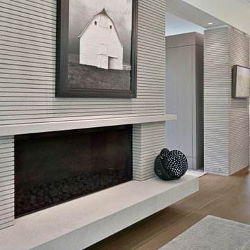
This private residence involved construction of a modern architectural style estate property in Highland Park, Texas. Dee Brown Inc’s role came into play late in the project, when corrections were needed to some specialty stonework.
The home’s center is formed around the main entry. The floorplan is largely open, but parallel core wall areas serve to define the foyer, kitchen, dining, and living areas. As key areas, the architect put special focus on materials selection for the core walls. It was decided that Indiana limestone would be the finish, and that the cladding panels would all have unique continuous horizontal grooves.
Material was received and installed by the original subcontractor. Upon seeing the completed work, it was evident to the architect and owner that grooves in the fabricated material were not consistent, and that the installation process had left numerous chips to the panels. It was at this point that the partially completed work was removed, and the second fabricator/installer was contacted.
Dee Brown Inc ordered the Indiana limestones slabs. There, special care was taken to hold tight tolerances to the horizontal grooves as well as to the typical cut-to-size aspects. Erection of these mechanically set panels was done very carefully. The result was a clean finished product with none of the tolerance and chipping issues of the original installation.
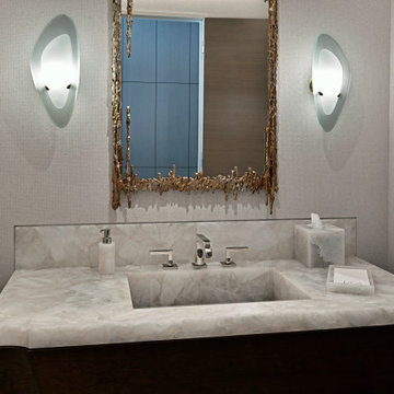
Dee Brown, Inc also created and installed special stone finishes at the adjacent half-bath. Semi-precious white onyx was transformed into a lavatory top/bowl assembly, water-closet wall cladding, and even tissue and towel holders.
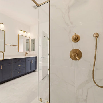 My Kitchen And Bath
A complete primary bathroom remodel in Springfield, Virginia, designed around three priorities our clients came in with: a real walk-in shower, a freestanding tub by the windows, and a proper double vanity with storage that actually worked.
The original layout had everything in the wrong place. The tub sat against an interior wall away from the natural light. A small stall shower took up real estate across the room. The vanity was squeezed into whatever space was left over. Three windows on the back wall were doing nothing for the room because the layout was fighting them. Our solution involved knocking down the dividing wall between the old shower and vanity area, relocating plumbing for both the tub and the new vanities, and placing the freestanding tub directly under the bay of windows so morning light became part of the experience.
Design Approach
We anchored the room around contrast: deep navy cabinetry against soft white walls, warm brushed gold against cool marble tile, sharp Shaker lines against the curved silhouette of the freestanding tub. Navy was the design decision the rest of the room was built around — the clients knew they wanted color but didn't want anything that would feel dated in five years. Navy reads bold without being loud, pairs with virtually any metal finish, and has staying power that trendier choices don't.
We used Fabuwood Galaxy Indigo for the vanities — all-plywood construction with solid wood doors and drawer fronts, soft close throughout. Shaker-style flat panels keep the navy from feeling heavy. The brushed gold (Jeffrey Alexander 635-96SBZ in satin bronze) shows up across hardware, faucets, lighting, the tub filler, and the shower trim, creating a quiet continuity throughout the room.
The Shower
Removing the wall between the old shower and old vanity area created room for a proper walk-in. We tiled the entire shower floor to ceiling in Decovita Calacatta Suave 24x48" porcelain — large format installed in a 50% offset horizontal pattern, with cement board and redgard underneath. The marble-look porcelain gives the visual depth of natural marble without the maintenance.
A built-in shower bench, custom-built into the corner, is wrapped in the same wall tile on the front with a quartz top matching the vanity counter. The shower niche is detailed with MSI Arabescato Carrara 2" honed hex mosaic at the back, the same tile used on the shower floor. All tile edges are finished with Schluter in satin bronze to match the room's metal finishes. The shower door is custom frameless 3/8" tempered glass with a satin bronze pull — no metal frame interrupting the sight line.
The Vanities and Countertops
The new double vanity gives both clients their own space for morning routines. Counter tops are MSI Calacatta Miraggio Cielo quartz with pencil edging and a 4" backsplash — a soft white with subtle gray veining that reads like real Calacatta marble without the porosity issues. Two undermount square porcelain sinks finish the surface cleanly.
The Tub
A 60" freestanding soaker tub sits under the bay of three windows. The floor-mounted tub filler is satin bronze with a handheld sprayer. We relocated the drain and supply lines to make the centered placement work. The tub is the room's quietest feature and its strongest — clients tell us they use this bathroom differently than they used the old one.
Flooring
MSI Sande Ivory 12x24" matte porcelain runs throughout the bathroom floor in a 50% offset pattern parallel to the vanity wall. Cement board underneath, 4" white wood baseboard, Whisper Grey grout that handles daily use without showing wear.
Paint and Lighting
Walls are Benjamin Moore Chantilly Lace 2121-70 in satin — a true crisp white that doesn't lean cool or warm. The ceiling uses Benjamin Moore Aura Bath and Spa White, which is formulated to resist mildew in high-humidity spaces. Lighting is layered: three new 6" LED recessed lights on a dimmer, two satin bronze vanity sconces above the mirrors, and the existing three windows providing the daytime ambient light.
Project Specs
Location: Springfield, Virginia
Project type: Full primary bathroom remodel
Project duration: Approximately 5 weeks
Style: Modern, Transitional
Color palette: Navy, white, brushed gold, marble
Materials
Cabinetry: Fabuwood Galaxy Indigo, Shaker-style flat panel maple, all-plywood construction
Cabinet hardware: Jeffrey Alexander 635-96SBZ Satin Bronze pulls
Vanity counter and bench top: MSI Calacatta Miraggio Cielo Quartz, pencil edge with 4" backsplash
Sinks: Undermount white porcelain BR-202 square (x2)
Wall tile: Decovita Calacatta Suave 24x48" porcelain
Floor tile: MSI Sande Ivory 12x24" matte porcelain
Shower floor + niche back: MSI Arabescato Carrara 2" honed hex mosaic marble
Edge trim: Schluter satin bronze
Shower door: Custom frameless 3/8" tempered glass
Tub: 60" freestanding acrylic soaker (Ferguson)
Tub filler: Floor-mounted satin bronze (Ferguson)
Vanity faucets, mirrors, sconces, toilet: Satin bronze coordinated finishes (Ferguson)
Wall paint: Benjamin Moore Chantilly Lace 2121-70 Satin
Ceiling paint: Benjamin Moore Aura Bath and Spa White
Grout: Whisper Grey (floor), Standard White (walls and shower)
Designed and built by My Kitchen and Bath out of our Alexandria showroom at 5710 General Washington Drive. We've been designing and building kitchens, bathrooms, and full home renovations across Northern Virginia and the DMV since 1994.
 Moss Building & Design
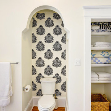
Formerly the home's "bonus room", its transformation to master bathroom was a design challenge for the MOSS team: an odd layout, as well as three staircases in and out of the room and the top of the former kitchen’s chimney running through it were the main issues. To solve these challenges, one staircase was completely closed off and the chimney covered up so as to essentially disappear, while all the plumbing for the room had to be run through the lower level ceiling and walls up to the bathroom. The final result? A calming oasis for the homeowners to relax in at the end of the day. The large walk-in shower is beautifully hand-tiled and located next to a standalone soaking tub, which sits next to a large window that allows in plenty of natural light. The water closet area has a unique wallpaper that draws the eye, as does the curved archway above the toilet, which matches the design in the kitchen leading from the hallway. MOSS was also able to transform a beloved piece of family furniture, which had traveled the globe with the family, into the master bathroom’s vanity, adding in a gorgeous countertop. While the room was transformed almost entirely from its original purpose, the homeowners kept the original hardwood floor, which provides continuity to the rest of the home and the original look and feel of a bygone era.
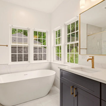 My Kitchen And Bath
A complete primary bathroom remodel in Springfield, Virginia, designed around three priorities our clients came in with: a real walk-in shower, a freestanding tub by the windows, and a proper double vanity with storage that actually worked.
The original layout had everything in the wrong place. The tub sat against an interior wall away from the natural light. A small stall shower took up real estate across the room. The vanity was squeezed into whatever space was left over. Three windows on the back wall were doing nothing for the room because the layout was fighting them. Our solution involved knocking down the dividing wall between the old shower and vanity area, relocating plumbing for both the tub and the new vanities, and placing the freestanding tub directly under the bay of windows so morning light became part of the experience.
Design Approach
We anchored the room around contrast: deep navy cabinetry against soft white walls, warm brushed gold against cool marble tile, sharp Shaker lines against the curved silhouette of the freestanding tub. Navy was the design decision the rest of the room was built around — the clients knew they wanted color but didn't want anything that would feel dated in five years. Navy reads bold without being loud, pairs with virtually any metal finish, and has staying power that trendier choices don't.
We used Fabuwood Galaxy Indigo for the vanities — all-plywood construction with solid wood doors and drawer fronts, soft close throughout. Shaker-style flat panels keep the navy from feeling heavy. The brushed gold (Jeffrey Alexander 635-96SBZ in satin bronze) shows up across hardware, faucets, lighting, the tub filler, and the shower trim, creating a quiet continuity throughout the room.
The Shower
Removing the wall between the old shower and old vanity area created room for a proper walk-in. We tiled the entire shower floor to ceiling in Decovita Calacatta Suave 24x48" porcelain — large format installed in a 50% offset horizontal pattern, with cement board and redgard underneath. The marble-look porcelain gives the visual depth of natural marble without the maintenance.
A built-in shower bench, custom-built into the corner, is wrapped in the same wall tile on the front with a quartz top matching the vanity counter. The shower niche is detailed with MSI Arabescato Carrara 2" honed hex mosaic at the back, the same tile used on the shower floor. All tile edges are finished with Schluter in satin bronze to match the room's metal finishes. The shower door is custom frameless 3/8" tempered glass with a satin bronze pull — no metal frame interrupting the sight line.
The Vanities and Countertops
The new double vanity gives both clients their own space for morning routines. Counter tops are MSI Calacatta Miraggio Cielo quartz with pencil edging and a 4" backsplash — a soft white with subtle gray veining that reads like real Calacatta marble without the porosity issues. Two undermount square porcelain sinks finish the surface cleanly.
The Tub
A 60" freestanding soaker tub sits under the bay of three windows. The floor-mounted tub filler is satin bronze with a handheld sprayer. We relocated the drain and supply lines to make the centered placement work. The tub is the room's quietest feature and its strongest — clients tell us they use this bathroom differently than they used the old one.
Flooring
MSI Sande Ivory 12x24" matte porcelain runs throughout the bathroom floor in a 50% offset pattern parallel to the vanity wall. Cement board underneath, 4" white wood baseboard, Whisper Grey grout that handles daily use without showing wear.
Paint and Lighting
Walls are Benjamin Moore Chantilly Lace 2121-70 in satin — a true crisp white that doesn't lean cool or warm. The ceiling uses Benjamin Moore Aura Bath and Spa White, which is formulated to resist mildew in high-humidity spaces. Lighting is layered: three new 6" LED recessed lights on a dimmer, two satin bronze vanity sconces above the mirrors, and the existing three windows providing the daytime ambient light.
Project Specs
Location: Springfield, Virginia
Project type: Full primary bathroom remodel
Project duration: Approximately 5 weeks
Style: Modern, Transitional
Color palette: Navy, white, brushed gold, marble
Materials
Cabinetry: Fabuwood Galaxy Indigo, Shaker-style flat panel maple, all-plywood construction
Cabinet hardware: Jeffrey Alexander 635-96SBZ Satin Bronze pulls
Vanity counter and bench top: MSI Calacatta Miraggio Cielo Quartz, pencil edge with 4" backsplash
Sinks: Undermount white porcelain BR-202 square (x2)
Wall tile: Decovita Calacatta Suave 24x48" porcelain
Floor tile: MSI Sande Ivory 12x24" matte porcelain
Shower floor + niche back: MSI Arabescato Carrara 2" honed hex mosaic marble
Edge trim: Schluter satin bronze
Shower door: Custom frameless 3/8" tempered glass
Tub: 60" freestanding acrylic soaker (Ferguson)
Tub filler: Floor-mounted satin bronze (Ferguson)
Vanity faucets, mirrors, sconces, toilet: Satin bronze coordinated finishes (Ferguson)
Wall paint: Benjamin Moore Chantilly Lace 2121-70 Satin
Ceiling paint: Benjamin Moore Aura Bath and Spa White
Grout: Whisper Grey (floor), Standard White (walls and shower)
Designed and built by My Kitchen and Bath out of our Alexandria showroom at 5710 General Washington Drive. We've been designing and building kitchens, bathrooms, and full home renovations across Northern Virginia and the DMV since 1994.
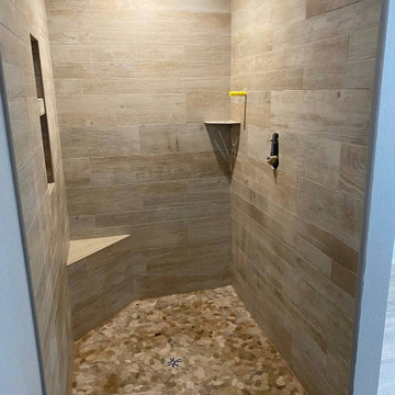
 Mi Tile Installation Experts
Almost five years ago, we completed this shower remodel using the Schluter waterproofing system and our full transparency approach.
From day one, our client knew every detail — every step, every deadline, and every material. No surprises. No delays. Just clear communication and results that stand the test of time.
Today, this shower still looks as beautiful and solid as the day it was finished. That same client continues to recommend us to friends and neighbors — and thanks to our Referral Program, he earns rewards for every new project that comes from his recommendation.
From that one neighborhood alone, we’ve completed four more full remodels, each one built on trust, craftsmanship, and proven results.
We take pride in knowing that our clients are not only satisfied — they’re proud to show their homes to others.
You can visit any of our past projects in person and see the same precision, durability, and beauty that define every Mi Tile Installation Experts project.
? Mikhailbelov37@gmail.com
? https://micatile.com
?️ Free Remodel Audit
Want to avoid hidden issues, costly delays, and budget surprises?
Comment “AUDIT” and we’ll provide a free expert review of your remodel — whether you’re just starting, already in progress, or recently completed.
We’ll help you:
✔️ Plan your project efficiently
✔️ Know what to expect
✔️ Identify common contractor shortcuts
✔️ Protect your investment from day one
? Exclusive Client Benefits
✨ Bonus Program — earn up to 15% back in bonus points to use toward your next project or gift to family/friends.
✨ Referral Program — get 10% cash back from every direct referral project, plus 3% from their referrals.
✨ Returning Client Discount — receive 10% off per sq ft on your second project.
Want the full details? Comment BONUS and we’ll send you the complete guide.
#longlastingquality #showerremodel #schlutersystem #trustworthycontractor #tileinstallation #referralprogram #customremodel #waterproofing #qualitycraftsmanship #loomis #granitebay #eldoradohills #mitileinstallationexperts #miauditmyremodel #beforeandafter #remodeljourney
 Natural Stone Institute
This private residence involved construction of a modern architectural style estate property in Highland Park, Texas. Dee Brown Inc’s role came into play late in the project, when corrections were needed to some specialty stonework.
The home’s center is formed around the main entry. The floorplan is largely open, but parallel core wall areas serve to define the foyer, kitchen, dining, and living areas. As key areas, the architect put special focus on materials selection for the core walls. It was decided that Indiana limestone would be the finish, and that the cladding panels would all have unique continuous horizontal grooves.
Material was received and installed by the original subcontractor. Upon seeing the completed work, it was evident to the architect and owner that grooves in the fabricated material were not consistent, and that the installation process had left numerous chips to the panels. It was at this point that the partially completed work was removed, and the second fabricator/installer was contacted.
Dee Brown Inc ordered the Indiana limestones slabs. There, special care was taken to hold tight tolerances to the horizontal grooves as well as to the typical cut-to-size aspects. Erection of these mechanically set panels was done very carefully. The result was a clean finished product with none of the tolerance and chipping issues of the original installation.
Dee Brown, Inc also created and installed special stone finishes at the adjacent half-bath. Semi-precious white onyx was transformed into a lavatory top/bowl assembly, water-closet wall cladding, and even tissue and towel holders.
 Pathway Design & Construction
Water leaks can be frustrating and happen often unexpectedly… especially when the water is coming from your upstairs neighbor!
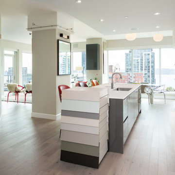
Once the leak occurred, the homeowners decided that it was the perfect opportunity to create their dream kitchen and entryway. The decision was made and the homeowners went shopping to purchase materials for their renovation. One problem; they hadn’t hired a contractor yet. They quickly discovered they would need help building their dream kitchen and entryway which is where we came in.
Scope:
Create a versatile space that reflects the homeowners’ vibrant personalities where they could cook, work, relax and entertain.
Desired features include:
Color changing LED tape lighting was essential to help create ambiance.
Smaller can lights with updated trim to modernize the lighting.
Disguising a “workspace” into the island design.
Installing a compost bin that doubles as a wine chiller for entertaining.
Separate wine bar.
Installing an intricate piece of mirror art and lighting in the entryway.
Installing custom waved back splash tile.
Challenges:
Creating a working set of construction plans from cabinet drawings was a challenge. The process entailed continuous communication with the clients including several walkthroughs before final installation of each aspect throughout the project.
Incorporating high-gloss and muted surfaces into the space without creating glare from the natural light coming in from many existing windows.
Wavy tile became difficult to install with the desired layout of backsplash outlet style and locations.
Solutions:
The core design issues were resolved with exceptional communication between our field team and the homeowners.
Satin finish countertops and matte paint offset the high gloss cabinetry and backsplash.
Because of the size of tiles in the space, the outlets needed to be cut in the center of the tile to look uniform. Time and a steady hand made this possible for the best visual result.
Result:
Thoughtful execution helped to create a versatile dream kitchen and entry way that also provides an at-home workspace. This now versatile space is useful and aesthetically pleasing, exceeding the homeowners’ vision. The small details ranging from accent lighting to the compost bin turned wine chiller make this a luxurious statement piece.
 Robin Rigby Fisher, CMKBD/CAPS/CLIPPS
Condos are often a challenge – can’t move water, venting has to remain connected to existing ducting and recessed cans may not be an option. In this project, we had an added challenge – we could not lower the ceiling on the exterior wall due to a continual leak issue that the HOA has put off due to the multi-million-dollar expense.
DESIGN PHILOSOPHY:
Work Centers: prep, baking, clean up, message, beverage and entertaining.
Vignette Design: avoid wall to wall cabinets, enhance the work center philosophy
Geometry: create a more exciting and natural flow
ANGLES: the baking center features a Miele wall oven and Liebherr Freezer, the countertop is 36” deep (allowing for an extra deep appliance garage with stainless tambour).
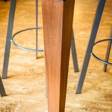
CURVES: the island, desk and ceiling is curved to create a more natural flow. A raised drink counter in Sapele allows for “bellying up to the bar”
CIRCLES: the 60” table (seating for 6) is supported by a steel plate and a custom column (used also to support the end of the curved desk – not shown)
ISLAND CHALLENGE: To install recessed cans and connect to the existing ducting – we dropped the ceiling 6”. The dropped ceiling curves at the end of the island to the existing ceiling height at the pantry/desk area of the kitchen. The stainless steel column at the end of the island is an electrical chase (the ceiling is concrete, which we were not allowed to puncture) for the island
Cabinets: Sapele – Vertical Grain
Island Cabinets: Metro LM 98 – Horizontal Grain Laminate
Countertop
Granite: Purple Dunes
Wood – maple
Drink Counter: Sapele
Appliances:
Refrigerator and Freezer: Liebherr
Induction CT, DW, Wall and Steam Oven: Miele
Hood: Best Range Hoods – Cirrus
Wine Refrigerator: Perlick
Flooring: Cork
Tile Backsplash: Artistic Tile Steppes – Negro Marquina
Lighting: Tom Dixon
NW Architectural Photography
 Window Treats Inc.
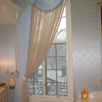
This home's master bathroom is the size of some homes' master bedroom. It includes two windows -- one on the right and one on the left of the soaking tub -- with beautiful views of the backyard.
Privacy was not an issue in this case, so we went with unique treatments to complement the windows. The designer actually drew the design out on paper first to make sure it would fit the room. Then, we continued with a lightweight, sheer voile in two colors. The top of the windows were curved, so we curved the boards and swags and included a panel coming down with a jabot-cut panel in the middle. There are rosettes on top and a tie-back on the bottom to finish the design.
This treatment flows and warms up this fantastic master bathroom.
 Natural Stone Institute
This private residence involved construction of a modern architectural style estate property in Highland Park, Texas. Dee Brown Inc’s role came into play late in the project, when corrections were needed to some specialty stonework.
The home’s center is formed around the main entry. The floorplan is largely open, but parallel core wall areas serve to define the foyer, kitchen, dining, and living areas. As key areas, the architect put special focus on materials selection for the core walls. It was decided that Indiana limestone would be the finish, and that the cladding panels would all have unique continuous horizontal grooves.
Material was received and installed by the original subcontractor. Upon seeing the completed work, it was evident to the architect and owner that grooves in the fabricated material were not consistent, and that the installation process had left numerous chips to the panels. It was at this point that the partially completed work was removed, and the second fabricator/installer was contacted.
Dee Brown Inc ordered the Indiana limestones slabs. There, special care was taken to hold tight tolerances to the horizontal grooves as well as to the typical cut-to-size aspects. Erection of these mechanically set panels was done very carefully. The result was a clean finished product with none of the tolerance and chipping issues of the original installation.
Dee Brown, Inc also created and installed special stone finishes at the adjacent half-bath. Semi-precious white onyx was transformed into a lavatory top/bowl assembly, water-closet wall cladding, and even tissue and towel holders.
 Gallery KBNY
The owner of this historic and landmarked town-home renovation in Hudson Square, originally built in 1826, hired Gallery Kitchen and Bath to fully gut-renovate this 3-unit row-home. The scope of work included a full-scale renovation of the owners unit, including the renovation of the kitchen, one 4-piece master ensuite bathroom, one 3-piece bathroom with a walk-in steam shower, and a beautiful powder room. Additional work in the owners unit also included flooring, electrical upgrade, major plumbing work, new HVAC system, restoration of a fireplace, installation of a fully integrated smart home system and landmarked approved windows.
CELLAR RENOVATION IN NYC LANDMARKED TOWN-HOME
Rounding out the owners unit we renovated the cellar, which was converted into an entertainment space and featured a custom glass curtain wall, along with a custom staircase with an exposed brick wall. During the demolition phase of the cellar, our team discovered 56 wine jugs filled with wine from the prohibition era, leading us to name this project the prohibition house. For the two tenant units, Gallery Kitchen and Bath undertook the renovation of 2 kitchens, 4 bathrooms, new hardwood flooring throughout, along with detailed carpentry work in the entire home.
WHY GALLERY KITCHEN AND BATH
After interviewing multiple contractors, our client decided on Gallery Kitchen and Bath primarily because of our turnkey design, selection, and build process. In a renovation of this magnitude it is crucial to have a centralized full service contractor under one roof to handle all of the aspects and simultaneous moving parts of the project. Decentralizing the entire process by having multiple unaffiliated vendors handle various parts of the process can easily become chaotic, time consuming, and costly.
Because Gallery Kitchen and Bath undertook the entire process, from the design of the entire space to the selection and procurement of all finishes and fixtures, down to the procurement of all permits and LPC filings, it made a seemingly chaotic project a’lot more manageable.
PHASE 1: DESIGN, SELECTION, PROCUREMENT
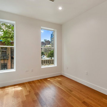
Our client wanted the renovation to incorporate a fully modern design into his Hudson Square town-house. Being that this is a landmarked property, the exterior facade had to be restored and kept with the original aesthetic, the interior of the home however was a whole different story.
In keeping up with the modern aesthetic, our designers went to work to design a custom kitchen that included fully custom flat panel base cabinets in a white high gloss finish and an absolute matte black appliance/pantry wall. The kitchen design also included a white quartz countertop and backsplash with a waterfall edge island. To bring warmth to the modern kitchen, our designers incorporated a rifted and quartered select oak wood floor in a herringbone pattern, and custom blended stain with matte polyurethane finish. For continuity, the wood floor was also extended throughout the entire owners unit.
In the ensuite bathroom we created a “wet area” which houses a standalone soaking tub as well as a beautiful rainfall shower, completely leveled with the rest of the floor in the bathroom. Some highlights within this space include a tiled square drain, large niche cutouts with a carrera marble accents. Once again, to bring warmth to this modern bathroom, our designers incorporated a floating rustic oak vanity and carrera marble mosaic floor tile.
Last on the list on the owners unit floor was the cellar, which our client wanted to utilize as an entertainment space for his friends and family. During the design phase, we incorporated an open concept layout, wedding the indoor and outdoor space with a custom glass curtain wall. The design also included custom walnut built-ins that serve as a custom wet bar and storage piece.
With the design approved and selections made our office liaisons moved to procure all of the material selections and finishes.
PHASE 2: DEMO
Because this home is almost two centuries old, we had to take extra precaution during the interior demolition phase of the project. One specific area that we had to pay special attention to was the existing brick. Over time the mortar in old brick homes deteriorates and turns into dust – for this reason it was extremely important that a thorough and ongoing inspection of the exteriors and interior walls took place during the demolition of the space.
After 14 30-yard debris containers and 56 wine filled jugs from the prohibition era later , the demolition of this historic Hudson Square town-home came to an end. If you are wondering whether we tried the wine? After notifying the owner we agreed to open one of the jugs and try them together – nothing but vinegar.
PHASE 3: BUILD
One of the challenges in a renovation project of this scope is nailing down the logistics and delivery of fixtures and finish material. Adding to this challenge was a narrow entry door that required us to use a boom truck in order to deliver some of the larger materials on site. To ensure a succinct time schedule, we boomed all of the materials through the 3rd floor for the entire project and worked our renovation work from top floor to cellar. This technique also insured that any unexpected water issues during the renovation process would not damage a finished floor.
With all roughing and framing complete, the Gallery KBNY team proceeded to execute on the design plan.
THE REVEAL
From what was once a dilapidated town-home with nothing but potential, to a glamorous and luxurious modern interior space – the prohibition house was complete. Ready to speak with us about your renovation project? Contact us to schedule your free consultation and let Gallery KBNY show you why our all-inclusive approach to your renovation is the smartest way to renovating in NYC.

24