
Search results for "Joining" in Home Design Ideas
 Uniik Design
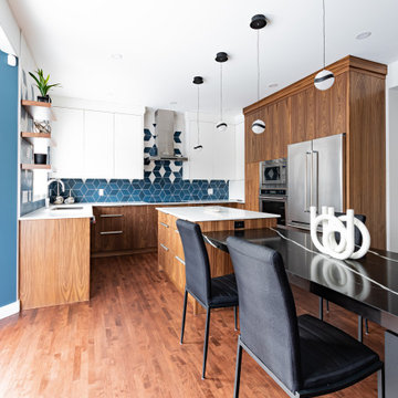
Modern kitchen featuring a faded blue and white backsplash, walnut cabinetry all around, five crystal and black pendants, stainless steel appliances and three floating shelves for a couple cook books and decor pieces.
 Vetter Architects
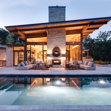
The owners requested a Private Resort that catered to their love for entertaining friends and family, a place where 2 people would feel just as comfortable as 42. Located on the western edge of a Wisconsin lake, the site provides a range of natural ecosystems from forest to prairie to water, allowing the building to have a more complex relationship with the lake - not merely creating large unencumbered views in that direction. The gently sloping site to the lake is atypical in many ways to most lakeside lots - as its main trajectory is not directly to the lake views - allowing for focus to be pushed in other directions such as a courtyard and into a nearby forest.
The biggest challenge was accommodating the large scale gathering spaces, while not overwhelming the natural setting with a single massive structure. Our solution was found in breaking down the scale of the project into digestible pieces and organizing them in a Camp-like collection of elements:
- Main Lodge: Providing the proper entry to the Camp and a Mess Hall
- Bunk House: A communal sleeping area and social space.
- Party Barn: An entertainment facility that opens directly on to a swimming pool & outdoor room.
- Guest Cottages: A series of smaller guest quarters.
- Private Quarters: The owners private space that directly links to the Main Lodge.
These elements are joined by a series green roof connectors, that merge with the landscape and allow the out buildings to retain their own identity. This Camp feel was further magnified through the materiality - specifically the use of Doug Fir, creating a modern Northwoods setting that is warm and inviting. The use of local limestone and poured concrete walls ground the buildings to the sloping site and serve as a cradle for the wood volumes that rest gently on them. The connections between these materials provided an opportunity to add a delicate reading to the spaces and re-enforce the camp aesthetic.
The oscillation between large communal spaces and private, intimate zones is explored on the interior and in the outdoor rooms. From the large courtyard to the private balcony - accommodating a variety of opportunities to engage the landscape was at the heart of the concept.
Overview
Chenequa, WI
Size
Total Finished Area: 9,543 sf
Completion Date
May 2013
Services
Architecture, Landscape Architecture, Interior Design
 Tiles Gone Wild, Inc.
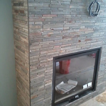
Lotus Slate Linear Mosaic
Elegant formal and open concept living room photo in Boston with green walls, a standard fireplace and a tile fireplace
Elegant formal and open concept living room photo in Boston with green walls, a standard fireplace and a tile fireplace
Find the right local pro for your project


 Denyne Designs
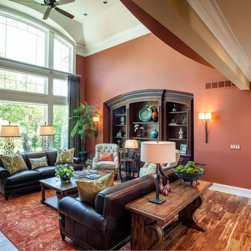
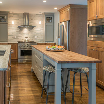
This beautiful transitional kitchen remodel features both natural cherry flat panel cabinetry alongside painted grey cabinets, stainless steel appliances and satin nickel hardware. The overall result is to an upscale and airy space that anyone would want to spend time in. The oversize island is a contrast in cool gray which joins the kitchen to the adjacent dining area, tying the two spaces together. Countertops in cherry butcher block as well as fantasy brown granite bring contrast to this expansive kitchen. Finally the rough-hewn flooring with it's mixture of rich, deep wood tones alongside lighter hues finish off this exquisite space.
 Manlove and Company Interiors
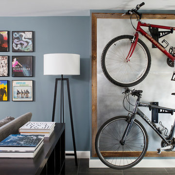
To obtain sources, copy and paste this link into your browser.
https://www.arlingtonhomeinteriors.com/retro-retreat
Photographer: Stacy Zarin-Goldberg




 Stephen Moser Architect
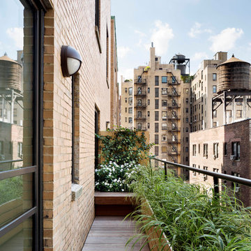
Aluminum planters with a wood slats were custom fabricated to maximize the usable space of this intimate terrace.
Mid-sized trendy balcony photo in New York with no cover
Mid-sized trendy balcony photo in New York with no cover


 Kathleen Jennison
An Arts & Crafts Bungalow is one of my favorite styles of homes. We have quite a few of them in our Stockton Mid-Town area. And when C&L called us to help them remodel their 1923 American Bungalow, I was beyond thrilled.
As per usual, when we get a new inquiry, we quickly Google the project location while we are talking to you on the phone. My excitement escalated when I saw the Google Earth Image of the sweet Sage Green bungalow in Mid-Town Stockton. "Yes, we would be interested in working with you," I said trying to keep my cool.
But what made it even better was meeting C&L and touring their home, because they are the nicest young couple, eager to make their home period perfect. Unfortunately, it had been slightly molested by some bad house-flippers, and we needed to bring the bathroom back to it "roots."
We knew we had to banish the hideous brown tile and cheap vanity quickly. But C&L complained about the condensation problems and the constant fight with mold. This immediately told me that improper remodeling had occurred and we needed to remedy that right away.
The Before: Frustrations with a Botched Remodel
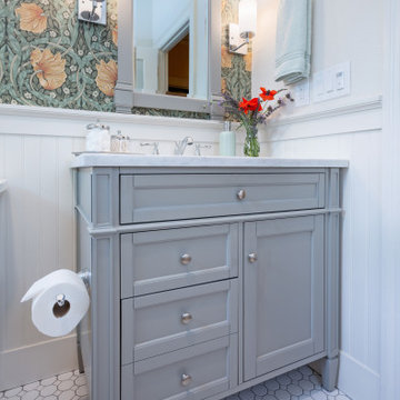
The bathroom needed to be brought back to period appropriate design with all the functionality of a modern bathroom. We thought of things like marble countertop, white mosaic floor tiles, white subway tile, board and batten molding, and of course a fabulous wallpaper.
This small (and only) bathroom on a tight budget required a little bit of design sleuthing to figure out how we could get the proper look and feel. Our goal was to determine where to splurge and where to economize and how to complete the remodel as quickly as possible because C&L would have to move out while construction was going on.
The Process: Hard Work to Remedy Design and Function
During our initial design study, (which included 2 hours in the owners’ home), we noticed framed images of William Morris Arts and Crafts textile patterns and knew this would be our design inspiration. We presented C&L with three options and they quickly selected the Pimpernel Design Concept.
We had originally selected the Black and Olive colors with a black vanity, mirror, and black and white floor tile. C&L liked it but weren’t quite sure about the black, We went back to the drawing board and decided the William & Co Pimpernel Wallpaper in Bayleaf and Manilla color with a softer gray painted vanity and mirror and white floor tile was more to their liking.
After the Design Concept was approved, we went to work securing the building permit, procuring all the elements, and scheduling our trusted tradesmen to perform the work.
We did uncover some shoddy work by the flippers such as live electrical wires hidden behind the wall, plumbing venting cut-off and buried in the walls (hence the constant dampness), the tub barely balancing on two fence boards across the floor joist, and no insulation on the exterior wall.
All of the previous blunders were fixed and the bathroom put back to its previous glory. We could feel the house thanking us for making it pretty again.
The After Reveal: Cohesive Design Decisions
We selected a simple white subway tile for the tub/shower. This is always classic and in keeping with the style of the house.
We selected a pre-fab vanity and mirror, but they look rich with the quartz countertop. There is much more storage in this small vanity than you would think.
The Transformation: A Period Perfect Refresh
We began the remodel just as the pandemic reared and stay-in-place orders went into effect. As C&L were already moved out and living with relatives, we got the go-ahead from city officials to get the work done (after all, how can you shelter in place without a bathroom?).
All our tradesmen were scheduled to work so that only one crew was on the job site at a time. We stayed on the original schedule with only a one week delay.
The end result is the sweetest little bathroom I've ever seen (and I can't wait to start work on C&L's kitchen next).
Thank you for joining me in this project transformation. I hope this inspired you to think about being creative with your design projects, determining what works best in keeping with the architecture of your space, and carefully assessing how you can have the best life in your home.
 DesignbyRuchi
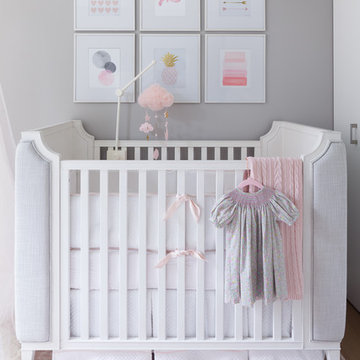
We love this crib with the upholstery on the sides, so luxurious. The details on the crib are adorable and enhanced with the bedding. Very neutral and tailored, quilted bedskirt with a pink band at the bottom, striped fitted sheet and the little pink bow and welting at the bumper. The art above brings the whole room together with the colors and organic prints.
Needless to say, its a convertible crib in gray upholstery, if and when a baby boy should join the family.
Our choices for furniture has clean lines that are modern and masculine with white washed wood finish giving it that hint of classic detail. Color palette wise, we made the nursery neutral with blush accents to make it girly.
 Kayla Stark
Photo: Kayla Stark © 2017 Houzz
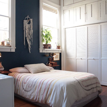
Inspiration for an eclectic bedroom remodel in New Orleans
Inspiration for an eclectic bedroom remodel in New Orleans
 Outdoor Dreams
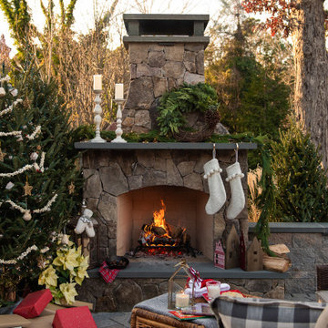
Inspiration for a large timeless backyard concrete paver patio remodel in Richmond with a fireplace and a roof extension
 DIGSdesign
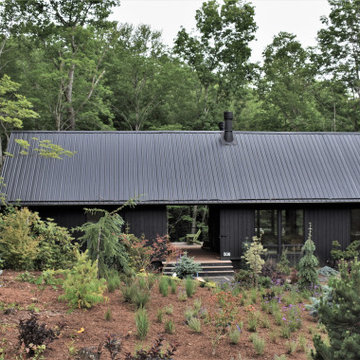
mountain road view. dogtrot design. black on black.
Minimalist home design photo in Charlotte
Minimalist home design photo in Charlotte
 Jim Carver & Sons Home Improvements
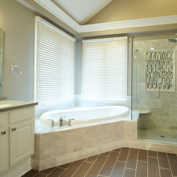
Bathroom - mid-sized traditional master beige tile and ceramic tile porcelain tile and brown floor bathroom idea in Cincinnati with raised-panel cabinets, white cabinets, beige walls, an undermount sink and a hinged shower door


72