
Search results for "Keeping economic" in Home Design Ideas

 User
the new kitchen
Sometimes, in remodel designs, it is best to keep things simple. Do small things to affect utility, flow and aesthetics. For this mid-century modern, for all their noted openness, the kitchen was closed off from the public, living areas. Hard to entertain to a wall. This we fixed. The other big flaw was the flow. While there was no way to economically change the path of travel through the kitchen. Nudging here and there could at least reduce the disruption at the core kitchen work areas. See the before and after plans and the photos:
Photo Credits - Beatrice McGinnis
 User
the new kitchen
Sometimes, in remodel designs, it is best to keep things simple. Do small things to affect utility, flow and aesthetics. For this mid-century modern, for all their noted openness, the kitchen was closed off from the public, living areas. Hard to entertain to a wall. This we fixed. The other big flaw was the flow. While there was no way to economically change the path of travel through the kitchen. Nudging here and there could at least reduce the disruption at the core kitchen work areas. See the before and after plans and the photos:
Photo Credits - Beatrice McGinnis

 Kathleen Jennison
An Arts & Crafts Bungalow is one of my favorite styles of homes. We have quite a few of them in our Stockton Mid-Town area. And when C&L called us to help them remodel their 1923 American Bungalow, I was beyond thrilled.
As per usual, when we get a new inquiry, we quickly Google the project location while we are talking to you on the phone. My excitement escalated when I saw the Google Earth Image of the sweet Sage Green bungalow in Mid-Town Stockton. "Yes, we would be interested in working with you," I said trying to keep my cool.
But what made it even better was meeting C&L and touring their home, because they are the nicest young couple, eager to make their home period perfect. Unfortunately, it had been slightly molested by some bad house-flippers, and we needed to bring the bathroom back to it "roots."
We knew we had to banish the hideous brown tile and cheap vanity quickly. But C&L complained about the condensation problems and the constant fight with mold. This immediately told me that improper remodeling had occurred and we needed to remedy that right away.
The Before: Frustrations with a Botched Remodel
The bathroom needed to be brought back to period appropriate design with all the functionality of a modern bathroom. We thought of things like marble countertop, white mosaic floor tiles, white subway tile, board and batten molding, and of course a fabulous wallpaper.
This small (and only) bathroom on a tight budget required a little bit of design sleuthing to figure out how we could get the proper look and feel. Our goal was to determine where to splurge and where to economize and how to complete the remodel as quickly as possible because C&L would have to move out while construction was going on.
The Process: Hard Work to Remedy Design and Function
During our initial design study, (which included 2 hours in the owners’ home), we noticed framed images of William Morris Arts and Crafts textile patterns and knew this would be our design inspiration. We presented C&L with three options and they quickly selected the Pimpernel Design Concept.
We had originally selected the Black and Olive colors with a black vanity, mirror, and black and white floor tile. C&L liked it but weren’t quite sure about the black, We went back to the drawing board and decided the William & Co Pimpernel Wallpaper in Bayleaf and Manilla color with a softer gray painted vanity and mirror and white floor tile was more to their liking.
After the Design Concept was approved, we went to work securing the building permit, procuring all the elements, and scheduling our trusted tradesmen to perform the work.
We did uncover some shoddy work by the flippers such as live electrical wires hidden behind the wall, plumbing venting cut-off and buried in the walls (hence the constant dampness), the tub barely balancing on two fence boards across the floor joist, and no insulation on the exterior wall.
All of the previous blunders were fixed and the bathroom put back to its previous glory. We could feel the house thanking us for making it pretty again.
The After Reveal: Cohesive Design Decisions
We selected a simple white subway tile for the tub/shower. This is always classic and in keeping with the style of the house.
We selected a pre-fab vanity and mirror, but they look rich with the quartz countertop. There is much more storage in this small vanity than you would think.
The Transformation: A Period Perfect Refresh
We began the remodel just as the pandemic reared and stay-in-place orders went into effect. As C&L were already moved out and living with relatives, we got the go-ahead from city officials to get the work done (after all, how can you shelter in place without a bathroom?).
All our tradesmen were scheduled to work so that only one crew was on the job site at a time. We stayed on the original schedule with only a one week delay.
The end result is the sweetest little bathroom I've ever seen (and I can't wait to start work on C&L's kitchen next).
Thank you for joining me in this project transformation. I hope this inspired you to think about being creative with your design projects, determining what works best in keeping with the architecture of your space, and carefully assessing how you can have the best life in your home.
Find the right local pro for your project

 A4 Architecture
Photos by A4 Architecture. For more information about A4 Architecture + Planning and the Beachmound Cottage visit www.A4arch.com
Small elegant front porch photo in Providence with decking
Small elegant front porch photo in Providence with decking
 User
the new kitchen . . .
Sometimes, in remodel designs, it is best to keep things simple. Do small things to affect utility, flow and aesthetics. For this mid-century modern, for all their noted openness, the kitchen was closed off from the public, living areas. Hard to entertain to a wall. This we fixed. The other big flaw was the flow. While there was no way to economically change the path of travel through the kitchen. Nudging here and there could at least reduce the disruption at the core kitchen work areas. See the before and after plans and the photos:
Photo Credits - Beatrice McGinnis
 User
from the great room . . .
Sometimes, in remodel designs, it is best to keep things simple. Do small things to affect utility, flow and aesthetics. For this mid-century modern, for all their noted openness, the kitchen was closed off from the public, living areas. Hard to entertain to a wall. This we fixed. The other big flaw was the flow. While there was no way to economically change the path of travel through the kitchen. Nudging here and there could at least reduce the disruption at the core kitchen work areas. See the before and after plans and the photos:
Photo Credits - Beatrice McGinnis

 Kim Teron Design Studio
This mid-century river walkout was an absolute joy to transform for a young dynamic professional couple. They acquired a Rideau River property with a million dollar view and wanted to take advantage of this extraordinary feature.
The existing older galley kitchen had seen better days and was an interior space with no view or natural light. Our recommendation? Take advantage of the cathedral ceiling sunroom and open up the kitchen to create a large, open-concept entertaining zone, with a chef’s kitchen. This new, ready-for-anything space would act as the heart of the home with an impactful sense of arrival.
Working with an economical budget we provided guidance on space planning, kitchen functionality and total aesthetic. Knowing our clients worked from home a generous amount of time we integrated storage and power solutions dedicated to keeping technology accessible yet out of sight, which resulted in a dramatic floating walnut island as a grounding element. The overall result with a budget-minded approach was a fully customized high-end transitional kitchen that was youthful, bright and cheerful with touches of industrial chic and a good dose of drama to achieve that ‘wow’ factor. The statement that this view deserved.
Also find this project featured in the Ottawa Citizen!
Sponsored
Columbus, OH

Hope Restoration & General Contracting
Columbus Design-Build, Kitchen & Bath Remodeling, Historic Renovations

 CompoKeeper
Composting comes with all kinds of benefits. It's economical, environmentally friendly and it keeps the world healthy for future generations. Recycling food waste in the kitchen no longer requires adopting a family of fruit flies, living with weird smells or taking multiple trips to the compost bin.
The CompoKeeper's patented odor control system eliminates the presence of smelly odor and fruit flies. This patented liner-sealing technology and the 6-gallon compostable bag enable compost to be collected for a week or more indoors, preventing the need to empty contents outdoors on a daily basis.
 The Cabinet Shoppe
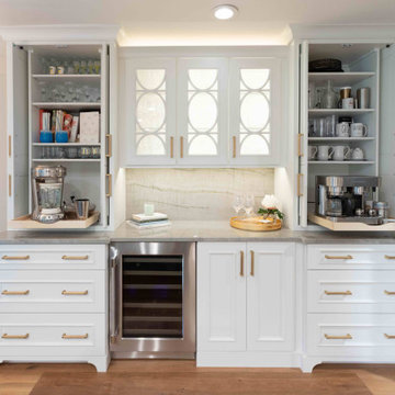
Kitchen beverage station with tower cabinets with pocket doors, glass upper cabinets and furniture-style base moulding at toe-space
Eat-in kitchen - mid-sized transitional galley medium tone wood floor and brown floor eat-in kitchen idea in Jacksonville with a farmhouse sink, recessed-panel cabinets, white cabinets, quartzite countertops, gray backsplash, quartz backsplash, stainless steel appliances, an island and gray countertops
Eat-in kitchen - mid-sized transitional galley medium tone wood floor and brown floor eat-in kitchen idea in Jacksonville with a farmhouse sink, recessed-panel cabinets, white cabinets, quartzite countertops, gray backsplash, quartz backsplash, stainless steel appliances, an island and gray countertops

 FA Design Build
To stay or to go? This is the question our clients are still pondering. Yet, as their youngest child heads off to college, they are ready to enjoy their new kitchen or feature it in a real estate listing. Since they were unsure of their plans, we decided a pull and replace renovation was the logical — and most economical—choice. While all appliances remain in their same locations, we were able to make easy adjustments with cabinetry to update the space: convert a desk to a beverage center; increase the size of the island; install an island countertop with overhang for seating; and lengthen the perimeter cabinetry and add a tip-up, on-counter cabinet to house small appliances. The color palette was based on introducing warm grays to the space while ensuring the existing Brazilian cherry floor remained compatible with the new design. A combination of light gray and dark gray painted cabinetry (Medallion, Irish Crème and Frappe) updates the space, along with bronze finishes. A unique hex-patterned white tile backsplash with contrasting gray grout on the perimeter adds interest yet keeps the focus on the island. We installed the understated Cambria Whitehall on the perimeter with the vivid Cambria Skara Brae on the island. We worked closely with the stone fabricator to ensure the Skara Brae’s veining pattern matched the client’s vision. Above the island countertop, we installed two oversized pendants to add intensity and beauty as you enter the room.
 S.Flynn Design + Build
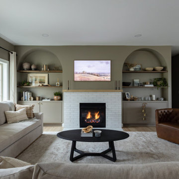
We layered similar neutral tones inside the home to keep it feeling timeless. The walls are painted a soft, subtle brown that feels like a giant hug when you walk in. On the floors, we installed one of our favorite luxury vinyl planks that gives a hardwood look at a more economical price.
The arched oak front door we selected is quaint and modern without leaning too heavily on the cottage style. For consistency, we replicated those arches throughout the home, which you can see surrounding the fireplace.
 FA Design Build
To stay or to go? This is the question our clients are still pondering. Yet, as their youngest child heads off to college, they are ready to enjoy their new kitchen or feature it in a real estate listing. Since they were unsure of their plans, we decided a pull and replace renovation was the logical — and most economical—choice. While all appliances remain in their same locations, we were able to make easy adjustments with cabinetry to update the space: convert a desk to a beverage center; increase the size of the island; install an island countertop with overhang for seating; and lengthen the perimeter cabinetry and add a tip-up, on-counter cabinet to house small appliances. The color palette was based on introducing warm grays to the space while ensuring the existing Brazilian cherry floor remained compatible with the new design. A combination of light gray and dark gray painted cabinetry (Medallion, Irish Crème and Frappe) updates the space, along with bronze finishes. A unique hex-patterned white tile backsplash with contrasting gray grout on the perimeter adds interest yet keeps the focus on the island. We installed the understated Cambria Whitehall on the perimeter with the vivid Cambria Skara Brae on the island. We worked closely with the stone fabricator to ensure the Skara Brae’s veining pattern matched the client’s vision. Above the island countertop, we installed two oversized pendants to add intensity and beauty as you enter the room.

 Feeney Inc.
DesignRail® with LED under rail lighting.
Nat Rea Photography and Don A. Johnson Builder
Large trendy backyard deck photo in Baltimore with no cover
Large trendy backyard deck photo in Baltimore with no cover
Sponsored
Columbus, OH
Hope Restoration & General Contracting
Columbus Design-Build, Kitchen & Bath Remodeling, Historic Renovations
 User
Shawn Talbot Photography
Example of a trendy rooftop rooftop deck design in Vancouver with a fire pit and no cover
Example of a trendy rooftop rooftop deck design in Vancouver with a fire pit and no cover
 S.Flynn Design + Build
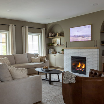
We layered similar neutral tones inside the home to keep it feeling timeless. The walls are painted a soft, subtle brown that feels like a giant hug when you walk in. On the floors, we installed one of our favorite luxury vinyl planks that gives a hardwood look at a more economical price.
The arched oak front door we selected is quaint and modern without leaning too heavily on the cottage style. For consistency, we replicated those arches throughout the home, which you can see surrounding the fireplace.
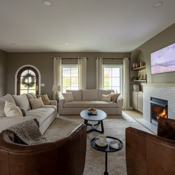 S.Flynn Design + Build
We layered similar neutral tones inside the home to keep it feeling timeless. The walls are painted a soft, subtle brown that feels like a giant hug when you walk in. On the floors, we installed one of our favorite luxury vinyl planks that gives a hardwood look at a more economical price.
The arched oak front door we selected is quaint and modern without leaning too heavily on the cottage style. For consistency, we replicated those arches throughout the home, which you can see surrounding the fireplace.
 CompoKeeper
Composting comes with all kinds of benefits. It's economical, environmentally friendly and it keeps the world healthy for future generations. Lots of smart science and product testing are behind this product, but you'll just love it's efficient, bug-free convenience, and how clean your kitchen stays. Our innovative food scrap collector was designed with your busy life and the planet in mind.
The CompoKeeper’s quadruple-action odor control technology locks smells in and bugs out
Proprietary bag-sealing clamps
Pedal-powered lid
Ventilated design
Activated carbon filter
Purchase Includes:
12 Compostable Bags
Two Activated Carbon Filters
Easy-to-assemble Handle Accessories
Sponsored
Columbus, OH

Wannemacher Interiors
Customized Award-Winning Interior Design Solutions in Franklin Cnty OH
 FA Design Build
To stay or to go? This is the question our clients are still pondering. Yet, as their youngest child heads off to college, they are ready to enjoy their new kitchen or feature it in a real estate listing. Since they were unsure of their plans, we decided a pull and replace renovation was the logical — and most economical—choice. While all appliances remain in their same locations, we were able to make easy adjustments with cabinetry to update the space: convert a desk to a beverage center; increase the size of the island; install an island countertop with overhang for seating; and lengthen the perimeter cabinetry and add a tip-up, on-counter cabinet to house small appliances. The color palette was based on introducing warm grays to the space while ensuring the existing Brazilian cherry floor remained compatible with the new design. A combination of light gray and dark gray painted cabinetry (Medallion, Irish Crème and Frappe) updates the space, along with bronze finishes. A unique hex-patterned white tile backsplash with contrasting gray grout on the perimeter adds interest yet keeps the focus on the island. We installed the understated Cambria Whitehall on the perimeter with the vivid Cambria Skara Brae on the island. We worked closely with the stone fabricator to ensure the Skara Brae’s veining pattern matched the client’s vision. Above the island countertop, we installed two oversized pendants to add intensity and beauty as you enter the room.

 Backyard Buildings
Our 10x8 shed customized with a storage loft and shelves. Window allows extra light inside to make it easier to navigate inside. Look at how much space there is for lawn and garden equipment. As you can see this may be one of our most economical sheds that we offer, but it still has plenty of storage space. What would you use this storage space for?

 Builder Boy
From sleek city lofts to rustic farmhouses, black and white rooms never fail to elevate the aesthetic of a home. This classic color scheme will always be in style, especially for bathroom makeovers.
10