
Search results for "Keeping" in Home Design Ideas
 Zaharias Design
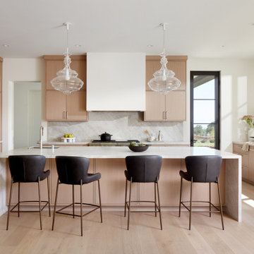
Quartzite waterfall design on island with counter seating, panel ready appliances, plaster hood, stone backsplash wrapping into large window frame. Pocket doors closed for coffee station
 Case Architects & Remodelers
Project Developer Neil Shaut
https://www.houzz.com/pro/nshaut/neil-shaut-case-design-remodeling-inc
Designer Ellen Linstead Whitmore
https://www.houzz.com/pro/elwhitmore/ellen-linstead-whitmore-case-design-remodeling-inc
Photography by Stacy Zarin Goldberg
 Penny Black Interiors LLC.
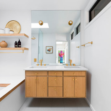
The architecture of this mid-century ranch in Portland’s West Hills oozes modernism’s core values. We wanted to focus on areas of the home that didn’t maximize the architectural beauty. The Client—a family of three, with Lucy the Great Dane, wanted to improve what was existing and update the kitchen and Jack and Jill Bathrooms, add some cool storage solutions and generally revamp the house.
We totally reimagined the entry to provide a “wow” moment for all to enjoy whilst entering the property. A giant pivot door was used to replace the dated solid wood door and side light.
We designed and built new open cabinetry in the kitchen allowing for more light in what was a dark spot. The kitchen got a makeover by reconfiguring the key elements and new concrete flooring, new stove, hood, bar, counter top, and a new lighting plan.
Our work on the Humphrey House was featured in Dwell Magazine.
Find the right local pro for your project
 McCabe By Design LLC
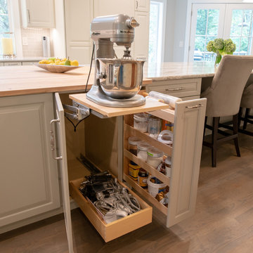
A mixer lift next to the butcher block and ovens is complimented by a pull-out base pantry dedicated to baking supplies.
Photos by A Kitchen That Works LLC
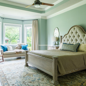
 By Design Interiors Inc
This moody bedroom is a calming escape from the everyday hustle of two working parents.
Seafoam-gray wall color is spa-like while the cozy fabrics, rich textures, and colorful rug make you want to curl up in bed and relax the weekend away.
Black out shades help control the light while the decorative panels add a soft touch.
Distressed wood furniture mixed with elegant fabrics further explore the rustic glam theme of this home.
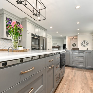
 Kowalske Kitchen & Bath
Creating a space to entertain was the top priority in this Mukwonago kitchen remodel. The homeowners wanted seating and counter space for hosting parties and watching sports. By opening the dining room wall, we extended the kitchen area. We added an island and custom designed furniture-style bar cabinet with retractable pocket doors. A new awning window overlooks the backyard and brings in natural light. Many in-cabinet storage features keep this kitchen neat and organized.
Bar Cabinet
The furniture-style bar cabinet has retractable pocket doors and a drop-in quartz counter. The homeowners can entertain in style, leaving the doors open during parties. Guests can grab a glass of wine or make a cocktail right in the cabinet.
Outlet Strips
Outlet strips on the island and peninsula keeps the end panels of the island and peninsula clean. The outlet strips also gives them options for plugging in appliances during parties.
Modern Farmhouse Design
The design of this kitchen is modern farmhouse. The materials, patterns, color and texture define this space. We used shades of golds and grays in the cabinetry, backsplash and hardware. The chevron backsplash and shiplap island adds visual interest.
Custom Cabinetry
This kitchen features frameless custom cabinets with light rail molding. It’s designed to hide the under cabinet lighting and angled plug molding. Putting the outlets under the cabinets keeps the backsplash uninterrupted.
Storage Features
Efficient storage and organization was important to these homeowners.
We opted for deep drawers to allow for easy access to stacks of dishes and bowls.
Under the cooktop, we used custom drawer heights to meet the homeowners’ storage needs.
A third drawer was added next to the spice drawer rollout.
Narrow pullout cabinets on either side of the cooktop for spices and oils.
The pantry rollout by the double oven rotates 90 degrees.
Other Updates
Staircase – We updated the staircase with a barn wood newel post and matte black balusters
Fireplace – We whitewashed the fireplace and added a barn wood mantel and pilasters.
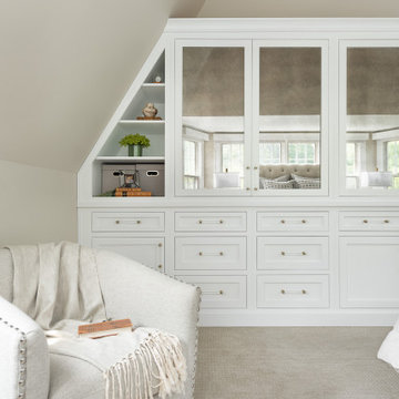
 Sarah Coe Design LLC
From out dated to high-end hotel, this master suite was brought from the 1980's to date both by look and by function.
Inspiration for a large timeless master carpeted and gray floor bedroom remodel in Chicago with gray walls
Inspiration for a large timeless master carpeted and gray floor bedroom remodel in Chicago with gray walls

Sponsored
Columbus, OH

Hope Restoration & General Contracting
Columbus Design-Build, Kitchen & Bath Remodeling, Historic Renovations
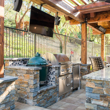
 Rescom Landscaping, Inc.
Business Photo Pro / Klee Van Hamersveld
Inspiration for a mid-sized transitional backyard stone patio kitchen remodel in Orange County with a pergola
Inspiration for a mid-sized transitional backyard stone patio kitchen remodel in Orange County with a pergola
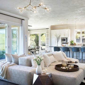
 Julia Katrine
This open concept kitchen is great for keeping tabs on the family and being a part of the conversation with your guests. Soft Italian leather bar stools create a nice place to sit and hang as you (or the chef!) cooks up a tasty meal. White cabinets with bronze accents keep the space feeling bright. Equip with a La Cornue stove, custom pendant lights and textured marble countertops, this kitchen is a dream! A second hang-out space just off the kitchen for relaxing on a large, comfy sectional.
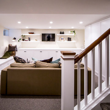
 The Conscious Builder Inc.
This bathroom was a must for the homeowners of this 100 year old home. Having only 1 bathroom in the entire home and a growing family, things were getting a little tight.
This bathroom was part of a basement renovation which ended up giving the homeowners 14” worth of extra headroom. The concrete slab is sitting on 2” of XPS. This keeps the heat from the heated floor in the bathroom instead of heating the ground and it’s covered with hand painted cement tiles. Sleek wall tiles keep everything clean looking and the niche gives you the storage you need in the shower.
Custom cabinetry was fabricated and the cabinet in the wall beside the tub has a removal back in order to access the sewage pump under the stairs if ever needed. The main trunk for the high efficiency furnace also had to run over the bathtub which lead to more creative thinking. A custom box was created inside the duct work in order to allow room for an LED potlight.
The seat to the toilet has a built in child seat for all the little ones who use this bathroom, the baseboard is a custom 3 piece baseboard to match the existing and the door knob was sourced to keep the classic transitional look as well. Needless to say, creativity and finesse was a must to bring this bathroom to reality.
Although this bathroom did not come easy, it was worth every minute and a complete success in the eyes of our team and the homeowners. An outstanding team effort.
Leon T. Switzer/Front Page Media Group
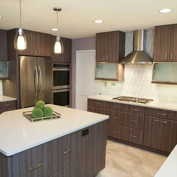
 Advance Design Studio, Ltd.
This clean cut kitchen stemmed from the design challenge to place a contemporary kitchen in a traditional Tudor style house in the Northwest Suburbs of Chicago. Our client was a self-described city person living in the country - who wanted an urban contemporary feeling incorporated into her home. She says she waited many years to find the right design team who understood her vision!
Not wanting to ignore the beautiful 50 year old oaks outside her window, Advance Design transformed her traditional kitchen into an urban kitchen utopia with the use of texture and earthy finishes keeping with the feel of the existing home. Dura Supreme Bria frameless cabinets with a soft pillowed door works to incorporate a woodsy feel in shades of grey textured foil appropriately called “Twig”. Aluminum framed opaque glass doors are hinged with a lift up Aventos hinge for a contemporary twist and a super-functional opening. Brushed nickel hardware in various sizes keeps with the clean line feel.
To keep the design organic and “fit it in” with the rest of the house, we covered the floor with a natural looking travertine porcelain laid on a 45 degree angle simulating a more traditional feel in a neutral tone of silvery-brown. The backsplash is clean and crisp with large Carrera marble tiles in a brick pattern, and a splash of energy from a vertical marble and glass mosaic accent. We then finished off the look with clean Cambria Torquay countertops portraying minimal patterning to keep the work surfaces feeling uncluttered and open.
Other areas of the home were addressed to “blend” the style in with lightly distressed grey tone hardwood floors and a “matching” renovated powder room displaying contemporary features to compliment the nearby kitchen’s style.
Photo Credits- Joe Nowak
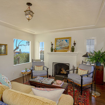
 Clark Collins - Collins Design & Development
Eric Foote
Inspiration for a small mediterranean home design remodel in Santa Barbara
Inspiration for a small mediterranean home design remodel in Santa Barbara
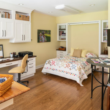
 Meadowlark Design+Build
This craft room is a quilters dream! The design wall for laying out the quilt design actually houses a Murphy Bed. Imagine sleeping among the quilts! This custom home was designed and built by Meadowlark Design+Build in Ann Arbor, Michigan. Photography by Joshua Caldwell.
Sponsored
Columbus, OH
Hope Restoration & General Contracting
Columbus Design-Build, Kitchen & Bath Remodeling, Historic Renovations
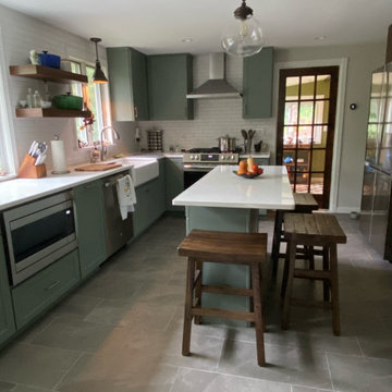
 Kitchen Magic
Brining the outdoors with a combination of Celadon Green and Walnut. Open shelving and a farmsink add to the kitchen's charms.
Example of a huge transitional galley eat-in kitchen design in Boston with an island
Example of a huge transitional galley eat-in kitchen design in Boston with an island
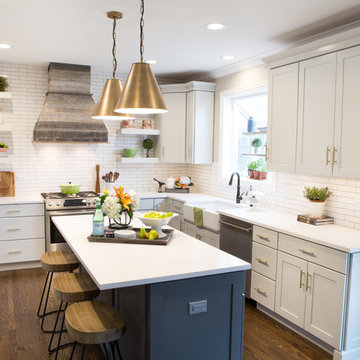 Advance Design Studio, Ltd.
After six years of living in their Huntley IL home, Chris and Meghan were tired of their dark, dingy, outdated kitchen and it was finally time for a long-anticipated change. “The kitchen is the place where we live, it’s where we do everything,” Meghan said. “It was important that it be a space where we wanted to be.” Meghan loves cooking and enjoys including their girls in healthy meal prepping, this led them to want a brighter, more enjoyable kitchen with increased functionality and improved storage.
For Chris especially, the laundry room was an entirely dysfunctional eyesore. “We had a washer and a dryer, but it was all kind-of cobbled together!” Chris said. “There were always laundry piles everywhere, we weren’t really sure what we wanted to do in there, but it was time for us to make a change.” The mess of the space was stressful every time they walked in the door from the garage each day. Kids’ backpacks and shoes piled up haphazardly in the makeshift boot-bench closet left the family feeling disorganized and stressed. They needed space for folding clothes and locker cubbies to help keep the family organized.
Having known Christine and Todd in the Huntley community for years, Chris and Meghan were familiar with their work. “We already trusted them personally and having seen their projects for years we knew they did top notch work. After we reviewed the initial round of designs, we knew that hiring them was definitely the right choice,” Meghan and Chris said. Although Chris had done a lot of work in their home himself, the kitchen and laundry room renovation was such a large undertaking that he didn’t want to steal time away from his family to spend what would surely be many long weekends doing the job himself. “That would not have been a wise choice for us,” Chris laughed.
“Our designer, Michelle was very, very, easy to work with; anything we wanted to see or weren’t sure about, she went above and beyond to make this easy for us. She was easy to get hold of and always quick to respond,” the couple said. Michelle pulled ideas that mirrored the couple’s taste and style and was adept at directing the couple to limited choices that didn’t overwhelm them and kept the process moving. “I have a hard time making decisions. Michelle made the decision-making process so easy. I loved how she listened to what I liked and then presented three great options for me to choose from,” Meghan said.
The main objectives for the kitchen were better storage solutions, they wanted the space to reflect their lifestyle and taste, and they wanted it to last for years with low maintenance. One of the first steps in creating a more functional kitchen was relocating the refrigerator, creating an improved workflow for the busy family.
“We didn’t know that we could even move the refrigerator to a new location where it is now, that was something that we never would have thought of,” Chris said. “The new refrigerator location makes the kitchen feel so much bigger. We didn’t add any space, but our whole kitchen with the new design just seems like it’s so much larger than before!” Meghan said.
The perimeter mist colored cabinets helped warm and brighten the entire room, while the graphite colored cabinets on the island added contrast. Using this fresh, clean color palette satisfied the couple’s desire for a bright space that was the exact opposite of what they had before. Organization accessories were also added to the cabinets such as a spice drawer tray and roll outs to create hidden convenience.
“I absolutely love the hidden spices – it makes cooking so much more enjoyable!” Chris said. “And all the pull outs, and the double trash bin, who would think you could get so excited about organization!” the couple said in unison.
One thing they hated in their original kitchen was how dark the space felt. Added lighting on the ceiling with the new light fixtures combined with the lighter cabinetry colors throughout solved this problem. “Our new kitchen has this warm, almost cozy feeling that our old kitchen never had, it’s just a space that I love spending my time in now,” Meghan said. The light airy feeling was accentuated with the use of floating white shelves on either side of the decorative range hood. “We have so much cabinetry space, the new design is amazing we actually have more storage space than we will ever need,” Meghan said.
The island was extended to create more work surface and added space for stool seating. “The new island changes how we live. Now the kids can be in the kitchen with us, doing homework, eating breakfast, and the three of us have special dinners there when Chris is working late,” Meghan said.
The Carrara Marmi Quartz countertops were chosen because they are, not only beautiful, but are made from hard-working material that doesn’t require maintenance. The white subway tile backsplash that wraps to the ceiling behind the focal point cooktop range/hood compliments the crisp white countertops perfectly, while brushed brass hardware and light fixtures keep the design fresh and new.
The couple had a few fears at the beginning of the project, as most homeowners do. Their biggest fear was being out of their kitchen and laundry room for an extended time. The crew made it very easy for the family to work in a limited space keeping the washer and dryer hooked up the majority of the time, and also getting appliances working with minimal downtime.
“They above and beyond accommodated us to get us through the process,” Meghan said. “They did a great job making sure we were as comfortable as possible throughout the process,” Chris added.
“Our project manager DJ did a great job. He was very good at updating us on schedule changes, getting guys in as quickly as possible. Everyone that stepped in the house was nice and did great work,” said Chris. They thought Advance’s carpenter was phenomenal and were impressed when he took a conceptual idea from a photograph and worked with designer Michelle to create a one of a kind range/hood that has become the topic of conversation with friends and family who visit the new kitchen. “He was in our house literally every day for several weeks. He was easy to work with and good at what he did,” Meghan and Chris said.
The focal point of the kitchen; a hand-crafted, custom-built ventilation hood was clad with handpicked reclaimed barnwood. Advance Design’s carpenter built the framework and the cladding to create a one-of-a-kind design element that the couple loves.
“I think it was especially fun for him to create something unique from scratch, showcasing his talent in this area,” Meghan said. “I love that my kitchen is not like everyone else’s. I got to pick out the wood on my hood and watch it being built and was able to choose what pieces of wood went where on it. It’s totally unique.”
Red Oak flooring was toothed-in throughout the kitchen and the rest of the first floor anywhere changes were made. Then the whole floor was refinished to tone down the orange undertones in the existing floor stain, ultimately changing the color complexion of the entire first floor. The result is a completely new feeling to the entire home.
Renovating the laundry room was extremely important to Meghan and Chris, but they had trouble visualizing what the possibilities were for the seemingly small space. Michelle produced beautiful 3D illustrations that helped them envision the space in a whole new way.
“I must have told Michelle 100 times that I am a visual person, seeing the designs in 3D made it so easy to make decisions and see what we could really do with our space,” Meghan said.
A dividing wall and doorway were removed between the existing laundry room and hallway formerly containing a coat closet, providing space to design specialized graphite colored cabinetry matching the kitchen island to house custom storage cubbies for each family member. Adding the tall utility cabinetry in the new laundry area helped solve the storage issue, tucking away cleaning supplies, household items, and even the cat got its own cubby.
“I love how everything is now hidden in its own space. I can’t tell you how much I hated coming home and seeing everything sitting around on counters,” Chris said.
Electrical outlets were planned for the inside of utility cabinets, so devices could charge in hidden locations. Stacking the washer and dryer allowed for wider countertop space to provide a folding area and a special space for clothes to hang. “The way I do laundry has been completely transformed! I can actually fold clothes and hang them now right out of the washer and dryer,” Meghan said.
“The end result in the kitchen and the laundry/mud room was an updated light and bright space, with a smarter work flow that better meets the needs of this family,” Michelle said.
“I would totally recommend Advance Design,” Meghan said. “Sometimes I sit and just look at my kitchen and laundry room and think ‘Wow, I can’t believe I get to live here!’ It’s an understatement to say we love our new space.”
 Kathleen Jennison
An Arts & Crafts Bungalow is one of my favorite styles of homes. We have quite a few of them in our Stockton Mid-Town area. And when C&L called us to help them remodel their 1923 American Bungalow, I was beyond thrilled.
As per usual, when we get a new inquiry, we quickly Google the project location while we are talking to you on the phone. My excitement escalated when I saw the Google Earth Image of the sweet Sage Green bungalow in Mid-Town Stockton. "Yes, we would be interested in working with you," I said trying to keep my cool.
But what made it even better was meeting C&L and touring their home, because they are the nicest young couple, eager to make their home period perfect. Unfortunately, it had been slightly molested by some bad house-flippers, and we needed to bring the bathroom back to it "roots."
We knew we had to banish the hideous brown tile and cheap vanity quickly. But C&L complained about the condensation problems and the constant fight with mold. This immediately told me that improper remodeling had occurred and we needed to remedy that right away.
The Before: Frustrations with a Botched Remodel
The bathroom needed to be brought back to period appropriate design with all the functionality of a modern bathroom. We thought of things like marble countertop, white mosaic floor tiles, white subway tile, board and batten molding, and of course a fabulous wallpaper.
This small (and only) bathroom on a tight budget required a little bit of design sleuthing to figure out how we could get the proper look and feel. Our goal was to determine where to splurge and where to economize and how to complete the remodel as quickly as possible because C&L would have to move out while construction was going on.
The Process: Hard Work to Remedy Design and Function
During our initial design study, (which included 2 hours in the owners’ home), we noticed framed images of William Morris Arts and Crafts textile patterns and knew this would be our design inspiration. We presented C&L with three options and they quickly selected the Pimpernel Design Concept.
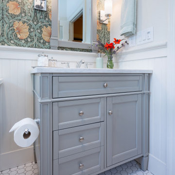
We had originally selected the Black and Olive colors with a black vanity, mirror, and black and white floor tile. C&L liked it but weren’t quite sure about the black, We went back to the drawing board and decided the William & Co Pimpernel Wallpaper in Bayleaf and Manilla color with a softer gray painted vanity and mirror and white floor tile was more to their liking.
After the Design Concept was approved, we went to work securing the building permit, procuring all the elements, and scheduling our trusted tradesmen to perform the work.
We did uncover some shoddy work by the flippers such as live electrical wires hidden behind the wall, plumbing venting cut-off and buried in the walls (hence the constant dampness), the tub barely balancing on two fence boards across the floor joist, and no insulation on the exterior wall.
All of the previous blunders were fixed and the bathroom put back to its previous glory. We could feel the house thanking us for making it pretty again.
The After Reveal: Cohesive Design Decisions
We selected a simple white subway tile for the tub/shower. This is always classic and in keeping with the style of the house.
We selected a pre-fab vanity and mirror, but they look rich with the quartz countertop. There is much more storage in this small vanity than you would think.
The Transformation: A Period Perfect Refresh
We began the remodel just as the pandemic reared and stay-in-place orders went into effect. As C&L were already moved out and living with relatives, we got the go-ahead from city officials to get the work done (after all, how can you shelter in place without a bathroom?).
All our tradesmen were scheduled to work so that only one crew was on the job site at a time. We stayed on the original schedule with only a one week delay.
The end result is the sweetest little bathroom I've ever seen (and I can't wait to start work on C&L's kitchen next).
Thank you for joining me in this project transformation. I hope this inspired you to think about being creative with your design projects, determining what works best in keeping with the architecture of your space, and carefully assessing how you can have the best life in your home.
 Stephanie Stroud Interiors
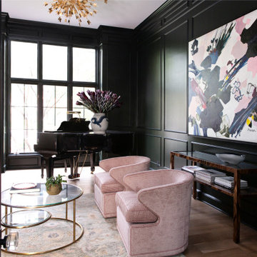
Inspiration for a transitional enclosed medium tone wood floor, brown floor and wall paneling living room remodel in Kansas City with black walls and no tv

Sponsored
Sunbury, OH

J.Holderby - Renovations
Franklin County's Leading General Contractors - 2X Best of Houzz!
 Revival House
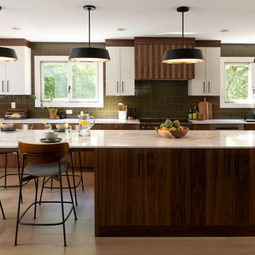
This kitchen remodel of a 70’s home reflects the character of the existing home and some design features of that era while giving it a fresh, modern look. The client wanted the remodeled space to blend in with the rest of the home, retaining some of the 1970’s character while including all the best features of today’s kitchens.
Removing the wall separating the informal eating area from the family room provided a nice open space allowing for a larger kitchen footprint and plenty of light throughout.
A combination of Decor's Dove Wing painted and Natural stained Walnut cabinetry was chosen. The dark walnut, slab lower cabinets unite the kitchen with the darker wood theme found throughout the home, while the white, slim-shaker upper cabinets give the space a light and airy feeling. The beautiful vertical grain of the walnut is the foundation of a theme that is echoed throughout the space: tall & thin vertical lines without bulk or needless ornamentation. The unique design detail gives the kitchen a great balance of depth and character while still brightening the space. Walnut crown molding throughout defines the space and ties everything together.
The vertical-set green Japanese tile from Virginia Tile, also characteristic of the 1970’s, serves as the backsplash and fills the range wall. The tall & slim theme is underscored by several design elements from the vertical tile and tall cabinet pulls in matte black from Top Knobs, to the thin quartz countertops, skinny shaker cabinet door style, and tall, slim refrigerator doors, all meant to eliminate excess bulk and lighten up the space.
An impressive focal point in this kitchen is the custom walnut reeded hood, designed to reflect a popular 1970’s feature. Narrow walnut shelves below the white upper cabinets near the refrigerator provide a nice surprise to the eye. An extra long island, decked in polished 2cm Corian Quartz countertop in Novello, provides ample seating, storage, and task space, making it an ideal surface for serving, eating, meal prep, gathering, and entertaining. The client desired a long island with comfortable counter seating at one end for a family of five, including space for a baby’s high chair.
High-end Bosch appliances and functional storage were also priorities. The dry bar on the opposite wall features additional storage and an Elica beverage refrigerator, framed by tall walnut larder cabinets on each end. The white larder cabinet doors pocket into the sides, revealing beautiful finished walnut interiors.
Wall cabinets feature Decor’s integrated under-cabinet lighting, while puck lights illuminate the beverage center counter. This kitchen is bursting with integrated storage. Many deep drawers feature interior double drawers making smaller items more accessible. Decor’s spice drawer to the right of the range keeps spices organized, while divided tray storage on the left of the range keeps these taller items handy.
While the design is inspired by the 1970’s, it exemplifies the best of the 2020’s, and the new space is open, bright, and functional for this family with young children.
 Old Town Design Group
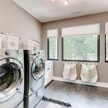
Dedicated laundry room - mid-sized contemporary u-shaped ceramic tile and gray floor dedicated laundry room idea in Indianapolis with a drop-in sink, shaker cabinets, gray cabinets, laminate countertops, gray walls, a side-by-side washer/dryer and white countertops
 Rachel Loewen Photography
Photo: Rachel Loewen © 2018 Houzz
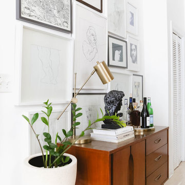
Entryway - eclectic entryway idea in Chicago
Entryway - eclectic entryway idea in Chicago
110