
Search results for "Key aspect" in Home Design Ideas

 Renovisions
These South Shore of Boston homeowners desired a larger kitchen as their existing had limited space to host family events and entertain guests – they turned to Renovisions to help transform their small, outdated kitchen with separate walk-in pantry into a beautiful, open and spacious inspirational room.
Choosing the right cabinetry for the room and how to meet the needs of the client was critical to the overall success of this design. A traditional style was the framework of the home and the flat paneled doors on the white painted cabinetry support this aspect. Going vertical as possible with cabinets is a trend here to stay; keeping with that idea, we recommended the graceful tall pantry cabinet that flanks one side of the kitchen. This not only lends to an eye-appealing furniture-look, but adds significant storage space, allowing the cabinets to store items they may not use on a regular basis. In this case, the clients are amazed with the amount of storage they’ve gained and one that provides easy access to all interior items. Every inch of space was key to create this optimally functional kitchen. Must-haves such as tray dividers above the refrigerator are handy and the double pull-out trash/recycling bins on the right side of the sink were a simple and clean way to gain floor space and conceal unsightly trash.
The focal point of this kitchen is the expansive, soft-grey colored contrasting island with larger, deeper drawers for pots, pans and platters. The client was excited to switch to an induction chef-series range that featured a divided oven that can accommodate two different temperatures.
Fit and finish is important in any renovation and this certainly holds true in this kitchen project to personalize their space. The custom recessed panel columns with wainscot details add an architectural element that ties into the kitchen cabinet design and Carrera-look quartz countertops which provide a stunning classical look that ties nicely with the overall traditional style. These homeowners are excited to show off their open and spacious Renovision!
“We really enjoyed our new kitchen and it’s amazing improvement over the holidays. We got rave reviews from all of our guests!”
Steve & Mary S. (Duxbury)

 Level One Construction
Seamless Elegance is a story bringing together both old and new. A cramped kitchen and a seldom-used den in a 100 year-old house were opened up to create a sprawling 300-sqft paradise. Obsessing over the little details was important to achieving our goal of seamless elegance.
The archway and molding detail between the dining and living room was perfectly mirrored between the dining room and kitchen, right down to the hidden closets. A faux brick wall painted white was added to the back wall of the kitchen to give the illusion that the previous expansion was always there.
The existing 1.5” wide beautiful oak hardwood floor was matched to the rest of the house and continued into the kitchen. The flooring throughout the house was re-done at the same time to solidify the marriage between old and new; the result was a seamless transition into functionality. The character brought into the space by the oak hardwood floor and brick wall off sets the contemporary high gloss white cabinets.
No upper cabinets were used in this design because we wanted to showcase the brick accent wall. The storage lost from zero upper kitchen cabinets was more than made up in floor-to-ceiling pantry. This corner pantry accommodates the bulk of storage for food and dishes in the kitchen. The subtraction of the upper cabinets allows the Tom Dixon pendant lights to be boldly featured over the eating peninsula.
Visual lines were a key aspect in this design helping the eye move throughout the space. The cabinet break lines are at the same height as the counter tops creating one continuous line. The paneled dishwasher blends perfectly with the rest of the kitchen cabinetry. The white quartz countertop flows down into a waterfall edge at the end of the eating peninsula, being the final grounding piece to visual lines.
Although the kitchen is all white, it is offset and given visual interest through texture and the use of different materials. The white allows the beautiful expensive appliances to be showcased along with the newly refinished flooring. The clean crisp kitchen will be the perfect backdrop to show case boldly colored art and accessories.

 TOC design & construction inc.
Formal Dining in a relax setting by Tania Scardellato – TOC design
Remodeling your home can be a lengthy and time consuming process, especially if you opt to renovate the entire house rather than just one room. However, even just by updating the decor in your home you can create a beautiful and fresh looking space. One space that is particularly easy to overhaul is the dining room. This is one of the smaller rooms in the home and contains a minimal amount of furniture, making the remodeling process quick and simple.
An essential factor of dining room design is the color scheme of this space. When searching for the best paint colors for a dining room you should keep a few things in mind, including your design, the size of the room, and the décor of the rest of your house. Because it tends to be smaller than most rooms in the home you do not want to choose a really dark or overwhelming color like black or bright fuchsia. Rather save these hues as accents in dark wood furniture, curtains, pictures, and other wall art. In this dining room we kept the colors neutral and added more accents to hi-gloss moldings, highlighting the architecture of the space and creating space definition with a TOUCH OF CLASS - TOC
When it comes to lighting for the dining room you have a lot of options such as chandeliers or wall sconces, however natural light is always best. If you already have windows in this space try to keep them uncovered or use sheer fabric curtains to allow optimum illumination in throughout the day. If your dining room does not have windows there are other options available that can help to brighten and open up this area
Accessorizing your dining room with the right accents is very important to tie in all aspects of the design. For example, an elegant table centerpiece can make the dining space feel more homey and relaxed. You can accent a kitchen island or dining table with a stunning vase of festive flowers, ornamental fruits and vegetables, or a basket of decorative glass ornaments. However, try to keep the ornamentation to a minimum to prevent cluttering the countertops. Sometimes the table itself can be an accent piece. The dining room creates an elegant focal point that contains different colors, textures, and patterns. Similarly, leather chairs surrounding solid oak dining room furniture add the element of texture and color while creating a rustic, old world atmosphere. Regardless of the look you are trying to obtain, or the room in which you are redecorating, we can help create the style custom to suit your needs
Find the right local pro for your project

 InnovationLand
Outdoor furniture from Restoration Hardware really made this Houston outdoor living space design project shine.
“It really went well,” says Wayne Franks, owner of Outdoor Homescapes of Houston. “It's not a huge space, but moving the existing two columns about four feet and bringing the roof out only three feet made all the difference in the world.”
“This particular client wanted a larger space to entertain,” says senior designer Lisha Maxey, who served as an outdoor furniture consultant while managing construction for the project.
The original space, Lisha explains, had two oddly placed columns blocking a clear view of the beautiful pool area from inside the home. “We removed those columns and gave her three more feet of roof, which extended her living area while also giving her the view she wanted.”
Since the client - a woman in her mid-50s with grown children who visit frequently - only wanted a small outdoor kitchen island with a 30-inch RCS grill Outdoor Homescapes closed up a French door that led from the master bedroom (which she never used) and created a new stucco wall for the kitchen.
“I would definitely call the style of this space ‘transitional,” says Lisha. The client is a very eclectic world traveler and a collector of art, yet wanted her outdoor living space to feel like a warm, homey living room once we placed the furniture and décor. In the end, her finishes centered around rustic stone, detailed columns and furniture leaning towards the contemporary.”
Much of the warmth in the space, she says, comes from the colors of the dry-stacked Sunset Canyon ledgestone. “It looks just like it sounds – like the sun setting in a deep canyon!”
“The columns are unique – decorative and fluted,” adds Wayne.
The client, who’d received five free hours of outdoor furniture consultation as part of an ongoing promotion, also wanted Lisha to help her select, buy and help place furnishings.
“I believe that now - more than ever - consumers are looking for turn-key operations in any type of service industry - a ‘one-stop-shop,’ so to speak,” says Lisha. “It gives us a more personal touch with the client, as well as an edge in the industry in terms of selling our designs, as the client is reassured that we’ll work with them in every aspect to give them the outdoor living space of their dreams.”
The client ended up choosing the Biscayne collection – including a chair that rocks and swivels - from Restoration Hardware. They also went with a lower, unique teak coffee table from the Belvedere collection.
“We mixed wicker with teak for an equally soft and hard look and added pops of color to bring out the beautiful art collection inside,” says Lisha. “The neutral gray wicker, by the way, was the perfect match for the distressed teak coffee table and credenza. The grays of the Key West granite countertop also echoed this color palette.”
For the fabric, Lisha helped keep it neutral with a Mocha linen and popped the color with royal blue throw pillows matching the area rug: “To make the space truly her own, we added some unique copper pots from her collection and a few items she's collected abroad.”
 InnovationLand
Outdoor furniture from Restoration Hardware really made this Houston outdoor living space design project shine.
“It really went well,” says Wayne Franks, owner of Outdoor Homescapes of Houston. “It's not a huge space, but moving the existing two columns about four feet and bringing the roof out only three feet made all the difference in the world.”
“This particular client wanted a larger space to entertain,” says senior designer Lisha Maxey, who served as an outdoor furniture consultant while managing construction for the project.
The original space, Lisha explains, had two oddly placed columns blocking a clear view of the beautiful pool area from inside the home. “We removed those columns and gave her three more feet of roof, which extended her living area while also giving her the view she wanted.”
Since the client - a woman in her mid-50s with grown children who visit frequently - only wanted a small outdoor kitchen island with a 30-inch RCS grill Outdoor Homescapes closed up a French door that led from the master bedroom (which she never used) and created a new stucco wall for the kitchen.
“I would definitely call the style of this space ‘transitional,” says Lisha. The client is a very eclectic world traveler and a collector of art, yet wanted her outdoor living space to feel like a warm, homey living room once we placed the furniture and décor. In the end, her finishes centered around rustic stone, detailed columns and furniture leaning towards the contemporary.”
Much of the warmth in the space, she says, comes from the colors of the dry-stacked Sunset Canyon ledgestone. “It looks just like it sounds – like the sun setting in a deep canyon!”
“The columns are unique – decorative and fluted,” adds Wayne.
The client, who’d received five free hours of outdoor furniture consultation as part of an ongoing promotion, also wanted Lisha to help her select, buy and help place furnishings.
“I believe that now - more than ever - consumers are looking for turn-key operations in any type of service industry - a ‘one-stop-shop,’ so to speak,” says Lisha. “It gives us a more personal touch with the client, as well as an edge in the industry in terms of selling our designs, as the client is reassured that we’ll work with them in every aspect to give them the outdoor living space of their dreams.”
The client ended up choosing the Biscayne collection – including a chair that rocks and swivels - from Restoration Hardware. They also went with a lower, unique teak coffee table from the Belvedere collection.
“We mixed wicker with teak for an equally soft and hard look and added pops of color to bring out the beautiful art collection inside,” says Lisha. “The neutral gray wicker, by the way, was the perfect match for the distressed teak coffee table and credenza. The grays of the Key West granite countertop also echoed this color palette.”
For the fabric, Lisha helped keep it neutral with a Mocha linen and popped the color with royal blue throw pillows matching the area rug: “To make the space truly her own, we added some unique copper pots from her collection and a few items she's collected abroad.”
 InnovationLand
Outdoor furniture from Restoration Hardware really made this Houston outdoor living space design project shine.
“It really went well,” says Wayne Franks, owner of Outdoor Homescapes of Houston. “It's not a huge space, but moving the existing two columns about four feet and bringing the roof out only three feet made all the difference in the world.”
“This particular client wanted a larger space to entertain,” says senior designer Lisha Maxey, who served as an outdoor furniture consultant while managing construction for the project.
The original space, Lisha explains, had two oddly placed columns blocking a clear view of the beautiful pool area from inside the home. “We removed those columns and gave her three more feet of roof, which extended her living area while also giving her the view she wanted.”
Since the client - a woman in her mid-50s with grown children who visit frequently - only wanted a small outdoor kitchen island with a 30-inch RCS grill Outdoor Homescapes closed up a French door that led from the master bedroom (which she never used) and created a new stucco wall for the kitchen.
“I would definitely call the style of this space ‘transitional,” says Lisha. The client is a very eclectic world traveler and a collector of art, yet wanted her outdoor living space to feel like a warm, homey living room once we placed the furniture and décor. In the end, her finishes centered around rustic stone, detailed columns and furniture leaning towards the contemporary.”
Much of the warmth in the space, she says, comes from the colors of the dry-stacked Sunset Canyon ledgestone. “It looks just like it sounds – like the sun setting in a deep canyon!”
“The columns are unique – decorative and fluted,” adds Wayne.
The client, who’d received five free hours of outdoor furniture consultation as part of an ongoing promotion, also wanted Lisha to help her select, buy and help place furnishings.
“I believe that now - more than ever - consumers are looking for turn-key operations in any type of service industry - a ‘one-stop-shop,’ so to speak,” says Lisha. “It gives us a more personal touch with the client, as well as an edge in the industry in terms of selling our designs, as the client is reassured that we’ll work with them in every aspect to give them the outdoor living space of their dreams.”
The client ended up choosing the Biscayne collection – including a chair that rocks and swivels - from Restoration Hardware. They also went with a lower, unique teak coffee table from the Belvedere collection.
“We mixed wicker with teak for an equally soft and hard look and added pops of color to bring out the beautiful art collection inside,” says Lisha. “The neutral gray wicker, by the way, was the perfect match for the distressed teak coffee table and credenza. The grays of the Key West granite countertop also echoed this color palette.”
For the fabric, Lisha helped keep it neutral with a Mocha linen and popped the color with royal blue throw pillows matching the area rug: “To make the space truly her own, we added some unique copper pots from her collection and a few items she's collected abroad.”
Ready to let outdoor furniture transform your living space? Contact us, and we'll get your outdoor design project started!
 Level One Construction
Seamless Elegance is a story bringing together both old and new. A cramped kitchen and a seldom-used den in a 100 year-old house were opened up to create a sprawling 300-sqft paradise. Obsessing over the little details was important to achieving our goal of seamless elegance.
The archway and molding detail between the dining and living room was perfectly mirrored between the dining room and kitchen, right down to the hidden closets. A faux brick wall painted white was added to the back wall of the kitchen to give the illusion that the previous expansion was always there.
The existing 1.5” wide beautiful oak hardwood floor was matched to the rest of the house and continued into the kitchen. The flooring throughout the house was re-done at the same time to solidify the marriage between old and new; the result was a seamless transition into functionality. The character brought into the space by the oak hardwood floor and brick wall off sets the contemporary high gloss white cabinets.
No upper cabinets were used in this design because we wanted to showcase the brick accent wall. The storage lost from zero upper kitchen cabinets was more than made up in floor-to-ceiling pantry. This corner pantry accommodates the bulk of storage for food and dishes in the kitchen. The subtraction of the upper cabinets allows the Tom Dixon pendant lights to be boldly featured over the eating peninsula.
Visual lines were a key aspect in this design helping the eye move throughout the space. The cabinet break lines are at the same height as the counter tops creating one continuous line. The paneled dishwasher blends perfectly with the rest of the kitchen cabinetry. The white quartz countertop flows down into a waterfall edge at the end of the eating peninsula, being the final grounding piece to visual lines.
Although the kitchen is all white, it is offset and given visual interest through texture and the use of different materials. The white allows the beautiful expensive appliances to be showcased along with the newly refinished flooring. The clean crisp kitchen will be the perfect backdrop to show case boldly colored art and accessories.
 Level One Construction
Seamless Elegance is a story bringing together both old and new. A cramped kitchen and a seldom-used den in a 100 year-old house were opened up to create a sprawling 300-sqft paradise. Obsessing over the little details was important to achieving our goal of seamless elegance.
The archway and molding detail between the dining and living room was perfectly mirrored between the dining room and kitchen, right down to the hidden closets. A faux brick wall painted white was added to the back wall of the kitchen to give the illusion that the previous expansion was always there.
The existing 1.5” wide beautiful oak hardwood floor was matched to the rest of the house and continued into the kitchen. The flooring throughout the house was re-done at the same time to solidify the marriage between old and new; the result was a seamless transition into functionality. The character brought into the space by the oak hardwood floor and brick wall off sets the contemporary high gloss white cabinets.
No upper cabinets were used in this design because we wanted to showcase the brick accent wall. The storage lost from zero upper kitchen cabinets was more than made up in floor-to-ceiling pantry. This corner pantry accommodates the bulk of storage for food and dishes in the kitchen. The subtraction of the upper cabinets allows the Tom Dixon pendant lights to be boldly featured over the eating peninsula.
Visual lines were a key aspect in this design helping the eye move throughout the space. The cabinet break lines are at the same height as the counter tops creating one continuous line. The paneled dishwasher blends perfectly with the rest of the kitchen cabinetry. The white quartz countertop flows down into a waterfall edge at the end of the eating peninsula, being the final grounding piece to visual lines.
Although the kitchen is all white, it is offset and given visual interest through texture and the use of different materials. The white allows the beautiful expensive appliances to be showcased along with the newly refinished flooring. The clean crisp kitchen will be the perfect backdrop to show case boldly colored art and accessories.
 Level One Construction
Seamless Elegance is a story bringing together both old and new. A cramped kitchen and a seldom-used den in a 100 year-old house were opened up to create a sprawling 300-sqft paradise. Obsessing over the little details was important to achieving our goal of seamless elegance.
The archway and molding detail between the dining and living room was perfectly mirrored between the dining room and kitchen, right down to the hidden closets. A faux brick wall painted white was added to the back wall of the kitchen to give the illusion that the previous expansion was always there.
The existing 1.5” wide beautiful oak hardwood floor was matched to the rest of the house and continued into the kitchen. The flooring throughout the house was re-done at the same time to solidify the marriage between old and new; the result was a seamless transition into functionality. The character brought into the space by the oak hardwood floor and brick wall off sets the contemporary high gloss white cabinets.
No upper cabinets were used in this design because we wanted to showcase the brick accent wall. The storage lost from zero upper kitchen cabinets was more than made up in floor-to-ceiling pantry. This corner pantry accommodates the bulk of storage for food and dishes in the kitchen. The subtraction of the upper cabinets allows the Tom Dixon pendant lights to be boldly featured over the eating peninsula.
Visual lines were a key aspect in this design helping the eye move throughout the space. The cabinet break lines are at the same height as the counter tops creating one continuous line. The paneled dishwasher blends perfectly with the rest of the kitchen cabinetry. The white quartz countertop flows down into a waterfall edge at the end of the eating peninsula, being the final grounding piece to visual lines.
Although the kitchen is all white, it is offset and given visual interest through texture and the use of different materials. The white allows the beautiful expensive appliances to be showcased along with the newly refinished flooring. The clean crisp kitchen will be the perfect backdrop to show case boldly colored art and accessories.
 Renovisions
These South Shore of Boston homeowners desired a larger kitchen as their existing had limited space to host family events and entertain guests – they turned to Renovisions to help transform their small, outdated kitchen with separate walk-in pantry into a beautiful, open and spacious inspirational room.
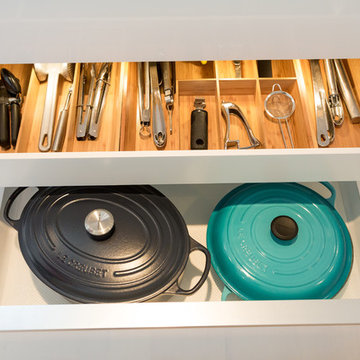
Choosing the right cabinetry for the room and how to meet the needs of the client was critical to the overall success of this design. A traditional style was the framework of the home and the flat paneled doors on the white painted cabinetry support this aspect. Going vertical as possible with cabinets is a trend here to stay; keeping with that idea, we recommended the graceful tall pantry cabinet that flanks one side of the kitchen. This not only lends to an eye-appealing furniture-look, but adds significant storage space, allowing the cabinets to store items they may not use on a regular basis. In this case, the clients are amazed with the amount of storage they’ve gained and one that provides easy access to all interior items. Every inch of space was key to create this optimally functional kitchen. Must-haves such as tray dividers above the refrigerator are handy and the double pull-out trash/recycling bins on the right side of the sink were a simple and clean way to gain floor space and conceal unsightly trash.
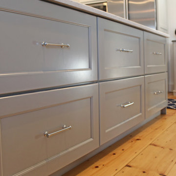
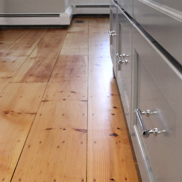
The focal point of this kitchen is the expansive, soft-grey colored contrasting island with larger, deeper drawers for pots, pans and platters. The client was excited to switch to an induction chef-series range that featured a divided oven that can accommodate two different temperatures.
Fit and finish is important in any renovation and this certainly holds true in this kitchen project to personalize their space. The custom recessed panel columns with wainscot details add an architectural element that ties into the kitchen cabinet design and Carrera-look quartz countertops which provide a stunning classical look that ties nicely with the overall traditional style. These homeowners are excited to show off their open and spacious Renovision!
“We really enjoyed our new kitchen and it’s amazing improvement over the holidays. We got rave reviews from all of our guests!”
Steve & Mary S. (Duxbury)
 Renovisions
These South Shore of Boston homeowners desired a larger kitchen as their existing had limited space to host family events and entertain guests – they turned to Renovisions to help transform their small, outdated kitchen with separate walk-in pantry into a beautiful, open and spacious inspirational room.
Choosing the right cabinetry for the room and how to meet the needs of the client was critical to the overall success of this design. A traditional style was the framework of the home and the flat paneled doors on the white painted cabinetry support this aspect. Going vertical as possible with cabinets is a trend here to stay; keeping with that idea, we recommended the graceful tall pantry cabinet that flanks one side of the kitchen. This not only lends to an eye-appealing furniture-look, but adds significant storage space, allowing the cabinets to store items they may not use on a regular basis. In this case, the clients are amazed with the amount of storage they’ve gained and one that provides easy access to all interior items. Every inch of space was key to create this optimally functional kitchen. Must-haves such as tray dividers above the refrigerator are handy and the double pull-out trash/recycling bins on the right side of the sink were a simple and clean way to gain floor space and conceal unsightly trash.
The focal point of this kitchen is the expansive, soft-grey colored contrasting island with larger, deeper drawers for pots, pans and platters. The client was excited to switch to an induction chef-series range that featured a divided oven that can accommodate two different temperatures.
Fit and finish is important in any renovation and this certainly holds true in this kitchen project to personalize their space. The custom recessed panel columns with wainscot details add an architectural element that ties into the kitchen cabinet design and Carrera-look quartz countertops which provide a stunning classical look that ties nicely with the overall traditional style. These homeowners are excited to show off their open and spacious Renovision!
“We really enjoyed our new kitchen and it’s amazing improvement over the holidays. We got rave reviews from all of our guests!”
Steve & Mary S. (Duxbury)
 Renovisions
These South Shore of Boston homeowners desired a larger kitchen as their existing had limited space to host family events and entertain guests – they turned to Renovisions to help transform their small, outdated kitchen with separate walk-in pantry into a beautiful, open and spacious inspirational room.
Choosing the right cabinetry for the room and how to meet the needs of the client was critical to the overall success of this design. A traditional style was the framework of the home and the flat paneled doors on the white painted cabinetry support this aspect. Going vertical as possible with cabinets is a trend here to stay; keeping with that idea, we recommended the graceful tall pantry cabinet that flanks one side of the kitchen. This not only lends to an eye-appealing furniture-look, but adds significant storage space, allowing the cabinets to store items they may not use on a regular basis. In this case, the clients are amazed with the amount of storage they’ve gained and one that provides easy access to all interior items. Every inch of space was key to create this optimally functional kitchen. Must-haves such as tray dividers above the refrigerator are handy and the double pull-out trash/recycling bins on the right side of the sink were a simple and clean way to gain floor space and conceal unsightly trash.
The focal point of this kitchen is the expansive, soft-grey colored contrasting island with larger, deeper drawers for pots, pans and platters. The client was excited to switch to an induction chef-series range that featured a divided oven that can accommodate two different temperatures.
Fit and finish is important in any renovation and this certainly holds true in this kitchen project to personalize their space. The custom recessed panel columns with wainscot details add an architectural element that ties into the kitchen cabinet design and Carrera-look quartz countertops which provide a stunning classical look that ties nicely with the overall traditional style. These homeowners are excited to show off their open and spacious Renovision!
“We really enjoyed our new kitchen and it’s amazing improvement over the holidays. We got rave reviews from all of our guests!”
Steve & Mary S. (Duxbury)
 Level One Construction
Seamless Elegance is a story bringing together both old and new. A cramped kitchen and a seldom-used den in a 100 year-old house were opened up to create a sprawling 300-sqft paradise. Obsessing over the little details was important to achieving our goal of seamless elegance.
The archway and molding detail between the dining and living room was perfectly mirrored between the dining room and kitchen, right down to the hidden closets. A faux brick wall painted white was added to the back wall of the kitchen to give the illusion that the previous expansion was always there.
The existing 1.5” wide beautiful oak hardwood floor was matched to the rest of the house and continued into the kitchen. The flooring throughout the house was re-done at the same time to solidify the marriage between old and new; the result was a seamless transition into functionality. The character brought into the space by the oak hardwood floor and brick wall off sets the contemporary high gloss white cabinets.
No upper cabinets were used in this design because we wanted to showcase the brick accent wall. The storage lost from zero upper kitchen cabinets was more than made up in floor-to-ceiling pantry. This corner pantry accommodates the bulk of storage for food and dishes in the kitchen. The subtraction of the upper cabinets allows the Tom Dixon pendant lights to be boldly featured over the eating peninsula.
Visual lines were a key aspect in this design helping the eye move throughout the space. The cabinet break lines are at the same height as the counter tops creating one continuous line. The paneled dishwasher blends perfectly with the rest of the kitchen cabinetry. The white quartz countertop flows down into a waterfall edge at the end of the eating peninsula, being the final grounding piece to visual lines.
Although the kitchen is all white, it is offset and given visual interest through texture and the use of different materials. The white allows the beautiful expensive appliances to be showcased along with the newly refinished flooring. The clean crisp kitchen will be the perfect backdrop to show case boldly colored art and accessories.
 Renovisions
These South Shore of Boston homeowners desired a larger kitchen as their existing had limited space to host family events and entertain guests – they turned to Renovisions to help transform their small, outdated kitchen with separate walk-in pantry into a beautiful, open and spacious inspirational room.
Choosing the right cabinetry for the room and how to meet the needs of the client was critical to the overall success of this design. A traditional style was the framework of the home and the flat paneled doors on the white painted cabinetry support this aspect. Going vertical as possible with cabinets is a trend here to stay; keeping with that idea, we recommended the graceful tall pantry cabinet that flanks one side of the kitchen. This not only lends to an eye-appealing furniture-look, but adds significant storage space, allowing the cabinets to store items they may not use on a regular basis. In this case, the clients are amazed with the amount of storage they’ve gained and one that provides easy access to all interior items. Every inch of space was key to create this optimally functional kitchen. Must-haves such as tray dividers above the refrigerator are handy and the double pull-out trash/recycling bins on the right side of the sink were a simple and clean way to gain floor space and conceal unsightly trash.
The focal point of this kitchen is the expansive, soft-grey colored contrasting island with larger, deeper drawers for pots, pans and platters. The client was excited to switch to an induction chef-series range that featured a divided oven that can accommodate two different temperatures.
Fit and finish is important in any renovation and this certainly holds true in this kitchen project to personalize their space. The custom recessed panel columns with wainscot details add an architectural element that ties into the kitchen cabinet design and Carrera-look quartz countertops which provide a stunning classical look that ties nicely with the overall traditional style. These homeowners are excited to show off their open and spacious Renovision!
“We really enjoyed our new kitchen and it’s amazing improvement over the holidays. We got rave reviews from all of our guests!”
Steve & Mary S. (Duxbury)
 Renovisions
These South Shore of Boston homeowners desired a larger kitchen as their existing had limited space to host family events and entertain guests – they turned to Renovisions to help transform their small, outdated kitchen with separate walk-in pantry into a beautiful, open and spacious inspirational room.
Choosing the right cabinetry for the room and how to meet the needs of the client was critical to the overall success of this design. A traditional style was the framework of the home and the flat paneled doors on the white painted cabinetry support this aspect. Going vertical as possible with cabinets is a trend here to stay; keeping with that idea, we recommended the graceful tall pantry cabinet that flanks one side of the kitchen. This not only lends to an eye-appealing furniture-look, but adds significant storage space, allowing the cabinets to store items they may not use on a regular basis. In this case, the clients are amazed with the amount of storage they’ve gained and one that provides easy access to all interior items. Every inch of space was key to create this optimally functional kitchen. Must-haves such as tray dividers above the refrigerator are handy and the double pull-out trash/recycling bins on the right side of the sink were a simple and clean way to gain floor space and conceal unsightly trash.
The focal point of this kitchen is the expansive, soft-grey colored contrasting island with larger, deeper drawers for pots, pans and platters. The client was excited to switch to an induction chef-series range that featured a divided oven that can accommodate two different temperatures.
Fit and finish is important in any renovation and this certainly holds true in this kitchen project to personalize their space. The custom recessed panel columns with wainscot details add an architectural element that ties into the kitchen cabinet design and Carrera-look quartz countertops which provide a stunning classical look that ties nicely with the overall traditional style. These homeowners are excited to show off their open and spacious Renovision!
“We really enjoyed our new kitchen and it’s amazing improvement over the holidays. We got rave reviews from all of our guests!”
Steve & Mary S. (Duxbury)
 Level One Construction
Seamless Elegance is a story bringing together both old and new. A cramped kitchen and a seldom-used den in a 100 year-old house were opened up to create a sprawling 300-sqft paradise. Obsessing over the little details was important to achieving our goal of seamless elegance.
The archway and molding detail between the dining and living room was perfectly mirrored between the dining room and kitchen, right down to the hidden closets. A faux brick wall painted white was added to the back wall of the kitchen to give the illusion that the previous expansion was always there.
The existing 1.5” wide beautiful oak hardwood floor was matched to the rest of the house and continued into the kitchen. The flooring throughout the house was re-done at the same time to solidify the marriage between old and new; the result was a seamless transition into functionality. The character brought into the space by the oak hardwood floor and brick wall off sets the contemporary high gloss white cabinets.
No upper cabinets were used in this design because we wanted to showcase the brick accent wall. The storage lost from zero upper kitchen cabinets was more than made up in floor-to-ceiling pantry. This corner pantry accommodates the bulk of storage for food and dishes in the kitchen. The subtraction of the upper cabinets allows the Tom Dixon pendant lights to be boldly featured over the eating peninsula.
Visual lines were a key aspect in this design helping the eye move throughout the space. The cabinet break lines are at the same height as the counter tops creating one continuous line. The paneled dishwasher blends perfectly with the rest of the kitchen cabinetry. The white quartz countertop flows down into a waterfall edge at the end of the eating peninsula, being the final grounding piece to visual lines.
Although the kitchen is all white, it is offset and given visual interest through texture and the use of different materials. The white allows the beautiful expensive appliances to be showcased along with the newly refinished flooring. The clean crisp kitchen will be the perfect backdrop to show case boldly colored art and accessories.
 Renovisions
These South Shore of Boston homeowners desired a larger kitchen as their existing had limited space to host family events and entertain guests – they turned to Renovisions to help transform their small, outdated kitchen with separate walk-in pantry into a beautiful, open and spacious inspirational room.
Choosing the right cabinetry for the room and how to meet the needs of the client was critical to the overall success of this design. A traditional style was the framework of the home and the flat paneled doors on the white painted cabinetry support this aspect. Going vertical as possible with cabinets is a trend here to stay; keeping with that idea, we recommended the graceful tall pantry cabinet that flanks one side of the kitchen. This not only lends to an eye-appealing furniture-look, but adds significant storage space, allowing the cabinets to store items they may not use on a regular basis. In this case, the clients are amazed with the amount of storage they’ve gained and one that provides easy access to all interior items. Every inch of space was key to create this optimally functional kitchen. Must-haves such as tray dividers above the refrigerator are handy and the double pull-out trash/recycling bins on the right side of the sink were a simple and clean way to gain floor space and conceal unsightly trash.
The focal point of this kitchen is the expansive, soft-grey colored contrasting island with larger, deeper drawers for pots, pans and platters. The client was excited to switch to an induction chef-series range that featured a divided oven that can accommodate two different temperatures.
Fit and finish is important in any renovation and this certainly holds true in this kitchen project to personalize their space. The custom recessed panel columns with wainscot details add an architectural element that ties into the kitchen cabinet design and Carrera-look quartz countertops which provide a stunning classical look that ties nicely with the overall traditional style. These homeowners are excited to show off their open and spacious Renovision!
“We really enjoyed our new kitchen and it’s amazing improvement over the holidays. We got rave reviews from all of our guests!”
Steve & Mary S. (Duxbury)
 Level One Construction
Seamless Elegance is a story bringing together both old and new. A cramped kitchen and a seldom-used den in a 100 year-old house were opened up to create a sprawling 300-sqft paradise. Obsessing over the little details was important to achieving our goal of seamless elegance.
The archway and molding detail between the dining and living room was perfectly mirrored between the dining room and kitchen, right down to the hidden closets. A faux brick wall painted white was added to the back wall of the kitchen to give the illusion that the previous expansion was always there.
The existing 1.5” wide beautiful oak hardwood floor was matched to the rest of the house and continued into the kitchen. The flooring throughout the house was re-done at the same time to solidify the marriage between old and new; the result was a seamless transition into functionality. The character brought into the space by the oak hardwood floor and brick wall off sets the contemporary high gloss white cabinets.
No upper cabinets were used in this design because we wanted to showcase the brick accent wall. The storage lost from zero upper kitchen cabinets was more than made up in floor-to-ceiling pantry. This corner pantry accommodates the bulk of storage for food and dishes in the kitchen. The subtraction of the upper cabinets allows the Tom Dixon pendant lights to be boldly featured over the eating peninsula.
Visual lines were a key aspect in this design helping the eye move throughout the space. The cabinet break lines are at the same height as the counter tops creating one continuous line. The paneled dishwasher blends perfectly with the rest of the kitchen cabinetry. The white quartz countertop flows down into a waterfall edge at the end of the eating peninsula, being the final grounding piece to visual lines.
Although the kitchen is all white, it is offset and given visual interest through texture and the use of different materials. The white allows the beautiful expensive appliances to be showcased along with the newly refinished flooring. The clean crisp kitchen will be the perfect backdrop to show case boldly colored art and accessories.
 Renovisions
These South Shore of Boston homeowners desired a larger kitchen as their existing had limited space to host family events and entertain guests – they turned to Renovisions to help transform their small, outdated kitchen with separate walk-in pantry into a beautiful, open and spacious inspirational room.
Choosing the right cabinetry for the room and how to meet the needs of the client was critical to the overall success of this design. A traditional style was the framework of the home and the flat paneled doors on the white painted cabinetry support this aspect. Going vertical as possible with cabinets is a trend here to stay; keeping with that idea, we recommended the graceful tall pantry cabinet that flanks one side of the kitchen. This not only lends to an eye-appealing furniture-look, but adds significant storage space, allowing the cabinets to store items they may not use on a regular basis. In this case, the clients are amazed with the amount of storage they’ve gained and one that provides easy access to all interior items. Every inch of space was key to create this optimally functional kitchen. Must-haves such as tray dividers above the refrigerator are handy and the double pull-out trash/recycling bins on the right side of the sink were a simple and clean way to gain floor space and conceal unsightly trash.
The focal point of this kitchen is the expansive, soft-grey colored contrasting island with larger, deeper drawers for pots, pans and platters. The client was excited to switch to an induction chef-series range that featured a divided oven that can accommodate two different temperatures.
Fit and finish is important in any renovation and this certainly holds true in this kitchen project to personalize their space. The custom recessed panel columns with wainscot details add an architectural element that ties into the kitchen cabinet design and Carrera-look quartz countertops which provide a stunning classical look that ties nicely with the overall traditional style. These homeowners are excited to show off their open and spacious Renovision!
“We really enjoyed our new kitchen and it’s amazing improvement over the holidays. We got rave reviews from all of our guests!”
Steve & Mary S. (Duxbury)
 Renovisions
These South Shore of Boston homeowners desired a larger kitchen as their existing had limited space to host family events and entertain guests – they turned to Renovisions to help transform their small, outdated kitchen with separate walk-in pantry into a beautiful, open and spacious inspirational room.
Choosing the right cabinetry for the room and how to meet the needs of the client was critical to the overall success of this design. A traditional style was the framework of the home and the flat paneled doors on the white painted cabinetry support this aspect. Going vertical as possible with cabinets is a trend here to stay; keeping with that idea, we recommended the graceful tall pantry cabinet that flanks one side of the kitchen. This not only lends to an eye-appealing furniture-look, but adds significant storage space, allowing the cabinets to store items they may not use on a regular basis. In this case, the clients are amazed with the amount of storage they’ve gained and one that provides easy access to all interior items. Every inch of space was key to create this optimally functional kitchen. Must-haves such as tray dividers above the refrigerator are handy and the double pull-out trash/recycling bins on the right side of the sink were a simple and clean way to gain floor space and conceal unsightly trash.
The focal point of this kitchen is the expansive, soft-grey colored contrasting island with larger, deeper drawers for pots, pans and platters. The client was excited to switch to an induction chef-series range that featured a divided oven that can accommodate two different temperatures.
Fit and finish is important in any renovation and this certainly holds true in this kitchen project to personalize their space. The custom recessed panel columns with wainscot details add an architectural element that ties into the kitchen cabinet design and Carrera-look quartz countertops which provide a stunning classical look that ties nicely with the overall traditional style. These homeowners are excited to show off their open and spacious Renovision!
“We really enjoyed our new kitchen and it’s amazing improvement over the holidays. We got rave reviews from all of our guests!”
Steve & Mary S. (Duxbury)
19