
Search results for "Key aspect" in Home Design Ideas

 Claude Clemaron Luxury Bespoke Furniture
Claude Clémaron had the pleasure of creating this large bespoke fitted dressing room for our clients’ residence in Esher, Surrey. The made to measure floor to ceiling wardrobes and integrated drawers are built to the highest quality with every detail tailored to the couple’s exact specification. Mirrors are a key aspect of this dedicated ‘his and hers’ dressing room, and they also enhance the natural light, add glamour, and create an illusion of space. Handcrafted in oak with a lacquer finish, the built in furniture has a classic elegance that will always be in style.
Classical elegance, real oak quality
All the cabinetry is made of solid oak wood and real oak veneer, both inside and out, and flawlessly spraypainted in Farrow and Ball’s Worsted. This lovely neutral mid grey has an understated richness with cold tones and makes perfect neutral background shade for a stylish his and hers dressing room. Ultra-slim, long, premium metal bar handles elevate the look even further. The vanity unit with an illuminated oak-framed mirror and drawers features a clear safety glass top to protect the counter from cosmetic and perfume spills. And an unsightly radiator had a bespoke cabinet cover created to blend seamlessly with the windowsill.
Illuminated interiors with tailored storage
Behind the mirrored soft-close doors, the matching grey cabinet interiors are fully customised with a range of storage features. These include internal felt and velvet-lined drawers for jewellery, watches, and belts. Concealed, vertical automatic LED lighting in all the closets. Double height hanging rails and cleverly crafted pull-out trays with low fronts for easy viewing and access. High-level open shelves with useful dividers for less frequently used items. Every millimetre of space has been immaculately crafted to accommodate every item in our clients’ collections from coats to cufflinks.

 Randy Trainor
This kitchen is in a small 100 year old home in the center of the historic district of town. Maximizing the use of available space and imbuing this well-used, functioning kitchen with rich detail and elegance were the two most important aspects of the project. Except for being able to borrow a small amount of space from an adjacent hallway to accommodate the depth of the refrigerator, pantry and drawers on one end wall, there was no other way to expand the footprint of the kitchen.
Since we had already remodeled and upgraded the décor in most of the rest of the house and since the kitchen opened into the dining room, we wanted to create a “little jewel box” of a kitchen that was dressy enough to blend with the surrounding areas.
Extensive use of Calcutta marble and a mirror-backed cabinet with glass doors provide the desired sparkle and elegance while the existing oak floor and a thick mahogany countertop visually warm the room. Custom cabinets provide the necessary storage, and we found the perfect antique rug to add color. Hand painted tiles above the stove, the custom hood, and an elegant faucet underscore the theme. “Fun” elements include the imported French stool and the portrait of the homeowner’s cats placed just above their feeding area.

 Progressive Design Build
In less than 90 days after work began, a dated kitchen is brought back to life with current trends and technologies, along with a neutral color palette.
Introduced to Progressive Design Build from a trusted referral, Mike and Holly approached their kitchen remodel with some trepidation. They had interviewed several contractors who were unsuccessful at solving key traffic flow issues around an island cabinet they wanted—until they met Progressive.
As restaurant owners, the husband and wife team were very familiar with remodeling contractors, having renovated many restaurants in the past. Design/build remodeling, however, was new to them. After learning more about the benefits of working with a design/build firm, Mike and Holly met with Progressive’s certified kitchen and bath designer, Betty Appleby. They understood immediately the value of teaming up with design and construction professionals early in the process.
Mike and Holly had done a lot of their own research and were clear about what they wanted. They had visions of an island cabinet being more usable and accessible. Progressive Design Build brought that vision to life.
While the project was under construction, the homeowners avoided the noise and dust by taking frequent trips to Europe and New York, trusting the entire remodeling project to Progressive Design Build. When they returned, all aspects of their functional and stylistic design needs were met.
Details of the finished project include a faux finish copper range hood, custom cabinetry, new stainless steel appliances, granite countertops, a new wet bar adjacent to the kitchen, and porcelain tile flooring throughout. The refrigerator was disguised using custom cabinet appliance panels, effectively integrating it with the cabinetry wall for a unified look.
This project was completed on time and on budget. As a result, the homeowners hired Progressive Design Build to complete two more home remodeling projects for them.
Find the right local pro for your project
 Timberlyne Group
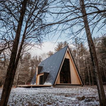
Located in the Catskill Mountains of Upstate New York, this stunning A-frame Cabin is the perfect retreat from busy city life. With 2,072 total square feet, the cabin has two bedrooms, two full bathrooms, two living spaces, a kitchen, an office, a laundry room, and a mudroom. This modern timber frame is sleek and stunning inside and out.
The exterior is bold, with a striking contrast between the black metal roof and the warm tones of Douglas Fir wood siding. Large windows strategically placed on each side of the home highlight the surrounding landscape's beauty.
Open the front door, and it's easy to imagine stepping into this cabin to unplug and reset. Upon entering the space, the classic white and natural wood combination gives a fresh, clean, calming vibe. The first floor features an open living space with a massive bank of windows letting natural light flood the room. The concealed (or hidden) kitchen design creates a clutter-free look. Right off the kitchen are sliding doors where you can step outside and relax on the ground-level deck. You'll find the primary bedroom and bath near the back of the home. The bathroom has a freestanding tub where you can truly soak in the beautiful views of the forest.
Climb the floating stairs to the loft, passing beneath the web pendant light, and you'll find a guest bedroom on one side and additional living space to relax or create on the other. The desk space with a large lookout window is the perfect setting to spark creativity. A frameless glass railing in the loft is a unique touch that creates a great sense of spaciousness throughout the home.
This A-Frame cabin is the perfect example of a minimalist aesthetic that allows nature to be the focal design element. The timber's natural warmth and texture play a key role in achieving biophilic design. Biophilic design is a philosophy and architectural practice that connects people with nature in built environments. It incorporates natural elements into spaces to improve health and well-being. Shown to improve mood, reduce stress, and enhance cognitive performance, incorporating wood is an important aspect to consider when designing your home.
The structure type of this home is a timber frame. Timber frame construction relies on mortise and tenon (or wood-to-wood) joinery to bring everything together aesthetically and structurally. This traditional method is known for longevity and creates a strong and attractive space.

 Level One Construction
Seamless Elegance is a story bringing together both old and new. A cramped kitchen and a seldom-used den in a 100 year-old house were opened up to create a sprawling 300-sqft paradise. Obsessing over the little details was important to achieving our goal of seamless elegance.
The archway and molding detail between the dining and living room was perfectly mirrored between the dining room and kitchen, right down to the hidden closets. A faux brick wall painted white was added to the back wall of the kitchen to give the illusion that the previous expansion was always there.
The existing 1.5” wide beautiful oak hardwood floor was matched to the rest of the house and continued into the kitchen. The flooring throughout the house was re-done at the same time to solidify the marriage between old and new; the result was a seamless transition into functionality. The character brought into the space by the oak hardwood floor and brick wall off sets the contemporary high gloss white cabinets.
No upper cabinets were used in this design because we wanted to showcase the brick accent wall. The storage lost from zero upper kitchen cabinets was more than made up in floor-to-ceiling pantry. This corner pantry accommodates the bulk of storage for food and dishes in the kitchen. The subtraction of the upper cabinets allows the Tom Dixon pendant lights to be boldly featured over the eating peninsula.
Visual lines were a key aspect in this design helping the eye move throughout the space. The cabinet break lines are at the same height as the counter tops creating one continuous line. The paneled dishwasher blends perfectly with the rest of the kitchen cabinetry. The white quartz countertop flows down into a waterfall edge at the end of the eating peninsula, being the final grounding piece to visual lines.
Although the kitchen is all white, it is offset and given visual interest through texture and the use of different materials. The white allows the beautiful expensive appliances to be showcased along with the newly refinished flooring. The clean crisp kitchen will be the perfect backdrop to show case boldly colored art and accessories.

 InnovationLand
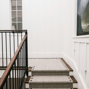
Outdoor furniture from Restoration Hardware really made this Houston outdoor living space design project shine.
“It really went well,” says Wayne Franks, owner of Outdoor Homescapes of Houston. “It's not a huge space, but moving the existing two columns about four feet and bringing the roof out only three feet made all the difference in the world.”
“This particular client wanted a larger space to entertain,” says senior designer Lisha Maxey, who served as an outdoor furniture consultant while managing construction for the project.
The original space, Lisha explains, had two oddly placed columns blocking a clear view of the beautiful pool area from inside the home. “We removed those columns and gave her three more feet of roof, which extended her living area while also giving her the view she wanted.”
Since the client - a woman in her mid-50s with grown children who visit frequently - only wanted a small outdoor kitchen island with a 30-inch RCS grill Outdoor Homescapes closed up a French door that led from the master bedroom (which she never used) and created a new stucco wall for the kitchen.
“I would definitely call the style of this space ‘transitional,” says Lisha. The client is a very eclectic world traveler and a collector of art, yet wanted her outdoor living space to feel like a warm, homey living room once we placed the furniture and décor. In the end, her finishes centered around rustic stone, detailed columns and furniture leaning towards the contemporary.”
Much of the warmth in the space, she says, comes from the colors of the dry-stacked Sunset Canyon ledgestone. “It looks just like it sounds – like the sun setting in a deep canyon!”
“The columns are unique – decorative and fluted,” adds Wayne.
The client, who’d received five free hours of outdoor furniture consultation as part of an ongoing promotion, also wanted Lisha to help her select, buy and help place furnishings.
“I believe that now - more than ever - consumers are looking for turn-key operations in any type of service industry - a ‘one-stop-shop,’ so to speak,” says Lisha. “It gives us a more personal touch with the client, as well as an edge in the industry in terms of selling our designs, as the client is reassured that we’ll work with them in every aspect to give them the outdoor living space of their dreams.”
The client ended up choosing the Biscayne collection – including a chair that rocks and swivels - from Restoration Hardware. They also went with a lower, unique teak coffee table from the Belvedere collection.
“We mixed wicker with teak for an equally soft and hard look and added pops of color to bring out the beautiful art collection inside,” says Lisha. “The neutral gray wicker, by the way, was the perfect match for the distressed teak coffee table and credenza. The grays of the Key West granite countertop also echoed this color palette.”
For the fabric, Lisha helped keep it neutral with a Mocha linen and popped the color with royal blue throw pillows matching the area rug: “To make the space truly her own, we added some unique copper pots from her collection and a few items she's collected abroad.”
 Level One Construction
Seamless Elegance is a story bringing together both old and new. A cramped kitchen and a seldom-used den in a 100 year-old house were opened up to create a sprawling 300-sqft paradise. Obsessing over the little details was important to achieving our goal of seamless elegance.
The archway and molding detail between the dining and living room was perfectly mirrored between the dining room and kitchen, right down to the hidden closets. A faux brick wall painted white was added to the back wall of the kitchen to give the illusion that the previous expansion was always there.
The existing 1.5” wide beautiful oak hardwood floor was matched to the rest of the house and continued into the kitchen. The flooring throughout the house was re-done at the same time to solidify the marriage between old and new; the result was a seamless transition into functionality. The character brought into the space by the oak hardwood floor and brick wall off sets the contemporary high gloss white cabinets.
No upper cabinets were used in this design because we wanted to showcase the brick accent wall. The storage lost from zero upper kitchen cabinets was more than made up in floor-to-ceiling pantry. This corner pantry accommodates the bulk of storage for food and dishes in the kitchen. The subtraction of the upper cabinets allows the Tom Dixon pendant lights to be boldly featured over the eating peninsula.
Visual lines were a key aspect in this design helping the eye move throughout the space. The cabinet break lines are at the same height as the counter tops creating one continuous line. The paneled dishwasher blends perfectly with the rest of the kitchen cabinetry. The white quartz countertop flows down into a waterfall edge at the end of the eating peninsula, being the final grounding piece to visual lines.
Although the kitchen is all white, it is offset and given visual interest through texture and the use of different materials. The white allows the beautiful expensive appliances to be showcased along with the newly refinished flooring. The clean crisp kitchen will be the perfect backdrop to show case boldly colored art and accessories.

 Thomas Roszak Architecture, LLC
Photo credit: Scott McDonald @ Hedrich Blessing
7RR-Ecohome:
The design objective was to build a house for a couple recently married who both had kids from previous marriages. How to bridge two families together?
The design looks forward in terms of how people live today. The home is an experiment in transparency and solid form; removing borders and edges from outside to inside the house, and to really depict “flowing and endless space”. The house floor plan is derived by pushing and pulling the house’s form to maximize the backyard and minimize the public front yard while welcoming the sun in key rooms by rotating the house 45-degrees to true north. The angular form of the house is a result of the family’s program, the zoning rules, the lot’s attributes, and the sun’s path. We wanted to construct a house that is smart and efficient in terms of construction and energy, both in terms of the building and the user. We could tell a story of how the house is built in terms of the constructability, structure and enclosure, with a nod to Japanese wood construction in the method in which the siding is installed and the exposed interior beams are placed in the double height space. We engineered the house to be smart which not only looks modern but acts modern; every aspect of user control is simplified to a digital touch button, whether lights, shades, blinds, HVAC, communication, audio, video, or security. We developed a planning module based on a 6-foot square room size and a 6-foot wide connector called an interstitial space for hallways, bathrooms, stairs and mechanical, which keeps the rooms pure and uncluttered. The house is 6,200 SF of livable space, plus garage and basement gallery for a total of 9,200 SF. A large formal foyer celebrates the entry and opens up to the living, dining, kitchen and family rooms all focused on the rear garden. The east side of the second floor is the Master wing and a center bridge connects it to the kid’s wing on the west. Second floor terraces and sunscreens provide views and shade in this suburban setting. The playful mathematical grid of the house in the x, y and z axis also extends into the layout of the trees and hard-scapes, all centered on a suburban one-acre lot.
Many green attributes were designed into the home; Ipe wood sunscreens and window shades block out unwanted solar gain in summer, but allow winter sun in. Patio door and operable windows provide ample opportunity for natural ventilation throughout the open floor plan. Minimal windows on east and west sides to reduce heat loss in winter and unwanted gains in summer. Open floor plan and large window expanse reduces lighting demands and maximizes available daylight. Skylights provide natural light to the basement rooms. Durable, low-maintenance exterior materials include stone, ipe wood siding and decking, and concrete roof pavers. Design is based on a 2' planning grid to minimize construction waste. Basement foundation walls and slab are highly insulated. FSC-certified walnut wood flooring was used. Light colored concrete roof pavers to reduce cooling loads by as much as 15%. 2x6 framing allows for more insulation and energy savings. Super efficient windows have low-E argon gas filled units, and thermally insulated aluminum frames. Permeable brick and stone pavers reduce the site’s storm-water runoff. Countertops use recycled composite materials. Energy-Star rated furnaces and smart thermostats are located throughout the house to minimize duct runs and avoid energy loss. Energy-Star rated boiler that heats up both radiant floors and domestic hot water. Low-flow toilets and plumbing fixtures are used to conserve water usage. No VOC finish options and direct venting fireplaces maintain a high interior air quality. Smart home system controls lighting, HVAC, and shades to better manage energy use. Plumbing runs through interior walls reducing possibilities of heat loss and freezing problems. A large food pantry was placed next to kitchen to reduce trips to the grocery store. Home office reduces need for automobile transit and associated CO2 footprint. Plan allows for aging in place, with guest suite than can become the master suite, with no need to move as family members mature.


 Renovisions
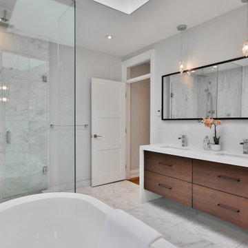
These South Shore of Boston homeowners desired a larger kitchen as their existing had limited space to host family events and entertain guests – they turned to Renovisions to help transform their small, outdated kitchen with separate walk-in pantry into a beautiful, open and spacious inspirational room.
Choosing the right cabinetry for the room and how to meet the needs of the client was critical to the overall success of this design. A traditional style was the framework of the home and the flat paneled doors on the white painted cabinetry support this aspect. Going vertical as possible with cabinets is a trend here to stay; keeping with that idea, we recommended the graceful tall pantry cabinet that flanks one side of the kitchen. This not only lends to an eye-appealing furniture-look, but adds significant storage space, allowing the cabinets to store items they may not use on a regular basis. In this case, the clients are amazed with the amount of storage they’ve gained and one that provides easy access to all interior items. Every inch of space was key to create this optimally functional kitchen. Must-haves such as tray dividers above the refrigerator are handy and the double pull-out trash/recycling bins on the right side of the sink were a simple and clean way to gain floor space and conceal unsightly trash.
The focal point of this kitchen is the expansive, soft-grey colored contrasting island with larger, deeper drawers for pots, pans and platters. The client was excited to switch to an induction chef-series range that featured a divided oven that can accommodate two different temperatures.
Fit and finish is important in any renovation and this certainly holds true in this kitchen project to personalize their space. The custom recessed panel columns with wainscot details add an architectural element that ties into the kitchen cabinet design and Carrera-look quartz countertops which provide a stunning classical look that ties nicely with the overall traditional style. These homeowners are excited to show off their open and spacious Renovision!
“We really enjoyed our new kitchen and it’s amazing improvement over the holidays. We got rave reviews from all of our guests!”
Steve & Mary S. (Duxbury)
 Level One Construction
Seamless Elegance is a story bringing together both old and new. A cramped kitchen and a seldom-used den in a 100 year-old house were opened up to create a sprawling 300-sqft paradise. Obsessing over the little details was important to achieving our goal of seamless elegance.
The archway and molding detail between the dining and living room was perfectly mirrored between the dining room and kitchen, right down to the hidden closets. A faux brick wall painted white was added to the back wall of the kitchen to give the illusion that the previous expansion was always there.
The existing 1.5” wide beautiful oak hardwood floor was matched to the rest of the house and continued into the kitchen. The flooring throughout the house was re-done at the same time to solidify the marriage between old and new; the result was a seamless transition into functionality. The character brought into the space by the oak hardwood floor and brick wall off sets the contemporary high gloss white cabinets.
No upper cabinets were used in this design because we wanted to showcase the brick accent wall. The storage lost from zero upper kitchen cabinets was more than made up in floor-to-ceiling pantry. This corner pantry accommodates the bulk of storage for food and dishes in the kitchen. The subtraction of the upper cabinets allows the Tom Dixon pendant lights to be boldly featured over the eating peninsula.
Visual lines were a key aspect in this design helping the eye move throughout the space. The cabinet break lines are at the same height as the counter tops creating one continuous line. The paneled dishwasher blends perfectly with the rest of the kitchen cabinetry. The white quartz countertop flows down into a waterfall edge at the end of the eating peninsula, being the final grounding piece to visual lines.
Although the kitchen is all white, it is offset and given visual interest through texture and the use of different materials. The white allows the beautiful expensive appliances to be showcased along with the newly refinished flooring. The clean crisp kitchen will be the perfect backdrop to show case boldly colored art and accessories.
 Thomas Roszak Architecture, LLC
Photo credit: Scott McDonald @ Hedrich Blessing
7RR-Ecohome:
The design objective was to build a house for a couple recently married who both had kids from previous marriages. How to bridge two families together?
The design looks forward in terms of how people live today. The home is an experiment in transparency and solid form; removing borders and edges from outside to inside the house, and to really depict “flowing and endless space”. The house floor plan is derived by pushing and pulling the house’s form to maximize the backyard and minimize the public front yard while welcoming the sun in key rooms by rotating the house 45-degrees to true north. The angular form of the house is a result of the family’s program, the zoning rules, the lot’s attributes, and the sun’s path. We wanted to construct a house that is smart and efficient in terms of construction and energy, both in terms of the building and the user. We could tell a story of how the house is built in terms of the constructability, structure and enclosure, with a nod to Japanese wood construction in the method in which the siding is installed and the exposed interior beams are placed in the double height space. We engineered the house to be smart which not only looks modern but acts modern; every aspect of user control is simplified to a digital touch button, whether lights, shades, blinds, HVAC, communication, audio, video, or security. We developed a planning module based on a 6-foot square room size and a 6-foot wide connector called an interstitial space for hallways, bathrooms, stairs and mechanical, which keeps the rooms pure and uncluttered. The house is 6,200 SF of livable space, plus garage and basement gallery for a total of 9,200 SF. A large formal foyer celebrates the entry and opens up to the living, dining, kitchen and family rooms all focused on the rear garden. The east side of the second floor is the Master wing and a center bridge connects it to the kid’s wing on the west. Second floor terraces and sunscreens provide views and shade in this suburban setting. The playful mathematical grid of the house in the x, y and z axis also extends into the layout of the trees and hard-scapes, all centered on a suburban one-acre lot.
Many green attributes were designed into the home; Ipe wood sunscreens and window shades block out unwanted solar gain in summer, but allow winter sun in. Patio door and operable windows provide ample opportunity for natural ventilation throughout the open floor plan. Minimal windows on east and west sides to reduce heat loss in winter and unwanted gains in summer. Open floor plan and large window expanse reduces lighting demands and maximizes available daylight. Skylights provide natural light to the basement rooms. Durable, low-maintenance exterior materials include stone, ipe wood siding and decking, and concrete roof pavers. Design is based on a 2' planning grid to minimize construction waste. Basement foundation walls and slab are highly insulated. FSC-certified walnut wood flooring was used. Light colored concrete roof pavers to reduce cooling loads by as much as 15%. 2x6 framing allows for more insulation and energy savings. Super efficient windows have low-E argon gas filled units, and thermally insulated aluminum frames. Permeable brick and stone pavers reduce the site’s storm-water runoff. Countertops use recycled composite materials. Energy-Star rated furnaces and smart thermostats are located throughout the house to minimize duct runs and avoid energy loss. Energy-Star rated boiler that heats up both radiant floors and domestic hot water. Low-flow toilets and plumbing fixtures are used to conserve water usage. No VOC finish options and direct venting fireplaces maintain a high interior air quality. Smart home system controls lighting, HVAC, and shades to better manage energy use. Plumbing runs through interior walls reducing possibilities of heat loss and freezing problems. A large food pantry was placed next to kitchen to reduce trips to the grocery store. Home office reduces need for automobile transit and associated CO2 footprint. Plan allows for aging in place, with guest suite than can become the master suite, with no need to move as family members mature.
 Renovisions
These South Shore of Boston homeowners desired a larger kitchen as their existing had limited space to host family events and entertain guests – they turned to Renovisions to help transform their small, outdated kitchen with separate walk-in pantry into a beautiful, open and spacious inspirational room.
Choosing the right cabinetry for the room and how to meet the needs of the client was critical to the overall success of this design. A traditional style was the framework of the home and the flat paneled doors on the white painted cabinetry support this aspect. Going vertical as possible with cabinets is a trend here to stay; keeping with that idea, we recommended the graceful tall pantry cabinet that flanks one side of the kitchen. This not only lends to an eye-appealing furniture-look, but adds significant storage space, allowing the cabinets to store items they may not use on a regular basis. In this case, the clients are amazed with the amount of storage they’ve gained and one that provides easy access to all interior items. Every inch of space was key to create this optimally functional kitchen. Must-haves such as tray dividers above the refrigerator are handy and the double pull-out trash/recycling bins on the right side of the sink were a simple and clean way to gain floor space and conceal unsightly trash.
The focal point of this kitchen is the expansive, soft-grey colored contrasting island with larger, deeper drawers for pots, pans and platters. The client was excited to switch to an induction chef-series range that featured a divided oven that can accommodate two different temperatures.
Fit and finish is important in any renovation and this certainly holds true in this kitchen project to personalize their space. The custom recessed panel columns with wainscot details add an architectural element that ties into the kitchen cabinet design and Carrera-look quartz countertops which provide a stunning classical look that ties nicely with the overall traditional style. These homeowners are excited to show off their open and spacious Renovision!
“We really enjoyed our new kitchen and it’s amazing improvement over the holidays. We got rave reviews from all of our guests!”
Steve & Mary S. (Duxbury)
 Renovisions
These South Shore of Boston homeowners desired a larger kitchen as their existing had limited space to host family events and entertain guests – they turned to Renovisions to help transform their small, outdated kitchen with separate walk-in pantry into a beautiful, open and spacious inspirational room.
Choosing the right cabinetry for the room and how to meet the needs of the client was critical to the overall success of this design. A traditional style was the framework of the home and the flat paneled doors on the white painted cabinetry support this aspect. Going vertical as possible with cabinets is a trend here to stay; keeping with that idea, we recommended the graceful tall pantry cabinet that flanks one side of the kitchen. This not only lends to an eye-appealing furniture-look, but adds significant storage space, allowing the cabinets to store items they may not use on a regular basis. In this case, the clients are amazed with the amount of storage they’ve gained and one that provides easy access to all interior items. Every inch of space was key to create this optimally functional kitchen. Must-haves such as tray dividers above the refrigerator are handy and the double pull-out trash/recycling bins on the right side of the sink were a simple and clean way to gain floor space and conceal unsightly trash.
The focal point of this kitchen is the expansive, soft-grey colored contrasting island with larger, deeper drawers for pots, pans and platters. The client was excited to switch to an induction chef-series range that featured a divided oven that can accommodate two different temperatures.
Fit and finish is important in any renovation and this certainly holds true in this kitchen project to personalize their space. The custom recessed panel columns with wainscot details add an architectural element that ties into the kitchen cabinet design and Carrera-look quartz countertops which provide a stunning classical look that ties nicely with the overall traditional style. These homeowners are excited to show off their open and spacious Renovision!
“We really enjoyed our new kitchen and it’s amazing improvement over the holidays. We got rave reviews from all of our guests!”
Steve & Mary S. (Duxbury)
 Renovisions
These South Shore of Boston homeowners desired a larger kitchen as their existing had limited space to host family events and entertain guests – they turned to Renovisions to help transform their small, outdated kitchen with separate walk-in pantry into a beautiful, open and spacious inspirational room.
Choosing the right cabinetry for the room and how to meet the needs of the client was critical to the overall success of this design. A traditional style was the framework of the home and the flat paneled doors on the white painted cabinetry support this aspect. Going vertical as possible with cabinets is a trend here to stay; keeping with that idea, we recommended the graceful tall pantry cabinet that flanks one side of the kitchen. This not only lends to an eye-appealing furniture-look, but adds significant storage space, allowing the cabinets to store items they may not use on a regular basis. In this case, the clients are amazed with the amount of storage they’ve gained and one that provides easy access to all interior items. Every inch of space was key to create this optimally functional kitchen. Must-haves such as tray dividers above the refrigerator are handy and the double pull-out trash/recycling bins on the right side of the sink were a simple and clean way to gain floor space and conceal unsightly trash.
The focal point of this kitchen is the expansive, soft-grey colored contrasting island with larger, deeper drawers for pots, pans and platters. The client was excited to switch to an induction chef-series range that featured a divided oven that can accommodate two different temperatures.
Fit and finish is important in any renovation and this certainly holds true in this kitchen project to personalize their space. The custom recessed panel columns with wainscot details add an architectural element that ties into the kitchen cabinet design and Carrera-look quartz countertops which provide a stunning classical look that ties nicely with the overall traditional style. These homeowners are excited to show off their open and spacious Renovision!
“We really enjoyed our new kitchen and it’s amazing improvement over the holidays. We got rave reviews from all of our guests!”
Steve & Mary S. (Duxbury)
 Level One Construction
Seamless Elegance is a story bringing together both old and new. A cramped kitchen and a seldom-used den in a 100 year-old house were opened up to create a sprawling 300-sqft paradise. Obsessing over the little details was important to achieving our goal of seamless elegance.
The archway and molding detail between the dining and living room was perfectly mirrored between the dining room and kitchen, right down to the hidden closets. A faux brick wall painted white was added to the back wall of the kitchen to give the illusion that the previous expansion was always there.
The existing 1.5” wide beautiful oak hardwood floor was matched to the rest of the house and continued into the kitchen. The flooring throughout the house was re-done at the same time to solidify the marriage between old and new; the result was a seamless transition into functionality. The character brought into the space by the oak hardwood floor and brick wall off sets the contemporary high gloss white cabinets.
No upper cabinets were used in this design because we wanted to showcase the brick accent wall. The storage lost from zero upper kitchen cabinets was more than made up in floor-to-ceiling pantry. This corner pantry accommodates the bulk of storage for food and dishes in the kitchen. The subtraction of the upper cabinets allows the Tom Dixon pendant lights to be boldly featured over the eating peninsula.
Visual lines were a key aspect in this design helping the eye move throughout the space. The cabinet break lines are at the same height as the counter tops creating one continuous line. The paneled dishwasher blends perfectly with the rest of the kitchen cabinetry. The white quartz countertop flows down into a waterfall edge at the end of the eating peninsula, being the final grounding piece to visual lines.
Although the kitchen is all white, it is offset and given visual interest through texture and the use of different materials. The white allows the beautiful expensive appliances to be showcased along with the newly refinished flooring. The clean crisp kitchen will be the perfect backdrop to show case boldly colored art and accessories.
 Renovisions
These South Shore of Boston homeowners desired a larger kitchen as their existing had limited space to host family events and entertain guests – they turned to Renovisions to help transform their small, outdated kitchen with separate walk-in pantry into a beautiful, open and spacious inspirational room.
Choosing the right cabinetry for the room and how to meet the needs of the client was critical to the overall success of this design. A traditional style was the framework of the home and the flat paneled doors on the white painted cabinetry support this aspect. Going vertical as possible with cabinets is a trend here to stay; keeping with that idea, we recommended the graceful tall pantry cabinet that flanks one side of the kitchen. This not only lends to an eye-appealing furniture-look, but adds significant storage space, allowing the cabinets to store items they may not use on a regular basis. In this case, the clients are amazed with the amount of storage they’ve gained and one that provides easy access to all interior items. Every inch of space was key to create this optimally functional kitchen. Must-haves such as tray dividers above the refrigerator are handy and the double pull-out trash/recycling bins on the right side of the sink were a simple and clean way to gain floor space and conceal unsightly trash.
The focal point of this kitchen is the expansive, soft-grey colored contrasting island with larger, deeper drawers for pots, pans and platters. The client was excited to switch to an induction chef-series range that featured a divided oven that can accommodate two different temperatures.
Fit and finish is important in any renovation and this certainly holds true in this kitchen project to personalize their space. The custom recessed panel columns with wainscot details add an architectural element that ties into the kitchen cabinet design and Carrera-look quartz countertops which provide a stunning classical look that ties nicely with the overall traditional style. These homeowners are excited to show off their open and spacious Renovision!
“We really enjoyed our new kitchen and it’s amazing improvement over the holidays. We got rave reviews from all of our guests!”
Steve & Mary S. (Duxbury)
 InnovationLand
Outdoor furniture from Restoration Hardware really made this Houston outdoor living space design project shine.
“It really went well,” says Wayne Franks, owner of Outdoor Homescapes of Houston. “It's not a huge space, but moving the existing two columns about four feet and bringing the roof out only three feet made all the difference in the world.”
“This particular client wanted a larger space to entertain,” says senior designer Lisha Maxey, who served as an outdoor furniture consultant while managing construction for the project.
The original space, Lisha explains, had two oddly placed columns blocking a clear view of the beautiful pool area from inside the home. “We removed those columns and gave her three more feet of roof, which extended her living area while also giving her the view she wanted.”
Since the client - a woman in her mid-50s with grown children who visit frequently - only wanted a small outdoor kitchen island with a 30-inch RCS grill Outdoor Homescapes closed up a French door that led from the master bedroom (which she never used) and created a new stucco wall for the kitchen.
“I would definitely call the style of this space ‘transitional,” says Lisha. The client is a very eclectic world traveler and a collector of art, yet wanted her outdoor living space to feel like a warm, homey living room once we placed the furniture and décor. In the end, her finishes centered around rustic stone, detailed columns and furniture leaning towards the contemporary.”
Much of the warmth in the space, she says, comes from the colors of the dry-stacked Sunset Canyon ledgestone. “It looks just like it sounds – like the sun setting in a deep canyon!”
“The columns are unique – decorative and fluted,” adds Wayne.
The client, who’d received five free hours of outdoor furniture consultation as part of an ongoing promotion, also wanted Lisha to help her select, buy and help place furnishings.
“I believe that now - more than ever - consumers are looking for turn-key operations in any type of service industry - a ‘one-stop-shop,’ so to speak,” says Lisha. “It gives us a more personal touch with the client, as well as an edge in the industry in terms of selling our designs, as the client is reassured that we’ll work with them in every aspect to give them the outdoor living space of their dreams.”
The client ended up choosing the Biscayne collection – including a chair that rocks and swivels - from Restoration Hardware. They also went with a lower, unique teak coffee table from the Belvedere collection.
“We mixed wicker with teak for an equally soft and hard look and added pops of color to bring out the beautiful art collection inside,” says Lisha. “The neutral gray wicker, by the way, was the perfect match for the distressed teak coffee table and credenza. The grays of the Key West granite countertop also echoed this color palette.”
For the fabric, Lisha helped keep it neutral with a Mocha linen and popped the color with royal blue throw pillows matching the area rug: “To make the space truly her own, we added some unique copper pots from her collection and a few items she's collected abroad.”
 Thomas Roszak Architecture, LLC
Photo credit: Scott McDonald @ Hedrich Blessing
7RR-Ecohome:
The design objective was to build a house for a couple recently married who both had kids from previous marriages. How to bridge two families together?
The design looks forward in terms of how people live today. The home is an experiment in transparency and solid form; removing borders and edges from outside to inside the house, and to really depict “flowing and endless space”. The house floor plan is derived by pushing and pulling the house’s form to maximize the backyard and minimize the public front yard while welcoming the sun in key rooms by rotating the house 45-degrees to true north. The angular form of the house is a result of the family’s program, the zoning rules, the lot’s attributes, and the sun’s path. We wanted to construct a house that is smart and efficient in terms of construction and energy, both in terms of the building and the user. We could tell a story of how the house is built in terms of the constructability, structure and enclosure, with a nod to Japanese wood construction in the method in which the siding is installed and the exposed interior beams are placed in the double height space. We engineered the house to be smart which not only looks modern but acts modern; every aspect of user control is simplified to a digital touch button, whether lights, shades, blinds, HVAC, communication, audio, video, or security. We developed a planning module based on a 6-foot square room size and a 6-foot wide connector called an interstitial space for hallways, bathrooms, stairs and mechanical, which keeps the rooms pure and uncluttered. The house is 6,200 SF of livable space, plus garage and basement gallery for a total of 9,200 SF. A large formal foyer celebrates the entry and opens up to the living, dining, kitchen and family rooms all focused on the rear garden. The east side of the second floor is the Master wing and a center bridge connects it to the kid’s wing on the west. Second floor terraces and sunscreens provide views and shade in this suburban setting. The playful mathematical grid of the house in the x, y and z axis also extends into the layout of the trees and hard-scapes, all centered on a suburban one-acre lot.
Many green attributes were designed into the home; Ipe wood sunscreens and window shades block out unwanted solar gain in summer, but allow winter sun in. Patio door and operable windows provide ample opportunity for natural ventilation throughout the open floor plan. Minimal windows on east and west sides to reduce heat loss in winter and unwanted gains in summer. Open floor plan and large window expanse reduces lighting demands and maximizes available daylight. Skylights provide natural light to the basement rooms. Durable, low-maintenance exterior materials include stone, ipe wood siding and decking, and concrete roof pavers. Design is based on a 2' planning grid to minimize construction waste. Basement foundation walls and slab are highly insulated. FSC-certified walnut wood flooring was used. Light colored concrete roof pavers to reduce cooling loads by as much as 15%. 2x6 framing allows for more insulation and energy savings. Super efficient windows have low-E argon gas filled units, and thermally insulated aluminum frames. Permeable brick and stone pavers reduce the site’s storm-water runoff. Countertops use recycled composite materials. Energy-Star rated furnaces and smart thermostats are located throughout the house to minimize duct runs and avoid energy loss. Energy-Star rated boiler that heats up both radiant floors and domestic hot water. Low-flow toilets and plumbing fixtures are used to conserve water usage. No VOC finish options and direct venting fireplaces maintain a high interior air quality. Smart home system controls lighting, HVAC, and shades to better manage energy use. Plumbing runs through interior walls reducing possibilities of heat loss and freezing problems. A large food pantry was placed next to kitchen to reduce trips to the grocery store. Home office reduces need for automobile transit and associated CO2 footprint. Plan allows for aging in place, with guest suite than can become the master suite, with no need to move as family members mature.
18