
Search results for "Key techniques" in Home Design Ideas
 Joni Spear Interior Design
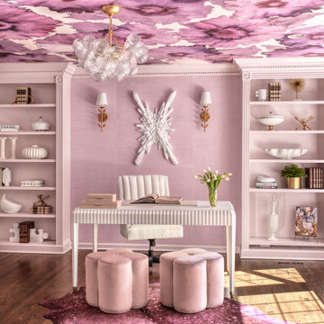
A busy working mother’s dark and dismal home office is transformed into a lively and inviting sanctuary.
Dated, stained wood shelves are painted a flirtatious pale pink.
The ceiling is emboldened with unexpected, outsized floral blossom wallpaper in provocative shades of fuchsia and violet.
Oak floors are refinished and topped with an acid washed cow hide rug.
Walls are swathed in multiple layers of pastel paint, mimicking grass cloth to add texture and interest.
Delicate brass sconces flank a dimensional marble sculpture behind an elegant desk featuring fluted sides and tapered legs that further nod to femininity.
The formidable, artisanal chandelier with multiple swirled glass orbs, allows light to gracefully shimmer across the space’s newfound sensual appeal.
 McDougal Clouse
Shoot 2 Sell
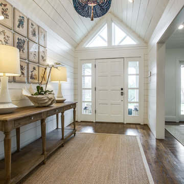
Beach style medium tone wood floor entryway photo in Dallas with white walls and a white front door
Beach style medium tone wood floor entryway photo in Dallas with white walls and a white front door

Find the right local pro for your project
 Finnleo Sauna
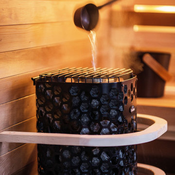
The Himalaya rock tower sauna heater is a key component for providing the ultimate soothing sauna experience. With its BioWater Technique, the heater provides a multidimensional experience of pleasure and relaxation in true Finnleo fashion.
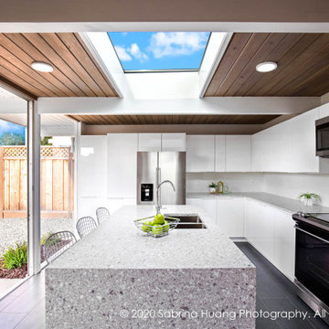
 Klopf Architecture
Joseph Eichler developed his moderately priced houses for the mass-market starting in 1949. His homes were designed using affordable materials and simple construction techniques. Nearly 70 years later these homes are in need of updating and remodeling an Eichler home today can become an imposing and costly project if you’re not careful. For this project the clients, who had undergone several previous house renovations, were determined to stick with an established budget from the beginning. Klopf Architecture helped them modernize their Eichler with a premium appearance on a reasonable budget.
The clients challenged the Klopf team to create a design that had a high-end feel and nicely done while adhering to their budget. That meant not all of the initial project scope could be built. Like many other Eichler homes, the original floor plan did not meet the family’s needs leaving them feeling disconnected from one room to another. While an early goal was to expand the house into a carport and create a larger garage, it did not survive the contractor pricing phase of the project.
The goals that did survive through to the end of the project included blurring some of the boundaries and opening up some of the spaces, making them more functional and creating a smoother flow in the house. The Klopf team joined the former separate kitchen and formal living room into one large space and shift the dining room where it is now connected to the kitchen. Klopf swapped the family room to the front alongside the living room, so the spaces feel more cohesive and are now better suited for family activities. The functional layout of the master bathroom was changed to include a large, curbless shower.
Installing a complete IKEA kitchen including cabinets, countertops, appliances, light fixtures, and furnishings was key to staying within budget. Bath fixtures in this house are also exclusively IKEA. Klopf Architecture has designed many homes using IKEA products, which are quite compatible offering an affordable, contemporary take on Eichler homes. The clients saved additional money from the simplicity and availability of IKEA products and by orchestrating the orders and purchases themselves. Following each construction meeting, the clients would make a run to IKEA and purchase items, pick up needed spare parts, and bring them back right away to stay ahead of the contractor’s schedule and minimize the chance of delays and bottlenecks.
Klopf balanced material selections by retaining some of the original woodwork and simply refinishing the mahogany paneling. They were able to retain the original windows and sliding doors which were still in good shape, avoiding some of the most costly replacement expenses. Additionally interior doors were simply refinished and the exterior siding cleaned up and repainted. Formerly dark interiors are now illuminated with new slimmer semi-recessed lighting eliminating the need for costly roof work.
Attention to design details allowed the Klopf team to ensure the house ended up with a high quality feel. Key visual elements were strictly aligned and Klopf worked with the clients to select a unified materials palette throughout the spaces so the house flows seamlessly together. Aligning the tile layout with the trusses and keeping it level with the concrete slab outside allowed them to achieve a level of quality that may otherwise be missed.
The clients were able to keep their budget on track by determining clear goals and making critical decisions upfront, choosing materials and furnishings wisely, working with the right design and construction teams in place and to a large part, their willingness to participate throughout the process. In the end the clients were much happier with their reconfigured Eichler home and Klopf Architecture managed to keep their remodeling costs to about $325/sf – a good amount below the average Bay Area Eichler remodel.
Project Team: John Klopf, Angela Todorova, Sherry Tan
Contractor: Keycon Construction
Structural Engineer: Sezen & Moon
Photography: Sabrina Huang
Year Completed: 2020
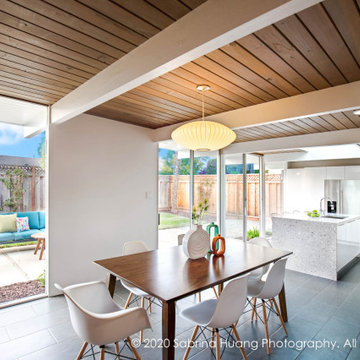 Klopf Architecture
Joseph Eichler developed his moderately priced houses for the mass-market starting in 1949. His homes were designed using affordable materials and simple construction techniques. Nearly 70 years later these homes are in need of updating and remodeling an Eichler home today can become an imposing and costly project if you’re not careful. For this project the clients, who had undergone several previous house renovations, were determined to stick with an established budget from the beginning. Klopf Architecture helped them modernize their Eichler with a premium appearance on a reasonable budget.
The clients challenged the Klopf team to create a design that had a high-end feel and nicely done while adhering to their budget. That meant not all of the initial project scope could be built. Like many other Eichler homes, the original floor plan did not meet the family’s needs leaving them feeling disconnected from one room to another. While an early goal was to expand the house into a carport and create a larger garage, it did not survive the contractor pricing phase of the project.
The goals that did survive through to the end of the project included blurring some of the boundaries and opening up some of the spaces, making them more functional and creating a smoother flow in the house. The Klopf team joined the former separate kitchen and formal living room into one large space and shift the dining room where it is now connected to the kitchen. Klopf swapped the family room to the front alongside the living room, so the spaces feel more cohesive and are now better suited for family activities. The functional layout of the master bathroom was changed to include a large, curbless shower.
Installing a complete IKEA kitchen including cabinets, countertops, appliances, light fixtures, and furnishings was key to staying within budget. Bath fixtures in this house are also exclusively IKEA. Klopf Architecture has designed many homes using IKEA products, which are quite compatible offering an affordable, contemporary take on Eichler homes. The clients saved additional money from the simplicity and availability of IKEA products and by orchestrating the orders and purchases themselves. Following each construction meeting, the clients would make a run to IKEA and purchase items, pick up needed spare parts, and bring them back right away to stay ahead of the contractor’s schedule and minimize the chance of delays and bottlenecks.
Klopf balanced material selections by retaining some of the original woodwork and simply refinishing the mahogany paneling. They were able to retain the original windows and sliding doors which were still in good shape, avoiding some of the most costly replacement expenses. Additionally interior doors were simply refinished and the exterior siding cleaned up and repainted. Formerly dark interiors are now illuminated with new slimmer semi-recessed lighting eliminating the need for costly roof work.
Attention to design details allowed the Klopf team to ensure the house ended up with a high quality feel. Key visual elements were strictly aligned and Klopf worked with the clients to select a unified materials palette throughout the spaces so the house flows seamlessly together. Aligning the tile layout with the trusses and keeping it level with the concrete slab outside allowed them to achieve a level of quality that may otherwise be missed.
The clients were able to keep their budget on track by determining clear goals and making critical decisions upfront, choosing materials and furnishings wisely, working with the right design and construction teams in place and to a large part, their willingness to participate throughout the process. In the end the clients were much happier with their reconfigured Eichler home and Klopf Architecture managed to keep their remodeling costs to about $325/sf – a good amount below the average Bay Area Eichler remodel.
Project Team: John Klopf, Angela Todorova, Sherry Tan
Contractor: Keycon Construction
Structural Engineer: Sezen & Moon
Photography: Sabrina Huang
Year Completed: 2020
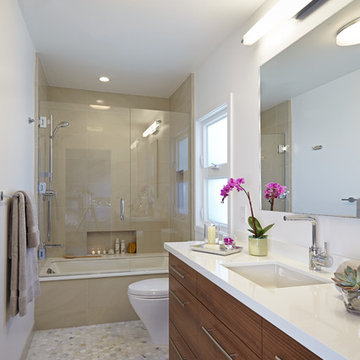
 SweisKloss
This bath remodel optimizes the limited space. Space saving techniques such as niches in the shower area and optimizing storage cabinets were key in making this small space feel spacious and uncluttered.
Photography: Doug Hill
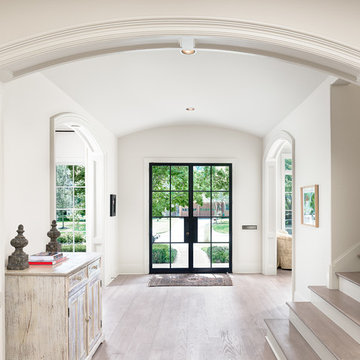
 Dillon Kyle Architects (DKA)
Casey Dunn Photography
Entryway - large country light wood floor and beige floor entryway idea in Houston with a glass front door and white walls
Entryway - large country light wood floor and beige floor entryway idea in Houston with a glass front door and white walls
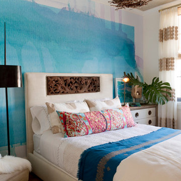
 Rikki Snyder
Photo: Rikki Snyder © 2014 Houzz
Interior Design: Jen Going Interiors http://jengoinginteriors.com/
 Balboa Design Group
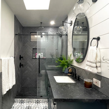
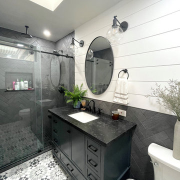
Great design makes all the difference - bold material choices were just what was needed to give this little bathroom some BIG personality! Our clients wanted a dark, moody vibe, but had always heard that using dark colors in a small space would only make it feel smaller. Not true!
Introducing a larger vanity cabinet with more storage and replacing the tub with an expansive walk-in shower immediately made the space feel larger, without any structural alterations. We went with a dark graphite tile that had a mix of texture on the walls and in the shower, but then anchored the space with white shiplap on the upper portion of the walls and a graphic floor tile (with mostly white and light gray tones). This technique of balancing dark tones with lighter tones is key to achieving those moody vibes, without creeping into cavernous territory. Subtle gray/blue/green tones on the vanity blend in well, but still pop in the space, and matte black fixtures add fantastic contrast to really finish off the whole look!
 Kitchens By Design
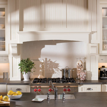
The key to creating an authentic Craftsman-styled kitchen is by embracing those details that embody hand-craftsmanship and hand-joinery. As a response to mass production and abundance of cheaply made goods, the craftsman design movement achieved prominence in the early 1990’s and recognized value in the work of the craftsman and artisan.
The handiwork of the cabinetmaker was idealized, and an appreciation for quality and craftsmanship was celebrated. Homes of this period were designed with an open, airy floor plan and a central hearth or gathering area. Woodwork and cabinetry became architectural focal points in warm, wood tones and joinery techniques were prominently featured.
Request a FREE Dura Supreme Cabinetry Brochure Packet at:
http://www.durasupreme.com/request-brochure
 Balboa Design Group
Great design makes all the difference - bold material choices were just what was needed to give this little bathroom some BIG personality! Our clients wanted a dark, moody vibe, but had always heard that using dark colors in a small space would only make it feel smaller. Not true!
Introducing a larger vanity cabinet with more storage and replacing the tub with an expansive walk-in shower immediately made the space feel larger, without any structural alterations. We went with a dark graphite tile that had a mix of texture on the walls and in the shower, but then anchored the space with white shiplap on the upper portion of the walls and a graphic floor tile (with mostly white and light gray tones). This technique of balancing dark tones with lighter tones is key to achieving those moody vibes, without creeping into cavernous territory. Subtle gray/blue/green tones on the vanity blend in well, but still pop in the space, and matte black fixtures add fantastic contrast to really finish off the whole look!
 Morrison Interiors
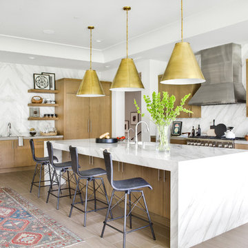
Surrounded by canyon views and nestled in the heart of Orange County, this 9,000 square foot home encompasses all that is “chic”. Clean lines, interesting textures, pops of color, and an emphasis on art were all key in achieving this contemporary but comfortable sophistication.
Photography by Chad Mellon
 User
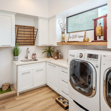
UserExample of a transitional l-shaped beige floor utility room design in Phoenix with an undermount sink, shaker cabinets, white cabinets, white walls, a side-by-side washer/dryer and white countertops
 building Lab, inc.
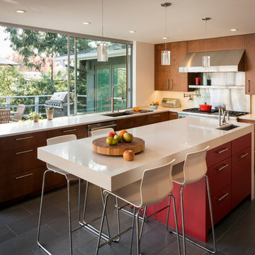
island counter cantilevered to form dining area.
photo: scott hargis
Example of a mid-sized trendy u-shaped porcelain tile and gray floor kitchen design in San Francisco with an undermount sink, flat-panel cabinets, medium tone wood cabinets, stainless steel appliances, quartz countertops, white backsplash and an island
Example of a mid-sized trendy u-shaped porcelain tile and gray floor kitchen design in San Francisco with an undermount sink, flat-panel cabinets, medium tone wood cabinets, stainless steel appliances, quartz countertops, white backsplash and an island
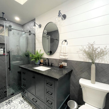 Balboa Design Group
Great design makes all the difference - bold material choices were just what was needed to give this little bathroom some BIG personality! Our clients wanted a dark, moody vibe, but had always heard that using dark colors in a small space would only make it feel smaller. Not true!
Introducing a larger vanity cabinet with more storage and replacing the tub with an expansive walk-in shower immediately made the space feel larger, without any structural alterations. We went with a dark graphite tile that had a mix of texture on the walls and in the shower, but then anchored the space with white shiplap on the upper portion of the walls and a graphic floor tile (with mostly white and light gray tones). This technique of balancing dark tones with lighter tones is key to achieving those moody vibes, without creeping into cavernous territory. Subtle gray/blue/green tones on the vanity blend in well, but still pop in the space, and matte black fixtures add fantastic contrast to really finish off the whole look!
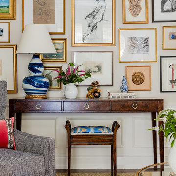
 Katie Rosenfeld Design
Michael J Lee
Example of a transitional family room design in Boston with white walls
Example of a transitional family room design in Boston with white walls
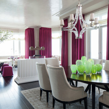
 TV Lift Cabinet by Cabinet Tronix
Gorgeous TV lift cabinet furniture piece placed beautifully as a room divider between the lounge and dining area. Lift kit built inside the white fine lined modern piece creates the opportunity to have a TV and not look at it while in use. Added benefit is that the furniture is also a perfect fit to softly separate the 2 room areas.
Cabinet Tronix specializes in TV lift furniture systems and has best of Houzz for 2014, 2015, and 2016.
Photography by Jacob Hand
Anthony Michael Interior Design
Florida
Miami
Jade at Brickell Bay
Santa Maria
Bristol Tower
Four Seasons Residences
Icon Brickell I II III
Skyline on Brickell
The Mark on Brickell
Brickell City Centre Reach
The Plaza on Brickell East West
1060 Brickell – 1050
Brickellhouse
1100 Millecento
Espirito Santo Plaza
Villa Regina
Infinity at Brickell
Brickell on the River North South
The Palace
Brickell Bay Club
Brickell Townhouse
Axis on Brickell North South
Nine at Mary Brickell Village
500 Brickell East West
Atlantis on Brickell
Imperial on Brickell
MYBrickell
Solaris at Brickell
The Club at Brickell Bay
Vue at Brickell
The Sail
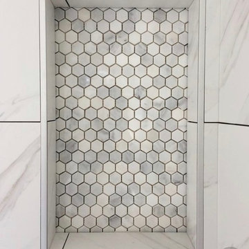
 Pro Tile Specialists
Our tile installation specialists, waterproof is our foundation. Preparation of surfaces prior to tile setting starts by using the best products and understanding how each product works with each other is the key to a successful waterproof results.
A niche is permanent recessed shelf (or niche) which is an ideal spot to keep shampoos and soaps in a tiled shower. We understand the needs of our clients and use the space between the walls to eliminate the need of corners shower shelves, aftermarket shower caddies tension poles and soap baskets.
We are highly qualified tile installers to build a fully waterproof sealed tiled shower niche which can be a detailed and time consuming task. We use different techniques to construct a custom shower niche of any size and any shape. Our niche designs are utilitarian and maintain integrity and durability, with attention to detail for highly functional and visually appealing results.
1