
Search results for "Kids require" in Home Design Ideas
 Alair Homes Scarborough
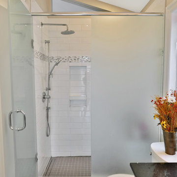
This rear addition provides the family with a living area that has lots of natural light for the family to enjoy and relax. The cathedral ceiling creates an open and airy space that is well lit from the side and rear windows. The cathedral ceiling also flows into the washroom. Light is very important to this family and due to the close proximity to the neighbours on either side, fire shutters were required and incorporated on all the side windows. The basement is a finished space with a bar, washroom, family room, and a dedicated room for the family’s adopted cats. Exterior was finished with matching brick that was sourced and still available.
 Ashton Renovations
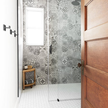
The bathroom in this cozy Upper Beaches home in Toronto required some reconfigurations and also updated fixtures and showering are. The entire bathroom was gutted along with the plumbing and electrical. As space was limited, we installed a curbless shower with sliding glass enclosure along with a heated floor and wall hung vanity. The beauty of this bathroom is the simplicity of the floor. It appears all as one thought the shower slopes into the drain.
 Drury Design
THE SETUP
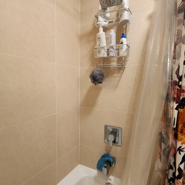
The original L-shaped guest bathroom, primarily utilized by the client’s young nephews, presented several design challenges. The entry door’s placement at the top of the stairs created an awkward flow, while the lack of natural light and the sectioned-off toilet and shower area contributed to a cramped and dimly lit ambiance.
Design Objectives:
Reconfigure the floor plan to improve guest access and circulation
Create a versatile space that accommodates both young guests and adult needs
Introduce natural light to brighten the overall ambiance
Incorporate a tub/shower combination suitable for children while meeting adult requirements
Design Challenges:
Relocating the entry door to a more functional position
Finding an optimal layout to open up the entire bathroom as a unified space
Maximizing natural light and creating a bright, inviting atmosphere
Updating the tub/shower area with a refreshed look while ensuring child-friendly features
THE RENEWED SPACE
Design Solutions:
Reconfigured floor plan with the entry door relocated to the main hallway for seamless guest access
Removal of the dividing wall separating the toilet and tub/shower area, enabling an open, spacious layout
Strategic placement of a window to flood the space with natural light. Also – careful selection of materials and finishes contributing to the bright and airy aesthetic
Inclusion of a handheld showerhead serving as a lower shower option for young guests
The new floor plan and the introduction of natural light have transformed this guest bathroom into a radiant, welcoming space. The dual vanity sinks and tall storage cabinet cater to versatile needs, while the terracotta floor tiles harmonize beautifully with the overall design, adding warmth and style. The decision to keep a shower curtain for the tub/shower combination enhances the open and airy feel. Thoughtful details, such as the gear-inspired faucet handles and complementary light fixtures above the mirrors, add a touch of edgy sophistication to this multifunctional guest retreat.
Find the right local pro for your project
 DesignFix LLC
Location: Mountain View, CA
Remodeling a home requires constant decision making, and every choice feels expensive and permanent. We worked closely with our clients and their contractor to make the process easy and fun, with stunning results!
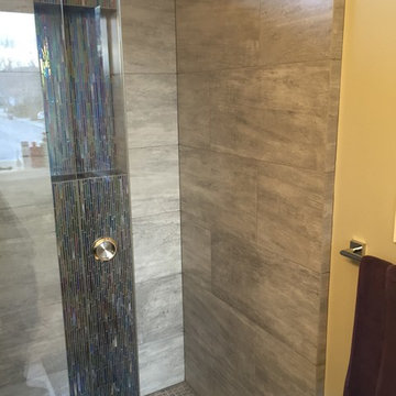
In this bath, the floor tile flows up the main walls of the shower, while a dramatic vertical accent of purple-toned glass mosaic spills from the ceiling, through the recessed niche, and across the shower floor all the way to the door.
 InnovationLand
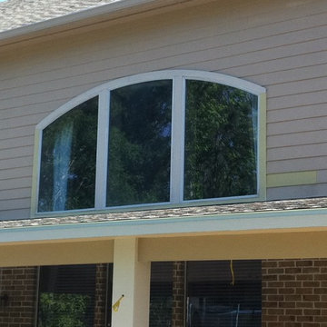
This outdoor media room and kitchen had to meet the needs of a Houston family needing kid space and adult space.
The kids wanted an outdoor audio visual area watch TV and movies. The grownups wanted an outdoor kitchen, bar and grilling area where they could enjoy themselves while watching the kids. And they all wanted a covered patio with places to sit between dips in the pool.
However, the family had very limited space between the back of their house and their pool, and no room for anything in either of the side yards:
Stringent homeowner association rules also required that any home modifications match the existing home's architecture, color and finishing materials. The pitch of the roof also had to be such that it didn't overlap the bottom of the second-story windows above.
So here's what we came up with: A 40-foot-long by 11-foot- deep roof extension off the back of the house (longer than most, but with good engineering specs and design work, we were able to preserve the structural integrity):
At one end of the covered patio below is a 12-foot by 8-foot outdoor living room with a custom audio-visual cabinet. At the other is an L-shaped, 8-foot-square outdoor kitchen island with a built-in commercial-grade RCS grill, a 4-by-8-foot outdoor refrigerator and a outdoor icemaker.
Keeping in line with the existing home's beige siding, white trim and brown accent façade, we helped the homeowner choose appropriate finishing materials: Austin Western limestone (mostly white with beige accents) for the TV cabinet, kitchen island and column supports; Old English travertine (beige) for the countertops) and white, fluted columns.
The Old English travertine countertop has a raised back for a bar with counter seating. The diamond-pattern tile backsplash also features inset fleur de lis accents.
The family is more than pleased with the results - two outdoor rooms with two different functions - all within the same covered outdoor living space!
 Michael Nash Design, Build & Homes
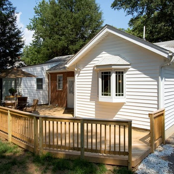
Young couple with two youngsters lived in 1970 Rambler in Arlington. As their kids growing and their nanny moving in, they all needed more space, bigger kitchen and better backyard space for kids to play.
Existing kitchen was 10’x10’ adjacent to dining room of about the same size
Old cabinets, vinyl floor and olive green appliances no longer made this kitchen a happy place to come home to
The back wall of solid block and brick and interior plaster walls where all big challenges to get rid of and opening up the place
A narrow hallway leading to bedroom was one of their major concerns and tough to get through. As the traffic path to get to the kitchen has been difficult
In few consultation session we all agreed on bumping the entire kitchen and dining room back wall and move the kitchen into new addition
This required breaking through a massive amount of cinder block and brick, leveling a majority of backyard to accomplish the desired grade level for addition and back deck
In past the only way out to backyard was through a single door of back stairway and it has been a big problem for them
With a new angle wall we have placed a large French door leading kitchen into back deck area
The old hallway wall has came down and gotten wider and new path from front to open floor plan kitchen and dining room was put in place
Another big challenge for this job was to run heating and cooling as well as plumbing into a kitchen area
The new kitchen had tall cabinets a beautiful cherry finish with a large bay window over sink area leading lot of light form back side.
New island with seating contributed to addition work space and more storage
Lot of recessed lights and a stone back splash made the project even more attractive
New wood flooring was put in place and entire Living, Dining room and kitchen was sanded and refinished to unify the space and make a seamless connection
A big wooded deck on the entire back was a place for kids to play and couple to retire and grill on their afternoons
 Bath Concepts Shower Enclosures Inc.
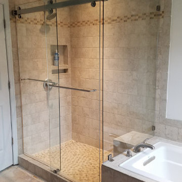
Frameless Double Sliding Barn Style Shower Enclosure with a Return Panel. Available hardware colors Polished and Brushed Stainless, Matte Black, Satin Brass, and Brushed Bronze. Can be done up to 72" wide. Requires 3" of flat space on the threshold you step over to get in and out to accept this door.


 Drury Design
THE SETUP
The original L-shaped guest bathroom, primarily utilized by the client’s young nephews, presented several design challenges. The entry door’s placement at the top of the stairs created an awkward flow, while the lack of natural light and the sectioned-off toilet and shower area contributed to a cramped and dimly lit ambiance.
Design Objectives:
Reconfigure the floor plan to improve guest access and circulation
Create a versatile space that accommodates both young guests and adult needs
Introduce natural light to brighten the overall ambiance
Incorporate a tub/shower combination suitable for children while meeting adult requirements
Design Challenges:
Relocating the entry door to a more functional position
Finding an optimal layout to open up the entire bathroom as a unified space
Maximizing natural light and creating a bright, inviting atmosphere
Updating the tub/shower area with a refreshed look while ensuring child-friendly features
THE RENEWED SPACE
Design Solutions:
Reconfigured floor plan with the entry door relocated to the main hallway for seamless guest access
Removal of the dividing wall separating the toilet and tub/shower area, enabling an open, spacious layout
Strategic placement of a window to flood the space with natural light. Also – careful selection of materials and finishes contributing to the bright and airy aesthetic
Inclusion of a handheld showerhead serving as a lower shower option for young guests
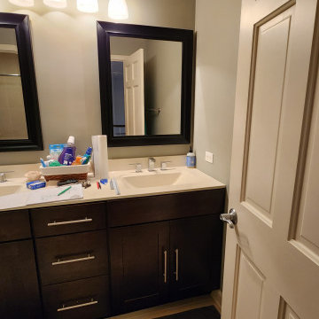
The new floor plan and the introduction of natural light have transformed this guest bathroom into a radiant, welcoming space. The dual vanity sinks and tall storage cabinet cater to versatile needs, while the terracotta floor tiles harmonize beautifully with the overall design, adding warmth and style. The decision to keep a shower curtain for the tub/shower combination enhances the open and airy feel. Thoughtful details, such as the gear-inspired faucet handles and complementary light fixtures above the mirrors, add a touch of edgy sophistication to this multifunctional guest retreat.
 Jordan Design Build Group
When our clients purchased their Fairfax Station home at the beginning of the pandemic, the main living areas had already been updated. However, three bathrooms were still stuck in the1980s. We tackled the upstairs primary and hall bathrooms first to ensure our clients had a working bathroom while construction was underway. Once the upstairs renovations were completed, we moved on to the main level guest bathroom.
Hall Bathroom Update:
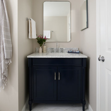
The hall bathroom did not require any significant layout changes, but the dated fixtures and finishes all had to go. We wanted the new bathroom to feel both classic and fresh, so we opted for a polished finish palette, including sleek white subway tiles on the walls and marble-look hexagonal on the floor. A furniture-style vanity, in dark navy, was paired with a distinctive Carrara marble top and sleek chrome fixtures for a modern twist. The tub+shower combo features both a standard shower head and multi-function handheld for optimum flexibility – great for bathing children and pets alike. This renovation blended classic details with modern functionality, creating a bathroom that’s both timeless and fresh.
 Ashton Renovations
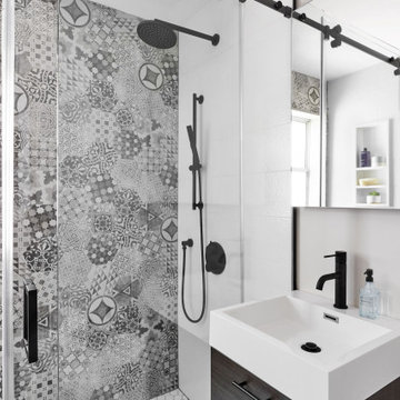
The bathroom in this cozy Upper Beaches home in Toronto required some reconfigurations and also updated fixtures and showering are. The entire bathroom was gutted along with the plumbing and electrical. As space was limited, we installed a curbless shower with sliding glass enclosure along with a heated floor and wall hung vanity. The beauty of this bathroom is the simplicity of the floor. It appears all as one thought the shower slopes into the drain.
 TaylorPro Design and Remodeling, Inc.
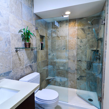
"We would definitely look TaylorPro up for future remodeling projects. We would also not hesitate to recommend TaylorPro's services based on our experience with our bathroom remodeling project.
Even prior to signing a contract with us, Mr Taylor (Kerry) was very patient with us and generous in sharing information pertaining to remodel options, material choices and general advice. At least one other dedicated 'Remodeler' we contacted thought we were too much of a nuisance and suggested we sign up before he could spend more time with us.
Kerry has a very transparent pricing policy, which allows someone unfamiliar with the scope of the work ( us) to understand the cost implications of each step or feature. His style allows complete flexibility in material choice. He also has a roster of 'favored suppliers' who extend sensible pricing to his clients.
Kerry also accommodates change requests at reasonable cost, while only requiring sufficient advance notice. Further, he was honest about not having expertise in certain features I wanted implemented - he executed them well anyway.
The job was very well planned and executed, with perhaps only one silent day in over 8 weeks of effort. We are very happy with this aspect also. Kerry remained very responsive to any issues or requests through the duration of the project.
We of course had set backs and surprises (+$) through the course of this project, but perhaps that is par for course.
Finally, a word about his crew: They were all courteous, trustworthy, efficient and pleasant. We were comfortable with their presence at home. "
~ Uma & Sumant I, Clients
Photo By: Kerry W. Taylor
 InnovationLand
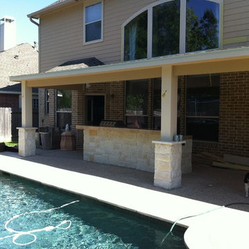
This outdoor media room and kitchen had to meet the needs of a Houston family needing kid space and adult space.
The kids wanted an outdoor audio visual area watch TV and movies. The grownups wanted an outdoor kitchen, bar and grilling area where they could enjoy themselves while watching the kids. And they all wanted a covered patio with places to sit between dips in the pool.
However, the family had very limited space between the back of their house and their pool, and no room for anything in either of the side yards:
Stringent homeowner association rules also required that any home modifications match the existing home's architecture, color and finishing materials. The pitch of the roof also had to be such that it didn't overlap the bottom of the second-story windows above.
So here's what we came up with: A 40-foot-long by 11-foot- deep roof extension off the back of the house (longer than most, but with good engineering specs and design work, we were able to preserve the structural integrity):
At one end of the covered patio below is a 12-foot by 8-foot outdoor living room with a custom audio-visual cabinet. At the other is an L-shaped, 8-foot-square outdoor kitchen island with a built-in commercial-grade RCS grill, a 4-by-8-foot outdoor refrigerator and a outdoor icemaker.
Keeping in line with the existing home's beige siding, white trim and brown accent façade, we helped the homeowner choose appropriate finishing materials: Austin Western limestone (mostly white with beige accents) for the TV cabinet, kitchen island and column supports; Old English travertine (beige) for the countertops) and white, fluted columns.
The Old English travertine countertop has a raised back for a bar with counter seating. The diamond-pattern tile backsplash also features inset fleur de lis accents.
The family is more than pleased with the results - two outdoor rooms with two different functions - all within the same covered outdoor living space!
 Drury Design
THE SETUP
The original L-shaped guest bathroom, primarily utilized by the client’s young nephews, presented several design challenges. The entry door’s placement at the top of the stairs created an awkward flow, while the lack of natural light and the sectioned-off toilet and shower area contributed to a cramped and dimly lit ambiance.
Design Objectives:
Reconfigure the floor plan to improve guest access and circulation
Create a versatile space that accommodates both young guests and adult needs
Introduce natural light to brighten the overall ambiance
Incorporate a tub/shower combination suitable for children while meeting adult requirements
Design Challenges:
Relocating the entry door to a more functional position
Finding an optimal layout to open up the entire bathroom as a unified space
Maximizing natural light and creating a bright, inviting atmosphere
Updating the tub/shower area with a refreshed look while ensuring child-friendly features
THE RENEWED SPACE
Design Solutions:
Reconfigured floor plan with the entry door relocated to the main hallway for seamless guest access
Removal of the dividing wall separating the toilet and tub/shower area, enabling an open, spacious layout
Strategic placement of a window to flood the space with natural light. Also – careful selection of materials and finishes contributing to the bright and airy aesthetic
Inclusion of a handheld showerhead serving as a lower shower option for young guests
The new floor plan and the introduction of natural light have transformed this guest bathroom into a radiant, welcoming space. The dual vanity sinks and tall storage cabinet cater to versatile needs, while the terracotta floor tiles harmonize beautifully with the overall design, adding warmth and style. The decision to keep a shower curtain for the tub/shower combination enhances the open and airy feel. Thoughtful details, such as the gear-inspired faucet handles and complementary light fixtures above the mirrors, add a touch of edgy sophistication to this multifunctional guest retreat.
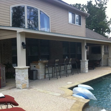 InnovationLand
This outdoor media room and kitchen had to meet the needs of a Houston family needing kid space and adult space.
The kids wanted an outdoor audio visual area watch TV and movies. The grownups wanted an outdoor kitchen, bar and grilling area where they could enjoy themselves while watching the kids. And they all wanted a covered patio with places to sit between dips in the pool.
However, the family had very limited space between the back of their house and their pool, and no room for anything in either of the side yards:
Stringent homeowner association rules also required that any home modifications match the existing home's architecture, color and finishing materials. The pitch of the roof also had to be such that it didn't overlap the bottom of the second-story windows above.
So here's what we came up with: A 40-foot-long by 11-foot- deep roof extension off the back of the house (longer than most, but with good engineering specs and design work, we were able to preserve the structural integrity):
At one end of the covered patio below is a 12-foot by 8-foot outdoor living room with a custom audio-visual cabinet. At the other is an L-shaped, 8-foot-square outdoor kitchen island with a built-in commercial-grade RCS grill, a 4-by-8-foot outdoor refrigerator and a outdoor icemaker.
Keeping in line with the existing home's beige siding, white trim and brown accent façade, we helped the homeowner choose appropriate finishing materials: Austin Western limestone (mostly white with beige accents) for the TV cabinet, kitchen island and column supports; Old English travertine (beige) for the countertops) and white, fluted columns.
The Old English travertine countertop has a raised back for a bar with counter seating. The diamond-pattern tile backsplash also features inset fleur de lis accents.
The family is more than pleased with the results - two outdoor rooms with two different functions - all within the same covered outdoor living space!
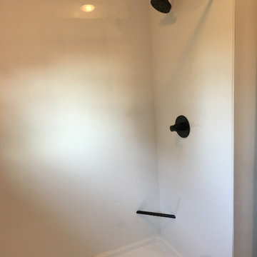
 Innovative Restorations
Old shower was old, and leaking. Update in 2 days! No painting required, no flooring. Custom shaving foot rest. Budget friendly shower option that looks way better than a stock shower but about the same price!
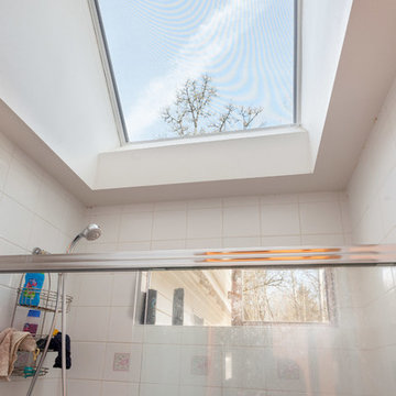
 Jo Ann S
We replaced the roof in 2014 and upgraded the fixed skylight to an opening Velux solar skylight - wonderful breezes and no electrical work required. Photos © Jo Ann Snover
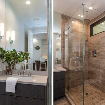
 Mark Brand Architecture
We were approached by a San Francisco firefighter to design a place for him and his girlfriend to live while also creating additional units he could sell to finance the project. He grew up in the house that was built on this site in approximately 1886. It had been remodeled repeatedly since it was first built so that there was only one window remaining that showed any sign of its Victorian heritage. The house had become so dilapidated over the years that it was a legitimate candidate for demolition. Furthermore, the house straddled two legal parcels, so there was an opportunity to build several new units in its place. At our client’s suggestion, we developed the left building as a duplex of which they could occupy the larger, upper unit and the right building as a large single-family residence. In addition to design, we handled permitting, including gathering support by reaching out to the surrounding neighbors and shepherding the project through the Planning Commission Discretionary Review process. The Planning Department insisted that we develop the two buildings so they had different characters and could not be mistaken for an apartment complex. The duplex design was inspired by Albert Frey’s Palm Springs modernism but clad in fibre cement panels and the house design was to be clad in wood. Because the site was steeply upsloping, the design required tall, thick retaining walls that we incorporated into the design creating sunken patios in the rear yards. All floors feature generous 10 foot ceilings and large windows with the upper, bedroom floors featuring 11 and 12 foot ceilings. Open plans are complemented by sleek, modern finishes throughout.
 Jordan Design Build Group
When our clients purchased their Fairfax Station home at the beginning of the pandemic, the main living areas had already been updated. However, three bathrooms were still stuck in the1980s. We tackled the upstairs primary and hall bathrooms first to ensure our clients had a working bathroom while construction was underway. Once the upstairs renovations were completed, we moved on to the main level guest bathroom.
Hall Bathroom Update:
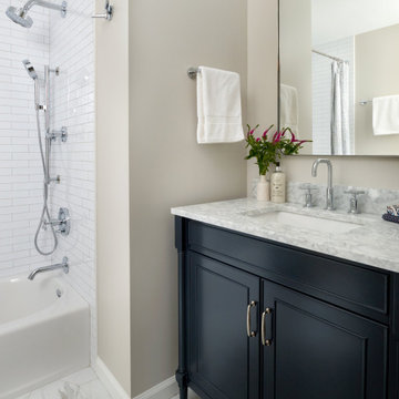
The hall bathroom did not require any significant layout changes, but the dated fixtures and finishes all had to go. We wanted the new bathroom to feel both classic and fresh, so we opted for a polished finish palette, including sleek white subway tiles on the walls and marble-look hexagonal on the floor. A furniture-style vanity, in dark navy, was paired with a distinctive Carrara marble top and sleek chrome fixtures for a modern twist. The tub+shower combo features both a standard shower head and multi-function handheld for optimum flexibility – great for bathing children and pets alike. This renovation blended classic details with modern functionality, creating a bathroom that’s both timeless and fresh.
 Otogawa-Anschel Design-Build
With the pending arrival of a beautiful baby girl, the homeowners of this 1928 Minneapolis Tudor wanted a basement that was conducive to a young child, but would still allow a place for family to gather and the occasional house guest. The original basement was typical; cold, lacking natural light with tiny, uncomfortably confined rooms and that “unique” basement smell. The goal was to reverse all of the ill effects of a rarely unappreciated space while increasing the performance of the older home.
The frigid temperatures and wet, mildew odor was remedied by demolishing the entire slab floor and excavating to gain an extra six inches in ceiling height. It also allowed us to insulate to R-15, moisture proof under the new slab, install a drain tile and sump pump. Within the concrete slab is a hydronic, in-floor radiant heating system which further helps to add comfort to the space. Lastly, we also sprayed a closed-cell, expanding urethane foam on the inside of the foundation walls all the way to the first floor.
To help bring more light down to the basement, we started by opening up the staircase on both sides. A curved wall bends light into the lower level while a countertop and cubbies below provide storage space for odds and ends. On the opposite wall, creatively placed cubbies provide places for paintings, ceramics and plants. We also removed the tiny 18” x 34” window on the south wall and installed a full-sized, high-efficiency, triple pane Pella egress window. To let lots of natural light into the window, we expanded the size of the cedar-lined egress well and included a built-in planter at the base to help bring life into an otherwise empty cavity.
Small, unspecified spaces that became storage areas now have purpose. The areas are defined, yet open. Upon descending down the stairs, one is greeted by a large living room with curved walls, custom design media center, built-in daybed and bookshelves. Use of paint was important in the design. Naturally in older homes basements are going to have exposed beams, soffits and a whole gambit of nooks and crannies. Instead of disguising them, we played them up, which created a layer effect with the color. The color also adds a touch of playfulness which anyone, regardless of age, can enjoy.
We scavenged the client’s garage and discovered that the previous homeowner kept the old, full-view glass front entry door in the garage. We re-installed the original glass knob and attached the door to sliding barn door hardware which was attached to the main structural beam of the lower level. On the other side of the door was the homeowners’ combined office and small fitness area. The office floor is a blend of thin strips of different colored cork. A built-in storage cabinet sits across from a site-built desk which forms to the curve of the dividing wall. A small, square hole in the curved wall provides a view to see who is coming down the stairs. Opposite of the office area and directly at the base of the stairs is a place for the homeowner’s treadmill.
Hidden is the mechanical room, which is home to many green and energy efficient products. The washing machine is a low-water consumption unit while the dryer requires less energy to operate than most standard units. Both sit atop a checkerboard pattern of different colored VCT tiles. We also replaced the aging boiler, which only heated the first and second level, with a 95% efficient heat source for the entire house—including the basement.
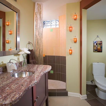
Behind the curved wall, the bathroom is conveniently located. A large, custom built no-formaldehyde added vanity supports the slab of remnant granite countertop. A piece of eco-resin wall panel, embedded with organic material, contains water in the shower and blends beautifully with the updated colors. Tucked under the stairs, we installed a dual-flush, low-water consumption toilet.
Through creative space planning, we packed a lot of into a rather small space. As a result, we have three very happy homeowners who are enjoying their light, clean and safe lower level of their home—however, they’ve been hard pressed to think of it as a “basement”.
highlights
Moisture management system
Insulated slab
Hydronic in-floor heat
Formaldehyde free cabinetry
MN-made custom cabinets
Ultra-low VOC paints
Wool carpet
Dual-flush toilet
Cork floor
No recessed lights
Cedar egress window well with planter
Re-used door
Eco-resin
 Alair Homes Nanaimo
This modern-style executive home takes full advantage of the views and rocky terrain. The homeowners are retirees whose goal was to build a home that they could age in place in. Taking their needs into consideration, we created a large open concept design that takes advantage of the natural light and scenery while enabling the owners full accessibility throughout. All the primary rooms are located on the main floor with guest and additional spaces on lower floors. All door widths were increased and a roll thru shower was installed to allow for wheelchair accessibility if required in the future. The entire house is controlled by a state of the art iPad home automation system controlling media, mechanical systems, lighting & security.
"Light & Bright" are the items our client wanted us to focus on, with "Light" we wanted to capture as much as natural light from the large windows as possible. As for "Bright" we kept most of the finishes grey and white and clean. Pops of colour and warm hardwood flooring tie the entire space together.
32