
Search results for "Lacking" in Home Design Ideas
 Let's Remodel
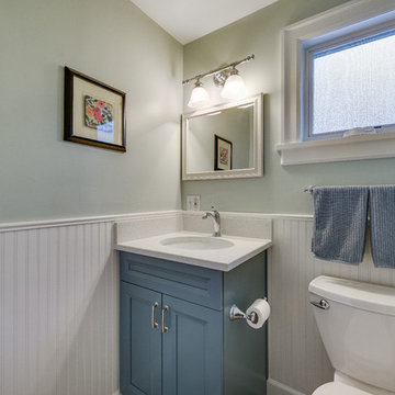
This bathroom had lacked storage with a pedestal sink. The yellow walls and dark tiled floors made the space feel dated and old. We updated the bathroom with light bright light blue paint, rich blue vanity cabinet, and black and white Design Evo flooring. With a smaller mirror, we are able to add in a light above the vanity. This helped the space feel bigger and updated with the fixtures and cabinet.
 Pineapple House Interior Design
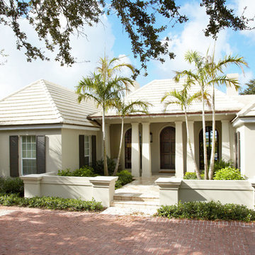
Pineapple House designers updated the home’s front façade by adding a portico reminiscent of Bohemian island architecture.
Daniel Newcomb Photography
Find the right local pro for your project

 Morning Star Builders LTD
Mike Kaskel
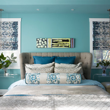
Example of a large classic master dark wood floor and brown floor bedroom design in Houston with blue walls and no fireplace
Example of a large classic master dark wood floor and brown floor bedroom design in Houston with blue walls and no fireplace
 Zieba Builders, Inc.
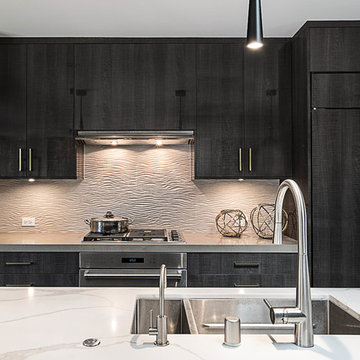
Mid-sized trendy galley porcelain tile and brown floor open concept kitchen photo in Los Angeles with an undermount sink, flat-panel cabinets, quartz countertops, beige backsplash, porcelain backsplash, paneled appliances, an island, white countertops and black cabinets
 Bay Area Kitchens
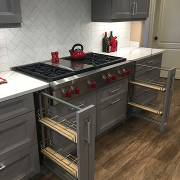
The rangetop is flanked by two pull-out cabinets for storage of oils and other items. Note the lack of unsightly outlets in the backsplash - there are special angled power strips hidden below the upper cabinets.
 Devine Bath & Kitchen
Northeast Portland is full of great old neighborhoods and houses bursting with character. The owners of this particular home had enjoyed their pink and blue bathroom’s quirky charm for years, but had finally outgrown its awkward layout and lack of functionality.
The Goal: Create a fresh, bright look for this bathroom that is both functional and fits the style of the home.
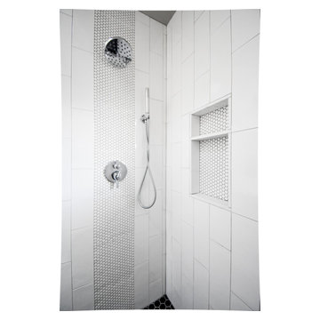
Step one was to establish the color scheme and style for our clients’ new bathroom. Bright whites and classic elements like marble, subway tile and penny-rounds helped establish a transitional style that didn’t feel “too modern” for the home.
When it comes to creating a more functional space, storage is key. The original bathroom featured a pedestal sink with no practical storage options. We designed a custom-built vanity with plenty of storage and useable counter space. And by opting for a durable, low-maintenance quartz countertop, we were able to create a beautiful marble-look without the hefty price-tag.
Next, we got rid of the old tub (and awkward shower outlet), and moved the entire shower-area to the back wall. This created a far more practical layout for this bathroom, providing more space for the large new vanity and the open, walk-in shower our clients were looking for.
 Maddie G Designs / Shop Maddie G
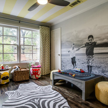
We turned a small unused room in the back of this house into a playroom for young children. Highlights include custom photo wallpaper (which is adhesive backed and can be peeled away without wall damage), a custom book wall and a wall system allowing easy rotation of kids' art.
Credit: Maddie G Designs
 Grosenbacher Custom Homes
Hill Country Real Estate Photography
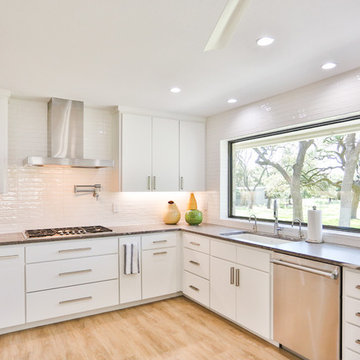
Example of a large 1950s u-shaped light wood floor and beige floor eat-in kitchen design in Austin with an undermount sink, flat-panel cabinets, white cabinets, quartz countertops, white backsplash, ceramic backsplash, stainless steel appliances, no island and brown countertops
Example of a large 1950s u-shaped light wood floor and beige floor eat-in kitchen design in Austin with an undermount sink, flat-panel cabinets, white cabinets, quartz countertops, white backsplash, ceramic backsplash, stainless steel appliances, no island and brown countertops
 Dave Fox Design Build Remodelers
This remodel consisted of a whole house transformation. We took this 3 bedroom dated home and turned it into a 5 bedroom award winning showpiece, all without an addition. By reworking the awkward floor plan and lowering the living room floor to be level with the rest of the house we were able to create additional space within the existing footprint of the home. What was once the small lack-luster master suite, is now 2 kids bedrooms that share a jack and jill bath. The master suite was relocated to the first floor, and the kitchen that was located right at the front door, is now located in the back of the home with great access to the patio overlooking the golf course.
View more about this project and our company at our website: www.davefox.com
 Crystal Kitchen + Bath
Maple Grove, MN
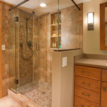
This bathroom remodel was part of a whole Lower Level update. The existing bathroom lacked the rustic look that the homeowner’s wanted and the space was not being fully utilized. A neo-angle shower was replaced with a larger rectangular shape that adds much needed elbow room for a better bathing experience. Porcelain slate tile on the walls in combination with the smooth, river rock floor and accent stripe up the wall add character and the rustic feeling the homeowner’s desired. A larger beech wood vanity and linen cabinet gained the homeowner’s lots of storage space for towels and toiletries.
JH Peterson
 Simply Baths & Kitchens
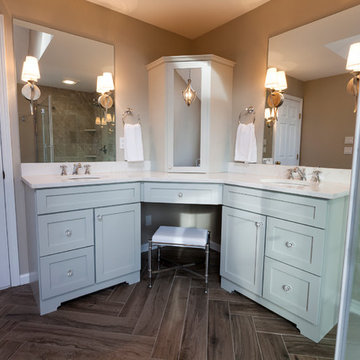
When designer Rachel Peterson of Simply Baths, Inc. first met this young, stylish couple at their house they had a small handful of items they knew they really wanted in their master bathroom: a freestanding tub, a chandelier, a larger shower and more counter space. But the truth was, the bath needed a major face-lift. The space was outdated and lacked personality. It certainly didn't reflect the homeowners and their elegant aesthetic. The combination of stone and wood tiles lends just enough of a rustic flair to bring a little bit of the outdoors in and while helping to balance some of the feminine elements in the room with simple masculine touches.
Featuring Dura Supreme Cabinetry.
 Craig O'Connell Architecture
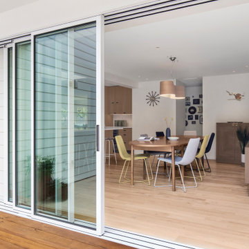
A large sliding glass door was added to this newly remodeled dining room to create indoor outdoor flow and a connection to the backyard.
Dining room - 1950s light wood floor and brown floor dining room idea in San Francisco with white walls
Dining room - 1950s light wood floor and brown floor dining room idea in San Francisco with white walls
 Julie Bradshaw BRADSHAW DESIGNS LLC
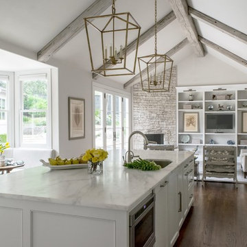
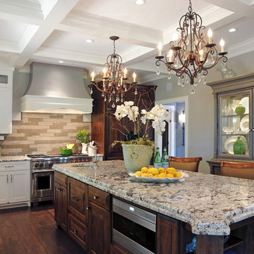
One of our most popular award-winning kitchens with a dramatic vaulted ceiling exemplifies how simply white is simply stunning! Texture added with distressed white/gray beams that replace the previous heavy beam structure. The expansive island is almost 11' long! Perfect for family and friends to gather 'round! Check out the Before and After white kitchen photos! Enjoy! Photographer Jennifer Siu-Rivera
 Milgard Windows & Doors
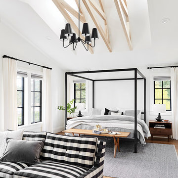
lack window frames can be bold in light-colored rooms, but the addition of the black bed frame and chandelier tied everything together beautifully. The windows became a focal point in the room, so, simple white curtains were the perfect window treatment to blend into the walls during the day and provide privacy at night.

 TVL Creative Ltd.
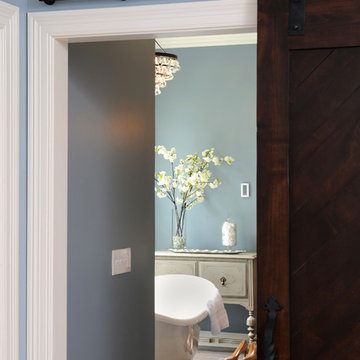
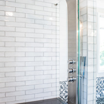
This project is an incredible transformation and the perfect example of successful style mixing! This client, and now a good friend of TVL (as they all become), is a wonderfully eclectic and adventurous one with immense interest in texture play, pops of color, and unique applications. Our scope in this home included a full kitchen renovation, main level powder room renovation, and a master bathroom overhaul. Taking just over a year to complete from the first design phases to final photos, this project was so insanely fun and packs an amazing amount of fun details and lively surprises. The original kitchen was large and fairly functional. However, the cabinetry was dated, the lighting was inefficient and frankly ugly, and the space was lacking personality in general. Our client desired maximized storage and a more personalized aesthetic. The existing cabinets were short and left the nice height of the space under-utilized. We integrated new gray shaker cabinets from Waypoint Living Spaces and ran them to the ceiling to really exaggerate the height of the space and to maximize usable storage as much as possible. The upper cabinets are glass and lit from within, offering display space or functional storage as the client needs. The central feature of this space is the large cobalt blue range from Viking as well as the custom made reclaimed wood range hood floating above. The backsplash along this entire wall is vertical slab of marble look quartz from Pental Surfaces. This matches the expanse of the same countertop that wraps the room. Flanking the range, we installed cobalt blue lantern penny tile from Merola Tile for a playful texture that adds visual interest and class to the entire room. We upgraded the lighting in the ceiling, under the cabinets, and within cabinets--we also installed accent sconces over each window on the sink wall to create cozy and functional illumination. The deep, textured front Whitehaven apron sink is a dramatic nod to the farmhouse aesthetic from KOHLER, and it's paired with the bold and industrial inspired Tournant faucet, also from Kohler. We finalized this space with other gorgeous appliances, a super sexy dining table and chair set from Room & Board, the Paxton dining light from Pottery Barn and a small bar area and pantry on the far end of the space. In the small powder room on the main level, we converted a drab builder-grade space into a super cute, rustic-inspired washroom. We utilized the Bonner vanity from Signature Hardware and paired this with the cute Ashfield faucet from Pfister. The most unique statements in this room include the water-drop light over the vanity from Shades Of Light, the copper-look porcelain floor tile from Pental Surfaces and the gorgeous Cashmere colored Tresham toilet from Kohler. Up in the master bathroom, elegance abounds. Using the same footprint, we upgraded everything in this space to reflect the client's desire for a more bright, patterned and pretty space. Starting at the entry, we installed a custom reclaimed plank barn door with bold large format hardware from Rustica Hardware. In the bathroom, the custom slate blue vanity from Tharp Cabinet Company is an eye catching statement piece. This is paired with gorgeous hardware from Amerock, vessel sinks from Kohler, and Purist faucets also from Kohler. We replaced the old built-in bathtub with a new freestanding soaker from Signature Hardware. The floor tile is a bold, graphic porcelain tile with a classic color scheme. The shower was upgraded with new tile and fixtures throughout: new clear glass, gorgeous distressed subway tile from the Castle line from TileBar, and a sophisticated shower panel from Vigo. We finalized the space with a small crystal chandelier and soft gray paint. This project is a stunning conversion and we are so thrilled that our client can enjoy these personalized spaces for years to come. Special thanks to the amazing Ian Burks of Burks Wurks Construction for bringing this to life!
 Dave Fox Design Build Remodelers
This remodel consisted of a whole house transformation. We took this 3 bedroom dated home and turned it into a 5 bedroom award winning showpiece, all without an addition. By reworking the awkward floor plan and lowering the living room floor to be level with the rest of the house we were able to create additional space within the existing footprint of the home. What was once the small lack-luster master suite, is now 2 kids bedrooms that share a jack and jill bath. The master suite was relocated to the first floor, and the kitchen that was located right at the front door, is now located in the back of the home with great access to the patio overlooking the golf course.
View more about this project and our company at our website: www.davefox.com

104