
Search results for "Lacks ample" in Home Design Ideas
 JRP Design & Remodel
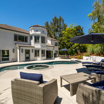
This home is a bachelor’s dream, but it didn’t start that way. It began with a young man purchasing his first single-family home in Westlake Village. The house was dated from the late 1980s, dark, and closed off. In other words, it felt like a man cave — not a home. It needed a masculine makeover.
He turned to his friend, who spoke highly of their experience with us. We had remodeled and designed their home, now known as the “Oak Park Soiree.” The result of this home’s new, open floorplan assured him we could provide the same flow and functionality to his own home. He put his trust in our hands, and the construction began.
The entry of our client’s original home had no “wow factor.” As you walked in, you noticed a staircase enclosed by a wall, making the space feel bulky and uninviting. Our team elevated the entry by designing a new modern staircase with a see-through railing. We even took advantage of the area under the stairs by building a wine cellar underneath it… because wine not?
Down the hall, the kitchen and family room used to be separated by a wall. The kitchen lacked countertop and storage space, and the family room had a high ceiling open to the second floor. This floorplan didn’t function well with our client’s lifestyle. He wanted one large space that allowed him to entertain family and friends while at the same time, not having to worry about noise traveling upstairs. Our architects crafted a new floorplan to make the kitchen, breakfast nook, and family room flow together as a great room. We removed the obstructing wall and enclosed the high ceiling above the family room by building a new loft space above.
The kitchen area of the great room is now the heart of the home! Our client and his guests have plenty of space to gather around the oversized island with additional seating. The walls are surrounded by custom Crystal cabinetry, and the countertops glisten with Vadara quartz, providing ample cooking and storage space. To top it all off, we installed several new appliances, including a built-in fridge and coffee machine, a Miele 48-inch range, and a beautifully designed boxed ventilation hood with brass strapping and contrasting color.
There is now an effortless transition from the kitchen to the family room, where your eyes are drawn to the newly centered, linear fireplace surrounded by floating shelves. Its backlighting spotlights the purposefully placed symmetrical décor inside it. Next to this focal point lies a LaCantina bi-fold door leading to the backyard’s sparkling new pool and additional outdoor living space. Not only does the wide door create a seamless transition to the outside, but it also brings an abundance of natural light into the home.
Once in need of a masculine makeover, this home’s sexy black and gold finishes paired with additional space for wine and guests to have a good time make it a bachelor’s dream.
Photographer: Andrew Orozco
 kimberly peck architect
For this project, we transformed the top floor of a Park Slope brownstone into a modern, lightfilled
home tailored to the needs of a busy couple. The original space was outdated and lacked
cohesion, so our design focused on creating a harmonious and functional layout that reflects the
clients’ lifestyle while introducing moments of drama and creativity.
At the heart of the penthouse is an open-concept dining room, living room, and kitchen. The
living room accommodates multiple areas, including a cozy seating nook illuminated by
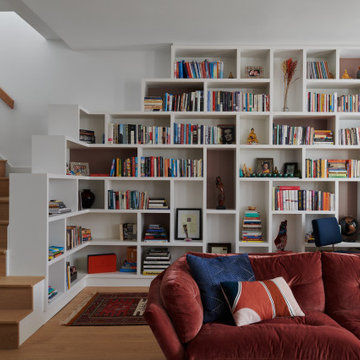
multicolored glass pendant lights. A dramatic custom-built feature spans the entire length of the
living room, integrating storage, display areas, and a unique guardwall that separates the
staircase to the couple's rooftop garden from the living space. This built-in showcases a dynamic
geometric design, with select sections backed in soft mauve for depth and visual interest. Along
the front of the space, a bespoke oak window seat with modern slatted wood fronts conceals the
AC and radiators while providing ample storage. The main seating area centers around a creamy
marble fireplace surround, a refined focal point in the living area. Wide-plank oak flooring
extends throughout the apartment and up the staircase, where a minimal aesthetic enhances the
clean, modern feel.
The kitchen continues the theme of modern sophistication with a palette of soft white lacquered
lower cabinets and oak upper cabinetry. The countertops and backsplash are crafted from a
striking quartzite in cream, peach, and mauve tones, adding a subtle vibrancy to the space. A
cream-enameled range takes center stage, complemented by a hidden coffee station and a
dedicated cabinet for AV supplies, ensuring a clutter-free aesthetic.
The hall guest bathroom is a playful yet refined mix of materials and textures. Peach-toned
concrete tiles cover the walls, while the floor features cream zellige tiles. Brass fixtures, a brass
mirror, and a brass wall sconce lend a touch of warmth and luxury, harmonizing with the custom
pecan-veneered vanity and custom concrete sink,
The primary bedroom suite is a serene retreat, painted in a rich, deep blue that sets a calming
tone. Accessed through a bespoke millwork closet, the ensuite bathroom is a small yet striking
space, showcasing impeccable craftsmanship. The rear wall of the shower is clad in floor-toceiling
slabs of light blue quartzite, creating a dramatic focal point visible from the bedroom.
This quartzite extends seamlessly to form a sculptural bench within the shower, which transitions
outward into a custom sink. Beneath the sink, two wood drawers provide discreet storage. The
remaining walls are finished in soft beige Moroccan tadelakt plaster, adding a warm contrast to
the cool tones of the quartzite.
This Park Slope penthouse is a carefully curated blend of modern elegance and thoughtful
functionality, with bespoke details and rich materiality that celebrate both the character of the
space and the needs of its owners.
 Drury Design
The Setup:
After purchasing this home, the homeowners faced a unique opportunity to reimagine their kitchen and nearby spaces. Water damage from a burst pipe had left much of the home’s interior in need of repair, and while the existing kitchen was functional and in relatively good shape, it didn’t align with the family’s vision for their new home. The layout included a peninsula that wasn’t ideal, and there were some druthers with the nearby pantry.
Since the space needed to be rebuilt anyway, the homeowners saw this as a chance to create a kitchen that was both highly functional for their four young children and timeless in its design. The project also included a refresh of the adjacent message center and dining room — spaces that play key roles in the family’s daily life. The goal was to create a cohesive flow between these areas, balancing modern functionality with the craftsman-inspired character of the rest of the home.
Design Objectives:
- Replace the outdated peninsula with a large island to maximize counter space and create new seating options.
- Open up the space visually by removing soffits and rethinking the cabinetry layout.
Incorporate concealed refrigeration and freezer units to provide significant storage for the family while maintaining a streamlined aesthetic.
- Integrate black cabinetry into the design without making the space feel harsh or heavy.
- Ensure the lighting plan balances functional task lighting with ambient accent lighting.
- Avoid visual clutter in the cabinetry design while still giving a nod to the craftsman aesthetic.
- Incorporate a slab backsplash as a key design feature.
Design Challenges:
- The outdated peninsula left dead space in the kitchen and lacked sufficient seating for the family.
- The cooktop wall was cramped, with small cabinets flanking the hood, limited storage, and soffits that made the space feel closed-in.
- The family needed significant refrigeration space (two refrigerators and a freezer) but wanted to avoid a cluttered look with visible stainless steel appliances.
- Adding black cabinetry risked making the space feel too dark or heavy.
- The original lighting plan was insufficient, particularly over the dining table where a decorative fixture proved too dim.
- The family wanted shaker-style drawer fronts to match the home’s arts-and-crafts design but worried that too much shaker cabinetry might look overly busy.
- Prioritizing a slab backsplash in the wish list priority planning.
The Renewed Space
Design Solutions:
- A functional island: The peninsula was replaced with a large island that provides continuous countertop space for prepping and serving. The island also features seating for four people, creating a central hub for informal meals and activities.
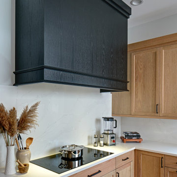
- Streamlined cooktop wall: The soffits were removed, and the upper cabinets on the cooktop wall were eliminated to create a more open, streamlined design. A custom oversized hood became the focal point of the wall, with the blower unit offset inside it to align with the cooktop while maintaining exterior visual symmetry.
- Concealed refrigeration: Two column refrigerators and one freezer were integrated into the cabinetry, concealing them behind wood paneling that blends seamlessly with the overall design.
- Warm black cabinetry: The black cabinetry was crafted from hickory with a visible grain, softening its appearance and adding warmth. The grain detail gives the cabinetry a rich, textured look that avoids feeling stark or overpowering.
- Additional lighting: In the dining area, recessed can lights were added during an additional installation phase to supplement the gorgeous decorative fixture’s dim output. The new lighting plan creates a layered effect, combining functional task lighting with softer ambient lighting.
- Simplified cabinetry details: Slab drawer fronts were used on the upper drawers, while five-piece shaker fronts (with slightly less prominent rail and stile pieces) were reserved for the middle and lower drawers. This approach simplified the overall look while maintaining the craftsman-inspired aesthetic.
- Slab backsplash priority: The slab backsplash was prioritized by making thoughtful adjustments elsewhere, like opting not to extend cabinetry to the ceiling, which also helped visually prioritize the gorgeous slab backsplash. This decision also enhanced the kitchen’s furniture-like feel, aligning with the home’s craftsman character.
- This kitchen perfectly balances practicality with timeless style. By addressing the family’s functional needs — ample seating, smart storage, and effective lighting — while incorporating thoughtful design elements like warm black cabinetry and a striking slab backsplash, Alicia created a space that works beautifully for a busy household. The result is a cohesive, inviting kitchen that honors the home’s craftsman roots and will serve the family well for years to come.
Find the right local pro for your project
 CRC Builders Inc.
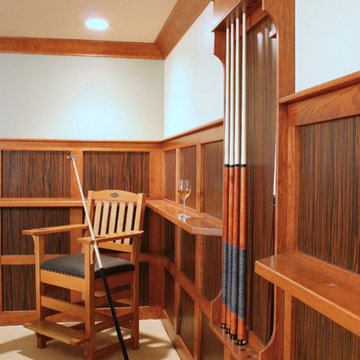
The homeowner wanted something different, out of the ordinary, as an entertainment center and bar combination that would add an unusual dimension to watching TV. It had to be in character with the rest of the residence, tastefully designed and executed to deliver the maximum effect.
A two-piece combination bar and seating, coupled with a fireplace and large screen TV was designed. A system was designed and custom built cabinet consisting of a radius front entertainment center houses a large flat screen TV and enclosed stereo speakers on the top level, and a gas log fireplace below.
A custom built see-through bar sports a matching radius front, plenty of storage, and room for three to eat, drink, and enjoy the warmth of the fireplace without missing any of the action on the TV. For even greater functionality, the TV is also viewable through the large opening in the bar while meals or snacks are prepared from the kitchen. Traffic flow is unique: access and egress between the bar front and TV can happen with ease around both sides of the bar, and the opening in the back of the bar provides for service both from and to the kitchen area. Because of the free and easy movement about the space, adequate lighting, and lack of combustibles at or on the fireplace, safety, as well as an ample use of space, are both achieved. Both pieces are custom fabricated from start to finish, and match each other identically in all respects. Both are constructed of clear cherry finish with a clear satin lacquer. Both enjoy chrome accents strips and custom crafted, glass cabinet doors with matching radii, and both are tastefully lit with accenting puck lights. The design and fabrication for both units shared issues in common as well as individually.
The entertainment center was fabricated in the shop in three units and then assembled onsite. The opening for the flat screen TV had to be carefully considered as it too had a radius and therefore had to be designed so that the TV would fit.
The entire bar system, except the countertop, had to be fabricated onsite due to the structural columns on either side between which the curved lower cabinets would rest. Then the countertop template was prepared, fabricated elsewhere, returned and installed. After the countertop was in place, the cabinetmaker had to wrap the two columns on either side as well as the overhead beam while making sure the joints at the columns and header maintained alignment. A complement of matching radii cabinet doors had to be constructed for both units. Radius glass inserts had to be ordered with precise dimensions to assure a perfect fit to openings with tight tolerances. Any mistake would have been expensive to correct. Because of the abundance of natural light into the space, the finishes had to be dead-on, otherwise every flaw would show. The custom walnut inlays were fabricated out of square stock, which protruded above the radius in each door. A jig matching the radius had to be designed and fabricated, then a router used to trim excess material and then sanded and finished.
Solving the multitude of challenges associated with the project was one of the parts that made the project fun and interesting. The homeowners now can entertain every night.
 Thyme & Place Design LLC
At this turn of the 20th century, home badly needed a new kitchen. An old porch had been partially enclosed, and the old kitchen window opened onto that enclosure, a small stretch of hallway 6 feet wide. The room had little in the way of form or function. The appliances all needed to be replaced, the lighting and flooring were in bad repair and the kitchen itself lacked culinary inspiration.
The client requested a kitchen with modern top-of-the-line cooking appliances, a well-thought-out plan which would include an island, a desk, eating for 6, custom storage, a "cat" corner for the family pet’s food and bowls as well as a drop-dead design aesthetic. Welcome to the Central Av Kitchen.
The old exterior wall was removed and the 6’ hallway was incorporated into the kitchen area providing space for both a table as well as a generous island with seating for three. In lieu of pantry cabinets, a pantry closet was framed to the right of the refrigerator to account for a change in ceiling height. The closet conceals the slope of the old exterior wall.
Additional space for the cooktop credenza was found by extending a wall concealing the basement stairs. Custom-screened marble tile covers the wall behind the induction cooktop. A pot filler faucet is an added convenience becoming very popular with clients who cook. The secondary cooking area adjacent to the cooktop has a single convection wall oven and one of my favorite appliances, a steam oven. This is the one appliance no kitchen should be without.
An immovable corner chase became part of the design supporting a full counter-to-ceiling cabinet for glasses and cups. Dish drawer storage is located below this cabinet, perfect when unloading the dishwasher. Once again, my favorite culinary sink (Franke) and a professional-style faucet (Brizo) add to the chef’s table experience of the kitchen. The refrigerator is a gorgeous 42” french door-styled Sub Zero.
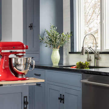
Moving to the island, you will find an under-counter beverage refrigerator, additional storage, and a mixer lift to keep the stand mixer at ready but tucked away. Great for casual dining and ample space for preparing meals, the island is the perfect centerpiece for the kitchen design. A traditional ship lap wood detail was turned on its end to surround the island. The contrasting color and texture of the rustic oak give relief to the smooth painted finish of the kitchen cabinets. The stain color is repeated on the pantry door as well as the family room entrance door to the kitchen.
Near the kitchen table, a desk is located for both recipe research as well as homework. The spare dining chair serves as a desk chair. Open shelves are simultaneously practical and decorative.
Custom storage details include a spice drawer, pull-out pantry, dish drawer, garbage/recycling cabinet, vertical tray storage, utensil, and flatware drawers, and “cat corner” which holds all things kitty related, while keeping the cat dining area out of the main kitchen.
Additional details about the space. The cabinets are a traditional plain inset construction but without visible hinges. Large format “concrete” porcelain floor tiles create a simple canvas for blue-painted cabinets with a black glazed finish. Contemporized matte black hardware provides a beautiful contrast to the cabinet color. The other splash areas are covered in a simple white mottled glazed porcelain subway tile. The “cat corner” which is not visible is realized in distressed black paint with a wood countertop to match the oak on the island.
Another key point is the ceiling height. Taller ceilings allow for taller cabinets but need a strong molding detail to balance the tall cabinet doors. To demonstrate that detail, you will notice a combination of moldings (9” high) and double-paneled doors to overcome a “tower effect” in the space.
 Nathan Taylor for Obelisk Home
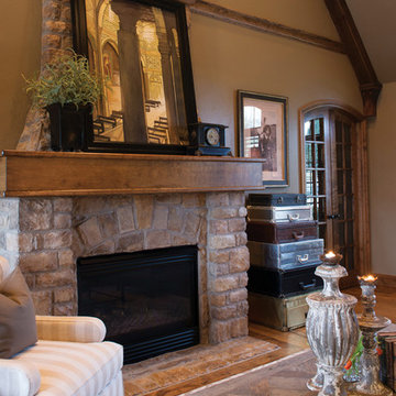
Before the transformation this home was heavy traditional with a prolific use of European antiques. The furniture and art in the ample living room were under-scaled and lacking in cohesion.
Clean lines and a neutral palette were introduced. Obelisk Home outfitted the entire living room with large comfortable furnishings in soothing grays, creams and reclaimed woods. A large library cabinet balanced the fireplace and was filled with antique books and the client’s aviary collectibles. A long reclaimed pine console was placed in front of a bank of windows drawing attention to the beautiful patio. The client’s antique breakfast table used as an end table was the pivot point between the two styles. Original art with pastoral themes breathed much needed color and energy into the space.
Original Artwork by James Eric Richardson
Photos by Randy Colwell
 Sunset Design and Build
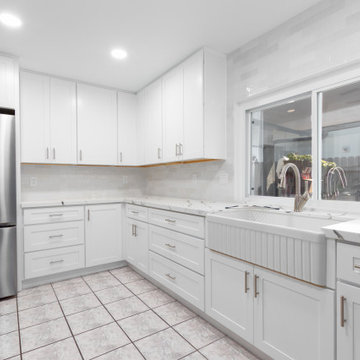
This Oceanside family wanted a kitchen that worked as both a functional cooking space and a central gathering spot for their home. Their existing kitchen felt closed-off, lacked storage, and didn’t reflect their style.
We completely redesigned the layout to create a more open and inviting flow, adding an island with seating for family meals and homework time. Custom cabinetry provided ample storage, while high-quality finishes gave the space a clean, timeless look.
The project also included updated countertops, modern fixtures, and improved lighting to make the kitchen feel brighter and more spacious. The end result is a warm, functional kitchen that has truly become the heart of their home.
 Drury Design
The Setup:
After purchasing this home, the homeowners faced a unique opportunity to reimagine their kitchen and nearby spaces. Water damage from a burst pipe had left much of the home’s interior in need of repair, and while the existing kitchen was functional and in relatively good shape, it didn’t align with the family’s vision for their new home. The layout included a peninsula that wasn’t ideal, and there were some druthers with the nearby pantry.
Since the space needed to be rebuilt anyway, the homeowners saw this as a chance to create a kitchen that was both highly functional for their four young children and timeless in its design. The project also included a refresh of the adjacent message center and dining room — spaces that play key roles in the family’s daily life. The goal was to create a cohesive flow between these areas, balancing modern functionality with the craftsman-inspired character of the rest of the home.
Design Objectives:
- Replace the outdated peninsula with a large island to maximize counter space and create new seating options.
- Open up the space visually by removing soffits and rethinking the cabinetry layout.
Incorporate concealed refrigeration and freezer units to provide significant storage for the family while maintaining a streamlined aesthetic.
- Integrate black cabinetry into the design without making the space feel harsh or heavy.
- Ensure the lighting plan balances functional task lighting with ambient accent lighting.
- Avoid visual clutter in the cabinetry design while still giving a nod to the craftsman aesthetic.
- Incorporate a slab backsplash as a key design feature.
Design Challenges:
- The outdated peninsula left dead space in the kitchen and lacked sufficient seating for the family.
- The cooktop wall was cramped, with small cabinets flanking the hood, limited storage, and soffits that made the space feel closed-in.
- The family needed significant refrigeration space (two refrigerators and a freezer) but wanted to avoid a cluttered look with visible stainless steel appliances.
- Adding black cabinetry risked making the space feel too dark or heavy.
- The original lighting plan was insufficient, particularly over the dining table where a decorative fixture proved too dim.
- The family wanted shaker-style drawer fronts to match the home’s arts-and-crafts design but worried that too much shaker cabinetry might look overly busy.
- Prioritizing a slab backsplash in the wish list priority planning.
The Renewed Space
Design Solutions:
- A functional island: The peninsula was replaced with a large island that provides continuous countertop space for prepping and serving. The island also features seating for four people, creating a central hub for informal meals and activities.
- Streamlined cooktop wall: The soffits were removed, and the upper cabinets on the cooktop wall were eliminated to create a more open, streamlined design. A custom oversized hood became the focal point of the wall, with the blower unit offset inside it to align with the cooktop while maintaining exterior visual symmetry.
- Concealed refrigeration: Two column refrigerators and one freezer were integrated into the cabinetry, concealing them behind wood paneling that blends seamlessly with the overall design.
- Warm black cabinetry: The black cabinetry was crafted from hickory with a visible grain, softening its appearance and adding warmth. The grain detail gives the cabinetry a rich, textured look that avoids feeling stark or overpowering.
- Additional lighting: In the dining area, recessed can lights were added during an additional installation phase to supplement the gorgeous decorative fixture’s dim output. The new lighting plan creates a layered effect, combining functional task lighting with softer ambient lighting.
- Simplified cabinetry details: Slab drawer fronts were used on the upper drawers, while five-piece shaker fronts (with slightly less prominent rail and stile pieces) were reserved for the middle and lower drawers. This approach simplified the overall look while maintaining the craftsman-inspired aesthetic.
- Slab backsplash priority: The slab backsplash was prioritized by making thoughtful adjustments elsewhere, like opting not to extend cabinetry to the ceiling, which also helped visually prioritize the gorgeous slab backsplash. This decision also enhanced the kitchen’s furniture-like feel, aligning with the home’s craftsman character.
- This kitchen perfectly balances practicality with timeless style. By addressing the family’s functional needs — ample seating, smart storage, and effective lighting — while incorporating thoughtful design elements like warm black cabinetry and a striking slab backsplash, Alicia created a space that works beautifully for a busy household. The result is a cohesive, inviting kitchen that honors the home’s craftsman roots and will serve the family well for years to come.
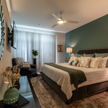
 Michael Nash Design, Build & Homes
This four-story townhome in the heart of old town Alexandria, was recently purchased by a family of four.
The outdated galley kitchen with confined spaces, lack of powder room on main level, dropped down ceiling, partition walls, small bathrooms, and the main level laundry were a few of the deficiencies this family wanted to resolve before moving in.
Starting with the top floor, we converted a small bedroom into a master suite, which has an outdoor deck with beautiful view of old town. We reconfigured the space to create a walk-in closet and another separate closet.
We took some space from the old closet and enlarged the master bath to include a bathtub and a walk-in shower. Double floating vanities and hidden toilet space were also added.
The addition of lighting and glass transoms allows light into staircase leading to the lower level.
On the third level is the perfect space for a girl’s bedroom. A new bathroom with walk-in shower and added space from hallway makes it possible to share this bathroom.
A stackable laundry space was added to the hallway, a few steps away from a new study with built in bookcase, French doors, and matching hardwood floors.
The main level was totally revamped. The walls were taken down, floors got built up to add extra insulation, new wide plank hardwood installed throughout, ceiling raised, and a new HVAC was added for three levels.
The storage closet under the steps was converted to a main level powder room, by relocating the electrical panel.
The new kitchen includes a large island with new plumbing for sink, dishwasher, and lots of storage placed in the center of this open kitchen. The south wall is complete with floor to ceiling cabinetry including a home for a new cooktop and stainless-steel range hood, covered with glass tile backsplash.
The dining room wall was taken down to combine the adjacent area with kitchen. The kitchen includes butler style cabinetry, wine fridge and glass cabinets for display. The old living room fireplace was torn down and revamped with a gas fireplace wrapped in stone.
Built-ins added on both ends of the living room gives floor to ceiling space provides ample display space for art. Plenty of lighting fixtures such as led lights, sconces and ceiling fans make this an immaculate remodel.
We added brick veneer on east wall to replicate the historic old character of old town homes.
The open floor plan with seamless wood floor and central kitchen has added warmth and with a desirable entertaining space.
 Native Edge Landscape
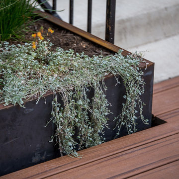
After their brand new construction was completed, this family had a beautiful and comfortable home that truly fit their needs. However, this new construction lacked an outdoor living space, which left the backyard feeling stark and bare. With this blank slate, we were able to create a relaxing environment for this family to enjoy.
Faced with the challenge of using every square-inch of this small space, Native Edge was able to design a landscape that left this family worry-free. We incorporated a low maintenance composite decking system, modern raised metal planters, and a bubbling urn water feature to tie this peaceful landscape together. The poor drainage of the lot gave us the opportunity to create a striking cat walk and drainage feature, which left ample room for their vegetable and herb garden hobby. There is even a nook for the family dog to enjoy!
 S Squared Design, LLC
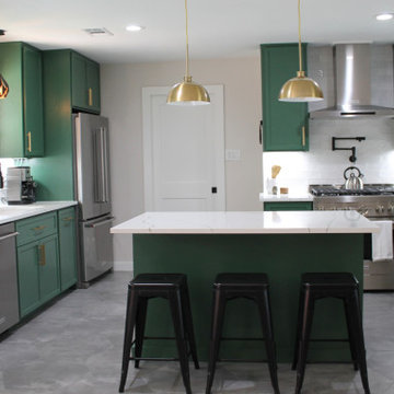
This remodel was one worth waiting for! Clients had a need for more storage, more counter and more room for entertaining friends and family. They love color and low maintenance materials so we went with a lovely happy green cabinet color, quartz counters, fun large hex porcelain floor tile and easy to clean backsplash. The original kitchen was lacking good flow, ample storage for this family.
We started in the laundry room but re configuring the layout so now the W/D and fridge could be on one wall which opened up space for a drop area. We removed the old small closet that was the pantry and replaced the old water heater with a tank-less one to allow more place where they needed it the most. Drop area has outlets for charging and one in the broom cabinet as well. We removed the door to allow for us to relocate the garage entry door which now sits in the mud room instead of right in the middle of the kitchen. We added an actual walk in pantry which is equipped with drawers and plenty of shelf storage, we put the small appliances in here to allow for more counter space in the kitchen. To access the kitchen is now through a pocket door which is a big space saver and allows a more open feel.
Let's get to this kitchen design! This was a odd layout before, now we have the fridge tucked away in it's proper home instead of sticking out. We relocated the garage entry door to the mud room to allow for this 36" range in its place featuring a pot filler as well. To maximize the kitchen footprint we closed up the door that went to the office and now we have a full L corner with plenty of storage and added some wood shelves for a sense of warmth and displace space in a beverage bar area, which also features an under-counter beverage fridge. Under-cabinet lighting, island fixture , a pendant above the sink and relocated the recessed lights to work better with the new kitchen layout. The island was a new addition which replaced the peninsula that used to cut off the kitchen from the rest of the home. We also removed a built in bookshelf and relocated the return air to the ceiling to free up even more floor space to truly transform this kitchen into the heart of the home.
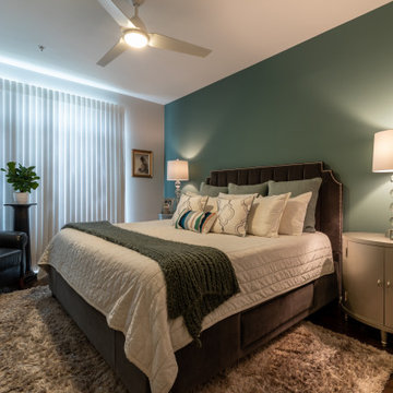 Michael Nash Design, Build & Homes
This four-story townhome in the heart of old town Alexandria, was recently purchased by a family of four.
The outdated galley kitchen with confined spaces, lack of powder room on main level, dropped down ceiling, partition walls, small bathrooms, and the main level laundry were a few of the deficiencies this family wanted to resolve before moving in.
Starting with the top floor, we converted a small bedroom into a master suite, which has an outdoor deck with beautiful view of old town. We reconfigured the space to create a walk-in closet and another separate closet.
We took some space from the old closet and enlarged the master bath to include a bathtub and a walk-in shower. Double floating vanities and hidden toilet space were also added.
The addition of lighting and glass transoms allows light into staircase leading to the lower level.
On the third level is the perfect space for a girl’s bedroom. A new bathroom with walk-in shower and added space from hallway makes it possible to share this bathroom.
A stackable laundry space was added to the hallway, a few steps away from a new study with built in bookcase, French doors, and matching hardwood floors.
The main level was totally revamped. The walls were taken down, floors got built up to add extra insulation, new wide plank hardwood installed throughout, ceiling raised, and a new HVAC was added for three levels.
The storage closet under the steps was converted to a main level powder room, by relocating the electrical panel.
The new kitchen includes a large island with new plumbing for sink, dishwasher, and lots of storage placed in the center of this open kitchen. The south wall is complete with floor to ceiling cabinetry including a home for a new cooktop and stainless-steel range hood, covered with glass tile backsplash.
The dining room wall was taken down to combine the adjacent area with kitchen. The kitchen includes butler style cabinetry, wine fridge and glass cabinets for display. The old living room fireplace was torn down and revamped with a gas fireplace wrapped in stone.
Built-ins added on both ends of the living room gives floor to ceiling space provides ample display space for art. Plenty of lighting fixtures such as led lights, sconces and ceiling fans make this an immaculate remodel.
We added brick veneer on east wall to replicate the historic old character of old town homes.
The open floor plan with seamless wood floor and central kitchen has added warmth and with a desirable entertaining space.
 Schulte Design Build
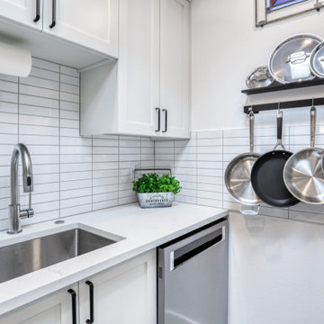
The client came to us wanting a more functional and visually appealing kitchen without changing the footprint of this 500 square foot condo in Queen Anne. They were frustrated by the lack of efficient storage, the outdated finishes, and a layout that didn’t make the best use of the narrow galley-like space. They also wanted to keep their favorite kitchen tools accessible without cluttering the countertops, and looked to us for a solution that felt brighter and more contemporary.
To meet their needs, we reimagined the space with custom cabinetry that goes all the way to the ceiling, providing ample storage, including a hidden spice rack. Heated tile floors were added for both comfort and luxury, and the layout was optimized to make every inch count. We brightened the kitchen with a fresh neutral toned palette and wall-mounted pot racks offered stylish storage solutions that keep essentials close at hand. The result is a highly functional space that feels, larger, updated, and more inviting. This kitchen is part of a larger remodel we did for this client which included the bathroom, sleeping, and living spaces.
 Margaux Interiors
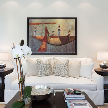
The scales of the decorative pieces are ample but not overwhelming. A lack of ornamentation and decoration keeps the focus on the simplicity and sophistication of the design.
Photography by Claudia Uribe
 Native Edge Landscape
After their brand new construction was completed, this family had a beautiful and comfortable home that truly fit their needs. However, this new construction lacked an outdoor living space, which left the backyard feeling stark and bare. With this blank slate, we were able to create a relaxing environment for this family to enjoy.
Faced with the challenge of using every square-inch of this small space, Native Edge was able to design a landscape that left this family worry-free. We incorporated a low maintenance composite decking system, modern raised metal planters, and a bubbling urn water feature to tie this peaceful landscape together. The poor drainage of the lot gave us the opportunity to create a striking cat walk and drainage feature, which left ample room for their vegetable and herb garden hobby. There is even a nook for the family dog to enjoy!
 Aardvark Architecture
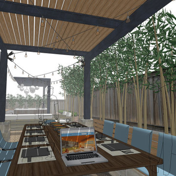
Caroline and Rich's backyard was lacking any clearly defined spaces for their many expected outdoor activities.
Their new hot tub deck and surrounding built in seating create a space to soak in the their new hot tub and for friends and family to gather around the soakers without getting wet themselves. Space to heat up after a dip when in their windy backyard was necessary too, thus the space for a firetable and added seating flank a large deck-topped boulder feature.
The family's new outdoor dining pavillion has ample space for large group get together, as well as serving for everyday lunches without having to shift any of the outdoor office setup. A built in grill and bench create an ideal stopping point for this structure, which is built right up to a rear utility easement. Fortunately only a bit of upligthing is needed to perfect a grove of existing bamboo that fills the space between this backstop and their back fence!
 m studio interior design
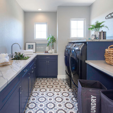
When all but the master suite was redesigned in a newly-purchased home, an opportunity arose for transformation.
Lack of storage, low-height counters and an unnecessary closet space were all undesirable.
Closing off the adjacent closet allowed for wider and taller vanities and a make-up station in the bathroom. Eliminating the tub, a shower sizable to wash large dogs is nestled by the windows offering ample light. The water-closet sits where the previous shower was, paired with French doors creating an airy feel while maintaining privacy.
In the old closet, the previous opening to the master bath is closed off with new access from the hallway allowing for a new laundry space. The cabinetry layout ensures maximum storage. Utilizing the longest wall for equipment offered full surface space with short hanging above and a tower functions as designated tall hanging with the dog’s water bowl built-in below.
A palette of warm silvers and blues compliment the bold patterns found in each of the spaces.
 Renovisions
This client requested that we design her new kitchen space to look and function with her and her family’s usage in mind. She was not happy with her existing kitchen due to builder-grade ceramic flooring, lack of countertop space, poor lighting, inadequate and unorganized storage and the closed off feel of the area. Renovisions resolved all of these issues by designing and building an impressive, transitional styled kitchen; delivering a beautifully well thought-out space that provides a multi-functional approach and meets the needs of this busy and dynamic household.
Typically, we encounter challenges in every project, and this was no different. The upstairs bathroom plumbing ran across the entire length of the kitchen sink wall and it was necessary to work with it by moving the plumbing as far up as possible and then building a soffit to hide it.
Creating a space that has a more open feel was top of mind for our client. Installing a new wood floor that matched the existing dining room floor helped with this and in addition, warmed up the room. By relocating the refrigerator to the opposite wall and adding a bar area at the end toward the family room, the flow of traffic for family members and guests became more managed.
The open floor plan allowed for additional island cabinets to accommodate smart storage and better functionality when prepping meals, sitting to eat or gathering with friends and family. We believe having ample countertop surface space is a critical improvement in any renovation and this particular project now boasts a large countertop area with a stunning wide vein pattern that accentuates the design instead of overpowering it. The soft look of the Blanco Arabescato quartz enhances the space and looks lovely with the white inset styled cabinetry.
Beauty and function go hand-in-hand in this kitchen with several exceptional elements such as under-cabinet lighting with dimmers to control the mood light. Glass doors were added to the wall cabinets which flank the wine rack for displaying their decorative glassware and a beverage cooler below provided added convenience and access to cold beverages. The GE Café line of appliances in ‘Slate’ and ‘Stainless Steel’ finishes are a stunning contrast here.
The sensational looking decorative marble 6”x6” backsplash tile over the gas range and in the bar area creates nice focal points by creating a unique look for her that family and guests love.
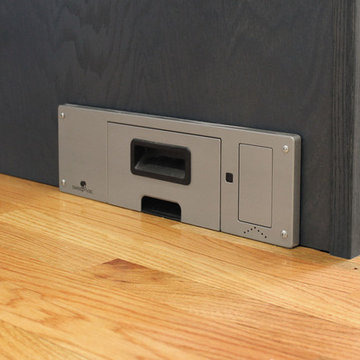
Convenient and functional elements were added such as a blind corner pull-out for easier pot/pan storage, a sweep-o-vac under cabinet vacuum system for those constant quick clean-ups, a pull-out caddy under the sink base for storage of cleaning products and a protective mat to collect potential spills.
Our client let us know it was time for a change and we listened. She shared a few pictures she loved from a home magazine, we shared our insight and then designed/built the kitchen of her dreams! … A fabulous and functional space.
 Sosna Inc
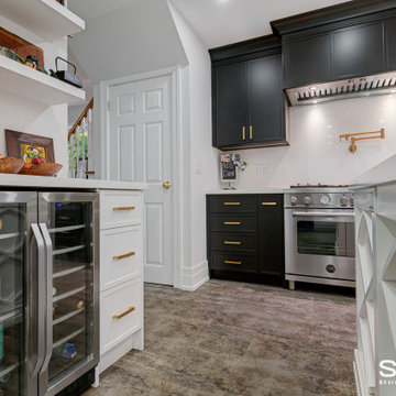
Our clients, a couple in their 40’s, approached us to remodel their Kitchen, which felt cramped and closed off from the rest of the Main Floor. They felt especially isolated when entertaining guests. They love to cook and entertain, but the lack of space made both of those things difficult for them to do.
We removed the walls surrounding the Kitchen, opening it up to the rest of the Main Floor. We expanded the Kitchen across the new open area, allowing for a lot more counter space for preparing and serving food. This also gave room for an enormous island, which is perfect for guests to gather around while entertaining.
During the planning stage, it was discovered that beams and posts needed to remain in the space for structural support. Our talented designer, Chantal, was able to incorporate the beams and posts in the design of the Kitchen, so they served a logical purpose, rather than feeling like they were in the way.
Featured in the new Kitchen are classic black and white cabinets, complemented by brass fixtures and accents. Ample task and ambient lighting was installed in order to brighten up this new space and allow for better visibility when cooking in the Kitchen. We also installed luxury vinyl flooring throughout the space, which is not only stylish,but incredibly durable.
From the beginning of the project, our Clients shared with us their concerns about the project staying within the budget, and the accuracy of the timeline for construction. Ultimately, we were able to ease those concerns, as we finished the renovation on time, and within the allotted budget without compromising on the quality or design wishes of our clients.
If you’re ready to make your forever home feel like it’s been made just for you, contact us to get started! We’re the Renovator You Can Count On!
Sosna Inc
7250 Keele Street, Unit 372
Vaughan, ON L4K 1Z8
416-888-7366 (RENO)
Website: sosna.ca
Email: contact@sosna.ca
 Drury Design
The Setup:
After purchasing this home, the homeowners faced a unique opportunity to reimagine their kitchen and nearby spaces. Water damage from a burst pipe had left much of the home’s interior in need of repair, and while the existing kitchen was functional and in relatively good shape, it didn’t align with the family’s vision for their new home. The layout included a peninsula that wasn’t ideal, and there were some druthers with the nearby pantry.
Since the space needed to be rebuilt anyway, the homeowners saw this as a chance to create a kitchen that was both highly functional for their four young children and timeless in its design. The project also included a refresh of the adjacent message center and dining room — spaces that play key roles in the family’s daily life. The goal was to create a cohesive flow between these areas, balancing modern functionality with the craftsman-inspired character of the rest of the home.
Design Objectives:
- Replace the outdated peninsula with a large island to maximize counter space and create new seating options.
- Open up the space visually by removing soffits and rethinking the cabinetry layout.
Incorporate concealed refrigeration and freezer units to provide significant storage for the family while maintaining a streamlined aesthetic.
- Integrate black cabinetry into the design without making the space feel harsh or heavy.
- Ensure the lighting plan balances functional task lighting with ambient accent lighting.
- Avoid visual clutter in the cabinetry design while still giving a nod to the craftsman aesthetic.
- Incorporate a slab backsplash as a key design feature.
Design Challenges:
- The outdated peninsula left dead space in the kitchen and lacked sufficient seating for the family.
- The cooktop wall was cramped, with small cabinets flanking the hood, limited storage, and soffits that made the space feel closed-in.
- The family needed significant refrigeration space (two refrigerators and a freezer) but wanted to avoid a cluttered look with visible stainless steel appliances.
- Adding black cabinetry risked making the space feel too dark or heavy.
- The original lighting plan was insufficient, particularly over the dining table where a decorative fixture proved too dim.
- The family wanted shaker-style drawer fronts to match the home’s arts-and-crafts design but worried that too much shaker cabinetry might look overly busy.
- Prioritizing a slab backsplash in the wish list priority planning.
The Renewed Space
Design Solutions:
- A functional island: The peninsula was replaced with a large island that provides continuous countertop space for prepping and serving. The island also features seating for four people, creating a central hub for informal meals and activities.
- Streamlined cooktop wall: The soffits were removed, and the upper cabinets on the cooktop wall were eliminated to create a more open, streamlined design. A custom oversized hood became the focal point of the wall, with the blower unit offset inside it to align with the cooktop while maintaining exterior visual symmetry.
- Concealed refrigeration: Two column refrigerators and one freezer were integrated into the cabinetry, concealing them behind wood paneling that blends seamlessly with the overall design.
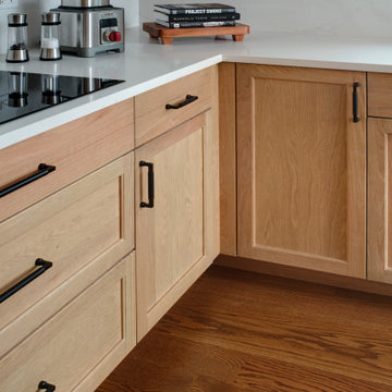
- Warm black cabinetry: The black cabinetry was crafted from hickory with a visible grain, softening its appearance and adding warmth. The grain detail gives the cabinetry a rich, textured look that avoids feeling stark or overpowering.
- Additional lighting: In the dining area, recessed can lights were added during an additional installation phase to supplement the gorgeous decorative fixture’s dim output. The new lighting plan creates a layered effect, combining functional task lighting with softer ambient lighting.
- Simplified cabinetry details: Slab drawer fronts were used on the upper drawers, while five-piece shaker fronts (with slightly less prominent rail and stile pieces) were reserved for the middle and lower drawers. This approach simplified the overall look while maintaining the craftsman-inspired aesthetic.
- Slab backsplash priority: The slab backsplash was prioritized by making thoughtful adjustments elsewhere, like opting not to extend cabinetry to the ceiling, which also helped visually prioritize the gorgeous slab backsplash. This decision also enhanced the kitchen’s furniture-like feel, aligning with the home’s craftsman character.
- This kitchen perfectly balances practicality with timeless style. By addressing the family’s functional needs — ample seating, smart storage, and effective lighting — while incorporating thoughtful design elements like warm black cabinetry and a striking slab backsplash, Alicia created a space that works beautifully for a busy household. The result is a cohesive, inviting kitchen that honors the home’s craftsman roots and will serve the family well for years to come.
18