
Search results for "Languages" in Home Design Ideas
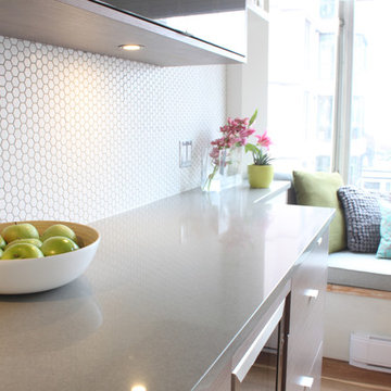
 One SEED Architecture + Interiors
Design: One SEED Architecture + Interiors (www.oneseed.ca)
Photography: One SEED Architecture + Interiors
Builder: Vertical Grain Projects (verticalgrainprojects.com)
The 1 000SF, two bed and two bath condo was a true fixer-upper with outdated finishes and a floor plan that needed refinement. The suite was gutted down to concrete and studs, taking down several walls in the process. The design was influenced by the character and materials of a converted New York loft, and using the vernacular West Coast Modern language, it was infused with warm wood accents, exposed concrete, and framed views of the North Shore mountains.
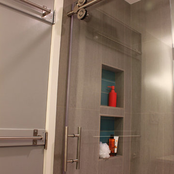 One SEED Architecture + Interiors
Design: One SEED Architecture + Interiors (www.oneseed.ca)
Photography: One SEED Architecture + Interiors
Builder: Vertical Grain Projects (verticalgrainprojects.com)
The 1 000SF, two bed and two bath condo was a true fixer-upper with outdated finishes and a floor plan that needed refinement. The suite was gutted down to concrete and studs, taking down several walls in the process. The design was influenced by the character and materials of a converted New York loft, and using the vernacular West Coast Modern language, it was infused with warm wood accents, exposed concrete, and framed views of the North Shore mountains.
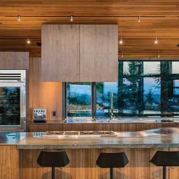
Example of a large trendy kitchen design with an integrated sink, flat-panel cabinets, medium tone wood cabinets, stainless steel appliances, an island, stainless steel countertops and window backsplash
Find the right local pro for your project
 Christopher Simmonds Architect
The client’s brief was to create a space reminiscent of their beloved downtown Chicago industrial loft, in a rural farm setting, while incorporating their unique collection of vintage and architectural salvage. The result is a custom designed space that blends life on the farm with an industrial sensibility.
The new house is located on approximately the same footprint as the original farm house on the property. Barely visible from the road due to the protection of conifer trees and a long driveway, the house sits on the edge of a field with views of the neighbouring 60 acre farm and creek that runs along the length of the property.
The main level open living space is conceived as a transparent social hub for viewing the landscape. Large sliding glass doors create strong visual connections with an adjacent barn on one end and a mature black walnut tree on the other.
The house is situated to optimize views, while at the same time protecting occupants from blazing summer sun and stiff winter winds. The wall to wall sliding doors on the south side of the main living space provide expansive views to the creek, and allow for breezes to flow throughout. The wrap around aluminum louvered sun shade tempers the sun.
The subdued exterior material palette is defined by horizontal wood siding, standing seam metal roofing and large format polished concrete blocks.
The interiors were driven by the owners’ desire to have a home that would properly feature their unique vintage collection, and yet have a modern open layout. Polished concrete floors and steel beams on the main level set the industrial tone and are paired with a stainless steel island counter top, backsplash and industrial range hood in the kitchen. An old drinking fountain is built-in to the mudroom millwork, carefully restored bi-parting doors frame the library entrance, and a vibrant antique stained glass panel is set into the foyer wall allowing diffused coloured light to spill into the hallway. Upstairs, refurbished claw foot tubs are situated to view the landscape.
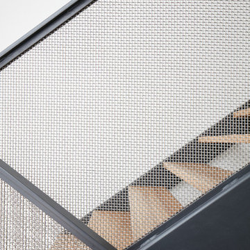
The double height library with mezzanine serves as a prominent feature and quiet retreat for the residents. The white oak millwork exquisitely displays the homeowners’ vast collection of books and manuscripts. The material palette is complemented by steel counter tops, stainless steel ladder hardware and matte black metal mezzanine guards. The stairs carry the same language, with white oak open risers and stainless steel woven wire mesh panels set into a matte black steel frame.
The overall effect is a truly sublime blend of an industrial modern aesthetic punctuated by personal elements of the owners’ storied life.
Photography: James Brittain
 Shenton Architects LLP
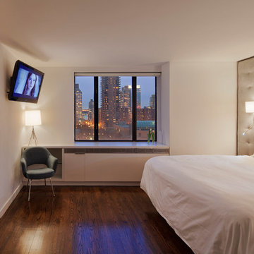
The design of this four bedroom Upper West Side apartment involved the complete renovation of one half of the unit and the remodeling of the other half.
The main living space includes a foyer, lounge, library, kitchen and island. The library can be converted into the fourth bedroom by deploying a series of sliding/folding glass doors together with a pivoting wall panel to separate it from the rest of the living area. The kitchen is delineated as a special space within the open floor plan by virtue of a folded wooden volume around the island - inviting casual congregation and dining.
All three bathrooms were designed with a common language of modern finishes and fixtures, with functional variations depending on their location within the apartment. New closets serve each bedroom as well as the foyer and lounge spaces.
Materials are kept to a limited palette of dark stained wood flooring, American Walnut for bathroom vanities and the kitchen island, white gloss and lacquer finish cabinetry, and translucent glass door panelling with natural anodized aluminum trim. Lightly veined carrara marble lines the bathroom floors and walls.
www.archphoto.com
 Wiedemann Architects LLC
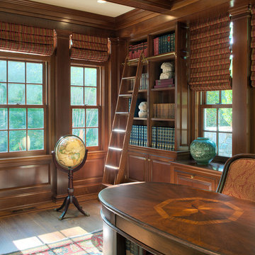
Our client was drawn to the property in Wesley Heights as it was in an established neighborhood of stately homes, on a quiet street with views of park. They wanted a traditional home for their young family with great entertaining spaces that took full advantage of the site.
The site was the challenge. The natural grade of the site was far from traditional. The natural grade at the rear of the property was about thirty feet above the street level. Large mature trees provided shade and needed to be preserved.
The solution was sectional. The first floor level was elevated from the street by 12 feet, with French doors facing the park. We created a courtyard at the first floor level that provide an outdoor entertaining space, with French doors that open the home to the courtyard.. By elevating the first floor level, we were able to allow on-grade parking and a private direct entrance to the lower level pub "Mulligans". An arched passage affords access to the courtyard from a shared driveway with the neighboring homes, while the stone fountain provides a focus.
A sweeping stone stair anchors one of the existing mature trees that was preserved and leads to the elevated rear garden. The second floor master suite opens to a sitting porch at the level of the upper garden, providing the third level of outdoor space that can be used for the children to play.
The home's traditional language is in context with its neighbors, while the design allows each of the three primary levels of the home to relate directly to the outside.
Builder: Peterson & Collins, Inc
Photos © Anice Hoachlander
 LuxeRevive Design & Build
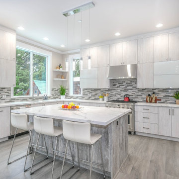
This bright, modern kitchen features high-gloss slab cabinetry in a custom matte laminate finish with integrated pulls and frosted glass panel uppers. LuxeRevive designed and installed a full-height mosaic glass backsplash, waterfall-edge quartz island with mitered corners, and sleek wood-look porcelain floors for durability and style. A large walk-in pantry with LED shelf lighting complements the open layout, while the stainless steel appliance package and flush-mount range hood deliver a clean, functional flow. Pendant lighting above the island adds subtle sparkle to the sleek design language.
 One SEED Architecture + Interiors
Design: One SEED Architecture + Interiors (www.oneseed.ca)
Photography: One SEED Architecture + Interiors
Builder: Vertical Grain Projects (verticalgrainprojects.com)
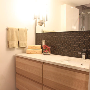
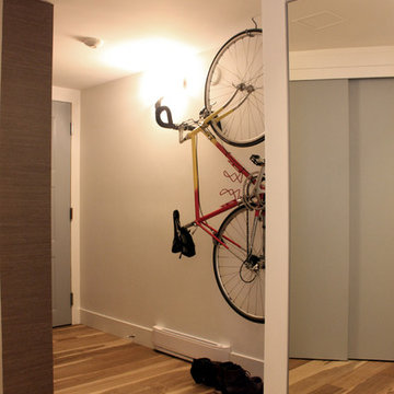
The 1 000SF, two bed and two bath condo was a true fixer-upper with outdated finishes and a floor plan that needed refinement. The suite was gutted down to concrete and studs, taking down several walls in the process. The design was influenced by the character and materials of a converted New York loft, and using the vernacular West Coast Modern language, it was infused with warm wood accents, exposed concrete, and framed views of the North Shore mountains.
 One SEED Architecture + Interiors
Design: One SEED Architecture + Interiors (www.oneseed.ca)
Photography: One SEED Architecture + Interiors
Builder: Vertical Grain Projects (verticalgrainprojects.com)
The 1 000SF, two bed and two bath condo was a true fixer-upper with outdated finishes and a floor plan that needed refinement. The suite was gutted down to concrete and studs, taking down several walls in the process. The design was influenced by the character and materials of a converted New York loft, and using the vernacular West Coast Modern language, it was infused with warm wood accents, exposed concrete, and framed views of the North Shore mountains.
 Wiedemann Architects LLC
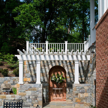
Our client was drawn to the property in Wesley Heights as it was in an established neighborhood of stately homes, on a quiet street with views of park. They wanted a traditional home for their young family with great entertaining spaces that took full advantage of the site.
The site was the challenge. The natural grade of the site was far from traditional. The natural grade at the rear of the property was about thirty feet above the street level. Large mature trees provided shade and needed to be preserved.
The solution was sectional. The first floor level was elevated from the street by 12 feet, with French doors facing the park. We created a courtyard at the first floor level that provide an outdoor entertaining space, with French doors that open the home to the courtyard.. By elevating the first floor level, we were able to allow on-grade parking and a private direct entrance to the lower level pub "Mulligans". An arched passage affords access to the courtyard from a shared driveway with the neighboring homes, while the stone fountain provides a focus.
A sweeping stone stair anchors one of the existing mature trees that was preserved and leads to the elevated rear garden. The second floor master suite opens to a sitting porch at the level of the upper garden, providing the third level of outdoor space that can be used for the children to play.
The home's traditional language is in context with its neighbors, while the design allows each of the three primary levels of the home to relate directly to the outside.
Builder: Peterson & Collins, Inc
Photos © Anice Hoachlander
 Exclusive Home Interiors
Decoration is creation.
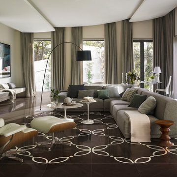
With Carisma Italiano, Petracer’s reaches the essence of the ceramic product and turns the necessary modularity of the support into expressive potential. Twelve positive and negative decoration patterns available in two colours create a language in its own right, universal yet always different, as different are its voices. Points and lines expand, take on different shapes and wander off in new directions, each time starting from scratch and telling a new, unique story. Patterns establish an intense dialogue with each specific interior design style, lines are powerful and plastic, space is used as a musical score. Carisma Italiano is dedicated to all those who have something interesting to say, and want to say it through decoration.
 Jaeger & Ernst Custom Cabinetmakers
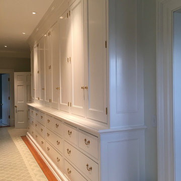
Hallways are often left for clutter or are minimally wide. Historic structures for purposes of air flow and grace tended to be wide and allow at least, for the passage of two people. This hallway utilizes the space to augment the closets of the new addition and to provide extra storage for the lack of closets in the original bedrooms of the home. Closets are a relatively modern amenity. In the seventeenth and eighteenth centuries closets were rare or missing entirely. Wardrobes, chests, and highboys stood to serve for storage of clothing and incidentals. We are well versed in the language of these pieces of furniture and were able to design and create a suitable cabinet for the hall to hold a myriad of items for one's wardrobe: simple, clean and properly proportioned.
Jaeger & Ernst cabinetmakers: 434-973-7018
 Donald Lococo Architects
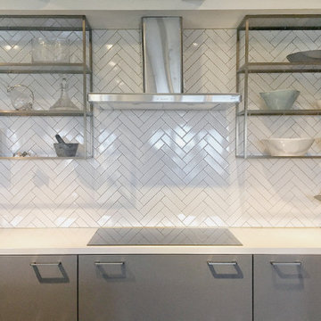
Subsequent additions are covered with living green walls to deemphasize stylistic conflicts imposed on a 1940’s Tudor and become backdrop surrounding a kitchen addition. On the interior, further added architectural inconsistencies are edited away, and the language of the Tudor’s original reclaimed integrity is referenced for the addition. Sympathetic to the home, windows and doors remain untrimmed and stark plaster walls contrast the original black metal windows. Sharp black elements contrast fields of white. With a ceiling pitch matching the existing and chiseled dormers, a stark ceiling hovers over the kitchen space referencing the existing homes plaster walls. Grid members in windows and on saw scored paneled walls and cabinetry mirror the machine age windows as do exposed steel beams. The exaggerated white field is pierced by an equally exaggerated 13 foot black steel tower that references the existing homes steel door and window members. Glass shelves in the tower further the window parallel. Even though it held enough dinner and glassware for eight, its thin members and transparent shelves defy its massive nature, allow light to flow through it and afford the kitchen open views and the feeling of continuous space. The full glass at the end of the kitchen reveres a grouping of 50 year old Hemlocks. At the opposite end, a window close to the peak looks up to a green roof.
 Vetter Architects
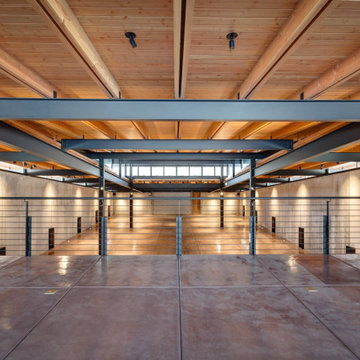
A minimal insertion into a densely wooded landscape, the Collector’s Pavilion provides the owners with an 8,000 sf private fitness space and vintage automobile gallery. On a gently sloping site in amongst a grove of trees, the pavilion slides into the topography - mimicking and contrasting the surrounding landscape with a folded roof plane that hovers over a board formed concrete base.
The clients’ requirement for a nearby room to display a growing car collection as well as provide a remote area for personal fitness carries with it a series of challenges related to privacy and security. The pavilion nestles into the wooded site - finding a home in a small clearing - and merges with the sloping landscape. The building has dual personalities, serving as a private and secure bunker from the exterior, while transforming into a warm and inviting space on the interior. The use of indirect light and the need to obscure direct views from the public right away provides the client with adequate day light for day-to-day use while ensuring that strict privacy is maintained. This shifting personality is also dramatically affected by the seasons - contrasting and merging with the surrounding environment depending on the time of year.
The Collector’s Pavilion employs meticulous detailing of its concrete to steel to wood connections, exploring the grounded nature of poured concrete in conjunction with a delicate wood roof system that floats above a grid of steel. Above all, the Pavilion harmonizes with it’s natural surroundings through it’s materiality, formal language, and siting.
Overview
Chenequa, WI
Size
8,000 sf
Completion Date
May 2013
Services
Architecture, Landscape Architecture, Interior Design
 Che Interiors
The client came to us looking for a remodeled kitchen and living space for their single-family home. They wanted to create a sleek, modern aesthetic with a touch of bling.
Built in the ‘70s, the home sits atop the San Rafael hills, giving it incredible views of the Bay. Our first priority: knock a few walls down to open the living space up to the dramatic landscape.
Then, we sourced a kitchen set that made bling feel like an understatement—frameless, umbra Siematic cabinets with golden bronze hardware, matching open glass shelves, mirrored toe kicks, and a glitter backsplash grout.
For further impact, we designed an island in a near-inverse color scheme—dark faux marble top, simple white walls, and a metallic border for a floating effect. Above this, we sourced distinctive glossy gold pendants that are hyper-modern but with a retro-influence.
Finally, we completed the space by consulting on and sourcing elegant dining furniture that echoed the design language established, including a large white table with a uniquely artful stand.
 LeichtCA / Architectural Kitchens Inc
www.LeichtCA.com
MODO | DESIGN OPTIONS
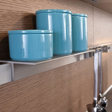
A functional vision for the backsplash. The house of LEICHT has designed the MODO system, focusing on the exciting contrast of metal and natural wood. It will enhance every modern kitchen with it's clear lines and puristic form language. It provides easy access to the required cooking utensils and eases the straight lined kitchen architecture at the same time.
A horizontal square railing of stainless steel colored aluminium screwed directly onto the niche back wall, provides the basic support element. Several function elements in lacquered solid oak are suspended here in various positions. The choice of instruments: shelves, paper roll holders, hook rail, utensil holder and a knife block. Separate function items can also be used as a shelf for smaller items. All lighting developed and designed by LEICHT demonstrates energy efficiency class A+ UL listed and is thus highly efficient. premium LED light with 4100 K (Kelvin) luminous color.
 One SEED Architecture + Interiors
Design: One SEED Architecture + Interiors (www.oneseed.ca)
Photography: Eric Scott Photography (www.ericscottphotography.com)
Builder: Vertical Grain Projects (verticalgrainprojects.com)
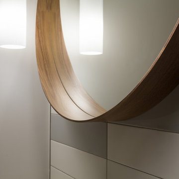
The 1 000SF, two bed and two bath condo was a true fixer-upper with outdated finishes and a floor plan that needed refinement. The suite was gutted down to concrete and studs, taking down several walls in the process. The design was influenced by the character and materials of a converted New York loft, and using the vernacular West Coast Modern language, it was infused with warm wood accents, exposed concrete, and framed views of the North Shore mountains.

 Century Stair Company
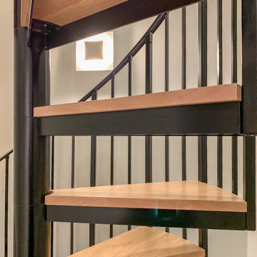
This recently built Bethesda home features two distinctive staircases that share a cohesive design language. The main staircase pairs natural wood treads with sleek steel horizontal rods, creating clean lines. The black wood newels and handrail create striking contrast with the lighter details.
A custom spiral staircase echoes this aesthetic with jet-black metal triangular frames supporting natural wood treads. The geometric structure winds upward, maintaining the same material palette of warm wood and dark metal found throughout the home's vertical connections.
1976-2026 © Century Stair Company
 The Brooklyn Studio
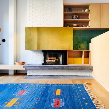
This residence was a complete gut renovation of a 4-story row house in Park Slope, and included a new rear extension and penthouse addition. The owners wished to create a warm, family home using a modern language that would act as a clean canvas to feature rich textiles and items from their world travels. As with most Brooklyn row houses, the existing house suffered from a lack of natural light and connection to exterior spaces, an issue that Principal Brendan Coburn is acutely aware of from his experience re-imagining historic structures in the New York area. The resulting architecture is designed around moments featuring natural light and views to the exterior, of both the private garden and the sky, throughout the house, and a stripped-down language of detailing and finishes allows for the concept of the modern-natural to shine.
Upon entering the home, the kitchen and dining space draw you in with views beyond through the large glazed opening at the rear of the house. An extension was built to allow for a large sunken living room that provides a family gathering space connected to the kitchen and dining room, but remains distinctly separate, with a strong visual connection to the rear garden. The open sculptural stair tower was designed to function like that of a traditional row house stair, but with a smaller footprint. By extending it up past the original roof level into the new penthouse, the stair becomes an atmospheric shaft for the spaces surrounding the core. All types of weather – sunshine, rain, lightning, can be sensed throughout the home through this unifying vertical environment. The stair space also strives to foster family communication, making open living spaces visible between floors. At the upper-most level, a free-form bench sits suspended over the stair, just by the new roof deck, which provides at-ease entertaining. Oak was used throughout the home as a unifying material element. As one travels upwards within the house, the oak finishes are bleached to further degrees as a nod to how light enters the home.
The owners worked with CWB to add their own personality to the project. The meter of a white oak and blackened steel stair screen was designed by the family to read “I love you” in Morse Code, and tile was selected throughout to reference places that hold special significance to the family. To support the owners’ comfort, the architectural design engages passive house technologies to reduce energy use, while increasing air quality within the home – a strategy which aims to respect the environment while providing a refuge from the harsh elements of urban living.
This project was published by Wendy Goodman as her Space of the Week, part of New York Magazine’s Design Hunting on The Cut.
Photography by Kevin Kunstadt
62