
Search results for "Larger goals" in Home Design Ideas

 Klopf Architecture
, Arterra Landscape Architects and Henry Calvert of Calvert Ventures Designed and built a new warm, modern, Eichler-inspired, open, indoor-outdoor home on a deeper-than-usual San Mateo Highlands property where an original Eichler house had burned to the ground.
The owners wanted multi-generational living and larger spaces than the original home offered, but all parties agreed that the house should respect the neighborhood and blend in stylistically with the other Eichlers. At first the Klopf team considered re-using what little was left of the original home and expanding on it. But after discussions with the owner and builder, all parties agreed that the last few remaining elements of the house were not practical to re-use, so Klopf Architecture designed a new home that pushes the Eichler approach in new directions.
One disadvantage of Eichler production homes is that the house designs were not optimized for each specific lot. A new custom home offered the team a chance to start over. In this case, a longer house that opens up sideways to the south fit the lot better than the original square-ish house that used to open to the rear (west). Accordingly, the Klopf team designed an L-shaped “bar” house with a large glass wall with large sliding glass doors that faces sideways instead of to the rear like a typical Eichler. This glass wall opens to a pool and landscaped yard designed by Arterra Landscape Architects.
Driving by the house, one might assume at first glance it is an Eichler because of the horizontality, the overhanging flat roof eaves, the dark gray vertical siding, and orange solid panel front door, but the house is designed for the 21st Century and is not meant to be a “Likeler.” You won't see any posts and beams in this home. Instead, the ceiling decking is a western red cedar that covers over all the beams. Like Eichlers, this cedar runs continuously from inside to out, enhancing the indoor / outdoor feeling of the house, but unlike Eichlers it conceals a cavity for lighting, wiring, and insulation. Ceilings are higher, rooms are larger and more open, the master bathroom is light-filled and more generous, with a separate tub and shower and a separate toilet compartment, and there is plenty of storage. The garage even easily fits two of today's vehicles with room to spare.
A massive 49-foot by 12-foot wall of glass and the continuity of materials from inside to outside enhance the inside-outside living concept, so the owners and their guests can flow freely from house to pool deck to BBQ to pool and back.
During construction in the rough framing stage, Klopf thought the front of the house appeared too tall even though the house had looked right in the design renderings (probably because the house is uphill from the street). So Klopf Architecture paid the framer to change the roofline from how we had designed it to be lower along the front, allowing the home to blend in better with the neighborhood. One project goal was for people driving up the street to pass the home without immediately noticing there is an "imposter" on this lot, and making that change was essential to achieve that goal.
This 2,606 square foot, 3 bedroom, 3 bathroom Eichler-inspired new house is located in San Mateo in the heart of the Silicon Valley.
Klopf Architecture Project Team: John Klopf, AIA, Klara Kevane
Landscape Architect: Arterra Landscape Architects
Contractor: Henry Calvert of Calvert Ventures
Photography ©2016 Mariko Reed
Location: San Mateo, CA
Year completed: 2016


 Catherine L Kauer, Kauerdesign.com
"Our goal was a livable space, easy to maintain and serve us well for entertaining as well as everyday enjoyment. Our project included removal of the existing concrete patio, all grass and plant material, and installation of a new, elegant, larger, more functional patio space, built-in BBQ island, smaller grass area and several new planting beds with beautiful, low maintenance plants."
Find the right local pro for your project
 Forward Design Build Remodel
Our clients came to us with specific remodeling goals: to create a more functional mid-century home with an updated and larger kitchen, to resolve the public circulation through their primary bedroom, have a unified feel versus a house with multiple additions, and expanded views of the lovely Huron River, which is right outside their backyard.
Our solutions focused on creating a new circulation system that reconnects the entire floor plan into a cohesive whole, and reinforces the connection to the outdoor courtyards.

 gindesigns, llc
A residential project by gindesigns, an interior design firm in Houston, Texas.
Photography by Peter Molick
Example of a large trendy master beige tile porcelain tile bathroom design in Houston with an undermount sink, flat-panel cabinets, dark wood cabinets and white walls
Example of a large trendy master beige tile porcelain tile bathroom design in Houston with an undermount sink, flat-panel cabinets, dark wood cabinets and white walls
 Forward Design Build Remodel
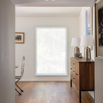
Our clients came to us with specific remodeling goals: to create a more functional mid-century home with an updated and larger kitchen, to resolve the public circulation through their primary bedroom, have a unified feel versus a house with multiple additions, and expanded views of the lovely Huron River, which is right outside their backyard.
Our solutions focused on creating a new circulation system that reconnects the entire floor plan into a cohesive whole, and reinforces the connection to the outdoor courtyards.

 ZeroEnergy Design
This LEED Platinum certified house reflects the homeowner's desire for an exceptionally healthy and comfortable living environment, within a traditional neighborhood.
INFILL SITE. The family, who moved from another area of Wellesley, sought out this property to be within walking distance of the high school and downtown area. An existing structure on the tight lot was removed to make way for the new home. 84% of the construction waste, from both the previous structure and the new home, was diverted from a landfill. ZED designed to preserve the existing mature trees on the perimeter of the property to minimize site impacts, and to maintain the character of the neighborhood as well as privacy on the site.
EXTERIOR EXPRESSION. The street facade of the home relates to the local New England vernacular. The rear uses contemporary language, a nod to the family’s Californian roots, to incorporate a roof deck, solar panels, outdoor living space, and the backyard swimming pool. ZED’s careful planning avoided to the need to face the garage doors towards the street, a common syndrome of a narrow lot.
THOUGHTFUL SPACE. Homes with dual entries can often result in duplicate and unused spaces. In this home, the everyday and formal entry areas are one and the same; the front and garage doors share the entry program of coat closets, mudroom storage with bench for removing your shoes, and a laundry room with generous closets for the children's sporting equipment. The entry area leads directly to the living space, encompassing the kitchen, dining and sitting area areas in an L-shaped open plan arrangement. The kitchen is placed at the south-west corner of the space to allow for a strong connection to the dining, sitting and outdoor living spaces. A fire pit on the deck satisfies the family’s desire for an open flame while a sealed gas fireplace is used indoors - ZED’s preference after omitting gas burning appliances completely from an airtight home. A small study, with a window seat, is conveniently located just off of the living space. A first floor guest bedroom includes an accessible bathroom for aging visitors and can be used as a master suite to accommodate aging in place.
HEALTHY LIVING. The client requested a home that was easy to clean and would provide a respite from seasonal allergies and common contaminants that are found in many indoor spaces. ZED selected easy to clean solid surface flooring throughout, provided ample space for cleaning supplies on each floor, and designed a mechanical system with ventilation that provides a constant supply of fresh outdoor air. ZED selected durable materials, finishes, cabinetry, and casework with low or no volatile organic compounds (VOCs) and no added urea formaldehyde.
YEAR-ROUND COMFORT. The home is super insulated and air-tight, paired with high performance triple-paned windows, to ensure it is draft-free throughout the winter (even when in front of the large windows and doors). ZED designed a right-sized heating and cooling system to pair with the thermally improved building enclosure to ensure year-round comfort. The glazing on the home maximizes passive solar gains, and facilitates cross ventilation and daylighting.
ENERGY EFFICIENT. As one of the most energy efficient houses built to date in Wellesley, the home highlights a practical solution for Massachusetts. First, the building enclosure reduces the largest energy requirement for typical houses (heating). Super-insulation, exceptional air sealing, a thermally broken wall assembly, triple pane windows, and passive solar gain combine for a sizable heating load reduction. Second, within the house only efficient systems consume energy. These include an air source heat pump for heating & cooling, a heat pump hot water heater, LED lighting, energy recovery ventilation, and high efficiency appliances. Lastly, photovoltaics provide renewable energy help offset energy consumption. The result is an 89% reduction in energy use compared to a similar brand new home built to code requirements.
RESILIENT. The home will fare well in extreme weather events. During a winter power outage, heat loss will be very slow due to the super-insulated and airtight envelope– taking multiple days to drop to 60 degrees even with no heat source. An engineered drainage system, paired with careful the detailing of the foundation, will help to keep the finished basement dry. A generator will provide full operation of the all-electric house during a power outage.
OVERALL. The home is a reflection of the family goals and an expression of their values, beautifully enabling health, comfort, safety, resilience, and utility, all while respecting the planet.
ZED - Architect & Mechanical Designer
Bevilacqua Builders Inc - Contractor
Creative Land & Water Engineering - Civil Engineering
Barbara Peterson Landscape - Landscape Design
Nest & Company - Interior Furnishings
Eric Roth Photography - Photography


 Alair Homes Milwaukee
This Master Suite Addition project was initiated by our Clients’ desire to stay in their family home well into their golden years. Their wish list included a master suite and large open space for entertaining. With “Aging in Place” a main objective, our goal was to move all essential tasks to the first floor. Our design created a smooth transition between old house and new by expanding their dining room and adding a vestibule between the two spaces. This resulted in a much larger dining space and the larger entertaining area they were seeking. The master bedroom’s floor to ceiling windows on two of the walls frames picturesque views of their beloved garden outside. Vaulted ceilings, French doors to the bathroom with a transom window above express class and grandeur. Through the French doors the elegant master bathroom shines with reflections from the decorative crystal chandelier, white and grey tile, polished chrome fixtures and lighted glass bowls. A double headed shower, with dual temperature controls, and the air-jetted tub provide a true sanctuary for a relaxed bathing experience. “His and Her” elements are also fulfilled with dual vanities, and dual toilet areas. Upon completion, the homeowners passionately stated that this project turned out even better than they could have imagined. They truly love their new space in their long loved home and look forward to many more years in their new haven.
 Forward Design Build Remodel
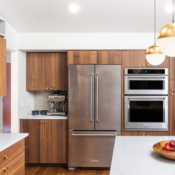
Our clients came to us with specific remodeling goals: to create a more functional mid-century home with an updated and larger kitchen, to resolve the public circulation through their primary bedroom, have a unified feel versus a house with multiple additions, and expanded views of the lovely Huron River, which is right outside their backyard.
Our solutions focused on creating a new circulation system that reconnects the entire floor plan into a cohesive whole, and reinforces the connection to the outdoor courtyards.
 Forward Design Build Remodel
Our clients came to us with specific remodeling goals: to create a more functional mid-century home with an updated and larger kitchen, to resolve the public circulation through their primary bedroom, have a unified feel versus a house with multiple additions, and expanded views of the lovely Huron River, which is right outside their backyard.
Our solutions focused on creating a new circulation system that reconnects the entire floor plan into a cohesive whole, and reinforces the connection to the outdoor courtyards.

 Harwood Design Builders Ltd.
A riverfront property is a desirable piece of property duet to its proximity to a waterway and parklike setting. The value in this renovation to the customer was creating a home that allowed for maximum appreciation of the outside environment and integrating the outside with the inside, and this design achieved this goal completely.
To eliminate the fishbowl effect and sight-lines from the street the kitchen was strategically designed with a higher counter top space, wall areas were added and sinks and appliances were intentional placement. Open shelving in the kitchen and wine display area in the dining room was incorporated to display customer's pottery. Seating on two sides of the island maximize river views and conversation potential. Overall kitchen/dining/great room layout designed for parties, etc. - lots of gathering spots for people to hang out without cluttering the work triangle.
Eliminating walls in the ensuite provided a larger footprint for the area allowing for the freestanding tub and larger walk-in closet. Hardwoods, wood cabinets and the light grey colour pallet were carried through the entire home to integrate the space.

 Lewis & Associates Designs, llc
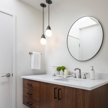
The previous doube bowl was only 60" wide! Our first goal was to give each user arm space to actually brush their teeth! By pulling the door all the way down to the end of the wall (where the tub once was), we were able to expand the vanity by over 30"+. We added drawer storage and kept the area light by floating the sink bases. Two clever tricks are in this area; 1.) the cabinet on the counter in the middle is actually full depth but is recessed into the wall so that we maximize storage while minimizing the bulk and 2.) the mirrors go all the way from behind the light fixtures to the countertop to give the illusion of a seamless, elongated, larger space.

 Van Metre Homes
Powder room - traditional white tile and subway tile medium tone wood floor and brown floor powder room idea in DC Metro with a two-piece toilet and a pedestal sink

 Jennifer Gardner Design
The classic modern design of this kitchen was planned for an active young family of four who uses the space as their central hub for gathering, eating and staying connected. Our goals were to create a beautiful and highly functional kitchen with an emphasis on cabinet organization, heated floors and incorporating a live edge slab countertop. We removed an existing bulky island and replaced it with a new island that while only 60 x 26 in size packs a powerful punch housing a baking center, trash/recycle center, microwave oven and cookbook storage. The island seemed the natural place for the gorgeous live edge slab coupled with vintage mercury glass light pendants that make for a truly stunning kitchen island. Polished carrara quartz perimeter counters pair beautifully with the watery blue-green glass backsplash tile. A message center conveniently located on a side panel of the refrigerator cabinet houses built in mailboxes, a family calendar and magnetic surface to display the children’s artwork. We are pleased to have met the family’s goals and that they love their kitchen. Design mission accomplished!
Photography by: Marcela Winspear

 William Guidero Planning and Design
Inspiration for a mid-sized transitional light wood floor and beige floor home yoga studio remodel in Orange County with white walls

 The Corner Cabinet
Carolyn & Peter were looking brighten their kitchen space, expand its ocean view, and update their cabinetry. To begin their kitchen renovation, we created a 3D rendering that addressed all their goals. During the design process, Carolyn & Peter selected Decora cabinetry for their kitchen; Prescott Maple Extra White cabinetry with a Prescott Maple Retreat painted island. They were happy with original footprint, so we updated that very little. Instead, we focused on ways to increase their storage and functionality all while, lightening the room to make it appear larger and blending the color palette into their home and their beautiful ocean view. Photo credit: Nicola Richard

 Interior Enhancement Group
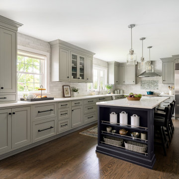
Lighter and brighter – those were our goals for this kitchen, plus we reconfigured the island to make the whole space more user-friendly. We added a larger window over the sink and chose dual-colored cabinets in a cool-warm contrast of white and greige. Photo by Matt Warren Photography

 Design Inspirations Inc.
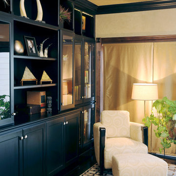
This project began right after the homeowners moved in. The only furnishings re-used were the beautiful rugs collected over time and travels. The goal was to create a welcoming space for family and friends to gather. We used the rugs as a jumping off point, choosing colourful fabrics and themes that reflect a global aesthetic. Living Room tables were carefully chosen to be individual pieces while allowing the rug to show through. The custom wall unit was designed by Teresa for the homeowners' many books and collectibles as well as the TV, and was built by Ian Schroeder of Forest Hill Woodwork and Cabinetry. Benches were added under the windows to maximize seating for larger gatherings.
Photos by Kelly Horkoff, kwestimages.com
 Grit Construction LLC
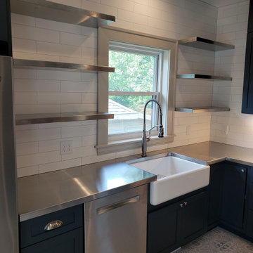
This kitchen remodel was part of a larger project we completed for this client. Their goal was to put an addition on the existing home, increase the kitchen size, add a half bathroom, and rework the second floor layout to include a complete bathroom remodel. The focal point of this part of the remodel was to create a large beautiful kitchen to enjoy for years to come!
 Harwood Design Builders Ltd.
A riverfront property is a desirable piece of property duet to its proximity to a waterway and parklike setting. The value in this renovation to the customer was creating a home that allowed for maximum appreciation of the outside environment and integrating the outside with the inside, and this design achieved this goal completely.
To eliminate the fishbowl effect and sight-lines from the street the kitchen was strategically designed with a higher counter top space, wall areas were added and sinks and appliances were intentional placement. Open shelving in the kitchen and wine display area in the dining room was incorporated to display customer's pottery. Seating on two sides of the island maximize river views and conversation potential. Overall kitchen/dining/great room layout designed for parties, etc. - lots of gathering spots for people to hang out without cluttering the work triangle.
Eliminating walls in the ensuite provided a larger footprint for the area allowing for the freestanding tub and larger walk-in closet. Hardwoods, wood cabinets and the light grey colour pallet were carried through the entire home to integrate the space.
25