
Search results for "Larger goals" in Home Design Ideas

 Renovisions
When these Canton, MA homeowners desired to upgrade their childrens’ bathroom, they were referred to Renovisions who were grateful to accept the task. The clients were unhappy with the existing cramped floor plan, lack of storage, old and drafty windows, outdated fixtures and overall lackluster aesthetic.
Renovisions designed the new room to not only meet the client’s goals, but exceeded them abundantly. Mobility in the space was limited due to the door swing into the room. Renovisions recommended replacing the currenmt door with a pocket door in an arch-top beaded design to match the nearby bedroom doors, while also upgrading the hallway linen closet with new shelving and same styled door.
Renovisions also increased the layout by borrowing space from the adjacent dining room. There is now more room for the handsome, quartered-mahogany wall-hung vanity with linen tower.
Since the homeowners requested a contemporary look, the design team focused on choosing more modern products including a soaking tub, minimalistic square designed shower heads, tub filler, single lever faucet and a large rectangular sink. The white quartz countertop with wide veining and waterfall edge, along with the striking larger format subway tile finished with square edge chrome profiles contribute to the clean aethetic and modern appeal.
From the sleek porcelain plank floor tile, new double-mulled Marvin casement windows and recessed lighting that provides just the right amount of light, the end result: a one-of-a-kind bathroom, a unique and modern ‘Revitalized Room’.

 Southwest Boulder & Stone
Joe and Tod, homeowners in the Vintage Hills area of Temecula, undertook this yard transformation themselves. Their goal was to replace a lawned portion of the right side of their front yard with drought-tolerant plants and rock complementing the existing landscaping.
The homeowners began the project by transplanting kangaroo paw, yucca, lantana and jade plants. Some of the plants made the journey from their former home in Long Beach and others came from thinning out existing plants in the yard. In addition to designing the space together, they also installed the project themselves. The small, light gray boulders and cobble were already located on the property, and closely resemble Sierra boulders. Gambler's Gold 3/4" crushed rock was used to create the "islands" around the plants, with 3/4" gray crushed rock to fill in the larger areas. Premium Sunburst pebbles in the 1"-3" size finished the area off as the border with the neighbor's property.

 kimberly peck architect
photos by Pedro Marti
The main goal of this renovation was to improve the overall flow of this one bedroom. The existing layout consisted of too much unusable circulation space and poorly laid out storage located at the entry of the apartment. The existing kitchen was an antiquated, small enclosed space. The main design solution was to remove the long entry hall by opening the kitchen to create one large open space that interacted with the main living room. A new focal point was created in the space by adding a long linear element of floating shelves with a workspace below opposite the kitchen running from the entry to the living space. Visually the apartment is tied together by using the same material for various elements throughout. Grey oak is used for the custom kitchen cabinetry, the floating shelves and desk, and to clad the entry walls. Custom light grey acid etched glass is used for the upper kitchen cabinets, the drawer fronts below the desk, and the tall closet doors at the entry. In the kitchen black granite countertops wrap around terminating with a raised dining surface open to the living room. The black counters are mirrored with a soft black acid etched backsplash that helps the kitchen feel larger as they create the illusion of receding. The existing floors of the apartment were stained a dark ebony and complimented by the new dark metallic porcelain tiled kitchen floor. In the bathroom the tub was replaced with an open shower. Brown limestone floors flow straight from the bathroom into the shower with out a curb, European style. The walls are tiled with a large format light blue glass.
Find the right local pro for your project

 Jill Pfeiffer Design
The driving force behind this remodel project was to form a cohesive space on the first floor. This entailed developing a larger kitchen, re-functioning the space of the living room and updating the fireplace, stairwell and lastly the master suite.
In order to achieve this concept, the existing wall that separated the dining room and kitchen was removed. Opening up this space allows for a continuous flow, and enables for a kitchen nook complete with an eating tabletop that connects with the kitchen island. The illumination in the kitchen and dining was updated to contemporary light fixtures.
Updating the fireplace and TV area in the family room added in another important element, the client’s desire to create a “sweet spot” for his passion of music. This called for altering the existing living room and turning it into a music space. Within the newly designed music room, a custom sofa was developed to fit into the space and placing speakers in the appropriate corners allows him to accomplish his “sweet spot” goals. All while being incorporated into the greater living space.
Finally, the curved custom tile work on the floor in the master bathroom creates the sense of an organic
spa like retreat for the clients. The high ceiling and clear glass of the large shower open the space and
allow for the focal point of the standing tub to be highlighted.
Other heighten features include a custom wood front door, stone work on the stairwell, custom organic
maple coffee table complete with live edges, pantry/ bar area and wall hung vanity cabinets.
 Jill Pfeiffer Design
The driving force behind this remodel project was to form a cohesive space on the first floor. This entailed developing a larger kitchen, re-functioning the space of the living room and updating the fireplace, stairwell and lastly the master suite.
In order to achieve this concept, the existing wall that separated the dining room and kitchen was removed. Opening up this space allows for a continuous flow, and enables for a kitchen nook complete with an eating tabletop that connects with the kitchen island. The illumination in the kitchen and dining was updated to contemporary light fixtures.
Updating the fireplace and TV area in the family room added in another important element, the client’s desire to create a “sweet spot” for his passion of music. This called for altering the existing living room and turning it into a music space. Within the newly designed music room, a custom sofa was developed to fit into the space and placing speakers in the appropriate corners allows him to accomplish his “sweet spot” goals. All while being incorporated into the greater living space.
Finally, the curved custom tile work on the floor in the master bathroom creates the sense of an organic
spa like retreat for the clients. The high ceiling and clear glass of the large shower open the space and
allow for the focal point of the standing tub to be highlighted.
Other heighten features include a custom wood front door, stone work on the stairwell, custom organic
maple coffee table complete with live edges, pantry/ bar area and wall hung vanity cabinets.

 Zieba Builders, Inc.
Built in the 1960’s, this 1,566 sq. ft. single story home needed updating and visual interests. The clients love to entertain and wanted to create a welcoming, fun atmosphere. Their wish lists were to have an enclosed courtyard to utilize the outdoor space, an open floor plan providing a bigger kitchen and better flow, and to incorporate a mid-century modern style.
The goal of this project was to create an open floor plan that would allow for better flow and function, thereby providing a more usable workspace and room for entertaining. We also incorporate the mid-century modern feel throughout the entire home from the inside to the out, bringing elements of design to all the spaces resulting in a completely uniform home.
Opening-up the space and removing any visual barriers resulted in the interior and exterior spaces appearing much larger. This allowed a much better flow into the space, and a flood of natural sunlight from the windows into the living area. We were able to enclose the outside front space with a rock wall and a gate providing additional square footage and a private outdoor living space. We also introduced materials such as IPE wood, stacked stone, and metal to incorporate into the exterior which created a warm, aesthetically pleasing, and mid-century modern courtyard.
 Bilotta Kitchen & Home
Written by Mary Kate Hogan for Westchester Home Magazine.
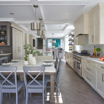
"The Goal: The family that cooks together has the most fun — especially when their kitchen is equipped with four ovens and tons of workspace. After a first-floor renovation of a home for a couple with four grown children, the new kitchen features high-tech appliances purchased through Royal Green and a custom island with a connected table to seat family, friends, and cooking spectators. An old dining room was eliminated, and the whole area was transformed into one open, L-shaped space with a bar and family room.
“They wanted to expand the kitchen and have more of an entertaining room for their family gatherings,” says designer Danielle Florie. She designed the kitchen so that two or three people can work at the same time, with a full sink in the island that’s big enough for cleaning vegetables or washing pots and pans.
Key Features:
Well-Stocked Bar: The bar area adjacent to the kitchen doubles as a coffee center. Topped with a leathered brown marble, the bar houses the coffee maker as well as a wine refrigerator, beverage fridge, and built-in ice maker. Upholstered swivel chairs encourage people to gather and stay awhile.
Finishing Touches: Counters around the kitchen and the island are covered with a Cambria quartz that has the light, airy look the homeowners wanted and resists stains and scratches. A geometric marble tile backsplash is an eye-catching decorative element.
Into the Wood: The larger table in the kitchen was handmade for the family and matches the island base. On the floor, wood planks with a warm gray tone run diagonally for added interest."
Bilotta Designer: Danielle Florie
Photographer: Phillip Ennis


 Tiffany Brooks, HGTV Host & Interior Designer
Inquire About Our Design Services
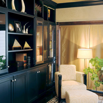
When we first started talking in the spring of 2015, I was impressed. She was witty, realistic, and understood that as much as she loves my shows on HGTV, design does not does not happen in 43 minutes! She told me about her space, and how she felt that her bedroom seemed “blah” to her. She had no retreat. Molly desperately longed for a place that she could spend time in, read in, play in and above all, relax in.
What we did:
Many people are terrified of hiring a designer. Rightfully so, they are investing a pretty penny in their homes. They want to make sure that everything, down to the last floral arrangement, is to their liking, because they will have to live it (and pay for it). Unfortunately, a client can unintentionally stifle a designer’s creativity through micro-management. This can produce lackluster results and ultimately cause more time (and money) to be spent on a project than is really necessary.
With Molly, that was never an issue. Before she even showed me the room in question, she said that I could have full creative license to do what I needed to do to her bedroom. SAY WHAAH!?
With Molly giving me complete creative freedom, I planned everything out and got down to business. The result: Bite-your-bottom-lip sexy. I don’t get jealous of too many of my clients’ spaces, but this one still takes my breath away every time I look at the pics!
The craziest part was that by adding more furniture, it actually made the space feel larger.
Molly and her husband Patrick loved the finished space, and promised me I will be back to finish the rest of the house!
Here’s the highlights of the rest of the project:
I came up with a space plan with three options.
Next, we reviewed mood boards and fabric schemes that would work for both Molly and her hubby Patrick.
We started with the bed. My goal was to add edge to its otherwise traditional style.
We decided to spice things up by painting the trim work in the room black.
We built in layers of lighting with dimmers. In a bedroom everything should be on dimmers, right? Right.
We designed and customized bedding, chairs and window treatments.
Together with Molly, we selected the most perfect wallpaper. This geometric “grasscloth” adds so much depth and dimension that was just missing before.
What I love:
That light fixture. I mean it is really, really amazing in person.
The porcupine mirror. This thing came packaged like it was the hope diamond, and everyone was terrified to handle it. But it really became a highlight of the room.
 Renovisions
When these Canton, MA homeowners desired to upgrade their childrens’ bathroom, they were referred to Renovisions who were grateful to accept the task. The clients were unhappy with the existing cramped floor plan, lack of storage, old and drafty windows, outdated fixtures and overall lackluster aesthetic.
Renovisions designed the new room to not only meet the client’s goals, but exceeded them abundantly. Mobility in the space was limited due to the door swing into the room. Renovisions recommended replacing the currenmt door with a pocket door in an arch-top beaded design to match the nearby bedroom doors, while also upgrading the hallway linen closet with new shelving and same styled door.
Renovisions also increased the layout by borrowing space from the adjacent dining room. There is now more room for the handsome, quartered-mahogany wall-hung vanity with linen tower.
Since the homeowners requested a contemporary look, the design team focused on choosing more modern products including a soaking tub, minimalistic square designed shower heads, tub filler, single lever faucet and a large rectangular sink. The white quartz countertop with wide veining and waterfall edge, along with the striking larger format subway tile finished with square edge chrome profiles contribute to the clean aethetic and modern appeal.
From the sleek porcelain plank floor tile, new double-mulled Marvin casement windows and recessed lighting that provides just the right amount of light, the end result: a one-of-a-kind bathroom, a unique and modern ‘Revitalized Room’.
 Twelve Stones Designs, LLC
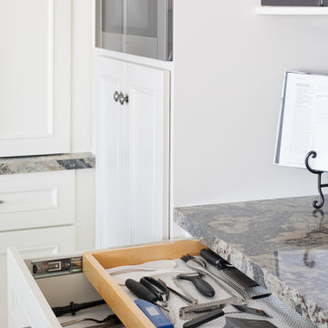
The owners of this kitchen had spent the money to upgrade the finishes in their kitchen upon building the home 12 years ago, but after living in the space for several years they realized how nonfunctional the layout really was. The (then) two preschool aged children had grown into busy, hungry teenagers with many friends who also liked to hang out at the house. So the family needed a more functional kitchen with better traffic flow, space for daily activities revolving around the kitchen at different times of day, and a kitchen that could accommodate cooking for and serving large groups. Furthermore, the dark, traditional finishes no longer reflected the homeowners’ style. They requested a brighter, more relaxed, coastal style that reflected their love of the seaside cities they like to visit.
Originally, the kitchen was U-shaped with a narrow island in the middle. The island created narrow aisles that bottle-necked at the dishwasher, refrigerator, and cooktop areas. There was a pass-through from the foyer into the kitchen, but the owners never liked that the pass-through was also located so close to the powder room. The awkward proximity was unappealing and made guests feel uncomfortable.
The kitchen’s storage was made up of lots of narrow cabinets, apothecary drawers, clipped corner units, and very few drawers. It lacked useful storage for the larger items the family used on a daily basis. And the kitchen’s only pantry was small closet that had only builder-grade, narrow shelving with no illumination to be able to see the contents inside.
Overall, the kitchen’s lighting plan was poorly executed. Only six recessed cans illuminated the entire kitchen and nook areas. The under cabinet lighting was not evenly distributed either. In fact, the builder had mis-placed the under cabinet lighting around the decorative pilasters which made for choppy, dark cubbies. Further, the builder didn’t include any lighting over the sink or the bar area, which meant whoever was doing the dishes was always in their own shadow. That, coupled with the steep overhang of the game room above made the bar area feel like a dim, cavernous space that wasn’t inviting or task oriented. The kitchen looked out into the main living space, but the raised bar and a narrow wall (which held the only large cabinet in the kitchen) created more of a barrier than a relationship to the living room or breakfast nook. In fact, one couldn’t even see the breakfast nook from the cooktop or sink areas due to its orientation. The raised bar top was too narrow to comfortably sit to either dine at or chat from due to the lack of knee space. The the homeowners confided that the kitchen felt more like a dark, dirty prison than place where the family, or their guests, wanted to gather and commune.
The clients' needs and desires were:
➢ to create a kitchen that would be a space the family loved to be in; to relate to the adjacent spaces all around, and to have better flow for entertaining large groups
➢ to remove the walls between the breakfast nook and living area and to be able to utilize the natural light from the windows in both those areas
➢ to incorporate a functional chopping block for prepping fresh food for home cooked meals, an island with a large sink and drain board, 2 pull out trash cans, and seating for at least the 2 teens to eat or do homework
➢ to design a kitchen and breakfast nook with an airy, coastal, relaxed vibe that blended with the rest of the house's coastal theme
➢ to integrate a layered lighting plan which would include ample general illumination, specific task lighting, decorative lighting, and lots of illuminated storage
➢ to design a kitchen with not only more storage for all the husband’s kitchen gadgets and collection of oils and spices, but smart storage, including a coffee/breakfast bar and a place to store and conceal the toaster oven and microwave
➢ to find a way to utilize the large open space between the kitchen, pantry area, and breakfast nook
Twelve Stones Designs achieved the owner's goals by:
➢ removing the walls between the kitchen and living room to allow the natural light to filter in from the adjacent rooms and to create a connection between the kitchen, nook, and living spaces for a sense of unity and communion
➢ removing the existing pantry and designing 3 large pantry style cabinets with LED tape lights and rollout drawers to house lots of kitchen appliances, gadgets, and tons of groceries. We also took the cabinets all the way up to the 9’ ceiling for additional storage for seasonal items and bulk storage.
➢ designing 2 islands - 1 with a gorgeous black walnut chopping block that houses a drawer for chopping and carving knives and a custom double pull out trash unit for point of use utilization - and 1 that houses the dishwasher, a large Blanco Gourmet sink with integrated drain board, woven baskets for fresh root vegetables and kitchen towels, plenty of drawer storage for kitchen items, and bar seating for up to 4 diners.
➢ closing off the space between the kitchen and the powder room to create a beautiful new private alcove for the powder room as well as adding some decorative storage. This also gave us space to include more tall storage near the new range for precision placement of the husband’s extensive oil and spice collection as well as a location for a combo-steam oven the wife wanted for baking and cooking healthy meals.
The project is enhanced functionally by:
➢ incorporated USB and standard receptacles for the kids’ laptops and phone charging in the large island
➢ designing the small island to include additional open shelving for items used on a daily basis such as a variety of bowls, plates, and colanders. This set up also works well for the husband who prefers to “plate” his dinners in restaurant-style fashion before presenting them to the table.
➢ the integration of specific storage units, such as double stacked cutlery drawers, a custom spice pull-out, a Kuerig coffee and tea pod drawer, and custom double stacked utensil drawers
➢ moving the refrigerator to the old oven location - this eliminated the bottle neck as well as created a better relationship to the eating table. It also utilizes the floor space between the pantry, nook, and kitchen
➢ creating a banquet style breakfast nook - this banquette seating not only doubles the amount of seating for large gatherings but it better utilizes the odd space between the kitchen and the previous nook area. It also helps to create a distinct pathway from the mudroom room through the pantry area, kitchen, nook, and living room.
➢ the coffee/breakfast bar area which includes the perfect location for the concealed microwave and toaster oven, convenient storage for the coffee pods and tea accoutrements. Roll-out drawers below also house the smoothie maker, hot water kettle, and a plethora of smoothie-making ingredients such as protein powders, smoothie additives, etc. Furthermore, the drawers below the Keurig house measuring utensil, cutlery, baking supplies and tupperware storage.
➢ incorporating lots of wide drawers and pullouts to accommodate large cookware.
➢ utilizing as much vertical space as possible by building storage to the ceiling which accommodates the family’s abundant amount of serving platters, baking sheets, bakeware, casserole dishes, and additional cutting boards.
The project is enhanced aesthetically by:
➢ new 5-piece Versailles pattern porcelain tile that now seamlessly joins the entire down stairs area together creating a bright, cohesiveness feeling instead of choppy separated spaces - it also adds a coastal feeling
➢ designing a cabinet to conceal the microwave and toaster oven
➢ the coastal influenced light fixtures over the nook table and island
➢ the sandy colors of the Langdon Cambria countertops. The swirling pattern and sparkling quartz pieces remind the homeowner of black-and-tan sandy beaches
➢ the striped banquet seating whose creamy white background and blue-green stripes were the inspiration for the cabinet and wall colors.
➢ All the interior doors were painted black to coordinate with the blacks and grays in the backsplash tile and countertop. This also adds a hint of tailored formality to an otherwise casual space.
➢ the use of WAC's Oculux small aperture LED units for the overhead lighting complimented with Diode LED strips for task lighting under the cabinets and inside the pantry and glass wall cabinets. All of the lighting applications are on separate dimmer switches.
Innovative uses of materials or construction methods by Realty Restoration LLC:
➢ Each 1-1/2” x 3” block of reclaimed end-grain black walnut that makes up the center island chopping block was hand milled and built in the shop. It was designed to look substantial and proportional to the surrounding elements, executed by creating the 4 inch tall top with a solid wood chamfered edge band.
➢ The metal doors on either side of the vent hood were also custom designed for this project and built in the Realty Restoration LLC shop. They are made 1x2, 11-gauge mild steel with ribbed glass. Weighing 60 lbs a piece, heavy duty cabinet hinges were added to support the weight of the door and keep them from sagging.
➢ Under-cabinet receptacles were added along the range wall in order to have a clean, uninterrupted backsplash.
Design obstacles to overcome:
➢ Because we were removing the demising walls between the kitchen and living room, we had to find a way to plumb and vent the new island. We did this by tunneling through the slab (the slab had post tension cables which prevented us from just trenching) to run a new wet vent through a nearby structural wall. We pulled the existing hot and cold lines between upper floor joists and ran them down the structural wall as well and up through a conduit in the tunnel.
➢ Since we were converting from wall overs to a gas range it allowed us to utilize the 220 feed for the wall ovens to provide a new sub panel for all the new kitchen circuits
➢ Due to framing deficiencies inherited from the original build there was a 1-1/2” differential in the floor-to-ceiling height over a 20 foot span; by utilizing the process of cutting and furring coupled with the crown moulding details on the cabinet elevations we were able to mask the problem and provide seamless transitions between the cabinet components.
Evidence of superior craftsmanship:
➢ uniquely designed, one-of-a-kind metal “X” end panels on the large island. The end panels were custom made in the Realty Restoration LLC shop and fitted to the exact dimensions of the island. The welding seams are completely indistinguishable - the posts look like they are cut from a single sheet of metal
➢ square metal posts on the small island were also custom made and designed to compliment and carry through the metal element s throughout the kitchen
➢ the beautiful, oversized end panels on the pantry cabinets which give the breakfast nook a tailored look
➢ integrating a large format 5 piece Versailles tile pattern to seamlessly flow from the existing spaces into the new kitchen space
➢ By constructing a custom cabinet that jogged around a corner we could not remodel (housing the entry way coat closet) we were able to camouflage the adjacent wall offset within the upper and lower cabinets. By designing around the existing jog in the structural walls we accomplished a few things: we were able to find the space to house, and hide, the microwave and toaster oven yet still have a clean cohesive appearance from the kitchen side. Additionally, the owners were able to keep their much needed coat closet and we didn’t have to increase the budget with unnecessary structural work.

 Klopf Architecture
 completely remodeled this once dark Eichler house in Palo Alto creating a more open, bright and functional family home. The reconfigured great room with new full height windows and sliding glass doors blends the indoors with the newly landscaped patio and seating areas outside. The former galley kitchen was relocated and was opened up to have clear sight lines through the great room and out to the patios and yard, including a large island and a beautiful walnut bar countertop with seating. An integrated small front addition was added allowing for a more spacious master bath and hall bath layouts. With the removal of the old brick fireplace, larger sliding glass doors and multiple skylights now flood the home with natural light.
The goals were to work within the Eichler style while creating a more open, indoor-outdoor flow and functional spaces, as well as a more efficient building envelope including a well insulated roof, providing solutions that many Eichler homeowners appreciate. The original entryway lacked unique details; the clients desired a more gracious front approach. The historic Eichler color palette was used to create a modern updated front facade.
Durable grey porcelain floor tiles unify the entire home, creating a continuous flow. They, along with white walls, provide a backdrop for the unique elements and materials to stand on their own, such as the brightly colored mosaic tiles, the walnut bar and furniture, and stained ceiling boards. A secondary living space was extended out to the patio with the addition of a bench and additional seating.
This Single family Eichler 4 bedroom 2 bath remodel is located in the heart of the Silicon Valley.
Klopf Architecture Project Team: John Klopf, Klara Kevane, and Ethan Taylor
Contractor: Coast to Coast Construction
Landscape Contractor: Discelli
Structural Engineer: Brian Dotson Consulting Engineer
Photography ©2018 Mariko Reed
Location: Palo Alto, CA
Year completed: 2017

 Studio1Plaster
Inspiration for a large timeless carpeted home weight room remodel in Los Angeles with beige walls

 Castle Building & Remodeling
Homeowners in Richfield came to Castle looking to update their 1956 Kitchen in their ranch style home. The goal was to keep the same U-Shaped footprint of the kitchen while maximizing the cabinet layout configuration. The overall transformation is stunning.
One major adjustment was installing the upper cabinets to the ceiling. This draws your eyes up and gives the room a larger feel with the added storage that was previously nonexistent. The java color stained Crystal Cabinets are balanced with clean polished nickel hardware.
Another part of the project that was important to the homeowners was lighting. The existing configuration was dark, with very little over head light or task lighting. With adding in disc LED light fixtures in the ceiling, decorative pendant and wall sconce lighting over the sink, the space now is light and bright even with selecting darker finishes.
To top off this project, Designer Tracy O’Donnell curated a gorgeous tile feature above the farmhouse sink. The picture framed Carrara marble herringbone mosaic tile features natural colors that play off the countertop and warmth of the cabinets beautifully. Overall, the homeowners couldn’t be happier with how it all turned out!
 Magikflame
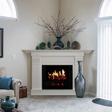
The Churchill corner electric fireplace inspired by MagikFlame is the ideal unit for going into the corner of your home or condo/apartment where two walls come together. Discover our electric fireplaces: https://magikflame.com/product-category/buy-electric-fireplaces/
The triangular shape goes perfectly into the 90 degree angle between your walls, and a TV can be placed above. Clean, beautiful styling is perfect for modern and traditional homes. Built in America with our patented Holographic projection technology. Also includes a heater and can be operated with an iPhone app or built in touch screen. Includes a 5,200 BTU heater to warm 800 sq/ft.
Dimensions: 52"W x 42"T x 40.5"D
At MagikFlame, our goal is to create the most realistic electric fireplaces ever made. We also believe in improving quality of life by providing people with the best possible cozy and relaxing environment every night. Using our patented holoflame technology, we've innovated the electric fireplace to bring you effortless cozy with friends and family. Because quality family time and relaxation after a hard workday or activity is life changing.
Experience 30 Flames. Built-In Heater. Sound.
Subscribe to our channel for tips on how to enhance your interior design, accessories, and focal points. Learn more about fireplace technology and the cozy, relaxation, and family atmosphere improvements to your home. We have everything you need to guide you on a journey to forge the American home and better living atmosphere.
Shop With Us Online: https://magikflame.com
Like MagikFlame on Facebook: https://www.facebook.com/MagikFlame
Follow MagikFlame on Instagram: https://www.instagram.com/magikflamefireplaces/
Tweet With Us: https://twitter.com/MagikFlameFire
Pin With Us: https://www.pinterest.com/MagikFlameElectricFireplaces
We attempt to be as accurate as possible. However, MagikFlame cannot guarantee that product descriptions, images or other content of products or services are 100% accurate, complete, reliable, current, or error-free. Some items may appear slightly larger or smaller than the actual size due to screen defaults and photography techniques. This also includes any momentary stutters or artifacts in frames of the flame video loop. Other items may be represented at a larger than the actual size in order to clearly show details, or smaller than the actual size to show the entire item.
 Southwest Boulder & Stone
Joe and Tod, homeowners in the Vintage Hills area of Temecula, undertook this yard transformation themselves. Their goal was to replace a lawned portion of the right side of their front yard with drought-tolerant plants and rock complementing the existing landscaping.
The homeowners began the project by transplanting kangaroo paw, yucca, lantana and jade plants. Some of the plants made the journey from their former home in Long Beach and others came from thinning out existing plants in the yard. In addition to designing the space together, they also installed the project themselves. The small, light gray boulders and cobble were already located on the property, and closely resemble Sierra boulders. Gambler's Gold 3/4" crushed rock was used to create the "islands" around the plants, with 3/4" gray crushed rock to fill in the larger areas. Premium Sunburst pebbles in the 1"-3" size finished the area off as the border with the neighbor's property.
 Castle Building & Remodeling
Homeowners in Richfield came to Castle looking to update their 1956 Kitchen in their ranch style home. The goal was to keep the same U-Shaped footprint of the kitchen while maximizing the cabinet layout configuration. The overall transformation is stunning.
One major adjustment was installing the upper cabinets to the ceiling. This draws your eyes up and gives the room a larger feel with the added storage that was previously nonexistent. The java color stained Crystal Cabinets are balanced with clean polished nickel hardware.
Another part of the project that was important to the homeowners was lighting. The existing configuration was dark, with very little over head light or task lighting. With adding in disc LED light fixtures in the ceiling, decorative pendant and wall sconce lighting over the sink, the space now is light and bright even with selecting darker finishes.
To top off this project, Designer Tracy O’Donnell curated a gorgeous tile feature above the farmhouse sink. The picture framed Carrara marble herringbone mosaic tile features natural colors that play off the countertop and warmth of the cabinets beautifully. Overall, the homeowners couldn’t be happier with how it all turned out!
 Castle Building & Remodeling
Homeowners in Richfield came to Castle looking to update their 1956 Kitchen in their ranch style home. The goal was to keep the same U-Shaped footprint of the kitchen while maximizing the cabinet layout configuration. The overall transformation is stunning.
One major adjustment was installing the upper cabinets to the ceiling. This draws your eyes up and gives the room a larger feel with the added storage that was previously nonexistent. The java color stained Crystal Cabinets are balanced with clean polished nickel hardware.
Another part of the project that was important to the homeowners was lighting. The existing configuration was dark, with very little over head light or task lighting. With adding in disc LED light fixtures in the ceiling, decorative pendant and wall sconce lighting over the sink, the space now is light and bright even with selecting darker finishes.
To top off this project, Designer Tracy O’Donnell curated a gorgeous tile feature above the farmhouse sink. The picture framed Carrara marble herringbone mosaic tile features natural colors that play off the countertop and warmth of the cabinets beautifully. Overall, the homeowners couldn’t be happier with how it all turned out!
 Klopf Architecture
 completely remodeled this once dark Eichler house in Palo Alto creating a more open, bright and functional family home. The reconfigured great room with new full height windows and sliding glass doors blends the indoors with the newly landscaped patio and seating areas outside. The former galley kitchen was relocated and was opened up to have clear sight lines through the great room and out to the patios and yard, including a large island and a beautiful walnut bar countertop with seating. An integrated small front addition was added allowing for a more spacious master bath and hall bath layouts. With the removal of the old brick fireplace, larger sliding glass doors and multiple skylights now flood the home with natural light.
The goals were to work within the Eichler style while creating a more open, indoor-outdoor flow and functional spaces, as well as a more efficient building envelope including a well insulated roof, providing solutions that many Eichler homeowners appreciate. The original entryway lacked unique details; the clients desired a more gracious front approach. The historic Eichler color palette was used to create a modern updated front facade.
Durable grey porcelain floor tiles unify the entire home, creating a continuous flow. They, along with white walls, provide a backdrop for the unique elements and materials to stand on their own, such as the brightly colored mosaic tiles, the walnut bar and furniture, and stained ceiling boards. A secondary living space was extended out to the patio with the addition of a bench and additional seating.
This Single family Eichler 4 bedroom 2 bath remodel is located in the heart of the Silicon Valley.
Klopf Architecture Project Team: John Klopf, Klara Kevane, and Ethan Taylor
Contractor: Coast to Coast Construction
Landscape Contractor: Discelli
Structural Engineer: Brian Dotson Consulting Engineer
Photography ©2018 Mariko Reed
Location: Palo Alto, CA
Year completed: 2017
 Renovisions
When these Canton, MA homeowners desired to upgrade their childrens’ bathroom, they were referred to Renovisions who were grateful to accept the task. The clients were unhappy with the existing cramped floor plan, lack of storage, old and drafty windows, outdated fixtures and overall lackluster aesthetic.
Renovisions designed the new room to not only meet the client’s goals, but exceeded them abundantly. Mobility in the space was limited due to the door swing into the room. Renovisions recommended replacing the currenmt door with a pocket door in an arch-top beaded design to match the nearby bedroom doors, while also upgrading the hallway linen closet with new shelving and same styled door.
Renovisions also increased the layout by borrowing space from the adjacent dining room. There is now more room for the handsome, quartered-mahogany wall-hung vanity with linen tower.
Since the homeowners requested a contemporary look, the design team focused on choosing more modern products including a soaking tub, minimalistic square designed shower heads, tub filler, single lever faucet and a large rectangular sink. The white quartz countertop with wide veining and waterfall edge, along with the striking larger format subway tile finished with square edge chrome profiles contribute to the clean aethetic and modern appeal.
From the sleek porcelain plank floor tile, new double-mulled Marvin casement windows and recessed lighting that provides just the right amount of light, the end result: a one-of-a-kind bathroom, a unique and modern ‘Revitalized Room’.
 Castle Building & Remodeling
Homeowners in Richfield came to Castle looking to update their 1956 Kitchen in their ranch style home. The goal was to keep the same U-Shaped footprint of the kitchen while maximizing the cabinet layout configuration. The overall transformation is stunning.
One major adjustment was installing the upper cabinets to the ceiling. This draws your eyes up and gives the room a larger feel with the added storage that was previously nonexistent. The java color stained Crystal Cabinets are balanced with clean polished nickel hardware.
Another part of the project that was important to the homeowners was lighting. The existing configuration was dark, with very little over head light or task lighting. With adding in disc LED light fixtures in the ceiling, decorative pendant and wall sconce lighting over the sink, the space now is light and bright even with selecting darker finishes.
To top off this project, Designer Tracy O’Donnell curated a gorgeous tile feature above the farmhouse sink. The picture framed Carrara marble herringbone mosaic tile features natural colors that play off the countertop and warmth of the cabinets beautifully. Overall, the homeowners couldn’t be happier with how it all turned out!
63