
Search results for "Larger goals" in Home Design Ideas

 Michael Nash Design, Build & Homes
2010 CAPTIAL COTY, HONORABLE MENTION AWARD WINNER, RESIDENTIAL
The owners of this single family home were seeking a more colorful, contemporary kitchen style. Other goals for the renovation included having larger appliances, better traffic flow, better lighting and other updated amenities.
To help the couple achieve their goals, the design team at Michael Nash Design, Build & Homes relocated all the electrical and plumbing from the bulk heads to create additional cabinet space. Then, they opened up the bearing wall between the family room and kitchen using structural beams and brought plumbing for a wall mounted faucet and a vessel sink for the wet bar. A new pantry replaced the old doorway to the dining room.
All of the new appliances were relocated to the wall between the kitchen and dining room that was previously blank. It now houses a new 36” refrigerator and 36” freezer, double ovens, and additional cabinets. A central island was installed to accommodate a large cooktop.
The design team then suggested double stack upper cabinetry that contains stainless steel glass door cabinets in upper part with a cobalt blue high-gloss lacquer on the lower part. Use of complementary exotic granite to tie in stainless steel appliances and color of the cabinets is one of the nice features of this job.
The entire kitchen and leading hallway to the front foyer was filled in with very contemporary metallic porcelain tiles. Use of LED lighting, pendant lights and creative paint were just of few of the finishing touches. An old brick fireplace in the family room was covered in granite that complements the kitchen’s colors to facilitate the new connection between the two rooms.
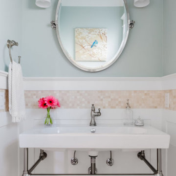
 Kimberlee Marie Interiors
This 1950s home got a major update and addition. It went from a modest three bedroom, two bath house to a beautiful five bedroom, four bath house. Our clients were outgrowing their home but loved their neighborhood and didn't want to move. So they decided to modify their existing home to bring it up to speed with their family's needs. The main goals were to enlarge the main living spaces and make the floor plan more open. This was primarily achieved by adding a second story which allowed new bedrooms to be created, freeing up space on the main floor for a larger kitchen, dining room, and living room. The soothing creams, blues, grays, and warm wood tones used throughout help make this home inviting, and the craftsman details add charm and character, ensuring our clients will be proud to call this space "home" for years to come.
---
Project designed by interior design studio Kimberlee Marie Interiors. They serve the Seattle metro area including Seattle, Bellevue, Kirkland, Medina, Clyde Hill, and Hunts Point.
For more about Kimberlee Marie Interiors, see here: https://www.kimberleemarie.com/
To learn more about this project, see here
https://www.kimberleemarie.com/greenlakecraftsman
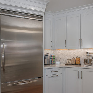
 Reico Kitchen & Bath
Designed by Christine Wade of Reico Kitchen & Bath in Salem, VA, this small kitchen remodeling project features a modern style inspired design with Merillat Masterpiece cabinets in the Martel door style with a Dove White finish. Kitchen countertops are Spectrum Sterling.
The kitchen also includes a Carrara Mosaic 1x2 Herringbone tile backsplash and Viking appliances.
“The old kitchen had black cabinets and old halogen lighting. My goal for the kitchen remodel was to have a brighter space,” said the client.
“Changing to LED lighting, changing from black to white cabinetry and lowering countertops to all one level were keys to meeting that goal. Although the layout was a galley style kitchen, removing side walls opened up the space and created a feeling that the space was bigger even though the footprint didn’t change.”
“The customer originally wanted to open up and take out the columns. After doing research and some preliminary probing we found that one of the columns was the main concrete structure for the building,” said Christine.
“With that in mind we were able to still open up the space and give the illusion of the kitchen being larger even though it’s the same foot print as before. For the bar, there was a piece of furniture that we added an end panel to the side of the wine fridge and a quartz top too. We also added shiplap, mantel, tile and additional molding around the built-in open shelves at the fireplace."
Photos courtesy of Sowder Group LLC.
Find the right local pro for your project
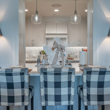 Reico Kitchen & Bath
Designed by Christine Wade of Reico Kitchen & Bath in Salem, VA, this small kitchen remodeling project features a modern style inspired design with Merillat Masterpiece cabinets in the Martel door style with a Dove White finish. Kitchen countertops are Spectrum Sterling.
The kitchen also includes a Carrara Mosaic 1x2 Herringbone tile backsplash and Viking appliances.
“The old kitchen had black cabinets and old halogen lighting. My goal for the kitchen remodel was to have a brighter space,” said the client.
“Changing to LED lighting, changing from black to white cabinetry and lowering countertops to all one level were keys to meeting that goal. Although the layout was a galley style kitchen, removing side walls opened up the space and created a feeling that the space was bigger even though the footprint didn’t change.”
“The customer originally wanted to open up and take out the columns. After doing research and some preliminary probing we found that one of the columns was the main concrete structure for the building,” said Christine.
“With that in mind we were able to still open up the space and give the illusion of the kitchen being larger even though it’s the same foot print as before. For the bar, there was a piece of furniture that we added an end panel to the side of the wine fridge and a quartz top too. We also added shiplap, mantel, tile and additional molding around the built-in open shelves at the fireplace."
Photos courtesy of Sowder Group LLC.
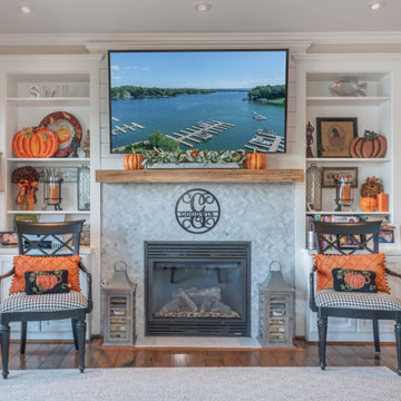 Reico Kitchen & Bath
Designed by Christine Wade of Reico Kitchen & Bath in Salem, VA, this small kitchen remodeling project features a modern style inspired design with Merillat Masterpiece cabinets in the Martel door style with a Dove White finish. Kitchen countertops are Spectrum Sterling.
The kitchen also includes a Carrara Mosaic 1x2 Herringbone tile backsplash and Viking appliances.
“The old kitchen had black cabinets and old halogen lighting. My goal for the kitchen remodel was to have a brighter space,” said the client.
“Changing to LED lighting, changing from black to white cabinetry and lowering countertops to all one level were keys to meeting that goal. Although the layout was a galley style kitchen, removing side walls opened up the space and created a feeling that the space was bigger even though the footprint didn’t change.”
“The customer originally wanted to open up and take out the columns. After doing research and some preliminary probing we found that one of the columns was the main concrete structure for the building,” said Christine.
“With that in mind we were able to still open up the space and give the illusion of the kitchen being larger even though it’s the same foot print as before. For the bar, there was a piece of furniture that we added an end panel to the side of the wine fridge and a quartz top too. We also added shiplap, mantel, tile and additional molding around the built-in open shelves at the fireplace."
Photos courtesy of Sowder Group LLC.

 Zieba Builders, Inc.
Built in the 1960’s, this 1,566 sq. ft. single story home needed updating and visual interests. The clients love to entertain and wanted to create a welcoming, fun atmosphere. Their wish lists were to have an enclosed courtyard to utilize the outdoor space, an open floor plan providing a bigger kitchen and better flow, and to incorporate a mid-century modern style.
The goal of this project was to create an open floor plan that would allow for better flow and function, thereby providing a more usable workspace and room for entertaining. We also incorporate the mid-century modern feel throughout the entire home from the inside to the out, bringing elements of design to all the spaces resulting in a completely uniform home.
Opening-up the space and removing any visual barriers resulted in the interior and exterior spaces appearing much larger. This allowed a much better flow into the space, and a flood of natural sunlight from the windows into the living area. We were able to enclose the outside front space with a rock wall and a gate providing additional square footage and a private outdoor living space. We also introduced materials such as IPE wood, stacked stone, and metal to incorporate into the exterior which created a warm, aesthetically pleasing, and mid-century modern courtyard.
 Reico Kitchen & Bath
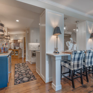
Designed by Christine Wade of Reico Kitchen & Bath in Salem, VA, this small kitchen remodeling project features a modern style inspired design with Merillat Masterpiece cabinets in the Martel door style with a Dove White finish. Kitchen countertops are Spectrum Sterling.
The kitchen also includes a Carrara Mosaic 1x2 Herringbone tile backsplash and Viking appliances.
“The old kitchen had black cabinets and old halogen lighting. My goal for the kitchen remodel was to have a brighter space,” said the client.
“Changing to LED lighting, changing from black to white cabinetry and lowering countertops to all one level were keys to meeting that goal. Although the layout was a galley style kitchen, removing side walls opened up the space and created a feeling that the space was bigger even though the footprint didn’t change.”
“The customer originally wanted to open up and take out the columns. After doing research and some preliminary probing we found that one of the columns was the main concrete structure for the building,” said Christine.
“With that in mind we were able to still open up the space and give the illusion of the kitchen being larger even though it’s the same foot print as before. For the bar, there was a piece of furniture that we added an end panel to the side of the wine fridge and a quartz top too. We also added shiplap, mantel, tile and additional molding around the built-in open shelves at the fireplace."
Photos courtesy of Sowder Group LLC.

 Reico Kitchen & Bath
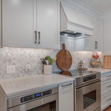
Designed by Christine Wade of Reico Kitchen & Bath in Salem, VA, this small kitchen remodeling project features a modern style inspired design with Merillat Masterpiece cabinets in the Martel door style with a Dove White finish. Kitchen countertops are Spectrum Sterling.
The kitchen also includes a Carrara Mosaic 1x2 Herringbone tile backsplash and Viking appliances.
“The old kitchen had black cabinets and old halogen lighting. My goal for the kitchen remodel was to have a brighter space,” said the client.
“Changing to LED lighting, changing from black to white cabinetry and lowering countertops to all one level were keys to meeting that goal. Although the layout was a galley style kitchen, removing side walls opened up the space and created a feeling that the space was bigger even though the footprint didn’t change.”
“The customer originally wanted to open up and take out the columns. After doing research and some preliminary probing we found that one of the columns was the main concrete structure for the building,” said Christine.
“With that in mind we were able to still open up the space and give the illusion of the kitchen being larger even though it’s the same foot print as before. For the bar, there was a piece of furniture that we added an end panel to the side of the wine fridge and a quartz top too. We also added shiplap, mantel, tile and additional molding around the built-in open shelves at the fireplace."
Photos courtesy of Sowder Group LLC.
 Reico Kitchen & Bath
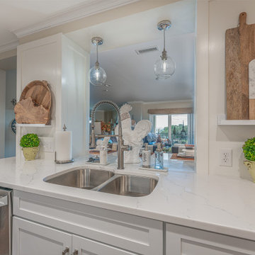
Designed by Christine Wade of Reico Kitchen & Bath in Salem, VA, this small kitchen remodeling project features a modern style inspired design with Merillat Masterpiece cabinets in the Martel door style with a Dove White finish. Kitchen countertops are Spectrum Sterling.
The kitchen also includes a Carrara Mosaic 1x2 Herringbone tile backsplash and Viking appliances.
“The old kitchen had black cabinets and old halogen lighting. My goal for the kitchen remodel was to have a brighter space,” said the client.
“Changing to LED lighting, changing from black to white cabinetry and lowering countertops to all one level were keys to meeting that goal. Although the layout was a galley style kitchen, removing side walls opened up the space and created a feeling that the space was bigger even though the footprint didn’t change.”
“The customer originally wanted to open up and take out the columns. After doing research and some preliminary probing we found that one of the columns was the main concrete structure for the building,” said Christine.
“With that in mind we were able to still open up the space and give the illusion of the kitchen being larger even though it’s the same foot print as before. For the bar, there was a piece of furniture that we added an end panel to the side of the wine fridge and a quartz top too. We also added shiplap, mantel, tile and additional molding around the built-in open shelves at the fireplace."
Photos courtesy of Sowder Group LLC.

 Pedini NW
This home remodel consisted of opening up the kitchen space that was previously closed off from the living and dining areas, installing new flooring throughout the home, and remodeling both bathrooms. The goal was to make the main living space better for entertaining and provide a more functional kitchen for multiple people to be able to cook in at once. The result? Basically a whole new house!
 Michael Nash Design, Build & Homes
2011 NARI CAPITAL COTY FINALIST AWARD WINNER
The homeowners purchased this 6,000 square foot Mount Vernon home as they were about to retire. While spacious, it was in desperate need of renovating. High on their list of goals for the project was having a large, contemporary master bathroom.
To get extra space for the new bathroom, the designer borrowed some space from an existing closet. Eliminating the tub—the owners preferred a larger shower—also provided some “added” space.
The new bathroom consists of a very large walk-in shower with double entry, built-in benches, multiple shower heads and a dramatic curved glass block partition wall. His and her vanities have been created for each client’s individual needs. Marble and tile used on the floors and walls features very specific handpicked glass tile inserts & designs.
The use of colorful marble counter tops and open vanity cabinetry is part of contemporary look of this project. A mixture of hand selected commode and faucets, rain showers, beveled mirrors, and custom lighting are all part of the detailed craftsmanship that went into this project.

 kimberly peck architect
photos by Pedro Marti
The main goal of this renovation was to improve the overall flow of this one bedroom. The existing layout consisted of too much unusable circulation space and poorly laid out storage located at the entry of the apartment. The existing kitchen was an antiquated, small enclosed space. The main design solution was to remove the long entry hall by opening the kitchen to create one large open space that interacted with the main living room. A new focal point was created in the space by adding a long linear element of floating shelves with a workspace below opposite the kitchen running from the entry to the living space. Visually the apartment is tied together by using the same material for various elements throughout. Grey oak is used for the custom kitchen cabinetry, the floating shelves and desk, and to clad the entry walls. Custom light grey acid etched glass is used for the upper kitchen cabinets, the drawer fronts below the desk, and the tall closet doors at the entry. In the kitchen black granite countertops wrap around terminating with a raised dining surface open to the living room. The black counters are mirrored with a soft black acid etched backsplash that helps the kitchen feel larger as they create the illusion of receding. The existing floors of the apartment were stained a dark ebony and complimented by the new dark metallic porcelain tiled kitchen floor. In the bathroom the tub was replaced with an open shower. Brown limestone floors flow straight from the bathroom into the shower with out a curb, European style. The walls are tiled with a large format light blue glass.

 RBL Architects
The owners were downsizing from a large ornate property down the street and were seeking a number of goals. Single story living, modern and open floor plan, comfortable working kitchen, spaces to house their collection of artwork, low maintenance and a strong connection between the interior and the landscape. Working with a long narrow lot adjacent to conservation land, the main living space (16 foot ceiling height at its peak) opens with folding glass doors to a large screen porch that looks out on a courtyard and the adjacent wooded landscape. This gives the home the perception that it is on a much larger lot and provides a great deal of privacy. The transition from the entry to the core of the home provides a natural gallery in which to display artwork and sculpture. Artificial light almost never needs to be turned on during daytime hours and the substantial peaked roof over the main living space is oriented to allow for solar panels not visible from the street or yard.

 Seacliff Construction & Design
This goals for this project were to create a new 1/2bath upstairs for guest use using the space of the existing pantry (and eliminating the need to use the master bath), and to reconfigure the the master bedroom with a walk-in closet and new bathroom layout. We created a new pantry space by opening up the wall between the kitchen and living room and inserting an antique cabinet.

 TimeLine Renovations Inc.
Going house hunting to find the dream home is difficult in every aspect, especially in NYC. The first apartment may have a feature that the other has but very rarely will one place have all. Most important is making sure the location and size works and everything else can be incorporated later. As the apartment our clients selected was "move in" condition its surely was not for what they work looking for in creating their dream home. We first started by creating a "wish list" of all of the essentials, which included; open kitchen, walk in closet, office space , larger master bathroom with stand up shower and soaking tub. With creating many different floor plan options, the only way we would achieve this was by sacrificing the 3rd bedroom. At this stage the 3rd bedroom was very easy for them to sacrifice as it gave them all of the wish list for now. In the future ,they could easily take the square footage from the new oversized living room and add that 3rd bedroom if it were necessary. Our first goal in the demolition stage was to remove all existing interior partition walls and start with a fresh new slate. By removing the existing kitchen walls the New Kitchen layout now combines it with the living room. The cabinetry is 2 tone color, flat slab doors for the modern look. State of the art appliances were installed; Integrated panels were installed on the fridge, wall oven, microwave, cook top. The sink is the ultimate chefs prep station sliding butcher block with bowls that slide over the sink. A garage cabinet was installed to conceal smaller appliances. The cantilever counter top adds the additional seating space for guests while keeping the bottom portion open for the view. The existing walk in closet was relocated to achieve the New Master Bathroom, Combining the spaces now gave us the option to add all the features. Floating vanity with double sinks, soaking tub, stand up shower. The glossy rectified tiles used are 12x36 and when installed make the grout line disappear and make it look like a solid wall. The chocolate floor tiles are randomly staggered then wrap up the tub platform and continue up one wall to create an accent. No tile edge was used but all tiles that meet on a 90 degree outside corner are mitered; tub platform, walls and shower niches. Heated floors were installed to keep the feet warm on the cold winter days. In the Master Bedroom we built a bed frame accent wall. Serves for multiple functions; eliminates night stands by using the niches for alarm clock / phone charger station, lights were added inside the niches for accent lights and raised wall paper was used to finish this beautiful feature. Each his and hers niche has an outlet, 4 way switch for the accent lights and 4 way switch for the recessed lights above when they are done reading in bed. Custom steps were built for easy up and down off the bed for the little puppies that could not possibly make the jump up. Other features throughout the apartment include; New bamboo floors throughout. Since the concrete ceiling slab cannot be chopped , soffits and drop ceilings were built throughout the apartment to accommodate recessed lights. Low voltage recessed lights were used with multiple zone dimmers for energy efficiency. Remote operated shades were installed The overall design was for the apartment was modern, simple lines and true elegance. The newly renovated apartment will be enjoyed by them, friends and family for many years to come...
edit

 Katie Hutchison Studio
With two small children and a third on the way, the owners of an original eighteenth century Cape were quickly out-growing it, but they had no desire to move away from the Cape Cod home and location they loved. They simply needed a reconfigured layout and more space. Their goals included repurposing some existing rooms, adding a new kitchen/family area plus screen porch on the first level, and creating a master suite and roof deck with an outdoor shower on the second level, connected by a new stair.
Our challenge was to improve the flow between existing spaces, and design the two-story addition without overwhelming the pint-sized original Cape. We took advantage of the lower grade at the rear of the property to step the first floor of the addition down two steps from the existing main level. This allowed us to align the second floor in the addition with the existing second floor, while gaining ceiling height in the new first-floor kitchen/family area. We composed a cross-gabled form for the addition to improve the second floor headroom, while maintaining the existing eave line. We then extended some existing shed dormers to gain headroom and enhance function. We also expanded the outdoor living area with privacy walls along the roof deck.
New, larger, double–hung windows that match the lite configuration of the existing windows, along with new side-wall shingles and trim which resemble the existing exterior treatment help to tie the new addition to the old Cape. Though there’s no mistaking the new for the old, the two are simpatico.
Katie Hutchison Studio collaborated with Geoffrey Koper Architect of Yarmouth Port, Mass. on the Yarmouth Port Antique Cape Renovation and Addition. Kitchen fit-out and interior finishes, fixtures, and furnishings by others.
photo by Katie Hutchison

 European Cabinets & Design Studios
Swedish design firm Cortina & Käll were tasked with connecting a new 1,400-square-foot apartment to an existing 3,000-square-foot apartment in a New York City high-rise. Their goal was to give the apartment a scale and flow benefitting its new larger size.
“We envisioned a light and sculptural spiral staircase at the center of it all. The staircase and its opening allowed us to achieve the desired transparency and volume, creating a dramatically new and generous apartment,” said Francisco Cortina.
Read more about this project on our blog: https://www.europeancabinets.com/news/cast-curved-staircase-nyc-cortina-kall/
Photo: Tim Williams Photography

 Melton Design Build
The goal of this project was to update the outdated master bathroom to better meet the homeowners design tastes and the style of the rest of this foothills home, as well as update all the doors on the first floor, and create a contemporary mud room and staircase to the basement.
The homeowners wanted a master suite that had a masculine feel, incorporated elements of black steel, wood, and contrast with clean white tiles and counter-tops and helped their long and skinny layout feel larger/ make better use of the space they have. They also wanted a more spacious and luxurious shower with water temperature control. A large window that existed above the original soaking tub offered spectacular views down into Boulder valley and it was important to keep this element in the updated design. However, privacy was also very important. Therefore, a custom-built powder coated steel shelf, was created to provide privacy blocking, add storage, and add a contrasting design element to the white wall tiles. Black honeycomb floor tiles, new black walnut cabinetry, contemporary wall paper, a floor to ceiling glass shower wall, and updated fixtures elevated the space and gave the clients exactly the look and feel that they wanted.
Unique custom metal design elements can be found throughout the new spaces (shower, mud room bench and shelving, and staircase railings and guardrails), and give this home the contemporary feel that the homeowners desired.
 Bilotta Kitchen & Home
Written by Mary Kate Hogan for Westchester Home Magazine.
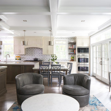
"The Goal: The family that cooks together has the most fun — especially when their kitchen is equipped with four ovens and tons of workspace. After a first-floor renovation of a home for a couple with four grown children, the new kitchen features high-tech appliances purchased through Royal Green and a custom island with a connected table to seat family, friends, and cooking spectators. An old dining room was eliminated, and the whole area was transformed into one open, L-shaped space with a bar and family room.
“They wanted to expand the kitchen and have more of an entertaining room for their family gatherings,” says designer Danielle Florie. She designed the kitchen so that two or three people can work at the same time, with a full sink in the island that’s big enough for cleaning vegetables or washing pots and pans.
Key Features:
Well-Stocked Bar: The bar area adjacent to the kitchen doubles as a coffee center. Topped with a leathered brown marble, the bar houses the coffee maker as well as a wine refrigerator, beverage fridge, and built-in ice maker. Upholstered swivel chairs encourage people to gather and stay awhile.
Finishing Touches: Counters around the kitchen and the island are covered with a Cambria quartz that has the light, airy look the homeowners wanted and resists stains and scratches. A geometric marble tile backsplash is an eye-catching decorative element.
Into the Wood: The larger table in the kitchen was handmade for the family and matches the island base. On the floor, wood planks with a warm gray tone run diagonally for added interest."
Bilotta Designer: Danielle Florie
Photographer: Phillip Ennis

 Southwest Boulder & Stone
Joe and Tod, homeowners in the Vintage Hills area of Temecula, undertook this yard transformation themselves. Their goal was to replace a lawned portion of the right side of their front yard with drought-tolerant plants and rock complementing the existing landscaping.
The homeowners began the project by transplanting kangaroo paw, yucca, lantana and jade plants. Some of the plants made the journey from their former home in Long Beach and others came from thinning out existing plants in the yard. In addition to designing the space together, they also installed the project themselves. The small, light gray boulders and cobble were already located on the property, and closely resemble Sierra boulders. Gambler's Gold 3/4" crushed rock was used to create the "islands" around the plants, with 3/4" gray crushed rock to fill in the larger areas. Premium Sunburst pebbles in the 1"-3" size finished the area off as the border with the neighbor's property.
59