
Search results for "Larger goals" in Home Design Ideas
 White Sands Coastal Development
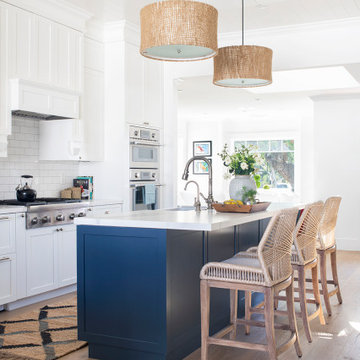
This was a gut remodel of a 1950’s 3 bedroom, 2 bath, 1200-square-foot home. The main house was composed of two bedrooms with one bathroom, and a separate studio unit with a full bathroom was located in the backyard. The new owners, a family of 4, wanted to remove the studio unit and increase the square footage of the main house to include a new master suite, family room, and powder room while leaving enough space for the possible addition of a pool in the backyard down the road. We also expanded the kitchen and remodeled the kids’ shared bathroom.
White Sands advised during the architectural stage of the project to perfect the layout and ensure enough space was carved out for the new kitchen, family room, and master bedroom. We designed a modified galley kitchen with a large eat-in island in the center. Custom cabinetry was key in making the layout work. To provide ample storage, we created a European-style larder pantry, which is flanked by full-height glass hutches and appliance garages to keep countertop gadgets concealed. The family room is anchored by a new fireplace, complete with custom built-ins flanking each side. The client’s goal for the overall aesthetic is very simple, classic coastal cottage. They wanted cutesy charm. They did not want anything fussy or fancy, requesting selections to be pared down and approachable. All tile and counter finishes selected were in timeless shapes and color palettes. We brought in color and personality with the accessories- cabinet hardware, mirrors, wallcoverings, and styling accessories.

 FORWARD Design | Architecture
Bob Greenspan
Example of a small minimalist built-in desk cork floor shed design in Kansas City with white walls
Example of a small minimalist built-in desk cork floor shed design in Kansas City with white walls

 Change Your Bathroom©
The detailed plans for this bathroom can be purchased here: https://www.changeyourbathroom.com/shop/felicitous-flora-bathroom-plans/
The original layout of this bathroom underutilized the spacious floor plan and had an entryway out into the living room as well as a poorly placed entry between the toilet and the shower into the master suite. The new floor plan offered more privacy for the water closet and cozier area for the round tub. A more spacious shower was created by shrinking the floor plan - by bringing the wall of the former living room entry into the bathroom it created a deeper shower space and the additional depth behind the wall offered deep towel storage. A living plant wall thrives and enjoys the humidity each time the shower is used. An oak wood wall gives a natural ambiance for a relaxing, nature inspired bathroom experience.
Find the right local pro for your project


 River Valley Landscapes
The property is one of the original farm houses located on the main street of a small town. It has been in the family for many years and our client just inherited the property. They were trying to have balance of preserving the old while realizing modern day living has its benefits too. The house had a large addition added using mostly old style materials, but designed with function and modern day luxuries. Our goal was to carry that theme to the outside.
Our first problem we had to address was how to transition between the first floor elevation changes. The lower room was the husband’s office. He stated in the future he may have clients over and it would be nice to have an area to sit outside. The wife’s main concern was to renew the four corner garden. She also felt it was very important to be able to see it from the kitchen area. Finally there was an old wishing well stuck right outside the kitchen. They both felt it would be neat to be able to incorporate this in some how. They wanted a patio area with a built in grill to accommodate there family and friends. They also wanted to keep a large play area for the kids.
We were able to pull this off successfully. We addressed the first issue by having a small lower level flagstone area. This area is large enough for 1 to 2 people to sit comfortably. It also provides a transition from his office to the larger patio area. We installed a simple small gravel sitting area opposite of the main patio. This provides our client a secluded place to relax or do business. Mrs.... told me she is amazed how much her and her husband enjoys this area. It is so peaceful looking at the small creek over a glass of wine.
We built a natural limestone retaining wall to create the patio terrace. The stone was chosen to extend the houses architectural elements into the landscape. Irregular broken flagstone was used to give it a more casual feel. We installed three Serviceberries into the patio terrace to replace some trees that were taken down during the remodeling. She was very concern that they would block the view of the four corner garden. We new they were crucial to nestle in the terrace, so we placed them for a couple days for her to decide. Fortunately she agreed they not only kept the view open, but helped frame the garden.
The four corner garden was designed to be viewed from afar and experienced up close. We wanted the space to have some formal structure while keeping with the casual farm house feel. Another natural limestone retaining wall was created. This leveled the garden terrace and helped associate it with the rest of the property. The four corner garden is nestled into the existing woods edge. This provides three distinct experiences to entering the garden; a more formal from the driveway, an open feel from the lower lawn, and a more natural / casual experience from the wooded area. The Plymouth brown gravel was used for the center of the garden. This helped highlight the stone post that was found during construction. The gravel also brings the sense of sound into the garden space. Lamb’s ear was chosen as a fun way to get kids interest in horticulture.
The balance of using the new to create the old feel is what makes this project a success. The property has already hosted a local historical society event and won an award for its preservation efforts. When Mrs.... can’t find her husband, she knows he is either reading the newspaper by the grill or resting in the hammock along the wood’s path.

 Vanessa Antonelli Designs
This fanciful floral nursery features a wall entirely of silk flowers. The feminine details like the upholstered crib, chandelier and metallic artwork are balanced by the clean lines of the furniture. It's a modern day trip into Wonderland.
Christine Farah Photography

 Haven Design and Construction
This stunning custom master closet is part of a whole house design and renovation project by Haven Design and Construction. The homeowners desired a master suite with a dream closet that had a place for everything. We started by significantly rearranging the master bath and closet floorplan to allow room for a more spacious closet. The closet features lighted storage for purses and shoes, a rolling ladder for easy access to top shelves, pull down clothing rods, an island with clothes hampers and a handy bench, a jewelry center with mirror, and ample hanging storage for clothing.


 SHELTER Custom-Built Living
Matthew Scott Photographer Inc.
Inspiration for a large and bedroom farmhouse loft-style and boy medium tone wood floor and gray floor kids' bedroom remodel in Charleston with white walls
Inspiration for a large and bedroom farmhouse loft-style and boy medium tone wood floor and gray floor kids' bedroom remodel in Charleston with white walls
 Change Your Bathroom©
The goal of this project was to upgrade the builder grade finishes and create an ergonomic space that had a contemporary feel. This bathroom transformed from a standard, builder grade bathroom to a contemporary urban oasis. This was one of my favorite projects, I know I say that about most of my projects but this one really took an amazing transformation. By removing the walls surrounding the shower and relocating the toilet it visually opened up the space. Creating a deeper shower allowed for the tub to be incorporated into the wet area. Adding a LED panel in the back of the shower gave the illusion of a depth and created a unique storage ledge. A custom vanity keeps a clean front with different storage options and linear limestone draws the eye towards the stacked stone accent wall.
Houzz Write Up: https://www.houzz.com/magazine/inside-houzz-a-chopped-up-bathroom-goes-streamlined-and-swank-stsetivw-vs~27263720
The layout of this bathroom was opened up to get rid of the hallway effect, being only 7 foot wide, this bathroom needed all the width it could muster. Using light flooring in the form of natural lime stone 12x24 tiles with a linear pattern, it really draws the eye down the length of the room which is what we needed. Then, breaking up the space a little with the stone pebble flooring in the shower, this client enjoyed his time living in Japan and wanted to incorporate some of the elements that he appreciated while living there. The dark stacked stone feature wall behind the tub is the perfect backdrop for the LED panel, giving the illusion of a window and also creates a cool storage shelf for the tub. A narrow, but tasteful, oval freestanding tub fit effortlessly in the back of the shower. With a sloped floor, ensuring no standing water either in the shower floor or behind the tub, every thought went into engineering this Atlanta bathroom to last the test of time. With now adequate space in the shower, there was space for adjacent shower heads controlled by Kohler digital valves. A hand wand was added for use and convenience of cleaning as well. On the vanity are semi-vessel sinks which give the appearance of vessel sinks, but with the added benefit of a deeper, rounded basin to avoid splashing. Wall mounted faucets add sophistication as well as less cleaning maintenance over time. The custom vanity is streamlined with drawers, doors and a pull out for a can or hamper.
A wonderful project and equally wonderful client. I really enjoyed working with this client and the creative direction of this project.
Brushed nickel shower head with digital shower valve, freestanding bathtub, curbless shower with hidden shower drain, flat pebble shower floor, shelf over tub with LED lighting, gray vanity with drawer fronts, white square ceramic sinks, wall mount faucets and lighting under vanity. Hidden Drain shower system. Atlanta Bathroom.


 Cgm Construction Incorporated
Home bar - transitional single-wall brown floor home bar idea in Boston with no sink, glass-front cabinets, black cabinets, gray backsplash and gray countertops

 Margot Hartford Photography
Photo: Margot Hartford © 2017 Houzz
Living room - modern living room idea in San Francisco
Living room - modern living room idea in San Francisco
 Avid Interior Design Inc.
New build dreams always require a clear design vision and this 3,650 sf home exemplifies that. Our clients desired a stylish, modern aesthetic with timeless elements to create balance throughout their home. With our clients intention in mind, we achieved an open concept floor plan complimented by an eye-catching open riser staircase. Custom designed features are showcased throughout, combined with glass and stone elements, subtle wood tones, and hand selected finishes.
The entire home was designed with purpose and styled with carefully curated furnishings and decor that ties these complimenting elements together to achieve the end goal. At Avid Interior Design, our goal is to always take a highly conscious, detailed approach with our clients. With that focus for our Altadore project, we were able to create the desirable balance between timeless and modern, to make one more dream come true.

 ODS Architecture
In the hills of San Anselmo in Marin County, this 5,000 square foot existing multi-story home was enlarged to 6,000 square feet with a new dance studio addition with new master bedroom suite and sitting room for evening entertainment and morning coffee. Sited on a steep hillside one acre lot, the back yard was unusable. New concrete retaining walls and planters were designed to create outdoor play and lounging areas with stairs that cascade down the hill forming a wrap-around walkway. The goal was to make the new addition integrate the disparate design elements of the house and calm it down visually. The scope was not to change everything, just the rear façade and some of the side facades.
The new addition is a long rectangular space inserted into the rear of the building with new up-swooping roof that ties everything together. Clad in red cedar, the exterior reflects the relaxed nature of the one acre wooded hillside site. Fleetwood windows and wood patterned tile complete the exterior color material palate.
The sitting room overlooks a new patio area off of the children’s playroom and features a butt glazed corner window providing views filtered through a grove of bay laurel trees. Inside is a television viewing area with wetbar off to the side that can be closed off with a concealed pocket door to the master bedroom. The bedroom was situated to take advantage of these views of the rear yard and the bed faces a stone tile wall with recessed skylight above. The master bath, a driving force for the project, is large enough to allow both of them to occupy and use at the same time.
The new dance studio and gym was inspired for their two daughters and has become a facility for the whole family. All glass, mirrors and space with cushioned wood sports flooring, views to the new level outdoor area and tree covered side yard make for a dramatic turnaround for a home with little play or usable outdoor space previously.
Photo Credit: Paul Dyer Photography.

 Howell Custom Building Group
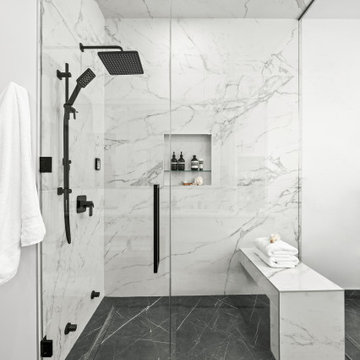
The original master bathroom in this 1980’s home was small, cramped and dated. It was divided into two compartments that also included a linen closet. The goal was to reconfigure the space to create a larger, single compartment space that exudes a calming, natural and contemporary style. The bathroom was remodeled into a larger, single compartment space using earth tones and soft textures to create a simple, yet sleek look. A continuous shallow shelf above the vanity provides a space for soft ambient down lighting. Large format wall tiles with a grass cloth pattern complement red grass cloth wall coverings. Both balance the horizontal grain of the white oak cabinetry. The small bath offers a spa-like setting, with a Scandinavian style white oak drying platform alongside the shower, inset into limestone with a white oak bench. The shower features a full custom glass surround with built-in niches and a cantilevered limestone bench. The spa-like styling was carried over to the bathroom door when the original 6 panel door was refaced with horizontal white oak paneling on the bathroom side, while the bedroom side was maintained as a 6 panel door to match existing doors in the hallway outside. The room features White oak trim with a clear finish.


 Klopf Architecture
, Arterra Landscape Architects and Henry Calvert of Calvert Ventures Designed and built a new warm, modern, Eichler-inspired, open, indoor-outdoor home on a deeper-than-usual San Mateo Highlands property where an original Eichler house had burned to the ground.
The owners wanted multi-generational living and larger spaces than the original home offered, but all parties agreed that the house should respect the neighborhood and blend in stylistically with the other Eichlers. At first the Klopf team considered re-using what little was left of the original home and expanding on it. But after discussions with the owner and builder, all parties agreed that the last few remaining elements of the house were not practical to re-use, so Klopf Architecture designed a new home that pushes the Eichler approach in new directions.
One disadvantage of Eichler production homes is that the house designs were not optimized for each specific lot. A new custom home offered the team a chance to start over. In this case, a longer house that opens up sideways to the south fit the lot better than the original square-ish house that used to open to the rear (west). Accordingly, the Klopf team designed an L-shaped “bar” house with a large glass wall with large sliding glass doors that faces sideways instead of to the rear like a typical Eichler. This glass wall opens to a pool and landscaped yard designed by Arterra Landscape Architects.
Driving by the house, one might assume at first glance it is an Eichler because of the horizontality, the overhanging flat roof eaves, the dark gray vertical siding, and orange solid panel front door, but the house is designed for the 21st Century and is not meant to be a “Likeler.” You won't see any posts and beams in this home. Instead, the ceiling decking is a western red cedar that covers over all the beams. Like Eichlers, this cedar runs continuously from inside to out, enhancing the indoor / outdoor feeling of the house, but unlike Eichlers it conceals a cavity for lighting, wiring, and insulation. Ceilings are higher, rooms are larger and more open, the master bathroom is light-filled and more generous, with a separate tub and shower and a separate toilet compartment, and there is plenty of storage. The garage even easily fits two of today's vehicles with room to spare.
A massive 49-foot by 12-foot wall of glass and the continuity of materials from inside to outside enhance the inside-outside living concept, so the owners and their guests can flow freely from house to pool deck to BBQ to pool and back.
During construction in the rough framing stage, Klopf thought the front of the house appeared too tall even though the house had looked right in the design renderings (probably because the house is uphill from the street). So Klopf Architecture paid the framer to change the roofline from how we had designed it to be lower along the front, allowing the home to blend in better with the neighborhood. One project goal was for people driving up the street to pass the home without immediately noticing there is an "imposter" on this lot, and making that change was essential to achieve that goal.
This 2,606 square foot, 3 bedroom, 3 bathroom Eichler-inspired new house is located in San Mateo in the heart of the Silicon Valley.
Klopf Architecture Project Team: John Klopf, AIA, Klara Kevane
Landscape Architect: Arterra Landscape Architects
Contractor: Henry Calvert of Calvert Ventures
Photography ©2016 Mariko Reed
Location: San Mateo, CA
Year completed: 2016

 b9 architects
Our client’s goal was to create a small, high-performance, healthy home for herself and her teenage son while providing a place for her father to age in place. An attached private accessory dwelling provides a space for him as well as flexibility in the future. The new home was designed to minimize its footprint on site, made smaller than the original 1930’s house.
Embracing adaptability and efficiency, the residence includes two dwellings: a one-bedroom 795 square-foot accessory dwelling at the lower grade and a two-story 1330 square-foot primary dwelling located above. Involved in all aspects of project execution, our client oversaw the process by living in a used trailer parked in the backyard throughout the project’s construction. Family-Share focused on maximizing the footprint’s performance, access to natural light and the health of the occupants. Sustainable features include high-performance glazing, solar preheat for domestic and hot water in-floor heating and reclaimed fir car decking rainscreen siding.

 Dynamic Architectural Windows & Doors
Country Garden Residence by Olson Kunding.
Photos by: Jeremy Bitterman
Inspiration for a cottage gray one-story wood gable roof remodel in Portland with a metal roof
Inspiration for a cottage gray one-story wood gable roof remodel in Portland with a metal roof

 Harwood Design Builders Ltd.
A riverfront property is a desirable piece of property duet to its proximity to a waterway and parklike setting. The value in this renovation to the customer was creating a home that allowed for maximum appreciation of the outside environment and integrating the outside with the inside, and this design achieved this goal completely.
To eliminate the fishbowl effect and sight-lines from the street the kitchen was strategically designed with a higher counter top space, wall areas were added and sinks and appliances were intentional placement. Open shelving in the kitchen and wine display area in the dining room was incorporated to display customer's pottery. Seating on two sides of the island maximize river views and conversation potential. Overall kitchen/dining/great room layout designed for parties, etc. - lots of gathering spots for people to hang out without cluttering the work triangle.
Eliminating walls in the ensuite provided a larger footprint for the area allowing for the freestanding tub and larger walk-in closet. Hardwoods, wood cabinets and the light grey colour pallet were carried through the entire home to integrate the space.
9