
Search results for "Larger goals" in Home Design Ideas

 River Valley Landscapes
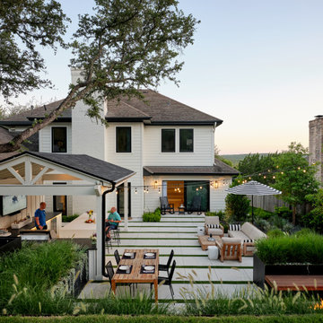
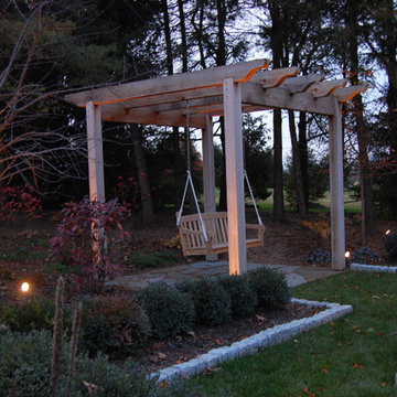
The property is one of the original farm houses located on the main street of a small town. It has been in the family for many years and our client just inherited the property. They were trying to have balance of preserving the old while realizing modern day living has its benefits too. The house had a large addition added using mostly old style materials, but designed with function and modern day luxuries. Our goal was to carry that theme to the outside.
Our first problem we had to address was how to transition between the first floor elevation changes. The lower room was the husband’s office. He stated in the future he may have clients over and it would be nice to have an area to sit outside. The wife’s main concern was to renew the four corner garden. She also felt it was very important to be able to see it from the kitchen area. Finally there was an old wishing well stuck right outside the kitchen. They both felt it would be neat to be able to incorporate this in some how. They wanted a patio area with a built in grill to accommodate there family and friends. They also wanted to keep a large play area for the kids.
We were able to pull this off successfully. We addressed the first issue by having a small lower level flagstone area. This area is large enough for 1 to 2 people to sit comfortably. It also provides a transition from his office to the larger patio area. We installed a simple small gravel sitting area opposite of the main patio. This provides our client a secluded place to relax or do business. Mrs.... told me she is amazed how much her and her husband enjoys this area. It is so peaceful looking at the small creek over a glass of wine.
We built a natural limestone retaining wall to create the patio terrace. The stone was chosen to extend the houses architectural elements into the landscape. Irregular broken flagstone was used to give it a more casual feel. We installed three Serviceberries into the patio terrace to replace some trees that were taken down during the remodeling. She was very concern that they would block the view of the four corner garden. We new they were crucial to nestle in the terrace, so we placed them for a couple days for her to decide. Fortunately she agreed they not only kept the view open, but helped frame the garden.
The four corner garden was designed to be viewed from afar and experienced up close. We wanted the space to have some formal structure while keeping with the casual farm house feel. Another natural limestone retaining wall was created. This leveled the garden terrace and helped associate it with the rest of the property. The four corner garden is nestled into the existing woods edge. This provides three distinct experiences to entering the garden; a more formal from the driveway, an open feel from the lower lawn, and a more natural / casual experience from the wooded area. The Plymouth brown gravel was used for the center of the garden. This helped highlight the stone post that was found during construction. The gravel also brings the sense of sound into the garden space. Lamb’s ear was chosen as a fun way to get kids interest in horticulture.
The balance of using the new to create the old feel is what makes this project a success. The property has already hosted a local historical society event and won an award for its preservation efforts. When Mrs.... can’t find her husband, she knows he is either reading the newspaper by the grill or resting in the hammock along the wood’s path.

 Twelve Stones Designs, LLC
The owners of this kitchen had spent the money to upgrade the finishes in their kitchen upon building the home 12 years ago, but after living in the space for several years they realized how nonfunctional the layout really was. The (then) two preschool aged children had grown into busy, hungry teenagers with many friends who also liked to hang out at the house. So the family needed a more functional kitchen with better traffic flow, space for daily activities revolving around the kitchen at different times of day, and a kitchen that could accommodate cooking for and serving large groups. Furthermore, the dark, traditional finishes no longer reflected the homeowners’ style. They requested a brighter, more relaxed, coastal style that reflected their love of the seaside cities they like to visit.
Originally, the kitchen was U-shaped with a narrow island in the middle. The island created narrow aisles that bottle-necked at the dishwasher, refrigerator, and cooktop areas. There was a pass-through from the foyer into the kitchen, but the owners never liked that the pass-through was also located so close to the powder room. The awkward proximity was unappealing and made guests feel uncomfortable.
The kitchen’s storage was made up of lots of narrow cabinets, apothecary drawers, clipped corner units, and very few drawers. It lacked useful storage for the larger items the family used on a daily basis. And the kitchen’s only pantry was small closet that had only builder-grade, narrow shelving with no illumination to be able to see the contents inside.
Overall, the kitchen’s lighting plan was poorly executed. Only six recessed cans illuminated the entire kitchen and nook areas. The under cabinet lighting was not evenly distributed either. In fact, the builder had mis-placed the under cabinet lighting around the decorative pilasters which made for choppy, dark cubbies. Further, the builder didn’t include any lighting over the sink or the bar area, which meant whoever was doing the dishes was always in their own shadow. That, coupled with the steep overhang of the game room above made the bar area feel like a dim, cavernous space that wasn’t inviting or task oriented. The kitchen looked out into the main living space, but the raised bar and a narrow wall (which held the only large cabinet in the kitchen) created more of a barrier than a relationship to the living room or breakfast nook. In fact, one couldn’t even see the breakfast nook from the cooktop or sink areas due to its orientation. The raised bar top was too narrow to comfortably sit to either dine at or chat from due to the lack of knee space. The the homeowners confided that the kitchen felt more like a dark, dirty prison than place where the family, or their guests, wanted to gather and commune.
The clients' needs and desires were:
➢ to create a kitchen that would be a space the family loved to be in; to relate to the adjacent spaces all around, and to have better flow for entertaining large groups
➢ to remove the walls between the breakfast nook and living area and to be able to utilize the natural light from the windows in both those areas
➢ to incorporate a functional chopping block for prepping fresh food for home cooked meals, an island with a large sink and drain board, 2 pull out trash cans, and seating for at least the 2 teens to eat or do homework
➢ to design a kitchen and breakfast nook with an airy, coastal, relaxed vibe that blended with the rest of the house's coastal theme
➢ to integrate a layered lighting plan which would include ample general illumination, specific task lighting, decorative lighting, and lots of illuminated storage
➢ to design a kitchen with not only more storage for all the husband’s kitchen gadgets and collection of oils and spices, but smart storage, including a coffee/breakfast bar and a place to store and conceal the toaster oven and microwave
➢ to find a way to utilize the large open space between the kitchen, pantry area, and breakfast nook
Twelve Stones Designs achieved the owner's goals by:
➢ removing the walls between the kitchen and living room to allow the natural light to filter in from the adjacent rooms and to create a connection between the kitchen, nook, and living spaces for a sense of unity and communion
➢ removing the existing pantry and designing 3 large pantry style cabinets with LED tape lights and rollout drawers to house lots of kitchen appliances, gadgets, and tons of groceries. We also took the cabinets all the way up to the 9’ ceiling for additional storage for seasonal items and bulk storage.
➢ designing 2 islands - 1 with a gorgeous black walnut chopping block that houses a drawer for chopping and carving knives and a custom double pull out trash unit for point of use utilization - and 1 that houses the dishwasher, a large Blanco Gourmet sink with integrated drain board, woven baskets for fresh root vegetables and kitchen towels, plenty of drawer storage for kitchen items, and bar seating for up to 4 diners.
➢ closing off the space between the kitchen and the powder room to create a beautiful new private alcove for the powder room as well as adding some decorative storage. This also gave us space to include more tall storage near the new range for precision placement of the husband’s extensive oil and spice collection as well as a location for a combo-steam oven the wife wanted for baking and cooking healthy meals.
The project is enhanced functionally by:
➢ incorporated USB and standard receptacles for the kids’ laptops and phone charging in the large island
➢ designing the small island to include additional open shelving for items used on a daily basis such as a variety of bowls, plates, and colanders. This set up also works well for the husband who prefers to “plate” his dinners in restaurant-style fashion before presenting them to the table.
➢ the integration of specific storage units, such as double stacked cutlery drawers, a custom spice pull-out, a Kuerig coffee and tea pod drawer, and custom double stacked utensil drawers
➢ moving the refrigerator to the old oven location - this eliminated the bottle neck as well as created a better relationship to the eating table. It also utilizes the floor space between the pantry, nook, and kitchen
➢ creating a banquet style breakfast nook - this banquette seating not only doubles the amount of seating for large gatherings but it better utilizes the odd space between the kitchen and the previous nook area. It also helps to create a distinct pathway from the mudroom room through the pantry area, kitchen, nook, and living room.
➢ the coffee/breakfast bar area which includes the perfect location for the concealed microwave and toaster oven, convenient storage for the coffee pods and tea accoutrements. Roll-out drawers below also house the smoothie maker, hot water kettle, and a plethora of smoothie-making ingredients such as protein powders, smoothie additives, etc. Furthermore, the drawers below the Keurig house measuring utensil, cutlery, baking supplies and tupperware storage.
➢ incorporating lots of wide drawers and pullouts to accommodate large cookware.
➢ utilizing as much vertical space as possible by building storage to the ceiling which accommodates the family’s abundant amount of serving platters, baking sheets, bakeware, casserole dishes, and additional cutting boards.
The project is enhanced aesthetically by:
➢ new 5-piece Versailles pattern porcelain tile that now seamlessly joins the entire down stairs area together creating a bright, cohesiveness feeling instead of choppy separated spaces - it also adds a coastal feeling
➢ designing a cabinet to conceal the microwave and toaster oven
➢ the coastal influenced light fixtures over the nook table and island
➢ the sandy colors of the Langdon Cambria countertops. The swirling pattern and sparkling quartz pieces remind the homeowner of black-and-tan sandy beaches
➢ the striped banquet seating whose creamy white background and blue-green stripes were the inspiration for the cabinet and wall colors.
➢ All the interior doors were painted black to coordinate with the blacks and grays in the backsplash tile and countertop. This also adds a hint of tailored formality to an otherwise casual space.
➢ the use of WAC's Oculux small aperture LED units for the overhead lighting complimented with Diode LED strips for task lighting under the cabinets and inside the pantry and glass wall cabinets. All of the lighting applications are on separate dimmer switches.
Innovative uses of materials or construction methods by Realty Restoration LLC:
➢ Each 1-1/2” x 3” block of reclaimed end-grain black walnut that makes up the center island chopping block was hand milled and built in the shop. It was designed to look substantial and proportional to the surrounding elements, executed by creating the 4 inch tall top with a solid wood chamfered edge band.
➢ The metal doors on either side of the vent hood were also custom designed for this project and built in the Realty Restoration LLC shop. They are made 1x2, 11-gauge mild steel with ribbed glass. Weighing 60 lbs a piece, heavy duty cabinet hinges were added to support the weight of the door and keep them from sagging.
➢ Under-cabinet receptacles were added along the range wall in order to have a clean, uninterrupted backsplash.
Design obstacles to overcome:
➢ Because we were removing the demising walls between the kitchen and living room, we had to find a way to plumb and vent the new island. We did this by tunneling through the slab (the slab had post tension cables which prevented us from just trenching) to run a new wet vent through a nearby structural wall. We pulled the existing hot and cold lines between upper floor joists and ran them down the structural wall as well and up through a conduit in the tunnel.
➢ Since we were converting from wall overs to a gas range it allowed us to utilize the 220 feed for the wall ovens to provide a new sub panel for all the new kitchen circuits
➢ Due to framing deficiencies inherited from the original build there was a 1-1/2” differential in the floor-to-ceiling height over a 20 foot span; by utilizing the process of cutting and furring coupled with the crown moulding details on the cabinet elevations we were able to mask the problem and provide seamless transitions between the cabinet components.
Evidence of superior craftsmanship:
➢ uniquely designed, one-of-a-kind metal “X” end panels on the large island. The end panels were custom made in the Realty Restoration LLC shop and fitted to the exact dimensions of the island. The welding seams are completely indistinguishable - the posts look like they are cut from a single sheet of metal
➢ square metal posts on the small island were also custom made and designed to compliment and carry through the metal element s throughout the kitchen
➢ the beautiful, oversized end panels on the pantry cabinets which give the breakfast nook a tailored look
➢ integrating a large format 5 piece Versailles tile pattern to seamlessly flow from the existing spaces into the new kitchen space
➢ By constructing a custom cabinet that jogged around a corner we could not remodel (housing the entry way coat closet) we were able to camouflage the adjacent wall offset within the upper and lower cabinets. By designing around the existing jog in the structural walls we accomplished a few things: we were able to find the space to house, and hide, the microwave and toaster oven yet still have a clean cohesive appearance from the kitchen side. Additionally, the owners were able to keep their much needed coat closet and we didn’t have to increase the budget with unnecessary structural work.
Find the right local pro for your project
 Organized Living
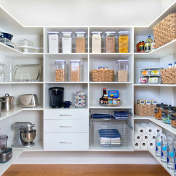
With Select, you can store a range of items and accessories in your pantry. Choose drawers and chrome baskets to store bags of chips, ovenmits, table covers, and more.

 Kitchen & Bath Gallery
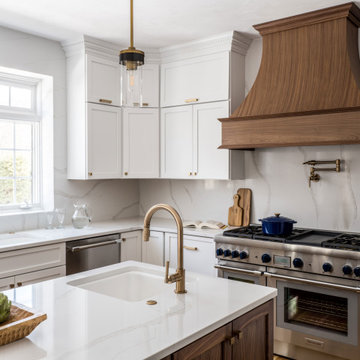
Bringing light and more functionality to a 20 year old kitchen was the goal for this extensive remodel. The homeowner worked with Kitchen Designer, Amanda Ortendahl of our North Attleboro location to update what was a dark wood G-shaped kitchen they had installed when they built the home 20 years earlier. The new design incorporates a large working island with ample seating for entertaining, homework and casual meals. The cabinets incorporate substantial crown molding and soar all the way to the ceiling adding to the feeling of height and spaciousness. The cabinets are all by Fieldstone Cabinetry. The perimeter cabinets are a painted finish in the color White. The island, hood and wine bar are Rattan Stain on walnut wood. The countertop and backsplash are Brunello Element Quartz. The plumbing fixtures are the Litze collection from Brizo in Luxe Gold. The coordinating hardware is from Top Knobs in their Honey Bronze finish.
Remodel by Maynard Construction BRC, Inc.
Photography by Erin Little
 USI Design & Remodeling
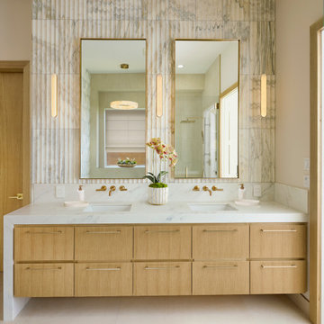
This master bathroom renovation in Frisco was completed for a repeat USI Design & Remodeling client as part of a larger first-floor transformation of the home. The original bathroom reflected a very typical North Texas layout of its era — dark stained cabinetry, granite countertops, compartmentalized vanities, a built-in tub adjoining a framed shower, and separated spaces that no longer aligned with how the homeowners wanted to live. As their aesthetic evolved toward a more transitional and contemporary direction, the goal became less about replacing finishes and more about redefining the experience of the room itself. The project needed to feel calmer, more architectural, and far more intentional in how the space functioned visually and emotionally.
One of the most important changes was removing the original shower curb and pony wall in favor of a fully open curbless shower with ultra-clear ½-inch heavy glass. Achieving that look required recessing the slab, re-floating the shower floor toward a linear drain, and engineering the space so the room would read as visually uninterrupted from end to end. Throughout the project, many of the design decisions were rooted in restraint rather than excess. The oversized 24x48 Porcelanosa flooring carries very little shade variation, creating a quieter visual field, while the cabinetry was executed in rift-sawn white oak specifically because it produces a far more controlled and consistent finish outcome than more common cuts of wood. In luxury projects, consistency itself becomes part of the refinement.
The floating vanity was designed more like custom furniture than traditional cabinetry, utilizing waterfall mitered edges and fully reworked plumbing locations so both homeowners could share in having generous functional countertop space. The original makeup station was repurposed into integrated storage with powered drawers and concealed organization for everyday items such as blow dryers and flat irons. Along the vanity wall, wall-mounted plumbing fixtures were paired with ribbed natural marble surfaces — a detail that required intentional planning long before construction began. Rather than allowing the ribbed material to terminate awkwardly behind the fixtures, the backsplash and stone transitions were specifically designed to resolve those conditions cleanly. Those are the types of details that distinguish highly coordinated design-build work from projects that simply assemble materials together.
While the room contains a significant amount of luxury detailing — from the freestanding tub and geoprism marble focal wall to the custom rift-sawn white oak closet doors and elongated mirrors that leverage the 11-foot ceiling heights — the project was always guided by quiet luxury rather than visual competition. Even the water closet enclosure was handled with restraint through the use of a satin-etched glass door rather than another heavy solid opening. The intent throughout was to create a bathroom that feels restorative and serene rather than overdesigned. In our view, the best luxury spaces are the ones that feel composed long after the initial impression wears off.


 Metke Remodeling & Luxury Homes
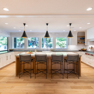
This spacious entertainer's kitchen is part of a whole house remodel and 2-story addition. Our clients' goal was to create a larger, more functional kitchen with a strong connection to the outdoors. The unique flip up window allows for a complete connection to the outdoor covered space.
No expense was spared in this design as the clients' desire for all natural materials drove the selections. The quartzite island in Opus White provides a textural and colorful element that grounds the space and complements the soapstone perimeter counters. The flip out window is a unique feature that bridges indoor and outdoor, and provides unique entertaining element. The focal point of the kitchen are the large windows looking into their greenspace, in order to preserve the view there were very few upper cabinets planned. To compensate with this direction, the lower cabinets were outfitted with top-of-the line interior accessories to provide the most functional and efficient storage. High-end, Wolf and Sub Zero appliance and the addition of a walk-in pantry completed the wish list!
Steel beams were the solution to creating the large open connection between existing structure and new kitchen addition. We had to incorporate a shallow steel beam spanning the whole width of the kitchen to not impede the existing 8' ceiling height, yet allow for the master bedroom addition directly above the new kitchen addition. In order to bridge interior and exterior spaces, a custom, flip-out window was selected. This sits on the finished counter slab, which extended into the adjacent covered entertaining patio. This allowed no room for error, all the components had to fit together exactly to insure the extended countertop would function as the sill.
The value provided our clients was in helping select high quality materials and install them with exceptional quality. Our team did an outstanding job of keeping our client on track and avoiding costly mistakes. This project was not delivered within the original budget due to several client driven change orders.
 Studio 804
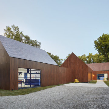
The 722 Ash Street residence consists of a 1500 sf primary house with a contiguous 500 sf accessory dwelling. The project is set in the rich culture of North Lawrence, its rear property line abuts the Lawrence levee trail which runs for nine miles along the north bank of the Kansas River.
North Lawrence is known for its quality soil, large trees, curbless streets and random size parcels before it breaks into larger farms further from the urban center. It is built on the typical orthogonal grid of American development, but it represents the older growth of the city prior to urban planners and zoning regulations. The rumble of freight trains and farm trucks in the shadows of the towering grain elevators are only blocks away. It is home to many who enjoy being only a bridge crossing away from Lawrence’s vibrant downtown but are far enough away to maintain their independence from many of the restrictions on living near the historic district. They can work in their large gardens and toiling in their garages and shops in a manner more rural than urban.
The house on 722 Ash St. is imbued with the character of North Lawrence and the Levee Trail area. The design was inspired by the Midwestern farmstead vernacular of the region. These timeless vernacular qualities house all the accommodations necessary for modern, sustainable living. A unique feature of this house is the Accessory Dwelling Unit permitted in the zoning district. It is a small separate residence on the same lot that can be used for income property or for extended family members. It also supports the city of Lawrence’s goals of increased density close to downtown rather than continued sprawl into the countryside.
The buildings use technology and common-sense design to reduce the building’s footprint and assure the owners low energy use and costs. A 4.9 Kw solar collection system is located on the only south facing gable and the super insulated envelopes (r-62 roof and r-35 walls) of all three forms easily exceeds the standards. Studio 804 continues their long standing pattern of maintaining the highest level of sustainable design while remaining contextually sensitive to the surrounding community. This house, like every Studio 804 project since 2008, is USGBC LEED Platinum Certified.

 Studio 804
The 722 Ash Street residence consists of a 1500 sf primary house with a contiguous 500 sf accessory dwelling. The project is set in the rich culture of North Lawrence, its rear property line abuts the Lawrence levee trail which runs for nine miles along the north bank of the Kansas River.
North Lawrence is known for its quality soil, large trees, curbless streets and random size parcels before it breaks into larger farms further from the urban center. It is built on the typical orthogonal grid of American development, but it represents the older growth of the city prior to urban planners and zoning regulations. The rumble of freight trains and farm trucks in the shadows of the towering grain elevators are only blocks away. It is home to many who enjoy being only a bridge crossing away from Lawrence’s vibrant downtown but are far enough away to maintain their independence from many of the restrictions on living near the historic district. They can work in their large gardens and toiling in their garages and shops in a manner more rural than urban.
The house on 722 Ash St. is imbued with the character of North Lawrence and the Levee Trail area. The design was inspired by the Midwestern farmstead vernacular of the region. These timeless vernacular qualities house all the accommodations necessary for modern, sustainable living. A unique feature of this house is the Accessory Dwelling Unit permitted in the zoning district. It is a small separate residence on the same lot that can be used for income property or for extended family members. It also supports the city of Lawrence’s goals of increased density close to downtown rather than continued sprawl into the countryside.
The buildings use technology and common-sense design to reduce the building’s footprint and assure the owners low energy use and costs. A 4.9 Kw solar collection system is located on the only south facing gable and the super insulated envelopes (r-62 roof and r-35 walls) of all three forms easily exceeds the standards. Studio 804 continues their long standing pattern of maintaining the highest level of sustainable design while remaining contextually sensitive to the surrounding community. This house, like every Studio 804 project since 2008, is USGBC LEED Platinum Certified.
 Ivy Hill Tile
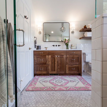
This white bathroom is design goals! The marble, hexagon floor makes a statement while the cozy linens complement the white subway tile. Everything is tied together with the free-standing bath tub. Design: JKathDesignBuild
 Klopf Architecture
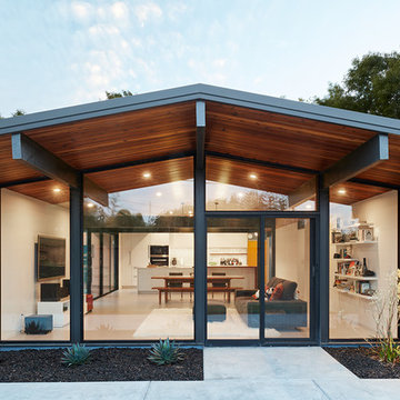
Klopf Architecture completely remodeled this once dark Eichler house in Palo Alto creating a more open, bright and functional family home. The reconfigured great room with new full height windows and sliding glass doors blends the indoors with the newly landscaped patio and seating areas outside. The former galley kitchen was relocated and was opened up to have clear sight lines through the great room and out to the patios and yard, including a large island and a beautiful walnut bar countertop with seating. An integrated small front addition was added allowing for a more spacious master bath and hall bath layouts. With the removal of the old brick fireplace, larger sliding glass doors and multiple skylights now flood the home with natural light.
The goals were to work within the Eichler style while creating a more open, indoor-outdoor flow and functional spaces, as well as a more efficient building envelope including a well insulated roof, providing solutions that many Eichler homeowners appreciate. The original entryway lacked unique details; the clients desired a more gracious front approach. The historic Eichler color palette was used to create a modern updated front facade.
Durable grey porcelain floor tiles unify the entire home, creating a continuous flow. They, along with white walls, provide a backdrop for the unique elements and materials to stand on their own, such as the brightly colored mosaic tiles, the walnut bar and furniture, and stained ceiling boards. A secondary living space was extended out to the patio with the addition of a bench and additional seating.
This Single family Eichler 4 bedroom 2 bath remodel is located in the heart of the Silicon Valley.
Klopf Architecture Project Team: John Klopf, Klara Kevane, and Ethan Taylor
Contractor: Coast to Coast Construction
Landscape Contractor: Discelli
Structural Engineer: Brian Dotson Consulting Engineer
Photography ©2018 Mariko Reed
Location: Palo Alto, CA
Year completed: 2017

 Lindsay Chambers Design
Lindsay Chambers Design, Roger Davies Photography
Bathroom - mid-sized transitional master white tile and marble tile marble floor and white floor bathroom idea in Los Angeles with a two-piece toilet, gray walls, an undermount sink, a hinged shower door, shaker cabinets, purple cabinets and marble countertops
Bathroom - mid-sized transitional master white tile and marble tile marble floor and white floor bathroom idea in Los Angeles with a two-piece toilet, gray walls, an undermount sink, a hinged shower door, shaker cabinets, purple cabinets and marble countertops

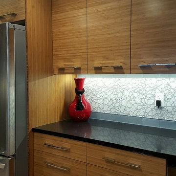
 Zweig Decorating Ideas
GOAL: Maximize storage, low maintenance, larger visual appearance, Zen ambience.
Caramelized bamboo cabinets with horizontal grain are
embellished with polished chrome handles.
Pullout doors are used under sink for trash & recycle bins. Base cabinets consists of drawers and a corner bi-fold door for Lazy Susan storage. Extra deep upper cabinets are 15"d (includes door) with 13"d interior shelves for better storage.
The Island design has one side with all drawers. The other side of Island has all doors that conceal shallow shelves.
The pantry: upper doors open to interior pullout shelves, and lower exterior pantry has drawers.
Backsplash: polished glass, center is a mosaic river rock design and brick style glass for the border. The stove backsplash is one glass sheet. Entire backsplash is designed for easy cleaning. Subtle sparkle grout glistens throughout the backsplash. The Counter tops are black engineered quartz. All materials used are Low maintenance.
Under cabinet and recessed lighting are dimmable LED.
Flooring is porcelain tile.
 Authenticity, LLC
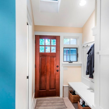
Architect: Michelle Penn, AIA This is remodel & addition project of an Arts & Crafts two-story home. It included the Kitchen & Dining remodel and an addition of an Office, Dining, Mudroom & 1/2 Bath. The new Mudroom has a bench & hooks for coats and storage. The skylight and angled ceiling create an inviting and warm entry from the backyard. Photo Credit: Jackson Studios
 Reliance Design Build
ARC Photography
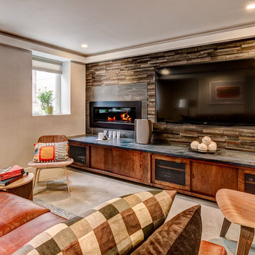
Mid-sized trendy enclosed concrete floor home theater photo in Los Angeles with beige walls and a wall-mounted tv
Mid-sized trendy enclosed concrete floor home theater photo in Los Angeles with beige walls and a wall-mounted tv
 White Sands Coastal Development
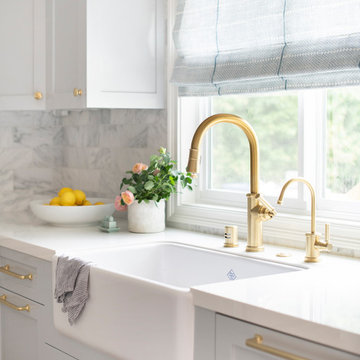
In Southern California there are pockets of darling cottages built in the early 20th century that we like to call jewelry boxes. They are quaint, full of charm and usually a bit cramped. Our clients have a growing family and needed a modern, functional home. They opted for a renovation that directly addressed their concerns.
When we first saw this 2,170 square-foot 3-bedroom beach cottage, the front door opened directly into a staircase and a dead-end hallway. The kitchen was cramped, the living room was claustrophobic and everything felt dark and dated.
The big picture items included pitching the living room ceiling to create space and taking down a kitchen wall. We added a French oven and luxury range that the wife had always dreamed about, a custom vent hood, and custom-paneled appliances.
We added a downstairs half-bath for guests (entirely designed around its whimsical wallpaper) and converted one of the existing bathrooms into a Jack-and-Jill, connecting the kids’ bedrooms, with double sinks and a closed-off toilet and shower for privacy.
In the bathrooms, we added white marble floors and wainscoting. We created storage throughout the home with custom-cabinets, new closets and built-ins, such as bookcases, desks and shelving.
White Sands Design/Build furnished the entire cottage mostly with commissioned pieces, including a custom dining table and upholstered chairs. We updated light fixtures and added brass hardware throughout, to create a vintage, bo-ho vibe.
The best thing about this cottage is the charming backyard accessory dwelling unit (ADU), designed in the same style as the larger structure. In order to keep the ADU it was necessary to renovate less than 50% of the main home, which took some serious strategy, otherwise the non-conforming ADU would need to be torn out. We renovated the bathroom with white walls and pine flooring, transforming it into a get-away that will grow with the girls.
 Advance Design Studio, Ltd.
Curtis and Peggy had been thinking of a kitchen remodel for quite some time, but they knew their house would have a unique set of challenges. Their older Victorian house was built in 1891. The kitchen cabinetry was original, and they wanted to keep the authenticity of their period home while adding modern comforts that would improve their quality of life.
A friend recommended Advance Design Studio for their exceptional experience and quality of work. After meeting with designer Michelle Lecinski at Advance Design, they were confident they could partner with Advance to accomplish the unique kitchen renovation they’d been talking about for years. “We wanted to do the kitchen for a long, long time,” Curtis said. “(We asked ourselves) what are we actually going to do? How are we going to do this? And who are we going to find to do exactly what we want?”
The goal for the project was to keep the home renovation and new kitchen feeling authentic to the time in which it was built. They desperately wanted the modern comforts that come with a larger refrigerator and the dishwasher that they never had! The old home was also a bit drafty so adding a fireplace, wall insulation and new windows became a priority. They very much wanted to create a comfortable hearth room adjacent to the kitchen, complete with old world brick.
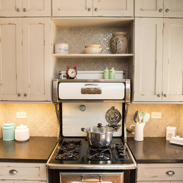
The original cabinetry had to go to make way for beautiful new kitchen cabinetry that appears as if it was a hundred years old, but with all the benefits of cutting-edge storage, self-closing drawers, and a brand-new look. “We just wanted to keep it old looking, but with some modern updates,” Peggy said.
Dura Supreme Highland Cabinets with a Heritage Old World Painted Finish replaced the original 1891 cabinets. The hand-applied careful rubbed-off detailing makes these exquisite cabinets look as if they came from a far-gone era. Despite the small size of the kitchen, Peggy, Curtis and Michelle utilized every inch with custom cabinet sizes to increase storage capacity. The custom cabinets allowed for the addition of a 24” Fisher Paykel dishwasher with a concealing Dura Supreme door panel. Michelle was also able to work into the new design a larger 30” Fisher Paykel French refrigerator. “We made every ¼ inch count in this small space,” designer Michelle said. “Having the ability to custom size the cabinetry was the only way to achieve this.”
“The kitchen essentially was designed around the Heartland Vintage range and oven,” says Michelle. A classic appliance that combines nostalgic beauty and craftsmanship for modern cooking, with nickel plated trim and elegantly shaped handles and legs; the not to miss range is a striking focal point of the entire room and an engaging conversation piece.
Granite countertops in Kodiak Satin with subtle veining kept with the old-world style. The delicate porcelain La Vie Crackle Sonoma tile kitchen backsplash compliments the home’s style perfectly. A handcrafted passthrough designed to show off Peggy’s fine china was custom built by project carpenters Justin Davis and Jeff Dallain to physically and visually open the space. Additional storage was created in the custom panty room with Latte Edinburg cabinets, hand-made weathered wood shelving with authentic black iron brackets, and an intricate tin copper ceiling.
Peggy and Curtis loved the idea of adding a Vermont stove to make the hearth-room not only functional, but a truly beckoning place to be. A stunning Bordeaux red Vermont Castings Stove with crisp black ventilation was chosen and combined with the authentic reclaimed Chicago brick wall. Advance’s talented carpenters custom-built elegant weathered shelves to house family memorabilia, installed carefully chosen barn sconces, and made the hearth room an inviting place to relax with a cup of coffee and a good book.
“Peggy and Curtis’ project was so much fun to work on. Creating a space that looks and feels like it always belonged in this beautiful old Victorian home is a designer’s dream. To see the delight in their faces when they saw the design details coming together truly made it worth the time and effort that went into making the very compact kitchen space work”, said Michelle. “The result is an amazing custom kitchen, packed with functionality in every inch, nook and cranny!” exclaims Michelle.
The renovation didn’t end with the kitchen. New Pella windows were added to help lessen the drafts. The removal of the original windows and trim necessitated the re-creation of hand-made corbels and trim details no longer available today. The talented carpenter team came to the rescue, crafting new pieces and masterfully finishing them as if they were always there. New custom gutters were formed and installed with a front entry rework necessary to accommodate the changes.
The whole house functions better, but it still feels like the original 1891 home. “From start to finish it’s just a much better space than we used to have,” Peggy said. “Jeff and Justin were amazing.” Curtis added; “We were lucky to find Advance Design, because they really came through for us. I loved that they had everything in house, anything you needed to have done, they could do it”.
12