
Search results for "Larger goals" in Home Design Ideas
 Drury Design
The Setup
For this primary bath, our clients—empty nesters who recently updated their entire first floor—wanted a fresh, sophisticated look that would harmonize with the rest of their home’s new design. The original space included a large corner tub and a layout that, while functional, felt outdated and oversized for their needs. The goal was to update the bathroom with a layout that suited them perfectly without moving walls or major fixtures.
Design objectives:
Remove the large, outdated corner tub and replace it with a freestanding tub
Expand and modernize the shower while keeping privacy in mind
Update cabinetry for more organized, efficient storage
Improve lighting with stylish yet understated fixtures to brighten the room
Create a cozy, timeless atmosphere in the large space, maintaining functionality
The Remodel
Design challenges to be solved:
Striking Balance with Lighting – The clients wanted a statement fixture that could enhance the overall design without feeling overwhelming or taking away from the open, airy atmosphere.
Maximizing Existing Footprint – The clients wanted to avoid altering the floor plan, meaning the layout remained mostly the same. The focus was on enhancing the room’s functionality within the existing footprint.
Retaining Coziness – With the removal of the oversized tub deck, there was a need to keep the space from feeling too vast and empty, ensuring it felt cozy and inviting despite the open layout.
Adding Hidden Storage – The master closet was not attached to the bathroom, and the clients wanted a discreet way to store a hamper within the bath area without cluttering the room.
The Renewed Space
Design solutions:
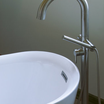
Freestanding Tub on an Angle – Replacing the old corner tub with a sleek, freestanding tub allowed the space to feel open and modern. Positioned at an angle, the tub brings balance to the layout and provides an inviting focal point while still preserving walk-around space for added functionality.
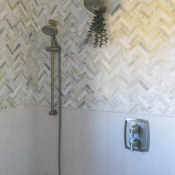
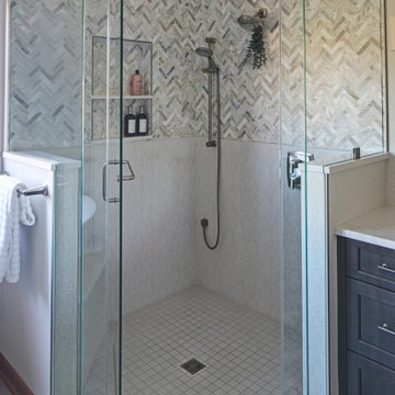
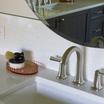
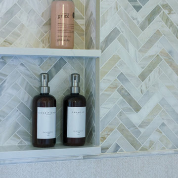
Expanded Shower with Privacy Enhancements – The original, smaller shower was transformed with a larger footprint, half-wall for privacy, and contemporary brushed nickel fixtures, adding both style and function. A herringbone marble accent tile halfway up the shower walls adds a touch of sophistication without overwhelming the space.
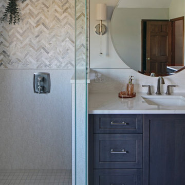
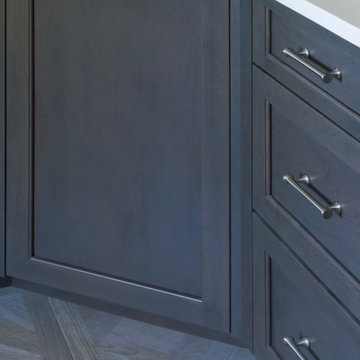
Custom Vanity with Built-in Hamper – A small pull-out hamper was added to the corner of the vanity, providing discreet storage and eliminating the need for a standalone basket. The cabinetry was reconfigured to be more functional and organized for the couple’s daily routines.
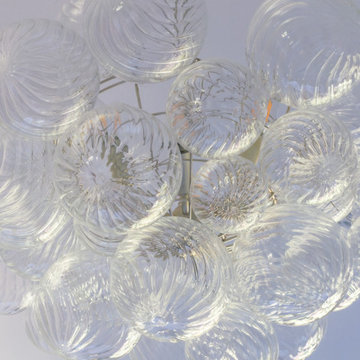
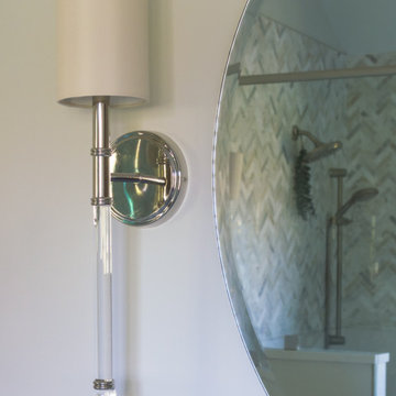
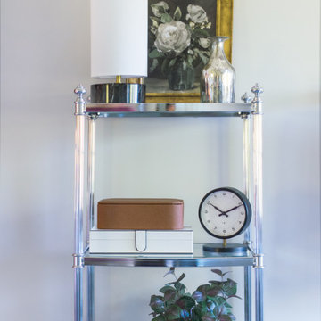
Lighting that Complements the Room – The lighting selection was central to the redesign, with the client gravitating toward a bubble chandelier she had admired. After exploring several options, they chose a smaller size to provide a soft accent without dominating the space, tying in with the bathroom’s overall light and airy feel.
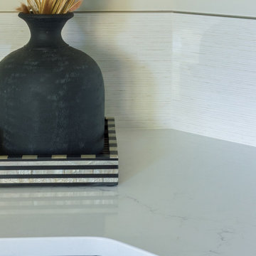
The newly remodeled primary bath exudes a classic, calm atmosphere with a carefully chosen mix of textures and materials. The large porcelain floor tiles mimic the look of wood, lending a warm, traditional touch. Lightly textured cream tiles and brushed nickel fixtures create a soft and cohesive look, while the subtle herringbone marble accent in the shower adds just the right amount of elegance. Round mirrors above the vanities complement the curves of the freestanding tub, softening the room’s overall look and adding a touch of femininity. The result is a bright, timeless space tailored perfectly for the homeowners’ lifestyle.

 The Galante Architecture Studio, Inc.
Originally built in 1972, these eight interlocked residential units and the accompanying House Master’s Residence won an AIA award for their unique spatial complexity, balancing standard units of construction with volumetric interplay, all while bringing natural light into living spaces. However, nearly 40 years later
These 1970’s era, interlocked faculty housing units won an AIA award when first completed. They were unique in spatial complexity, By early 2,000’s they were showing signs of age, and had become outdated on many levels. Working with project management for the Faculty of Arts & Sciences, we prepared one prototype design to bring the buildings into the 21st century. New insulated skylights, standing seam metal siding, cedar decks and trellises, exchanging black roofs for well insulated white roofs, were all part of a larger planning program to renovate all nine units. The prototype was implemented in 2012, to great approval and result. In 2013 a few more units were done. In 2014 the “House Masters” unit was done, with the remaining four units planned for future budgets.
Sustainable features include re-use of most materials on site, (former siding was able to become sheathing below metal panels), implementing the Stretch Energy Code for insulation, and putting new white roof membranes in place. Using FSC certified wood for decks and trellises, and using Rheinzink siding, a “200 year material” according to the manufacturer.
After nearly 40 years, Ronald Gourley’s AIA award winning Faculty Housing (1972) was beginning to show its age – plywood siding was delaminating, wooden decks splintering, and custom windows failing. Therefore, the opportunity to reinvent a piece of Mid-Century Modernism presented itself when two of the building’s eight alternating rooftop designs were to be rebuilt as prototypes for the remainder of the structure.
The strength of the original design was its rectilinear and symmetrical arrangement of internal and external spaces, but the difference between the two had become blurred over the decades. New zinc siding, mahogany decking, and stainless steel railings accentuate the defining elements and more clearly articulate the living spaces, breathing new life into the building and reinvigorating the surrounding campus.
Furthermore, the renovation also provided a chance to bring the structure up to modern energy standards and help meet Harvard’s lofty environmental goals. Insulation within the ceilings was more than tripled, white TPO roofing reduces the heat island effect, construction waste was minimized by recasting the siding as sheathing, and materials were selected not only for aesthetics, but for their longevity and ability to be recycled as well.
Harvard’s energy standards brought an uncharacteristic level of environmental care to this building. Roof structures are triple insulated, allowing separating interior from exterior in the most thermally efficient manner. North facing triple insulated skylights and white TPO roofing reduces the heat gain, but allows natural light to pour in. Materials were selected not only for aesthetics, but for their longevity. Zinc, for example, is made of 100% recycled material, and has duration of 200 years. Uncharacteristic levels of environmental care were common on this project.
 The Galante Architecture Studio, Inc.
Originally built in 1972, these eight interlocked residential units and the accompanying House Master’s Residence won an AIA award for their unique spatial complexity, balancing standard units of construction with volumetric interplay, all while bringing natural light into living spaces. However, nearly 40 years later
These 1970’s era, interlocked faculty housing units won an AIA award when first completed. They were unique in spatial complexity, By early 2,000’s they were showing signs of age, and had become outdated on many levels. Working with project management for the Faculty of Arts & Sciences, we prepared one prototype design to bring the buildings into the 21st century. New insulated skylights, standing seam metal siding, cedar decks and trellises, exchanging black roofs for well insulated white roofs, were all part of a larger planning program to renovate all nine units. The prototype was implemented in 2012, to great approval and result. In 2013 a few more units were done. In 2014 the “House Masters” unit was done, with the remaining four units planned for future budgets.
Sustainable features include re-use of most materials on site, (former siding was able to become sheathing below metal panels), implementing the Stretch Energy Code for insulation, and putting new white roof membranes in place. Using FSC certified wood for decks and trellises, and using Rheinzink siding, a “200 year material” according to the manufacturer.
After nearly 40 years, Ronald Gourley’s AIA award winning Faculty Housing (1972) was beginning to show its age – plywood siding was delaminating, wooden decks splintering, and custom windows failing. Therefore, the opportunity to reinvent a piece of Mid-Century Modernism presented itself when two of the building’s eight alternating rooftop designs were to be rebuilt as prototypes for the remainder of the structure.
The strength of the original design was its rectilinear and symmetrical arrangement of internal and external spaces, but the difference between the two had become blurred over the decades. New zinc siding, mahogany decking, and stainless steel railings accentuate the defining elements and more clearly articulate the living spaces, breathing new life into the building and reinvigorating the surrounding campus.
Furthermore, the renovation also provided a chance to bring the structure up to modern energy standards and help meet Harvard’s lofty environmental goals. Insulation within the ceilings was more than tripled, white TPO roofing reduces the heat island effect, construction waste was minimized by recasting the siding as sheathing, and materials were selected not only for aesthetics, but for their longevity and ability to be recycled as well.
Harvard’s energy standards brought an uncharacteristic level of environmental care to this building. Roof structures are triple insulated, allowing separating interior from exterior in the most thermally efficient manner. North facing triple insulated skylights and white TPO roofing reduces the heat gain, but allows natural light to pour in. Materials were selected not only for aesthetics, but for their longevity. Zinc, for example, is made of 100% recycled material, and has duration of 200 years. Uncharacteristic levels of environmental care were common on this project.
Find the right local pro for your project
 Drury Design
The Setup
For this primary bath, our clients—empty nesters who recently updated their entire first floor—wanted a fresh, sophisticated look that would harmonize with the rest of their home’s new design. The original space included a large corner tub and a layout that, while functional, felt outdated and oversized for their needs. The goal was to update the bathroom with a layout that suited them perfectly without moving walls or major fixtures.
Design objectives:
Remove the large, outdated corner tub and replace it with a freestanding tub
Expand and modernize the shower while keeping privacy in mind
Update cabinetry for more organized, efficient storage
Improve lighting with stylish yet understated fixtures to brighten the room
Create a cozy, timeless atmosphere in the large space, maintaining functionality
The Remodel
Design challenges to be solved:
Striking Balance with Lighting – The clients wanted a statement fixture that could enhance the overall design without feeling overwhelming or taking away from the open, airy atmosphere.
Maximizing Existing Footprint – The clients wanted to avoid altering the floor plan, meaning the layout remained mostly the same. The focus was on enhancing the room’s functionality within the existing footprint.
Retaining Coziness – With the removal of the oversized tub deck, there was a need to keep the space from feeling too vast and empty, ensuring it felt cozy and inviting despite the open layout.
Adding Hidden Storage – The master closet was not attached to the bathroom, and the clients wanted a discreet way to store a hamper within the bath area without cluttering the room.
The Renewed Space
Design solutions:
Freestanding Tub on an Angle – Replacing the old corner tub with a sleek, freestanding tub allowed the space to feel open and modern. Positioned at an angle, the tub brings balance to the layout and provides an inviting focal point while still preserving walk-around space for added functionality.
Expanded Shower with Privacy Enhancements – The original, smaller shower was transformed with a larger footprint, half-wall for privacy, and contemporary brushed nickel fixtures, adding both style and function. A herringbone marble accent tile halfway up the shower walls adds a touch of sophistication without overwhelming the space.
Custom Vanity with Built-in Hamper – A small pull-out hamper was added to the corner of the vanity, providing discreet storage and eliminating the need for a standalone basket. The cabinetry was reconfigured to be more functional and organized for the couple’s daily routines.
Lighting that Complements the Room – The lighting selection was central to the redesign, with the client gravitating toward a bubble chandelier she had admired. After exploring several options, they chose a smaller size to provide a soft accent without dominating the space, tying in with the bathroom’s overall light and airy feel.
The newly remodeled primary bath exudes a classic, calm atmosphere with a carefully chosen mix of textures and materials. The large porcelain floor tiles mimic the look of wood, lending a warm, traditional touch. Lightly textured cream tiles and brushed nickel fixtures create a soft and cohesive look, while the subtle herringbone marble accent in the shower adds just the right amount of elegance. Round mirrors above the vanities complement the curves of the freestanding tub, softening the room’s overall look and adding a touch of femininity. The result is a bright, timeless space tailored perfectly for the homeowners’ lifestyle.
 Drury Design
The Setup
For this primary bath, our clients—empty nesters who recently updated their entire first floor—wanted a fresh, sophisticated look that would harmonize with the rest of their home’s new design. The original space included a large corner tub and a layout that, while functional, felt outdated and oversized for their needs. The goal was to update the bathroom with a layout that suited them perfectly without moving walls or major fixtures.
Design objectives:
Remove the large, outdated corner tub and replace it with a freestanding tub
Expand and modernize the shower while keeping privacy in mind
Update cabinetry for more organized, efficient storage
Improve lighting with stylish yet understated fixtures to brighten the room
Create a cozy, timeless atmosphere in the large space, maintaining functionality
The Remodel
Design challenges to be solved:
Striking Balance with Lighting – The clients wanted a statement fixture that could enhance the overall design without feeling overwhelming or taking away from the open, airy atmosphere.
Maximizing Existing Footprint – The clients wanted to avoid altering the floor plan, meaning the layout remained mostly the same. The focus was on enhancing the room’s functionality within the existing footprint.
Retaining Coziness – With the removal of the oversized tub deck, there was a need to keep the space from feeling too vast and empty, ensuring it felt cozy and inviting despite the open layout.
Adding Hidden Storage – The master closet was not attached to the bathroom, and the clients wanted a discreet way to store a hamper within the bath area without cluttering the room.
The Renewed Space
Design solutions:
Freestanding Tub on an Angle – Replacing the old corner tub with a sleek, freestanding tub allowed the space to feel open and modern. Positioned at an angle, the tub brings balance to the layout and provides an inviting focal point while still preserving walk-around space for added functionality.
Expanded Shower with Privacy Enhancements – The original, smaller shower was transformed with a larger footprint, half-wall for privacy, and contemporary brushed nickel fixtures, adding both style and function. A herringbone marble accent tile halfway up the shower walls adds a touch of sophistication without overwhelming the space.
Custom Vanity with Built-in Hamper – A small pull-out hamper was added to the corner of the vanity, providing discreet storage and eliminating the need for a standalone basket. The cabinetry was reconfigured to be more functional and organized for the couple’s daily routines.
Lighting that Complements the Room – The lighting selection was central to the redesign, with the client gravitating toward a bubble chandelier she had admired. After exploring several options, they chose a smaller size to provide a soft accent without dominating the space, tying in with the bathroom’s overall light and airy feel.
The newly remodeled primary bath exudes a classic, calm atmosphere with a carefully chosen mix of textures and materials. The large porcelain floor tiles mimic the look of wood, lending a warm, traditional touch. Lightly textured cream tiles and brushed nickel fixtures create a soft and cohesive look, while the subtle herringbone marble accent in the shower adds just the right amount of elegance. Round mirrors above the vanities complement the curves of the freestanding tub, softening the room’s overall look and adding a touch of femininity. The result is a bright, timeless space tailored perfectly for the homeowners’ lifestyle.
 Drury Design
The Setup
For this primary bath, our clients—empty nesters who recently updated their entire first floor—wanted a fresh, sophisticated look that would harmonize with the rest of their home’s new design. The original space included a large corner tub and a layout that, while functional, felt outdated and oversized for their needs. The goal was to update the bathroom with a layout that suited them perfectly without moving walls or major fixtures.
Design objectives:
Remove the large, outdated corner tub and replace it with a freestanding tub
Expand and modernize the shower while keeping privacy in mind
Update cabinetry for more organized, efficient storage
Improve lighting with stylish yet understated fixtures to brighten the room
Create a cozy, timeless atmosphere in the large space, maintaining functionality
The Remodel
Design challenges to be solved:
Striking Balance with Lighting – The clients wanted a statement fixture that could enhance the overall design without feeling overwhelming or taking away from the open, airy atmosphere.
Maximizing Existing Footprint – The clients wanted to avoid altering the floor plan, meaning the layout remained mostly the same. The focus was on enhancing the room’s functionality within the existing footprint.
Retaining Coziness – With the removal of the oversized tub deck, there was a need to keep the space from feeling too vast and empty, ensuring it felt cozy and inviting despite the open layout.
Adding Hidden Storage – The master closet was not attached to the bathroom, and the clients wanted a discreet way to store a hamper within the bath area without cluttering the room.
The Renewed Space
Design solutions:
Freestanding Tub on an Angle – Replacing the old corner tub with a sleek, freestanding tub allowed the space to feel open and modern. Positioned at an angle, the tub brings balance to the layout and provides an inviting focal point while still preserving walk-around space for added functionality.
Expanded Shower with Privacy Enhancements – The original, smaller shower was transformed with a larger footprint, half-wall for privacy, and contemporary brushed nickel fixtures, adding both style and function. A herringbone marble accent tile halfway up the shower walls adds a touch of sophistication without overwhelming the space.
Custom Vanity with Built-in Hamper – A small pull-out hamper was added to the corner of the vanity, providing discreet storage and eliminating the need for a standalone basket. The cabinetry was reconfigured to be more functional and organized for the couple’s daily routines.
Lighting that Complements the Room – The lighting selection was central to the redesign, with the client gravitating toward a bubble chandelier she had admired. After exploring several options, they chose a smaller size to provide a soft accent without dominating the space, tying in with the bathroom’s overall light and airy feel.
The newly remodeled primary bath exudes a classic, calm atmosphere with a carefully chosen mix of textures and materials. The large porcelain floor tiles mimic the look of wood, lending a warm, traditional touch. Lightly textured cream tiles and brushed nickel fixtures create a soft and cohesive look, while the subtle herringbone marble accent in the shower adds just the right amount of elegance. Round mirrors above the vanities complement the curves of the freestanding tub, softening the room’s overall look and adding a touch of femininity. The result is a bright, timeless space tailored perfectly for the homeowners’ lifestyle.
 Drury Design
The Setup
For this primary bath, our clients—empty nesters who recently updated their entire first floor—wanted a fresh, sophisticated look that would harmonize with the rest of their home’s new design. The original space included a large corner tub and a layout that, while functional, felt outdated and oversized for their needs. The goal was to update the bathroom with a layout that suited them perfectly without moving walls or major fixtures.
Design objectives:
Remove the large, outdated corner tub and replace it with a freestanding tub
Expand and modernize the shower while keeping privacy in mind
Update cabinetry for more organized, efficient storage
Improve lighting with stylish yet understated fixtures to brighten the room
Create a cozy, timeless atmosphere in the large space, maintaining functionality
The Remodel
Design challenges to be solved:
Striking Balance with Lighting – The clients wanted a statement fixture that could enhance the overall design without feeling overwhelming or taking away from the open, airy atmosphere.
Maximizing Existing Footprint – The clients wanted to avoid altering the floor plan, meaning the layout remained mostly the same. The focus was on enhancing the room’s functionality within the existing footprint.
Retaining Coziness – With the removal of the oversized tub deck, there was a need to keep the space from feeling too vast and empty, ensuring it felt cozy and inviting despite the open layout.
Adding Hidden Storage – The master closet was not attached to the bathroom, and the clients wanted a discreet way to store a hamper within the bath area without cluttering the room.
The Renewed Space
Design solutions:
Freestanding Tub on an Angle – Replacing the old corner tub with a sleek, freestanding tub allowed the space to feel open and modern. Positioned at an angle, the tub brings balance to the layout and provides an inviting focal point while still preserving walk-around space for added functionality.
Expanded Shower with Privacy Enhancements – The original, smaller shower was transformed with a larger footprint, half-wall for privacy, and contemporary brushed nickel fixtures, adding both style and function. A herringbone marble accent tile halfway up the shower walls adds a touch of sophistication without overwhelming the space.
Custom Vanity with Built-in Hamper – A small pull-out hamper was added to the corner of the vanity, providing discreet storage and eliminating the need for a standalone basket. The cabinetry was reconfigured to be more functional and organized for the couple’s daily routines.
Lighting that Complements the Room – The lighting selection was central to the redesign, with the client gravitating toward a bubble chandelier she had admired. After exploring several options, they chose a smaller size to provide a soft accent without dominating the space, tying in with the bathroom’s overall light and airy feel.
The newly remodeled primary bath exudes a classic, calm atmosphere with a carefully chosen mix of textures and materials. The large porcelain floor tiles mimic the look of wood, lending a warm, traditional touch. Lightly textured cream tiles and brushed nickel fixtures create a soft and cohesive look, while the subtle herringbone marble accent in the shower adds just the right amount of elegance. Round mirrors above the vanities complement the curves of the freestanding tub, softening the room’s overall look and adding a touch of femininity. The result is a bright, timeless space tailored perfectly for the homeowners’ lifestyle.


 River Valley Landscapes
The property is one of the original farm houses located on the main street of a small town. It has been in the family for many years and our client just inherited the property. They were trying to have balance of preserving the old while realizing modern day living has its benefits too. The house had a large addition added using mostly old style materials, but designed with function and modern day luxuries. Our goal was to carry that theme to the outside.
Our first problem we had to address was how to transition between the first floor elevation changes. The lower room was the husband’s office. He stated in the future he may have clients over and it would be nice to have an area to sit outside. The wife’s main concern was to renew the four corner garden. She also felt it was very important to be able to see it from the kitchen area. Finally there was an old wishing well stuck right outside the kitchen. They both felt it would be neat to be able to incorporate this in some how. They wanted a patio area with a built in grill to accommodate there family and friends. They also wanted to keep a large play area for the kids.
We were able to pull this off successfully. We addressed the first issue by having a small lower level flagstone area. This area is large enough for 1 to 2 people to sit comfortably. It also provides a transition from his office to the larger patio area. We installed a simple small gravel sitting area opposite of the main patio. This provides our client a secluded place to relax or do business. Mrs.... told me she is amazed how much her and her husband enjoys this area. It is so peaceful looking at the small creek over a glass of wine.
We built a natural limestone retaining wall to create the patio terrace. The stone was chosen to extend the houses architectural elements into the landscape. Irregular broken flagstone was used to give it a more casual feel. We installed three Serviceberries into the patio terrace to replace some trees that were taken down during the remodeling. She was very concern that they would block the view of the four corner garden. We new they were crucial to nestle in the terrace, so we placed them for a couple days for her to decide. Fortunately she agreed they not only kept the view open, but helped frame the garden.
The four corner garden was designed to be viewed from afar and experienced up close. We wanted the space to have some formal structure while keeping with the casual farm house feel. Another natural limestone retaining wall was created. This leveled the garden terrace and helped associate it with the rest of the property. The four corner garden is nestled into the existing woods edge. This provides three distinct experiences to entering the garden; a more formal from the driveway, an open feel from the lower lawn, and a more natural / casual experience from the wooded area. The Plymouth brown gravel was used for the center of the garden. This helped highlight the stone post that was found during construction. The gravel also brings the sense of sound into the garden space. Lamb’s ear was chosen as a fun way to get kids interest in horticulture.
The balance of using the new to create the old feel is what makes this project a success. The property has already hosted a local historical society event and won an award for its preservation efforts. When Mrs.... can’t find her husband, she knows he is either reading the newspaper by the grill or resting in the hammock along the wood’s path.

 Advance Design Studio, Ltd.
Curtis and Peggy had been thinking of a kitchen remodel for quite some time, but they knew their house would have a unique set of challenges. Their older Victorian house was built in 1891. The kitchen cabinetry was original, and they wanted to keep the authenticity of their period home while adding modern comforts that would improve their quality of life.
A friend recommended Advance Design Studio for their exceptional experience and quality of work. After meeting with designer Michelle Lecinski at Advance Design, they were confident they could partner with Advance to accomplish the unique kitchen renovation they’d been talking about for years. “We wanted to do the kitchen for a long, long time,” Curtis said. “(We asked ourselves) what are we actually going to do? How are we going to do this? And who are we going to find to do exactly what we want?”
The goal for the project was to keep the home renovation and new kitchen feeling authentic to the time in which it was built. They desperately wanted the modern comforts that come with a larger refrigerator and the dishwasher that they never had! The old home was also a bit drafty so adding a fireplace, wall insulation and new windows became a priority. They very much wanted to create a comfortable hearth room adjacent to the kitchen, complete with old world brick.
The original cabinetry had to go to make way for beautiful new kitchen cabinetry that appears as if it was a hundred years old, but with all the benefits of cutting-edge storage, self-closing drawers, and a brand-new look. “We just wanted to keep it old looking, but with some modern updates,” Peggy said.
Dura Supreme Highland Cabinets with a Heritage Old World Painted Finish replaced the original 1891 cabinets. The hand-applied careful rubbed-off detailing makes these exquisite cabinets look as if they came from a far-gone era. Despite the small size of the kitchen, Peggy, Curtis and Michelle utilized every inch with custom cabinet sizes to increase storage capacity. The custom cabinets allowed for the addition of a 24” Fisher Paykel dishwasher with a concealing Dura Supreme door panel. Michelle was also able to work into the new design a larger 30” Fisher Paykel French refrigerator. “We made every ¼ inch count in this small space,” designer Michelle said. “Having the ability to custom size the cabinetry was the only way to achieve this.”
“The kitchen essentially was designed around the Heartland Vintage range and oven,” says Michelle. A classic appliance that combines nostalgic beauty and craftsmanship for modern cooking, with nickel plated trim and elegantly shaped handles and legs; the not to miss range is a striking focal point of the entire room and an engaging conversation piece.
Granite countertops in Kodiak Satin with subtle veining kept with the old-world style. The delicate porcelain La Vie Crackle Sonoma tile kitchen backsplash compliments the home’s style perfectly. A handcrafted passthrough designed to show off Peggy’s fine china was custom built by project carpenters Justin Davis and Jeff Dallain to physically and visually open the space. Additional storage was created in the custom panty room with Latte Edinburg cabinets, hand-made weathered wood shelving with authentic black iron brackets, and an intricate tin copper ceiling.
Peggy and Curtis loved the idea of adding a Vermont stove to make the hearth-room not only functional, but a truly beckoning place to be. A stunning Bordeaux red Vermont Castings Stove with crisp black ventilation was chosen and combined with the authentic reclaimed Chicago brick wall. Advance’s talented carpenters custom-built elegant weathered shelves to house family memorabilia, installed carefully chosen barn sconces, and made the hearth room an inviting place to relax with a cup of coffee and a good book.
“Peggy and Curtis’ project was so much fun to work on. Creating a space that looks and feels like it always belonged in this beautiful old Victorian home is a designer’s dream. To see the delight in their faces when they saw the design details coming together truly made it worth the time and effort that went into making the very compact kitchen space work”, said Michelle. “The result is an amazing custom kitchen, packed with functionality in every inch, nook and cranny!” exclaims Michelle.
The renovation didn’t end with the kitchen. New Pella windows were added to help lessen the drafts. The removal of the original windows and trim necessitated the re-creation of hand-made corbels and trim details no longer available today. The talented carpenter team came to the rescue, crafting new pieces and masterfully finishing them as if they were always there. New custom gutters were formed and installed with a front entry rework necessary to accommodate the changes.
The whole house functions better, but it still feels like the original 1891 home. “From start to finish it’s just a much better space than we used to have,” Peggy said. “Jeff and Justin were amazing.” Curtis added; “We were lucky to find Advance Design, because they really came through for us. I loved that they had everything in house, anything you needed to have done, they could do it”.
 Advance Design Studio, Ltd.
Willie & Leslie of Barrington Hills loved the location of their home. Its breathtaking views overlooked a wooded backyard and a captivating lake. They didn’t want to move, but they needed more space. But the house was missing that big family room where everyone could gather, relax and converse, and the house was completely cut off visually from the beautiful outdoor view right outside!
They knew what they wanted meant building an addition to their home. They began searching the internet and came across Advance Design Studio, and after browsing through project after project and reading one outstanding client review after another, they were sold on Advance Design. Additionally, they loved Advance Design’s “Common Sense Remodeling” process and felt confident that it would allow the Design/Build company to easily coordinate the multiple projects they wanted to complete all at one time. Willie and Leslie immediately set up a meeting with Owner Todd Jurs and Project Designer Claudia Pop. When the meeting ended, they were sure that Advance Design were the right people and the right approach for their project.
"Establishing a direction and a budget is always key in project of this size," Todd said. "This house was screaming for a family room and it didn't have one. Ultimately, it's about working together towards the same goal of a beautiful functional addition."
The project consisted of a significant family room addition with an extraordinary vaulted ceiling and floor to ceiling fireplace, a guest suite renovation with a luxury bath, a garage addition, and an adjoining outdoor patio renovation complete with a fantastic built in grilling station. The main goal was to add comfort and space to the existing home that would last their lifetime, and finally allow them to capture the amazing view of the backyard and lake that they never could really enjoy previously.
Willie, Leslie and Claudia paid special attention to designing the space to make sure that the footprint of the room did not interfere with the views. Floor to ceiling Pella windows were incorporated into a spectacular window wall to provide plenty of natural light.
Vaulted ceilings gave the room a bigger feel and the stunning floor to ceiling masonry fireplace was designed giving the room a rustic, comfortable feel of a Colorado Lodge. Barnwood doors and exposed wooden beams accentuate the crackling fireplace and family gathering space. An oversized statement chandelier bathes the space in soft light once the sun sets and compliments the exposed wood and fireplace perfectly.
“It simple elegant and beautiful,” Designer Claudia Pop said. “It is a great family room that captures the views perfectly. They love the fireplace, the barndoors and the openness of the space we designed for the whole family now to enjoy.”
And when warm weather beckons, the outdoor patio is a terrific place to spend an evening. The family now enjoys fall nights in front of their outdoor fireplace overlooking the quiet lake. Dekton Trillium Quartz counters tops adorn an amazing grilling bar. Nearly indestructible, they are the only manufactured stone product designed exclusively to withstand high heat in summer and extreme cold temperatures in winter.
The guest bath renovation makes Willie and Leslie’s friends and family feel like they are staying at a 5-star hotel. Carlisle colored Maple cabinets from Medallion make a roomy dual vanity more than adequate with plenty of space to get ready for the day after a peaceful night’s sleep. Cambria Quartz countertops are durable and elegant, while contrasting the neutral cabinets flawlessly. Heated flooring from Warmly Yours is the cherry on top for this cozy guest bath.
All the projects turned out better than they even imagined. Willie and Leslie now have a spacious family room with even better views of the lake and woods, a much larger garage, a fantastic relaxing outdoor patio, and a guest bath that makes it almost impossible to get the guest to leave after their stay.
Are you thinking about a remodeling project? Talk to the experts at Advance Design about the renovation of your dreams. Now is the perfect time to renovate. Check out other amazing projects here. With “Common Sense Remodeling”, the process of renovating your home has never been easier. Contact us today at 847-836-2600 or schedule an appointment to talk with us about your kitchen remodeling project, or any other home renovation you are planning. Our talented team can help you design and build the new space you’ve been dreaming about.
 Drury Design
The Setup
For this primary bath, our clients—empty nesters who recently updated their entire first floor—wanted a fresh, sophisticated look that would harmonize with the rest of their home’s new design. The original space included a large corner tub and a layout that, while functional, felt outdated and oversized for their needs. The goal was to update the bathroom with a layout that suited them perfectly without moving walls or major fixtures.
Design objectives:
Remove the large, outdated corner tub and replace it with a freestanding tub
Expand and modernize the shower while keeping privacy in mind
Update cabinetry for more organized, efficient storage
Improve lighting with stylish yet understated fixtures to brighten the room
Create a cozy, timeless atmosphere in the large space, maintaining functionality
The Remodel
Design challenges to be solved:
Striking Balance with Lighting – The clients wanted a statement fixture that could enhance the overall design without feeling overwhelming or taking away from the open, airy atmosphere.
Maximizing Existing Footprint – The clients wanted to avoid altering the floor plan, meaning the layout remained mostly the same. The focus was on enhancing the room’s functionality within the existing footprint.
Retaining Coziness – With the removal of the oversized tub deck, there was a need to keep the space from feeling too vast and empty, ensuring it felt cozy and inviting despite the open layout.
Adding Hidden Storage – The master closet was not attached to the bathroom, and the clients wanted a discreet way to store a hamper within the bath area without cluttering the room.
The Renewed Space
Design solutions:
Freestanding Tub on an Angle – Replacing the old corner tub with a sleek, freestanding tub allowed the space to feel open and modern. Positioned at an angle, the tub brings balance to the layout and provides an inviting focal point while still preserving walk-around space for added functionality.
Expanded Shower with Privacy Enhancements – The original, smaller shower was transformed with a larger footprint, half-wall for privacy, and contemporary brushed nickel fixtures, adding both style and function. A herringbone marble accent tile halfway up the shower walls adds a touch of sophistication without overwhelming the space.
Custom Vanity with Built-in Hamper – A small pull-out hamper was added to the corner of the vanity, providing discreet storage and eliminating the need for a standalone basket. The cabinetry was reconfigured to be more functional and organized for the couple’s daily routines.
Lighting that Complements the Room – The lighting selection was central to the redesign, with the client gravitating toward a bubble chandelier she had admired. After exploring several options, they chose a smaller size to provide a soft accent without dominating the space, tying in with the bathroom’s overall light and airy feel.
The newly remodeled primary bath exudes a classic, calm atmosphere with a carefully chosen mix of textures and materials. The large porcelain floor tiles mimic the look of wood, lending a warm, traditional touch. Lightly textured cream tiles and brushed nickel fixtures create a soft and cohesive look, while the subtle herringbone marble accent in the shower adds just the right amount of elegance. Round mirrors above the vanities complement the curves of the freestanding tub, softening the room’s overall look and adding a touch of femininity. The result is a bright, timeless space tailored perfectly for the homeowners’ lifestyle.
 Drury Design
The Setup
For this primary bath, our clients—empty nesters who recently updated their entire first floor—wanted a fresh, sophisticated look that would harmonize with the rest of their home’s new design. The original space included a large corner tub and a layout that, while functional, felt outdated and oversized for their needs. The goal was to update the bathroom with a layout that suited them perfectly without moving walls or major fixtures.
Design objectives:
Remove the large, outdated corner tub and replace it with a freestanding tub
Expand and modernize the shower while keeping privacy in mind
Update cabinetry for more organized, efficient storage
Improve lighting with stylish yet understated fixtures to brighten the room
Create a cozy, timeless atmosphere in the large space, maintaining functionality
The Remodel
Design challenges to be solved:
Striking Balance with Lighting – The clients wanted a statement fixture that could enhance the overall design without feeling overwhelming or taking away from the open, airy atmosphere.
Maximizing Existing Footprint – The clients wanted to avoid altering the floor plan, meaning the layout remained mostly the same. The focus was on enhancing the room’s functionality within the existing footprint.
Retaining Coziness – With the removal of the oversized tub deck, there was a need to keep the space from feeling too vast and empty, ensuring it felt cozy and inviting despite the open layout.
Adding Hidden Storage – The master closet was not attached to the bathroom, and the clients wanted a discreet way to store a hamper within the bath area without cluttering the room.
The Renewed Space
Design solutions:
Freestanding Tub on an Angle – Replacing the old corner tub with a sleek, freestanding tub allowed the space to feel open and modern. Positioned at an angle, the tub brings balance to the layout and provides an inviting focal point while still preserving walk-around space for added functionality.
Expanded Shower with Privacy Enhancements – The original, smaller shower was transformed with a larger footprint, half-wall for privacy, and contemporary brushed nickel fixtures, adding both style and function. A herringbone marble accent tile halfway up the shower walls adds a touch of sophistication without overwhelming the space.
Custom Vanity with Built-in Hamper – A small pull-out hamper was added to the corner of the vanity, providing discreet storage and eliminating the need for a standalone basket. The cabinetry was reconfigured to be more functional and organized for the couple’s daily routines.
Lighting that Complements the Room – The lighting selection was central to the redesign, with the client gravitating toward a bubble chandelier she had admired. After exploring several options, they chose a smaller size to provide a soft accent without dominating the space, tying in with the bathroom’s overall light and airy feel.
The newly remodeled primary bath exudes a classic, calm atmosphere with a carefully chosen mix of textures and materials. The large porcelain floor tiles mimic the look of wood, lending a warm, traditional touch. Lightly textured cream tiles and brushed nickel fixtures create a soft and cohesive look, while the subtle herringbone marble accent in the shower adds just the right amount of elegance. Round mirrors above the vanities complement the curves of the freestanding tub, softening the room’s overall look and adding a touch of femininity. The result is a bright, timeless space tailored perfectly for the homeowners’ lifestyle.
 Drury Design
The Setup
For this primary bath, our clients—empty nesters who recently updated their entire first floor—wanted a fresh, sophisticated look that would harmonize with the rest of their home’s new design. The original space included a large corner tub and a layout that, while functional, felt outdated and oversized for their needs. The goal was to update the bathroom with a layout that suited them perfectly without moving walls or major fixtures.
Design objectives:
Remove the large, outdated corner tub and replace it with a freestanding tub
Expand and modernize the shower while keeping privacy in mind
Update cabinetry for more organized, efficient storage
Improve lighting with stylish yet understated fixtures to brighten the room
Create a cozy, timeless atmosphere in the large space, maintaining functionality
The Remodel
Design challenges to be solved:
Striking Balance with Lighting – The clients wanted a statement fixture that could enhance the overall design without feeling overwhelming or taking away from the open, airy atmosphere.
Maximizing Existing Footprint – The clients wanted to avoid altering the floor plan, meaning the layout remained mostly the same. The focus was on enhancing the room’s functionality within the existing footprint.
Retaining Coziness – With the removal of the oversized tub deck, there was a need to keep the space from feeling too vast and empty, ensuring it felt cozy and inviting despite the open layout.
Adding Hidden Storage – The master closet was not attached to the bathroom, and the clients wanted a discreet way to store a hamper within the bath area without cluttering the room.
The Renewed Space
Design solutions:
Freestanding Tub on an Angle – Replacing the old corner tub with a sleek, freestanding tub allowed the space to feel open and modern. Positioned at an angle, the tub brings balance to the layout and provides an inviting focal point while still preserving walk-around space for added functionality.
Expanded Shower with Privacy Enhancements – The original, smaller shower was transformed with a larger footprint, half-wall for privacy, and contemporary brushed nickel fixtures, adding both style and function. A herringbone marble accent tile halfway up the shower walls adds a touch of sophistication without overwhelming the space.
Custom Vanity with Built-in Hamper – A small pull-out hamper was added to the corner of the vanity, providing discreet storage and eliminating the need for a standalone basket. The cabinetry was reconfigured to be more functional and organized for the couple’s daily routines.
Lighting that Complements the Room – The lighting selection was central to the redesign, with the client gravitating toward a bubble chandelier she had admired. After exploring several options, they chose a smaller size to provide a soft accent without dominating the space, tying in with the bathroom’s overall light and airy feel.
The newly remodeled primary bath exudes a classic, calm atmosphere with a carefully chosen mix of textures and materials. The large porcelain floor tiles mimic the look of wood, lending a warm, traditional touch. Lightly textured cream tiles and brushed nickel fixtures create a soft and cohesive look, while the subtle herringbone marble accent in the shower adds just the right amount of elegance. Round mirrors above the vanities complement the curves of the freestanding tub, softening the room’s overall look and adding a touch of femininity. The result is a bright, timeless space tailored perfectly for the homeowners’ lifestyle.
 Drury Design
The Setup
For this primary bath, our clients—empty nesters who recently updated their entire first floor—wanted a fresh, sophisticated look that would harmonize with the rest of their home’s new design. The original space included a large corner tub and a layout that, while functional, felt outdated and oversized for their needs. The goal was to update the bathroom with a layout that suited them perfectly without moving walls or major fixtures.
Design objectives:
Remove the large, outdated corner tub and replace it with a freestanding tub
Expand and modernize the shower while keeping privacy in mind
Update cabinetry for more organized, efficient storage
Improve lighting with stylish yet understated fixtures to brighten the room
Create a cozy, timeless atmosphere in the large space, maintaining functionality
The Remodel
Design challenges to be solved:
Striking Balance with Lighting – The clients wanted a statement fixture that could enhance the overall design without feeling overwhelming or taking away from the open, airy atmosphere.
Maximizing Existing Footprint – The clients wanted to avoid altering the floor plan, meaning the layout remained mostly the same. The focus was on enhancing the room’s functionality within the existing footprint.
Retaining Coziness – With the removal of the oversized tub deck, there was a need to keep the space from feeling too vast and empty, ensuring it felt cozy and inviting despite the open layout.
Adding Hidden Storage – The master closet was not attached to the bathroom, and the clients wanted a discreet way to store a hamper within the bath area without cluttering the room.
The Renewed Space
Design solutions:
Freestanding Tub on an Angle – Replacing the old corner tub with a sleek, freestanding tub allowed the space to feel open and modern. Positioned at an angle, the tub brings balance to the layout and provides an inviting focal point while still preserving walk-around space for added functionality.
Expanded Shower with Privacy Enhancements – The original, smaller shower was transformed with a larger footprint, half-wall for privacy, and contemporary brushed nickel fixtures, adding both style and function. A herringbone marble accent tile halfway up the shower walls adds a touch of sophistication without overwhelming the space.
Custom Vanity with Built-in Hamper – A small pull-out hamper was added to the corner of the vanity, providing discreet storage and eliminating the need for a standalone basket. The cabinetry was reconfigured to be more functional and organized for the couple’s daily routines.
Lighting that Complements the Room – The lighting selection was central to the redesign, with the client gravitating toward a bubble chandelier she had admired. After exploring several options, they chose a smaller size to provide a soft accent without dominating the space, tying in with the bathroom’s overall light and airy feel.
The newly remodeled primary bath exudes a classic, calm atmosphere with a carefully chosen mix of textures and materials. The large porcelain floor tiles mimic the look of wood, lending a warm, traditional touch. Lightly textured cream tiles and brushed nickel fixtures create a soft and cohesive look, while the subtle herringbone marble accent in the shower adds just the right amount of elegance. Round mirrors above the vanities complement the curves of the freestanding tub, softening the room’s overall look and adding a touch of femininity. The result is a bright, timeless space tailored perfectly for the homeowners’ lifestyle.
 Drury Design
The Setup
For this primary bath, our clients—empty nesters who recently updated their entire first floor—wanted a fresh, sophisticated look that would harmonize with the rest of their home’s new design. The original space included a large corner tub and a layout that, while functional, felt outdated and oversized for their needs. The goal was to update the bathroom with a layout that suited them perfectly without moving walls or major fixtures.
Design objectives:
Remove the large, outdated corner tub and replace it with a freestanding tub
Expand and modernize the shower while keeping privacy in mind
Update cabinetry for more organized, efficient storage
Improve lighting with stylish yet understated fixtures to brighten the room
Create a cozy, timeless atmosphere in the large space, maintaining functionality
The Remodel
Design challenges to be solved:
Striking Balance with Lighting – The clients wanted a statement fixture that could enhance the overall design without feeling overwhelming or taking away from the open, airy atmosphere.
Maximizing Existing Footprint – The clients wanted to avoid altering the floor plan, meaning the layout remained mostly the same. The focus was on enhancing the room’s functionality within the existing footprint.
Retaining Coziness – With the removal of the oversized tub deck, there was a need to keep the space from feeling too vast and empty, ensuring it felt cozy and inviting despite the open layout.
Adding Hidden Storage – The master closet was not attached to the bathroom, and the clients wanted a discreet way to store a hamper within the bath area without cluttering the room.
The Renewed Space
Design solutions:
Freestanding Tub on an Angle – Replacing the old corner tub with a sleek, freestanding tub allowed the space to feel open and modern. Positioned at an angle, the tub brings balance to the layout and provides an inviting focal point while still preserving walk-around space for added functionality.
Expanded Shower with Privacy Enhancements – The original, smaller shower was transformed with a larger footprint, half-wall for privacy, and contemporary brushed nickel fixtures, adding both style and function. A herringbone marble accent tile halfway up the shower walls adds a touch of sophistication without overwhelming the space.
Custom Vanity with Built-in Hamper – A small pull-out hamper was added to the corner of the vanity, providing discreet storage and eliminating the need for a standalone basket. The cabinetry was reconfigured to be more functional and organized for the couple’s daily routines.
Lighting that Complements the Room – The lighting selection was central to the redesign, with the client gravitating toward a bubble chandelier she had admired. After exploring several options, they chose a smaller size to provide a soft accent without dominating the space, tying in with the bathroom’s overall light and airy feel.
The newly remodeled primary bath exudes a classic, calm atmosphere with a carefully chosen mix of textures and materials. The large porcelain floor tiles mimic the look of wood, lending a warm, traditional touch. Lightly textured cream tiles and brushed nickel fixtures create a soft and cohesive look, while the subtle herringbone marble accent in the shower adds just the right amount of elegance. Round mirrors above the vanities complement the curves of the freestanding tub, softening the room’s overall look and adding a touch of femininity. The result is a bright, timeless space tailored perfectly for the homeowners’ lifestyle.
 The Galante Architecture Studio, Inc.
Originally built in 1972, these eight interlocked residential units and the accompanying House Master’s Residence won an AIA award for their unique spatial complexity, balancing standard units of construction with volumetric interplay, all while bringing natural light into living spaces. However, nearly 40 years later
These 1970’s era, interlocked faculty housing units won an AIA award when first completed. They were unique in spatial complexity, By early 2,000’s they were showing signs of age, and had become outdated on many levels. Working with project management for the Faculty of Arts & Sciences, we prepared one prototype design to bring the buildings into the 21st century. New insulated skylights, standing seam metal siding, cedar decks and trellises, exchanging black roofs for well insulated white roofs, were all part of a larger planning program to renovate all nine units. The prototype was implemented in 2012, to great approval and result. In 2013 a few more units were done. In 2014 the “House Masters” unit was done, with the remaining four units planned for future budgets.
Sustainable features include re-use of most materials on site, (former siding was able to become sheathing below metal panels), implementing the Stretch Energy Code for insulation, and putting new white roof membranes in place. Using FSC certified wood for decks and trellises, and using Rheinzink siding, a “200 year material” according to the manufacturer.
After nearly 40 years, Ronald Gourley’s AIA award winning Faculty Housing (1972) was beginning to show its age – plywood siding was delaminating, wooden decks splintering, and custom windows failing. Therefore, the opportunity to reinvent a piece of Mid-Century Modernism presented itself when two of the building’s eight alternating rooftop designs were to be rebuilt as prototypes for the remainder of the structure.
The strength of the original design was its rectilinear and symmetrical arrangement of internal and external spaces, but the difference between the two had become blurred over the decades. New zinc siding, mahogany decking, and stainless steel railings accentuate the defining elements and more clearly articulate the living spaces, breathing new life into the building and reinvigorating the surrounding campus.
Furthermore, the renovation also provided a chance to bring the structure up to modern energy standards and help meet Harvard’s lofty environmental goals. Insulation within the ceilings was more than tripled, white TPO roofing reduces the heat island effect, construction waste was minimized by recasting the siding as sheathing, and materials were selected not only for aesthetics, but for their longevity and ability to be recycled as well.
Harvard’s energy standards brought an uncharacteristic level of environmental care to this building. Roof structures are triple insulated, allowing separating interior from exterior in the most thermally efficient manner. North facing triple insulated skylights and white TPO roofing reduces the heat gain, but allows natural light to pour in. Materials were selected not only for aesthetics, but for their longevity. Zinc, for example, is made of 100% recycled material, and has duration of 200 years. Uncharacteristic levels of environmental care were common on this project.
 Advance Design Studio, Ltd.
Curtis and Peggy had been thinking of a kitchen remodel for quite some time, but they knew their house would have a unique set of challenges. Their older Victorian house was built in 1891. The kitchen cabinetry was original, and they wanted to keep the authenticity of their period home while adding modern comforts that would improve their quality of life.
A friend recommended Advance Design Studio for their exceptional experience and quality of work. After meeting with designer Michelle Lecinski at Advance Design, they were confident they could partner with Advance to accomplish the unique kitchen renovation they’d been talking about for years. “We wanted to do the kitchen for a long, long time,” Curtis said. “(We asked ourselves) what are we actually going to do? How are we going to do this? And who are we going to find to do exactly what we want?”
The goal for the project was to keep the home renovation and new kitchen feeling authentic to the time in which it was built. They desperately wanted the modern comforts that come with a larger refrigerator and the dishwasher that they never had! The old home was also a bit drafty so adding a fireplace, wall insulation and new windows became a priority. They very much wanted to create a comfortable hearth room adjacent to the kitchen, complete with old world brick.
The original cabinetry had to go to make way for beautiful new kitchen cabinetry that appears as if it was a hundred years old, but with all the benefits of cutting-edge storage, self-closing drawers, and a brand-new look. “We just wanted to keep it old looking, but with some modern updates,” Peggy said.
Dura Supreme Highland Cabinets with a Heritage Old World Painted Finish replaced the original 1891 cabinets. The hand-applied careful rubbed-off detailing makes these exquisite cabinets look as if they came from a far-gone era. Despite the small size of the kitchen, Peggy, Curtis and Michelle utilized every inch with custom cabinet sizes to increase storage capacity. The custom cabinets allowed for the addition of a 24” Fisher Paykel dishwasher with a concealing Dura Supreme door panel. Michelle was also able to work into the new design a larger 30” Fisher Paykel French refrigerator. “We made every ¼ inch count in this small space,” designer Michelle said. “Having the ability to custom size the cabinetry was the only way to achieve this.”
“The kitchen essentially was designed around the Heartland Vintage range and oven,” says Michelle. A classic appliance that combines nostalgic beauty and craftsmanship for modern cooking, with nickel plated trim and elegantly shaped handles and legs; the not to miss range is a striking focal point of the entire room and an engaging conversation piece.
Granite countertops in Kodiak Satin with subtle veining kept with the old-world style. The delicate porcelain La Vie Crackle Sonoma tile kitchen backsplash compliments the home’s style perfectly. A handcrafted passthrough designed to show off Peggy’s fine china was custom built by project carpenters Justin Davis and Jeff Dallain to physically and visually open the space. Additional storage was created in the custom panty room with Latte Edinburg cabinets, hand-made weathered wood shelving with authentic black iron brackets, and an intricate tin copper ceiling.
Peggy and Curtis loved the idea of adding a Vermont stove to make the hearth-room not only functional, but a truly beckoning place to be. A stunning Bordeaux red Vermont Castings Stove with crisp black ventilation was chosen and combined with the authentic reclaimed Chicago brick wall. Advance’s talented carpenters custom-built elegant weathered shelves to house family memorabilia, installed carefully chosen barn sconces, and made the hearth room an inviting place to relax with a cup of coffee and a good book.
“Peggy and Curtis’ project was so much fun to work on. Creating a space that looks and feels like it always belonged in this beautiful old Victorian home is a designer’s dream. To see the delight in their faces when they saw the design details coming together truly made it worth the time and effort that went into making the very compact kitchen space work”, said Michelle. “The result is an amazing custom kitchen, packed with functionality in every inch, nook and cranny!” exclaims Michelle.
The renovation didn’t end with the kitchen. New Pella windows were added to help lessen the drafts. The removal of the original windows and trim necessitated the re-creation of hand-made corbels and trim details no longer available today. The talented carpenter team came to the rescue, crafting new pieces and masterfully finishing them as if they were always there. New custom gutters were formed and installed with a front entry rework necessary to accommodate the changes.
The whole house functions better, but it still feels like the original 1891 home. “From start to finish it’s just a much better space than we used to have,” Peggy said. “Jeff and Justin were amazing.” Curtis added; “We were lucky to find Advance Design, because they really came through for us. I loved that they had everything in house, anything you needed to have done, they could do it”.
 Drury Design
The Setup
For this primary bath, our clients—empty nesters who recently updated their entire first floor—wanted a fresh, sophisticated look that would harmonize with the rest of their home’s new design. The original space included a large corner tub and a layout that, while functional, felt outdated and oversized for their needs. The goal was to update the bathroom with a layout that suited them perfectly without moving walls or major fixtures.
Design objectives:
Remove the large, outdated corner tub and replace it with a freestanding tub
Expand and modernize the shower while keeping privacy in mind
Update cabinetry for more organized, efficient storage
Improve lighting with stylish yet understated fixtures to brighten the room
Create a cozy, timeless atmosphere in the large space, maintaining functionality
The Remodel
Design challenges to be solved:
Striking Balance with Lighting – The clients wanted a statement fixture that could enhance the overall design without feeling overwhelming or taking away from the open, airy atmosphere.
Maximizing Existing Footprint – The clients wanted to avoid altering the floor plan, meaning the layout remained mostly the same. The focus was on enhancing the room’s functionality within the existing footprint.
Retaining Coziness – With the removal of the oversized tub deck, there was a need to keep the space from feeling too vast and empty, ensuring it felt cozy and inviting despite the open layout.
Adding Hidden Storage – The master closet was not attached to the bathroom, and the clients wanted a discreet way to store a hamper within the bath area without cluttering the room.
The Renewed Space
Design solutions:
Freestanding Tub on an Angle – Replacing the old corner tub with a sleek, freestanding tub allowed the space to feel open and modern. Positioned at an angle, the tub brings balance to the layout and provides an inviting focal point while still preserving walk-around space for added functionality.
Expanded Shower with Privacy Enhancements – The original, smaller shower was transformed with a larger footprint, half-wall for privacy, and contemporary brushed nickel fixtures, adding both style and function. A herringbone marble accent tile halfway up the shower walls adds a touch of sophistication without overwhelming the space.
Custom Vanity with Built-in Hamper – A small pull-out hamper was added to the corner of the vanity, providing discreet storage and eliminating the need for a standalone basket. The cabinetry was reconfigured to be more functional and organized for the couple’s daily routines.
Lighting that Complements the Room – The lighting selection was central to the redesign, with the client gravitating toward a bubble chandelier she had admired. After exploring several options, they chose a smaller size to provide a soft accent without dominating the space, tying in with the bathroom’s overall light and airy feel.
The newly remodeled primary bath exudes a classic, calm atmosphere with a carefully chosen mix of textures and materials. The large porcelain floor tiles mimic the look of wood, lending a warm, traditional touch. Lightly textured cream tiles and brushed nickel fixtures create a soft and cohesive look, while the subtle herringbone marble accent in the shower adds just the right amount of elegance. Round mirrors above the vanities complement the curves of the freestanding tub, softening the room’s overall look and adding a touch of femininity. The result is a bright, timeless space tailored perfectly for the homeowners’ lifestyle.
 The Galante Architecture Studio, Inc.
Originally built in 1972, these eight interlocked residential units and the accompanying House Master’s Residence won an AIA award for their unique spatial complexity, balancing standard units of construction with volumetric interplay, all while bringing natural light into living spaces. However, nearly 40 years later
These 1970’s era, interlocked faculty housing units won an AIA award when first completed. They were unique in spatial complexity, By early 2,000’s they were showing signs of age, and had become outdated on many levels. Working with project management for the Faculty of Arts & Sciences, we prepared one prototype design to bring the buildings into the 21st century. New insulated skylights, standing seam metal siding, cedar decks and trellises, exchanging black roofs for well insulated white roofs, were all part of a larger planning program to renovate all nine units. The prototype was implemented in 2012, to great approval and result. In 2013 a few more units were done. In 2014 the “House Masters” unit was done, with the remaining four units planned for future budgets.
Sustainable features include re-use of most materials on site, (former siding was able to become sheathing below metal panels), implementing the Stretch Energy Code for insulation, and putting new white roof membranes in place. Using FSC certified wood for decks and trellises, and using Rheinzink siding, a “200 year material” according to the manufacturer.
After nearly 40 years, Ronald Gourley’s AIA award winning Faculty Housing (1972) was beginning to show its age – plywood siding was delaminating, wooden decks splintering, and custom windows failing. Therefore, the opportunity to reinvent a piece of Mid-Century Modernism presented itself when two of the building’s eight alternating rooftop designs were to be rebuilt as prototypes for the remainder of the structure.
The strength of the original design was its rectilinear and symmetrical arrangement of internal and external spaces, but the difference between the two had become blurred over the decades. New zinc siding, mahogany decking, and stainless steel railings accentuate the defining elements and more clearly articulate the living spaces, breathing new life into the building and reinvigorating the surrounding campus.
Furthermore, the renovation also provided a chance to bring the structure up to modern energy standards and help meet Harvard’s lofty environmental goals. Insulation within the ceilings was more than tripled, white TPO roofing reduces the heat island effect, construction waste was minimized by recasting the siding as sheathing, and materials were selected not only for aesthetics, but for their longevity and ability to be recycled as well.
Harvard’s energy standards brought an uncharacteristic level of environmental care to this building. Roof structures are triple insulated, allowing separating interior from exterior in the most thermally efficient manner. North facing triple insulated skylights and white TPO roofing reduces the heat gain, but allows natural light to pour in. Materials were selected not only for aesthetics, but for their longevity. Zinc, for example, is made of 100% recycled material, and has duration of 200 years. Uncharacteristic levels of environmental care were common on this project.


90