
Search results for "Larger goals" in Home Design Ideas

 River Valley Landscapes
The property is one of the original farm houses located on the main street of a small town. It has been in the family for many years and our client just inherited the property. They were trying to have balance of preserving the old while realizing modern day living has its benefits too. The house had a large addition added using mostly old style materials, but designed with function and modern day luxuries. Our goal was to carry that theme to the outside.
Our first problem we had to address was how to transition between the first floor elevation changes. The lower room was the husband’s office. He stated in the future he may have clients over and it would be nice to have an area to sit outside. The wife’s main concern was to renew the four corner garden. She also felt it was very important to be able to see it from the kitchen area. Finally there was an old wishing well stuck right outside the kitchen. They both felt it would be neat to be able to incorporate this in some how. They wanted a patio area with a built in grill to accommodate there family and friends. They also wanted to keep a large play area for the kids.
We were able to pull this off successfully. We addressed the first issue by having a small lower level flagstone area. This area is large enough for 1 to 2 people to sit comfortably. It also provides a transition from his office to the larger patio area. We installed a simple small gravel sitting area opposite of the main patio. This provides our client a secluded place to relax or do business. Mrs.... told me she is amazed how much her and her husband enjoys this area. It is so peaceful looking at the small creek over a glass of wine.
We built a natural limestone retaining wall to create the patio terrace. The stone was chosen to extend the houses architectural elements into the landscape. Irregular broken flagstone was used to give it a more casual feel. We installed three Serviceberries into the patio terrace to replace some trees that were taken down during the remodeling. She was very concern that they would block the view of the four corner garden. We new they were crucial to nestle in the terrace, so we placed them for a couple days for her to decide. Fortunately she agreed they not only kept the view open, but helped frame the garden.
The four corner garden was designed to be viewed from afar and experienced up close. We wanted the space to have some formal structure while keeping with the casual farm house feel. Another natural limestone retaining wall was created. This leveled the garden terrace and helped associate it with the rest of the property. The four corner garden is nestled into the existing woods edge. This provides three distinct experiences to entering the garden; a more formal from the driveway, an open feel from the lower lawn, and a more natural / casual experience from the wooded area. The Plymouth brown gravel was used for the center of the garden. This helped highlight the stone post that was found during construction. The gravel also brings the sense of sound into the garden space. Lamb’s ear was chosen as a fun way to get kids interest in horticulture.
The balance of using the new to create the old feel is what makes this project a success. The property has already hosted a local historical society event and won an award for its preservation efforts. When Mrs.... can’t find her husband, she knows he is either reading the newspaper by the grill or resting in the hammock along the wood’s path.
 Kowalske Kitchen & Bath
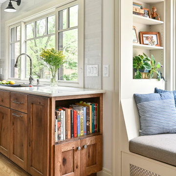
 was hired as the remodeling contractor for this first floor remodel in the countryside of Oconomowoc, WI. By opening the kitchen up to the living room, the layout is better for hosting family gatherings. The entire family can be together in the kitchen and living room – cooking or spending time together. Highlights of this country kitchen include a window seat, walk-in pantry and space for their treasured piano.
Project Goals
+ Restore the beauty of their family home, that was built by the homeowner’s grandfather
+ Cooking functionality for their family farm
+ Add a workstation sink for easy food prep
+ Pantry storage space for canned items & wine collection
+ Design that honors the mid-century ranch bones of the house her grandfather built and their own traditional style
Challenges & Issues
+ Needed space to highlight their piano, since the homeowner is an avid pianist
+ Old layout didn’t have good views of their outdoor space – the lake, gardens and chicken coop
+ Kitchen was too small and cut off from the rest of the home
+ The heat and air conditioning did not function well due to several past additions
Country Kitchen Features:
Cooking Kitchen – We created a larger kitchen by expanding into the old dining room. The homeowners needed more space for canning vegetables, cooking and entertaining.
Mid-Century Country Design – The ranch home was built in the 1950s so we kept the mid-century and country kitchen design aesthetic by using hickory wood, tall verticals and long horizontals.
Kitchen Window Seat – A custom window seat with a curved backrest creates a gathering spot in the kitchen. This connects the home to the outdoor view of the lake where the family fishes and ice skates in winter. The bench is large enough to be used as a guest bed when they have visitors. The cozy nook has shelving, art lights, and a hidden radiator underneath to keep it warm and toasty.
Window Backsplash – Along the range wall, a new window backsplash features the beautiful view of the farm driveway, trees and gardens.
Minimalistic Hood – The hood with the wood shelf mimics the new fireplace mantel and ties the country kitchen and living room together.
New Pantry – The old kitchen area was converted into the new pantry and a laundry room. The pantry is their working kitchen where they can store food, their wine collection, and have countertop space for small appliances. Butcher block countertops, colorful wallpaper and a new window make the pantry inviting. Adjustable shelves allow for flexible storage options. The pocket door can be closed when they have guests.
Recycled Ash Flooring in Kitchen – The homeowners chose an eco-friendly flooring for their country kitchen. The beautiful varied width wood planks are from recycled ash trees from Milwaukee parks.
Workstation Sink – This sink has sliding platforms that hold bowls, colanders and cutting boards to multiply the countertop by going deep instead of wide. The sink can be used to chop, rinse, prep, dry dishes, hold hot dishes and clean up after a meal more efficiently.
Country House Living Room:
New Tile Floor – To better conduct the heat, we replaced the old wood floors with porcelain tile. New radiators, insulation, ductwork, and enclosing the basement staircase improved the function of their HVAC.
Fireplace Makeover – To create a new focal point for the living room, we installed a new fire box, new mantle, and floor to ceiling stone. The goal was to draw the eye up to the vaulted beamed ceiling.
Open Concept Layout – The wall between the kitchen and living room was removed to connect the two spaces. We added new cabinetry along the wall with a tall bookcase. Since they didn’t use their formal dining room, a small dining table was added to the living room.
New Railing & Stairs – The staircase to the kitchen area was tricky because we needed to find a style that would make it feel airy. We did a glass enclosure with a simple metal railing and moved the staircase to the center of the room to allow room for the piano.
 Kowalske Kitchen & Bath
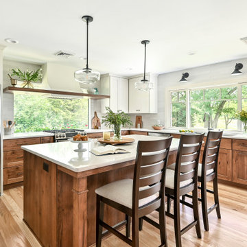
 was hired as the remodeling contractor for this first floor remodel in the countryside of Oconomowoc, WI. By opening the kitchen up to the living room, the layout is better for hosting family gatherings. The entire family can be together in the kitchen and living room – cooking or spending time together. Highlights of this country kitchen include a window seat, walk-in pantry and space for their treasured piano.
Project Goals
+ Restore the beauty of their family home, that was built by the homeowner’s grandfather
+ Cooking functionality for their family farm
+ Add a workstation sink for easy food prep
+ Pantry storage space for canned items & wine collection
+ Design that honors the mid-century ranch bones of the house her grandfather built and their own traditional style
Challenges & Issues
+ Needed space to highlight their piano, since the homeowner is an avid pianist
+ Old layout didn’t have good views of their outdoor space – the lake, gardens and chicken coop
+ Kitchen was too small and cut off from the rest of the home
+ The heat and air conditioning did not function well due to several past additions
Country Kitchen Features:
Cooking Kitchen – We created a larger kitchen by expanding into the old dining room. The homeowners needed more space for canning vegetables, cooking and entertaining.
Mid-Century Country Design – The ranch home was built in the 1950s so we kept the mid-century and country kitchen design aesthetic by using hickory wood, tall verticals and long horizontals.
Kitchen Window Seat – A custom window seat with a curved backrest creates a gathering spot in the kitchen. This connects the home to the outdoor view of the lake where the family fishes and ice skates in winter. The bench is large enough to be used as a guest bed when they have visitors. The cozy nook has shelving, art lights, and a hidden radiator underneath to keep it warm and toasty.
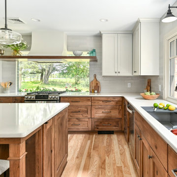
Window Backsplash – Along the range wall, a new window backsplash features the beautiful view of the farm driveway, trees and gardens.
Minimalistic Hood – The hood with the wood shelf mimics the new fireplace mantel and ties the country kitchen and living room together.
New Pantry – The old kitchen area was converted into the new pantry and a laundry room. The pantry is their working kitchen where they can store food, their wine collection, and have countertop space for small appliances. Butcher block countertops, colorful wallpaper and a new window make the pantry inviting. Adjustable shelves allow for flexible storage options. The pocket door can be closed when they have guests.
Recycled Ash Flooring in Kitchen – The homeowners chose an eco-friendly flooring for their country kitchen. The beautiful varied width wood planks are from recycled ash trees from Milwaukee parks.
Workstation Sink – This sink has sliding platforms that hold bowls, colanders and cutting boards to multiply the countertop by going deep instead of wide. The sink can be used to chop, rinse, prep, dry dishes, hold hot dishes and clean up after a meal more efficiently.
Country House Living Room:
New Tile Floor – To better conduct the heat, we replaced the old wood floors with porcelain tile. New radiators, insulation, ductwork, and enclosing the basement staircase improved the function of their HVAC.
Fireplace Makeover – To create a new focal point for the living room, we installed a new fire box, new mantle, and floor to ceiling stone. The goal was to draw the eye up to the vaulted beamed ceiling.
Open Concept Layout – The wall between the kitchen and living room was removed to connect the two spaces. We added new cabinetry along the wall with a tall bookcase. Since they didn’t use their formal dining room, a small dining table was added to the living room.
New Railing & Stairs – The staircase to the kitchen area was tricky because we needed to find a style that would make it feel airy. We did a glass enclosure with a simple metal railing and moved the staircase to the center of the room to allow room for the piano.
Find the right local pro for your project
 Kowalske Kitchen & Bath
 was hired as the remodeling contractor for this first floor remodel in the countryside of Oconomowoc, WI. By opening the kitchen up to the living room, the layout is better for hosting family gatherings. The entire family can be together in the kitchen and living room – cooking or spending time together. Highlights of this country kitchen include a window seat, walk-in pantry and space for their treasured piano.
Project Goals
+ Restore the beauty of their family home, that was built by the homeowner’s grandfather
+ Cooking functionality for their family farm
+ Add a workstation sink for easy food prep
+ Pantry storage space for canned items & wine collection
+ Design that honors the mid-century ranch bones of the house her grandfather built and their own traditional style
Challenges & Issues
+ Needed space to highlight their piano, since the homeowner is an avid pianist
+ Old layout didn’t have good views of their outdoor space – the lake, gardens and chicken coop
+ Kitchen was too small and cut off from the rest of the home
+ The heat and air conditioning did not function well due to several past additions
Country Kitchen Features:
Cooking Kitchen – We created a larger kitchen by expanding into the old dining room. The homeowners needed more space for canning vegetables, cooking and entertaining.
Mid-Century Country Design – The ranch home was built in the 1950s so we kept the mid-century and country kitchen design aesthetic by using hickory wood, tall verticals and long horizontals.
Kitchen Window Seat – A custom window seat with a curved backrest creates a gathering spot in the kitchen. This connects the home to the outdoor view of the lake where the family fishes and ice skates in winter. The bench is large enough to be used as a guest bed when they have visitors. The cozy nook has shelving, art lights, and a hidden radiator underneath to keep it warm and toasty.
Window Backsplash – Along the range wall, a new window backsplash features the beautiful view of the farm driveway, trees and gardens.
Minimalistic Hood – The hood with the wood shelf mimics the new fireplace mantel and ties the country kitchen and living room together.
New Pantry – The old kitchen area was converted into the new pantry and a laundry room. The pantry is their working kitchen where they can store food, their wine collection, and have countertop space for small appliances. Butcher block countertops, colorful wallpaper and a new window make the pantry inviting. Adjustable shelves allow for flexible storage options. The pocket door can be closed when they have guests.
Recycled Ash Flooring in Kitchen – The homeowners chose an eco-friendly flooring for their country kitchen. The beautiful varied width wood planks are from recycled ash trees from Milwaukee parks.
Workstation Sink – This sink has sliding platforms that hold bowls, colanders and cutting boards to multiply the countertop by going deep instead of wide. The sink can be used to chop, rinse, prep, dry dishes, hold hot dishes and clean up after a meal more efficiently.
Country House Living Room:
New Tile Floor – To better conduct the heat, we replaced the old wood floors with porcelain tile. New radiators, insulation, ductwork, and enclosing the basement staircase improved the function of their HVAC.
Fireplace Makeover – To create a new focal point for the living room, we installed a new fire box, new mantle, and floor to ceiling stone. The goal was to draw the eye up to the vaulted beamed ceiling.
Open Concept Layout – The wall between the kitchen and living room was removed to connect the two spaces. We added new cabinetry along the wall with a tall bookcase. Since they didn’t use their formal dining room, a small dining table was added to the living room.
New Railing & Stairs – The staircase to the kitchen area was tricky because we needed to find a style that would make it feel airy. We did a glass enclosure with a simple metal railing and moved the staircase to the center of the room to allow room for the piano.

 Fiorito Interior Design
For this project, my client’s goal was to remove a rarely-used existing bath tub next to a medium-sized shower and replace it all with a roomy, open, walk-in shower. With soaring, ten-foot high ceilings, this space became a luxurious statement in minimalism!
I chose a neutral, linen-striated ceramic tile for the floor which, since we were creating a barrier-free shower, meant I could run this tile into the shower and add a hidden, tiled drain for a continuous, seamless look. This makes the bathroom appear even larger. For interest, I added opulent, large-format, ceramic tiles with a blue- and grey-veined marble pattern trimmed out with metal strips. A grand glass wall separates the wet area from the rest of the bathroom. Controls for the shower were wisely placed at the entrance which also features towel hooks and a towel bar on a coordinating panel of blue marble ceramic tile.
The rest of the bathroom received a modern makeover as well with a crisp, custom-built vanity and quartz counter top replacing the old tile counter. Undermount sinks and sculptural hardware sit under modern mirrors with integrated LED lights for maximum light on the face. To top this design off, I chose a glamorous but tailored chandelier with discreet crystal embellishments to infuse sophistication into this sleek, minimalist space.
The new room is light, bright, and uncluttered. For this client, the ultimate luxury is not having a space full of things, but having a space that is simply full of space!
Photo by Bernardo Grijalva


 Advance Design Studio, Ltd.
Willie & Leslie of Barrington Hills loved the location of their home. Its breathtaking views overlooked a wooded backyard and a captivating lake. They didn’t want to move, but they needed more space. But the house was missing that big family room where everyone could gather, relax and converse, and the house was completely cut off visually from the beautiful outdoor view right outside!
They knew what they wanted meant building an addition to their home. They began searching the internet and came across Advance Design Studio, and after browsing through project after project and reading one outstanding client review after another, they were sold on Advance Design. Additionally, they loved Advance Design’s “Common Sense Remodeling” process and felt confident that it would allow the Design/Build company to easily coordinate the multiple projects they wanted to complete all at one time. Willie and Leslie immediately set up a meeting with Owner Todd Jurs and Project Designer Claudia Pop. When the meeting ended, they were sure that Advance Design were the right people and the right approach for their project.
"Establishing a direction and a budget is always key in project of this size," Todd said. "This house was screaming for a family room and it didn't have one. Ultimately, it's about working together towards the same goal of a beautiful functional addition."
The project consisted of a significant family room addition with an extraordinary vaulted ceiling and floor to ceiling fireplace, a guest suite renovation with a luxury bath, a garage addition, and an adjoining outdoor patio renovation complete with a fantastic built in grilling station. The main goal was to add comfort and space to the existing home that would last their lifetime, and finally allow them to capture the amazing view of the backyard and lake that they never could really enjoy previously.
Willie, Leslie and Claudia paid special attention to designing the space to make sure that the footprint of the room did not interfere with the views. Floor to ceiling Pella windows were incorporated into a spectacular window wall to provide plenty of natural light.
Vaulted ceilings gave the room a bigger feel and the stunning floor to ceiling masonry fireplace was designed giving the room a rustic, comfortable feel of a Colorado Lodge. Barnwood doors and exposed wooden beams accentuate the crackling fireplace and family gathering space. An oversized statement chandelier bathes the space in soft light once the sun sets and compliments the exposed wood and fireplace perfectly.
“It simple elegant and beautiful,” Designer Claudia Pop said. “It is a great family room that captures the views perfectly. They love the fireplace, the barndoors and the openness of the space we designed for the whole family now to enjoy.”
And when warm weather beckons, the outdoor patio is a terrific place to spend an evening. The family now enjoys fall nights in front of their outdoor fireplace overlooking the quiet lake. Dekton Trillium Quartz counters tops adorn an amazing grilling bar. Nearly indestructible, they are the only manufactured stone product designed exclusively to withstand high heat in summer and extreme cold temperatures in winter.
The guest bath renovation makes Willie and Leslie’s friends and family feel like they are staying at a 5-star hotel. Carlisle colored Maple cabinets from Medallion make a roomy dual vanity more than adequate with plenty of space to get ready for the day after a peaceful night’s sleep. Cambria Quartz countertops are durable and elegant, while contrasting the neutral cabinets flawlessly. Heated flooring from Warmly Yours is the cherry on top for this cozy guest bath.
All the projects turned out better than they even imagined. Willie and Leslie now have a spacious family room with even better views of the lake and woods, a much larger garage, a fantastic relaxing outdoor patio, and a guest bath that makes it almost impossible to get the guest to leave after their stay.
Are you thinking about a remodeling project? Talk to the experts at Advance Design about the renovation of your dreams. Now is the perfect time to renovate. Check out other amazing projects here. With “Common Sense Remodeling”, the process of renovating your home has never been easier. Contact us today at 847-836-2600 or schedule an appointment to talk with us about your kitchen remodeling project, or any other home renovation you are planning. Our talented team can help you design and build the new space you’ve been dreaming about.

 River Valley Landscapes
The property is one of the original farm houses located on the main street of a small town. It has been in the family for many years and our client just inherited the property. They were trying to have balance of preserving the old while realizing modern day living has its benefits too. The house had a large addition added using mostly old style materials, but designed with function and modern day luxuries. Our goal was to carry that theme to the outside.
Our first problem we had to address was how to transition between the first floor elevation changes. The lower room was the husband’s office. He stated in the future he may have clients over and it would be nice to have an area to sit outside. The wife’s main concern was to renew the four corner garden. She also felt it was very important to be able to see it from the kitchen area. Finally there was an old wishing well stuck right outside the kitchen. They both felt it would be neat to be able to incorporate this in some how. They wanted a patio area with a built in grill to accommodate there family and friends. They also wanted to keep a large play area for the kids.
We were able to pull this off successfully. We addressed the first issue by having a small lower level flagstone area. This area is large enough for 1 to 2 people to sit comfortably. It also provides a transition from his office to the larger patio area. We installed a simple small gravel sitting area opposite of the main patio. This provides our client a secluded place to relax or do business. Mrs.... told me she is amazed how much her and her husband enjoys this area. It is so peaceful looking at the small creek over a glass of wine.
We built a natural limestone retaining wall to create the patio terrace. The stone was chosen to extend the houses architectural elements into the landscape. Irregular broken flagstone was used to give it a more casual feel. We installed three Serviceberries into the patio terrace to replace some trees that were taken down during the remodeling. She was very concern that they would block the view of the four corner garden. We new they were crucial to nestle in the terrace, so we placed them for a couple days for her to decide. Fortunately she agreed they not only kept the view open, but helped frame the garden.
The four corner garden was designed to be viewed from afar and experienced up close. We wanted the space to have some formal structure while keeping with the casual farm house feel. Another natural limestone retaining wall was created. This leveled the garden terrace and helped associate it with the rest of the property. The four corner garden is nestled into the existing woods edge. This provides three distinct experiences to entering the garden; a more formal from the driveway, an open feel from the lower lawn, and a more natural / casual experience from the wooded area. The Plymouth brown gravel was used for the center of the garden. This helped highlight the stone post that was found during construction. The gravel also brings the sense of sound into the garden space. Lamb’s ear was chosen as a fun way to get kids interest in horticulture.
The balance of using the new to create the old feel is what makes this project a success. The property has already hosted a local historical society event and won an award for its preservation efforts. When Mrs.... can’t find her husband, she knows he is either reading the newspaper by the grill or resting in the hammock along the wood’s path.
 Advance Design Studio, Ltd.
Willie & Leslie of Barrington Hills loved the location of their home. Its breathtaking views overlooked a wooded backyard and a captivating lake. They didn’t want to move, but they needed more space. But the house was missing that big family room where everyone could gather, relax and converse, and the house was completely cut off visually from the beautiful outdoor view right outside!
They knew what they wanted meant building an addition to their home. They began searching the internet and came across Advance Design Studio, and after browsing through project after project and reading one outstanding client review after another, they were sold on Advance Design. Additionally, they loved Advance Design’s “Common Sense Remodeling” process and felt confident that it would allow the Design/Build company to easily coordinate the multiple projects they wanted to complete all at one time. Willie and Leslie immediately set up a meeting with Owner Todd Jurs and Project Designer Claudia Pop. When the meeting ended, they were sure that Advance Design were the right people and the right approach for their project.
"Establishing a direction and a budget is always key in project of this size," Todd said. "This house was screaming for a family room and it didn't have one. Ultimately, it's about working together towards the same goal of a beautiful functional addition."
The project consisted of a significant family room addition with an extraordinary vaulted ceiling and floor to ceiling fireplace, a guest suite renovation with a luxury bath, a garage addition, and an adjoining outdoor patio renovation complete with a fantastic built in grilling station. The main goal was to add comfort and space to the existing home that would last their lifetime, and finally allow them to capture the amazing view of the backyard and lake that they never could really enjoy previously.
Willie, Leslie and Claudia paid special attention to designing the space to make sure that the footprint of the room did not interfere with the views. Floor to ceiling Pella windows were incorporated into a spectacular window wall to provide plenty of natural light.
Vaulted ceilings gave the room a bigger feel and the stunning floor to ceiling masonry fireplace was designed giving the room a rustic, comfortable feel of a Colorado Lodge. Barnwood doors and exposed wooden beams accentuate the crackling fireplace and family gathering space. An oversized statement chandelier bathes the space in soft light once the sun sets and compliments the exposed wood and fireplace perfectly.
“It simple elegant and beautiful,” Designer Claudia Pop said. “It is a great family room that captures the views perfectly. They love the fireplace, the barndoors and the openness of the space we designed for the whole family now to enjoy.”
And when warm weather beckons, the outdoor patio is a terrific place to spend an evening. The family now enjoys fall nights in front of their outdoor fireplace overlooking the quiet lake. Dekton Trillium Quartz counters tops adorn an amazing grilling bar. Nearly indestructible, they are the only manufactured stone product designed exclusively to withstand high heat in summer and extreme cold temperatures in winter.
The guest bath renovation makes Willie and Leslie’s friends and family feel like they are staying at a 5-star hotel. Carlisle colored Maple cabinets from Medallion make a roomy dual vanity more than adequate with plenty of space to get ready for the day after a peaceful night’s sleep. Cambria Quartz countertops are durable and elegant, while contrasting the neutral cabinets flawlessly. Heated flooring from Warmly Yours is the cherry on top for this cozy guest bath.
All the projects turned out better than they even imagined. Willie and Leslie now have a spacious family room with even better views of the lake and woods, a much larger garage, a fantastic relaxing outdoor patio, and a guest bath that makes it almost impossible to get the guest to leave after their stay.
Are you thinking about a remodeling project? Talk to the experts at Advance Design about the renovation of your dreams. Now is the perfect time to renovate. Check out other amazing projects here. With “Common Sense Remodeling”, the process of renovating your home has never been easier. Contact us today at 847-836-2600 or schedule an appointment to talk with us about your kitchen remodeling project, or any other home renovation you are planning. Our talented team can help you design and build the new space you’ve been dreaming about.
 Advance Design Studio, Ltd.
Willie & Leslie of Barrington Hills loved the location of their home. Its breathtaking views overlooked a wooded backyard and a captivating lake. They didn’t want to move, but they needed more space. But the house was missing that big family room where everyone could gather, relax and converse, and the house was completely cut off visually from the beautiful outdoor view right outside!
They knew what they wanted meant building an addition to their home. They began searching the internet and came across Advance Design Studio, and after browsing through project after project and reading one outstanding client review after another, they were sold on Advance Design. Additionally, they loved Advance Design’s “Common Sense Remodeling” process and felt confident that it would allow the Design/Build company to easily coordinate the multiple projects they wanted to complete all at one time. Willie and Leslie immediately set up a meeting with Owner Todd Jurs and Project Designer Claudia Pop. When the meeting ended, they were sure that Advance Design were the right people and the right approach for their project.
"Establishing a direction and a budget is always key in project of this size," Todd said. "This house was screaming for a family room and it didn't have one. Ultimately, it's about working together towards the same goal of a beautiful functional addition."
The project consisted of a significant family room addition with an extraordinary vaulted ceiling and floor to ceiling fireplace, a guest suite renovation with a luxury bath, a garage addition, and an adjoining outdoor patio renovation complete with a fantastic built in grilling station. The main goal was to add comfort and space to the existing home that would last their lifetime, and finally allow them to capture the amazing view of the backyard and lake that they never could really enjoy previously.
Willie, Leslie and Claudia paid special attention to designing the space to make sure that the footprint of the room did not interfere with the views. Floor to ceiling Pella windows were incorporated into a spectacular window wall to provide plenty of natural light.
Vaulted ceilings gave the room a bigger feel and the stunning floor to ceiling masonry fireplace was designed giving the room a rustic, comfortable feel of a Colorado Lodge. Barnwood doors and exposed wooden beams accentuate the crackling fireplace and family gathering space. An oversized statement chandelier bathes the space in soft light once the sun sets and compliments the exposed wood and fireplace perfectly.
“It simple elegant and beautiful,” Designer Claudia Pop said. “It is a great family room that captures the views perfectly. They love the fireplace, the barndoors and the openness of the space we designed for the whole family now to enjoy.”
And when warm weather beckons, the outdoor patio is a terrific place to spend an evening. The family now enjoys fall nights in front of their outdoor fireplace overlooking the quiet lake. Dekton Trillium Quartz counters tops adorn an amazing grilling bar. Nearly indestructible, they are the only manufactured stone product designed exclusively to withstand high heat in summer and extreme cold temperatures in winter.
The guest bath renovation makes Willie and Leslie’s friends and family feel like they are staying at a 5-star hotel. Carlisle colored Maple cabinets from Medallion make a roomy dual vanity more than adequate with plenty of space to get ready for the day after a peaceful night’s sleep. Cambria Quartz countertops are durable and elegant, while contrasting the neutral cabinets flawlessly. Heated flooring from Warmly Yours is the cherry on top for this cozy guest bath.
All the projects turned out better than they even imagined. Willie and Leslie now have a spacious family room with even better views of the lake and woods, a much larger garage, a fantastic relaxing outdoor patio, and a guest bath that makes it almost impossible to get the guest to leave after their stay.
Are you thinking about a remodeling project? Talk to the experts at Advance Design about the renovation of your dreams. Now is the perfect time to renovate. Check out other amazing projects here. With “Common Sense Remodeling”, the process of renovating your home has never been easier. Contact us today at 847-836-2600 or schedule an appointment to talk with us about your kitchen remodeling project, or any other home renovation you are planning. Our talented team can help you design and build the new space you’ve been dreaming about.
 Advance Design Studio, Ltd.
Willie & Leslie of Barrington Hills loved the location of their home. Its breathtaking views overlooked a wooded backyard and a captivating lake. They didn’t want to move, but they needed more space. But the house was missing that big family room where everyone could gather, relax and converse, and the house was completely cut off visually from the beautiful outdoor view right outside!
They knew what they wanted meant building an addition to their home. They began searching the internet and came across Advance Design Studio, and after browsing through project after project and reading one outstanding client review after another, they were sold on Advance Design. Additionally, they loved Advance Design’s “Common Sense Remodeling” process and felt confident that it would allow the Design/Build company to easily coordinate the multiple projects they wanted to complete all at one time. Willie and Leslie immediately set up a meeting with Owner Todd Jurs and Project Designer Claudia Pop. When the meeting ended, they were sure that Advance Design were the right people and the right approach for their project.
"Establishing a direction and a budget is always key in project of this size," Todd said. "This house was screaming for a family room and it didn't have one. Ultimately, it's about working together towards the same goal of a beautiful functional addition."
The project consisted of a significant family room addition with an extraordinary vaulted ceiling and floor to ceiling fireplace, a guest suite renovation with a luxury bath, a garage addition, and an adjoining outdoor patio renovation complete with a fantastic built in grilling station. The main goal was to add comfort and space to the existing home that would last their lifetime, and finally allow them to capture the amazing view of the backyard and lake that they never could really enjoy previously.
Willie, Leslie and Claudia paid special attention to designing the space to make sure that the footprint of the room did not interfere with the views. Floor to ceiling Pella windows were incorporated into a spectacular window wall to provide plenty of natural light.
Vaulted ceilings gave the room a bigger feel and the stunning floor to ceiling masonry fireplace was designed giving the room a rustic, comfortable feel of a Colorado Lodge. Barnwood doors and exposed wooden beams accentuate the crackling fireplace and family gathering space. An oversized statement chandelier bathes the space in soft light once the sun sets and compliments the exposed wood and fireplace perfectly.
“It simple elegant and beautiful,” Designer Claudia Pop said. “It is a great family room that captures the views perfectly. They love the fireplace, the barndoors and the openness of the space we designed for the whole family now to enjoy.”
And when warm weather beckons, the outdoor patio is a terrific place to spend an evening. The family now enjoys fall nights in front of their outdoor fireplace overlooking the quiet lake. Dekton Trillium Quartz counters tops adorn an amazing grilling bar. Nearly indestructible, they are the only manufactured stone product designed exclusively to withstand high heat in summer and extreme cold temperatures in winter.
The guest bath renovation makes Willie and Leslie’s friends and family feel like they are staying at a 5-star hotel. Carlisle colored Maple cabinets from Medallion make a roomy dual vanity more than adequate with plenty of space to get ready for the day after a peaceful night’s sleep. Cambria Quartz countertops are durable and elegant, while contrasting the neutral cabinets flawlessly. Heated flooring from Warmly Yours is the cherry on top for this cozy guest bath.
All the projects turned out better than they even imagined. Willie and Leslie now have a spacious family room with even better views of the lake and woods, a much larger garage, a fantastic relaxing outdoor patio, and a guest bath that makes it almost impossible to get the guest to leave after their stay.
Are you thinking about a remodeling project? Talk to the experts at Advance Design about the renovation of your dreams. Now is the perfect time to renovate. Check out other amazing projects here. With “Common Sense Remodeling”, the process of renovating your home has never been easier. Contact us today at 847-836-2600 or schedule an appointment to talk with us about your kitchen remodeling project, or any other home renovation you are planning. Our talented team can help you design and build the new space you’ve been dreaming about.
 Advance Design Studio, Ltd.
Curtis and Peggy had been thinking of a kitchen remodel for quite some time, but they knew their house would have a unique set of challenges. Their older Victorian house was built in 1891. The kitchen cabinetry was original, and they wanted to keep the authenticity of their period home while adding modern comforts that would improve their quality of life.
A friend recommended Advance Design Studio for their exceptional experience and quality of work. After meeting with designer Michelle Lecinski at Advance Design, they were confident they could partner with Advance to accomplish the unique kitchen renovation they’d been talking about for years. “We wanted to do the kitchen for a long, long time,” Curtis said. “(We asked ourselves) what are we actually going to do? How are we going to do this? And who are we going to find to do exactly what we want?”
The goal for the project was to keep the home renovation and new kitchen feeling authentic to the time in which it was built. They desperately wanted the modern comforts that come with a larger refrigerator and the dishwasher that they never had! The old home was also a bit drafty so adding a fireplace, wall insulation and new windows became a priority. They very much wanted to create a comfortable hearth room adjacent to the kitchen, complete with old world brick.
The original cabinetry had to go to make way for beautiful new kitchen cabinetry that appears as if it was a hundred years old, but with all the benefits of cutting-edge storage, self-closing drawers, and a brand-new look. “We just wanted to keep it old looking, but with some modern updates,” Peggy said.
Dura Supreme Highland Cabinets with a Heritage Old World Painted Finish replaced the original 1891 cabinets. The hand-applied careful rubbed-off detailing makes these exquisite cabinets look as if they came from a far-gone era. Despite the small size of the kitchen, Peggy, Curtis and Michelle utilized every inch with custom cabinet sizes to increase storage capacity. The custom cabinets allowed for the addition of a 24” Fisher Paykel dishwasher with a concealing Dura Supreme door panel. Michelle was also able to work into the new design a larger 30” Fisher Paykel French refrigerator. “We made every ¼ inch count in this small space,” designer Michelle said. “Having the ability to custom size the cabinetry was the only way to achieve this.”
“The kitchen essentially was designed around the Heartland Vintage range and oven,” says Michelle. A classic appliance that combines nostalgic beauty and craftsmanship for modern cooking, with nickel plated trim and elegantly shaped handles and legs; the not to miss range is a striking focal point of the entire room and an engaging conversation piece.
Granite countertops in Kodiak Satin with subtle veining kept with the old-world style. The delicate porcelain La Vie Crackle Sonoma tile kitchen backsplash compliments the home’s style perfectly. A handcrafted passthrough designed to show off Peggy’s fine china was custom built by project carpenters Justin Davis and Jeff Dallain to physically and visually open the space. Additional storage was created in the custom panty room with Latte Edinburg cabinets, hand-made weathered wood shelving with authentic black iron brackets, and an intricate tin copper ceiling.
Peggy and Curtis loved the idea of adding a Vermont stove to make the hearth-room not only functional, but a truly beckoning place to be. A stunning Bordeaux red Vermont Castings Stove with crisp black ventilation was chosen and combined with the authentic reclaimed Chicago brick wall. Advance’s talented carpenters custom-built elegant weathered shelves to house family memorabilia, installed carefully chosen barn sconces, and made the hearth room an inviting place to relax with a cup of coffee and a good book.
“Peggy and Curtis’ project was so much fun to work on. Creating a space that looks and feels like it always belonged in this beautiful old Victorian home is a designer’s dream. To see the delight in their faces when they saw the design details coming together truly made it worth the time and effort that went into making the very compact kitchen space work”, said Michelle. “The result is an amazing custom kitchen, packed with functionality in every inch, nook and cranny!” exclaims Michelle.
The renovation didn’t end with the kitchen. New Pella windows were added to help lessen the drafts. The removal of the original windows and trim necessitated the re-creation of hand-made corbels and trim details no longer available today. The talented carpenter team came to the rescue, crafting new pieces and masterfully finishing them as if they were always there. New custom gutters were formed and installed with a front entry rework necessary to accommodate the changes.
The whole house functions better, but it still feels like the original 1891 home. “From start to finish it’s just a much better space than we used to have,” Peggy said. “Jeff and Justin were amazing.” Curtis added; “We were lucky to find Advance Design, because they really came through for us. I loved that they had everything in house, anything you needed to have done, they could do it”.
 Fiorito Interior Design
For this project, my client’s goal was to remove a rarely-used existing bath tub next to a medium-sized shower and replace it all with a roomy, open, walk-in shower. With soaring, ten-foot high ceilings, this space became a luxurious statement in minimalism!
I chose a neutral, linen-striated ceramic tile for the floor which, since we were creating a barrier-free shower, meant I could run this tile into the shower and add a hidden, tiled drain for a continuous, seamless look. This makes the bathroom appear even larger. For interest, I added opulent, large-format, ceramic tiles with a blue- and grey-veined marble pattern trimmed out with metal strips. A grand glass wall separates the wet area from the rest of the bathroom. Controls for the shower were wisely placed at the entrance which also features towel hooks and a towel bar on a coordinating panel of blue marble ceramic tile.
The rest of the bathroom received a modern makeover as well with a crisp, custom-built vanity and quartz counter top replacing the old tile counter. Undermount sinks and sculptural hardware sit under modern mirrors with integrated LED lights for maximum light on the face. To top this design off, I chose a glamorous but tailored chandelier with discreet crystal embellishments to infuse sophistication into this sleek, minimalist space.
The new room is light, bright, and uncluttered. For this client, the ultimate luxury is not having a space full of things, but having a space that is simply full of space!
Photo by Bernardo Grijalva
 Twelve Stones Designs, LLC
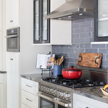
The owners of this kitchen had spent the money to upgrade the finishes in their kitchen upon building the home 12 years ago, but after living in the space for several years they realized how nonfunctional the layout really was. The (then) two preschool aged children had grown into busy, hungry teenagers with many friends who also liked to hang out at the house. So the family needed a more functional kitchen with better traffic flow, space for daily activities revolving around the kitchen at different times of day, and a kitchen that could accommodate cooking for and serving large groups. Furthermore, the dark, traditional finishes no longer reflected the homeowners’ style. They requested a brighter, more relaxed, coastal style that reflected their love of the seaside cities they like to visit.
Originally, the kitchen was U-shaped with a narrow island in the middle. The island created narrow aisles that bottle-necked at the dishwasher, refrigerator, and cooktop areas. There was a pass-through from the foyer into the kitchen, but the owners never liked that the pass-through was also located so close to the powder room. The awkward proximity was unappealing and made guests feel uncomfortable.
The kitchen’s storage was made up of lots of narrow cabinets, apothecary drawers, clipped corner units, and very few drawers. It lacked useful storage for the larger items the family used on a daily basis. And the kitchen’s only pantry was small closet that had only builder-grade, narrow shelving with no illumination to be able to see the contents inside.
Overall, the kitchen’s lighting plan was poorly executed. Only six recessed cans illuminated the entire kitchen and nook areas. The under cabinet lighting was not evenly distributed either. In fact, the builder had mis-placed the under cabinet lighting around the decorative pilasters which made for choppy, dark cubbies. Further, the builder didn’t include any lighting over the sink or the bar area, which meant whoever was doing the dishes was always in their own shadow. That, coupled with the steep overhang of the game room above made the bar area feel like a dim, cavernous space that wasn’t inviting or task oriented. The kitchen looked out into the main living space, but the raised bar and a narrow wall (which held the only large cabinet in the kitchen) created more of a barrier than a relationship to the living room or breakfast nook. In fact, one couldn’t even see the breakfast nook from the cooktop or sink areas due to its orientation. The raised bar top was too narrow to comfortably sit to either dine at or chat from due to the lack of knee space. The the homeowners confided that the kitchen felt more like a dark, dirty prison than place where the family, or their guests, wanted to gather and commune.
The clients' needs and desires were:
➢ to create a kitchen that would be a space the family loved to be in; to relate to the adjacent spaces all around, and to have better flow for entertaining large groups
➢ to remove the walls between the breakfast nook and living area and to be able to utilize the natural light from the windows in both those areas
➢ to incorporate a functional chopping block for prepping fresh food for home cooked meals, an island with a large sink and drain board, 2 pull out trash cans, and seating for at least the 2 teens to eat or do homework
➢ to design a kitchen and breakfast nook with an airy, coastal, relaxed vibe that blended with the rest of the house's coastal theme
➢ to integrate a layered lighting plan which would include ample general illumination, specific task lighting, decorative lighting, and lots of illuminated storage
➢ to design a kitchen with not only more storage for all the husband’s kitchen gadgets and collection of oils and spices, but smart storage, including a coffee/breakfast bar and a place to store and conceal the toaster oven and microwave
➢ to find a way to utilize the large open space between the kitchen, pantry area, and breakfast nook
Twelve Stones Designs achieved the owner's goals by:
➢ removing the walls between the kitchen and living room to allow the natural light to filter in from the adjacent rooms and to create a connection between the kitchen, nook, and living spaces for a sense of unity and communion
➢ removing the existing pantry and designing 3 large pantry style cabinets with LED tape lights and rollout drawers to house lots of kitchen appliances, gadgets, and tons of groceries. We also took the cabinets all the way up to the 9’ ceiling for additional storage for seasonal items and bulk storage.
➢ designing 2 islands - 1 with a gorgeous black walnut chopping block that houses a drawer for chopping and carving knives and a custom double pull out trash unit for point of use utilization - and 1 that houses the dishwasher, a large Blanco Gourmet sink with integrated drain board, woven baskets for fresh root vegetables and kitchen towels, plenty of drawer storage for kitchen items, and bar seating for up to 4 diners.
➢ closing off the space between the kitchen and the powder room to create a beautiful new private alcove for the powder room as well as adding some decorative storage. This also gave us space to include more tall storage near the new range for precision placement of the husband’s extensive oil and spice collection as well as a location for a combo-steam oven the wife wanted for baking and cooking healthy meals.
The project is enhanced functionally by:
➢ incorporated USB and standard receptacles for the kids’ laptops and phone charging in the large island
➢ designing the small island to include additional open shelving for items used on a daily basis such as a variety of bowls, plates, and colanders. This set up also works well for the husband who prefers to “plate” his dinners in restaurant-style fashion before presenting them to the table.
➢ the integration of specific storage units, such as double stacked cutlery drawers, a custom spice pull-out, a Kuerig coffee and tea pod drawer, and custom double stacked utensil drawers
➢ moving the refrigerator to the old oven location - this eliminated the bottle neck as well as created a better relationship to the eating table. It also utilizes the floor space between the pantry, nook, and kitchen
➢ creating a banquet style breakfast nook - this banquette seating not only doubles the amount of seating for large gatherings but it better utilizes the odd space between the kitchen and the previous nook area. It also helps to create a distinct pathway from the mudroom room through the pantry area, kitchen, nook, and living room.
➢ the coffee/breakfast bar area which includes the perfect location for the concealed microwave and toaster oven, convenient storage for the coffee pods and tea accoutrements. Roll-out drawers below also house the smoothie maker, hot water kettle, and a plethora of smoothie-making ingredients such as protein powders, smoothie additives, etc. Furthermore, the drawers below the Keurig house measuring utensil, cutlery, baking supplies and tupperware storage.
➢ incorporating lots of wide drawers and pullouts to accommodate large cookware.
➢ utilizing as much vertical space as possible by building storage to the ceiling which accommodates the family’s abundant amount of serving platters, baking sheets, bakeware, casserole dishes, and additional cutting boards.
The project is enhanced aesthetically by:
➢ new 5-piece Versailles pattern porcelain tile that now seamlessly joins the entire down stairs area together creating a bright, cohesiveness feeling instead of choppy separated spaces - it also adds a coastal feeling
➢ designing a cabinet to conceal the microwave and toaster oven
➢ the coastal influenced light fixtures over the nook table and island
➢ the sandy colors of the Langdon Cambria countertops. The swirling pattern and sparkling quartz pieces remind the homeowner of black-and-tan sandy beaches
➢ the striped banquet seating whose creamy white background and blue-green stripes were the inspiration for the cabinet and wall colors.
➢ All the interior doors were painted black to coordinate with the blacks and grays in the backsplash tile and countertop. This also adds a hint of tailored formality to an otherwise casual space.
➢ the use of WAC's Oculux small aperture LED units for the overhead lighting complimented with Diode LED strips for task lighting under the cabinets and inside the pantry and glass wall cabinets. All of the lighting applications are on separate dimmer switches.
Innovative uses of materials or construction methods by Realty Restoration LLC:
➢ Each 1-1/2” x 3” block of reclaimed end-grain black walnut that makes up the center island chopping block was hand milled and built in the shop. It was designed to look substantial and proportional to the surrounding elements, executed by creating the 4 inch tall top with a solid wood chamfered edge band.
➢ The metal doors on either side of the vent hood were also custom designed for this project and built in the Realty Restoration LLC shop. They are made 1x2, 11-gauge mild steel with ribbed glass. Weighing 60 lbs a piece, heavy duty cabinet hinges were added to support the weight of the door and keep them from sagging.
➢ Under-cabinet receptacles were added along the range wall in order to have a clean, uninterrupted backsplash.
Design obstacles to overcome:
➢ Because we were removing the demising walls between the kitchen and living room, we had to find a way to plumb and vent the new island. We did this by tunneling through the slab (the slab had post tension cables which prevented us from just trenching) to run a new wet vent through a nearby structural wall. We pulled the existing hot and cold lines between upper floor joists and ran them down the structural wall as well and up through a conduit in the tunnel.
➢ Since we were converting from wall overs to a gas range it allowed us to utilize the 220 feed for the wall ovens to provide a new sub panel for all the new kitchen circuits
➢ Due to framing deficiencies inherited from the original build there was a 1-1/2” differential in the floor-to-ceiling height over a 20 foot span; by utilizing the process of cutting and furring coupled with the crown moulding details on the cabinet elevations we were able to mask the problem and provide seamless transitions between the cabinet components.
Evidence of superior craftsmanship:
➢ uniquely designed, one-of-a-kind metal “X” end panels on the large island. The end panels were custom made in the Realty Restoration LLC shop and fitted to the exact dimensions of the island. The welding seams are completely indistinguishable - the posts look like they are cut from a single sheet of metal
➢ square metal posts on the small island were also custom made and designed to compliment and carry through the metal element s throughout the kitchen
➢ the beautiful, oversized end panels on the pantry cabinets which give the breakfast nook a tailored look
➢ integrating a large format 5 piece Versailles tile pattern to seamlessly flow from the existing spaces into the new kitchen space
➢ By constructing a custom cabinet that jogged around a corner we could not remodel (housing the entry way coat closet) we were able to camouflage the adjacent wall offset within the upper and lower cabinets. By designing around the existing jog in the structural walls we accomplished a few things: we were able to find the space to house, and hide, the microwave and toaster oven yet still have a clean cohesive appearance from the kitchen side. Additionally, the owners were able to keep their much needed coat closet and we didn’t have to increase the budget with unnecessary structural work.
 Drury Design
The Setup
For this primary bath, our clients—empty nesters who recently updated their entire first floor—wanted a fresh, sophisticated look that would harmonize with the rest of their home’s new design. The original space included a large corner tub and a layout that, while functional, felt outdated and oversized for their needs. The goal was to update the bathroom with a layout that suited them perfectly without moving walls or major fixtures.
Design objectives:
Remove the large, outdated corner tub and replace it with a freestanding tub
Expand and modernize the shower while keeping privacy in mind
Update cabinetry for more organized, efficient storage
Improve lighting with stylish yet understated fixtures to brighten the room
Create a cozy, timeless atmosphere in the large space, maintaining functionality
The Remodel
Design challenges to be solved:
Striking Balance with Lighting – The clients wanted a statement fixture that could enhance the overall design without feeling overwhelming or taking away from the open, airy atmosphere.
Maximizing Existing Footprint – The clients wanted to avoid altering the floor plan, meaning the layout remained mostly the same. The focus was on enhancing the room’s functionality within the existing footprint.
Retaining Coziness – With the removal of the oversized tub deck, there was a need to keep the space from feeling too vast and empty, ensuring it felt cozy and inviting despite the open layout.
Adding Hidden Storage – The master closet was not attached to the bathroom, and the clients wanted a discreet way to store a hamper within the bath area without cluttering the room.
The Renewed Space
Design solutions:
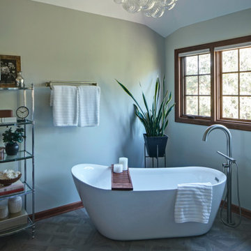
Freestanding Tub on an Angle – Replacing the old corner tub with a sleek, freestanding tub allowed the space to feel open and modern. Positioned at an angle, the tub brings balance to the layout and provides an inviting focal point while still preserving walk-around space for added functionality.
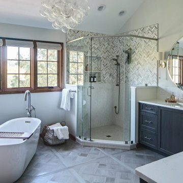
Expanded Shower with Privacy Enhancements – The original, smaller shower was transformed with a larger footprint, half-wall for privacy, and contemporary brushed nickel fixtures, adding both style and function. A herringbone marble accent tile halfway up the shower walls adds a touch of sophistication without overwhelming the space.
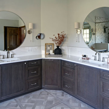
Custom Vanity with Built-in Hamper – A small pull-out hamper was added to the corner of the vanity, providing discreet storage and eliminating the need for a standalone basket. The cabinetry was reconfigured to be more functional and organized for the couple’s daily routines.
Lighting that Complements the Room – The lighting selection was central to the redesign, with the client gravitating toward a bubble chandelier she had admired. After exploring several options, they chose a smaller size to provide a soft accent without dominating the space, tying in with the bathroom’s overall light and airy feel.
The newly remodeled primary bath exudes a classic, calm atmosphere with a carefully chosen mix of textures and materials. The large porcelain floor tiles mimic the look of wood, lending a warm, traditional touch. Lightly textured cream tiles and brushed nickel fixtures create a soft and cohesive look, while the subtle herringbone marble accent in the shower adds just the right amount of elegance. Round mirrors above the vanities complement the curves of the freestanding tub, softening the room’s overall look and adding a touch of femininity. The result is a bright, timeless space tailored perfectly for the homeowners’ lifestyle.
 Drury Design
The Setup
For this primary bath, our clients—empty nesters who recently updated their entire first floor—wanted a fresh, sophisticated look that would harmonize with the rest of their home’s new design. The original space included a large corner tub and a layout that, while functional, felt outdated and oversized for their needs. The goal was to update the bathroom with a layout that suited them perfectly without moving walls or major fixtures.
Design objectives:
Remove the large, outdated corner tub and replace it with a freestanding tub
Expand and modernize the shower while keeping privacy in mind
Update cabinetry for more organized, efficient storage
Improve lighting with stylish yet understated fixtures to brighten the room
Create a cozy, timeless atmosphere in the large space, maintaining functionality
The Remodel
Design challenges to be solved:
Striking Balance with Lighting – The clients wanted a statement fixture that could enhance the overall design without feeling overwhelming or taking away from the open, airy atmosphere.
Maximizing Existing Footprint – The clients wanted to avoid altering the floor plan, meaning the layout remained mostly the same. The focus was on enhancing the room’s functionality within the existing footprint.
Retaining Coziness – With the removal of the oversized tub deck, there was a need to keep the space from feeling too vast and empty, ensuring it felt cozy and inviting despite the open layout.
Adding Hidden Storage – The master closet was not attached to the bathroom, and the clients wanted a discreet way to store a hamper within the bath area without cluttering the room.
The Renewed Space
Design solutions:
Freestanding Tub on an Angle – Replacing the old corner tub with a sleek, freestanding tub allowed the space to feel open and modern. Positioned at an angle, the tub brings balance to the layout and provides an inviting focal point while still preserving walk-around space for added functionality.
Expanded Shower with Privacy Enhancements – The original, smaller shower was transformed with a larger footprint, half-wall for privacy, and contemporary brushed nickel fixtures, adding both style and function. A herringbone marble accent tile halfway up the shower walls adds a touch of sophistication without overwhelming the space.
Custom Vanity with Built-in Hamper – A small pull-out hamper was added to the corner of the vanity, providing discreet storage and eliminating the need for a standalone basket. The cabinetry was reconfigured to be more functional and organized for the couple’s daily routines.
Lighting that Complements the Room – The lighting selection was central to the redesign, with the client gravitating toward a bubble chandelier she had admired. After exploring several options, they chose a smaller size to provide a soft accent without dominating the space, tying in with the bathroom’s overall light and airy feel.
The newly remodeled primary bath exudes a classic, calm atmosphere with a carefully chosen mix of textures and materials. The large porcelain floor tiles mimic the look of wood, lending a warm, traditional touch. Lightly textured cream tiles and brushed nickel fixtures create a soft and cohesive look, while the subtle herringbone marble accent in the shower adds just the right amount of elegance. Round mirrors above the vanities complement the curves of the freestanding tub, softening the room’s overall look and adding a touch of femininity. The result is a bright, timeless space tailored perfectly for the homeowners’ lifestyle.

 Zelaya Properties LLC
We used: Custom cherry cabinetry in Arts & Crafts Shaker style by Kabinart in Boulder and Espresso stains. Liberty Hardware Venetian bronze 1-1/2" cabinet knobs. KitchenAid Architect II Series 22 CF counter-depth French door refrigerator. KitchenAid Architect Series II 27" convection single wall oven. KitchenAid 36" 6-burner dual fuel freestanding commercial-style range. KitchenAid Architect II Series 24" dishwasher. Sharp Insight Pro Series 24" built-in microwave drawer (Model #KB6524PS). Crystorama Solaris 12" wide pendant lights in English bronze. Granite countertops in Brown Fantasy. 3"x6" polished marble backsplash.
Paint colors:
Walls: Glidden Silver Cloud 30YY 63/024
Ceilings/Trims/Doors: Glidden Swan White GLC23
Robert B. Narod Photography
 Drury Design
The Setup
For this primary bath, our clients—empty nesters who recently updated their entire first floor—wanted a fresh, sophisticated look that would harmonize with the rest of their home’s new design. The original space included a large corner tub and a layout that, while functional, felt outdated and oversized for their needs. The goal was to update the bathroom with a layout that suited them perfectly without moving walls or major fixtures.
Design objectives:
Remove the large, outdated corner tub and replace it with a freestanding tub
Expand and modernize the shower while keeping privacy in mind
Update cabinetry for more organized, efficient storage
Improve lighting with stylish yet understated fixtures to brighten the room
Create a cozy, timeless atmosphere in the large space, maintaining functionality
The Remodel
Design challenges to be solved:
Striking Balance with Lighting – The clients wanted a statement fixture that could enhance the overall design without feeling overwhelming or taking away from the open, airy atmosphere.
Maximizing Existing Footprint – The clients wanted to avoid altering the floor plan, meaning the layout remained mostly the same. The focus was on enhancing the room’s functionality within the existing footprint.
Retaining Coziness – With the removal of the oversized tub deck, there was a need to keep the space from feeling too vast and empty, ensuring it felt cozy and inviting despite the open layout.
Adding Hidden Storage – The master closet was not attached to the bathroom, and the clients wanted a discreet way to store a hamper within the bath area without cluttering the room.
The Renewed Space
Design solutions:
Freestanding Tub on an Angle – Replacing the old corner tub with a sleek, freestanding tub allowed the space to feel open and modern. Positioned at an angle, the tub brings balance to the layout and provides an inviting focal point while still preserving walk-around space for added functionality.
Expanded Shower with Privacy Enhancements – The original, smaller shower was transformed with a larger footprint, half-wall for privacy, and contemporary brushed nickel fixtures, adding both style and function. A herringbone marble accent tile halfway up the shower walls adds a touch of sophistication without overwhelming the space.
Custom Vanity with Built-in Hamper – A small pull-out hamper was added to the corner of the vanity, providing discreet storage and eliminating the need for a standalone basket. The cabinetry was reconfigured to be more functional and organized for the couple’s daily routines.
Lighting that Complements the Room – The lighting selection was central to the redesign, with the client gravitating toward a bubble chandelier she had admired. After exploring several options, they chose a smaller size to provide a soft accent without dominating the space, tying in with the bathroom’s overall light and airy feel.
The newly remodeled primary bath exudes a classic, calm atmosphere with a carefully chosen mix of textures and materials. The large porcelain floor tiles mimic the look of wood, lending a warm, traditional touch. Lightly textured cream tiles and brushed nickel fixtures create a soft and cohesive look, while the subtle herringbone marble accent in the shower adds just the right amount of elegance. Round mirrors above the vanities complement the curves of the freestanding tub, softening the room’s overall look and adding a touch of femininity. The result is a bright, timeless space tailored perfectly for the homeowners’ lifestyle.

 The Galante Architecture Studio, Inc.
Originally built in 1972, these eight interlocked residential units and the accompanying House Master’s Residence won an AIA award for their unique spatial complexity, balancing standard units of construction with volumetric interplay, all while bringing natural light into living spaces. However, nearly 40 years later
These 1970’s era, interlocked faculty housing units won an AIA award when first completed. They were unique in spatial complexity, By early 2,000’s they were showing signs of age, and had become outdated on many levels. Working with project management for the Faculty of Arts & Sciences, we prepared one prototype design to bring the buildings into the 21st century. New insulated skylights, standing seam metal siding, cedar decks and trellises, exchanging black roofs for well insulated white roofs, were all part of a larger planning program to renovate all nine units. The prototype was implemented in 2012, to great approval and result. In 2013 a few more units were done. In 2014 the “House Masters” unit was done, with the remaining four units planned for future budgets.
Sustainable features include re-use of most materials on site, (former siding was able to become sheathing below metal panels), implementing the Stretch Energy Code for insulation, and putting new white roof membranes in place. Using FSC certified wood for decks and trellises, and using Rheinzink siding, a “200 year material” according to the manufacturer.
After nearly 40 years, Ronald Gourley’s AIA award winning Faculty Housing (1972) was beginning to show its age – plywood siding was delaminating, wooden decks splintering, and custom windows failing. Therefore, the opportunity to reinvent a piece of Mid-Century Modernism presented itself when two of the building’s eight alternating rooftop designs were to be rebuilt as prototypes for the remainder of the structure.
The strength of the original design was its rectilinear and symmetrical arrangement of internal and external spaces, but the difference between the two had become blurred over the decades. New zinc siding, mahogany decking, and stainless steel railings accentuate the defining elements and more clearly articulate the living spaces, breathing new life into the building and reinvigorating the surrounding campus.
Furthermore, the renovation also provided a chance to bring the structure up to modern energy standards and help meet Harvard’s lofty environmental goals. Insulation within the ceilings was more than tripled, white TPO roofing reduces the heat island effect, construction waste was minimized by recasting the siding as sheathing, and materials were selected not only for aesthetics, but for their longevity and ability to be recycled as well.
Harvard’s energy standards brought an uncharacteristic level of environmental care to this building. Roof structures are triple insulated, allowing separating interior from exterior in the most thermally efficient manner. North facing triple insulated skylights and white TPO roofing reduces the heat gain, but allows natural light to pour in. Materials were selected not only for aesthetics, but for their longevity. Zinc, for example, is made of 100% recycled material, and has duration of 200 years. Uncharacteristic levels of environmental care were common on this project.
 The Galante Architecture Studio, Inc.
Originally built in 1972, these eight interlocked residential units and the accompanying House Master’s Residence won an AIA award for their unique spatial complexity, balancing standard units of construction with volumetric interplay, all while bringing natural light into living spaces. However, nearly 40 years later
These 1970’s era, interlocked faculty housing units won an AIA award when first completed. They were unique in spatial complexity, By early 2,000’s they were showing signs of age, and had become outdated on many levels. Working with project management for the Faculty of Arts & Sciences, we prepared one prototype design to bring the buildings into the 21st century. New insulated skylights, standing seam metal siding, cedar decks and trellises, exchanging black roofs for well insulated white roofs, were all part of a larger planning program to renovate all nine units. The prototype was implemented in 2012, to great approval and result. In 2013 a few more units were done. In 2014 the “House Masters” unit was done, with the remaining four units planned for future budgets.
Sustainable features include re-use of most materials on site, (former siding was able to become sheathing below metal panels), implementing the Stretch Energy Code for insulation, and putting new white roof membranes in place. Using FSC certified wood for decks and trellises, and using Rheinzink siding, a “200 year material” according to the manufacturer.
After nearly 40 years, Ronald Gourley’s AIA award winning Faculty Housing (1972) was beginning to show its age – plywood siding was delaminating, wooden decks splintering, and custom windows failing. Therefore, the opportunity to reinvent a piece of Mid-Century Modernism presented itself when two of the building’s eight alternating rooftop designs were to be rebuilt as prototypes for the remainder of the structure.
The strength of the original design was its rectilinear and symmetrical arrangement of internal and external spaces, but the difference between the two had become blurred over the decades. New zinc siding, mahogany decking, and stainless steel railings accentuate the defining elements and more clearly articulate the living spaces, breathing new life into the building and reinvigorating the surrounding campus.
Furthermore, the renovation also provided a chance to bring the structure up to modern energy standards and help meet Harvard’s lofty environmental goals. Insulation within the ceilings was more than tripled, white TPO roofing reduces the heat island effect, construction waste was minimized by recasting the siding as sheathing, and materials were selected not only for aesthetics, but for their longevity and ability to be recycled as well.
Harvard’s energy standards brought an uncharacteristic level of environmental care to this building. Roof structures are triple insulated, allowing separating interior from exterior in the most thermally efficient manner. North facing triple insulated skylights and white TPO roofing reduces the heat gain, but allows natural light to pour in. Materials were selected not only for aesthetics, but for their longevity. Zinc, for example, is made of 100% recycled material, and has duration of 200 years. Uncharacteristic levels of environmental care were common on this project.
89