
Search results for "Larger sectionals" in Home Design Ideas
 Revival House
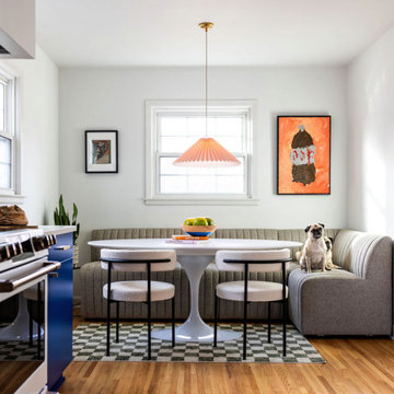
These clients are your typical, plant-loving millennials who, slowly and on a budget, are bringing a unique vision for their home to life. Color, while important to every homeowner, was clearly important to these homeowners. With one homeowner being an artist with an affinity for pink, the couple went through a gamut of cabinet color options including olive, teal, navy, and mustard. Assisted by interior designer Erinn Farrell, they landed on a custom paint color – Benjamin Moore’s Evening Blue – for the cabinetry, complemented by clear Alder in a natural stain. The retro, Mid-Mod Squares tile backsplash in custom colors from Mercury Mosaics gives a nod to the original style of the home built in the 1950's.
The overall layout of the kitchen didn't change much, but the pantry and baking center on the refrigerator wall are new features that provide much needed storage. The main living area, however, did go through some major changes. The wall separating the kitchen and dining room came down, and the small doorway connecting the dining and living rooms was transformed into a larger arch. The original wood floors (found beneath not one, but two layers of linoleum) received a fresh stain. The homeowners also knocked down the wall that sectioned off the stairs and built a slatted wood partition themselves. It was originally going to be a reeded wall, but they added the boxes for extra support, giving it more character in the end.
At Revival House we love a unique, bold project. However, the fact that these clients love the new kitchen and can’t believe they get to use it every day is the best compliment!
 Simply Home Decorating
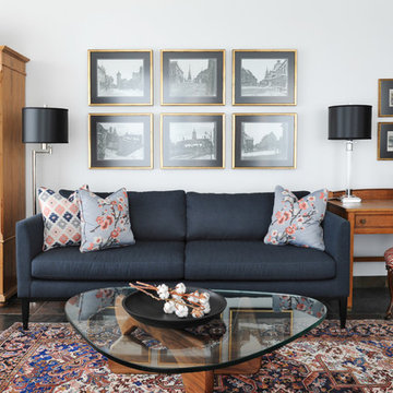
The homeowners of this condo sought our assistance when downsizing from a large family home on Howe Sound to a small urban condo in Lower Lonsdale, North Vancouver. They asked us to incorporate many of their precious antiques and art pieces into the new design. Our challenges here were twofold; first, how to deal with the unconventional curved floor plan with vast South facing windows that provide a 180 degree view of downtown Vancouver, and second, how to successfully merge an eclectic collection of antique pieces into a modern setting. We began by updating most of their artwork with new matting and framing. We created a gallery effect by grouping like artwork together and displaying larger pieces on the sections of wall between the windows, lighting them with black wall sconces for a graphic effect. We re-upholstered their antique seating with more contemporary fabrics choices - a gray flannel on their Victorian fainting couch and a fun orange chenille animal print on their Louis style chairs. We selected black as an accent colour for many of the accessories as well as the dining room wall to give the space a sophisticated modern edge. The new pieces that we added, including the sofa, coffee table and dining light fixture are mid century inspired, bridging the gap between old and new. White walls and understated wallpaper provide the perfect backdrop for the colourful mix of antique pieces. Interior Design by Lori Steeves, Simply Home Decorating. Photos by Tracey Ayton Photography

Find the right local pro for your project
 Simply Home Decorating
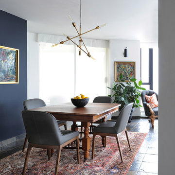
The homeowners of this condo sought our assistance when downsizing from a large family home on Howe Sound to a small urban condo in Lower Lonsdale, North Vancouver. They asked us to incorporate many of their precious antiques and art pieces into the new design. Our challenges here were twofold; first, how to deal with the unconventional curved floor plan with vast South facing windows that provide a 180 degree view of downtown Vancouver, and second, how to successfully merge an eclectic collection of antique pieces into a modern setting. We began by updating most of their artwork with new matting and framing. We created a gallery effect by grouping like artwork together and displaying larger pieces on the sections of wall between the windows, lighting them with black wall sconces for a graphic effect. We re-upholstered their antique seating with more contemporary fabrics choices - a gray flannel on their Victorian fainting couch and a fun orange chenille animal print on their Louis style chairs. We selected black as an accent colour for many of the accessories as well as the dining room wall to give the space a sophisticated modern edge. The new pieces that we added, including the sofa, coffee table and dining light fixture are mid century inspired, bridging the gap between old and new. White walls and understated wallpaper provide the perfect backdrop for the colourful mix of antique pieces. Interior Design by Lori Steeves, Simply Home Decorating. Photos by Tracey Ayton Photography
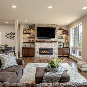
 Schock Construction Inc
We removed the wall between the dining room and family room, creating a larger more expansive space. We replaced the fireplace with a more efficient linear fireplace, installed stacked stone tile, a live edge wood mantel, and cabinets with floating shelves on either side of the fireplace.
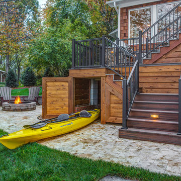
 Keystone Building Group, Inc.
Jim Schmid Photography
Large mountain style backyard tile patio photo in Charlotte with a fire pit and a roof extension
Large mountain style backyard tile patio photo in Charlotte with a fire pit and a roof extension



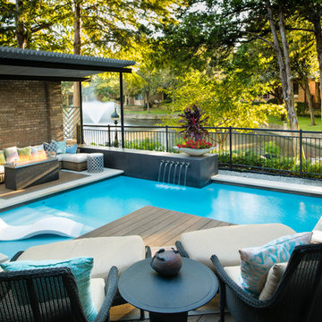
 Randy Angell Designs
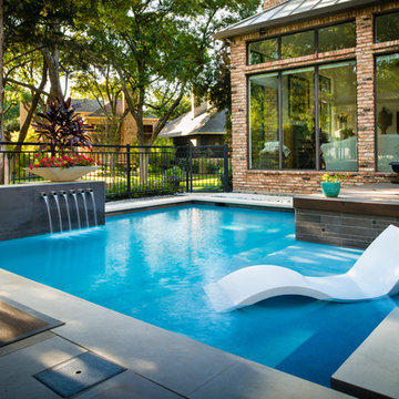
The client purchased this property with grand plans of renovating the entire place; from top to bottom, and from inside to outside. And while the inside canvas was very generous and even somewhat forgiving, the outside space would be anything but.
We wanted to squeeze in as much seating space as possible in their limited courtyard area, without encroaching on the already compact-sized pool. The first and most obvious solution was to get rid of the trees and shrubs that separated this house from its zero-lot-line neighbor. With the addition of Lueder limestone pavers, this new area alone would free up nearly 120 additional square feet, which happened to be the perfect amount of space for a mobile gas fire pit and sectional sofa. And this would make for the perfect place to enjoy the afternoon sunset with the implementation of a custom-built metal pergola standing above it all.
The next problem to overcome was the disconnected feel of the existing patio; there were too many levels of steps and stairs, which meant that it would have been difficult to have any sort of traditional furniture arrangement in their outdoor space. Randy knew that it only made sense to bring in a wood deck that could be mated to the highest level of the patio, thus creating and gaining the greatest amount of continuous, flat space that the client needed. But even so, that flat space would be limited to a very tight "L-shape" around the pool. And knowing this, the client decided that the larger space would be more valuable to them than the spa, so they opted to have a portion of the deck built over it in order to allow for a more generous amount of patio space.
And with the edge of the patio/deck dropping off almost 2 feet to the waterline, it now created the perfect opportunity to have a visually compelling raised wall that could be adorned with different hues of plank-shaped tiles. From inside the pool, the varying shades of brown were a great accent to the wood deck that sat just above.
However, the true visual crowning jewel of this project would end up being the raised back wall along the fence, fully encased in a large format, 24x24 slate grey tile, complete with a custom stainless steel, square-tube scupper bank, installed at just the right height to create the perfect amount of water noise.
But Randy wasn't done just yet. With two entirely new entertaining areas opened up at opposite ends of the pool, the only thing left to do now was to connect them. Knowing that he nor the client wanted to eliminate any more water space, he decided to bring a new traffic pattern right into the pool by way of two "floating", Lueder limestone stepper pads. It would be a visually perfect union of both pool and walking spaces.
The existing steps and walkways were then cut away and replaced with matching Lueder limestone caps and steppers. All remaining hardscape gaps were later filled with Mexican beach pebble, which helped to promote a very "zen-like" feel in this outdoor space.
The interior of the pool was coated with Wet Edge Primerastone "Blue Pacific Coast" plaster, and then lit up with the incredibly versatile Pentair GloBrite LED pool lights.
In the end, the client ended up gaining the additional entertaining and seating space that they needed, and the updated, modern feel that they loved.

 Randy Angell Designs
The client purchased this property with grand plans of renovating the entire place; from top to bottom, and from inside to outside. And while the inside canvas was very generous and even somewhat forgiving, the outside space would be anything but.
We wanted to squeeze in as much seating space as possible in their limited courtyard area, without encroaching on the already compact-sized pool. The first and most obvious solution was to get rid of the trees and shrubs that separated this house from its zero-lot-line neighbor. With the addition of Lueder limestone pavers, this new area alone would free up nearly 120 additional square feet, which happened to be the perfect amount of space for a mobile gas fire pit and sectional sofa. And this would make for the perfect place to enjoy the afternoon sunset with the implementation of a custom-built metal pergola standing above it all.
The next problem to overcome was the disconnected feel of the existing patio; there were too many levels of steps and stairs, which meant that it would have been difficult to have any sort of traditional furniture arrangement in their outdoor space. Randy knew that it only made sense to bring in a wood deck that could be mated to the highest level of the patio, thus creating and gaining the greatest amount of continuous, flat space that the client needed. But even so, that flat space would be limited to a very tight "L-shape" around the pool. And knowing this, the client decided that the larger space would be more valuable to them than the spa, so they opted to have a portion of the deck built over it in order to allow for a more generous amount of patio space.
And with the edge of the patio/deck dropping off almost 2 feet to the waterline, it now created the perfect opportunity to have a visually compelling raised wall that could be adorned with different hues of plank-shaped tiles. From inside the pool, the varying shades of brown were a great accent to the wood deck that sat just above.
However, the true visual crowning jewel of this project would end up being the raised back wall along the fence, fully encased in a large format, 24x24 slate grey tile, complete with a custom stainless steel, square-tube scupper bank, installed at just the right height to create the perfect amount of water noise.
But Randy wasn't done just yet. With two entirely new entertaining areas opened up at opposite ends of the pool, the only thing left to do now was to connect them. Knowing that he nor the client wanted to eliminate any more water space, he decided to bring a new traffic pattern right into the pool by way of two "floating", Lueder limestone stepper pads. It would be a visually perfect union of both pool and walking spaces.
The existing steps and walkways were then cut away and replaced with matching Lueder limestone caps and steppers. All remaining hardscape gaps were later filled with Mexican beach pebble, which helped to promote a very "zen-like" feel in this outdoor space.
The interior of the pool was coated with Wet Edge Primerastone "Blue Pacific Coast" plaster, and then lit up with the incredibly versatile Pentair GloBrite LED pool lights.
In the end, the client ended up gaining the additional entertaining and seating space that they needed, and the updated, modern feel that they loved.

 LK Design
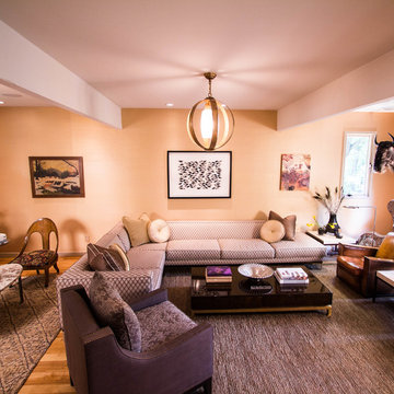
This large living room is divided into two separate areas by the sectional. On the left is a small sitting area for quiet, more intimate occasions. The middle-right is the main area meant for larger social occasions. The mix of mid-century modern and traditional creates a timeless look and feel.
Sponsored
Sunbury, OH

J.Holderby - Renovations
Franklin County's Leading General Contractors - 2X Best of Houzz!
 User
User
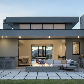
Entering the home through a floor-to-ceiling full light pivoting front door provides a sense of grandeur that continues through the home with immediate sightlines through the 16-foot wide sliding door at the opposite wall. The distinct black window frames provide a sleek modern aesthetic while providing European performance standards. The Glo A5h Series with double-pane glazing outperforms most North American triple pane windows due to high performance spacers, low iron glass, a larger continuous thermal break, and multiple air seals. By going double-pane the homeowners have been able to realize tremendous efficiency and cost effective durability while maintaining the clean architectural lines of the home design. The selection of our hidden sash option further cements the modern design by providing a seamless aesthetic on the exterior between fixed and operable windows.
 Brooks + Scarpa Architects
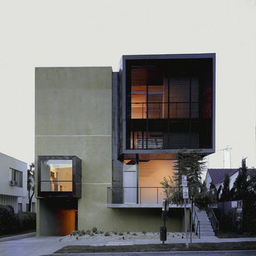
Located in a neighborhood characterized by traditional bungalow style single-family residences, Orange Grove is a new landmark for the City of West Hollywood. The building is sensitively designed and compatible with the neighborhood, but differs in material palette and scale from its neighbors. Referencing architectural conventions of modernism rather than the pitched roof forms of traditional domesticity, the project presents a characteristic that is consistent with the eclectic and often unconventional demographic of West Hollywood. Distinct from neighboring structures, the building creates a strong relationship to the street by virtue of its large amount of highly usable balcony area in the front façade.
While there are dramatic and larger scale elements that define the building, it is also broken down into comprehensible human scale parts, and is itself broken down into two different buildings. Orange Grove displays a similar kind of iconoclasm as the Schindler House, an icon of California modernism, located a short distance away. Like the Schindler House, the conventional architectural elements of windows and porches become part of an abstract sculptural ensemble. At the Schindler House, windows are found in the gaps between structural concrete wall panels. At Orange Grove, windows are inserted in gaps between different sections of the building.
The design of Orange Grove is generated by a subtle balance of tensions. Building volumes and the placement of windows, doors and balconies are not static but rather constitute an active three-dimensional composition in motion. Each piece of the building is a strong and clearly defined shape, such as the corrugated metal surround that encloses the second story balcony in the east and north facades. Another example of this clear delineation is the use of two square profile balcony surrounds in the front façade that set up a dialogue between them—one is small, the other large, one is open at the front, the other is veiled with stainless steel slats. At the same time each balcony is balanced and related to other elements in the building, the smaller one to the driveway gate below and the other to the roll-up door and first floor balcony. Each building element is intended to read as an abstract form in itself—such as a window becoming a slit or windows becoming a framed box, while also becoming part of a larger whole. Although this building may not mirror the status quo it answers to the desires of consumers in a burgeoning niche market who want large, simple interior volumes of space, and a paradigm based on space, light and industrial materials of the loft rather than the bungalow.
 Castle Building & Remodeling
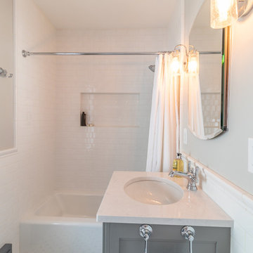
This family and had been living in their 1917 Tangletown neighborhood, Minneapolis home for over two years and it wasn’t meeting their needs.
The lack of AC in the bathroom was an issue, the bathtub leaked frequently, and their lack of a shower made it difficult for them to use the space well. After researching Design/Build firms, they came to Castle on the recommendations from others.
Wanting a clean “canvas” to work with, Castle removed all the flooring, plaster walls, tiles, plumbing and electrical fixtures. We replaced the existing window with a beautiful Marvin Integrity window with privacy glass to match the rest of the home.
A bath fan was added as well as a much smaller radiator. Castle installed a new cast iron bathtub, tub filler, hand shower, new custom vanity from the Woodshop of Avon with Cambria Weybourne countertop and a recessed medicine cabinet. Wall sconces from Creative lighting add personality to the space.
The entire space feels charming with all new traditional black and white hexagon floor tile, tiled shower niche, white subway tile bath tub surround, tile wainscoting and custom shelves above the toilet.
Just outside the bathroom, Castle also installed an attic access ladder in their hallway, that is not only functional, but aesthetically pleasing.
Come see this project on the 2018 Castle Educational Home Tour, September 29 – 30, 2018.
 Simply Home Decorating
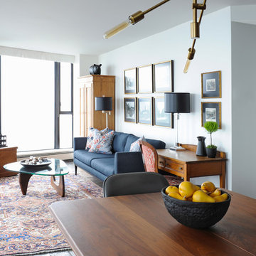
The homeowners of this condo sought our assistance when downsizing from a large family home on Howe Sound to a small urban condo in Lower Lonsdale, North Vancouver. They asked us to incorporate many of their precious antiques and art pieces into the new design. Our challenges here were twofold; first, how to deal with the unconventional curved floor plan with vast South facing windows that provide a 180 degree view of downtown Vancouver, and second, how to successfully merge an eclectic collection of antique pieces into a modern setting. We began by updating most of their artwork with new matting and framing. We created a gallery effect by grouping like artwork together and displaying larger pieces on the sections of wall between the windows, lighting them with black wall sconces for a graphic effect. We re-upholstered their antique seating with more contemporary fabrics choices - a gray flannel on their Victorian fainting couch and a fun orange chenille animal print on their Louis style chairs. We selected black as an accent colour for many of the accessories as well as the dining room wall to give the space a sophisticated modern edge. The new pieces that we added, including the sofa, coffee table and dining light fixture are mid century inspired, bridging the gap between old and new. White walls and understated wallpaper provide the perfect backdrop for the colourful mix of antique pieces. Interior Design by Lori Steeves, Simply Home Decorating. Photos by Tracey Ayton Photography
Sponsored
Sunbury, OH
J.Holderby - Renovations
Franklin County's Leading General Contractors - 2X Best of Houzz!
 Garden Stories
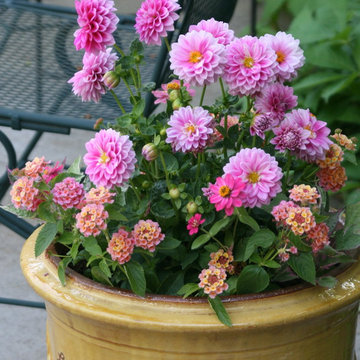
Summer container garden with lantana, dahlia, and zinnia
Photo of a landscaping in Minneapolis for summer.
Photo of a landscaping in Minneapolis for summer.

 California Closets, Santa Barbara
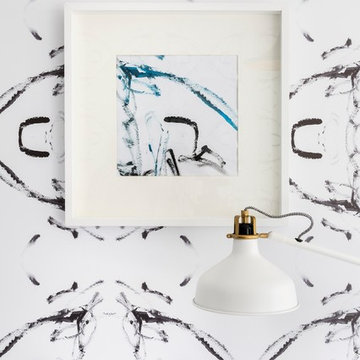
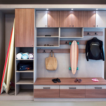
Seasonal Storage with Unique "Sand Room"
Mudroom - mid-sized contemporary porcelain tile mudroom idea in Santa Barbara with gray walls
Mudroom - mid-sized contemporary porcelain tile mudroom idea in Santa Barbara with gray walls
27