
Search results for "Learning processes" in Home Design Ideas

 TVL Creative Ltd.
Cramped kitchen be gone! That was the project motto and top priority. The goal was to transform the current layout from multiple smaller spaces into a connected whole that would activate the main level for our clients, a young family of four.
The biggest obstacle was the wall dividing the kitchen and the dining room. Removing this wall was central to opening up and integrating the main living spaces, but the existing ductwork that ran right through the center of the wall posed a design challenge, er design opportunity. The resulting design solution features a central pantry that captures the ductwork and provides valuable storage- especially when compared to the original kitchen's 18" wide pantry cabinet. The pantry also anchors the kitchen island and serves as a visual separation of space between the kitchen and homework area.
Through our design development process, we learned the formal living room was of no service to their lifestyle and therefore space they rarely spent time in. With that in mind, we proposed to eliminate the unused living room and make it the new dining room. Relocating the dining room to this space inherently felt right given the soaring ceiling and ample room for holiday dinners and celebrations. The new dining room was spacious enough for us to incorporate a conversational seating area in the warm, south-facing window alcove.
Now what to do with the old dining room?! To answer that question we took inspiration from our clients' shared profession in education and developed a craft area/homework station for both of their boys. The semi-custom cabinetry of the desk area carries over to the adjacent wall and forms window bench base with storage that we topped with butcher block for a touch of warmth. While the boys are young, the bench drawers are the perfect place for a stash of toys close to the kitchen.
The kitchen begins just beyond the window seat with their refrigerator enclosure. Opposite the refrigerator is the new pantry with twenty linear feet of shelving and space for brooms and a stick vacuum. Extending from the backside of the pantry the kitchen island design incorporates counter seating on the family room side and a cabinetry configuration on the kitchen side with drawer storage, a trashcan center, farmhouse sink, and dishwasher.
We took careful time in design and execution to align the range and sink because while it might seem like a small detail, it plays an important role in supporting the symmetrical configuration of the back wall of the kitchen. The rear wall design utilizes an appliance garage mirrors the visual impact of the refrigerator enclosure and helps keep the now open kitchen tidy. Between the appliance garage and refrigerator enclosure is the cooking zone with 30" of cabinetry and work surface on either side of the range, a chimney style vent hood, and a bold graphic tile backsplash.
The backsplash is just one of many personal touches we added to the space to reflect our client's modern eclectic style and love of color. Swooping lines of the mid-mod style barstools compliment the pendants and backsplash pattern. A pop of vibrant green on the frame of the pantry door adds a fresh wash of color to an otherwise neutral space. The big show stopper is the custom charcoal gray and copper chevron wall installation in the dining room. This was an idea our clients softly suggested, and we excitedly embraced the opportunity. It is also a kickass solution to the head-scratching design dilemma of how to fill a large and lofty wall.
We are so grateful to bring this design to life for our clients and now dear friends.
 TVL Creative Ltd.
Cramped kitchen be gone! That was the project motto and top priority. The goal was to transform the current layout from multiple smaller spaces into a connected whole that would activate the main level for our clients, a young family of four.
The biggest obstacle was the wall dividing the kitchen and the dining room. Removing this wall was central to opening up and integrating the main living spaces, but the existing ductwork that ran right through the center of the wall posed a design challenge, er design opportunity. The resulting design solution features a central pantry that captures the ductwork and provides valuable storage- especially when compared to the original kitchen's 18" wide pantry cabinet. The pantry also anchors the kitchen island and serves as a visual separation of space between the kitchen and homework area.
Through our design development process, we learned the formal living room was of no service to their lifestyle and therefore space they rarely spent time in. With that in mind, we proposed to eliminate the unused living room and make it the new dining room. Relocating the dining room to this space inherently felt right given the soaring ceiling and ample room for holiday dinners and celebrations. The new dining room was spacious enough for us to incorporate a conversational seating area in the warm, south-facing window alcove.
Now what to do with the old dining room?! To answer that question we took inspiration from our clients' shared profession in education and developed a craft area/homework station for both of their boys. The semi-custom cabinetry of the desk area carries over to the adjacent wall and forms window bench base with storage that we topped with butcher block for a touch of warmth. While the boys are young, the bench drawers are the perfect place for a stash of toys close to the kitchen.
The kitchen begins just beyond the window seat with their refrigerator enclosure. Opposite the refrigerator is the new pantry with twenty linear feet of shelving and space for brooms and a stick vacuum. Extending from the backside of the pantry the kitchen island design incorporates counter seating on the family room side and a cabinetry configuration on the kitchen side with drawer storage, a trashcan center, farmhouse sink, and dishwasher.
We took careful time in design and execution to align the range and sink because while it might seem like a small detail, it plays an important role in supporting the symmetrical configuration of the back wall of the kitchen. The rear wall design utilizes an appliance garage mirrors the visual impact of the refrigerator enclosure and helps keep the now open kitchen tidy. Between the appliance garage and refrigerator enclosure is the cooking zone with 30" of cabinetry and work surface on either side of the range, a chimney style vent hood, and a bold graphic tile backsplash.
The backsplash is just one of many personal touches we added to the space to reflect our client's modern eclectic style and love of color. Swooping lines of the mid-mod style barstools compliment the pendants and backsplash pattern. A pop of vibrant green on the frame of the pantry door adds a fresh wash of color to an otherwise neutral space. The big show stopper is the custom charcoal gray and copper chevron wall installation in the dining room. This was an idea our clients softly suggested, and we excitedly embraced the opportunity. It is also a kickass solution to the head-scratching design dilemma of how to fill a large and lofty wall.
We are so grateful to bring this design to life for our clients and now dear friends.

 Feeney Inc.
Winner of the Feeney’s Annual "Show Us Your View" Contest, matching DesignRail® aluminum railings with CableRail infill on this Maine deck. Nat Rea Photography
Find the right local pro for your project

 MIG Furniture Design, Inc.
Italian Ultra Modern Kids Bedroom Set ONE 401 by SPAR. ONE Junior Furniture Collection by Spar makes dream come true, making both parents and children happy! ONE Kids Furniture line creates functional and modern bedrooms for girls and boys, small kids and teenagers, optimizing the space not only for sleeping, but every need: relax, learn and play. Colorful and modular ONE Bedroom Collection helps you get what you really want.
All pieces can be modified in size and color as well as mixed and matched from other ONE compositions. Please contact our office regarding customization of this kids bedroom set.
The starting price is for the "As Shown" bedroom set that includes following elements:
- 1 Twin Size Bed (bed fits US standard Twin size mattress 39" x 75")
- 2 3-Drawer Nightstands
- 1 Desk with bookcase unit
- 2 Horizontal Hanging Bookcase Units
- 2 Complementing Hanging Bookcases
- 2 Complementing Hanging Bookcase Corners
- 1 Wall Shelf W39.4"
- 1 Wall Shelf W31.5"
- 1 Wardrobe (4 Doors)
Please Note: Room/bed decorative accessories and the mattress are not included in the price.
MATERIAL/CONSTRUCTION:
E1-Class ecological panels, which are produced exclusively trough a wood recycling production process
Used lacquers conform to the norm 71/3 (toys directive)
Structure: 18 mm thick melamine-coated particle board
Shelves: 25mm thick melamine-coated particle board
Back panels: high density fibreboard 5mm thick
Doors: 18 mm thick melamine-coated particle board finished on 4 sides
Hardware: metal runners with self-closing system and double stop; adjustable self closing hinges; quick-mount and braking systems
Dimensions:
Twin Size Bed: W45.3" x D80.7" x H36.2" (internal 39" x 75" US Standard)
Full Size Bed: W60.5" x D80.7" x H36.2" (internal 54" x 75" US Standard)
3-Drawer Nightstand: W36.2" x D17.8" x H21.7"
Desk: W53" x D23.2" x H30"
Bookcase (part of desk): W10" x D21.7" x H28.5"
Horizontal Hanging Bookcase Unit: W17.7" x D11.4" x H11.8"
Complementing Hanging Bookcase: W11.8" x D10" x H11.8"
Complementing Hanging Bookcase Corner: W5.2" x D9" x H5.2"
Wall Shelf: W39.4" x D10" x H1"
Wall Shelf: W31.5" x D10" x H1"
4-Door Wardrobe: W71.7" x D22.8" x H89.8" or H102.4"
 MIG Furniture Design, Inc.
Ultra Modern Italian Kids Bedroom Set ONE 603 by SPAR. ONE Junior Furniture Collection by Spar makes dream come true, making both parents and children happy! ONE Kids Furniture line creates functional and modern bedrooms for girls and boys, small kids and teenagers, optimizing the space not only for sleeping, but every need: relax, learn and play. Colorful and modular ONE Bedroom Collection helps you get what you really want.
All pieces can be modified in size and color as well as mixed and matched from other ONE compositions. Please contact our office regarding customization of this kids bedroom set.
The starting price is for the "As Shown" bedroom set that includes following elements:
- 1 Top Bed (bed requires special size mattress 31.5" x 76.5")
- 1 Safety Bar (for Top Bed)
- 1 Bottom Twin Size Bed (bed fits US standard Twin size mattress 39" x 75")
- 1 Storage Ladder with Extension storage platform
- 1 3-Drawer Nightstand
- 1 Desk with 3-drawer cabinet
- 2 Standing Bookcases/Libraries
- 1 Wall Shelf W63.5"
- 1 Wardrobe (2 doors & 4 drawers & open insert with shelf)
- 1 Storage Composition "Corner Bridge"
Please Note: Room/bed decorative accessories and the mattress are not included in the price.
MATERIAL/CONSTRUCTION:
E1-Class ecological panels, which are produced exclusively trough a wood recycling production process
Used lacquers conform to the norm 71/3 (toys directive)
Structure: 18 mm thick melamine-coated particle board
Shelves: 25mm thick melamine-coated particle board
Back panels: high density fibreboard 5mm thick
Doors: 18 mm thick melamine-coated particle board finished on 4 sides
Hardware: metal runners with self-closing system and double stop; adjustable self closing hinges; quick-mount and braking systems
Dimensions:
Top Bed: W35.2" x D81" x H13" (internal 31.5" x 76.5" special size)
Bottom Twin Size Bed: W42.5" x D78.7" x H38.6"
Bottom Full Size Bed: W57.5" x D78.7" x H38.6"
Safety Bar: W54.7" x H16.8"
Storage Ladder: W18.5" x D40.5" x H39.8"
Extension Storage Platform: W18.5" x D40.5" x H39.8"
3-Drawer Nightstand: W36.2" x D17.8" x H21.7"
Desk: W53" x D23.2" x H30"
3-Drawer Cabinet (part of desk): W18.5" x D17.8" x H28.5"
Standing Bookcase: W18" x D14.4" x H89.8" or H102.4"
Wall Shelf: W39.5" x D10" x H1"
Wardrobe: W36" x D23.6" x H89.8" or H102.4"
Storage Composition "Corner Bridge": W(81" x 81") x D23.6"/33.7" x H89.8" or H102.4"
 MIG Furniture Design, Inc.
SPAR Italian Kids Bedroom Set ONE 506. ONE Junior Furniture Collection by Spar makes dream come true, making both parents and children happy! ONE Kids Furniture line creates functional and modern bedrooms for girls and boys, small kids and teenagers, optimizing the space not only for sleeping, but every need: relax, learn and play. Colorful and modular ONE Bedroom Collection helps you get what you really want.
All pieces can be modified in size and color as well as mixed and matched from other ONE compositions. Please contact our office regarding customization of this kids bedroom set.
The starting price is for the "As Shown" bedroom set that includes following elements:
- 1 Twin Size Bed (bed fits US standard Twin size mattress 39" x 75")
- 1 Hanging 2-Drawer Nightstand
- 1 Desk
- 1 3-Drawer Cabinet (on wheels)
- 3 Wall Shelves (each W53")
- 3 Horizontal Hanging Bookcases W17.7"
- 3 Horizontal Hanging Bookcases W23.6"
- 1 Corner Wardrobe
- 1 Storage Composition "Bridge"
Please Note: Room/bed decorative accessories and the mattress are not included in the price.
MATERIAL/CONSTRUCTION:
E1-Class ecological panels, which are produced exclusively trough a wood recycling production process
Used lacquers conform to the norm 71/3 (toys directive)
Structure: 18 mm thick melamine-coated particle board
Shelves: 25mm thick melamine-coated particle board
Back panels: high density fibreboard 5mm thick
Doors: 18 mm thick melamine-coated particle board finished on 4 sides
Hardware: metal runners with self-closing system and double stop; adjustable self closing hinges; quick-mount and braking systems
Dimensions:
Twin Size Bed: W45.3" x D82.8" x H35.4" (internal 39" x 75" US Standard)
Full Size Bed: W60.3" x D82.8" x H35.4" (internal 54" x 75" US Standard)
Hanging Nightstand: W19.2" x D13.8" x H14"
Desk: W53" x D23.2" x H30"
Drawer Cabinet: W18.5" x D17.8" x H23.2"
Horizontal Hanging Bookcase: W17.7" x D11.4" x H11.8"
Horizontal Hanging Bookcase: W23.6" x D11.4" x H11.8"
Wall Shelf: W53" x D10" x H1"
Corner Wardrobe: W(65.8" x 65.8") x D23.6" x H89.8" or H102.4"
Storage Composition "Bridge": W81.7" x D22.8" x H89.8" or H102.4"
 Simply Home Decorating
The kitchen may be the heart of a home, but the dining room is where the family gathers to enjoy special occasions, create and pass on traditions, and savour each other’s company free from distractions. The family behind this particular dining room enjoys doing just that.
When they are not traveling the world, Matthew and Anna (names changed) love to cook meals at home with their teenage daughter, entertain family and friends, and live amongst their cherished travel souvenirs and heirlooms. Their dining room, however, was far from the perfect backdrop for these experiences.
Before: Dining Room:
When Matthew and Anna contacted us, they imagined a space that would comfortably seat 8 to 10 people and incorporate their beautiful inherited dining table and sideboard in a fresh, modern way. Above all, they wanted a dining room that they would feel proud to share.
They worked with us to design, lightly renovate, and furnish their dining room and adjacent living space. Now, the room is nothing short of inviting and elevated.
Classic Yet Contemporary Dining Room:
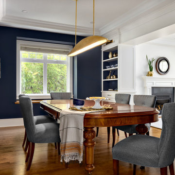
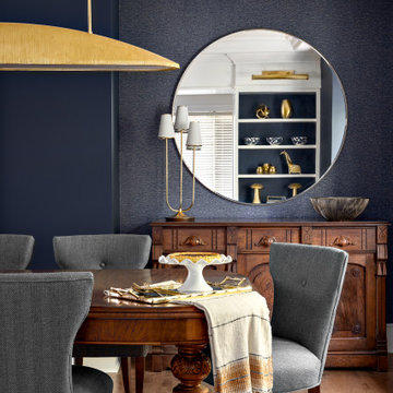
Viewed from the living area, the dining room is a hidden gem waiting to be discovered. Matthew and Anna wanted dark blue for the walls, and we couldn’t have been happier to find the perfect shade for them. By leaning darker, this rich blue creates the perception of depth, making the room feel enticing, comfortable and secluded.
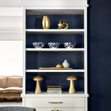
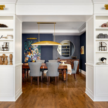
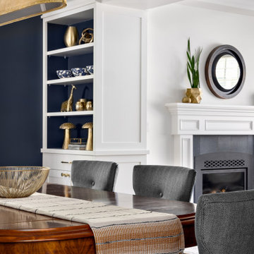
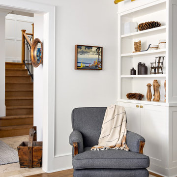
The previous built-ins were underwhelming and lacked function, so we designed wider, taller, double sided cabinets that integrated the existing bulk-head, and then accessorized the shelves with the family’s travel finds, books, and decor. Topping these units with brass art lights not only blends contemporary and traditional styles, it also draws attention to the dining table’s modern show-stopping chandelier. You can’t miss it.
Inside the dining room, the effect is equally impressive: enveloping yet spacious, warm yet cool, classic yet contemporary. We incorporated their heirloom pieces seamlessly into the design thanks to the 1:2 ratio. For every traditional piece, we introduced two more modern or contemporary pieces — clean lines, subtle curves, and lustrous brass hardware. The result is a collected yet updated look.
In any room with dark walls, lighting is of the utmost importance. We placed a mirror adjacent to the window to reflect natural light throughout the room, and we kept the trim and ceiling white for brightness. To provide maximum versatility, we provided multiple light sources that can be adjusted to create different levels of light to suit any mood or occasion. These include: pot lights and a chandelier on dimmers, a sculptural trilight lamp on the sideboard, and art lights on the bookcases and above important art pieces.
The built-ins have another surprise waiting inside this special dining room:
Double-sided built-ins: dining room shelving and living room shelving.
Rather than keep them white like we did in the living room, we painted the back wall of the book cases the same dark blue as the walls in the rest of the room. This reduces the contrast with the surrounding walls and emphasizes the white outline of the cabinets. We also love the dark blue walls’ role as a beautiful backdrop for this family’s treasures. The brass accessories and hand-painted vases and bowls feel like part of the experience.
Of course, what is beauty without function? It may not look like it, but the base storage is only accessible from the dining room side. The units include deep cabinets for storing serving ware, as well as another delightful surprise: silverware drawers lined in luxurious navy velvet!
Lastly, we designed this beautiful nook for their heirloom sideboard. From afar, the wall looks as if it has texture and perhaps a touch of shine. Up close, you will notice that it is actually navy blue wallpaper with tiny golden dots. This unique touch accentuates the brass in the room touches throughout the space.. The room feels curated, contemporary, and full of character.
Words of Praise:
Anna and Matthew were thrilled with their new dining room and with the design process itself, which is always the highest compliment. They said:
“Working with Lori and her team at Simply Home Decorating was a great experience. The design they came up with was both beautiful and practical for our family. Renovations can be stressful but working with Simply Home made the process much more pleasant.
“Simply Home's project management and their longstanding relationships with reliable trades meant we could relax, knowing that everything was taken care of. If an issue arose, the entire Simply Home team was quick to address it. They were excellent at communicating with us—we never felt like we didn't know what was going on. We would highly recommend working with Simply Home Decorating.”
Thank you, Matthew and Anna! We are honoured to have been part of your journey and wish your family many happy memories in these new spaces.
Now, is it your turn? Are you ready to uncover the hidden potential in your home? If so, contact us here to start the conversation or download my guide Uncovering the Hidden Potential in Your Home below to learn more about what we can do for you.
 Simply Home Decorating
The kitchen may be the heart of a home, but the dining room is where the family gathers to enjoy special occasions, create and pass on traditions, and savour each other’s company free from distractions. The family behind this particular dining room enjoys doing just that.
When they are not traveling the world, Matthew and Anna (names changed) love to cook meals at home with their teenage daughter, entertain family and friends, and live amongst their cherished travel souvenirs and heirlooms. Their dining room, however, was far from the perfect backdrop for these experiences.
Before: Dining Room:
When Matthew and Anna contacted us, they imagined a space that would comfortably seat 8 to 10 people and incorporate their beautiful inherited dining table and sideboard in a fresh, modern way. Above all, they wanted a dining room that they would feel proud to share.
They worked with us to design, lightly renovate, and furnish their dining room and adjacent living space. Now, the room is nothing short of inviting and elevated.
Classic Yet Contemporary Dining Room:
Viewed from the living area, the dining room is a hidden gem waiting to be discovered. Matthew and Anna wanted dark blue for the walls, and we couldn’t have been happier to find the perfect shade for them. By leaning darker, this rich blue creates the perception of depth, making the room feel enticing, comfortable and secluded.
The previous built-ins were underwhelming and lacked function, so we designed wider, taller, double sided cabinets that integrated the existing bulk-head, and then accessorized the shelves with the family’s travel finds, books, and decor. Topping these units with brass art lights not only blends contemporary and traditional styles, it also draws attention to the dining table’s modern show-stopping chandelier. You can’t miss it.
Inside the dining room, the effect is equally impressive: enveloping yet spacious, warm yet cool, classic yet contemporary. We incorporated their heirloom pieces seamlessly into the design thanks to the 1:2 ratio. For every traditional piece, we introduced two more modern or contemporary pieces — clean lines, subtle curves, and lustrous brass hardware. The result is a collected yet updated look.
In any room with dark walls, lighting is of the utmost importance. We placed a mirror adjacent to the window to reflect natural light throughout the room, and we kept the trim and ceiling white for brightness. To provide maximum versatility, we provided multiple light sources that can be adjusted to create different levels of light to suit any mood or occasion. These include: pot lights and a chandelier on dimmers, a sculptural trilight lamp on the sideboard, and art lights on the bookcases and above important art pieces.
The built-ins have another surprise waiting inside this special dining room:
Double-sided built-ins: dining room shelving and living room shelving.
Rather than keep them white like we did in the living room, we painted the back wall of the book cases the same dark blue as the walls in the rest of the room. This reduces the contrast with the surrounding walls and emphasizes the white outline of the cabinets. We also love the dark blue walls’ role as a beautiful backdrop for this family’s treasures. The brass accessories and hand-painted vases and bowls feel like part of the experience.
Of course, what is beauty without function? It may not look like it, but the base storage is only accessible from the dining room side. The units include deep cabinets for storing serving ware, as well as another delightful surprise: silverware drawers lined in luxurious navy velvet!
Lastly, we designed this beautiful nook for their heirloom sideboard. From afar, the wall looks as if it has texture and perhaps a touch of shine. Up close, you will notice that it is actually navy blue wallpaper with tiny golden dots. This unique touch accentuates the brass in the room touches throughout the space.. The room feels curated, contemporary, and full of character.
Words of Praise:
Anna and Matthew were thrilled with their new dining room and with the design process itself, which is always the highest compliment. They said:
“Working with Lori and her team at Simply Home Decorating was a great experience. The design they came up with was both beautiful and practical for our family. Renovations can be stressful but working with Simply Home made the process much more pleasant.
“Simply Home's project management and their longstanding relationships with reliable trades meant we could relax, knowing that everything was taken care of. If an issue arose, the entire Simply Home team was quick to address it. They were excellent at communicating with us—we never felt like we didn't know what was going on. We would highly recommend working with Simply Home Decorating.”
Thank you, Matthew and Anna! We are honoured to have been part of your journey and wish your family many happy memories in these new spaces.
Now, is it your turn? Are you ready to uncover the hidden potential in your home? If so, contact us here to start the conversation or download my guide Uncovering the Hidden Potential in Your Home below to learn more about what we can do for you.
 Simply Home Decorating
The kitchen may be the heart of a home, but the dining room is where the family gathers to enjoy special occasions, create and pass on traditions, and savour each other’s company free from distractions. The family behind this particular dining room enjoys doing just that.
When they are not traveling the world, Matthew and Anna (names changed) love to cook meals at home with their teenage daughter, entertain family and friends, and live amongst their cherished travel souvenirs and heirlooms. Their dining room, however, was far from the perfect backdrop for these experiences.
Before: Dining Room:
When Matthew and Anna contacted us, they imagined a space that would comfortably seat 8 to 10 people and incorporate their beautiful inherited dining table and sideboard in a fresh, modern way. Above all, they wanted a dining room that they would feel proud to share.
They worked with us to design, lightly renovate, and furnish their dining room and adjacent living space. Now, the room is nothing short of inviting and elevated.
Classic Yet Contemporary Dining Room:
Viewed from the living area, the dining room is a hidden gem waiting to be discovered. Matthew and Anna wanted dark blue for the walls, and we couldn’t have been happier to find the perfect shade for them. By leaning darker, this rich blue creates the perception of depth, making the room feel enticing, comfortable and secluded.
The previous built-ins were underwhelming and lacked function, so we designed wider, taller, double sided cabinets that integrated the existing bulk-head, and then accessorized the shelves with the family’s travel finds, books, and decor. Topping these units with brass art lights not only blends contemporary and traditional styles, it also draws attention to the dining table’s modern show-stopping chandelier. You can’t miss it.
Inside the dining room, the effect is equally impressive: enveloping yet spacious, warm yet cool, classic yet contemporary. We incorporated their heirloom pieces seamlessly into the design thanks to the 1:2 ratio. For every traditional piece, we introduced two more modern or contemporary pieces — clean lines, subtle curves, and lustrous brass hardware. The result is a collected yet updated look.
In any room with dark walls, lighting is of the utmost importance. We placed a mirror adjacent to the window to reflect natural light throughout the room, and we kept the trim and ceiling white for brightness. To provide maximum versatility, we provided multiple light sources that can be adjusted to create different levels of light to suit any mood or occasion. These include: pot lights and a chandelier on dimmers, a sculptural trilight lamp on the sideboard, and art lights on the bookcases and above important art pieces.
The built-ins have another surprise waiting inside this special dining room:
Double-sided built-ins: dining room shelving and living room shelving.
Rather than keep them white like we did in the living room, we painted the back wall of the book cases the same dark blue as the walls in the rest of the room. This reduces the contrast with the surrounding walls and emphasizes the white outline of the cabinets. We also love the dark blue walls’ role as a beautiful backdrop for this family’s treasures. The brass accessories and hand-painted vases and bowls feel like part of the experience.
Of course, what is beauty without function? It may not look like it, but the base storage is only accessible from the dining room side. The units include deep cabinets for storing serving ware, as well as another delightful surprise: silverware drawers lined in luxurious navy velvet!
Lastly, we designed this beautiful nook for their heirloom sideboard. From afar, the wall looks as if it has texture and perhaps a touch of shine. Up close, you will notice that it is actually navy blue wallpaper with tiny golden dots. This unique touch accentuates the brass in the room touches throughout the space.. The room feels curated, contemporary, and full of character.
Words of Praise:
Anna and Matthew were thrilled with their new dining room and with the design process itself, which is always the highest compliment. They said:
“Working with Lori and her team at Simply Home Decorating was a great experience. The design they came up with was both beautiful and practical for our family. Renovations can be stressful but working with Simply Home made the process much more pleasant.
“Simply Home's project management and their longstanding relationships with reliable trades meant we could relax, knowing that everything was taken care of. If an issue arose, the entire Simply Home team was quick to address it. They were excellent at communicating with us—we never felt like we didn't know what was going on. We would highly recommend working with Simply Home Decorating.”
Thank you, Matthew and Anna! We are honoured to have been part of your journey and wish your family many happy memories in these new spaces.
Now, is it your turn? Are you ready to uncover the hidden potential in your home? If so, contact us here to start the conversation or download my guide Uncovering the Hidden Potential in Your Home below to learn more about what we can do for you.
 Simply Home Decorating
The kitchen may be the heart of a home, but the dining room is where the family gathers to enjoy special occasions, create and pass on traditions, and savour each other’s company free from distractions. The family behind this particular dining room enjoys doing just that.
When they are not traveling the world, Matthew and Anna (names changed) love to cook meals at home with their teenage daughter, entertain family and friends, and live amongst their cherished travel souvenirs and heirlooms. Their dining room, however, was far from the perfect backdrop for these experiences.
Before: Dining Room:
When Matthew and Anna contacted us, they imagined a space that would comfortably seat 8 to 10 people and incorporate their beautiful inherited dining table and sideboard in a fresh, modern way. Above all, they wanted a dining room that they would feel proud to share.
They worked with us to design, lightly renovate, and furnish their dining room and adjacent living space. Now, the room is nothing short of inviting and elevated.
Classic Yet Contemporary Dining Room:
Viewed from the living area, the dining room is a hidden gem waiting to be discovered. Matthew and Anna wanted dark blue for the walls, and we couldn’t have been happier to find the perfect shade for them. By leaning darker, this rich blue creates the perception of depth, making the room feel enticing, comfortable and secluded.
The previous built-ins were underwhelming and lacked function, so we designed wider, taller, double sided cabinets that integrated the existing bulk-head, and then accessorized the shelves with the family’s travel finds, books, and decor. Topping these units with brass art lights not only blends contemporary and traditional styles, it also draws attention to the dining table’s modern show-stopping chandelier. You can’t miss it.
Inside the dining room, the effect is equally impressive: enveloping yet spacious, warm yet cool, classic yet contemporary. We incorporated their heirloom pieces seamlessly into the design thanks to the 1:2 ratio. For every traditional piece, we introduced two more modern or contemporary pieces — clean lines, subtle curves, and lustrous brass hardware. The result is a collected yet updated look.
In any room with dark walls, lighting is of the utmost importance. We placed a mirror adjacent to the window to reflect natural light throughout the room, and we kept the trim and ceiling white for brightness. To provide maximum versatility, we provided multiple light sources that can be adjusted to create different levels of light to suit any mood or occasion. These include: pot lights and a chandelier on dimmers, a sculptural trilight lamp on the sideboard, and art lights on the bookcases and above important art pieces.
The built-ins have another surprise waiting inside this special dining room:
Double-sided built-ins: dining room shelving and living room shelving.
Rather than keep them white like we did in the living room, we painted the back wall of the book cases the same dark blue as the walls in the rest of the room. This reduces the contrast with the surrounding walls and emphasizes the white outline of the cabinets. We also love the dark blue walls’ role as a beautiful backdrop for this family’s treasures. The brass accessories and hand-painted vases and bowls feel like part of the experience.
Of course, what is beauty without function? It may not look like it, but the base storage is only accessible from the dining room side. The units include deep cabinets for storing serving ware, as well as another delightful surprise: silverware drawers lined in luxurious navy velvet!
Lastly, we designed this beautiful nook for their heirloom sideboard. From afar, the wall looks as if it has texture and perhaps a touch of shine. Up close, you will notice that it is actually navy blue wallpaper with tiny golden dots. This unique touch accentuates the brass in the room touches throughout the space.. The room feels curated, contemporary, and full of character.
Words of Praise:
Anna and Matthew were thrilled with their new dining room and with the design process itself, which is always the highest compliment. They said:
“Working with Lori and her team at Simply Home Decorating was a great experience. The design they came up with was both beautiful and practical for our family. Renovations can be stressful but working with Simply Home made the process much more pleasant.
“Simply Home's project management and their longstanding relationships with reliable trades meant we could relax, knowing that everything was taken care of. If an issue arose, the entire Simply Home team was quick to address it. They were excellent at communicating with us—we never felt like we didn't know what was going on. We would highly recommend working with Simply Home Decorating.”
Thank you, Matthew and Anna! We are honoured to have been part of your journey and wish your family many happy memories in these new spaces.
Now, is it your turn? Are you ready to uncover the hidden potential in your home? If so, contact us here to start the conversation or download my guide Uncovering the Hidden Potential in Your Home below to learn more about what we can do for you.
 Simply Home Decorating
The kitchen may be the heart of a home, but the dining room is where the family gathers to enjoy special occasions, create and pass on traditions, and savour each other’s company free from distractions. The family behind this particular dining room enjoys doing just that.
When they are not traveling the world, Matthew and Anna (names changed) love to cook meals at home with their teenage daughter, entertain family and friends, and live amongst their cherished travel souvenirs and heirlooms. Their dining room, however, was far from the perfect backdrop for these experiences.
Before: Dining Room:
When Matthew and Anna contacted us, they imagined a space that would comfortably seat 8 to 10 people and incorporate their beautiful inherited dining table and sideboard in a fresh, modern way. Above all, they wanted a dining room that they would feel proud to share.
They worked with us to design, lightly renovate, and furnish their dining room and adjacent living space. Now, the room is nothing short of inviting and elevated.
Classic Yet Contemporary Dining Room:
Viewed from the living area, the dining room is a hidden gem waiting to be discovered. Matthew and Anna wanted dark blue for the walls, and we couldn’t have been happier to find the perfect shade for them. By leaning darker, this rich blue creates the perception of depth, making the room feel enticing, comfortable and secluded.
The previous built-ins were underwhelming and lacked function, so we designed wider, taller, double sided cabinets that integrated the existing bulk-head, and then accessorized the shelves with the family’s travel finds, books, and decor. Topping these units with brass art lights not only blends contemporary and traditional styles, it also draws attention to the dining table’s modern show-stopping chandelier. You can’t miss it.
Inside the dining room, the effect is equally impressive: enveloping yet spacious, warm yet cool, classic yet contemporary. We incorporated their heirloom pieces seamlessly into the design thanks to the 1:2 ratio. For every traditional piece, we introduced two more modern or contemporary pieces — clean lines, subtle curves, and lustrous brass hardware. The result is a collected yet updated look.
In any room with dark walls, lighting is of the utmost importance. We placed a mirror adjacent to the window to reflect natural light throughout the room, and we kept the trim and ceiling white for brightness. To provide maximum versatility, we provided multiple light sources that can be adjusted to create different levels of light to suit any mood or occasion. These include: pot lights and a chandelier on dimmers, a sculptural trilight lamp on the sideboard, and art lights on the bookcases and above important art pieces.
The built-ins have another surprise waiting inside this special dining room:
Double-sided built-ins: dining room shelving and living room shelving.
Rather than keep them white like we did in the living room, we painted the back wall of the book cases the same dark blue as the walls in the rest of the room. This reduces the contrast with the surrounding walls and emphasizes the white outline of the cabinets. We also love the dark blue walls’ role as a beautiful backdrop for this family’s treasures. The brass accessories and hand-painted vases and bowls feel like part of the experience.
Of course, what is beauty without function? It may not look like it, but the base storage is only accessible from the dining room side. The units include deep cabinets for storing serving ware, as well as another delightful surprise: silverware drawers lined in luxurious navy velvet!
Lastly, we designed this beautiful nook for their heirloom sideboard. From afar, the wall looks as if it has texture and perhaps a touch of shine. Up close, you will notice that it is actually navy blue wallpaper with tiny golden dots. This unique touch accentuates the brass in the room touches throughout the space.. The room feels curated, contemporary, and full of character.
Words of Praise:
Anna and Matthew were thrilled with their new dining room and with the design process itself, which is always the highest compliment. They said:
“Working with Lori and her team at Simply Home Decorating was a great experience. The design they came up with was both beautiful and practical for our family. Renovations can be stressful but working with Simply Home made the process much more pleasant.
“Simply Home's project management and their longstanding relationships with reliable trades meant we could relax, knowing that everything was taken care of. If an issue arose, the entire Simply Home team was quick to address it. They were excellent at communicating with us—we never felt like we didn't know what was going on. We would highly recommend working with Simply Home Decorating.”
Thank you, Matthew and Anna! We are honoured to have been part of your journey and wish your family many happy memories in these new spaces.
Now, is it your turn? Are you ready to uncover the hidden potential in your home? If so, contact us here to start the conversation or download my guide Uncovering the Hidden Potential in Your Home below to learn more about what we can do for you.
 TVL Creative Ltd.
Cramped kitchen be gone! That was the project motto and top priority. The goal was to transform the current layout from multiple smaller spaces into a connected whole that would activate the main level for our clients, a young family of four.
The biggest obstacle was the wall dividing the kitchen and the dining room. Removing this wall was central to opening up and integrating the main living spaces, but the existing ductwork that ran right through the center of the wall posed a design challenge, er design opportunity. The resulting design solution features a central pantry that captures the ductwork and provides valuable storage- especially when compared to the original kitchen's 18" wide pantry cabinet. The pantry also anchors the kitchen island and serves as a visual separation of space between the kitchen and homework area.
Through our design development process, we learned the formal living room was of no service to their lifestyle and therefore space they rarely spent time in. With that in mind, we proposed to eliminate the unused living room and make it the new dining room. Relocating the dining room to this space inherently felt right given the soaring ceiling and ample room for holiday dinners and celebrations. The new dining room was spacious enough for us to incorporate a conversational seating area in the warm, south-facing window alcove.
Now what to do with the old dining room?! To answer that question we took inspiration from our clients' shared profession in education and developed a craft area/homework station for both of their boys. The semi-custom cabinetry of the desk area carries over to the adjacent wall and forms window bench base with storage that we topped with butcher block for a touch of warmth. While the boys are young, the bench drawers are the perfect place for a stash of toys close to the kitchen.
The kitchen begins just beyond the window seat with their refrigerator enclosure. Opposite the refrigerator is the new pantry with twenty linear feet of shelving and space for brooms and a stick vacuum. Extending from the backside of the pantry the kitchen island design incorporates counter seating on the family room side and a cabinetry configuration on the kitchen side with drawer storage, a trashcan center, farmhouse sink, and dishwasher.
We took careful time in design and execution to align the range and sink because while it might seem like a small detail, it plays an important role in supporting the symmetrical configuration of the back wall of the kitchen. The rear wall design utilizes an appliance garage mirrors the visual impact of the refrigerator enclosure and helps keep the now open kitchen tidy. Between the appliance garage and refrigerator enclosure is the cooking zone with 30" of cabinetry and work surface on either side of the range, a chimney style vent hood, and a bold graphic tile backsplash.
The backsplash is just one of many personal touches we added to the space to reflect our client's modern eclectic style and love of color. Swooping lines of the mid-mod style barstools compliment the pendants and backsplash pattern. A pop of vibrant green on the frame of the pantry door adds a fresh wash of color to an otherwise neutral space. The big show stopper is the custom charcoal gray and copper chevron wall installation in the dining room. This was an idea our clients softly suggested, and we excitedly embraced the opportunity. It is also a kickass solution to the head-scratching design dilemma of how to fill a large and lofty wall.
We are so grateful to bring this design to life for our clients and now dear friends.
 TVL Creative Ltd.
Cramped kitchen be gone! That was the project motto and top priority. The goal was to transform the current layout from multiple smaller spaces into a connected whole that would activate the main level for our clients, a young family of four.
The biggest obstacle was the wall dividing the kitchen and the dining room. Removing this wall was central to opening up and integrating the main living spaces, but the existing ductwork that ran right through the center of the wall posed a design challenge, er design opportunity. The resulting design solution features a central pantry that captures the ductwork and provides valuable storage- especially when compared to the original kitchen's 18" wide pantry cabinet. The pantry also anchors the kitchen island and serves as a visual separation of space between the kitchen and homework area.
Through our design development process, we learned the formal living room was of no service to their lifestyle and therefore space they rarely spent time in. With that in mind, we proposed to eliminate the unused living room and make it the new dining room. Relocating the dining room to this space inherently felt right given the soaring ceiling and ample room for holiday dinners and celebrations. The new dining room was spacious enough for us to incorporate a conversational seating area in the warm, south-facing window alcove.
Now what to do with the old dining room?! To answer that question we took inspiration from our clients' shared profession in education and developed a craft area/homework station for both of their boys. The semi-custom cabinetry of the desk area carries over to the adjacent wall and forms window bench base with storage that we topped with butcher block for a touch of warmth. While the boys are young, the bench drawers are the perfect place for a stash of toys close to the kitchen.
The kitchen begins just beyond the window seat with their refrigerator enclosure. Opposite the refrigerator is the new pantry with twenty linear feet of shelving and space for brooms and a stick vacuum. Extending from the backside of the pantry the kitchen island design incorporates counter seating on the family room side and a cabinetry configuration on the kitchen side with drawer storage, a trashcan center, farmhouse sink, and dishwasher.
We took careful time in design and execution to align the range and sink because while it might seem like a small detail, it plays an important role in supporting the symmetrical configuration of the back wall of the kitchen. The rear wall design utilizes an appliance garage mirrors the visual impact of the refrigerator enclosure and helps keep the now open kitchen tidy. Between the appliance garage and refrigerator enclosure is the cooking zone with 30" of cabinetry and work surface on either side of the range, a chimney style vent hood, and a bold graphic tile backsplash.
The backsplash is just one of many personal touches we added to the space to reflect our client's modern eclectic style and love of color. Swooping lines of the mid-mod style barstools compliment the pendants and backsplash pattern. A pop of vibrant green on the frame of the pantry door adds a fresh wash of color to an otherwise neutral space. The big show stopper is the custom charcoal gray and copper chevron wall installation in the dining room. This was an idea our clients softly suggested, and we excitedly embraced the opportunity. It is also a kickass solution to the head-scratching design dilemma of how to fill a large and lofty wall.
We are so grateful to bring this design to life for our clients and now dear friends.
 U.S. Green Building Council (USGBC)
LEED Certification Level: V4
Builder: BPC Green Builders, LLC
Architect: Trillium Architects
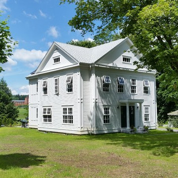
The Taft School faculty home serves as a high performance residence and learning lab for students. The project also earned certification through ENERGY STAR, Indoor airPLUS, Water Sense, PHIUS, and Department of Energy Zero Energy Ready Homes with Living Building Challenge Petal recognition pending. The project team was honored with third place in the 2014 Connecticut Zero Energy Home Challenge. Excluding the photovoltaic installation the HERS index was 33, and with the 13.1 kW the HERS index is -14. A year of utility bills show the home is producing more electricity than it uses.
Located on a quiet street adjacent to campus the existing, historic home was deconstructed and materials donated or reused where possible. Challenged to find high efficiency windows that were historic commission acceptable, the team installed Klearwall awnings or casements over fixed glass (to mimic double hungs) with simulated divided lites (u-values as low as 0.13). A high solar heat gain coefficient (0.58) facilitates the passive solar gain for winter months, while well designed overhangs and a pergola shade summer sun. Double stud walls have 2¼” closed cell foam plus 8½” dense pack cellulose for a R-49 cavity. The exterior sheathing is R-6.6 Zip Wall System with taped seams to create the continuous air barrier. Inside the solid concrete foundation is 3” closed cell foam behind 2x4 stud walls and R-32 cellulose in the cavity. Prefabricated TJI joists frame the attic floor, an insulated “room” houses the heat recovery ventilator and ductwork, and blown in cellulose blankets it all in R-86. The house tested 0.6ACH50 proving the effectiveness of its air-tight envelope and attention to air sealing.
Heating and cooling is provided by efficient air source heat pumps (9.2 HSPF, 16.5 SEER) and delivered by short duct runs which tested extremely tight. A heat pump water heater provides domestic hot water and an on-demand switch, with an occupancy sensor at each bath, ensures hot water is delivered fast and efficiently. Low flow fixtures are WaterSense certified, appliances are Energy Star labeled, and all LED lighting. A Zehnder Novus 300 (93.3% efficient) HRV supplies 112 cfm of continuous fresh air while using only 32 watts of power and running quietly. The homeowners control the mechanical ventilation through the intuitive wall-mounted control pad to shut off or increase the ventilation. Chemicals and contaminants were reduced by using low VOC and GreenGuard certified sealants, adhesives, primers, and paints. A walk-off matt at the side entry and hardwood floors help control dirt and dust. The granite front steps were salvaged and local stone used for the patio and stone walls. Storm water runoff from the roof, patio, and driveway is managed by the rain garden. The native landscaping is low maintenance, a community garden produces vegetables, and the chicken coop is powered by its own roof mounted PV panels.
Taft School Director of Environmental Stewardship, Carly Borken has used the design and construction process as a teaching tool for her science classes. With access to the home monitoring system they can virtually access the residents’ consumption.
 TVL Creative Ltd.
Cramped kitchen be gone! That was the project motto and top priority. The goal was to transform the current layout from multiple smaller spaces into a connected whole that would activate the main level for our clients, a young family of four.
The biggest obstacle was the wall dividing the kitchen and the dining room. Removing this wall was central to opening up and integrating the main living spaces, but the existing ductwork that ran right through the center of the wall posed a design challenge, er design opportunity. The resulting design solution features a central pantry that captures the ductwork and provides valuable storage- especially when compared to the original kitchen's 18" wide pantry cabinet. The pantry also anchors the kitchen island and serves as a visual separation of space between the kitchen and homework area.
Through our design development process, we learned the formal living room was of no service to their lifestyle and therefore space they rarely spent time in. With that in mind, we proposed to eliminate the unused living room and make it the new dining room. Relocating the dining room to this space inherently felt right given the soaring ceiling and ample room for holiday dinners and celebrations. The new dining room was spacious enough for us to incorporate a conversational seating area in the warm, south-facing window alcove.
Now what to do with the old dining room?! To answer that question we took inspiration from our clients' shared profession in education and developed a craft area/homework station for both of their boys. The semi-custom cabinetry of the desk area carries over to the adjacent wall and forms window bench base with storage that we topped with butcher block for a touch of warmth. While the boys are young, the bench drawers are the perfect place for a stash of toys close to the kitchen.
The kitchen begins just beyond the window seat with their refrigerator enclosure. Opposite the refrigerator is the new pantry with twenty linear feet of shelving and space for brooms and a stick vacuum. Extending from the backside of the pantry the kitchen island design incorporates counter seating on the family room side and a cabinetry configuration on the kitchen side with drawer storage, a trashcan center, farmhouse sink, and dishwasher.
We took careful time in design and execution to align the range and sink because while it might seem like a small detail, it plays an important role in supporting the symmetrical configuration of the back wall of the kitchen. The rear wall design utilizes an appliance garage mirrors the visual impact of the refrigerator enclosure and helps keep the now open kitchen tidy. Between the appliance garage and refrigerator enclosure is the cooking zone with 30" of cabinetry and work surface on either side of the range, a chimney style vent hood, and a bold graphic tile backsplash.
The backsplash is just one of many personal touches we added to the space to reflect our client's modern eclectic style and love of color. Swooping lines of the mid-mod style barstools compliment the pendants and backsplash pattern. A pop of vibrant green on the frame of the pantry door adds a fresh wash of color to an otherwise neutral space. The big show stopper is the custom charcoal gray and copper chevron wall installation in the dining room. This was an idea our clients softly suggested, and we excitedly embraced the opportunity. It is also a kickass solution to the head-scratching design dilemma of how to fill a large and lofty wall.
We are so grateful to bring this design to life for our clients and now dear friends.
 PropertyLark
The Pros and Cons of Fix and Flip Real Estate Investment
Last week, we covered The Pros and Cons of Buy and Hold Real Estate Investment for rental property investors. This week, we want to talk about the other most common type of real estate investment: “fix and flip.”
The Appeal of House Flipping
We all love the house flipping shows on HGTV and other reality channels. They’re great and they make the prospect of buying, renovating and flipping homes for big profits seem super sexy and fun. However, any experienced real estate investor will tell you it’s not quite as easy as they make it look. There’s a lot of work that goes into a successful fix and flip investment.
The basic premise of a fix and flip investment is pretty simple. You buy a property, usually one that needs some work and is available at a great price. You renovate the property, making the necessary repairs and upgrades to maximize its resale value. Then, you sell the property on the open market for the highest possible price. You get in and out as quickly as possible. Full-time flippers will move from property to property or will have multiple properties being worked on at the same time. Rather than the “buy and hold” strategy where you keep the house while earning rental income and equity over time, you are looking for the quick sale to earn your profits.
If you are going to explore house flipping—whether as a full-time career or just a side hustle—you will want to know exactly what you are getting into. That is why we are going to cover the pros and cons of fix and flip real estate investment in this article.
The Pros of Fix and Flip
Here are some of the pros of fix and flip investing:
Faster Return on Investment—The biggest appeal of fix and flip investing is that it gives you a quicker return on investment. Buy and hold will take you longer to see your ROI. House flipping allows you to see your full profit (hopefully) as soon as the house sells. The average house flip for an experienced investor is around six months. It may take longer for a first-timer who is just learning how to do certain things.
Fairly Safe Investment—As long as you do all your projections and calculations carefully and avoid any major problems along the way, house flipping is a relatively safe investment strategy compared to something as turbulent as the stock market. Real estate markets are generally predictable and the short time frame of a flip helps you avoid losses if the property happens to depreciate over a longer period of time.
Exciting—There is a reason why there are so many reality shows based around flipping and none based on buy and hold investing. It’s an exciting process to buy a home, gut it and completely renovate it. Then, you get the ultimate reward of selling it and collecting the profits—as long as you do things right.
The Cons of Fix and Flip
Here are some of the cons of fix and flip investing:
Upfront Expenses—A house flip will require a lot of upfront expenses. We’re not only talking about financing the house itself, but all the renovation costs and other expenses involved in the flip. You are laying out all that money at the beginning and only seeing your returns when the property sells. This can create cash flow issues and stress if you fall being schedule or go above your initial budget.
Taxes—House flips will usually create dramatic swings in income year over year, and that can increase your tax bill. You have to pace things correctly to take advantage of specific capital gains tax rules. Capital gains taxes are higher on any property owned less than a year, so you have to find that balance of how long you own any specific investment properties and how long it takes to complete the renovation and sale. Before you get too deep into fix and flip investing, you will want to talk with your tax advisor to make sure you have the right plan in place.
Surprises—All real estate investment is susceptible to surprises. You don’t always know what lies behind the walls until you start the renovation process. You cannot plan for everything as a real estate investor, but you have to be prepared for anything. It is a good idea to add some wiggle room in your budget and overestimate your renovation expenses/timeline to cover any surprises that may come up.
These are some of the biggest pros and cons of fix and flip real estate investment. Of course, there are other things you need to know as an investor, so be sure and do your homework in order to get the most out of your investment portfolio. Both fix and flip and buy and hold strategies can be highly lucrative if you do things right. There are no wrong answers, but there are wrong ways of doing things if you truly want to be successful in this field.
If you are looking for great investment properties to fix and flip, join the exclusive PropertyLark home buyers’ network. If you qualify, you’ll have access to our exclusive off-market deals and analytics tools that will help you identify the best investments and get the highest possible ROI. Fill out the contact form and questionnaire on the PropertyLark buyer’s site to apply!
 Simply Home Decorating
The kitchen may be the heart of a home, but the dining room is where the family gathers to enjoy special occasions, create and pass on traditions, and savour each other’s company free from distractions. The family behind this particular dining room enjoys doing just that.
When they are not traveling the world, Matthew and Anna (names changed) love to cook meals at home with their teenage daughter, entertain family and friends, and live amongst their cherished travel souvenirs and heirlooms. Their dining room, however, was far from the perfect backdrop for these experiences.
Before: Dining Room:
When Matthew and Anna contacted us, they imagined a space that would comfortably seat 8 to 10 people and incorporate their beautiful inherited dining table and sideboard in a fresh, modern way. Above all, they wanted a dining room that they would feel proud to share.
They worked with us to design, lightly renovate, and furnish their dining room and adjacent living space. Now, the room is nothing short of inviting and elevated.
Classic Yet Contemporary Dining Room:
Viewed from the living area, the dining room is a hidden gem waiting to be discovered. Matthew and Anna wanted dark blue for the walls, and we couldn’t have been happier to find the perfect shade for them. By leaning darker, this rich blue creates the perception of depth, making the room feel enticing, comfortable and secluded.
The previous built-ins were underwhelming and lacked function, so we designed wider, taller, double sided cabinets that integrated the existing bulk-head, and then accessorized the shelves with the family’s travel finds, books, and decor. Topping these units with brass art lights not only blends contemporary and traditional styles, it also draws attention to the dining table’s modern show-stopping chandelier. You can’t miss it.
Inside the dining room, the effect is equally impressive: enveloping yet spacious, warm yet cool, classic yet contemporary. We incorporated their heirloom pieces seamlessly into the design thanks to the 1:2 ratio. For every traditional piece, we introduced two more modern or contemporary pieces — clean lines, subtle curves, and lustrous brass hardware. The result is a collected yet updated look.
In any room with dark walls, lighting is of the utmost importance. We placed a mirror adjacent to the window to reflect natural light throughout the room, and we kept the trim and ceiling white for brightness. To provide maximum versatility, we provided multiple light sources that can be adjusted to create different levels of light to suit any mood or occasion. These include: pot lights and a chandelier on dimmers, a sculptural trilight lamp on the sideboard, and art lights on the bookcases and above important art pieces.
The built-ins have another surprise waiting inside this special dining room:
Double-sided built-ins: dining room shelving and living room shelving.
Rather than keep them white like we did in the living room, we painted the back wall of the book cases the same dark blue as the walls in the rest of the room. This reduces the contrast with the surrounding walls and emphasizes the white outline of the cabinets. We also love the dark blue walls’ role as a beautiful backdrop for this family’s treasures. The brass accessories and hand-painted vases and bowls feel like part of the experience.
Of course, what is beauty without function? It may not look like it, but the base storage is only accessible from the dining room side. The units include deep cabinets for storing serving ware, as well as another delightful surprise: silverware drawers lined in luxurious navy velvet!
Lastly, we designed this beautiful nook for their heirloom sideboard. From afar, the wall looks as if it has texture and perhaps a touch of shine. Up close, you will notice that it is actually navy blue wallpaper with tiny golden dots. This unique touch accentuates the brass in the room touches throughout the space.. The room feels curated, contemporary, and full of character.
Words of Praise:
Anna and Matthew were thrilled with their new dining room and with the design process itself, which is always the highest compliment. They said:
“Working with Lori and her team at Simply Home Decorating was a great experience. The design they came up with was both beautiful and practical for our family. Renovations can be stressful but working with Simply Home made the process much more pleasant.
“Simply Home's project management and their longstanding relationships with reliable trades meant we could relax, knowing that everything was taken care of. If an issue arose, the entire Simply Home team was quick to address it. They were excellent at communicating with us—we never felt like we didn't know what was going on. We would highly recommend working with Simply Home Decorating.”
Thank you, Matthew and Anna! We are honoured to have been part of your journey and wish your family many happy memories in these new spaces.
Now, is it your turn? Are you ready to uncover the hidden potential in your home? If so, contact us here to start the conversation or download my guide Uncovering the Hidden Potential in Your Home below to learn more about what we can do for you.

 McCullough's Flooring
Gorgeous master bath finished with Dal-Tile's Fabrique porcelain tile in the color Noir Linen polished. Tile size is 12"x24" installed in a brick joint pattern. The floor boasts underfloor heating on a timed thermostat.

 Housetrends Magazine
When you open the back doors of the home of Nancy and Jeremy Campbell in Granville, you don’t just step out onto a patio. You enter an extension of a modern living space that just happens to be outdoors. Their patio’s unique design and setting provides the comfort and style of indoors while enjoying the natural beauty and fresh air of outdoors.
It all started with a rather desolate back yard. “It was completely blank, there was nothing back there,” Nancy remembers of the patio space of this 1972 split-level house they bought five years ago. With a blank slate to work with, the Campbells knew the key elements of what they wanted for their new outdoor space when they sat down with Travis Ketron of Ketron Custom Builders to design it. “We knew we wanted something covered so we could use it in the rain, and in the winter, and we knew we wanted a stone fireplace,” Nancy recalls.
Travis translated the Campbells’ vision into a design to satisfy outdoor entertaining and relaxing desires in all seasons. The new outdoor space is reminiscent of a vast, rustic great room complete with a stone fireplace, a vaulted ceiling, skylights, and ceiling fans, yet no walls. The space is completely open to the elements without any glass or doors on any of the sides, except from the house. Furnished like a great room, with a built-in music system as well, it’s truly an extension of indoor living and entertaining space, and one that is unaffected by rain. Jeremy comments, “We haven’t had to cover the furniture yet. It would have to be a pretty strong wind to get wet.” Just outside the covered patio is a quartet of outdoor chairs adorned with plush cushions and colorful pillows, positioned perfectly for users to bask in the sun.
In the design process, the fireplace emerged as the anchor of the space and set the stage for the outdoor space both aesthetically and functionally. “We didn’t want it to block the view. Then designing the space with Travis, the fireplace became the center,” remembers Jeremy. Placed directly across from the two sets of French doors leading out from the house, a Rumford fireplace and extended hearth of stone in neutral earth tones is the focal point of this outdoor living room. Seating for entertaining and lounging falls easily into place around it providing optimal viewing of the private, wooded back yard. When temperatures cool off, the fireplace provides ample warmth and a cozy setting to experience the change of seasons. “It’s a great fireplace for the space,” Jeremy says of the unique design of a Rumford style fireplace. “The way you stack the wood in the fireplace is different so as to get more heat. It has a shallower box, burns hotter and puts off more heat. Wood is placed in it vertically, not stacked.” Just in case the fireplace doesn’t provide enough light for late-night soirees, there is additional outdoor lighting mounted from the ceiling to make sure the party always goes on.
Travis brought the idea of the Rumford outdoor fireplace to the Campbells. “I learned about it a few years back from some masons, and I was intrigued by the idea then,” he says. “We like to do stuff that’s out of the norm, and this fireplace fits the space and function very well.” Travis adds, “People want unique things that are designed for them. That’s our style to do that for them.”
The patio also extends out to an uncovered area set up with patio tables for grilling and dining. Gray pavers flow throughout from the covered space to the open-air area. Their continuous flow mimics the feel of flooring that extends from a living room into a dining room inside a home. Also, the earth tone colors throughout the space on the pavers, fireplace and furnishings help the entire space mesh nicely with its natural surroundings.
A little ways off from both the covered and uncovered patio area is a stone fire pit ring. Removed by just the right distance, it provides a separate place for young adults to gather and enjoy the night.
Adirondack chairs and matching tables surround the outdoor fire pit, offering seating for anyone who doesn’t wish to stand and a place to set down ingredients for yummy fireside treats like s’mores.
Padded chairs outside the reach of the pavilion and the nearby umbrella the perfect place to kick back and relax in the sun. The colorful throw pillows and outdoor furniture cushions add some needed color and a touch of personality.
Enjoying the comforts of indoors while being outdoors is exactly what the Campbells are doing now, particularly when lounging on the comfortable wicker furniture that dominate most of the area. “My favorite part of the whole thing is the fireplace,” Nancy says.
Jeremy concludes, “There is no television, it would destroy the ambiance out there. We just enjoy listening to music and watching the fire.”
 TVL Creative Ltd.
Cramped kitchen be gone! That was the project motto and top priority. The goal was to transform the current layout from multiple smaller spaces into a connected whole that would activate the main level for our clients, a young family of four.
The biggest obstacle was the wall dividing the kitchen and the dining room. Removing this wall was central to opening up and integrating the main living spaces, but the existing ductwork that ran right through the center of the wall posed a design challenge, er design opportunity. The resulting design solution features a central pantry that captures the ductwork and provides valuable storage- especially when compared to the original kitchen's 18" wide pantry cabinet. The pantry also anchors the kitchen island and serves as a visual separation of space between the kitchen and homework area.
Through our design development process, we learned the formal living room was of no service to their lifestyle and therefore space they rarely spent time in. With that in mind, we proposed to eliminate the unused living room and make it the new dining room. Relocating the dining room to this space inherently felt right given the soaring ceiling and ample room for holiday dinners and celebrations. The new dining room was spacious enough for us to incorporate a conversational seating area in the warm, south-facing window alcove.
Now what to do with the old dining room?! To answer that question we took inspiration from our clients' shared profession in education and developed a craft area/homework station for both of their boys. The semi-custom cabinetry of the desk area carries over to the adjacent wall and forms window bench base with storage that we topped with butcher block for a touch of warmth. While the boys are young, the bench drawers are the perfect place for a stash of toys close to the kitchen.
The kitchen begins just beyond the window seat with their refrigerator enclosure. Opposite the refrigerator is the new pantry with twenty linear feet of shelving and space for brooms and a stick vacuum. Extending from the backside of the pantry the kitchen island design incorporates counter seating on the family room side and a cabinetry configuration on the kitchen side with drawer storage, a trashcan center, farmhouse sink, and dishwasher.
We took careful time in design and execution to align the range and sink because while it might seem like a small detail, it plays an important role in supporting the symmetrical configuration of the back wall of the kitchen. The rear wall design utilizes an appliance garage mirrors the visual impact of the refrigerator enclosure and helps keep the now open kitchen tidy. Between the appliance garage and refrigerator enclosure is the cooking zone with 30" of cabinetry and work surface on either side of the range, a chimney style vent hood, and a bold graphic tile backsplash.
The backsplash is just one of many personal touches we added to the space to reflect our client's modern eclectic style and love of color. Swooping lines of the mid-mod style barstools compliment the pendants and backsplash pattern. A pop of vibrant green on the frame of the pantry door adds a fresh wash of color to an otherwise neutral space. The big show stopper is the custom charcoal gray and copper chevron wall installation in the dining room. This was an idea our clients softly suggested, and we excitedly embraced the opportunity. It is also a kickass solution to the head-scratching design dilemma of how to fill a large and lofty wall.
We are so grateful to bring this design to life for our clients and now dear friends.
38