
Search results for "Lettering" in Home Design Ideas
 Walczak Design And Build
When our clients came to us, their master bathroom was doing them no favors. An awkwardly oversized corner tub that hadn't seen a bubble bath in years, a shower barely large enough to turn around in, and a color palette best described as "contractor default." The bones were there — a generously sized footprint — but the space had zero personality and even less function.
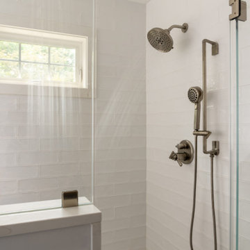
Our first move was rethinking how the square footage was being used. Out went the hulking corner tub, and in its place: a spa-worthy walk-in shower that finally earns the space it occupies. Classic white subway tile with soft gray grout lines gives it a timeless foundation, while dual showerheads — a traditional wall-mount and a ceiling-mounted rain shower — turn every morning into something worth waking up for. Built-in niches keep everything organized without interrupting the clean aesthetic.
The commode room got a full character transplant. Wainscoting grounds the space with architectural detail, while a custom nautical map wallcovering wraps the room in something deeply personal — a curated cartographic love letter to the waterways and places that matter most to this family. The addition of a traditional pedestal bidet elevates both the function and the feeling of the space.
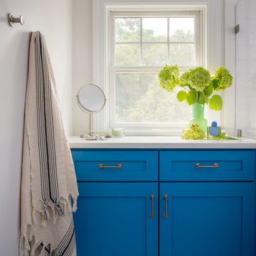
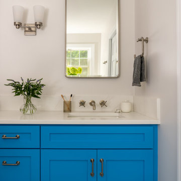
Back in the main bathroom, the clients' personality finally has a place to live. A bold, saturated blue on the custom double vanity cabinetry makes an unapologetic statement — the kind that makes you smile every time you walk in. Wall-mounted brushed nickel faucets and coordinating hardware keep the look polished and cohesive throughout. A heated towel rack and radiant heated floors are the quiet luxuries that tip this bathroom from "really nice" into "I never want to leave."
New windows flood the space with natural light, making the already generous footprint feel even more expansive and bringing out the best in every finish and material choice.
The result is a bathroom that works as hard as it looks good — and one that finally, unmistakably, feels like them.
 Walczak Design And Build
When our clients came to us, their master bathroom was doing them no favors. An awkwardly oversized corner tub that hadn't seen a bubble bath in years, a shower barely large enough to turn around in, and a color palette best described as "contractor default." The bones were there — a generously sized footprint — but the space had zero personality and even less function.
Our first move was rethinking how the square footage was being used. Out went the hulking corner tub, and in its place: a spa-worthy walk-in shower that finally earns the space it occupies. Classic white subway tile with soft gray grout lines gives it a timeless foundation, while dual showerheads — a traditional wall-mount and a ceiling-mounted rain shower — turn every morning into something worth waking up for. Built-in niches keep everything organized without interrupting the clean aesthetic.
The commode room got a full character transplant. Wainscoting grounds the space with architectural detail, while a custom nautical map wallcovering wraps the room in something deeply personal — a curated cartographic love letter to the waterways and places that matter most to this family. The addition of a traditional pedestal bidet elevates both the function and the feeling of the space.
Back in the main bathroom, the clients' personality finally has a place to live. A bold, saturated blue on the custom double vanity cabinetry makes an unapologetic statement — the kind that makes you smile every time you walk in. Wall-mounted brushed nickel faucets and coordinating hardware keep the look polished and cohesive throughout. A heated towel rack and radiant heated floors are the quiet luxuries that tip this bathroom from "really nice" into "I never want to leave."
New windows flood the space with natural light, making the already generous footprint feel even more expansive and bringing out the best in every finish and material choice.
The result is a bathroom that works as hard as it looks good — and one that finally, unmistakably, feels like them.
 Walczak Design And Build
When our clients came to us, their master bathroom was doing them no favors. An awkwardly oversized corner tub that hadn't seen a bubble bath in years, a shower barely large enough to turn around in, and a color palette best described as "contractor default." The bones were there — a generously sized footprint — but the space had zero personality and even less function.
Our first move was rethinking how the square footage was being used. Out went the hulking corner tub, and in its place: a spa-worthy walk-in shower that finally earns the space it occupies. Classic white subway tile with soft gray grout lines gives it a timeless foundation, while dual showerheads — a traditional wall-mount and a ceiling-mounted rain shower — turn every morning into something worth waking up for. Built-in niches keep everything organized without interrupting the clean aesthetic.
The commode room got a full character transplant. Wainscoting grounds the space with architectural detail, while a custom nautical map wallcovering wraps the room in something deeply personal — a curated cartographic love letter to the waterways and places that matter most to this family. The addition of a traditional pedestal bidet elevates both the function and the feeling of the space.
Back in the main bathroom, the clients' personality finally has a place to live. A bold, saturated blue on the custom double vanity cabinetry makes an unapologetic statement — the kind that makes you smile every time you walk in. Wall-mounted brushed nickel faucets and coordinating hardware keep the look polished and cohesive throughout. A heated towel rack and radiant heated floors are the quiet luxuries that tip this bathroom from "really nice" into "I never want to leave."
New windows flood the space with natural light, making the already generous footprint feel even more expansive and bringing out the best in every finish and material choice.
The result is a bathroom that works as hard as it looks good — and one that finally, unmistakably, feels like them.
Find the right local pro for your project
 CROWNCUSTOMDOORS
Key Features:
Luxurious Upholstery: The plush vinyl upholstery vinyl provides a luxurious look and feel, reminiscent of classic theater seating. The deep red color adds a touch of drama and excitement, setting the stage for a captivating movie experience. (Keywords: upholstered door, theater door, vinyl door, padded door)
Classic Diamond Tufting: The meticulously crafted diamond tufting adds a touch of timeless elegance and sophistication, creating a focal point that's both stylish and comfortable. (Keywords: tufted door, button tufted door, decorative door)
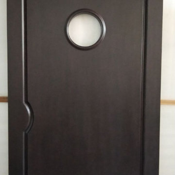
Unique Easy View Window: The circular window, as seen in Jennifer's door, allows for a sneak peek into the theater beyond, building anticipation and adding a touch of classic theater charm. Customize the window with your family name, theater name, or a design of your choice. (Keywords: window door, porthole door, custom lettering)
Statement Hardware: The half-moon handle provides a comfortable grip and adds a touch of vintage flair, complementing the overall design. (Keywords: art deco door handle, half moon handle, unique door hardware)
Customizable Options: As demonstrated by Jennifer's door, we specialize in creating custom home theater doors tailored to your exact specifications. Choose from a variety of colors, upholstery materials, hardware options, and window designs to create a door that perfectly matches your home theater aesthetic. (Keywords: custom door, bespoke door, personalized door)
Durable Construction: Crafted with a solid wood core and high-quality materials, these doors are built to last and provide years of enjoyment. The solid core construction also offers enhanced sound dampening for a more immersive viewing experience. (Keywords: solid core door, soundproof door, durable door)
Single or Double Door Options: Whether you prefer a single, impactful entrance or a grand double door design, we can create the perfect solution for your space. (Keywords: single door, double door)
 Walczak Design And Build
When our clients came to us, their master bathroom was doing them no favors. An awkwardly oversized corner tub that hadn't seen a bubble bath in years, a shower barely large enough to turn around in, and a color palette best described as "contractor default." The bones were there — a generously sized footprint — but the space had zero personality and even less function.
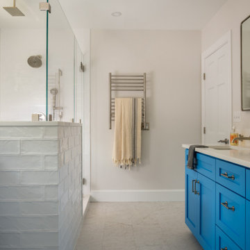
Our first move was rethinking how the square footage was being used. Out went the hulking corner tub, and in its place: a spa-worthy walk-in shower that finally earns the space it occupies. Classic white subway tile with soft gray grout lines gives it a timeless foundation, while dual showerheads — a traditional wall-mount and a ceiling-mounted rain shower — turn every morning into something worth waking up for. Built-in niches keep everything organized without interrupting the clean aesthetic.
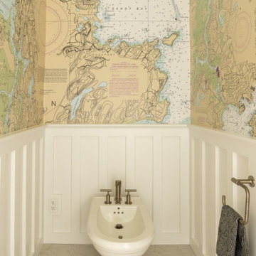
The commode room got a full character transplant. Wainscoting grounds the space with architectural detail, while a custom nautical map wallcovering wraps the room in something deeply personal — a curated cartographic love letter to the waterways and places that matter most to this family. The addition of a traditional pedestal bidet elevates both the function and the feeling of the space.
Back in the main bathroom, the clients' personality finally has a place to live. A bold, saturated blue on the custom double vanity cabinetry makes an unapologetic statement — the kind that makes you smile every time you walk in. Wall-mounted brushed nickel faucets and coordinating hardware keep the look polished and cohesive throughout. A heated towel rack and radiant heated floors are the quiet luxuries that tip this bathroom from "really nice" into "I never want to leave."
New windows flood the space with natural light, making the already generous footprint feel even more expansive and bringing out the best in every finish and material choice.
The result is a bathroom that works as hard as it looks good — and one that finally, unmistakably, feels like them.

 Tech Scapes Australia Landscaping
Individually designed and hand crafted letterbox.
This is an example of a huge contemporary front yard driveway in Sydney.
This is an example of a huge contemporary front yard driveway in Sydney.
 Walczak Design And Build
When our clients came to us, their master bathroom was doing them no favors. An awkwardly oversized corner tub that hadn't seen a bubble bath in years, a shower barely large enough to turn around in, and a color palette best described as "contractor default." The bones were there — a generously sized footprint — but the space had zero personality and even less function.
Our first move was rethinking how the square footage was being used. Out went the hulking corner tub, and in its place: a spa-worthy walk-in shower that finally earns the space it occupies. Classic white subway tile with soft gray grout lines gives it a timeless foundation, while dual showerheads — a traditional wall-mount and a ceiling-mounted rain shower — turn every morning into something worth waking up for. Built-in niches keep everything organized without interrupting the clean aesthetic.
The commode room got a full character transplant. Wainscoting grounds the space with architectural detail, while a custom nautical map wallcovering wraps the room in something deeply personal — a curated cartographic love letter to the waterways and places that matter most to this family. The addition of a traditional pedestal bidet elevates both the function and the feeling of the space.
Back in the main bathroom, the clients' personality finally has a place to live. A bold, saturated blue on the custom double vanity cabinetry makes an unapologetic statement — the kind that makes you smile every time you walk in. Wall-mounted brushed nickel faucets and coordinating hardware keep the look polished and cohesive throughout. A heated towel rack and radiant heated floors are the quiet luxuries that tip this bathroom from "really nice" into "I never want to leave."
New windows flood the space with natural light, making the already generous footprint feel even more expansive and bringing out the best in every finish and material choice.
The result is a bathroom that works as hard as it looks good — and one that finally, unmistakably, feels like them.

 Sans Soucie Art Glass
GLASS LAUNDRY ROOM DOORS that YOU customize to suit your decor! Let a Pretty Glass Laundry Room Door Lighten Your Load! Glass Laundry Room Doors and laundry door inserts with custom etched glass, frosted glass designs! Spruce up your laundry room with a beautiful etched glass laundry room door by Sans Soucie! Creating the highest quality and largest selection of frosted glass laundry room doors available anywhere! Select from dozens of frosted glass designs, borders and letter styles! Sans Soucie creates their laundry door obscure glass designs thru sandblasting the glass in different ways which create not only different effects, but different levels in price. The "same design, done different" - with no limit to design, there's something for every decor, regardless of style. Inside our fun, easy to use online Glass and Door Designer at sanssoucie.com, you'll get instant pricing on everything as YOU customize your door and the glass, just the way YOU want it, to compliment and coordinate with your decor. When you're all finished designing, you can place your order right there online! Shipping starts at just $99! Custom packed and fully insured with a 1-4 day transit time. Available any size, as laundry door glass insert only or pre-installed in a door frame, with 8 wood types available. ETA for laundry doors will vary from 3-8 weeks depending on glass & door type. Glass and doors ship worldwide. Glass is sandblast frosted or etched and laundry room door designs are available in 3 effects: Solid frost, 2D surface etched or 3D carved. Visit our site to learn more!

 Jaimie Anand Interiors
Inspiration for a bedroom and mid-sized modern girl carpeted kids' bedroom remodel in Austin with white walls

 Great Northwest Homes
Custom Wrought Iron Gate. Photo by Bill Johnson
Example of a large mountain style brown two-story stone gable roof design in Seattle
Example of a large mountain style brown two-story stone gable roof design in Seattle
 Susan Yeley Homes
Nearly two decades ago now, Susan and her husband put a letter in the mailbox of this eastside home: "If you have any interest in selling, please reach out." But really, who would give up a Flansburgh House?
Fast forward to 2020, when the house went on the market! By then it was clear that three children and a busy home design studio couldn't be crammed into this efficient footprint. But what's second best to moving into your dream home? Being asked to redesign the functional core for the family that was.
In this classic Flansburgh layout, all the rooms align tidily in a square around a central hall and open air atrium. As such, all the spaces are both connected to one another and also private; and all allow for visual access to the outdoors in two directions—toward the atrium and toward the exterior. All except, in this case, the utilitarian galley kitchen. That space, oft-relegated to second class in midcentury architecture, got the shaft, with narrow doorways on two ends and no good visual access to the atrium or the outside. Who spends time in the kitchen anyway?
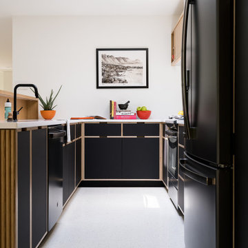
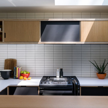
As is often the case with even the very best midcentury architecture, the kitchen at the Flansburgh House needed to be modernized; appliances and cabinetry have come a long way since 1970, but our culture has evolved too, becoming more casual and open in ways we at SYH believe are here to stay. People (gasp!) do spend time—lots of time!—in their kitchens! Nonetheless, our goal was to make this kitchen look as if it had been designed this way by Earl Flansburgh himself.
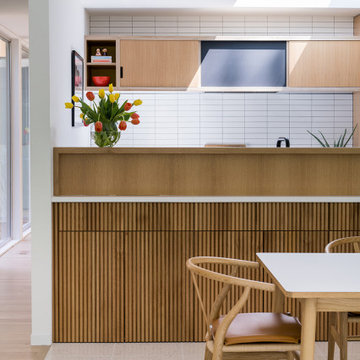
The house came to us full of bold, bright color. We edited out some of it (along with the walls it was on) but kept and built upon the stunning red, orange and yellow closet doors in the family room adjacent to the kitchen. That pop was balanced by a few colorful midcentury pieces that our clients already owned, and the stunning light and verdant green coming in from both the atrium and the perimeter of the house, not to mention the many skylights. Thus, the rest of the space just needed to quiet down and be a beautiful, if neutral, foil. White terrazzo tile grounds custom plywood and black cabinetry, offset by a half wall that offers both camouflage for the cooking mess and also storage below, hidden behind seamless oak tambour.
Contractor: Rusty Peterson
Cabinetry: Stoll's Woodworking
Photographer: Sarah Shields

 JRP Design & Remodel
Our clients were living with outdated, dark bathrooms in their newly purchased Falling Star home. The dull palette of warm neutrals did not reflect the couple’s East Coast traditional style. They noticed several renovation projects by JRP in the neighborhood. The professionalism and the process impressed them. After receiving a Pardon Our Dust courtesy letter from JRP, the couple decided to call for a consultation. Their wish list was clear. They wanted the Falling Star design to be light, airy, and white. It had to reflect their East Coast roots. Working with the original footprint, JRP completely transformed the space, creating a tranquil primary suite rich with traditional detail. The result is an effusive celebration of classic style.
Now, the radiant rooms glow. To enlarge the primary closet, the JRP team removed a cluttered storage area. Inside, a separate dressing space is finished with upgraded storage and refined built-in cabinetry with recessed panels. Pops of glam such as Robert Abbey glass chandeliers and brilliant bits of chrome are moored by traditional elements like crown molding, porcelain tiles, and a quartz-clad drop-in soaking tub. Large windows in the primary bath and funnel skylights in the closet harness the natural light to stunning effect, sweeping the rooms with the cool feeling of fresh air. The “Sail Cloth” white paint adds soft depth to the uncomplicated elegance of both rooms.
PROJECT DETAILS:
• Style: Transitional
• Countertops: Vadara Quartz – Calacatta Dorado
• Cabinets: DeWils Recessed-panel, painted white
• Hardware/Plumbing Fixture Finish: Chrome
• Lighting Fixtures:
Master Closet: Skylight Sun Tunnel
Master Bath: Robert Abbey, Glass Chandelier
• Flooring:
Floor: Calacatta Dorado Porcelain Tiles w/Accent
• Tile/Backsplash: Shower Surround: Ceramic Blanc/Crackle
• Paint Colors:
Master Bath & Closet: Dunn Edwards Sail Cloth
Hall Bath: Benjamin Moore Ballet White
• Other Details: Drop-in soaking Tub
Photographer: J.R. Maddox
 Sans Soucie Art Glass
GLASS LAUNDRY ROOM DOORS that YOU customize to suit your decor! Let a Pretty Glass Laundry Room Door Lighten Your Load! Glass Laundry Room Doors and laundry door inserts with custom etched glass, frosted glass designs! Spruce up your laundry room with a beautiful etched glass laundry room door by Sans Soucie! Creating the highest quality and largest selection of frosted glass laundry room doors available anywhere! Select from dozens of frosted glass designs, borders and letter styles! Sans Soucie creates their laundry door obscure glass designs thru sandblasting the glass in different ways which create not only different effects, but different levels in price. The "same design, done different" - with no limit to design, there's something for every decor, regardless of style. Inside our fun, easy to use online Glass and Door Designer at sanssoucie.com, you'll get instant pricing on everything as YOU customize your door and the glass, just the way YOU want it, to compliment and coordinate with your decor. When you're all finished designing, you can place your order right there online! Shipping starts at just $99! Custom packed and fully insured with a 1-4 day transit time. Available any size, as laundry door glass insert only or pre-installed in a door frame, with 8 wood types available. ETA for laundry doors will vary from 3-8 weeks depending on glass & door type. Glass and doors ship worldwide. Glass is sandblast frosted or etched and laundry room door designs are available in 3 effects: Solid frost, 2D surface etched or 3D carved. Visit our site to learn more!

 Anjie Cho Architect PLLC
Girl’s room:
Custom wall decals, Raydoor frosted sliding door, IKEA cabinets, wall partitions, door partitions, custom drapes, polka dotted drapes, custom pillows, custom duvet, West Elm nightstand, PBteen nightstand lamp, purples and pinks
 Susan Yeley Homes
Nearly two decades ago now, Susan and her husband put a letter in the mailbox of this eastside home: "If you have any interest in selling, please reach out." But really, who would give up a Flansburgh House?
Fast forward to 2020, when the house went on the market! By then it was clear that three children and a busy home design studio couldn't be crammed into this efficient footprint. But what's second best to moving into your dream home? Being asked to redesign the functional core for the family that was.
In this classic Flansburgh layout, all the rooms align tidily in a square around a central hall and open air atrium. As such, all the spaces are both connected to one another and also private; and all allow for visual access to the outdoors in two directions—toward the atrium and toward the exterior. All except, in this case, the utilitarian galley kitchen. That space, oft-relegated to second class in midcentury architecture, got the shaft, with narrow doorways on two ends and no good visual access to the atrium or the outside. Who spends time in the kitchen anyway?
As is often the case with even the very best midcentury architecture, the kitchen at the Flansburgh House needed to be modernized; appliances and cabinetry have come a long way since 1970, but our culture has evolved too, becoming more casual and open in ways we at SYH believe are here to stay. People (gasp!) do spend time—lots of time!—in their kitchens! Nonetheless, our goal was to make this kitchen look as if it had been designed this way by Earl Flansburgh himself.
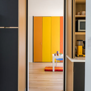
The house came to us full of bold, bright color. We edited out some of it (along with the walls it was on) but kept and built upon the stunning red, orange and yellow closet doors in the family room adjacent to the kitchen. That pop was balanced by a few colorful midcentury pieces that our clients already owned, and the stunning light and verdant green coming in from both the atrium and the perimeter of the house, not to mention the many skylights. Thus, the rest of the space just needed to quiet down and be a beautiful, if neutral, foil. White terrazzo tile grounds custom plywood and black cabinetry, offset by a half wall that offers both camouflage for the cooking mess and also storage below, hidden behind seamless oak tambour.
Contractor: Rusty Peterson
Cabinetry: Stoll's Woodworking
Photographer: Sarah Shields
 Susan Yeley Homes
Nearly two decades ago now, Susan and her husband put a letter in the mailbox of this eastside home: "If you have any interest in selling, please reach out." But really, who would give up a Flansburgh House?
Fast forward to 2020, when the house went on the market! By then it was clear that three children and a busy home design studio couldn't be crammed into this efficient footprint. But what's second best to moving into your dream home? Being asked to redesign the functional core for the family that was.
In this classic Flansburgh layout, all the rooms align tidily in a square around a central hall and open air atrium. As such, all the spaces are both connected to one another and also private; and all allow for visual access to the outdoors in two directions—toward the atrium and toward the exterior. All except, in this case, the utilitarian galley kitchen. That space, oft-relegated to second class in midcentury architecture, got the shaft, with narrow doorways on two ends and no good visual access to the atrium or the outside. Who spends time in the kitchen anyway?
As is often the case with even the very best midcentury architecture, the kitchen at the Flansburgh House needed to be modernized; appliances and cabinetry have come a long way since 1970, but our culture has evolved too, becoming more casual and open in ways we at SYH believe are here to stay. People (gasp!) do spend time—lots of time!—in their kitchens! Nonetheless, our goal was to make this kitchen look as if it had been designed this way by Earl Flansburgh himself.
The house came to us full of bold, bright color. We edited out some of it (along with the walls it was on) but kept and built upon the stunning red, orange and yellow closet doors in the family room adjacent to the kitchen. That pop was balanced by a few colorful midcentury pieces that our clients already owned, and the stunning light and verdant green coming in from both the atrium and the perimeter of the house, not to mention the many skylights. Thus, the rest of the space just needed to quiet down and be a beautiful, if neutral, foil. White terrazzo tile grounds custom plywood and black cabinetry, offset by a half wall that offers both camouflage for the cooking mess and also storage below, hidden behind seamless oak tambour.
Contractor: Rusty Peterson
Cabinetry: Stoll's Woodworking
Photographer: Sarah Shields

 Brandalyn Designs
Game Room |
This industrial space with a mid-century twist provides an inviting and fun space for both adults and kids to play games, and hang out.
Large urban walk-out light wood floor basement photo in Salt Lake City with gray walls
Large urban walk-out light wood floor basement photo in Salt Lake City with gray walls

 Kimberley Kay Interiors
Kids space with playhouse and table and chairs for arts and crafts
Example of a mid-sized eclectic girl playroom design in Phoenix
Example of a mid-sized eclectic girl playroom design in Phoenix

 Hudson Home
The perfect desert getaway. A living room loaded with high contrast and graphic elements. The client's goal to create a "hot pink swanky hotel lounge"
 Susan Yeley Homes
Nearly two decades ago now, Susan and her husband put a letter in the mailbox of this eastside home: "If you have any interest in selling, please reach out." But really, who would give up a Flansburgh House?
Fast forward to 2020, when the house went on the market! By then it was clear that three children and a busy home design studio couldn't be crammed into this efficient footprint. But what's second best to moving into your dream home? Being asked to redesign the functional core for the family that was.
In this classic Flansburgh layout, all the rooms align tidily in a square around a central hall and open air atrium. As such, all the spaces are both connected to one another and also private; and all allow for visual access to the outdoors in two directions—toward the atrium and toward the exterior. All except, in this case, the utilitarian galley kitchen. That space, oft-relegated to second class in midcentury architecture, got the shaft, with narrow doorways on two ends and no good visual access to the atrium or the outside. Who spends time in the kitchen anyway?
As is often the case with even the very best midcentury architecture, the kitchen at the Flansburgh House needed to be modernized; appliances and cabinetry have come a long way since 1970, but our culture has evolved too, becoming more casual and open in ways we at SYH believe are here to stay. People (gasp!) do spend time—lots of time!—in their kitchens! Nonetheless, our goal was to make this kitchen look as if it had been designed this way by Earl Flansburgh himself.
The house came to us full of bold, bright color. We edited out some of it (along with the walls it was on) but kept and built upon the stunning red, orange and yellow closet doors in the family room adjacent to the kitchen. That pop was balanced by a few colorful midcentury pieces that our clients already owned, and the stunning light and verdant green coming in from both the atrium and the perimeter of the house, not to mention the many skylights. Thus, the rest of the space just needed to quiet down and be a beautiful, if neutral, foil. White terrazzo tile grounds custom plywood and black cabinetry, offset by a half wall that offers both camouflage for the cooking mess and also storage below, hidden behind seamless oak tambour.
Contractor: Rusty Peterson
Cabinetry: Stoll's Woodworking
Photographer: Sarah Shields
225