
Search results for "Lies ahead" in Home Design Ideas

 Amanda Martocchio Architecture
Michael Moran/OTTO photography.
The objective of this award-winning gut renovation was to create a spatially dynamic, light-filled, and energy-efficient home with a strong connection to Long Island Sound. The design strategy is straightforward: a gabled roof covers a central “spine” corridor that terminates with cathedral ceilinged spaces at both ends. The relocated approach and entry deposit visitors into the front hall with its curvilinear, cantilevered stair. A two-story, windowed family gathering space lies ahead – a straight shot to the water beyond.
The design challenge was to utilize the existing house footprint and structure, while raising the top of foundation walls to exceed new flood regulations, reconfiguring the spatial organization, and using innovative materials to produce a tight thermal envelope and contemporary yet contextually appropriate facades.

 Protech Home Improvements LLC
The client was very excited to update her kitchen. She wanted a more inviting place to showcase her amazing cooking skills.
The layout remained but the end result was a more complete kitchen with more storage which allowed for more counter space. We updated the tile floor, kitchen cabinets, counter top, tile back splash and appliances. Our professional sub-contractors updated the electric and plumbing to code.
We finished the kitchen with a beautiful new gray paint which highlighted the counter top, grout color, appliances and floors.
Client said:
"Protech is a highly professional and more importantly, trustworthy company that strives to fully satisfy. They truly listened to my desires and made sure to explain all possible options and limitations that could lie ahead. I dealt with two of the owners (Paul, John) as well as their head foreman Will, who were all polite, always at the job site and kept everything clean. The end was everything and more than I was hoping for. While they were not the cheapest price wise, the cost is worth it in the end. You made me VERY HAPPY and PROUD of my new kitchen. THANK YOU!!!"
Barbara M. Bernardsville, NJ
 Protech Home Improvements LLC
The client was very excited to update her kitchen. She wanted a more inviting place to showcase her amazing cooking skills.
The layout remained but the end result was a more complete kitchen with more storage which allowed for more counter space. We updated the tile floor, kitchen cabinets, counter top, tile back splash and appliances. Our professional sub-contractors updated the electric and plumbing to code.
We finished the kitchen with a beautiful new gray paint which highlighted the counter top, grout color, appliances and floors.
Client said:
"Protech is a highly professional and more importantly, trustworthy company that strives to fully satisfy. They truly listened to my desires and made sure to explain all possible options and limitations that could lie ahead. I dealt with two of the owners (Paul, John) as well as their head foreman Will, who were all polite, always at the job site and kept everything clean. The end was everything and more than I was hoping for. While they were not the cheapest price wise, the cost is worth it in the end. You made me VERY HAPPY and PROUD of my new kitchen. THANK YOU!!!"
Barbara M. Bernardsville, NJ
Find the right local pro for your project
 Amanda Martocchio Architecture
Michael Moran/OTTO photography.
The objective of this award-winning gut renovation was to create a spatially dynamic, light-filled, and energy-efficient home with a strong connection to Long Island Sound. The design strategy is straightforward: a gabled roof covers a central “spine” corridor that terminates with cathedral ceilinged spaces at both ends. The relocated approach and entry deposit visitors into the front hall with its curvilinear, cantilevered stair. A two-story, windowed family gathering space lies ahead – a straight shot to the water beyond.
The design challenge was to utilize the existing house footprint and structure, while raising the top of foundation walls to exceed new flood regulations, reconfiguring the spatial organization, and using innovative materials to produce a tight thermal envelope and contemporary yet contextually appropriate facades.
 Jamie's Kitchen & Bath
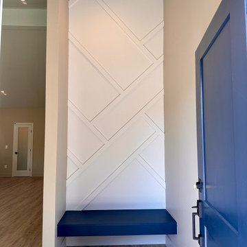
The moment you swing open the blue front door, you are welcomed into a world of elegance and style. The entryway of this home has been transformed into a space that effortlessly blends sophistication with comfort, making a memorable first impression.
One of the standout features is the custom wall paneling that adorns the entryway. Crafted with meticulous attention to detail, these panels add a layer of texture and depth and set the tone for what lies ahead.
The entryway also boasts a charming touch of blue with the entry seating. The rich, serene hue of the seating adds a pop of color to the space, complementing the custom wall paneling perfectly. It's a spot where you can sit and pause, offering a moment of respite as you enter the home.
The combination of custom wall paneling and the inviting blue seating creates a sense of anticipation, hinting at the comfort and style that permeates the entire home.
This is not just an entryway; it's a promise of what's to come.
 Protech Home Improvements LLC
The client was very excited to update her kitchen. She wanted a more inviting place to showcase her amazing cooking skills.
The layout remained but the end result was a more complete kitchen with more storage which allowed for more counter space. We updated the tile floor, kitchen cabinets, counter top, tile back splash and appliances. Our professional sub-contractors updated the electric and plumbing to code.
We finished the kitchen with a beautiful new gray paint which highlighted the counter top, grout color, appliances and floors.
Client said:
"Protech is a highly professional and more importantly, trustworthy company that strives to fully satisfy. They truly listened to my desires and made sure to explain all possible options and limitations that could lie ahead. I dealt with two of the owners (Paul, John) as well as their head foreman Will, who were all polite, always at the job site and kept everything clean. The end was everything and more than I was hoping for. While they were not the cheapest price wise, the cost is worth it in the end. You made me VERY HAPPY and PROUD of my new kitchen. THANK YOU!!!"
Barbara M. Bernardsville, NJ

 Custer Homes Inc
Alan Wycheck Photography
This extensive remodel in Mechanicsburg, PA features a complete redesign of the kitchen, pantry, butler's pantry and master bathroom as well as repainting and refinishing many areas throughout the house.
 Protech Home Improvements LLC
The client was very excited to update her kitchen. She wanted a more inviting place to showcase her amazing cooking skills.
The layout remained but the end result was a more complete kitchen with more storage which allowed for more counter space. We updated the tile floor, kitchen cabinets, counter top, tile back splash and appliances. Our professional sub-contractors updated the electric and plumbing to code.
We finished the kitchen with a beautiful new gray paint which highlighted the counter top, grout color, appliances and floors.
Client said:
"Protech is a highly professional and more importantly, trustworthy company that strives to fully satisfy. They truly listened to my desires and made sure to explain all possible options and limitations that could lie ahead. I dealt with two of the owners (Paul, John) as well as their head foreman Will, who were all polite, always at the job site and kept everything clean. The end was everything and more than I was hoping for. While they were not the cheapest price wise, the cost is worth it in the end. You made me VERY HAPPY and PROUD of my new kitchen. THANK YOU!!!"
Barbara M. Bernardsville, NJ
 Changing Spaces
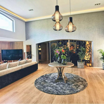
Once you step into the entrance at our Ruyteplaats project, you are immediately drawn towards the sprawling views across Hout Bay and the ocean below.
Cheryl wanted this space to feel warm and inviting, pulling you in towards the areas that lie beyond, by designing bespoke items with lots of rich woods, texture and a colour palette of Neutrals, Deep Blue Jewel tones and rich Tans.
The double volume entrance area called for bold light fittings in the form of 3 x Black pendants which hang at various heights, never detracting from the views ahead.
A gorgeous, round, bespoke flower table with hand carved detailing on the base, holds hand blown glass vases with a colourful array of fresh flowers, which welcomes one and causes one to pause here and take a breath, before taking in the rest of the open plan space.
Two bespoke custom designed consol tables flank the striking front door.
Cheryl loves layering with textures to create depth, and the wall paper used on these walls have just the right amount of tactility to add more interest.
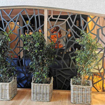
Plants in wicker baskets gives life to any space, and the custom designed screen behind the plants seperate the Library from the Entrance Hall, giving the Library a bit of privacy but still allowing maximum light in this space.
It’s all in the details, always and in all ways.
 Changing Spaces
Once you step into the entrance at our Ruyteplaats project, you are immediately drawn towards the sprawling views across Hout Bay and the ocean below.
Cheryl wanted this space to feel warm and inviting, pulling you in towards the areas that lie beyond, by designing bespoke items with lots of rich woods, texture and a colour palette of Neutrals, Deep Blue Jewel tones and rich Tans.
The double volume entrance area called for bold light fittings in the form of 3 x Black pendants which hang at various heights, never detracting from the views ahead.
A gorgeous, round, bespoke flower table with hand carved detailing on the base, holds hand blown glass vases with a colourful array of fresh flowers, which welcomes one and causes one to pause here and take a breath, before taking in the rest of the open plan space.
Two bespoke custom designed consol tables flank the striking front door.
Cheryl loves layering with textures to create depth, and the wall paper used on these walls have just the right amount of tactility to add more interest.
Plants in wicker baskets gives life to any space, and the custom designed screen behind the plants seperate the Library from the Entrance Hall, giving the Library a bit of privacy but still allowing maximum light in this space.
It’s all in the details, always and in all ways.
 Changing Spaces
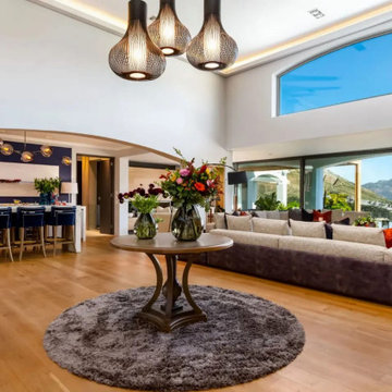
Once you step into the entrance at our Ruyteplaats project, you are immediately drawn towards the sprawling views across Hout Bay and the ocean below.
Cheryl wanted this space to feel warm and inviting, pulling you in towards the areas that lie beyond, by designing bespoke items with lots of rich woods, texture and a colour palette of Neutrals, Deep Blue Jewel tones and rich Tans.
The double volume entrance area called for bold light fittings in the form of 3 x Black pendants which hang at various heights, never detracting from the views ahead.
A gorgeous, round, bespoke flower table with hand carved detailing on the base, holds hand blown glass vases with a colourful array of fresh flowers, which welcomes one and causes one to pause here and take a breath, before taking in the rest of the open plan space.
Two bespoke custom designed consol tables flank the striking front door.
Cheryl loves layering with textures to create depth, and the wall paper used on these walls have just the right amount of tactility to add more interest.
Plants in wicker baskets gives life to any space, and the custom designed screen behind the plants seperate the Library from the Entrance Hall, giving the Library a bit of privacy but still allowing maximum light in this space.
It’s all in the details, always and in all ways.

 Ginkgo Leaf Studio
Runnels in the concrete function to drain water out of the patio area but also add a subtle inlay detail. Here the runnel is filled with both beach pebbles and dry-laid bluestone.
Renn Kuhnen Photography
 Changing Spaces
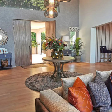
Once you step into the entrance at our Ruyteplaats project, you are immediately drawn towards the sprawling views across Hout Bay and the ocean below.
Cheryl wanted this space to feel warm and inviting, pulling you in towards the areas that lie beyond, by designing bespoke items with lots of rich woods, texture and a colour palette of Neutrals, Deep Blue Jewel tones and rich Tans.
The double volume entrance area called for bold light fittings in the form of 3 x Black pendants which hang at various heights, never detracting from the views ahead.
A gorgeous, round, bespoke flower table with hand carved detailing on the base, holds hand blown glass vases with a colourful array of fresh flowers, which welcomes one and causes one to pause here and take a breath, before taking in the rest of the open plan space.
Two bespoke custom designed consol tables flank the striking front door.
Cheryl loves layering with textures to create depth, and the wall paper used on these walls have just the right amount of tactility to add more interest.
Plants in wicker baskets gives life to any space, and the custom designed screen behind the plants seperate the Library from the Entrance Hall, giving the Library a bit of privacy but still allowing maximum light in this space.
It’s all in the details, always and in all ways.

 TFLA | Terra Ferma Landscape Architecture
We designed a small space in the lower garden for the clients to enjoy the view.
This is an example of a mid-sized modern shade front yard gravel landscaping in San Francisco for summer.
This is an example of a mid-sized modern shade front yard gravel landscaping in San Francisco for summer.
 PI Photography Wall Art & Fine Art
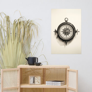
Nautical Artwork: Charting the Course Charcoal Drawing - Digital Artwork Loose Art Print. https://pipafineart.com/products/charting-the-course-charcoal-drawing-digital-artwork-loose-art-print. Embark on a journey of discovery with "Charting the Course," a captivating art print that evokes the spirit of exploration and adventure. This mesmerizing piece showcases an antique compass rendered in intricate detail with charcoal pencil, its delicate lines and shading capturing the timeless beauty of this navigational instrument. The artist's masterful technique brings the compass to life, highlighting the intricate details of its face and the weathered texture of its casing. Set against a soft, minimal background, the compass takes center stage, inviting viewers to contemplate the endless possibilities that lie ahead.
Printed on high-quality photo paper with premium inks, "Charting the Course" faithfully captures the rich textures and subtle nuances of the original charcoal drawing. This art print is a perfect addition to any living room, bedroom, dining room, or office, bringing a touch of vintage charm and adventurous spirit to your space. Hang it on your wall and let this timeless symbol inspire you to navigate your own path with confidence and curiosity.
 Changing Spaces
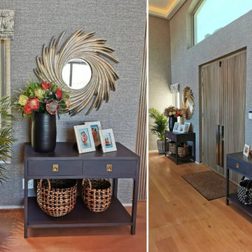
Once you step into the entrance at our Ruyteplaats project, you are immediately drawn towards the sprawling views across Hout Bay and the ocean below.
Cheryl wanted this space to feel warm and inviting, pulling you in towards the areas that lie beyond, by designing bespoke items with lots of rich woods, texture and a colour palette of Neutrals, Deep Blue Jewel tones and rich Tans.
The double volume entrance area called for bold light fittings in the form of 3 x Black pendants which hang at various heights, never detracting from the views ahead.
A gorgeous, round, bespoke flower table with hand carved detailing on the base, holds hand blown glass vases with a colourful array of fresh flowers, which welcomes one and causes one to pause here and take a breath, before taking in the rest of the open plan space.
Two bespoke custom designed consol tables flank the striking front door.
Cheryl loves layering with textures to create depth, and the wall paper used on these walls have just the right amount of tactility to add more interest.
Plants in wicker baskets gives life to any space, and the custom designed screen behind the plants seperate the Library from the Entrance Hall, giving the Library a bit of privacy but still allowing maximum light in this space.
It’s all in the details, always and in all ways.
 Changing Spaces
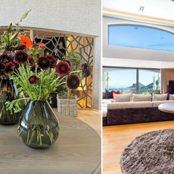
Once you step into the entrance at our Ruyteplaats project, you are immediately drawn towards the sprawling views across Hout Bay and the ocean below.
Cheryl wanted this space to feel warm and inviting, pulling you in towards the areas that lie beyond, by designing bespoke items with lots of rich woods, texture and a colour palette of Neutrals, Deep Blue Jewel tones and rich Tans.
The double volume entrance area called for bold light fittings in the form of 3 x Black pendants which hang at various heights, never detracting from the views ahead.
A gorgeous, round, bespoke flower table with hand carved detailing on the base, holds hand blown glass vases with a colourful array of fresh flowers, which welcomes one and causes one to pause here and take a breath, before taking in the rest of the open plan space.
Two bespoke custom designed consol tables flank the striking front door.
Cheryl loves layering with textures to create depth, and the wall paper used on these walls have just the right amount of tactility to add more interest.
Plants in wicker baskets gives life to any space, and the custom designed screen behind the plants seperate the Library from the Entrance Hall, giving the Library a bit of privacy but still allowing maximum light in this space.
It’s all in the details, always and in all ways.


 Hive Home
Mid-sized elegant built-in desk medium tone wood floor and brown floor home office photo in Los Angeles with white walls

 Refined Interior Staging Solutions
Eat-in kitchen - small traditional u-shaped medium tone wood floor eat-in kitchen idea in Kansas City with a drop-in sink, shaker cabinets, white cabinets, quartz countertops, multicolored backsplash, subway tile backsplash, stainless steel appliances and no island
Eat-in kitchen - small traditional u-shaped medium tone wood floor eat-in kitchen idea in Kansas City with a drop-in sink, shaker cabinets, white cabinets, quartz countertops, multicolored backsplash, subway tile backsplash, stainless steel appliances and no island
5