
Search results for "Life objectives" in Home Design Ideas
 Myers Constructs, Inc.
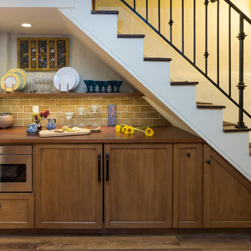
We recently took on an exciting whole-home renovation for this lovely historic Trinity in Center City Philadelphia. Originally built in the mid-1800s, the house footprint is just over 17’ x 13’. As is typical of this type of 3-story house, the kitchen is located in the basement, making this house four floors of occupied space with overall square footage totaling just under 900 square feet.
The homeowner felt the former kitchen was cramped, dimly lit, and inefficiently designed, and she was in search of help in bringing her artistic vision for the space to life, blending both old and new elements through an exciting mix of textures and character. High on her priority list was integrating her wonderful collection of objects gathered from her travels around the world.
We brought our design skills and construction experience to the team, working with the homeowner and the designer to develop a host of creative solutions, including the installation of an Indonesian screen as a sliding door covering a newly reconfigured utility area, which includes a new on-demand hot water heater, mounted next to a new electrical panel with ample room for service and access.
Other Noteworthy Features and Solutions
New crisp drywall blended with original masonry wall textures and original exposed beams
Custom-glazed adler wood cabinets, beautiful fusion Quartzite and custom cherry counters, and a copper sink were selected for a wonderful interplay of colors, textures, and Old World feel
Small-space efficiencies designed for real-size humans, including built-ins wherever possible, limited free-standing furniture, and no upper cabinets
Built-in storage and appliances under the counter (refrigerator, freezer, washer, dryer, and microwave drawer)
Additional multi-function storage under stairs
Extensive lighting plan with multiple sources and types of light to make this partially below-grade space feel bright and cheery
Enlarged window well to bring much more light into the space
Insulation added to create sound buffer from the floor above
 RFK Kitchens
Objectives
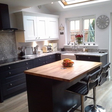
Having lived with the kitchen as supplied by the builder since buying the property new they had finally had enough of its poor and inadequate design that provided only a basic L shape layout, no dining area and only a single built under oven.
At our initial design brief meeting it became clear that the Gardner’s wanted more light in the kitchen, more useable work surface, more storage, high level built in cooking appliances, an island with somewhere to sit and socialise but not to compromise on the aesthetic which was all important.
What We Did
They liked the whole look of the Second Nature 1909 in frame painted style but were concerned about price.
We suggested breaking into the pitched roof and introducing a long bank of Velux’s to create a much lighter, airier feel to the whole room; he also suggested removing the existing radiator and replacing it with a plinth heater thus freeing up an otherwise difficult to use wall.
To keep cost down he also suggested using the Second Nature Milbourne painted foil wrapped shaker door in contrasting colour ways shown.
The Result
We created the desired look but keeping within the budget. As you can see from the photos, the room is much lighter.
Testimonial
We were planning to renew our kitchen and had already visited some of the usual DIY stores to get ideas and estimates.
We then went along to Rugby Fitted Kitchens to see what they could offer and were immediately impressed by the showroom; the variety of kitchen styles and design ideas on display were inspirational and brought the prospect of a new kitchen to life, far better than flicking through brochures.
Trevor understood our requirements and guided us through the design process suggesting options for the cupboard configurations and fitments that maximised our storage space, in addition to which the pricing for the Neff appliances was second to none either matching or bettering the best buys I could find online.
The installation was expertly undertaken by Daniel & Daniel (yes they really do have the same Christian names!!) and nothing was too much trouble for them.
We are absolutely delighted with the finished product and would have no hesitation in recommending RFK to our friends.”
 Klopf Architecture
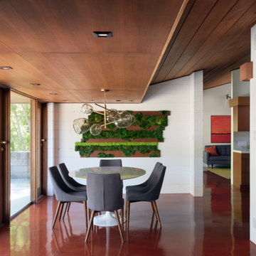
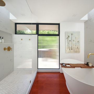
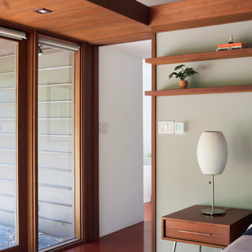
Nestled in the hills of Orinda, California, this 1951 residence is one of only seven extant homes, now known as “The Magnificent Seven”, designed by architect Olof Dahlstrand, a protégé of Frank Lloyd Wright. With its low-slung rooflines, natural materials, and deep integration with the sloping landscape, the home is a pristine example of mid-century modern design inspired by Wright’s organic principles. Over the years, prior homeowners have emphasized preservation, ensuring that the house remained relatively untouched. Each owner has respected the original architecture and stayed true to Dahlstrand’s intent. When a family of five—two college-aged sons and a middle school-aged daughter—acquired the property, they were captivated by its history, legacy of care, and architectural significance. While they appreciated Dahlstrand’s original vision, they also recognized the need to adapt the home for contemporary living while preserving its design integrity.
The remodel was conceived as a thoughtful response to the past—an effort to bring the house into the 21st century without compromising its soul. The primary mandate was to maintain architectural continuity while improving the functionality, comfort, and livability for a modern family. The design team—architects and contractor alike—worked with a shared reverence for the original architecture, allowing that mindset to guide even the most technical or pragmatic decisions.
A key objective was to increase natural light in the kitchen—a departure from Wrightian principles of enclosed, intimate cooking spaces—while maintaining the home’s architectural language. The kitchen was reconfigured to foster a stronger connection to adjacent living spaces while retaining the underlying concept of spatial separation. One of the most transformative architectural changes was the removal of a ridge beam that was originally planned to remain visible through the kitchen. During construction, the team collaborated on a better solution: a wide-flanged steel beam concealed within the roof envelope. This subtle move preserved the clean lines and ceiling continuity, a modern update carried out with utmost respect for the existing framework.
The home’s original powder room, previously accessible only through the kitchen, was relocated for better flow and privacy. A new powder room was carved out of former kitchen cabinetry—a narrow, interior space that could have felt dark and enclosed. To avoid this, the design extended the line of original transom windows into the new powder room and added a skylight above the vanity. The result is a bright and airy space that feels consistent with the rest of the home. Other updates included the installation of new solid-core interior doors with veneers carefully matched to the original mahogany, enhancing the continuity of the interiors. Even smaller decisions, such as placing the door knobs at 42 inches high, mirrored the original proportions. Every choice reflected a shared belief between the architect, contractor, and client: that new work should serve the integrity of the old.
The home’s extensive interior redwood millwork and paneling was meticulously restored. Where new materials were introduced—such as the replacement redwood soffit paneling—the contractor took pains to find finish nails that matched the original, rather than using modern equivalents. This level of craftsmanship and collaboration defined the project. It extended even to the detailing of a blind door to the new powder room, which had to disappear into the existing redwood board-and-batten wall. It was a team effort: the owner found a suitable handle, the architects devised the custom in-swing mechanism, and the contractor executed it so the door aligned precisely with the battens. Throughout, the homeowners were deeply engaged in the design process. One, a meticulous design enthusiast, focused on aesthetic integrity and historic detail. The other brought a practical and function-driven perspective, ensuring that new fixtures and materials would be durable and require minimal maintenance.
While the home’s location posed no major site challenges, sustainability was a key concern. The team upgraded the roof insulation, installed solar panels with battery storage, and added ductless mini-split cooling systems. Lighting was another area where modern technology was woven into a historic framework: new square LED fixtures echo the original custom perimeter soffit lights, maintaining the design language while offering advanced performance.
A planned expansion of a bedroom into suite with a bathroom had to be shelved due to budget constraints and the high cost of below-grade foundation work. Still, the team focused their efforts on making the most of the existing footprint, resolving constraints through design ingenuity rather than adding square footage. This renovation represents a collaborative achievement in preserving and evolving a historically significant home. Every decision was shaped by a shared ethos among clients, architects, and contractor: to maintain the home’s architectural soul while updating it for contemporary life. The result is a timeless modernist residence that continues Olof Dahlstrand’s legacy, remaining grounded in nature, craftsmanship, and human-scale design.
Klopf Architecture Team: John Klopf, AIA, Klara Kevane, Fernanda Bernardes
Interior Architectural Design: Klopf Architecture
Structural Engineer: Daniel Bastiao
Contractor: Don Larwood, Larwood Construction
Photography: Mariko Reed
Year Completed: 2022
Find the right local pro for your project
 Loft Design System USA
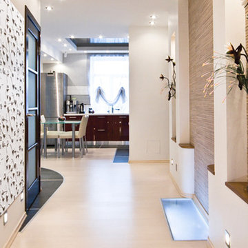
Just as one’s life can be a bed of roses, as can a wall. The only thing needed to make it happen is this model of decorative panels. The rose garden motive is an ideal solution for interiors with a distinguished glamour style. Highly decorative wall ensures functionality and definitely a good idea for changing a flat surface into a three-dimensional object. Foremost, it is an addition that has a capacity to change a plain arrangement into a designer space, that is a work of art in itself.
Specification
Width: 60 cm*
Height: 60 cm*
Thickness: 1.6-4.6 cm
Weight: 6.7 kg
* dimensions tolerance 1cm, in ordered part up to 1mm.
All the patterns are registered trademarks, protected by the law. Using the present patterns without patent owner’s consent will be prosecuted by the certified authorities.
 Drury Design
The Setup:
After purchasing this home, the homeowners faced a unique opportunity to reimagine their kitchen and nearby spaces. Water damage from a burst pipe had left much of the home’s interior in need of repair, and while the existing kitchen was functional and in relatively good shape, it didn’t align with the family’s vision for their new home. The layout included a peninsula that wasn’t ideal, and there were some druthers with the nearby pantry.
Since the space needed to be rebuilt anyway, the homeowners saw this as a chance to create a kitchen that was both highly functional for their four young children and timeless in its design. The project also included a refresh of the adjacent message center and dining room — spaces that play key roles in the family’s daily life. The goal was to create a cohesive flow between these areas, balancing modern functionality with the craftsman-inspired character of the rest of the home.
Design Objectives:
- Replace the outdated peninsula with a large island to maximize counter space and create new seating options.
- Open up the space visually by removing soffits and rethinking the cabinetry layout.
Incorporate concealed refrigeration and freezer units to provide significant storage for the family while maintaining a streamlined aesthetic.
- Integrate black cabinetry into the design without making the space feel harsh or heavy.
- Ensure the lighting plan balances functional task lighting with ambient accent lighting.
- Avoid visual clutter in the cabinetry design while still giving a nod to the craftsman aesthetic.
- Incorporate a slab backsplash as a key design feature.
Design Challenges:
- The outdated peninsula left dead space in the kitchen and lacked sufficient seating for the family.
- The cooktop wall was cramped, with small cabinets flanking the hood, limited storage, and soffits that made the space feel closed-in.
- The family needed significant refrigeration space (two refrigerators and a freezer) but wanted to avoid a cluttered look with visible stainless steel appliances.
- Adding black cabinetry risked making the space feel too dark or heavy.
- The original lighting plan was insufficient, particularly over the dining table where a decorative fixture proved too dim.
- The family wanted shaker-style drawer fronts to match the home’s arts-and-crafts design but worried that too much shaker cabinetry might look overly busy.
- Prioritizing a slab backsplash in the wish list priority planning.
The Renewed Space
Design Solutions:
- A functional island: The peninsula was replaced with a large island that provides continuous countertop space for prepping and serving. The island also features seating for four people, creating a central hub for informal meals and activities.
- Streamlined cooktop wall: The soffits were removed, and the upper cabinets on the cooktop wall were eliminated to create a more open, streamlined design. A custom oversized hood became the focal point of the wall, with the blower unit offset inside it to align with the cooktop while maintaining exterior visual symmetry.
- Concealed refrigeration: Two column refrigerators and one freezer were integrated into the cabinetry, concealing them behind wood paneling that blends seamlessly with the overall design.
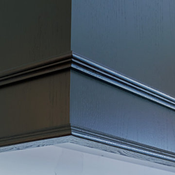
- Warm black cabinetry: The black cabinetry was crafted from hickory with a visible grain, softening its appearance and adding warmth. The grain detail gives the cabinetry a rich, textured look that avoids feeling stark or overpowering.
- Additional lighting: In the dining area, recessed can lights were added during an additional installation phase to supplement the gorgeous decorative fixture’s dim output. The new lighting plan creates a layered effect, combining functional task lighting with softer ambient lighting.
- Simplified cabinetry details: Slab drawer fronts were used on the upper drawers, while five-piece shaker fronts (with slightly less prominent rail and stile pieces) were reserved for the middle and lower drawers. This approach simplified the overall look while maintaining the craftsman-inspired aesthetic.
- Slab backsplash priority: The slab backsplash was prioritized by making thoughtful adjustments elsewhere, like opting not to extend cabinetry to the ceiling, which also helped visually prioritize the gorgeous slab backsplash. This decision also enhanced the kitchen’s furniture-like feel, aligning with the home’s craftsman character.
- This kitchen perfectly balances practicality with timeless style. By addressing the family’s functional needs — ample seating, smart storage, and effective lighting — while incorporating thoughtful design elements like warm black cabinetry and a striking slab backsplash, Alicia created a space that works beautifully for a busy household. The result is a cohesive, inviting kitchen that honors the home’s craftsman roots and will serve the family well for years to come.
 Klopf Architecture
Nestled in the hills of Orinda, California, this 1951 residence is one of only seven extant homes, now known as “The Magnificent Seven”, designed by architect Olof Dahlstrand, a protégé of Frank Lloyd Wright. With its low-slung rooflines, natural materials, and deep integration with the sloping landscape, the home is a pristine example of mid-century modern design inspired by Wright’s organic principles. Over the years, prior homeowners have emphasized preservation, ensuring that the house remained relatively untouched. Each owner has respected the original architecture and stayed true to Dahlstrand’s intent. When a family of five—two college-aged sons and a middle school-aged daughter—acquired the property, they were captivated by its history, legacy of care, and architectural significance. While they appreciated Dahlstrand’s original vision, they also recognized the need to adapt the home for contemporary living while preserving its design integrity.
The remodel was conceived as a thoughtful response to the past—an effort to bring the house into the 21st century without compromising its soul. The primary mandate was to maintain architectural continuity while improving the functionality, comfort, and livability for a modern family. The design team—architects and contractor alike—worked with a shared reverence for the original architecture, allowing that mindset to guide even the most technical or pragmatic decisions.
A key objective was to increase natural light in the kitchen—a departure from Wrightian principles of enclosed, intimate cooking spaces—while maintaining the home’s architectural language. The kitchen was reconfigured to foster a stronger connection to adjacent living spaces while retaining the underlying concept of spatial separation. One of the most transformative architectural changes was the removal of a ridge beam that was originally planned to remain visible through the kitchen. During construction, the team collaborated on a better solution: a wide-flanged steel beam concealed within the roof envelope. This subtle move preserved the clean lines and ceiling continuity, a modern update carried out with utmost respect for the existing framework.
The home’s original powder room, previously accessible only through the kitchen, was relocated for better flow and privacy. A new powder room was carved out of former kitchen cabinetry—a narrow, interior space that could have felt dark and enclosed. To avoid this, the design extended the line of original transom windows into the new powder room and added a skylight above the vanity. The result is a bright and airy space that feels consistent with the rest of the home. Other updates included the installation of new solid-core interior doors with veneers carefully matched to the original mahogany, enhancing the continuity of the interiors. Even smaller decisions, such as placing the door knobs at 42 inches high, mirrored the original proportions. Every choice reflected a shared belief between the architect, contractor, and client: that new work should serve the integrity of the old.
The home’s extensive interior redwood millwork and paneling was meticulously restored. Where new materials were introduced—such as the replacement redwood soffit paneling—the contractor took pains to find finish nails that matched the original, rather than using modern equivalents. This level of craftsmanship and collaboration defined the project. It extended even to the detailing of a blind door to the new powder room, which had to disappear into the existing redwood board-and-batten wall. It was a team effort: the owner found a suitable handle, the architects devised the custom in-swing mechanism, and the contractor executed it so the door aligned precisely with the battens. Throughout, the homeowners were deeply engaged in the design process. One, a meticulous design enthusiast, focused on aesthetic integrity and historic detail. The other brought a practical and function-driven perspective, ensuring that new fixtures and materials would be durable and require minimal maintenance.
While the home’s location posed no major site challenges, sustainability was a key concern. The team upgraded the roof insulation, installed solar panels with battery storage, and added ductless mini-split cooling systems. Lighting was another area where modern technology was woven into a historic framework: new square LED fixtures echo the original custom perimeter soffit lights, maintaining the design language while offering advanced performance.
A planned expansion of a bedroom into suite with a bathroom had to be shelved due to budget constraints and the high cost of below-grade foundation work. Still, the team focused their efforts on making the most of the existing footprint, resolving constraints through design ingenuity rather than adding square footage. This renovation represents a collaborative achievement in preserving and evolving a historically significant home. Every decision was shaped by a shared ethos among clients, architects, and contractor: to maintain the home’s architectural soul while updating it for contemporary life. The result is a timeless modernist residence that continues Olof Dahlstrand’s legacy, remaining grounded in nature, craftsmanship, and human-scale design.
Klopf Architecture Team: John Klopf, AIA, Klara Kevane, Fernanda Bernardes
Interior Architectural Design: Klopf Architecture
Structural Engineer: Daniel Bastiao
Contractor: Don Larwood, Larwood Construction
Photography: Mariko Reed
Year Completed: 2022
 Veneta Cucine Coral Gables
VERDIANA
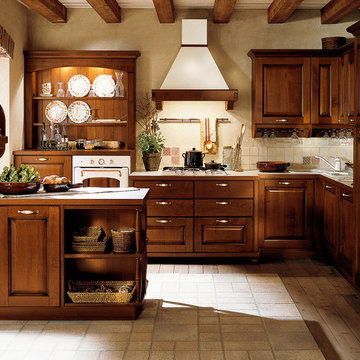
The classic kitchen as a setting for reviving traditions. A style conjured up from things of the past now felt with a renewed passion. Buildings where the boundaries between history and tradition are blurred, objects where art cohabits with craftsmanship, flavors that express genuine goodness, a rural life spent in harmony with nature called upon to cadence the passing of time.

Sponsored
Columbus, OH

Wannemacher Interiors
Customized Award-Winning Interior Design Solutions in Franklin Cnty OH
 Michael Nash Design, Build & Homes
2013 NARI Capital CotY, Merit Award Winner, Creative Solutions under $15,000
Objective:
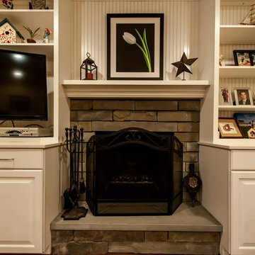
This couple was tired of the old brick look of their family room and its embedded fireplace.
They wanted to uplift the entire room, with better lighting, updated built ins and new gas log fireplace.
Challenges:
It was not an easy task to get rid of all masonry and brick wall.
Gas lines and powder line were quite distance away and the family room floor was a concrete slab.
Design solutions:
It was important for the couple to create an optional separation between the family room and the kitchen for times that she is having her book club gang over and husband wanted to watch his sporting events.
Part of the wall between kitchen and family room was taken by a closet.
We have removed that entire wall and implemented a 6” wide Barn door for a partial solution to their problem.
New wiring for light and cable wires were running into the old masonry wall.
Gas line gave the old wood burning fireplace and new life.
Custom built in cabinetry was placed in place old masonry wall.
A new stone hearth and surround wrapped around the new fireplace.
New hardwood wide plank flooring gave this family room warmth.
New recess lighting has offered a much brighter room.
Outcome:
He gets to enjoy his favorite football team beat up the rebels while she gets to have her tea party around the kitchen table.
And in all other occasions they get to cuddle by the flames of a new fireplace.
 Klopf Architecture
Nestled in the hills of Orinda, California, this 1951 residence is one of only seven extant homes, now known as “The Magnificent Seven”, designed by architect Olof Dahlstrand, a protégé of Frank Lloyd Wright. With its low-slung rooflines, natural materials, and deep integration with the sloping landscape, the home is a pristine example of mid-century modern design inspired by Wright’s organic principles. Over the years, prior homeowners have emphasized preservation, ensuring that the house remained relatively untouched. Each owner has respected the original architecture and stayed true to Dahlstrand’s intent. When a family of five—two college-aged sons and a middle school-aged daughter—acquired the property, they were captivated by its history, legacy of care, and architectural significance. While they appreciated Dahlstrand’s original vision, they also recognized the need to adapt the home for contemporary living while preserving its design integrity.
The remodel was conceived as a thoughtful response to the past—an effort to bring the house into the 21st century without compromising its soul. The primary mandate was to maintain architectural continuity while improving the functionality, comfort, and livability for a modern family. The design team—architects and contractor alike—worked with a shared reverence for the original architecture, allowing that mindset to guide even the most technical or pragmatic decisions.
A key objective was to increase natural light in the kitchen—a departure from Wrightian principles of enclosed, intimate cooking spaces—while maintaining the home’s architectural language. The kitchen was reconfigured to foster a stronger connection to adjacent living spaces while retaining the underlying concept of spatial separation. One of the most transformative architectural changes was the removal of a ridge beam that was originally planned to remain visible through the kitchen. During construction, the team collaborated on a better solution: a wide-flanged steel beam concealed within the roof envelope. This subtle move preserved the clean lines and ceiling continuity, a modern update carried out with utmost respect for the existing framework.
The home’s original powder room, previously accessible only through the kitchen, was relocated for better flow and privacy. A new powder room was carved out of former kitchen cabinetry—a narrow, interior space that could have felt dark and enclosed. To avoid this, the design extended the line of original transom windows into the new powder room and added a skylight above the vanity. The result is a bright and airy space that feels consistent with the rest of the home. Other updates included the installation of new solid-core interior doors with veneers carefully matched to the original mahogany, enhancing the continuity of the interiors. Even smaller decisions, such as placing the door knobs at 42 inches high, mirrored the original proportions. Every choice reflected a shared belief between the architect, contractor, and client: that new work should serve the integrity of the old.
The home’s extensive interior redwood millwork and paneling was meticulously restored. Where new materials were introduced—such as the replacement redwood soffit paneling—the contractor took pains to find finish nails that matched the original, rather than using modern equivalents. This level of craftsmanship and collaboration defined the project. It extended even to the detailing of a blind door to the new powder room, which had to disappear into the existing redwood board-and-batten wall. It was a team effort: the owner found a suitable handle, the architects devised the custom in-swing mechanism, and the contractor executed it so the door aligned precisely with the battens. Throughout, the homeowners were deeply engaged in the design process. One, a meticulous design enthusiast, focused on aesthetic integrity and historic detail. The other brought a practical and function-driven perspective, ensuring that new fixtures and materials would be durable and require minimal maintenance.
While the home’s location posed no major site challenges, sustainability was a key concern. The team upgraded the roof insulation, installed solar panels with battery storage, and added ductless mini-split cooling systems. Lighting was another area where modern technology was woven into a historic framework: new square LED fixtures echo the original custom perimeter soffit lights, maintaining the design language while offering advanced performance.
A planned expansion of a bedroom into suite with a bathroom had to be shelved due to budget constraints and the high cost of below-grade foundation work. Still, the team focused their efforts on making the most of the existing footprint, resolving constraints through design ingenuity rather than adding square footage. This renovation represents a collaborative achievement in preserving and evolving a historically significant home. Every decision was shaped by a shared ethos among clients, architects, and contractor: to maintain the home’s architectural soul while updating it for contemporary life. The result is a timeless modernist residence that continues Olof Dahlstrand’s legacy, remaining grounded in nature, craftsmanship, and human-scale design.
Klopf Architecture Team: John Klopf, AIA, Klara Kevane, Fernanda Bernardes
Interior Architectural Design: Klopf Architecture
Structural Engineer: Daniel Bastiao
Contractor: Don Larwood, Larwood Construction
Photography: Mariko Reed
Year Completed: 2022

 Malt Studio
Welcome to Malt Studio where modern design meets functionality!
Our design journey began as classmates who share a passion for creating spaces that inspire and uplift as well as provide harmony and beauty.
As graduates of the New York School of Interior Design, we have been collaborating on projects that showcase our love for interesting new spaces layered with unique objects that are personal to each client.
Our mission is to bring joy and comfort to our clients through thoughtful, functional design. With our combined expertise and creative synergy, we're dedicated to transforming spaces and enhancing lives. Let's work together to bring your vision to life!
 Roa Custom Woodwork
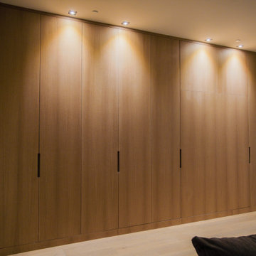
Behold, a wardrobe of distinction, more than just storage—it’s a representation of craftsmanship! with a murphy bed included.
Full of beautiful details of LED lights and refined white oak rift cut finish, this piece stands out as an object of admiration.
Every creation from our workshop is meticulously crafted in the United States, using certified white oak rift cut. At ROA, we firmly believe that it’s the commitment to quality that sets the stage for genuinely opulent projects.
Reach out and let’s bring your vision to life! Contact us at info@roawoodwork.com to start a conversation about crafting the extraordinary.
 Flourish Interiors by Vanessa C Smith
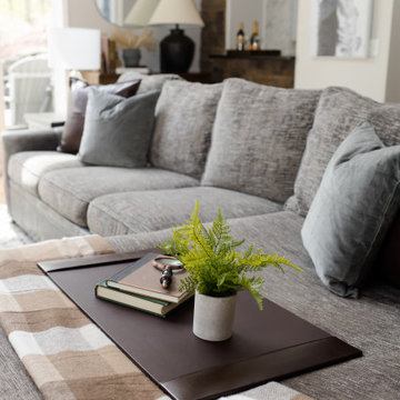
Styling spaces for both custom interior design and staging projects is one of our superpowers! From coffee tables to bookcases, we love any chance to curate beautiful objects. And the best part about surface styling is that it's easy to change it up and try new things. If the items on your bookshelves have been in the same spots since you first moved in, just gathering cobwebs and dust...then consider just taking everything down and starting from scratch. With or without adding new accessories, re-styling your existing decor items can breathe so much fresh life into your personal home design!
 Michael Nash Design, Build & Homes
2013 NARI Capital CotY, Merit Award Winner, Creative Solutions under $15,000
Objective:
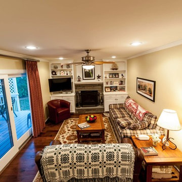
This couple was tired of the old brick look of their family room and its embedded fireplace.
They wanted to uplift the entire room, with better lighting, updated built ins and new gas log fireplace.
Challenges:
It was not an easy task to get rid of all masonry and brick wall.
Gas lines and powder line were quite distance away and the family room floor was a concrete slab.
Design solutions:
It was important for the couple to create an optional separation between the family room and the kitchen for times that she is having her book club gang over and husband wanted to watch his sporting events.
Part of the wall between kitchen and family room was taken by a closet.
We have removed that entire wall and implemented a 6” wide Barn door for a partial solution to their problem.
New wiring for light and cable wires were running into the old masonry wall.
Gas line gave the old wood burning fireplace and new life.
Custom built in cabinetry was placed in place old masonry wall.
A new stone hearth and surround wrapped around the new fireplace.
New hardwood wide plank flooring gave this family room warmth.
New recess lighting has offered a much brighter room.
Outcome:
He gets to enjoy his favorite football team beat up the rebels while she gets to have her tea party around the kitchen table.
And in all other occasions they get to cuddle by the flames of a new fireplace.
 COSWICK LTD
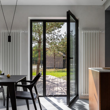
Modern minimalism as a basis for unusual, expressive art objects and author’s painting. This is what determined the main style of the living space. The concept was based on such materials as concrete and plaster, natural wood and stone. The interior had to be as natural as possible, reflecting the architectural image of the residential complex and the beauty of the surrounding nature. “The most important thing for me in this project is the result. Customers say that the interior has become their place of power! They want to return home, invite guests, spend a lot of time in their house and enjoy life here! It is very valuable and important that the project was realized almost 100%, while the customers themselves were interested not to deviate even a millimeter from the project, but to do everything exactly as the Author intended,” emphasized project designer Ksenia Mitskevich.
Coswick oak Cinnamon hardwood flooring was used in the project.
Designer: Ksenia Mitskevich.
Photo by Sergey Pilipovich.
Coswick’s partner: Domani.
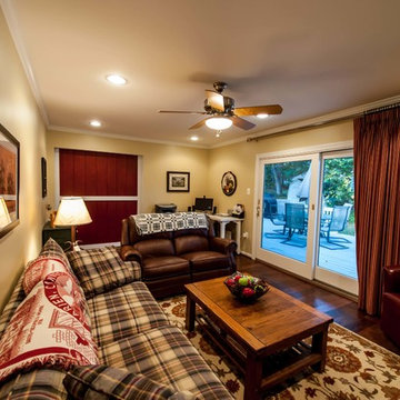 Michael Nash Design, Build & Homes
2013 NARI Capital CotY, Merit Award Winner, Creative Solutions under $15,000
Objective:
This couple was tired of the old brick look of their family room and its embedded fireplace.
They wanted to uplift the entire room, with better lighting, updated built ins and new gas log fireplace.
Challenges:
It was not an easy task to get rid of all masonry and brick wall.
Gas lines and powder line were quite distance away and the family room floor was a concrete slab.
Design solutions:
It was important for the couple to create an optional separation between the family room and the kitchen for times that she is having her book club gang over and husband wanted to watch his sporting events.
Part of the wall between kitchen and family room was taken by a closet.
We have removed that entire wall and implemented a 6” wide Barn door for a partial solution to their problem.
New wiring for light and cable wires were running into the old masonry wall.
Gas line gave the old wood burning fireplace and new life.
Custom built in cabinetry was placed in place old masonry wall.
A new stone hearth and surround wrapped around the new fireplace.
New hardwood wide plank flooring gave this family room warmth.
New recess lighting has offered a much brighter room.
Outcome:
He gets to enjoy his favorite football team beat up the rebels while she gets to have her tea party around the kitchen table.
And in all other occasions they get to cuddle by the flames of a new fireplace.
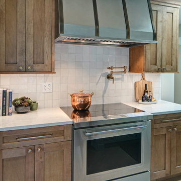 Drury Design
THE SETUP
Senior Designer Diana Burton’s client loved her sixties-era home – it just needed some work. The cozy galley kitchen was narrow and mostly closed off from the family room. A pass-through window served as a limited pipeline for treats and chatter. The appliances were failing, too. It was simply time for an overhaul.
Design Objectives:
Remove load bearing wall and open kitchen to the family room
Omit large unused fireplace in family room
Increase work surfaces and overall storage solutions
Dedicated small countertop appliance storage
Seating for 3 or 4 at island
Add pantry storage
Offer solution for lack of mudroom
Upgrade all appliances
THE REMODEL
Design Challenges:
Finding a location to hide structural support for new beam
Reworking awkward configuration of existing walls
Adding a walk-in pantry
Creating mudroom storage
Allowing room for large sectional in family room
Design Solutions:
Add a discreet column by the fridge to hide essential support
Flush out wall by bath to be even with the range wall, where the new walk in pantry exists
Use void space behind new wall for large appliance garage
Create combination walk in pantry/mudroom by adding bench with shoe storage and hooks
Maintain island depth for comfortable seating without infringing on space for the sectional
THE RENEWED SPACE
This cramped, dated kitchen has a new lease on life! Opening it to the family room dramatically transformed the space. Diana’s client now has plenty of storage, a big island for food prep, and an open-concept space that’s perfect for entertaining and hanging out with friends and family.
 Yates Desygn
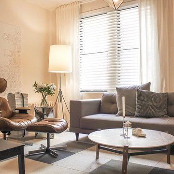
Set at pre-war, mid-rise apartment building amongst the hustle and bustle of New York City's Hell's Kitchen, the client's main objective was to construct a sanctuary and quiet space while incorporating their love of mid-century modern furniture.
This perfect challenge for Yates Desygn allowed us to add life and visual stimulation to a limited footprint.
In this space, we incorporated our client's existing furniture blending in new pieces to create a peaceful haven in the fast-paced city they love.

 User
UserWall or table cuckoo clock composed of two or three bodies in different colors inspired by the labor of man, a contemporary object that is simple but significant, strong and well defined. A cuckoo clock that aims to inspire us, reminding us that time passes and that we must continue moving, finding the strength and energy to do what we must. Elements with different sizes and heights, positioned according to a staggered framework, give life to Strong Cuckoo which is made of painted wood. Battery quartz movement. A light sensor automatically turns off the cuckoo sound in the absence of light.
 Modern Citi Group: Renovations & Remodeling
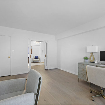
Modern Citi Group worked with Robyn on remodeling her newly purchased professional space in Murray Hill. This exciting renovation project included a full remodel of two bathrooms, kitchen, and three offices as well as the main waiting area. The primary objective was to modernize the space for professional aesthetics and functionality while adhering to the strict timeline and budget.
Every renovation project starts with the planning phase led by the project planners. During the in-person visit, Anna captured a 360 tour of the space to get accurate measurements and fast-track the project as well as align with the client on their design vision, remodeling priorities and budget.
The design challenge was to deliver modern aesthetics and functionality for a professional office while keeping the project within budget. The designers worked on several layouts and design visualizations so the client had options. Finally, the choice was made and Robyn felt confident in her decision.
The construction team transformed every corner of the space, breathing new life into it. They replaced the floors, refinished the walls and ceilings, installed new doors and windows, upgraded plumbing and electrical systems, and redesigned the office layout for optimal functionality and flow. Updated closet configuration with custom shelving, light fixtures and sliding barn doors enhanced the ergonomics of the work space.
The newly remodeled kitchen featured sleek matte white cabinetry and stunning quartz countertops, enhancing both functionality and storage. The bathrooms were masterfully renovated with exquisite new tiling, stylish fixtures, and upgraded plumbing and lighting.
In just a few weeks, Modern Citi Group has redefined the old apartment, transforming it into a sophisticated and professional space through this meticulous remodel. The result is a stunning blend of style, comfort, and efficiency. This remodel enhanced both employee satisfaction and new business for Robyn.

 Ellen Hoverkamp Photography
A still-life photograph - Bird and tree associated objects, tenuously connected
Mid-sized eclectic family room photo in Bridgeport
Mid-sized eclectic family room photo in Bridgeport
29