
Search results for "Life objectives" in Home Design Ideas

 Malt Studio
Welcome to Malt Studio where modern design meets functionality!
Our design journey began as classmates who share a passion for creating spaces that inspire and uplift as well as provide harmony and beauty.
As graduates of the New York School of Interior Design, we have been collaborating on projects that showcase our love for interesting new spaces layered with unique objects that are personal to each client.
Our mission is to bring joy and comfort to our clients through thoughtful, functional design. With our combined expertise and creative synergy, we're dedicated to transforming spaces and enhancing lives. Let's work together to bring your vision to life!
 Roa Custom Woodwork
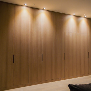
Behold, a wardrobe of distinction, more than just storage—it’s a representation of craftsmanship! with a murphy bed included.
Full of beautiful details of LED lights and refined white oak rift cut finish, this piece stands out as an object of admiration.
Every creation from our workshop is meticulously crafted in the United States, using certified white oak rift cut. At ROA, we firmly believe that it’s the commitment to quality that sets the stage for genuinely opulent projects.
Reach out and let’s bring your vision to life! Contact us at info@roawoodwork.com to start a conversation about crafting the extraordinary.

 Ellen Hoverkamp Photography
A still-life photograph - Bird and tree associated objects, tenuously connected
Mid-sized eclectic family room photo in Bridgeport
Mid-sized eclectic family room photo in Bridgeport
Find the right local pro for your project
 Fiorito Interior Design
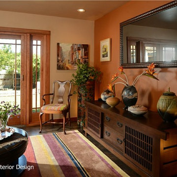
After a decade of being bi-coastal, my clients decided to retire from the east coast to the west. But the task of packing up a whole lifetime in a home was quite daunting so they hired me to comb through their furniture and accessories to see what could fit, what should be left behind, and what should make the move. The job proved difficult since my clients have a wealth of absolutely gorgeous objects and furnishings collected from trips to exotic, far-flung locales like Nepal, or inherited from relatives in England. It was tough to pare down, but after hours of diligent measuring, I mapped out what would migrate west and where it would be placed once here, and I filled in some blank spaces with new pieces.
They bought their recent Craftsman-style home from the contractor who had designed and built it for his family. The only architectural work we did was to transform the den at the rear of the house into a television/garden room. My clients did not want the television to be on display, and sticking a TV in an armoire just doesn’t cut it anymore. I recommended installing a hidden, mirror TV with accompanying invisible in-wall speakers. To do this, we removed an unnecessary small door in the corner of the room to free up the entire wall. Now, at the touch of a remote, what looks like a beautiful wall mirror mounted over a Japanese tansu console comes to life, and sound magically floats out from the wall around it! We also replaced a bank of windows with French doors to allow easy access to the garden.
While the house is extremely well made, the interiors were bland. The warm woodwork was lost in a sea of beige, so I chose a deep aqua color palette for the front rooms of the house which makes the woodwork sing. And we discovered a wonderful art niche over the fireplace that the previous owners had covered with a framed print. Conversely, a warm color palette in the TV room contrasts nicely with the greenery from the garden seen through the new French doors.
Photo by Bernardo Grijalva
 Drury Design
THE SETUP
Upon moving to Glen Ellyn, the homeowners were eager to infuse their new residence with a style that resonated with their modern aesthetic sensibilities. The primary bathroom, while spacious and structurally impressive with its dramatic high ceilings, presented a dated, overly traditional appearance that clashed with their vision.
Design objectives:
Transform the space into a serene, modern spa-like sanctuary.
Integrate a palette of deep, earthy tones to create a rich, enveloping ambiance.
Employ a blend of organic and natural textures to foster a connection with nature.
THE REMODEL
Design challenges:
Take full advantage of the vaulted ceiling
Source unique marble that is more grounding than fanciful
Design minimal, modern cabinetry with a natural, organic finish
Offer a unique lighting plan to create a sexy, Zen vibe
Design solutions:
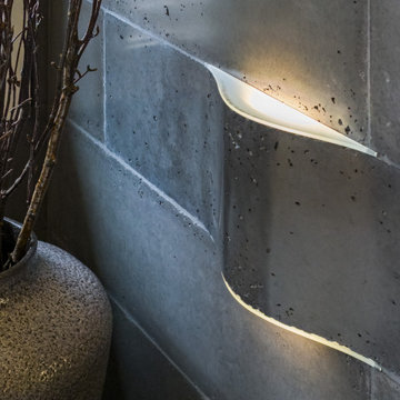
To highlight the vaulted ceiling, we extended the shower tile to the ceiling and added a skylight to bathe the area in natural light.
Sourced unique marble with raw, chiseled edges that provide a tactile, earthy element.
Our custom-designed cabinetry in a minimal, modern style features a natural finish, complementing the organic theme.
A truly creative layered lighting strategy dials in the perfect Zen-like atmosphere. The wavy protruding wall tile lights triggered our inspiration but came with an unintended harsh direct-light effect so we sourced a solution: bespoke diffusers measured and cut for the top and bottom of each tile light gap.
THE RENEWED SPACE
The homeowners dreamed of a tranquil, luxurious retreat that embraced natural materials and a captivating color scheme. Our collaborative effort brought this vision to life, creating a bathroom that not only meets the clients’ functional needs but also serves as a daily sanctuary. The carefully chosen materials and lighting design enable the space to shift its character with the changing light of day.
“Trust the process and it will all come together,” the home owners shared. “Sometimes we just stand here and think, ‘Wow, this is lovely!'”
 Ferriss - Architectural Renderings
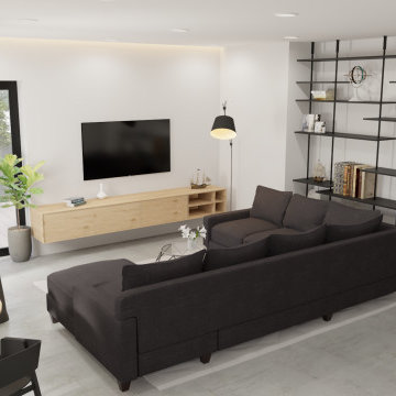
Here are some practical tips for creating a beautiful, comfortable and thoughtful living room design.
The living room in the house is the place where, as the name suggests, receives guests. However, the owners themselves relax here, spending time in front of the TV or a book, with drinks, pleasant conversation and other activities. Therefore, the living room should be the most comfortable place in your home.
The place of the sofa in the design of the living room
The sofa does not need to be placed in a draft. This means that it should not be on an imaginary line from window to door - if you drew a floor plan, it will just be easy to trace.
1. The sofa in front of the TV, diagonally from the door, is a great location. As if inviting you to sit down :)
2. Sofa near the door. A good solution if you often have overnight guests.
3. Corner sofa in the living room. Best placed in the farthest corner from the door. This will make the room look more spacious.
Correct opening of the door in the living room. Inward or outward?
Open inward or outward? There is no clear rule here, because everything depends on the layout and on the furniture placed. The main thing is that the door leaf opens freely and does not interfere with entering and exiting the room. Also, the door should not interfere with free access to the closet or dressing room.
TV in living room size and location. Location.
The TV is placed on the wall opposite to the sofa - this is the most logical and reasonable place for it in the living room. Moreover, the distance to it does not really matter: modern TV models can be placed close to the sofa.
Cabinet or bracket? To your taste. The main thing is that the television zone looks neat and presentable. Provide in advance a cable channel in which all the wires and numerous sockets for the receiver, modem, set-top box, sound bar will hide. Nothing spoils a design like sticking wires!
Height from the floor. It is optimal to place the TV 1 m from the floor to the middle of the screen - this is exactly the level of the eyes of a seated person.
Diagonal size. If there is a financial opportunity, consider options from 50 inches - smaller screens look lonely and lonely on an empty wall.
Living room furniture.
Armchair. Often the chair becomes an accent item in the interior, then its shade, and sometimes its shape, differ from the rest of the furniture. When choosing a chair, be guided also by your habits: for example, it will be more convenient to climb up with your feet and read a book in an armchair with dimensions of 90x90 cm, and you can “just sit comfortably” in a fireplace chair with a high back, comfortable armrests and with a seat 80x80 cm.
TV stand. Large TV stands are no longer as relevant as they used to be, when it was necessary to store a player, cassettes and discs there. For now, a console table or a narrow elegant pedestal is enough.
Coffee table. Nice piece of furniture that creates a cozy atmosphere. Some models, if necessary, can be transformed into a more spacious table for receiving guests - however, finding comfortable and beautiful specimens is not easy, plus they usually cost a lot.
Rack. An extremely useful type of furniture. :) Firstly, a large number of decor items can be beautifully placed on the rack. And secondly, it can also play the role of a light through partition, which divides the room into zones and does not select light at the same time. This is a very big plus for small apartments.
Fireplace. Here we are talking about electric fireplaces. Some of them come with a humidifier and heated, so 3-in-1 models can be very helpful. Fireplace portals have different styles: classic, antique, modern. Inconsistency with the general style of the living room can greatly spoil the impression of the room, so be careful with creativity. Sizing is an important issue. A large wall with a high ceiling also needs a proportionate fireplace; in horror, a small portal will look lonely and ridiculous.
What do you think about our new living room project?
https://www.ferriss.co
#ferriss #We_bring_objects_to_life #3drendering #architecture #San_Francisco
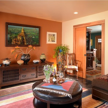 Fiorito Interior Design
After a decade of being bi-coastal, my clients decided to retire from the east coast to the west. But the task of packing up a whole lifetime in a home was quite daunting so they hired me to comb through their furniture and accessories to see what could fit, what should be left behind, and what should make the move. The job proved difficult since my clients have a wealth of absolutely gorgeous objects and furnishings collected from trips to exotic, far-flung locales like Nepal, or inherited from relatives in England. It was tough to pare down, but after hours of diligent measuring, I mapped out what would migrate west and where it would be placed once here, and I filled in some blank spaces with new pieces.
They bought their recent Craftsman-style home from the contractor who had designed and built it for his family. The only architectural work we did was to transform the den at the rear of the house into a television/garden room. My clients did not want the television to be on display, and sticking a TV in an armoire just doesn’t cut it anymore. I recommended installing a hidden, mirror TV with accompanying invisible in-wall speakers. To do this, we removed an unnecessary small door in the corner of the room to free up the entire wall. Now, at the touch of a remote, what looks like a beautiful wall mirror mounted over a Japanese tansu console comes to life, and sound magically floats out from the wall around it! We also replaced a bank of windows with French doors to allow easy access to the garden.
While the house is extremely well made, the interiors were bland. The warm woodwork was lost in a sea of beige, so I chose a deep aqua color palette for the front rooms of the house which makes the woodwork sing. And we discovered a wonderful art niche over the fireplace that the previous owners had covered with a framed print. Conversely, a warm color palette in the TV room contrasts nicely with the greenery from the garden seen through the new French doors.
Photo by Bernardo Grijalva

Sponsored
Columbus, OH

Wannemacher Interiors
Customized Award-Winning Interior Design Solutions in Franklin Cnty OH
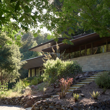
 Klopf Architecture
Nestled in the hills of Orinda, California, this 1951 residence is one of only seven extant homes, now known as “The Magnificent Seven”, designed by architect Olof Dahlstrand, a protégé of Frank Lloyd Wright. With its low-slung rooflines, natural materials, and deep integration with the sloping landscape, the home is a pristine example of mid-century modern design inspired by Wright’s organic principles. Over the years, prior homeowners have emphasized preservation, ensuring that the house remained relatively untouched. Each owner has respected the original architecture and stayed true to Dahlstrand’s intent. When a family of five—two college-aged sons and a middle school-aged daughter—acquired the property, they were captivated by its history, legacy of care, and architectural significance. While they appreciated Dahlstrand’s original vision, they also recognized the need to adapt the home for contemporary living while preserving its design integrity.
The remodel was conceived as a thoughtful response to the past—an effort to bring the house into the 21st century without compromising its soul. The primary mandate was to maintain architectural continuity while improving the functionality, comfort, and livability for a modern family. The design team—architects and contractor alike—worked with a shared reverence for the original architecture, allowing that mindset to guide even the most technical or pragmatic decisions.
A key objective was to increase natural light in the kitchen—a departure from Wrightian principles of enclosed, intimate cooking spaces—while maintaining the home’s architectural language. The kitchen was reconfigured to foster a stronger connection to adjacent living spaces while retaining the underlying concept of spatial separation. One of the most transformative architectural changes was the removal of a ridge beam that was originally planned to remain visible through the kitchen. During construction, the team collaborated on a better solution: a wide-flanged steel beam concealed within the roof envelope. This subtle move preserved the clean lines and ceiling continuity, a modern update carried out with utmost respect for the existing framework.
The home’s original powder room, previously accessible only through the kitchen, was relocated for better flow and privacy. A new powder room was carved out of former kitchen cabinetry—a narrow, interior space that could have felt dark and enclosed. To avoid this, the design extended the line of original transom windows into the new powder room and added a skylight above the vanity. The result is a bright and airy space that feels consistent with the rest of the home. Other updates included the installation of new solid-core interior doors with veneers carefully matched to the original mahogany, enhancing the continuity of the interiors. Even smaller decisions, such as placing the door knobs at 42 inches high, mirrored the original proportions. Every choice reflected a shared belief between the architect, contractor, and client: that new work should serve the integrity of the old.
The home’s extensive interior redwood millwork and paneling was meticulously restored. Where new materials were introduced—such as the replacement redwood soffit paneling—the contractor took pains to find finish nails that matched the original, rather than using modern equivalents. This level of craftsmanship and collaboration defined the project. It extended even to the detailing of a blind door to the new powder room, which had to disappear into the existing redwood board-and-batten wall. It was a team effort: the owner found a suitable handle, the architects devised the custom in-swing mechanism, and the contractor executed it so the door aligned precisely with the battens. Throughout, the homeowners were deeply engaged in the design process. One, a meticulous design enthusiast, focused on aesthetic integrity and historic detail. The other brought a practical and function-driven perspective, ensuring that new fixtures and materials would be durable and require minimal maintenance.
While the home’s location posed no major site challenges, sustainability was a key concern. The team upgraded the roof insulation, installed solar panels with battery storage, and added ductless mini-split cooling systems. Lighting was another area where modern technology was woven into a historic framework: new square LED fixtures echo the original custom perimeter soffit lights, maintaining the design language while offering advanced performance.
A planned expansion of a bedroom into suite with a bathroom had to be shelved due to budget constraints and the high cost of below-grade foundation work. Still, the team focused their efforts on making the most of the existing footprint, resolving constraints through design ingenuity rather than adding square footage. This renovation represents a collaborative achievement in preserving and evolving a historically significant home. Every decision was shaped by a shared ethos among clients, architects, and contractor: to maintain the home’s architectural soul while updating it for contemporary life. The result is a timeless modernist residence that continues Olof Dahlstrand’s legacy, remaining grounded in nature, craftsmanship, and human-scale design.
Klopf Architecture Team: John Klopf, AIA, Klara Kevane, Fernanda Bernardes
Interior Architectural Design: Klopf Architecture
Structural Engineer: Daniel Bastiao
Contractor: Don Larwood, Larwood Construction
Photography: Mariko Reed
Year Completed: 2022
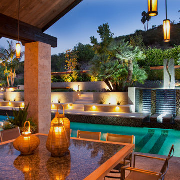
 Lori Gentile Interior Design
So in love with how their interior space felt, our clients once again invited us to orchestrate an outdoor environment just as life changing. Our first objective was to create an unobstructed view of the sculptural pool fountain from the front door while designing a covered lanai. We developed a highly sophisticated and textural material palette and layout for large family gatherings. We brought together a dream team that consisted of landscape, lighting, pool and contractors, all that excel in their trades to collaborate on this one of a kind outdoor experience.
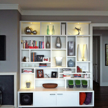
 Michael Stanca
A display unit built with an emphasis on composition. The client was less interested in something practical and chose instead an arrangement that allows him to show some of his favoured objects and becomes the focus of the space.
Concept by Doina Serban who was somewhat inspired by Piet Mondrian.
 Tapis Rouge
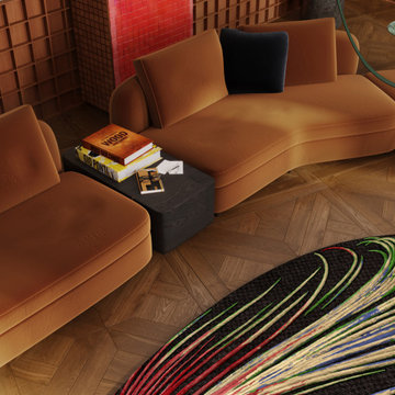
In 17th century Isaac Newton identified the colors (red, orange, yellow, green, blue, indigo, and violet) that make up the visible spectrum. And as his discovery at a time shocked the world and became a first step for a new era of discoveries and world evolution, we believe that the new Electric collection, creation of which is based on a solid theory of photon spectrum and physical characteristics of 4 speeds of rays which travel between Gamma as form of nuclear and cosmic radiation to infrared rays, a result of movement of lower-energy photons, will become a breakthrough of contemporary interior design.
This collection reflects a principally new approach to perception of rug in interior making it an art object at the first place. Nevertheless, very important value that remains untouched whatever we do and however futuristic our works are is extreme care about ecologic background and sustainability of our product. Through all the history of Atelier Tapis Rouge each of our rugs has been manually drawn by the team of our designers and afterwards tinted and knotted by hands of best Nepalese craftsmen, who carefully maintain tradition of rug knotting throughout the centuries.
The world has gone through a very hard time during last 2 years and perception of things, behavior, philosophic approach of people has changed drastically. We all need a recharge of energy and inspiration to restart our live paths in a new reality and there is no better place where we get energetic feed as home and family. Therefore, having created Electtrico we meant to boost the homes with warm solar energy – eternal source of life and continuity and we believe that it is a good start for new conquests.
Designed by Natalia Enze
 annalynch
At the present level of development of the concept of "quality" is considered as a complex component, which includes the quality of the final product, the quality of management, quality of deliveries or work, the quality of life of people (employees) and society as a whole.
Quality management is coordinated and interconnected management activities, which was built in such a way as to ensure safe and smooth operation of the organization.
Organization Management, with regard to quality means that all activity is subject to the objectives set for quality, and to achieve these goals, the organization has developed a system of plans, have the necessary resources, carried out actions to achieve their goals.
Quality management - a very important element for any business. After all, quality is one of the criteria of the high popularity of a brand among consumers. Besides good quality will save the company from warranty repairs, lawsuits, etc.
Quality management includes four basic components:
• quality control;
• quality assurance;
• quality planning;
• quality improvement.
There are 8 basic principles of quality management system:
• The principle of orientation to the user. Product success primarily depends on how the user takes it. Moreover, this principle directs the company to study the needs of its customers.
• The principle of leadership or leadership role. Quality management in the first place depends directly on the company's management, which should by their actions show his concern for the produced goods, on its quality.
• The principle of staff involvement. From more - in less. If the head of the company must set an example in their interest in the quality of products, the company and each employee must also work to improve the quality of products and must want to improve it.
• The principle of the process approach. Based on the division of the company to suppliers and consumers. Suppliers - material security that comes into the company, and which must comply with certain quality. Consumers - the product, which is depending on the materials, must be of good quality. Because this is a direct product of your company.
• The principle of the system approach. It combines two previously identified types of organization in the common system. Moreover, he claims that this system should be a common goal, and general management.
• The principle of continuous improvement. Or to put it in simple words - "There is no limit to perfection." The principle involves constant monitoring of the quality of products in order to improve it.
• The principle of decision-making based on facts. It implies that all decisions will be taken by research, scientific evidence, public opinion polls, and not on an intuitive level head.
• Mutually beneficial supplier relationships. It's simple - the supplier delivers you high-quality materials and receives respective payment. The lower the quality of the goods, the less the cost.
• It is believed that the introduction of these 8 principles in any company will improve the quality of its products and the improvement of the production process. That, in turn, affect the overall good of the company success.
About Author: Anna Lynch is a freelance writer at http://online-check-in.org/, who creates papers about business and marketing. She has a long practice and great experience in the sphere of economics and now is able to help young people.
 Drury Design
THE SETUP
Upon moving to Glen Ellyn, the homeowners were eager to infuse their new residence with a style that resonated with their modern aesthetic sensibilities. The primary bathroom, while spacious and structurally impressive with its dramatic high ceilings, presented a dated, overly traditional appearance that clashed with their vision.
Design objectives:
Transform the space into a serene, modern spa-like sanctuary.
Integrate a palette of deep, earthy tones to create a rich, enveloping ambiance.
Employ a blend of organic and natural textures to foster a connection with nature.
THE REMODEL
Design challenges:
Take full advantage of the vaulted ceiling
Source unique marble that is more grounding than fanciful
Design minimal, modern cabinetry with a natural, organic finish
Offer a unique lighting plan to create a sexy, Zen vibe
Design solutions:
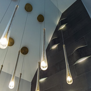
To highlight the vaulted ceiling, we extended the shower tile to the ceiling and added a skylight to bathe the area in natural light.
Sourced unique marble with raw, chiseled edges that provide a tactile, earthy element.
Our custom-designed cabinetry in a minimal, modern style features a natural finish, complementing the organic theme.
A truly creative layered lighting strategy dials in the perfect Zen-like atmosphere. The wavy protruding wall tile lights triggered our inspiration but came with an unintended harsh direct-light effect so we sourced a solution: bespoke diffusers measured and cut for the top and bottom of each tile light gap.
THE RENEWED SPACE
The homeowners dreamed of a tranquil, luxurious retreat that embraced natural materials and a captivating color scheme. Our collaborative effort brought this vision to life, creating a bathroom that not only meets the clients’ functional needs but also serves as a daily sanctuary. The carefully chosen materials and lighting design enable the space to shift its character with the changing light of day.
“Trust the process and it will all come together,” the home owners shared. “Sometimes we just stand here and think, ‘Wow, this is lovely!'”
 Drury Design
THE SETUP
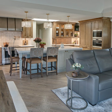
Senior Designer Diana Burton’s client loved her sixties-era home – it just needed some work. The cozy galley kitchen was narrow and mostly closed off from the family room. A pass-through window served as a limited pipeline for treats and chatter. The appliances were failing, too. It was simply time for an overhaul.
Design Objectives:
Remove load bearing wall and open kitchen to the family room
Omit large unused fireplace in family room
Increase work surfaces and overall storage solutions
Dedicated small countertop appliance storage
Seating for 3 or 4 at island
Add pantry storage
Offer solution for lack of mudroom
Upgrade all appliances
THE REMODEL
Design Challenges:
Finding a location to hide structural support for new beam
Reworking awkward configuration of existing walls
Adding a walk-in pantry
Creating mudroom storage
Allowing room for large sectional in family room
Design Solutions:
Add a discreet column by the fridge to hide essential support
Flush out wall by bath to be even with the range wall, where the new walk in pantry exists
Use void space behind new wall for large appliance garage
Create combination walk in pantry/mudroom by adding bench with shoe storage and hooks
Maintain island depth for comfortable seating without infringing on space for the sectional
THE RENEWED SPACE
This cramped, dated kitchen has a new lease on life! Opening it to the family room dramatically transformed the space. Diana’s client now has plenty of storage, a big island for food prep, and an open-concept space that’s perfect for entertaining and hanging out with friends and family.
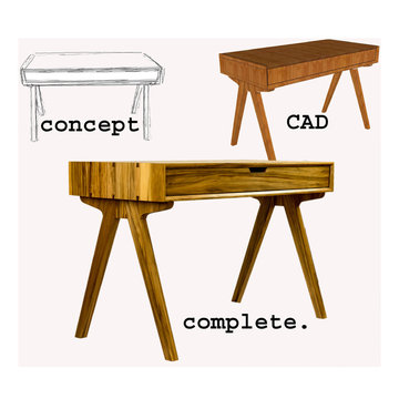
 Open Door Furniture
Nature itself inspires most of our designs. It has given us some amazing aesthetic proportions. These natural proportions tend to unify diverse objects into captivating compositions such as sunsets, mountainscapes, and bodies. Adhering to these ratios ensure that our designs embody nature’s beauty and are cohesive with a variety of décor. To accomplish this, our creative process entails multiple paper sketches, computer animated designs, and tweaks to real life prototypes. This progression ensures that anything brought into your home has the mark of great design.
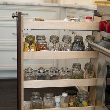
 Advance Design Studio, Ltd.
Raza and Baneen purchased their home in Schaumburg IL. knowing it needed work, but they saw the incredible potential it had with its expanse of beautiful kitchen windows and spacious floor plan.
The kitchen technically functioned fine, but was desperately outdated with its honey oak cabinets and plain countertops. This family loved to cook and host parties so it was an easy decision that the kitchen remodel was the first project they needed to tackle to make their home come to life.
Baneen had very specific ideas for her new dream kitchen and had been thinking about it for over 10 years! When they met Advance Design’s Project Designer Claudia Pop, Baneen felt an instant connection.
“From the first meeting, I knew that Claudia would guide us without putting down our ideas,” Baneen said.
The couple had two fears common among remodeling home owners: Would the project be done on time? And, would the project stay on budget? Advance Design was able to alleviate their fears early on, as Claudia shared the “Common Sense Remodeling” process. Raza and Baneen absolutely loved the custom project analysis that helped them understand how a budget could be accurately predicted and then safeguarded during the design process.
“Advance Design was spot on with both the budget and the project timeframe,” Baneen said. “Overall there were no surprises, and the budget was exactly what we were quoted. The experience was phenomenal, everybody was professional, everybody was courteous, everyone was nice, everyone was friendly. It wasn't stressful for us, they still left the house in a presentable state. It wasn't like we would come home and we were bring the kids in and it was going to be hazardous."
After the relationship was cemented, Raza, Baneen and Claudia began to finalize the kitchen design. The main objective was to create a functional space for preparing meals and to create an inviting space for their family and friends to enjoy, while incorporating interesting design elements such as the iconic blue island and reclaimed Chicago brick walls. Sufficient storage space was really important to Baneen, and high quality appliances were a priority. As the overall layout was being completed, together they reviewed each cabinet to determine exactly what would be stored there.
Because cooking was a high priority for this family, Claudia incorporated spice racks close to the range and included two mixer lift shelves for their larger countertop appliances.
The focal point of the kitchen is the striking blue island constructed from custom colored Dura Supreme cabinets. Designed with decorative shelving and a highly functional prep sink. The couple loves the “galley” prep sink, it adds even more functionality and significantly shortens preparation and cleaning time. This island also includes a 24" Bosch Dishwasher with matching panel to blend in.
"Aesthetically, and in terms of functionality, the island everything I imagined," Baneen said. "I love how beautiful it looks and how functional it is. It just brings everybody together."
The Praa Sands Quartz countertop with an ogee edge profile provides excellent contrast by blending it's subtle tones with the outer cabinetry. It ties the island together with the rest of the space. Overlooking the beautiful backyard through spacious windows, the crisp white farmhouse sink is something that Baneen envisioned in her kitchen for years.
Two tones of Dura Supreme Cabinetry were used throughout the rest of the kitchen. Chestnut Cherry cabinets grace the range and decorative range hood and as panels over the Wolf refrigerator and freezer. Antique White cabinets surround the perimeter, creating a warm balance that beckons guests into the softly rounded space.
Drawing the eye immediately to the custom wood hood hiding a powerful 1,500 CFM ventilation system and spectacular 60” Duel Fuel Wolf range, a creatively patterned Tessen in Café & Brine backsplash detail stands out from the white subway tile backsplash spanning the outer walls. The vibrant space reflects the lively personality of the family who now loves spending time both cooking and enjoying this kitchen as a family.
“The end result is a beautiful and extremely functional kitchen that is able to handle a growing family, lots of parties and lots of cooking,” Claudia said.
“Advance Design was wonderfully professional and a pleasure to work with. They catered to what my needs and ideas were, while skillfully guiding us to make the right choices where we seemed lost,” Baneen said.
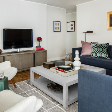
 Décor Aid
Everyone deserves to end the day in a comfortable, tranquil home. And for those with children, it can seem impossible to reconcile the challenges of family life with the need to have a well-designed space. Our client—a financial executive and her family of four—had not considered a design makeover since moving into their apartment, which was more than ten years ago. So when she reached out to Decor Aid, she asked us to modernize and brighten her home, in addition to creating a space for her family to hang out and relax.
The apartment originally featured sunflower-yellow walls and a set of brown suede living room furniture, all of which significantly darkened the space. The living room also did not have sufficient seating options, so the client was improvising seating arrangements when guests would come over.
With no outward facing windows, the living room received little natural light, and so we began the redesign by painting the walls a classic grey, and adding white crown molding.
As a pathway from the front door to the kitchen, the living room functions as a high-traffic area of the home. So we sourced a geometric indoor-outdoor area rug, and established a layout that’s easy to walk through. We also sourced a coffee table from Serena & Lily. Our client has teenage twins, and so we sourced a sturdy sectional couch from Restoration Hardware, and placed it in a corner which was previously being underused.
We hired an electrician to hide all of the cables leading to the media console, and added custom window treatments. In the kitchen, we painted the cabinets a semi-gloss white, and added slate flooring, for a clean, crisp, modern look to match the living room.
The finishing touches included a set of geometric table objects, comfortable throw rugs, and plush high-shine pillows. The final result is a fully functional living room for this family of four.
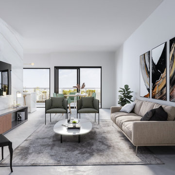 Ferriss - Architectural Renderings
We don't have a favorite style.
When they ask us in what style we work, we answer that in the style of our Customer. We always try to understand what he wants and what the ideal interior of a particular person looks like. Even if there is a mixture of styles, you can do it beautifully and subtly, emphasizing the individuality of its owner.
We publish only the work done by us, and not beautiful pictures from the Internet.
Each work is created with love and thought out in the smallest detail.
Write to us, we will answer all your questions!
We will design a home for you, which is always warm and cozy!
 COSWICK LTD
Modern minimalism as a basis for unusual, expressive art objects and author’s painting. This is what determined the main style of the living space. The concept was based on such materials as concrete and plaster, natural wood and stone. The interior had to be as natural as possible, reflecting the architectural image of the residential complex and the beauty of the surrounding nature. “The most important thing for me in this project is the result. Customers say that the interior has become their place of power! They want to return home, invite guests, spend a lot of time in their house and enjoy life here! It is very valuable and important that the project was realized almost 100%, while the customers themselves were interested not to deviate even a millimeter from the project, but to do everything exactly as the Author intended,” emphasized project designer Ksenia Mitskevich.
Coswick oak Cinnamon hardwood flooring was used in the project.
Designer: Ksenia Mitskevich.
Photo by Sergey Pilipovich.
Coswick’s partner: Domani.
 Drury Design
THE SETUP
This client lives in a great high-rise condo in downtown Chicago. Alicia has already remodeled a few areas of her home, including her kitchen and home office. The bathroom is one of the last big places the client wanted to update. The existing bathroom had a large, outdated whirlpool tub in the corner. It was a darker space that had a lack of natural light. There are no windows (due to the bathroom’s location within the high-rise building). So, the idea was to brighten up the space and give the client an updated, elegant primary bathroom that is more her style and tailor-made for her routines.
Design Objectives:
- Make the space brighter.
- Create different daily routine stations to maximize functionality while keeping things clutter-free – a makeup station, a blow-dry station, and a sink-needs station.
- Achieve the client’s specific style and function needs while also keeping the look and design open to future possibilities: different users of the space/resale clients.
Design Challenges:
- Toilet cannot be moved. (In a high-rise, you can’t really move plumbing around too much when reimagining a space)
- Existing bathroom had a soffit that hid a lot of electrical wiring, so completely removing the soffit wasn’t an option.
- The blow-dry station needs to accommodate the client’s preference for standing up.
- Finding a place for the make-up station, which the client wants oriented for sitting.
- Create storage within the shower that can eliminate the clutter of personal care products that are actually needed every day. Do this, while keeping the client’s favorite things about the existing shower: the shower bench, a tub filler faucet (for rinsing shaving cream when shaving legs) and a low niche for placing her foot when shaving her legs.
THE RENEWED SPACE
Design Solutions:
- Extended a bit of wall near the toilet to give the commode its own area within the space, but without closing it off into a claustrophobic WC.
- Worked within the reality of the existing soffit situation, reshaping it to align with the new shower. Can lights were also added. Installed a beautiful ceiling light fixture that works within the new soffit shape, commanding attention and adding light, as if the sofit shape was chosen for it.
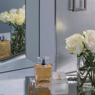
- Created a nice, furniture-looking 42”-high cabinet with pullout drawers to be the blow-dry station, complete with a mirror and a nice top. The pullout drawers are all powered, concealing a Dyson dryer and curling iron (and all the accoutrements) while keeping them plugged in, which is ideal for easy usage and put away. A stylish mirror on the wall above the cabinet, and proper lighting, make this the perfect blow-dry station. The top has a grommet that can accommodate a power cord should the client ever want to have a powered device on top of the cabinet.
- Put the sit-down makeup station where the tub used to be, putting the mirror back into a new recessed wall just a bit, allowing the area to have more room.
- Created a niche in the shower’s inner wall so that you can’t see it unless you are literally inside the shower. At the client’s request, it also has a hook so she can hang her loofa. Hiding the utility niche in this way allowed us to use the full main wall of the shower as a canvas for a beautiful accent stripe of raised decorative tile. The new shower has her old favorites, too: the tub filler, foot niche and bench.
Alicia’s client loves her new primary bathroom, especially the blow dry area. It is very accommodating for her, as a tall lady, while being very easy to use. The drawers store everything. Being powered, they make using already-plugged in appliances very easy to use and put away.
Her previous makeup station was a freestanding vanity with a single drawer, so beauty products were all over the surface top. With her new makeup station, everything is nicely tucked away and organized in drawers.
The new lighting is fantastic and the colors are light and soft. The clients loves the overall look and feel of her new bathroom and raves about how well the functionality-minded design makes her morning routine – and her life – easier and enjoyable!
30