
Search results for "Life objectives" in Home Design Ideas
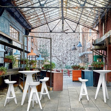
 OH LA LA !
Italian Different Concept
A real laboratory of ideas. Myyour is a reality where the most innovative design ideas are chosen and transformed into new and unique decorative solutions... solutions that are able to express elegance and color, functionality and aesthetics, versatility and prestige. A result that has been achieved thanks to the upshot of the series of research, assessments, studies and applications that have been carried out for each of the collections... An uninterrupted series of formal and technological trials to help us reach our final objective: a vanguard product that is best characterized as a perfect blend of craftsmanship and innovation and which is destined to become the protagonist of the most diverse spaces: a product designed to take over the scene by giving a touch of exclusivity and originality to the home, office, public setting...
The founding pillars of the Myyour philosophy are the surprising stateliness of its products and the distinction of a manufacturing process, which is meticulously followed as to ensure perfection; from the development of the project to the selection of the materials, but also from the execution of the project to the attention and care that are paid to every single minimum detail along the way. This is how the Myyour quality came to life. A must that is always more and more appreciated on an international level and by a clientele who has witnessed the potential artistic expression of these decorative creations. These solutions have managed to fill an empty space and are always in perfect harmony with their outside beauty and intrinsic functionalities. These creations always manage to trigger the creativity of individuals, architects, decorators and designers.
 Drury Design
THE SETUP
Once these empty nest homeowners decided to stay put, they knew a new kitchen was in order. Passionate about cooking, entertaining, and hosting holiday gatherings, they found their existing kitchen inadequate. The space, with its traditional style and outdated layout, was far from ideal. They longed for an elegant, timeless kitchen that was not only show-stopping but also functional, seamlessly catering to both their daily routines and special occasions with friends and family. Another key factor was its future appeal to potential buyers, as they’re ready to enjoy their new kitchen while also considering downsizing in the future.
Design Objectives:
Create a more streamlined, open space
Eliminate traditional elements
Improve flow for entertaining and everyday use
Omit dated posts and soffits
Include storage for small appliances to keep counters clutter-free
Address mail organization and phone charging concerns
THE REMODEL
Design Challenges:
Compensate for lost storage from omitted wall cabinets
Revise floorplan to feature a single, spacious island
Enhance island seating proximity for a more engaging atmosphere
Address awkward space above existing built-ins
Improve natural light blocked by wall cabinet near the window
Create a highly functional space tailored for entertaining
Design Solutions:
Tall cabinetry and pull-outs maximize storage efficiency
A generous single island promotes seamless flow and ample prep space
Strategic island seating arrangement fosters easy conversation
New built-ins fill arched openings, ensuring a custom, clutter-free look
Replace wall cabinet with lighted open shelves for an airy feel
Galley Dresser and Workstation offer impeccable organization and versatility, creating the perfect setup for entertaining with everything easily accessible.
THE RENEWED SPACE
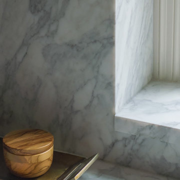
The new kitchen exceeded every expectation, thrilling the clients with its revitalized, expansive design and thoughtful functionality. The transformation brought to life an open space adorned with marble accents, a state-of-the-art steam oven, and the seamless integration of the Galley Dresser, crafting a kitchen not just to be used, but to be cherished. This is more than a culinary space; it’s a new heart of their home, ready to host countless memories and culinary adventures.
 Michael Nash Design, Build & Homes
2013 NARI Capital CotY, Merit Award Winner, Creative Solutions under $15,000
Objective:
This couple was tired of the old brick look of their family room and its embedded fireplace.
They wanted to uplift the entire room, with better lighting, updated built ins and new gas log fireplace.
Challenges:
It was not an easy task to get rid of all masonry and brick wall.
Gas lines and powder line were quite distance away and the family room floor was a concrete slab.
Design solutions:
It was important for the couple to create an optional separation between the family room and the kitchen for times that she is having her book club gang over and husband wanted to watch his sporting events.
Part of the wall between kitchen and family room was taken by a closet.
We have removed that entire wall and implemented a 6” wide Barn door for a partial solution to their problem.
New wiring for light and cable wires were running into the old masonry wall.
Gas line gave the old wood burning fireplace and new life.
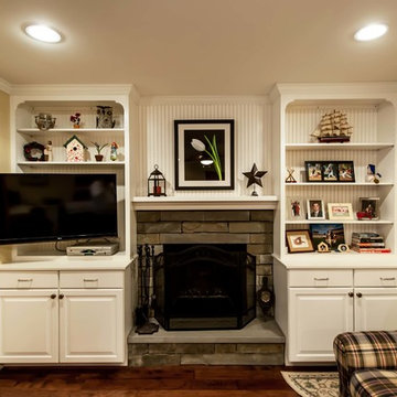
Custom built in cabinetry was placed in place old masonry wall.
A new stone hearth and surround wrapped around the new fireplace.
New hardwood wide plank flooring gave this family room warmth.
New recess lighting has offered a much brighter room.
Outcome:
He gets to enjoy his favorite football team beat up the rebels while she gets to have her tea party around the kitchen table.
And in all other occasions they get to cuddle by the flames of a new fireplace.
Find the right local pro for your project
 Ernest M. Ferizi
German Embassy in Pristina - Kosovo, contracted the architecture office “Ferizi + Ferizi Architects” to plan and implement an Annex Office building for their purposes. As detached part of this building is designed the waiting area, as alone standing structure.
This Office Building is constructed by assembling of Eight used office containers that were delivered on trucks and set up after only a few hours on the basis of the LEGO principle, according to the planning on strip foundations.
By removing the flexible exterior wall panels, a large room of 115 m² was created, with the counter wall as a room partition between two office spaces, each with seven workstations as well as three counters for agents on one side and a room for visitors on the other side.
With this system, room solutions can be easily implemented in all dimensions.
The container, seen as a geometric shape, is a simple, octagonal, solid box.
The standardized perfection of its dimensions is striking: 2.44 meters wide, 2.59 meters high and 6.06 meters or 12.19 meters long.
Since its introduction in 1956 by the American transport entrepreneur Malcom McLean, the container has become a standardized transport module worldwide, whether on ships, trucks or construction sites.
The shipping containers have additionally revolutionized the transport industry, pushed the globalization noticeably, and thus directly or indirectly influenced all our lives.
But after only a few years, when the first overseas containers wore out, many engineers recognized the positive properties of used shipping containers for building houses, especially since they are robust, flexible, multifunctional and second-hand relatively inexpensive to purchase. The time has long passed by to treat containers exclusively as transport objects.
As a "measure of all things", containers can hardly be ignored in construction.
Their use is no longer limited to temporary use since school containers, information containers, office containers or entire residential buildings are now part of our everyday life in the construction industry.
However, current examples of the container architecture prove that even the most demanding solutions for container building are feasible. For their specific aesthetic and spatial qualities, containers also serve as design parameters for the development of new forms of architecture and urbanity.
The office building as an extension of the visa section, characterized by modern materials and contemporary aesthetics has been designed and built mainly as a low-energy building.
Extensive insulation to achieve a comfortable and sustainable constant temperature in the interior, high window quality and low energy consumption make the building energy-efficient.
The sophisticated lighting technology, networks, heating systems and air-conditioning systems are also components of this equipment.
It creates an overall harmonic picture and guarantees the highest standard in sustainable construction, taking into consideration the fact that environmentally friendly recycling and reutilization have become an increasingly important issue in our society.
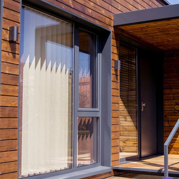
West and East side of the wooden facade is compact and has few openings, while the southern facade is completely open with lot of glass. Its spatial openness ensures a transparent, friendly work environment, which allows a lot of light into the space.
This openness allows an uninterrupted, pleasant and close-to-nature view from interior spaces into the beautiful garden. During the installation of sophisticated light sources in the garden, emphasis was not only put on functionality and security, but also on the beauty of the garden shown through the illumination in the evening.
Large, horizontal white “brisole” serve as external sun protection systems, mounted on the canopies of the entrance areas of the modular construction and the enclosure, adeptly cast shade on these areas and at the same time shape the entire architectural language.
While on one hand, the two quadratic ledges suspended in the air, are docked with steel stairs and match the wooden façade, lead the staff to their office space, the artful modern interior, on the other hand, perfectly unites the functionality, innovative technology, culture and positive effects on the employees' efficiency and wellbeing.
A lot of white, interjected by warm wooden and colored accents, determines the ambience.
In the case of the lighting solution, the mainly linear ceiling lighting is used as the overlapping design element both for the offices of the visa section as well as for the counters and the waiting area for the visitors.
They underline the puristic design in order to create a pleasant light for a desired general illumination and ensure optimal light conditions without causing disturbing reflections on the computer screens.
In addition, precisely positioned pendant luminaires are installed at the workstations, which ensure pleasant room brightness.
In the entrance area, the harmonic and uniform lighting effect from the ground highlights the integration of photography and architecture.
Photographs of landscapes, people, places, expressing unforgettable, impressive moments and memories have been lovingly engraved on 8 x 8cm square oak blocks.
The idea of an effective, impressive environment that stimulates and inspires the work was the premiss on which the whole design concept was based. Consequently, the modular construction was no longer viewed through its history of utilization and scars, but rather as a structure of work ambiance, art and elegance.
FERIZI + FERIZI Architects
Photo: Arben Llapashtica
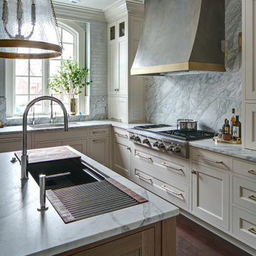 Drury Design
THE SETUP
Once these empty nest homeowners decided to stay put, they knew a new kitchen was in order. Passionate about cooking, entertaining, and hosting holiday gatherings, they found their existing kitchen inadequate. The space, with its traditional style and outdated layout, was far from ideal. They longed for an elegant, timeless kitchen that was not only show-stopping but also functional, seamlessly catering to both their daily routines and special occasions with friends and family. Another key factor was its future appeal to potential buyers, as they’re ready to enjoy their new kitchen while also considering downsizing in the future.
Design Objectives:
Create a more streamlined, open space
Eliminate traditional elements
Improve flow for entertaining and everyday use
Omit dated posts and soffits
Include storage for small appliances to keep counters clutter-free
Address mail organization and phone charging concerns
THE REMODEL
Design Challenges:
Compensate for lost storage from omitted wall cabinets
Revise floorplan to feature a single, spacious island
Enhance island seating proximity for a more engaging atmosphere
Address awkward space above existing built-ins
Improve natural light blocked by wall cabinet near the window
Create a highly functional space tailored for entertaining
Design Solutions:
Tall cabinetry and pull-outs maximize storage efficiency
A generous single island promotes seamless flow and ample prep space
Strategic island seating arrangement fosters easy conversation
New built-ins fill arched openings, ensuring a custom, clutter-free look
Replace wall cabinet with lighted open shelves for an airy feel
Galley Dresser and Workstation offer impeccable organization and versatility, creating the perfect setup for entertaining with everything easily accessible.
THE RENEWED SPACE
The new kitchen exceeded every expectation, thrilling the clients with its revitalized, expansive design and thoughtful functionality. The transformation brought to life an open space adorned with marble accents, a state-of-the-art steam oven, and the seamless integration of the Galley Dresser, crafting a kitchen not just to be used, but to be cherished. This is more than a culinary space; it’s a new heart of their home, ready to host countless memories and culinary adventures.
This shot features the integrated Galley prep sink dresser, storing all the necessities of prep and entertaining.
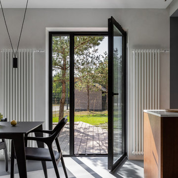
 COSWICK LTD
Modern minimalism as a basis for unusual, expressive art objects and author’s painting. This is what determined the main style of the living space. The concept was based on such materials as concrete and plaster, natural wood and stone. The interior had to be as natural as possible, reflecting the architectural image of the residential complex and the beauty of the surrounding nature. “The most important thing for me in this project is the result. Customers say that the interior has become their place of power! They want to return home, invite guests, spend a lot of time in their house and enjoy life here! It is very valuable and important that the project was realized almost 100%, while the customers themselves were interested not to deviate even a millimeter from the project, but to do everything exactly as the Author intended,” emphasized project designer Ksenia Mitskevich.
Coswick oak Cinnamon hardwood flooring was used in the project.
Designer: Ksenia Mitskevich.
Photo by Sergey Pilipovich.
Coswick’s partner: Domani.
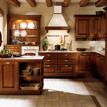
 Veneta Cucine Coral Gables
VERDIANA
The classic kitchen as a setting for reviving traditions. A style conjured up from things of the past now felt with a renewed passion. Buildings where the boundaries between history and tradition are blurred, objects where art cohabits with craftsmanship, flavors that express genuine goodness, a rural life spent in harmony with nature called upon to cadence the passing of time.

Sponsored
Columbus, OH

Wannemacher Interiors
Customized Award-Winning Interior Design Solutions in Franklin Cnty OH
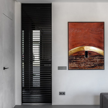 COSWICK LTD
Modern minimalism as a basis for unusual, expressive art objects and author’s painting. This is what determined the main style of the living space. The concept was based on such materials as concrete and plaster, natural wood and stone. The interior had to be as natural as possible, reflecting the architectural image of the residential complex and the beauty of the surrounding nature. “The most important thing for me in this project is the result. Customers say that the interior has become their place of power! They want to return home, invite guests, spend a lot of time in their house and enjoy life here! It is very valuable and important that the project was realized almost 100%, while the customers themselves were interested not to deviate even a millimeter from the project, but to do everything exactly as the Author intended,” emphasized project designer Ksenia Mitskevich.
Coswick oak Cinnamon hardwood flooring was used in the project.
Designer: Ksenia Mitskevich.
Photo by Sergey Pilipovich.
Coswick’s partner: Domani.

 Malt Studio
Welcome to Malt Studio where modern design meets functionality!
Our design journey began as classmates who share a passion for creating spaces that inspire and uplift as well as provide harmony and beauty.
As graduates of the New York School of Interior Design, we have been collaborating on projects that showcase our love for interesting new spaces layered with unique objects that are personal to each client.
Our mission is to bring joy and comfort to our clients through thoughtful, functional design. With our combined expertise and creative synergy, we're dedicated to transforming spaces and enhancing lives. Let's work together to bring your vision to life!
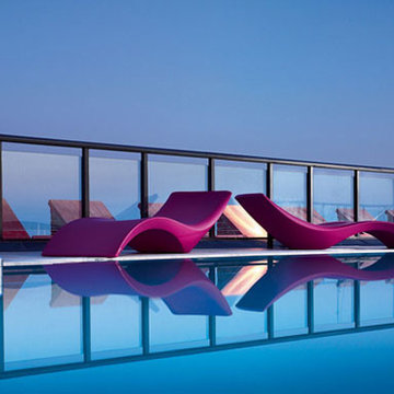 OH LA LA !
Italian Different Concept
A real laboratory of ideas. Myyour is a reality where the most innovative design ideas are chosen and transformed into new and unique decorative solutions... solutions that are able to express elegance and color, functionality and aesthetics, versatility and prestige. A result that has been achieved thanks to the upshot of the series of research, assessments, studies and applications that have been carried out for each of the collections... An uninterrupted series of formal and technological trials to help us reach our final objective: a vanguard product that is best characterized as a perfect blend of craftsmanship and innovation and which is destined to become the protagonist of the most diverse spaces: a product designed to take over the scene by giving a touch of exclusivity and originality to the home, office, public setting...
The founding pillars of the Myyour philosophy are the surprising stateliness of its products and the distinction of a manufacturing process, which is meticulously followed as to ensure perfection; from the development of the project to the selection of the materials, but also from the execution of the project to the attention and care that are paid to every single minimum detail along the way. This is how the Myyour quality came to life. A must that is always more and more appreciated on an international level and by a clientele who has witnessed the potential artistic expression of these decorative creations. These solutions have managed to fill an empty space and are always in perfect harmony with their outside beauty and intrinsic functionalities. These creations always manage to trigger the creativity of individuals, architects, decorators and designers.
 Advance Design Studio, Ltd.
Raza and Baneen purchased their home in Schaumburg IL. knowing it needed work, but they saw the incredible potential it had with its expanse of beautiful kitchen windows and spacious floor plan.
The kitchen technically functioned fine, but was desperately outdated with its honey oak cabinets and plain countertops. This family loved to cook and host parties so it was an easy decision that the kitchen remodel was the first project they needed to tackle to make their home come to life.
Baneen had very specific ideas for her new dream kitchen and had been thinking about it for over 10 years! When they met Advance Design’s Project Designer Claudia Pop, Baneen felt an instant connection.
“From the first meeting, I knew that Claudia would guide us without putting down our ideas,” Baneen said.
The couple had two fears common among remodeling home owners: Would the project be done on time? And, would the project stay on budget? Advance Design was able to alleviate their fears early on, as Claudia shared the “Common Sense Remodeling” process. Raza and Baneen absolutely loved the custom project analysis that helped them understand how a budget could be accurately predicted and then safeguarded during the design process.
“Advance Design was spot on with both the budget and the project timeframe,” Baneen said. “Overall there were no surprises, and the budget was exactly what we were quoted. The experience was phenomenal, everybody was professional, everybody was courteous, everyone was nice, everyone was friendly. It wasn't stressful for us, they still left the house in a presentable state. It wasn't like we would come home and we were bring the kids in and it was going to be hazardous."
After the relationship was cemented, Raza, Baneen and Claudia began to finalize the kitchen design. The main objective was to create a functional space for preparing meals and to create an inviting space for their family and friends to enjoy, while incorporating interesting design elements such as the iconic blue island and reclaimed Chicago brick walls. Sufficient storage space was really important to Baneen, and high quality appliances were a priority. As the overall layout was being completed, together they reviewed each cabinet to determine exactly what would be stored there.
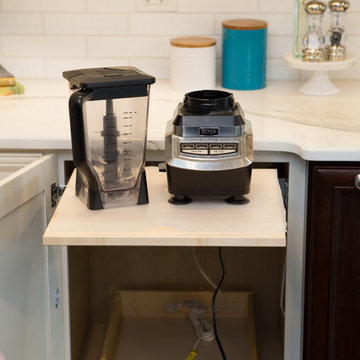
Because cooking was a high priority for this family, Claudia incorporated spice racks close to the range and included two mixer lift shelves for their larger countertop appliances.
The focal point of the kitchen is the striking blue island constructed from custom colored Dura Supreme cabinets. Designed with decorative shelving and a highly functional prep sink. The couple loves the “galley” prep sink, it adds even more functionality and significantly shortens preparation and cleaning time. This island also includes a 24" Bosch Dishwasher with matching panel to blend in.
"Aesthetically, and in terms of functionality, the island everything I imagined," Baneen said. "I love how beautiful it looks and how functional it is. It just brings everybody together."
The Praa Sands Quartz countertop with an ogee edge profile provides excellent contrast by blending it's subtle tones with the outer cabinetry. It ties the island together with the rest of the space. Overlooking the beautiful backyard through spacious windows, the crisp white farmhouse sink is something that Baneen envisioned in her kitchen for years.
Two tones of Dura Supreme Cabinetry were used throughout the rest of the kitchen. Chestnut Cherry cabinets grace the range and decorative range hood and as panels over the Wolf refrigerator and freezer. Antique White cabinets surround the perimeter, creating a warm balance that beckons guests into the softly rounded space.
Drawing the eye immediately to the custom wood hood hiding a powerful 1,500 CFM ventilation system and spectacular 60” Duel Fuel Wolf range, a creatively patterned Tessen in Café & Brine backsplash detail stands out from the white subway tile backsplash spanning the outer walls. The vibrant space reflects the lively personality of the family who now loves spending time both cooking and enjoying this kitchen as a family.
“The end result is a beautiful and extremely functional kitchen that is able to handle a growing family, lots of parties and lots of cooking,” Claudia said.
“Advance Design was wonderfully professional and a pleasure to work with. They catered to what my needs and ideas were, while skillfully guiding us to make the right choices where we seemed lost,” Baneen said.
 Drury Design
The Setup:
After purchasing this home, the homeowners faced a unique opportunity to reimagine their kitchen and nearby spaces. Water damage from a burst pipe had left much of the home’s interior in need of repair, and while the existing kitchen was functional and in relatively good shape, it didn’t align with the family’s vision for their new home. The layout included a peninsula that wasn’t ideal, and there were some druthers with the nearby pantry.
Since the space needed to be rebuilt anyway, the homeowners saw this as a chance to create a kitchen that was both highly functional for their four young children and timeless in its design. The project also included a refresh of the adjacent message center and dining room — spaces that play key roles in the family’s daily life. The goal was to create a cohesive flow between these areas, balancing modern functionality with the craftsman-inspired character of the rest of the home.
Design Objectives:
- Replace the outdated peninsula with a large island to maximize counter space and create new seating options.
- Open up the space visually by removing soffits and rethinking the cabinetry layout.
Incorporate concealed refrigeration and freezer units to provide significant storage for the family while maintaining a streamlined aesthetic.
- Integrate black cabinetry into the design without making the space feel harsh or heavy.
- Ensure the lighting plan balances functional task lighting with ambient accent lighting.
- Avoid visual clutter in the cabinetry design while still giving a nod to the craftsman aesthetic.
- Incorporate a slab backsplash as a key design feature.
Design Challenges:
- The outdated peninsula left dead space in the kitchen and lacked sufficient seating for the family.
- The cooktop wall was cramped, with small cabinets flanking the hood, limited storage, and soffits that made the space feel closed-in.
- The family needed significant refrigeration space (two refrigerators and a freezer) but wanted to avoid a cluttered look with visible stainless steel appliances.
- Adding black cabinetry risked making the space feel too dark or heavy.
- The original lighting plan was insufficient, particularly over the dining table where a decorative fixture proved too dim.
- The family wanted shaker-style drawer fronts to match the home’s arts-and-crafts design but worried that too much shaker cabinetry might look overly busy.
- Prioritizing a slab backsplash in the wish list priority planning.
The Renewed Space
Design Solutions:
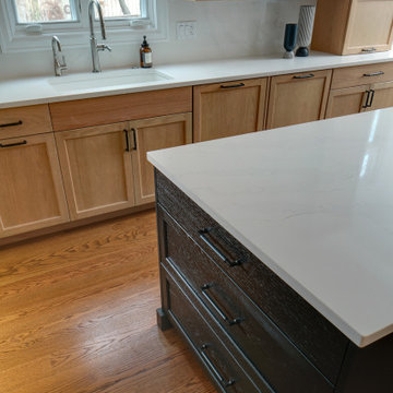
- A functional island: The peninsula was replaced with a large island that provides continuous countertop space for prepping and serving. The island also features seating for four people, creating a central hub for informal meals and activities.
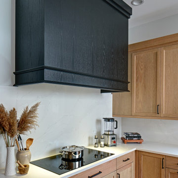
- Streamlined cooktop wall: The soffits were removed, and the upper cabinets on the cooktop wall were eliminated to create a more open, streamlined design. A custom oversized hood became the focal point of the wall, with the blower unit offset inside it to align with the cooktop while maintaining exterior visual symmetry.
- Concealed refrigeration: Two column refrigerators and one freezer were integrated into the cabinetry, concealing them behind wood paneling that blends seamlessly with the overall design.
- Warm black cabinetry: The black cabinetry was crafted from hickory with a visible grain, softening its appearance and adding warmth. The grain detail gives the cabinetry a rich, textured look that avoids feeling stark or overpowering.
- Additional lighting: In the dining area, recessed can lights were added during an additional installation phase to supplement the gorgeous decorative fixture’s dim output. The new lighting plan creates a layered effect, combining functional task lighting with softer ambient lighting.
- Simplified cabinetry details: Slab drawer fronts were used on the upper drawers, while five-piece shaker fronts (with slightly less prominent rail and stile pieces) were reserved for the middle and lower drawers. This approach simplified the overall look while maintaining the craftsman-inspired aesthetic.
- Slab backsplash priority: The slab backsplash was prioritized by making thoughtful adjustments elsewhere, like opting not to extend cabinetry to the ceiling, which also helped visually prioritize the gorgeous slab backsplash. This decision also enhanced the kitchen’s furniture-like feel, aligning with the home’s craftsman character.
- This kitchen perfectly balances practicality with timeless style. By addressing the family’s functional needs — ample seating, smart storage, and effective lighting — while incorporating thoughtful design elements like warm black cabinetry and a striking slab backsplash, Alicia created a space that works beautifully for a busy household. The result is a cohesive, inviting kitchen that honors the home’s craftsman roots and will serve the family well for years to come.
 Drury Design
The Setup:
After purchasing this home, the homeowners faced a unique opportunity to reimagine their kitchen and nearby spaces. Water damage from a burst pipe had left much of the home’s interior in need of repair, and while the existing kitchen was functional and in relatively good shape, it didn’t align with the family’s vision for their new home. The layout included a peninsula that wasn’t ideal, and there were some druthers with the nearby pantry.
Since the space needed to be rebuilt anyway, the homeowners saw this as a chance to create a kitchen that was both highly functional for their four young children and timeless in its design. The project also included a refresh of the adjacent message center and dining room — spaces that play key roles in the family’s daily life. The goal was to create a cohesive flow between these areas, balancing modern functionality with the craftsman-inspired character of the rest of the home.
Design Objectives:
- Replace the outdated peninsula with a large island to maximize counter space and create new seating options.
- Open up the space visually by removing soffits and rethinking the cabinetry layout.
Incorporate concealed refrigeration and freezer units to provide significant storage for the family while maintaining a streamlined aesthetic.
- Integrate black cabinetry into the design without making the space feel harsh or heavy.
- Ensure the lighting plan balances functional task lighting with ambient accent lighting.
- Avoid visual clutter in the cabinetry design while still giving a nod to the craftsman aesthetic.
- Incorporate a slab backsplash as a key design feature.
Design Challenges:
- The outdated peninsula left dead space in the kitchen and lacked sufficient seating for the family.
- The cooktop wall was cramped, with small cabinets flanking the hood, limited storage, and soffits that made the space feel closed-in.
- The family needed significant refrigeration space (two refrigerators and a freezer) but wanted to avoid a cluttered look with visible stainless steel appliances.
- Adding black cabinetry risked making the space feel too dark or heavy.
- The original lighting plan was insufficient, particularly over the dining table where a decorative fixture proved too dim.
- The family wanted shaker-style drawer fronts to match the home’s arts-and-crafts design but worried that too much shaker cabinetry might look overly busy.
- Prioritizing a slab backsplash in the wish list priority planning.
The Renewed Space
Design Solutions:
- A functional island: The peninsula was replaced with a large island that provides continuous countertop space for prepping and serving. The island also features seating for four people, creating a central hub for informal meals and activities.
- Streamlined cooktop wall: The soffits were removed, and the upper cabinets on the cooktop wall were eliminated to create a more open, streamlined design. A custom oversized hood became the focal point of the wall, with the blower unit offset inside it to align with the cooktop while maintaining exterior visual symmetry.
- Concealed refrigeration: Two column refrigerators and one freezer were integrated into the cabinetry, concealing them behind wood paneling that blends seamlessly with the overall design.
- Warm black cabinetry: The black cabinetry was crafted from hickory with a visible grain, softening its appearance and adding warmth. The grain detail gives the cabinetry a rich, textured look that avoids feeling stark or overpowering.
- Additional lighting: In the dining area, recessed can lights were added during an additional installation phase to supplement the gorgeous decorative fixture’s dim output. The new lighting plan creates a layered effect, combining functional task lighting with softer ambient lighting.
- Simplified cabinetry details: Slab drawer fronts were used on the upper drawers, while five-piece shaker fronts (with slightly less prominent rail and stile pieces) were reserved for the middle and lower drawers. This approach simplified the overall look while maintaining the craftsman-inspired aesthetic.
- Slab backsplash priority: The slab backsplash was prioritized by making thoughtful adjustments elsewhere, like opting not to extend cabinetry to the ceiling, which also helped visually prioritize the gorgeous slab backsplash. This decision also enhanced the kitchen’s furniture-like feel, aligning with the home’s craftsman character.
- This kitchen perfectly balances practicality with timeless style. By addressing the family’s functional needs — ample seating, smart storage, and effective lighting — while incorporating thoughtful design elements like warm black cabinetry and a striking slab backsplash, Alicia created a space that works beautifully for a busy household. The result is a cohesive, inviting kitchen that honors the home’s craftsman roots and will serve the family well for years to come.
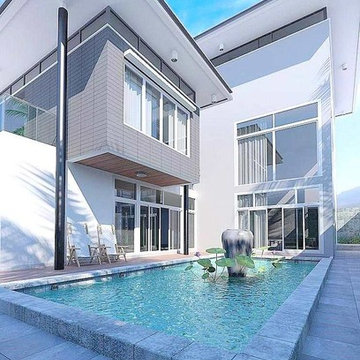
 Yantram Animation Studio
3d Architectural Visualization of models using CAD tools brings life and clarity into the design objectives with respect to interference, clearance, tolerance aspects, aesthetics and helps communicate ideas more effectively.
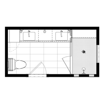 Drury Design
This client is in the beauty industry, so – in additional to great style – she has more beauty products than most people do. Before the renovation, there were products all over the counters and in temporary roll-in shelving units that got wheeled into the bathroom.
It was time for a change.
Design objectives:
-Add tons of storage
-Feature blingy, reflective materials
-Improve lighting
-Omit unused built-in tub
-Create a large luxurious shower
-Include large mirrors to the ceiling
THE REMODEL
With the right storage solutions, a bathroom loaded with products and gadgets can look virtually empty. Elegance and order contribute to living life artfully.
Design challenges:
-Standard vanities don’t offer much storage
-The existing window was in an ideal spot for a shower
-The client prefers large mirrors, so we needed an alternative to medicine cabinets
Design solutions:
-Replace the existing window with a waterproof privacy window
-Create dresser-style vanities with u-shaped drawers for maximum storage
-Include a tall cabinet with roll-out shelves for maximum storage and organization
THE RENEWED SPACE
Beauty products and daily needs are organized and out of the way – out of sight but easy to access. With a creative, modern palette of colors, patterns and textures, the bathroom’s aura is inviting, relaxing and luxurious.
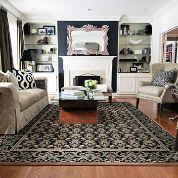
 Cure Design Group
This classically traditional space got quite the refresh. Our main objective was that we had to keep the main existing furniture pieces. We added layers of custom pillows and window treatments. Gave new life to the bookshelves by adding a grass cloth wallpaper and loads of personalized accessories. Painted the room a crisp white and accented the fireplace with black to make it pop.
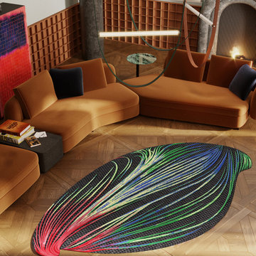
 Tapis Rouge
In 17th century Isaac Newton identified the colors (red, orange, yellow, green, blue, indigo, and violet) that make up the visible spectrum. And as his discovery at a time shocked the world and became a first step for a new era of discoveries and world evolution, we believe that the new Electric collection, creation of which is based on a solid theory of photon spectrum and physical characteristics of 4 speeds of rays which travel between Gamma as form of nuclear and cosmic radiation to infrared rays, a result of movement of lower-energy photons, will become a breakthrough of contemporary interior design.
This collection reflects a principally new approach to perception of rug in interior making it an art object at the first place. Nevertheless, very important value that remains untouched whatever we do and however futuristic our works are is extreme care about ecologic background and sustainability of our product. Through all the history of Atelier Tapis Rouge each of our rugs has been manually drawn by the team of our designers and afterwards tinted and knotted by hands of best Nepalese craftsmen, who carefully maintain tradition of rug knotting throughout the centuries.
The world has gone through a very hard time during last 2 years and perception of things, behavior, philosophic approach of people has changed drastically. We all need a recharge of energy and inspiration to restart our live paths in a new reality and there is no better place where we get energetic feed as home and family. Therefore, having created Electtrico we meant to boost the homes with warm solar energy – eternal source of life and continuity and we believe that it is a good start for new conquests.
Designed by Natalia Enze
 Ernest M. Ferizi
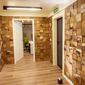
German Embassy in Pristina - Kosovo, contracted the architecture office “Ferizi + Ferizi Architects” to plan and implement an Annex Office building for their purposes. As detached part of this building is designed the waiting area, as alone standing structure.
This Office Building is constructed by assembling of Eight used office containers that were delivered on trucks and set up after only a few hours on the basis of the LEGO principle, according to the planning on strip foundations.
By removing the flexible exterior wall panels, a large room of 115 m² was created, with the counter wall as a room partition between two office spaces, each with seven workstations as well as three counters for agents on one side and a room for visitors on the other side.
With this system, room solutions can be easily implemented in all dimensions.
The container, seen as a geometric shape, is a simple, octagonal, solid box.
The standardized perfection of its dimensions is striking: 2.44 meters wide, 2.59 meters high and 6.06 meters or 12.19 meters long.
Since its introduction in 1956 by the American transport entrepreneur Malcom McLean, the container has become a standardized transport module worldwide, whether on ships, trucks or construction sites.
The shipping containers have additionally revolutionized the transport industry, pushed the globalization noticeably, and thus directly or indirectly influenced all our lives.
But after only a few years, when the first overseas containers wore out, many engineers recognized the positive properties of used shipping containers for building houses, especially since they are robust, flexible, multifunctional and second-hand relatively inexpensive to purchase. The time has long passed by to treat containers exclusively as transport objects.
As a "measure of all things", containers can hardly be ignored in construction.
Their use is no longer limited to temporary use since school containers, information containers, office containers or entire residential buildings are now part of our everyday life in the construction industry.
However, current examples of the container architecture prove that even the most demanding solutions for container building are feasible. For their specific aesthetic and spatial qualities, containers also serve as design parameters for the development of new forms of architecture and urbanity.
The office building as an extension of the visa section, characterized by modern materials and contemporary aesthetics has been designed and built mainly as a low-energy building.
Extensive insulation to achieve a comfortable and sustainable constant temperature in the interior, high window quality and low energy consumption make the building energy-efficient.
The sophisticated lighting technology, networks, heating systems and air-conditioning systems are also components of this equipment.
It creates an overall harmonic picture and guarantees the highest standard in sustainable construction, taking into consideration the fact that environmentally friendly recycling and reutilization have become an increasingly important issue in our society.
West and East side of the wooden facade is compact and has few openings, while the southern facade is completely open with lot of glass. Its spatial openness ensures a transparent, friendly work environment, which allows a lot of light into the space.
This openness allows an uninterrupted, pleasant and close-to-nature view from interior spaces into the beautiful garden. During the installation of sophisticated light sources in the garden, emphasis was not only put on functionality and security, but also on the beauty of the garden shown through the illumination in the evening.
Large, horizontal white “brisole” serve as external sun protection systems, mounted on the canopies of the entrance areas of the modular construction and the enclosure, adeptly cast shade on these areas and at the same time shape the entire architectural language.
While on one hand, the two quadratic ledges suspended in the air, are docked with steel stairs and match the wooden façade, lead the staff to their office space, the artful modern interior, on the other hand, perfectly unites the functionality, innovative technology, culture and positive effects on the employees' efficiency and wellbeing.
A lot of white, interjected by warm wooden and colored accents, determines the ambience.
In the case of the lighting solution, the mainly linear ceiling lighting is used as the overlapping design element both for the offices of the visa section as well as for the counters and the waiting area for the visitors.
They underline the puristic design in order to create a pleasant light for a desired general illumination and ensure optimal light conditions without causing disturbing reflections on the computer screens.
In addition, precisely positioned pendant luminaires are installed at the workstations, which ensure pleasant room brightness.
In the entrance area, the harmonic and uniform lighting effect from the ground highlights the integration of photography and architecture.
Photographs of landscapes, people, places, expressing unforgettable, impressive moments and memories have been lovingly engraved on 8 x 8cm square oak blocks.
The idea of an effective, impressive environment that stimulates and inspires the work was the premiss on which the whole design concept was based. Consequently, the modular construction was no longer viewed through its history of utilization and scars, but rather as a structure of work ambiance, art and elegance.
FERIZI + FERIZI Architects
Photo: Arben Llapashtica
 Drury Design
THE SETUP
This client lives in a great high-rise condo in downtown Chicago. Alicia has already remodeled a few areas of her home, including her kitchen and home office. The bathroom is one of the last big places the client wanted to update. The existing bathroom had a large, outdated whirlpool tub in the corner. It was a darker space that had a lack of natural light. There are no windows (due to the bathroom’s location within the high-rise building). So, the idea was to brighten up the space and give the client an updated, elegant primary bathroom that is more her style and tailor-made for her routines.
Design Objectives:
- Make the space brighter.
- Create different daily routine stations to maximize functionality while keeping things clutter-free – a makeup station, a blow-dry station, and a sink-needs station.
- Achieve the client’s specific style and function needs while also keeping the look and design open to future possibilities: different users of the space/resale clients.
Design Challenges:
- Toilet cannot be moved. (In a high-rise, you can’t really move plumbing around too much when reimagining a space)
- Existing bathroom had a soffit that hid a lot of electrical wiring, so completely removing the soffit wasn’t an option.
- The blow-dry station needs to accommodate the client’s preference for standing up.
- Finding a place for the make-up station, which the client wants oriented for sitting.
- Create storage within the shower that can eliminate the clutter of personal care products that are actually needed every day. Do this, while keeping the client’s favorite things about the existing shower: the shower bench, a tub filler faucet (for rinsing shaving cream when shaving legs) and a low niche for placing her foot when shaving her legs.
THE RENEWED SPACE
Design Solutions:
- Extended a bit of wall near the toilet to give the commode its own area within the space, but without closing it off into a claustrophobic WC.
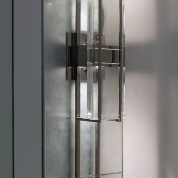
- Worked within the reality of the existing soffit situation, reshaping it to align with the new shower. Can lights were also added. Installed a beautiful ceiling light fixture that works within the new soffit shape, commanding attention and adding light, as if the sofit shape was chosen for it.
- Created a nice, furniture-looking 42”-high cabinet with pullout drawers to be the blow-dry station, complete with a mirror and a nice top. The pullout drawers are all powered, concealing a Dyson dryer and curling iron (and all the accoutrements) while keeping them plugged in, which is ideal for easy usage and put away. A stylish mirror on the wall above the cabinet, and proper lighting, make this the perfect blow-dry station. The top has a grommet that can accommodate a power cord should the client ever want to have a powered device on top of the cabinet.
- Put the sit-down makeup station where the tub used to be, putting the mirror back into a new recessed wall just a bit, allowing the area to have more room.
- Created a niche in the shower’s inner wall so that you can’t see it unless you are literally inside the shower. At the client’s request, it also has a hook so she can hang her loofa. Hiding the utility niche in this way allowed us to use the full main wall of the shower as a canvas for a beautiful accent stripe of raised decorative tile. The new shower has her old favorites, too: the tub filler, foot niche and bench.
Alicia’s client loves her new primary bathroom, especially the blow dry area. It is very accommodating for her, as a tall lady, while being very easy to use. The drawers store everything. Being powered, they make using already-plugged in appliances very easy to use and put away.
Her previous makeup station was a freestanding vanity with a single drawer, so beauty products were all over the surface top. With her new makeup station, everything is nicely tucked away and organized in drawers.
The new lighting is fantastic and the colors are light and soft. The clients loves the overall look and feel of her new bathroom and raves about how well the functionality-minded design makes her morning routine – and her life – easier and enjoyable!
 Yates Desygn
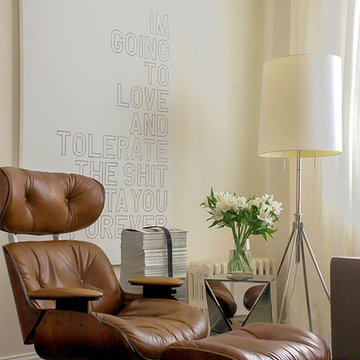
Set at pre-war, mid-rise apartment building amongst the hustle and bustle of New York City's Hell's Kitchen, the client's main objective was to construct a sanctuary and quiet space while incorporating their love of mid-century modern furniture.
This perfect challenge for Yates Desygn allowed us to add life and visual stimulation to a limited footprint.
In this space, we incorporated our client's existing furniture blending in new pieces to create a peaceful haven in the fast-paced city they love.
33