
Search results for "Like new condition" in Home Design Ideas
 Interiors Joan and Associates
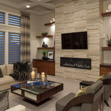
Example of a trendy carpeted living room design in Omaha with a ribbon fireplace, a wall-mounted tv and beige walls
 John B. Murray Architect
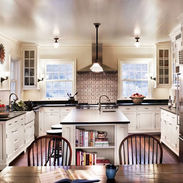
Kitchen - A New Farmhouse in Columbia County, New York - John B. Murray Architect - Interior Design by Sam Blount - Photography by Durston Saylor
Inspiration for a country u-shaped dark wood floor eat-in kitchen remodel in New York with a farmhouse sink, recessed-panel cabinets, white cabinets and multicolored backsplash
Inspiration for a country u-shaped dark wood floor eat-in kitchen remodel in New York with a farmhouse sink, recessed-panel cabinets, white cabinets and multicolored backsplash
 Simply Home Decorating
This beautiful North Vancouver home belongs to a nature-loving and health-conscious couple, Emma and Vince (names changed), their two young children, and their dog, Jasper. When they contacted us about renovating and furnishing their kitchen and family room, we walked in and saw a world of potential waiting to be uncovered.
Before: Larkhall Crescent Home:
Like many original North Vancouver homes, the interior was definitely dated. We encountered late ‘80s finishes in powder pink and teal green, old carpet, and a kitchen that wasn’t maximized to suit this family’s modern-day lifestyle. However, the size of the rooms offered us a ton of space with which to get creative.
Knowing our clients’ love of cooking, need for work spaces (Emma and Vince both work remotely), and growing family, we developed a design concept that would increase usable space, optimize storage, and create intimacy in this large area. As for the style, we were inspired by their European roots, inventing a new and modern take on “Belgian Farmhouse” style. Now, the home is truly one-of-a-kind.
After: Warm & Cozy Family Room:
Fresh, bright, and comfortable, this living area has been transformed! We started with the fireplace as a focal point, selecting aged brick tiles for added texture and a crisp wood mantle. The taupe-coloured sectional infuses the room with visual warmth and serves the added purpose of separating the family room from the kitchen.
Emma and Vince were also keen on using non-toxic materials in their home, and we were happy to oblige. To meet their needs, we sourced natural wood elements and sought out Canadian-made products - that adhere to high health standards - whenever possible.
Look closer at the elements of this space, and you will find this stunning, honeycomb-patterned rug in earthy gold, beige, and charcoal tones. It’s plush to the touch and full of visual texture that brings this room’s colour palette together. We sourced these two-tone chairs with caning, petrified wood side table, black sconces, and botanical prints in greyscale from local artist, Heather Johnston.
We topped off the space with this dark wood and rattan console that offers storage facing the kitchen and presents an opportunity to display cherished items. The result is a cozy lounging space brimming with comfort and functionality. It’s perfect for enjoying quality family time, or Emma can simply slide the coffee table away to make room for her morning yoga practice.
Now, let’s turn around and give some attention to the kitchen. Do you remember what the original kitchen looked like? If not, scroll back up, because the transformation is shocking…
Moody & Welcoming Kitchen for Healthy Living:
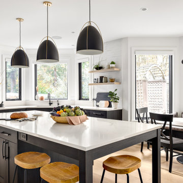
This kitchen looks very different from how it started, right? Though we didn’t touch any walls, the kitchen has almost doubled in usable space! We created a long, extended island with storage, an outlet for small appliances, and seating for comfortable prep, after-school snacking, or mingling among friends.
On the other side of the island, the family has even more storage and an integrated dishwasher within easy reach of the sink, perfect for quick clean-up. From this angle, you can also see the expansive custom Shaker cabinetry in white and the integrated double ovens. These facilitate their cooking experience and gave us the opportunity to add an additional surprise…
A coffee garage station and more hidden storage! Keeping these items located along the perimeter allows them to be accessed by the family or their guests without someone getting under the cook’s feet. These are the little details that make everyday life easier and more enjoyable.
Moving deeper into the kitchen, the seamless induction cooktop topped with a freestanding concealed hood fan commands attention in a soft yet prominent way. The natural wood accent mirrors the fireplace mantle, and the choice of off-black wood-grain cabinets not only continues our black-and-white colour palette but adds a sense of depth and contrast. The corner sink is located to the right and perfectly positioned with a view of their thriving backyard.
To invite more of this family’s character into the space, we mixed metals for interest — matte black, dark pewter, and warm brass — and created open shelves in white oak for their plants and decor. You can also glimpse the tumbled edge of the backsplash tile, which echoes the rustic brick of the fireplace. It adds that farmhouse charm while still feeling timeless and sophisticated.
Last but not least, we designed this dining banquette in the bay window (with integrated bench storage, of course), where the family can share a meal together, the kids can do homework, or Emma and Vince can work and enjoy a change of scenery from their offices. Like the other spaces in the home, it was designed to be beautiful, multi-functional, and long-lasting.
Praise from Our Clients:
It is clear that we love this home, but what did our clients have to say?
“Lori is a visionary and masters execution to the finest detail all at the same time. When she first met us to know more about who we are and how we live, she could right away envision how we could use the space in our kitchen and living room…The results exceeded our expectations.
Lori and her team were also a delight to work with — coordination with all the trades, fast problem-solving, regular updates, professional and friendly attitude of her entire team — made it the dream team. Thank you SHD for making our space so beautiful!”
In turn, we are so grateful for this family’s trust, their open communication, and for being wonderful people with whom to work. (So, thank you!)
Find the right local pro for your project
 threshold interiors
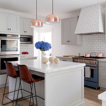
This cute cottage, one block from the beach, had not been updated in over 20 years. The homeowners finally decided that it was time to renovate after scrapping the idea of tearing the home down and starting over. Amazingly, they were able to give this house a fresh start with our input. We completed a full kitchen renovation and addition and updated 4 of their bathrooms. We added all new light fixtures, furniture, wallpaper, flooring, window treatments and tile. The mix of metals and wood brings a fresh vibe to the home. We loved working on this project and are so happy with the outcome!
Photographed by: James Salomon
 Krista + Home
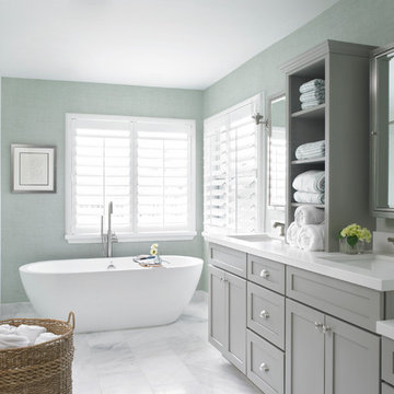
A spa like master bath retreat with double sinks, gray cabinetry, aqua linen wallpaper and a huge shower oasis. Design by Krista Watterworth Alterman. Photos by Troy Campbell. Krista Watterworth Design Studio, Palm Beach Gardens, Florida.
 Albert, Righter & Tittmann Architects, Inc.
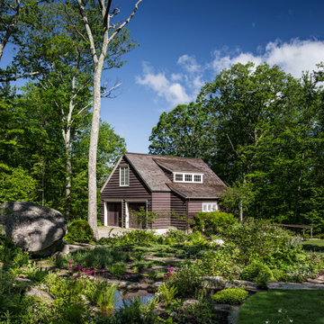
Our client, with whom we had worked on a number of projects over the years, enlisted our help in transforming her family’s beloved but deteriorating rustic summer retreat, built by her grandparents in the mid-1920’s, into a house that would be livable year-‘round. It had served the family well but needed to be renewed for the decades to come without losing the flavor and patina they were attached to.
The house was designed by Ruth Adams, a rare female architect of the day, who also designed in a similar vein a nearby summer colony of Vassar faculty and alumnae.
To make Treetop habitable throughout the year, the whole house had to be gutted and insulated. The raw homosote interior wall finishes were replaced with plaster, but all the wood trim was retained and reused, as were all old doors and hardware. The old single-glazed casement windows were restored, and removable storm panels fitted into the existing in-swinging screen frames. New windows were made to match the old ones where new windows were added. This approach was inherently sustainable, making the house energy-efficient while preserving most of the original fabric.
Changes to the original design were as seamless as possible, compatible with and enhancing the old character. Some plan modifications were made, and some windows moved around. The existing cave-like recessed entry porch was enclosed as a new book-lined entry hall and a new entry porch added, using posts made from an oak tree on the site.
The kitchen and bathrooms are entirely new but in the spirit of the place. All the bookshelves are new.
A thoroughly ramshackle garage couldn’t be saved, and we replaced it with a new one built in a compatible style, with a studio above for our client, who is a writer.
 Klopf Architecture
The Roger Lee designed house from 1962 was purchased by the current homeowners in almost original condition, as the previous owners elected to defer most maintenance projects over the years. The clients were able to see beyond the dated materials and finishes, single-paned glass and uninsulated walls and they approached Klopf Architecture to help them expand and update the entire home, one the family could settle into and enjoy for years to come. It was important that the new designs were aligned with Lee's original intent not only because of the client's appreciation for mid-century modern architecture, but also because the house was deemed historical. The Stanford Real Estate Office requires a stringent design review which safeguards the integrity of the community, which Klopf Architecture was happy to oblige going into their updated designs.
As with many original mid-century modern homes, the house was scaled to the 1960s lifestyle where rooms were smaller and openings to views were limited and tightly framed. The original conditions defined the direction the family of four would take in updating the house and making it comfortable for their modern lifestyle. Klopf designed a full gut remodel and major addition to bring the house into the 21st century and provide the living area needed for the client's family. The newly expanded house added just about 1,100 sf to create an airy, comfortable and family friendly house, taking full advantage of the beautiful southwestern views that extend out to the hills beyond. The enclosed garage created an additional 240 sf of covered space for long-term storage.
A cracked swimming pool created an eyesore taking up a majority of the backyard landscape, so it was one of the first elements to go during the transformation. Working with Outer Space Landscape Architects, the family asked for a mix of relaxing outdoor patio spaces that eventually blend into the native landscaping, extending their views outward toward the natural greenery of the trees beyond their property. Filling in the old pool was a smart way to expand the living spaces outward. The orientation of the house was designed to enjoy the views, but the original architecture provided the first homeowners with mere glimpses of the landscape outside.
Klopf was able to broaden those views, continuing and extending on the original architecture to take full advantage of the unobstructed natural views across the rear facade of the house. Small horizontal openings in the primary bedroom and office were replaced with much taller windows that now follow the angled roof line upward, extending across almost all of the facade. We worked with Western Windows, whose designs included an oblique-shaped, operable casement that allowed our design to rise with the slope. A new corner office added to the primary suite, offers a bright and functional work-from-home solution that looks out at the distant views and added natural light from the expanded window configuration that now wraps around the corner.
The existing lower level was designed by Lee as a utilitarian space, serving as a wet pool room with a drain in the center of the floor, bathroom, laundry and storage areas. Without the need for a pool room, Klopf was able to convert the area into a much more comfortable and functional living space with a new family room and guest suite. The new spaces enjoy easy access to a new outdoor patio through floor to ceiling, full-width glass sliders.
Continuing along the rear facade, a previously exposed deck extending from the living room and hallway provided access to the backyard through a single set of stairs leading toward the side of the house which made sense when the pool was in place. The new deck was re-envisioned as an extension of the main living room and now serves as a second outdoor living room. A new slatted pergola above provides the homeowners welcome relief from the hot afternoon sun. A second set of stairs now creates a better connection to the redesigned lower level. Klopf was able to reconfigure the spaces, extending the living room outward toward the views, where the family now claims it as the heart of the home, spending a large majority of their time outdoors.
Back inside, the original wood-burning Malm fireplace was beautifully restored and a gas burner installed to comply with California's strict air standards. It now rests in front of a wall of Heath accent tiles where a dated red brick wall used to stand. A new taller window brings more light and views into the refreshed interior living room. The original glass doors opposite the fireplace were replaced by larger sliders that when fully opened, create a seamless transition to the new outdoor living area so the two spaces feel like one connected space. The original utilitarian kitchen was needlessly tucked into the far back corner and closed-off, out of sight from the living room, so the clients asked Klopf to open it up and expand the kitchen forward so it felt more connected. Today the much larger kitchen is connected to the living area where a short wall with a cutout offers a visual glimpse into the kitchen and a handy pass-through counter for serving guests. A new breakfast nook was also added to create another spot where the family can gather for casual meals. Just outside, a new built-in outdoor grill and prep area extends the kitchen outside and connects to a new outdoor dining spot nestled amongst the trees, taking advantage of the views out back.
Klopf was able to expand the other two bedrooms, add a new laundry room and half-bath and convert the carport to an enclosed garage to add more storage areas which was lost when the pool house was converted to the family and guest room.
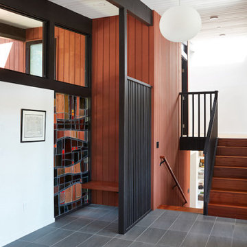
To maintain a historical connection to the original designs, the exterior siding was repeated on all exterior walls, a full-height stained glass window at the front entryway restored, and an interior slatted screen element repeated outside at the exterior entry courtyard and over the new outdoor living room to create a shade trellis. The new house stands proudly and shines against it's new landscaping features, while respecting and expanding on the original intent of Roger Lee's designs epitomizing the comforts of indoor-outdoor living in Northern California.
Completion year: 2020
Klopf Architecture project team: John Klopf, Klara Kevane, Noel Andrade
Contractor: ORB Construction, Brendan O'Reilly
Structural engineer: Sezen and Moon
Landscape architect: Outer space
Furnishings and decoration: Urbanism Designs
Photographer: Mariko Reed

 Think Chic Interiors LLC
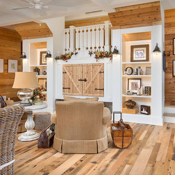
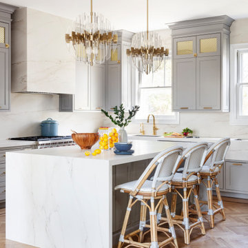
This kitchen belongs to a lively young family of five (soon to be six) in New Rochelle New York. When meeting the family to discuss the kitchen renovation, the request was simple, yet required careful planning. They wanted a beautiful high end kitchen that would be not only child friendly but one that would give their children the feeling that this is a space for them to use freely. And so the kitchen was designed.
All countertops and backsplash, including the sink apron and the kitchen hood, are made out of a Dekton porcelain, a material that is both heat, scratch and stain resistant. Thanks to ever evolving technologies, it not only looks like stone, but feels like it as well. A secret compartment with a pouch magnet on the panel wall contains a three tier step-stool for reaching the upper cabinets while those are equipped with pulldown shelves to utilize all spaces with easy access.
 New Old, LLC
Cal Mitchner Photography
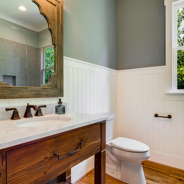
Example of a cottage medium tone wood floor bathroom design in Charlotte with an undermount sink, medium tone wood cabinets, green walls, a two-piece toilet and flat-panel cabinets
Example of a cottage medium tone wood floor bathroom design in Charlotte with an undermount sink, medium tone wood cabinets, green walls, a two-piece toilet and flat-panel cabinets
 Amazing Spaces
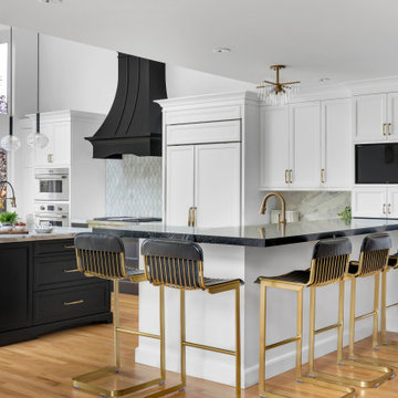
The existing U-shaped kitchen was tucked away in a small corner while the dining table was swimming in a room much too large for its size. The client’s needs and the architecture of the home made it apparent that the perfect design solution for the home was to swap the spaces.
The homeowners entertain frequently and wanted the new layout to accommodate a lot of counter seating, a bar/buffet for serving hors d’oeuvres, an island with prep sink, and all new appliances. They had a strong preference that the hood be a focal point and wanted to go beyond a typical white color scheme even though they wanted white cabinets.
While moving the kitchen to the dining space gave us a generous amount of real estate to work with, two of the exterior walls are occupied with full-height glass creating a challenge how best to fulfill their wish list. We used one available wall for the needed tall appliances, taking advantage of its height to create the hood as a focal point. We opted for both a peninsula and island instead of one large island in order to maximize the seating requirements and create a barrier when entertaining so guests do not flow directly into the work area of the kitchen. This also made it possible to add a second sink as requested. Lastly, the peninsula sets up a well-defined path to the new dining room without feeling like you are walking through the kitchen. We used the remaining fourth wall for the bar/buffet.
Black cabinetry adds strong contrast in several areas of the new kitchen. Wire mesh wall cabinet doors at the bar and gold accents on the hardware, light fixtures, faucets and furniture add further drama to the concept. The focal point is definitely the black hood, looking both dramatic and cohesive at the same time.
 J.P. Hoffman Design Build
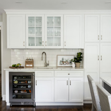
Offering a beautiful view through a large window into the backyard, we knew we would highlight the window and design a new kitchen layout, around that window. The former kitchen felt closed in with super dark cabinets. Along with the homeowner, our team designed a light and airy kitchen, including a new pass through to the dining room. Closed off from the kitchen before, the pass through not only allows light to flow in from the beautiful bay window in the dining room, but if offers a functional countertop used for entertaining and serving guests.
Not pictured is a drop zone, located immediately when you enter from the mudroom. Drop zones are fantastic for everyday items like keys, wallets, dog gear and more. We added an additional opening to the living room, right off the kitchen as well as a wet bar strategically placed outside the ever day kitchen work zone. Wet bars are fantastic for holding entertainment dishware, barware and appetizers!
We finished the space with beautiful new hardwood floors throughout the entire first floor, except the tile in the mudroom.
 Andrew Thompson Construction
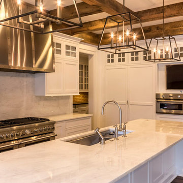
Our clients on this project already had a beautiful home… We just helped them get the living room and kitchen just like they wanted for their new needs. We reconfigured the entire kitchen footprint to get them a bigger work area and moved the pantry to an unused wall in the eat-in area. This allowed us to get them a larger island and much more wall cabinetry. The glass fronts on the upper cabinets, and the puck lights inside, really warmed the kitchen up. In the living room, we added floating shelves with specialty rope lighting along with new base cabinets on both sides of the fireplace. We also were able to provide a new and fresh look on the fireplace tile surround and trim work to the mantle and wall above. These few changes transformed a formal living room into a comfortable destination that they will enjoy forever.
Design: Anna Brown Interiors
Cabinetry: Barber Cabinet Company
Contractor: Andrew Thompson Construction
 Crown Point Cabinetry
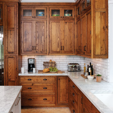
Reclaimed Chestnut cabinetry reaches all the way to the ceiling in a door over door configuration.
Photo Credit: Crown Point Cabinetry
Inspiration for a rustic l-shaped brick floor kitchen remodel in Burlington with an undermount sink, recessed-panel cabinets, medium tone wood cabinets, granite countertops, white backsplash and subway tile backsplash
Inspiration for a rustic l-shaped brick floor kitchen remodel in Burlington with an undermount sink, recessed-panel cabinets, medium tone wood cabinets, granite countertops, white backsplash and subway tile backsplash
 Nicole Benveniste Interior Design
David Duncan LIvingston
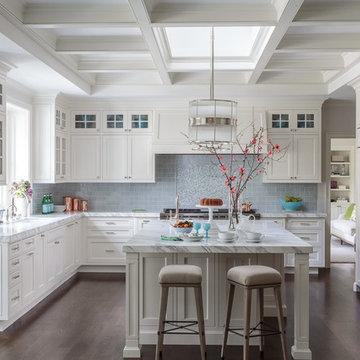
For this ground up project in one of Lafayette’s most prized neighborhoods, we brought an East Coast sensibility to this West Coast residence. Honoring the client’s love of classical interiors, we layered the traditional architecture with a crisp contrast of saturated colors, clean moldings and refined white marble. In the living room, tailored furnishings are punctuated by modern accents, bespoke draperies and jewelry like sconces. Built-in custom cabinetry, lasting finishes and indoor/outdoor fabrics were used throughout to create a fresh, elegant yet livable home for this active family of five.
 Tom Bassett-Dilley Architect, Ltd.
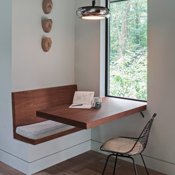
This 1960 house was in need of updating from both design and performance standpoints, and the project turned into a comprehensive deep energy retrofit, with thorough airtightness and insulation, new space conditioning and energy-recovery-ventilation, triple glazed windows, and an interior of incredible elegance. While we maintained the foundation and overall massing, this is essentially a new house, well equipped for a new generation of use and enjoyment.
 The Brooklyn Studio
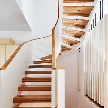
This residence was a complete gut renovation of a 4-story row house in Park Slope, and included a new rear extension and penthouse addition. The owners wished to create a warm, family home using a modern language that would act as a clean canvas to feature rich textiles and items from their world travels. As with most Brooklyn row houses, the existing house suffered from a lack of natural light and connection to exterior spaces, an issue that Principal Brendan Coburn is acutely aware of from his experience re-imagining historic structures in the New York area. The resulting architecture is designed around moments featuring natural light and views to the exterior, of both the private garden and the sky, throughout the house, and a stripped-down language of detailing and finishes allows for the concept of the modern-natural to shine.
Upon entering the home, the kitchen and dining space draw you in with views beyond through the large glazed opening at the rear of the house. An extension was built to allow for a large sunken living room that provides a family gathering space connected to the kitchen and dining room, but remains distinctly separate, with a strong visual connection to the rear garden. The open sculptural stair tower was designed to function like that of a traditional row house stair, but with a smaller footprint. By extending it up past the original roof level into the new penthouse, the stair becomes an atmospheric shaft for the spaces surrounding the core. All types of weather – sunshine, rain, lightning, can be sensed throughout the home through this unifying vertical environment. The stair space also strives to foster family communication, making open living spaces visible between floors. At the upper-most level, a free-form bench sits suspended over the stair, just by the new roof deck, which provides at-ease entertaining. Oak was used throughout the home as a unifying material element. As one travels upwards within the house, the oak finishes are bleached to further degrees as a nod to how light enters the home.
The owners worked with CWB to add their own personality to the project. The meter of a white oak and blackened steel stair screen was designed by the family to read “I love you” in Morse Code, and tile was selected throughout to reference places that hold special significance to the family. To support the owners’ comfort, the architectural design engages passive house technologies to reduce energy use, while increasing air quality within the home – a strategy which aims to respect the environment while providing a refuge from the harsh elements of urban living.
This project was published by Wendy Goodman as her Space of the Week, part of New York Magazine’s Design Hunting on The Cut.
Photography by Kevin Kunstadt
 Klopf Architecture
From Mid-Century Classic to the Present
An iconic design updated with comfort, function, and flow for today.
A Remodel That Balances Past and Present
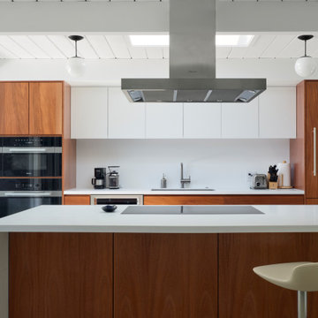
What started as a desire to update a classic Eichler soon became an exploration of how Mid-Century Modern design can successfully evolve for today. The client, a tech professional with a passion for scuba diving and underwater photography, wanted a home that would both honor its original character and feel tailored to his daily life. A lifelong technology enthusiast, he still owns the very first Mac desktop he saved up for as a teenager working at Radio Shack, a detail that underscores his appreciation for design that melds function and form.
Honoring Separation While Expanding Possibility
Unlike many contemporary remodels where walls are opened up to create expansive living spaces, this project took a more restrained approach. The client valued the defined rooms of the original plan and wanted to preserve as much wall space as possible for displaying his large-format underwater photography. The emphasis was not on dramatic spatial reinvention, but on thoughtful refinements. Klopf Architecture shaped a gallery-like backdrop while also expanding the primary suite, modernizing materials and fixtures throughout the home, and improving the functionality and layout of the kitchen. The finished home feels at once timeless and renewed, an Eichler that continues to inspire while fully supporting the lifestyle of its present-day owner.
A major turning point came mid-design. The original project brief had not included an addition, but as the reconfiguration of the primary bedroom and bath unfolded, it became clear that an expansion was the best approach to achieve the client’s vision of a more spacious suite. Fortunately, the adjustment came at a stage when revisions were still manageable and was integrated seamlessly, showing how thoughtful course corrections can strengthen a project rather than hinder it.
Navigating Challenges With Precision
The design development included multiple conceptual rounds, balancing preservation with subtle expansion. During construction, an existing post previously thought to be load-bearing turned out not to be. The structural engineer was able to pivot quickly, and both the post and the cross beam that had been intended to replace it could be omitted, allowing the original rhythm of the Eichler beam bays to be preserved.
Sustainability was not just a checklist item, but a way to align the home with the client’s values of simplicity, efficiency, and long-term functionality. R-38 roof insulation reduced energy usage, solar panels with battery storage provided independence and resilience, and passive comfort strategies eliminated the need forenergy-intensive air conditioning. An electric vehicle charger and an on-demand hot water recirculation system (with call buttons as opposed to having constant circulation) add to the home’s long-term efficiency factors. Together, these moves created a home that is quieter, more comfortable, and better equipped for the future, qualities that supported the client’s pragmatic approach to design and living lightly.
Details That Respect the Eichler DNA
The remodel carries forward the Eichler’s original spirit while introducing new layers of modern livability. Originally, the house was approached along a deep, narrow walk, with the garage on one side and the house on the other, leaving the front door tucked far back within this chasm-like space. By pulling the entry forward, the design reshaped the arrival experience, creating a clearer threshold and a natural drop-off zone for bags, shoes, and keys. This shift also made room for a custom bench at the entry that extends seamlessly through the glass sidelight. The bench and drop-off zone now work together as a single, integrated sequence that supports everyday living while offering a tactile reminder of Eichler’s philosophy of connectedness.
At the client’s request, Klopf reintroduced a classic Eichler gesture by extending the exterior siding into the entry and living room. The detail reinforces a sense of indoor/outdoor continuity while providing a subtle architectural surface that allows the client’s photography to take visual precedence.
The signature concrete masonry wall at the front was reconstructed using blocks sourced to match the originals, now strengthened with rebar for seismic resilience while maintaining a private outdoor courtyard, visually extending the kitchen outward. A decorative trellis element, a detail borrowed from a neighboring Eichler, restores a familiar mid-century modern architectural motif. At the courtyard entry door, a custom etched glass sidelight with an ocean-themed design featuring kelp and jellyfish serves as a subtle homage to the client’s passion for deep-sea diving.
Landscaping became an integral part of the overall transformation. The homeowner engaged landscape architect Randi Johnsen of Third Nature Studio to shape a series of calm, inviting outdoor rooms that read as a natural extension of the interiors. While technically outside of the core construction scope, the landscape design proved central to achieving a sense of completeness and connectedness across the property. Such whole-property considerations often emerge as design ideas take shape, underscoring the importance of flexibility in planning and budgeting, as well as close collaboration among the design team starting early in the process.
The Value of Evolving Scope
As with many custom residential projects, the scope evolved during the design process. What began as a targeted remodel grew to include a new/expanded primary suite, a rebuilt CMU patio wall for strength and longevity, and a solar panel array and battery storage for energy resilience and carbon-reduction. Each thoughtful decision represented a conscious investment in the home’s performance and character, rather than a cost overrun.
The result was a project delivered on schedule, tailored precisely to the client’s lifestyle, and positioned to add long-term value both functionally and aesthetically. By embracing scope evolution as an opportunity rather than a challenge, and relying on good design paired with transparent communication, this remodel demonstrates how Eichler homes can be adapted for contemporary living without erasing their DNA.
Klopf Architecture project team: John Klopf, AIA, and Klara Kevane, Elise Webb and Nicholas LaNasa.
Contractor: Golden Cove Construction
Landscape Design: Third Nature Studio
Structural Engineer: Daniel Bastiao Design
Photography: ©2025 Mariko Reed
Year Completed: 2024
Location: Sunnyvale, CA


 Five Star Interiors
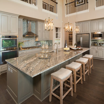
Sucuri Granite Countertop sourced from Shenoy or Midwest Tile in Austin, TX; Kent Moore Cabinets (Painted Nebulous Grey-Low-Mocha-Hilite), Island painted Misty Bayou-Low; Backsplash - Marazzi (AMT), Studio M (Brick), Flamenco, 13 x 13 Mesh 1-1/4" x 5/8"; Flooring - Earth Werks, "5" Prestige, Handsculpted Maple, Graphite Maple Finish; Pendant Lights - Savoy House - Structure 4 Light Foyer, SKU: 3-4302-4-242; Barstools - New Pacific Direct - item # 108627-2050; The wall color is PPG Ashen 516-4.
 Kitchen Kraft
John Evans
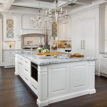
Inspiration for a huge timeless u-shaped dark wood floor kitchen remodel in Columbus with beaded inset cabinets, white cabinets, white backsplash, paneled appliances, an island, granite countertops and stone tile backsplash
Inspiration for a huge timeless u-shaped dark wood floor kitchen remodel in Columbus with beaded inset cabinets, white cabinets, white backsplash, paneled appliances, an island, granite countertops and stone tile backsplash
 Amazing Spaces
The existing U-shaped kitchen was tucked away in a small corner while the dining table was swimming in a room much too large for its size. The client’s needs and the architecture of the home made it apparent that the perfect design solution for the home was to swap the spaces.
The homeowners entertain frequently and wanted the new layout to accommodate a lot of counter seating, a bar/buffet for serving hors d’oeuvres, an island with prep sink, and all new appliances. They had a strong preference that the hood be a focal point and wanted to go beyond a typical white color scheme even though they wanted white cabinets.
While moving the kitchen to the dining space gave us a generous amount of real estate to work with, two of the exterior walls are occupied with full-height glass creating a challenge how best to fulfill their wish list. We used one available wall for the needed tall appliances, taking advantage of its height to create the hood as a focal point. We opted for both a peninsula and island instead of one large island in order to maximize the seating requirements and create a barrier when entertaining so guests do not flow directly into the work area of the kitchen. This also made it possible to add a second sink as requested. Lastly, the peninsula sets up a well-defined path to the new dining room without feeling like you are walking through the kitchen. We used the remaining fourth wall for the bar/buffet.
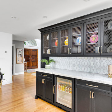
Black cabinetry adds strong contrast in several areas of the new kitchen. Wire mesh wall cabinet doors at the bar and gold accents on the hardware, light fixtures, faucets and furniture add further drama to the concept. The focal point is definitely the black hood, looking both dramatic and cohesive at the same time.
10