
Search results for "Like new condition" in Home Design Ideas
 Tamara Rosenbloom Design LLC
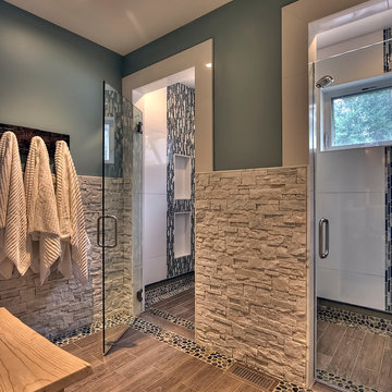
My clients had outgrown their builder’s basic home and had plenty of room to expand on their 10 acres. Working with a local architect and a talented contractor, we designed an addition to create 3 new bedrooms, a bathroom scaled for all 3 girls, a playroom and a master retreat including 3 fireplaces, sauna, steam shower, office or “creative room”, and large bedroom with folding glass wall to capitalize on their view. The master suite, gym, pool and tennis courts are still under construction, but the girls’ suite and living room space are complete and dust free. Each child’s room was designed around their preference of color scheme and each girl has a unique feature that makes their room truly their own. The oldest daughter has a secret passage hidden behind what looks like built in cabinetry. The youngest daughter wanted to “swing”, so we outfitted her with a hanging bed set in front of a custom mural created by a Spanish artist. The middle daughter is an elite gymnast, so we added monkey bars so she can cruise her room in style. The girls’ bathroom suite has 3 identical “stations” with abundant storage. Cabinetry in black walnut and peacock blue and white quartz counters with white marble backsplash are durable and beautiful. Two shower stalls, designed with a colorful and intricate tile design, prevent bathroom wait times and a custom wall mural brings a little of the outdoors in.
Photos by Mike Martin www.martinvisualtours.com
 BRADSHAW DESIGNS LLC
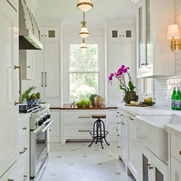
This Award-winning kitchen proves vintage doesn't have to look old and tired. This previously dark kitchen was updated with white, gold, and wood in the historic district of Monte Vista. The challenge is making a new kitchen look and feel like it belongs in a charming older home. The highlight and starting point is the original hex tile flooring in white and gold. It was in excellent condition and merely needed a good cleaning. The addition of white calacatta marble, white subway tile, walnut wood counters, brass and gold accents keep the charm intact. Cabinet panels mimic original door panels found in other areas of the home. Custom coffee storage is a modern bonus! 30" Sub-Zero Refrig, Rohl sink.
 BRADSHAW DESIGNS LLC
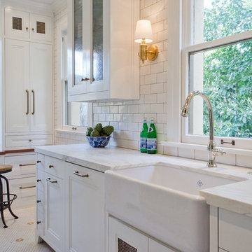
This Award-winning kitchen proves vintage doesn't have to look old and tired. This previously dark kitchen was updated with white, gold, and wood in the historic district of Monte Vista. The challenge is making a new kitchen look and feel like it belongs in a charming older home. The highlight and starting point is the original hex tile flooring in white and gold. It was in excellent condition and merely needed a good cleaning. The addition of white calacatta marble, white subway tile, walnut wood counters, brass and gold accents keep the charm intact. Cabinet panels mimic original door panels found in other areas of the home. Custom coffee storage is a modern bonus! Sub-Zero Refrig, Rohl sink, seeded glass cabinets, brass wire grille,
Find the right local pro for your project
 ZeroEnergy Design
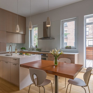
This renovated brick rowhome in Boston’s South End offers a modern aesthetic within a historic structure, creative use of space, exceptional thermal comfort, a reduced carbon footprint, and a passive stream of income.
DESIGN PRIORITIES. The goals for the project were clear - design the primary unit to accommodate the family’s modern lifestyle, rework the layout to create a desirable rental unit, improve thermal comfort and introduce a modern aesthetic. We designed the street-level entry as a shared entrance for both the primary and rental unit. The family uses it as their everyday entrance - we planned for bike storage and an open mudroom with bench and shoe storage to facilitate the change from shoes to slippers or bare feet as they enter their home. On the main level, we expanded the kitchen into the dining room to create an eat-in space with generous counter space and storage, as well as a comfortable connection to the living space. The second floor serves as master suite for the couple - a bedroom with a walk-in-closet and ensuite bathroom, and an adjacent study, with refinished original pumpkin pine floors. The upper floor, aside from a guest bedroom, is the child's domain with interconnected spaces for sleeping, work and play. In the play space, which can be separated from the work space with new translucent sliding doors, we incorporated recreational features inspired by adventurous and competitive television shows, at their son’s request.
MODERN MEETS TRADITIONAL. We left the historic front facade of the building largely unchanged - the security bars were removed from the windows and the single pane windows were replaced with higher performing historic replicas. We designed the interior and rear facade with a vision of warm modernism, weaving in the notable period features. Each element was either restored or reinterpreted to blend with the modern aesthetic. The detailed ceiling in the living space, for example, has a new matte monochromatic finish, and the wood stairs are covered in a dark grey floor paint, whereas the mahogany doors were simply refinished. New wide plank wood flooring with a neutral finish, floor-to-ceiling casework, and bold splashes of color in wall paint and tile, and oversized high-performance windows (on the rear facade) round out the modern aesthetic.
RENTAL INCOME. The existing rowhome was zoned for a 2-family dwelling but included an undesirable, single-floor studio apartment at the garden level with low ceiling heights and questionable emergency egress. In order to increase the quality and quantity of space in the rental unit, we reimagined it as a two-floor, 1 or 2 bedroom, 2 bathroom apartment with a modern aesthetic, increased ceiling height on the lowest level and provided an in-unit washer/dryer. The apartment was listed with Jackie O'Connor Real Estate and rented immediately, providing the owners with a source of passive income.
ENCLOSURE WITH BENEFITS. The homeowners sought a minimal carbon footprint, enabled by their urban location and lifestyle decisions, paired with the benefits of a high-performance home. The extent of the renovation allowed us to implement a deep energy retrofit (DER) to address air tightness, insulation, and high-performance windows. The historic front facade is insulated from the interior, while the rear facade is insulated on the exterior. Together with these building enclosure improvements, we designed an HVAC system comprised of continuous fresh air ventilation, and an efficient, all-electric heating and cooling system to decouple the house from natural gas. This strategy provides optimal thermal comfort and indoor air quality, improved acoustic isolation from street noise and neighbors, as well as a further reduced carbon footprint. We also took measures to prepare the roof for future solar panels, for when the South End neighborhood’s aging electrical infrastructure is upgraded to allow them.
URBAN LIVING. The desirable neighborhood location allows the both the homeowners and tenant to walk, bike, and use public transportation to access the city, while each charging their respective plug-in electric cars behind the building to travel greater distances.
OVERALL. The understated rowhouse is now ready for another century of urban living, offering the owners comfort and convenience as they live life as an expression of their values.
Photography: Eric Roth Photo
 Advance Design Studio, Ltd.
After six years of living in their Huntley IL home, Chris and Meghan were tired of their dark, dingy, outdated kitchen and it was finally time for a long-anticipated change. “The kitchen is the place where we live, it’s where we do everything,” Meghan said. “It was important that it be a space where we wanted to be.” Meghan loves cooking and enjoys including their girls in healthy meal prepping, this led them to want a brighter, more enjoyable kitchen with increased functionality and improved storage.
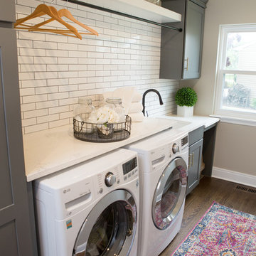
For Chris especially, the laundry room was an entirely dysfunctional eyesore. “We had a washer and a dryer, but it was all kind-of cobbled together!” Chris said. “There were always laundry piles everywhere, we weren’t really sure what we wanted to do in there, but it was time for us to make a change.” The mess of the space was stressful every time they walked in the door from the garage each day. Kids’ backpacks and shoes piled up haphazardly in the makeshift boot-bench closet left the family feeling disorganized and stressed. They needed space for folding clothes and locker cubbies to help keep the family organized.
Having known Christine and Todd in the Huntley community for years, Chris and Meghan were familiar with their work. “We already trusted them personally and having seen their projects for years we knew they did top notch work. After we reviewed the initial round of designs, we knew that hiring them was definitely the right choice,” Meghan and Chris said. Although Chris had done a lot of work in their home himself, the kitchen and laundry room renovation was such a large undertaking that he didn’t want to steal time away from his family to spend what would surely be many long weekends doing the job himself. “That would not have been a wise choice for us,” Chris laughed.
“Our designer, Michelle was very, very, easy to work with; anything we wanted to see or weren’t sure about, she went above and beyond to make this easy for us. She was easy to get hold of and always quick to respond,” the couple said. Michelle pulled ideas that mirrored the couple’s taste and style and was adept at directing the couple to limited choices that didn’t overwhelm them and kept the process moving. “I have a hard time making decisions. Michelle made the decision-making process so easy. I loved how she listened to what I liked and then presented three great options for me to choose from,” Meghan said.
The main objectives for the kitchen were better storage solutions, they wanted the space to reflect their lifestyle and taste, and they wanted it to last for years with low maintenance. One of the first steps in creating a more functional kitchen was relocating the refrigerator, creating an improved workflow for the busy family.
“We didn’t know that we could even move the refrigerator to a new location where it is now, that was something that we never would have thought of,” Chris said. “The new refrigerator location makes the kitchen feel so much bigger. We didn’t add any space, but our whole kitchen with the new design just seems like it’s so much larger than before!” Meghan said.
The perimeter mist colored cabinets helped warm and brighten the entire room, while the graphite colored cabinets on the island added contrast. Using this fresh, clean color palette satisfied the couple’s desire for a bright space that was the exact opposite of what they had before. Organization accessories were also added to the cabinets such as a spice drawer tray and roll outs to create hidden convenience.
“I absolutely love the hidden spices – it makes cooking so much more enjoyable!” Chris said. “And all the pull outs, and the double trash bin, who would think you could get so excited about organization!” the couple said in unison.
One thing they hated in their original kitchen was how dark the space felt. Added lighting on the ceiling with the new light fixtures combined with the lighter cabinetry colors throughout solved this problem. “Our new kitchen has this warm, almost cozy feeling that our old kitchen never had, it’s just a space that I love spending my time in now,” Meghan said. The light airy feeling was accentuated with the use of floating white shelves on either side of the decorative range hood. “We have so much cabinetry space, the new design is amazing we actually have more storage space than we will ever need,” Meghan said.
The island was extended to create more work surface and added space for stool seating. “The new island changes how we live. Now the kids can be in the kitchen with us, doing homework, eating breakfast, and the three of us have special dinners there when Chris is working late,” Meghan said.
The Carrara Marmi Quartz countertops were chosen because they are, not only beautiful, but are made from hard-working material that doesn’t require maintenance. The white subway tile backsplash that wraps to the ceiling behind the focal point cooktop range/hood compliments the crisp white countertops perfectly, while brushed brass hardware and light fixtures keep the design fresh and new.
The couple had a few fears at the beginning of the project, as most homeowners do. Their biggest fear was being out of their kitchen and laundry room for an extended time. The crew made it very easy for the family to work in a limited space keeping the washer and dryer hooked up the majority of the time, and also getting appliances working with minimal downtime.
“They above and beyond accommodated us to get us through the process,” Meghan said. “They did a great job making sure we were as comfortable as possible throughout the process,” Chris added.
“Our project manager DJ did a great job. He was very good at updating us on schedule changes, getting guys in as quickly as possible. Everyone that stepped in the house was nice and did great work,” said Chris. They thought Advance’s carpenter was phenomenal and were impressed when he took a conceptual idea from a photograph and worked with designer Michelle to create a one of a kind range/hood that has become the topic of conversation with friends and family who visit the new kitchen. “He was in our house literally every day for several weeks. He was easy to work with and good at what he did,” Meghan and Chris said.
The focal point of the kitchen; a hand-crafted, custom-built ventilation hood was clad with handpicked reclaimed barnwood. Advance Design’s carpenter built the framework and the cladding to create a one-of-a-kind design element that the couple loves.
“I think it was especially fun for him to create something unique from scratch, showcasing his talent in this area,” Meghan said. “I love that my kitchen is not like everyone else’s. I got to pick out the wood on my hood and watch it being built and was able to choose what pieces of wood went where on it. It’s totally unique.”
Red Oak flooring was toothed-in throughout the kitchen and the rest of the first floor anywhere changes were made. Then the whole floor was refinished to tone down the orange undertones in the existing floor stain, ultimately changing the color complexion of the entire first floor. The result is a completely new feeling to the entire home.
Renovating the laundry room was extremely important to Meghan and Chris, but they had trouble visualizing what the possibilities were for the seemingly small space. Michelle produced beautiful 3D illustrations that helped them envision the space in a whole new way.
“I must have told Michelle 100 times that I am a visual person, seeing the designs in 3D made it so easy to make decisions and see what we could really do with our space,” Meghan said.
A dividing wall and doorway were removed between the existing laundry room and hallway formerly containing a coat closet, providing space to design specialized graphite colored cabinetry matching the kitchen island to house custom storage cubbies for each family member. Adding the tall utility cabinetry in the new laundry area helped solve the storage issue, tucking away cleaning supplies, household items, and even the cat got its own cubby.
“I love how everything is now hidden in its own space. I can’t tell you how much I hated coming home and seeing everything sitting around on counters,” Chris said.
Electrical outlets were planned for the inside of utility cabinets, so devices could charge in hidden locations. Stacking the washer and dryer allowed for wider countertop space to provide a folding area and a special space for clothes to hang. “The way I do laundry has been completely transformed! I can actually fold clothes and hang them now right out of the washer and dryer,” Meghan said.
“The end result in the kitchen and the laundry/mud room was an updated light and bright space, with a smarter work flow that better meets the needs of this family,” Michelle said.
“I would totally recommend Advance Design,” Meghan said. “Sometimes I sit and just look at my kitchen and laundry room and think ‘Wow, I can’t believe I get to live here!’ It’s an understatement to say we love our new space.”
 Casework Inter Design
When the homeowners first purchased the 1925 house, it was compartmentalized, outdated, and completely unfunctional for their growing family. Casework designed the owner's previous kitchen and family room and was brought in to lead up the creative direction for the project. Casework teamed up with architect Paul Crowther and brother sister team Ainslie Davis on the addition and remodel of the Colonial.
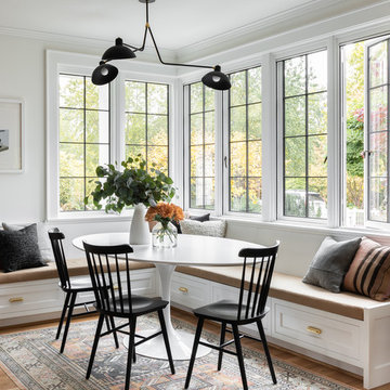
The existing kitchen and powder bath were demoed and walls expanded to create a new footprint for the home. This created a much larger, more open kitchen and breakfast nook with mudroom, pantry and more private half bath. In the spacious kitchen, a large walnut island perfectly compliments the homes existing oak floors without feeling too heavy. Paired with brass accents, Calcutta Carrera marble countertops, and clean white cabinets and tile, the kitchen feels bright and open - the perfect spot for a glass of wine with friends or dinner with the whole family.
There was no official master prior to the renovations. The existing four bedrooms and one separate bathroom became two smaller bedrooms perfectly suited for the client’s two daughters, while the third became the true master complete with walk-in closet and master bath. There are future plans for a second story addition that would transform the current master into a guest suite and build out a master bedroom and bath complete with walk in shower and free standing tub.
Overall, a light, neutral palette was incorporated to draw attention to the existing colonial details of the home, like coved ceilings and leaded glass windows, that the homeowners fell in love with. Modern furnishings and art were mixed in to make this space an eclectic haven.
 Karla Trincanello, CID, Interior Decisions, Inc.
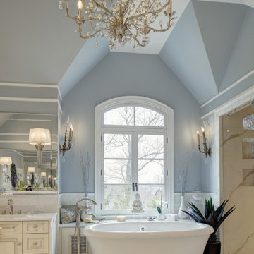
This well used but dreary bathroom was ready for an update but this time, materials were selected that not only looked great but would stand the test of time. The large steam shower (6x6') was like a dark cave with one glass door allowing light. To create a brighter shower space and the feel of an even larger shower, the wall was removed and full glass panels now allowed full sunlight streaming into the shower which avoids the growth of mold and mildew in this newly brighter space which also expands the bathroom by showing all the spaces. Originally the dark shower was permeated with cracks in the marble marble material and bench seat so mold and mildew had a home. The designer specified Porcelain slabs for a carefree un-penetrable material that had fewer grouted seams and added luxury to the new bath. Although Quartz is a hard material and fine to use in a shower, it is not suggested for steam showers because there is some porosity. A free standing bench was fabricated from quartz which works well. A new free
standing, hydrotherapy tub was installed allowing more free space around the tub area and instilling luxury with the use of beautiful marble for the walls and flooring. A lovely crystal chandelier emphasizes the height of the room and the lovely tall window.. Two smaller vanities were replaced by a larger U shaped vanity allotting two corner lazy susan cabinets for storing larger items. The center cabinet was used to store 3 laundry bins that roll out, one for towels and one for his and one for her delicates. Normally this space would be a makeup dressing table but since we were able to design a large one in her closet, she felt laundry bins were more needed in this bathroom. Instead of constructing a closet in the bathroom, the designer suggested an elegant glass front French Armoire to not encumber the space with a wall for the closet.The new bathroom is stunning and stops the heart on entering with all the luxurious amenities.
Sponsored
Delaware, OH

Buckeye Basements, Inc.
Central Ohio's Basement Finishing ExpertsBest Of Houzz '13-'21
 KitchenLab Interiors
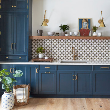
KitchenLab Interiors’ first, entirely new construction project in collaboration with GTH architects who designed the residence. KLI was responsible for all interior finishes, fixtures, furnishings, and design including the stairs, casework, interior doors, moldings and millwork. KLI also worked with the client on selecting the roof, exterior stucco and paint colors, stone, windows, and doors. The homeowners had purchased the existing home on a lakefront lot of the Valley Lo community in Glenview, thinking that it would be a gut renovation, but when they discovered a host of issues including mold, they decided to tear it down and start from scratch. The minute you look out the living room windows, you feel as though you're on a lakeside vacation in Wisconsin or Michigan. We wanted to help the homeowners achieve this feeling throughout the house - merging the causal vibe of a vacation home with the elegance desired for a primary residence. This project is unique and personal in many ways - Rebekah and the homeowner, Lorie, had grown up together in a small suburb of Columbus, Ohio. Lorie had been Rebekah's babysitter and was like an older sister growing up. They were both heavily influenced by the style of the late 70's and early 80's boho/hippy meets disco and 80's glam, and both credit their moms for an early interest in anything related to art, design, and style. One of the biggest challenges of doing a new construction project is that it takes so much longer to plan and execute and by the time tile and lighting is installed, you might be bored by the selections of feel like you've seen them everywhere already. “I really tried to pull myself, our team and the client away from the echo-chamber of Pinterest and Instagram. We fell in love with counter stools 3 years ago that I couldn't bring myself to pull the trigger on, thank god, because then they started showing up literally everywhere", Rebekah recalls. Lots of one of a kind vintage rugs and furnishings make the home feel less brand-spanking new. The best projects come from a team slightly outside their comfort zone. One of the funniest things Lorie says to Rebekah, "I gave you everything you wanted", which is pretty hilarious coming from a client to a designer.
 Drury Design
THE SETUP
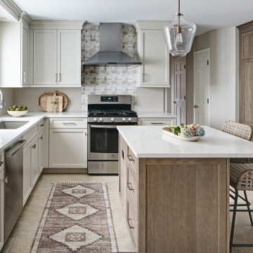
Client Background: Our clients, a couple who have transitioned into the empty nest phase, have cherished their home for over three decades without undergoing any significant renovations. With a newfound desire to adapt their living space to better suit their current lifestyle, they’ve embarked on a journey to reimagine their kitchen — the heart of their home. Their aspiration is to cultivate a serene, neutral-toned sanctuary on the first floor that seamlessly merges with their family room, ensuring a harmonious and inviting environment.
Design Inspiration: The renovation is inspired by the couple’s penchant for soft, calming neutrals, using their cherished family room and the kitchen’s existing tile flooring as the cornerstone for the color scheme. This approach aims to foster a sense of warmth and tranquility throughout.
Design Objectives:
Harmonize the kitchen with the family room by adopting a soothing, neutral color scheme, ensuring a seamless flow across the first floor.
Enhance kitchen functionality with thoughtfully designed cabinetry, providing a designated place for every item and maximizing storage efficiency.
Cultivate an inviting and comfortable atmosphere that reflects the homeowners’ desire for a calm and relaxing space.
Design Challenges:
The homeowners wish to retain the existing kitchen tile flooring and integrate it into a refreshed, modern design.
Accommodating a dining area spacious enough for family visits without compromising the kitchen’s open feel or functional layout.
Despite liking the current placement of plumbing and appliances, the homeowners aspire for a more open floor plan to facilitate better movement and interaction.
The need to amplify natural light in the kitchen, especially around the sink area, where existing lighting is insufficient.
Preserving the half-wall between the kitchen and family room, a feature the homeowners want to keep, while ensuring it complements the new design.
THE RENEWED SPACE
Design Solutions:
By choosing a neutral color palette that complements the existing tile, the design unifies the kitchen with the adjacent spaces. The tile’s grout was cleaned and restored, enhancing the floor’s appearance and integrating it seamlessly with the new kitchen aesthetic.
The inclusion of a larger island with seating for two, alongside maintaining a substantial dining table, was achieved by optimizing the spatial layout. This allowed for a sociable yet functional kitchen, accommodating large family gatherings without feeling crowded.
Minor adjustments to the kitchen’s layout maintained the preferred locations for plumbing and appliances while introducing an ‘open’ design concept. Strategic modifications, such as angling the pantry wall, improved the flow and accessibility within the space.
Replacing the garden window with a broader, standard window significantly increased natural light, transforming the sink area into a bright, welcoming space with enhanced views of the outdoors.
The decision to keep the half-wall was ingeniously leveraged to define the dining area while maintaining an open connection to the family room. This feature not only serves as a visual separator but also ties the two spaces together through the shared color scheme and design elements.
The homeowners are thrilled with their newly remodeled kitchen, which has become a hub of warmth and hospitality. Hosting a wedding shower and a birthday party, they have shared their renewed space with friends and family, who have been equally enamored. This remodel has not only met their functional and aesthetic desires but has also enriched their home with a fresh sense of serenity and joy.
The upstairs part of the home is shaping up nicely. Here’s their newly remodeled primary bathroom.
 Cure Design Group
Cure Design Group (636) 294-2343 https://curedesigngroup.com/
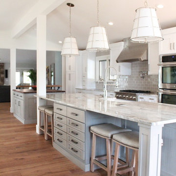
First things first…this renovation was certainly a labor of love for everyone involved, from our amazing clients, to the contractors, vendors and us, this project consumed all of us and the outcome is more than Gorgeous. This contemporary home is nestled back in a a great area of St Louis County. A brick ranch with contemporary touches…once adorned glass blocked bar and stairwell, a tiny galley kitchen and a remodeled garage that once housed their “dining and hearth room” but no one ever used that space.
CURE Senior Designer, Cori Dyer took this space, completely and brilliantly re worked the configuration and entire floor plan and layout. Tearing out the dividing wall from the kitchen and what was once the garage, allowed the new kitchen layout to be flipped to the now long perpendicular wall, and created an open mega kitchen with great natural light, double islands, eat in kitchen and seating area, bar and open the great room. You can stand among the space at any point and are able to take in the entire view.
Creating an uber chic space doesn’t happen on its own…it takes intricate design, research and planning. Custom made cabinets, a double island featuring two surfaces a butcher block and unforgettable marble. This clean color palette plays well with the new custom furniture in the great room, creating a seating area that sparks conversations.
 Tom Bassett-Dilley Architect, Ltd.
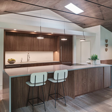
This 1960 house was in need of updating from both design and performance standpoints, and the project turned into a comprehensive deep energy retrofit, with thorough airtightness and insulation, new space conditioning and energy-recovery-ventilation, triple glazed windows, and an interior of incredible elegance. While we maintained the foundation and overall massing, this is essentially a new house, well equipped for a new generation of use and enjoyment.
 Talianko Design Group, LLC
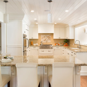
The kitchen was a full remodel which incorporated all new high-end appliances like a 48” Sub Zero refrigerator and Thermador cooktop and ovens. Bead board was added to the ceiling and a heavy crown molding adds detail to the transitional kitchen. The cabinets are painted Swiss coffee by Benjamin Moore, which contrast against the brown granite and creamy subway tile backsplash. A custom mosaic is the centerpiece of the kitchen, adding an organic element. The refrigerator and dishwasher are paneled to help conceal the appliances. A wine fridge was incorporated into the peninsula. Pendants add extra light to peninsula where there is bar stools for extra seating. Photography by: Erika Bierman

 Twelve Stones Designs, LLC
The owners of this kitchen had spent the money to upgrade the finishes in their kitchen upon building the home 12 years ago, but after living in the space for several years they realized how nonfunctional the layout really was. The (then) two preschool aged children had grown into busy, hungry teenagers with many friends who also liked to hang out at the house. So the family needed a more functional kitchen with better traffic flow, space for daily activities revolving around the kitchen at different times of day, and a kitchen that could accommodate cooking for and serving large groups. Furthermore, the dark, traditional finishes no longer reflected the homeowners’ style. They requested a brighter, more relaxed, coastal style that reflected their love of the seaside cities they like to visit.
Originally, the kitchen was U-shaped with a narrow island in the middle. The island created narrow aisles that bottle-necked at the dishwasher, refrigerator, and cooktop areas. There was a pass-through from the foyer into the kitchen, but the owners never liked that the pass-through was also located so close to the powder room. The awkward proximity was unappealing and made guests feel uncomfortable.
The kitchen’s storage was made up of lots of narrow cabinets, apothecary drawers, clipped corner units, and very few drawers. It lacked useful storage for the larger items the family used on a daily basis. And the kitchen’s only pantry was small closet that had only builder-grade, narrow shelving with no illumination to be able to see the contents inside.
Overall, the kitchen’s lighting plan was poorly executed. Only six recessed cans illuminated the entire kitchen and nook areas. The under cabinet lighting was not evenly distributed either. In fact, the builder had mis-placed the under cabinet lighting around the decorative pilasters which made for choppy, dark cubbies. Further, the builder didn’t include any lighting over the sink or the bar area, which meant whoever was doing the dishes was always in their own shadow. That, coupled with the steep overhang of the game room above made the bar area feel like a dim, cavernous space that wasn’t inviting or task oriented. The kitchen looked out into the main living space, but the raised bar and a narrow wall (which held the only large cabinet in the kitchen) created more of a barrier than a relationship to the living room or breakfast nook. In fact, one couldn’t even see the breakfast nook from the cooktop or sink areas due to its orientation. The raised bar top was too narrow to comfortably sit to either dine at or chat from due to the lack of knee space. The the homeowners confided that the kitchen felt more like a dark, dirty prison than place where the family, or their guests, wanted to gather and commune.
The clients' needs and desires were:
➢ to create a kitchen that would be a space the family loved to be in; to relate to the adjacent spaces all around, and to have better flow for entertaining large groups
➢ to remove the walls between the breakfast nook and living area and to be able to utilize the natural light from the windows in both those areas
➢ to incorporate a functional chopping block for prepping fresh food for home cooked meals, an island with a large sink and drain board, 2 pull out trash cans, and seating for at least the 2 teens to eat or do homework
➢ to design a kitchen and breakfast nook with an airy, coastal, relaxed vibe that blended with the rest of the house's coastal theme
➢ to integrate a layered lighting plan which would include ample general illumination, specific task lighting, decorative lighting, and lots of illuminated storage
➢ to design a kitchen with not only more storage for all the husband’s kitchen gadgets and collection of oils and spices, but smart storage, including a coffee/breakfast bar and a place to store and conceal the toaster oven and microwave
➢ to find a way to utilize the large open space between the kitchen, pantry area, and breakfast nook
Twelve Stones Designs achieved the owner's goals by:
➢ removing the walls between the kitchen and living room to allow the natural light to filter in from the adjacent rooms and to create a connection between the kitchen, nook, and living spaces for a sense of unity and communion
➢ removing the existing pantry and designing 3 large pantry style cabinets with LED tape lights and rollout drawers to house lots of kitchen appliances, gadgets, and tons of groceries. We also took the cabinets all the way up to the 9’ ceiling for additional storage for seasonal items and bulk storage.
➢ designing 2 islands - 1 with a gorgeous black walnut chopping block that houses a drawer for chopping and carving knives and a custom double pull out trash unit for point of use utilization - and 1 that houses the dishwasher, a large Blanco Gourmet sink with integrated drain board, woven baskets for fresh root vegetables and kitchen towels, plenty of drawer storage for kitchen items, and bar seating for up to 4 diners.
➢ closing off the space between the kitchen and the powder room to create a beautiful new private alcove for the powder room as well as adding some decorative storage. This also gave us space to include more tall storage near the new range for precision placement of the husband’s extensive oil and spice collection as well as a location for a combo-steam oven the wife wanted for baking and cooking healthy meals.
The project is enhanced functionally by:
➢ incorporated USB and standard receptacles for the kids’ laptops and phone charging in the large island
➢ designing the small island to include additional open shelving for items used on a daily basis such as a variety of bowls, plates, and colanders. This set up also works well for the husband who prefers to “plate” his dinners in restaurant-style fashion before presenting them to the table.
➢ the integration of specific storage units, such as double stacked cutlery drawers, a custom spice pull-out, a Kuerig coffee and tea pod drawer, and custom double stacked utensil drawers
➢ moving the refrigerator to the old oven location - this eliminated the bottle neck as well as created a better relationship to the eating table. It also utilizes the floor space between the pantry, nook, and kitchen
➢ creating a banquet style breakfast nook - this banquette seating not only doubles the amount of seating for large gatherings but it better utilizes the odd space between the kitchen and the previous nook area. It also helps to create a distinct pathway from the mudroom room through the pantry area, kitchen, nook, and living room.
➢ the coffee/breakfast bar area which includes the perfect location for the concealed microwave and toaster oven, convenient storage for the coffee pods and tea accoutrements. Roll-out drawers below also house the smoothie maker, hot water kettle, and a plethora of smoothie-making ingredients such as protein powders, smoothie additives, etc. Furthermore, the drawers below the Keurig house measuring utensil, cutlery, baking supplies and tupperware storage.
➢ incorporating lots of wide drawers and pullouts to accommodate large cookware.
➢ utilizing as much vertical space as possible by building storage to the ceiling which accommodates the family’s abundant amount of serving platters, baking sheets, bakeware, casserole dishes, and additional cutting boards.
The project is enhanced aesthetically by:
➢ new 5-piece Versailles pattern porcelain tile that now seamlessly joins the entire down stairs area together creating a bright, cohesiveness feeling instead of choppy separated spaces - it also adds a coastal feeling
➢ designing a cabinet to conceal the microwave and toaster oven
➢ the coastal influenced light fixtures over the nook table and island
➢ the sandy colors of the Langdon Cambria countertops. The swirling pattern and sparkling quartz pieces remind the homeowner of black-and-tan sandy beaches
➢ the striped banquet seating whose creamy white background and blue-green stripes were the inspiration for the cabinet and wall colors.
➢ All the interior doors were painted black to coordinate with the blacks and grays in the backsplash tile and countertop. This also adds a hint of tailored formality to an otherwise casual space.
➢ the use of WAC's Oculux small aperture LED units for the overhead lighting complimented with Diode LED strips for task lighting under the cabinets and inside the pantry and glass wall cabinets. All of the lighting applications are on separate dimmer switches.
Innovative uses of materials or construction methods by Realty Restoration LLC:
➢ Each 1-1/2” x 3” block of reclaimed end-grain black walnut that makes up the center island chopping block was hand milled and built in the shop. It was designed to look substantial and proportional to the surrounding elements, executed by creating the 4 inch tall top with a solid wood chamfered edge band.
➢ The metal doors on either side of the vent hood were also custom designed for this project and built in the Realty Restoration LLC shop. They are made 1x2, 11-gauge mild steel with ribbed glass. Weighing 60 lbs a piece, heavy duty cabinet hinges were added to support the weight of the door and keep them from sagging.
➢ Under-cabinet receptacles were added along the range wall in order to have a clean, uninterrupted backsplash.
Design obstacles to overcome:
➢ Because we were removing the demising walls between the kitchen and living room, we had to find a way to plumb and vent the new island. We did this by tunneling through the slab (the slab had post tension cables which prevented us from just trenching) to run a new wet vent through a nearby structural wall. We pulled the existing hot and cold lines between upper floor joists and ran them down the structural wall as well and up through a conduit in the tunnel.
➢ Since we were converting from wall overs to a gas range it allowed us to utilize the 220 feed for the wall ovens to provide a new sub panel for all the new kitchen circuits
➢ Due to framing deficiencies inherited from the original build there was a 1-1/2” differential in the floor-to-ceiling height over a 20 foot span; by utilizing the process of cutting and furring coupled with the crown moulding details on the cabinet elevations we were able to mask the problem and provide seamless transitions between the cabinet components.
Evidence of superior craftsmanship:
➢ uniquely designed, one-of-a-kind metal “X” end panels on the large island. The end panels were custom made in the Realty Restoration LLC shop and fitted to the exact dimensions of the island. The welding seams are completely indistinguishable - the posts look like they are cut from a single sheet of metal
➢ square metal posts on the small island were also custom made and designed to compliment and carry through the metal element s throughout the kitchen
➢ the beautiful, oversized end panels on the pantry cabinets which give the breakfast nook a tailored look
➢ integrating a large format 5 piece Versailles tile pattern to seamlessly flow from the existing spaces into the new kitchen space
➢ By constructing a custom cabinet that jogged around a corner we could not remodel (housing the entry way coat closet) we were able to camouflage the adjacent wall offset within the upper and lower cabinets. By designing around the existing jog in the structural walls we accomplished a few things: we were able to find the space to house, and hide, the microwave and toaster oven yet still have a clean cohesive appearance from the kitchen side. Additionally, the owners were able to keep their much needed coat closet and we didn’t have to increase the budget with unnecessary structural work.
Sponsored
Delaware, OH
Buckeye Basements, Inc.
Central Ohio's Basement Finishing ExpertsBest Of Houzz '13-'21
 Michael Nash Design, Build & Homes
This growing family of six was struggling with a dysfunctional kitchen design. The center island had been installed at an odd angle that limited accessibility and traffic flow. Additionally, storage space was limited by poor cabinet design. Finally, doorways in and out of the kitchen were narrow and poorly located, especially for children dashing in and out.
Other design challenges included how to better use a 10’ x 12’ room for children’s jackets and toys and how to add a professional-quality gas range in a neighborhood were natural gas wasn’t available. The new design would address all of these issues.
DESIGN SOLUTIONS
The new kitchen design revolves around a more proportional island. Carefully placed in the center of the new space with seating for four, it includes a prep sink, a second dishwasher and a beverage center.
The distressed ebony-stained island and hutch provides a brilliant contrast between the white color cabinetry. White Carrera marble countertops and backsplash top both island and perimeter cabinets.
Tall, double stacked cabinetry lines two walls to maximize storage space. Across the room there was an unused wall that now contains a 36” tower fridge and freezer, both covered with matching panels, and a tall cabinet that contains a microwave, steam unit and warming drawer.
A propane tank was buried in the back yard to provide gas to a new 60” professional range and cooktop. A custom-made wood mantel hood blends perfectly with the cabinet style.
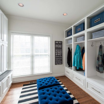
The old laundry room was reconfigured to have lots of locker space for all kids and added cabinetry for storage. A double entry door separated the new mudroom from the rest of the back hall. In the back hall the back windows were replaced with a set of French door and added decking to create a direct access to deck and backyard.
The end result is an open floor plan, high-end appliances, great traffic flow and pleasing colors. The homeowner calls it the “kitchen of her dreams.”
 Twelve Stones Designs, LLC
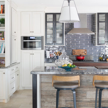
The owners of this kitchen had spent the money to upgrade the finishes in their kitchen upon building the home 12 years ago, but after living in the space for several years they realized how nonfunctional the layout really was. The (then) two preschool aged children had grown into busy, hungry teenagers with many friends who also liked to hang out at the house. So the family needed a more functional kitchen with better traffic flow, space for daily activities revolving around the kitchen at different times of day, and a kitchen that could accommodate cooking for and serving large groups. Furthermore, the dark, traditional finishes no longer reflected the homeowners’ style. They requested a brighter, more relaxed, coastal style that reflected their love of the seaside cities they like to visit.
Originally, the kitchen was U-shaped with a narrow island in the middle. The island created narrow aisles that bottle-necked at the dishwasher, refrigerator, and cooktop areas. There was a pass-through from the foyer into the kitchen, but the owners never liked that the pass-through was also located so close to the powder room. The awkward proximity was unappealing and made guests feel uncomfortable.
The kitchen’s storage was made up of lots of narrow cabinets, apothecary drawers, clipped corner units, and very few drawers. It lacked useful storage for the larger items the family used on a daily basis. And the kitchen’s only pantry was small closet that had only builder-grade, narrow shelving with no illumination to be able to see the contents inside.
Overall, the kitchen’s lighting plan was poorly executed. Only six recessed cans illuminated the entire kitchen and nook areas. The under cabinet lighting was not evenly distributed either. In fact, the builder had mis-placed the under cabinet lighting around the decorative pilasters which made for choppy, dark cubbies. Further, the builder didn’t include any lighting over the sink or the bar area, which meant whoever was doing the dishes was always in their own shadow. That, coupled with the steep overhang of the game room above made the bar area feel like a dim, cavernous space that wasn’t inviting or task oriented. The kitchen looked out into the main living space, but the raised bar and a narrow wall (which held the only large cabinet in the kitchen) created more of a barrier than a relationship to the living room or breakfast nook. In fact, one couldn’t even see the breakfast nook from the cooktop or sink areas due to its orientation. The raised bar top was too narrow to comfortably sit to either dine at or chat from due to the lack of knee space. The the homeowners confided that the kitchen felt more like a dark, dirty prison than place where the family, or their guests, wanted to gather and commune.
The clients' needs and desires were:
➢ to create a kitchen that would be a space the family loved to be in; to relate to the adjacent spaces all around, and to have better flow for entertaining large groups
➢ to remove the walls between the breakfast nook and living area and to be able to utilize the natural light from the windows in both those areas
➢ to incorporate a functional chopping block for prepping fresh food for home cooked meals, an island with a large sink and drain board, 2 pull out trash cans, and seating for at least the 2 teens to eat or do homework
➢ to design a kitchen and breakfast nook with an airy, coastal, relaxed vibe that blended with the rest of the house's coastal theme
➢ to integrate a layered lighting plan which would include ample general illumination, specific task lighting, decorative lighting, and lots of illuminated storage
➢ to design a kitchen with not only more storage for all the husband’s kitchen gadgets and collection of oils and spices, but smart storage, including a coffee/breakfast bar and a place to store and conceal the toaster oven and microwave
➢ to find a way to utilize the large open space between the kitchen, pantry area, and breakfast nook
Twelve Stones Designs achieved the owner's goals by:
➢ removing the walls between the kitchen and living room to allow the natural light to filter in from the adjacent rooms and to create a connection between the kitchen, nook, and living spaces for a sense of unity and communion
➢ removing the existing pantry and designing 3 large pantry style cabinets with LED tape lights and rollout drawers to house lots of kitchen appliances, gadgets, and tons of groceries. We also took the cabinets all the way up to the 9’ ceiling for additional storage for seasonal items and bulk storage.
➢ designing 2 islands - 1 with a gorgeous black walnut chopping block that houses a drawer for chopping and carving knives and a custom double pull out trash unit for point of use utilization - and 1 that houses the dishwasher, a large Blanco Gourmet sink with integrated drain board, woven baskets for fresh root vegetables and kitchen towels, plenty of drawer storage for kitchen items, and bar seating for up to 4 diners.
➢ closing off the space between the kitchen and the powder room to create a beautiful new private alcove for the powder room as well as adding some decorative storage. This also gave us space to include more tall storage near the new range for precision placement of the husband’s extensive oil and spice collection as well as a location for a combo-steam oven the wife wanted for baking and cooking healthy meals.
The project is enhanced functionally by:
➢ incorporated USB and standard receptacles for the kids’ laptops and phone charging in the large island
➢ designing the small island to include additional open shelving for items used on a daily basis such as a variety of bowls, plates, and colanders. This set up also works well for the husband who prefers to “plate” his dinners in restaurant-style fashion before presenting them to the table.
➢ the integration of specific storage units, such as double stacked cutlery drawers, a custom spice pull-out, a Kuerig coffee and tea pod drawer, and custom double stacked utensil drawers
➢ moving the refrigerator to the old oven location - this eliminated the bottle neck as well as created a better relationship to the eating table. It also utilizes the floor space between the pantry, nook, and kitchen
➢ creating a banquet style breakfast nook - this banquette seating not only doubles the amount of seating for large gatherings but it better utilizes the odd space between the kitchen and the previous nook area. It also helps to create a distinct pathway from the mudroom room through the pantry area, kitchen, nook, and living room.
➢ the coffee/breakfast bar area which includes the perfect location for the concealed microwave and toaster oven, convenient storage for the coffee pods and tea accoutrements. Roll-out drawers below also house the smoothie maker, hot water kettle, and a plethora of smoothie-making ingredients such as protein powders, smoothie additives, etc. Furthermore, the drawers below the Keurig house measuring utensil, cutlery, baking supplies and tupperware storage.
➢ incorporating lots of wide drawers and pullouts to accommodate large cookware.
➢ utilizing as much vertical space as possible by building storage to the ceiling which accommodates the family’s abundant amount of serving platters, baking sheets, bakeware, casserole dishes, and additional cutting boards.
The project is enhanced aesthetically by:
➢ new 5-piece Versailles pattern porcelain tile that now seamlessly joins the entire down stairs area together creating a bright, cohesiveness feeling instead of choppy separated spaces - it also adds a coastal feeling
➢ designing a cabinet to conceal the microwave and toaster oven
➢ the coastal influenced light fixtures over the nook table and island
➢ the sandy colors of the Langdon Cambria countertops. The swirling pattern and sparkling quartz pieces remind the homeowner of black-and-tan sandy beaches
➢ the striped banquet seating whose creamy white background and blue-green stripes were the inspiration for the cabinet and wall colors.
➢ All the interior doors were painted black to coordinate with the blacks and grays in the backsplash tile and countertop. This also adds a hint of tailored formality to an otherwise casual space.
➢ the use of WAC's Oculux small aperture LED units for the overhead lighting complimented with Diode LED strips for task lighting under the cabinets and inside the pantry and glass wall cabinets. All of the lighting applications are on separate dimmer switches.
Innovative uses of materials or construction methods by Realty Restoration LLC:
➢ Each 1-1/2” x 3” block of reclaimed end-grain black walnut that makes up the center island chopping block was hand milled and built in the shop. It was designed to look substantial and proportional to the surrounding elements, executed by creating the 4 inch tall top with a solid wood chamfered edge band.
➢ The metal doors on either side of the vent hood were also custom designed for this project and built in the Realty Restoration LLC shop. They are made 1x2, 11-gauge mild steel with ribbed glass. Weighing 60 lbs a piece, heavy duty cabinet hinges were added to support the weight of the door and keep them from sagging.
➢ Under-cabinet receptacles were added along the range wall in order to have a clean, uninterrupted backsplash.
Design obstacles to overcome:
➢ Because we were removing the demising walls between the kitchen and living room, we had to find a way to plumb and vent the new island. We did this by tunneling through the slab (the slab had post tension cables which prevented us from just trenching) to run a new wet vent through a nearby structural wall. We pulled the existing hot and cold lines between upper floor joists and ran them down the structural wall as well and up through a conduit in the tunnel.
➢ Since we were converting from wall overs to a gas range it allowed us to utilize the 220 feed for the wall ovens to provide a new sub panel for all the new kitchen circuits
➢ Due to framing deficiencies inherited from the original build there was a 1-1/2” differential in the floor-to-ceiling height over a 20 foot span; by utilizing the process of cutting and furring coupled with the crown moulding details on the cabinet elevations we were able to mask the problem and provide seamless transitions between the cabinet components.
Evidence of superior craftsmanship:
➢ uniquely designed, one-of-a-kind metal “X” end panels on the large island. The end panels were custom made in the Realty Restoration LLC shop and fitted to the exact dimensions of the island. The welding seams are completely indistinguishable - the posts look like they are cut from a single sheet of metal
➢ square metal posts on the small island were also custom made and designed to compliment and carry through the metal element s throughout the kitchen
➢ the beautiful, oversized end panels on the pantry cabinets which give the breakfast nook a tailored look
➢ integrating a large format 5 piece Versailles tile pattern to seamlessly flow from the existing spaces into the new kitchen space
➢ By constructing a custom cabinet that jogged around a corner we could not remodel (housing the entry way coat closet) we were able to camouflage the adjacent wall offset within the upper and lower cabinets. By designing around the existing jog in the structural walls we accomplished a few things: we were able to find the space to house, and hide, the microwave and toaster oven yet still have a clean cohesive appearance from the kitchen side. Additionally, the owners were able to keep their much needed coat closet and we didn’t have to increase the budget with unnecessary structural work.
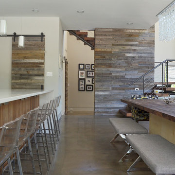
 Sarah Greenman
Photo: Sarah Greenman © 2014 Houzz
Design: New Leaf Construction
Inspiration for a contemporary concrete floor kitchen/dining room combo remodel in Dallas with white walls and no fireplace
Inspiration for a contemporary concrete floor kitchen/dining room combo remodel in Dallas with white walls and no fireplace
 Gallery KBNY
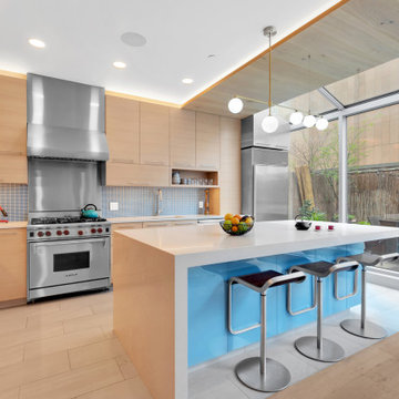
For our full gut renovation of this Manhattan loft penthouse, we partnered with architecture firm Todd Zwigard Architects. Many of our clients know us as experts in the full design-build approach, where we handle every aspect of the project. But in this case, architectural plans were already drawn, the full schedule was finished, and our clients needed a partner to execute on the architectural plans – enter Gallery. Construction management is as vital to a project as the design phase, so we’re happy to offer our expertise in this type of scenario.
A DIFFERENT APPROACH
Construction and design are often the face of most renovations, but the planning and follow-through are naturally just as necessary to make it all come together. The project itself was a fairly straightforward gut renovation of the loft. Everything was included: new floors, a new kitchen, new bathrooms, new lighting. Our task was to manage every aspect of the construction, ensuring that the planning work of Todd Zwigard Architects was executed to the exact vision imagined for this Manhattan loft renovation.
CONTEMPORARY GOES ECLECTIC
Although we didn’t contribute to the aesthetic of the interior design in this project, we did carry out the plans that brought it life. The tone was very modern, with some eclectic touches. The kitchen, featuring an island with a baby blue lacquered finish, blends contemporary clean lines into an industrial-tinged, almost futuristic aesthetic. Reclaimed wooden doors and art pieces collected throughout the years are an ode to the client's travels, an artistic touch from Todd Zwigard Architects.
LET’S TALK
Quality of work is of course important, but there are several components of construction management that are equally vital: communication; processes that make sure you're able to adhere to schedules; protocols with both safety and communication. You might say this is the nerding out of the construction process. It’s not often the face of a project, but it’s absolutely massive in terms of carrying out a successful renovation, whether it’s a penthouse loft in Manhattan, a condo in Prospect Heights, or a kitchen in a Brooklyn brownstone. Quality construction management is probably one of the biggest ways to separate professional contractors from those who aren’t.
ART FROM CHAOS
This was such a large project, so our ability to procure and source all the finishes and fixtures was hugely important to our clients. The sheer number of floors, tiles, and plumbing fixtures alone that need to be ordered, in addition to everything else, plus figuring out lead times, shipments, deliveries, and inspections. It can quickly become chaotic, but there’s an art to the planning and organization, and we’ve mastered it.
The larger a project is, the more likely that havoc will rear its head. The antidote is not only really proper planning and construction management, as we achieved in this Manhattan loft penthouse renovation, but also a great working relationship with everyone else involved in the project: contractors, architect, and clients alike.
GET IN TOUCH
Is a loft renovation in New York in your future? We’re experts in renovating New York homes, from apartment combinations in managed buildings to kitchens and bathrooms in co-ops and condos to gut renovations of historic spaces and landmark renovations.
Contact us to learn more about our approach as a design-and-build firm, where all aspects of your project are handled under the same roof. In addition to construction management, you’ll get our in-house architect in-house and the added renovation benefits of experts in design, material selection, and paperwork.


 TKS Design Group
Download our free ebook, Creating the Ideal Kitchen. DOWNLOAD NOW
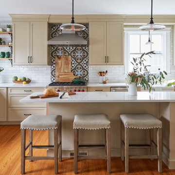
The homeowners came to us looking to update the kitchen in their historic 1897 home. The home had gone through an extensive renovation several years earlier that added a master bedroom suite and updates to the front façade. The kitchen however was not part of that update and a prior 1990’s update had left much to be desired. The client is an avid cook, and it was just not very functional for the family.
The original kitchen was very choppy and included a large eat in area that took up more than its fair share of the space. On the wish list was a place where the family could comfortably congregate, that was easy and to cook in, that feels lived in and in check with the rest of the home’s décor. They also wanted a space that was not cluttered and dark – a happy, light and airy room. A small powder room off the space also needed some attention so we set out to include that in the remodel as well.
See that arch in the neighboring dining room? The homeowner really wanted to make the opening to the dining room an arch to match, so we incorporated that into the design.
Another unfortunate eyesore was the state of the ceiling and soffits. Turns out it was just a series of shortcuts from the prior renovation, and we were surprised and delighted that we were easily able to flatten out almost the entire ceiling with a couple of little reworks.
Other changes we made were to add new windows that were appropriate to the new design, which included moving the sink window over slightly to give the work zone more breathing room. We also adjusted the height of the windows in what was previously the eat-in area that were too low for a countertop to work. We tried to keep an old island in the plan since it was a well-loved vintage find, but the tradeoff for the function of the new island was not worth it in the end. We hope the old found a new home, perhaps as a potting table.
Designed by: Susan Klimala, CKD, CBD
Photography by: Michael Kaskel
For more information on kitchen and bath design ideas go to: www.kitchenstudio-ge.com
 Erica Peale Design
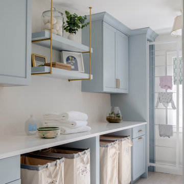
Once dark and weighed down by orange walls, this laundry room has been completely reimagined into a light-filled, uplifting space. New custom cabinetry delivers abundant hidden storage, keeping everyday essentials beautifully organized, while a dedicated laundry sink with a natural stone backsplash brings both function and a touch of luxury. Thoughtful details like pull-out drying racks make daily tasks effortless. The result is a room that feels fresh, bright, and genuinely happy—proof that even the most utilitarian spaces can be a joy to be in.
 Stalburg Design
Relocating from their home in Brisbane, Australia with ocean views to the Pacific, our clients envisioned a refresh for their new lakefront cottage on Pine Lake in West Bloomfield, Michigan. Completed in July 2024, we created new spaces, reimagined old ones, and even swapped places for a primary bedroom and its en suite bath.
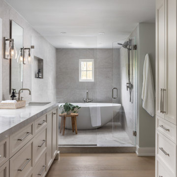
Our goal was to create a serene and soothing spa- like experience for the bathroom, all while maintaining gorgeous lake views. But this reconfiguration presented some challenges. The primary bedroom was oversized, while its adjacent bath was tiny and crowded. We completely flipped the locations of the bedroom and bathroom, even rerouting plumbing over the bar in the lower level to accommodate the freestanding tub.
To maximize space, we designed large, walk-in dressing pantries that are as functional as they are beautiful, and lead to the large dual custom vanity. The vanity itself is freestanding to provide access for hand towel bath hardware on its sides. The his-and-hers unit contains built-in dividers, laundry hampers and trash pullouts to maximize its function. An enclosed water closet allows for privacy in the open concept bathroom, and is placed beyond the cabinetry.
The star of this space is the large enclosed wet room. As the focal point of the bathroom, its oversized tiled walls and deep built-in bench allow for a steam or soaking in the tub while enjoying stunning lake views. The wet room is spacious and serene, and perfect for an end to a Michigan winter day.
11